| 💯Free Plan | Yes |
|---|---|
| 💲Starting Price | $10.00 |
| 📄Number of Templates | 50 |
| 🔌Apps/Integrations | Yes |
| 🛒E-commerce Tools | Yes |
Overview
Weebly Is Great For Beginners, But It Has Its Limits
Weebly is one of those rare website builders that isn’t just easy to use, but legitimately fun. That is, its new editor is fun to use. The old one mostly feels, well, old.
I’m getting ahead of myself. Weebly has two distinct website editors: the classic Weebly site builder, which is intended for basic websites, and what I’m dubbing the e-commerce builder, because you’re directed there if you need an online store.


Weebly is now only $6.00 per month!
Sign up for an annual plan and enjoy the savings.
I’ll be honest – I much prefer the e-commerce builder, which is a great tool even if you don’t need an online store.
You can create any kind of website on either Weebly editor, so it will likely come down to which style of editor you prefer and how much customization you need. The classic builder has more ways to customize your site, and even though there is an online store feature, it’s better for sites that don’t sell a lot of products. (Plus, you can access most features on the free version!)
I’m here to tell you exactly what you can and can’t do with each Weebly builder, so you can decide if one of these editors is right for you.
Templates
There Aren’t Tons of Themes, but They Look Good
Weebly’s template library is on the smaller side, with about 50 themes (Weebly’s term for templates) in a few different categories, covering personal sites and portfolios as well as businesses and online stores. The personal and blog categories have more themes than the business-related categories, but no matter what you need, you’ll find some solid choices.
What Weebly lacks in theme quantity, it makes up for in quality – these aren’t just the same layout recycled a dozen times. You’ll find unique themes in different styles and for different purposes, so it’s very likely you’ll find a theme that works for your site.
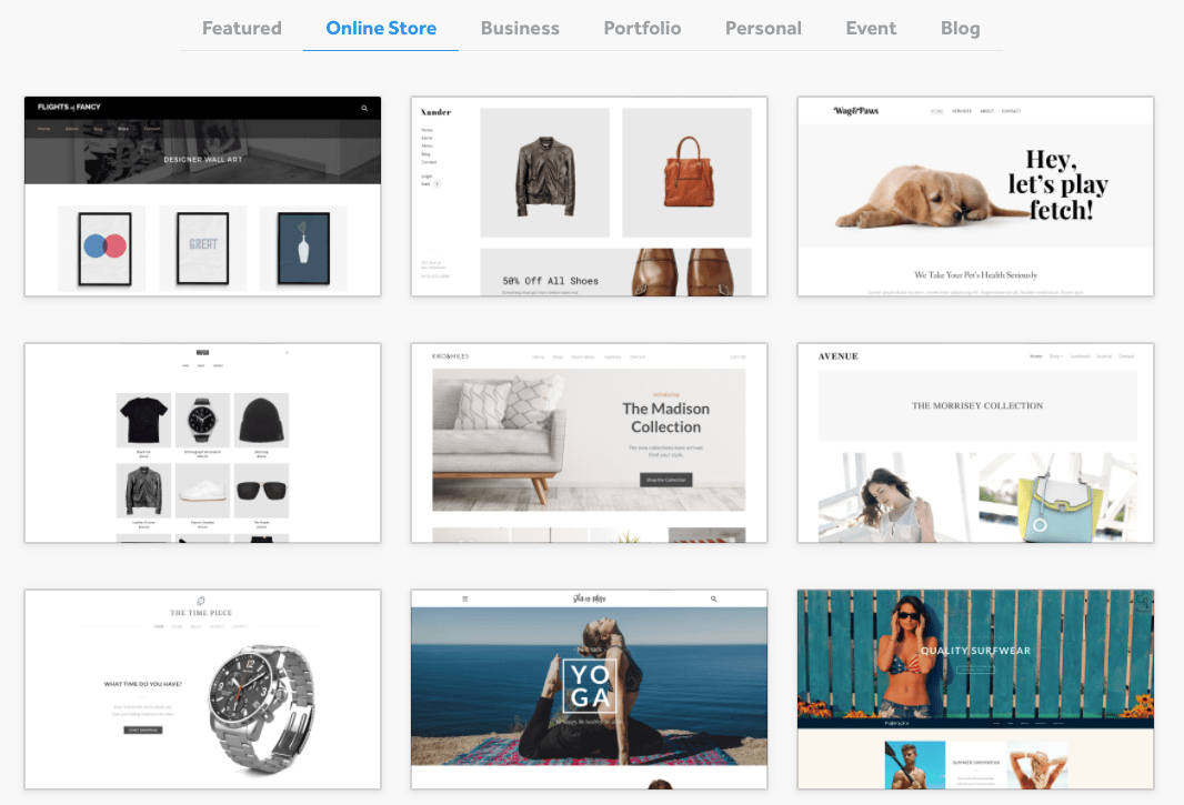
You can use these themes on both the classic and e-commerce site editors, and both allow for basic customization. That said, you can customize a bit more in the classic Weebly builder, with more options for colors and fonts. All themes are mobile-responsive, so there’s no need to worry about how your site will look on a smartphone or other smaller screens.
If the Weebly selection doesn’t quite have what you need, you can also purchase a theme on third-party platforms like ThemeForest (read our expert review) and Webfire Themes. Some reviews and support comments suggest that these require more technical knowledge, so keep that in mind if you choose this route.
Features
Weebly Is a Simple Builder That Can Run a Pretty Powerful Site
Weebly manages to pack some excellent features into its beginner-friendly site building process. Where other website builders might cut some features that have a steeper learning curve, Weebly simplifies those tasks so you can have the site you want without needing a ton of advanced knowledge.
The available features vary slightly depending on which builder you’re using, so make sure you choose the right one for your needs. You’ll make that choice when you first start your website, when you reach the following screen:
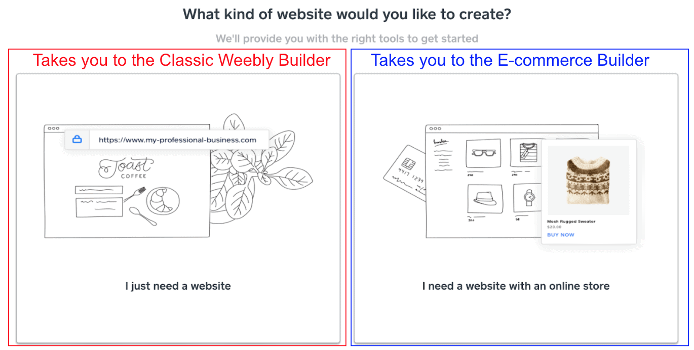
This choice is misleading, because both builders have online store features. You can create all the same types of pages on both editors (including a blog, which only recently rolled out to the e-commerce builder), so ultimately, the difference comes down to some customization options and if you have a preference for one style of editor over the other.
Some features below only apply to one of the Weebly editors, so I’ve noted those where they are relevant. Let’s dig in.
Robust App Centers
In the classic builder, you can access Weebly’s App Center, which offers more than 350 apps and integrations across five different categories:
- E-commerce
- Communication
- Marketing
- Social Media
- Site Tools & Features
There are good filters and a search function, so it’s easy to find what you’re looking for.
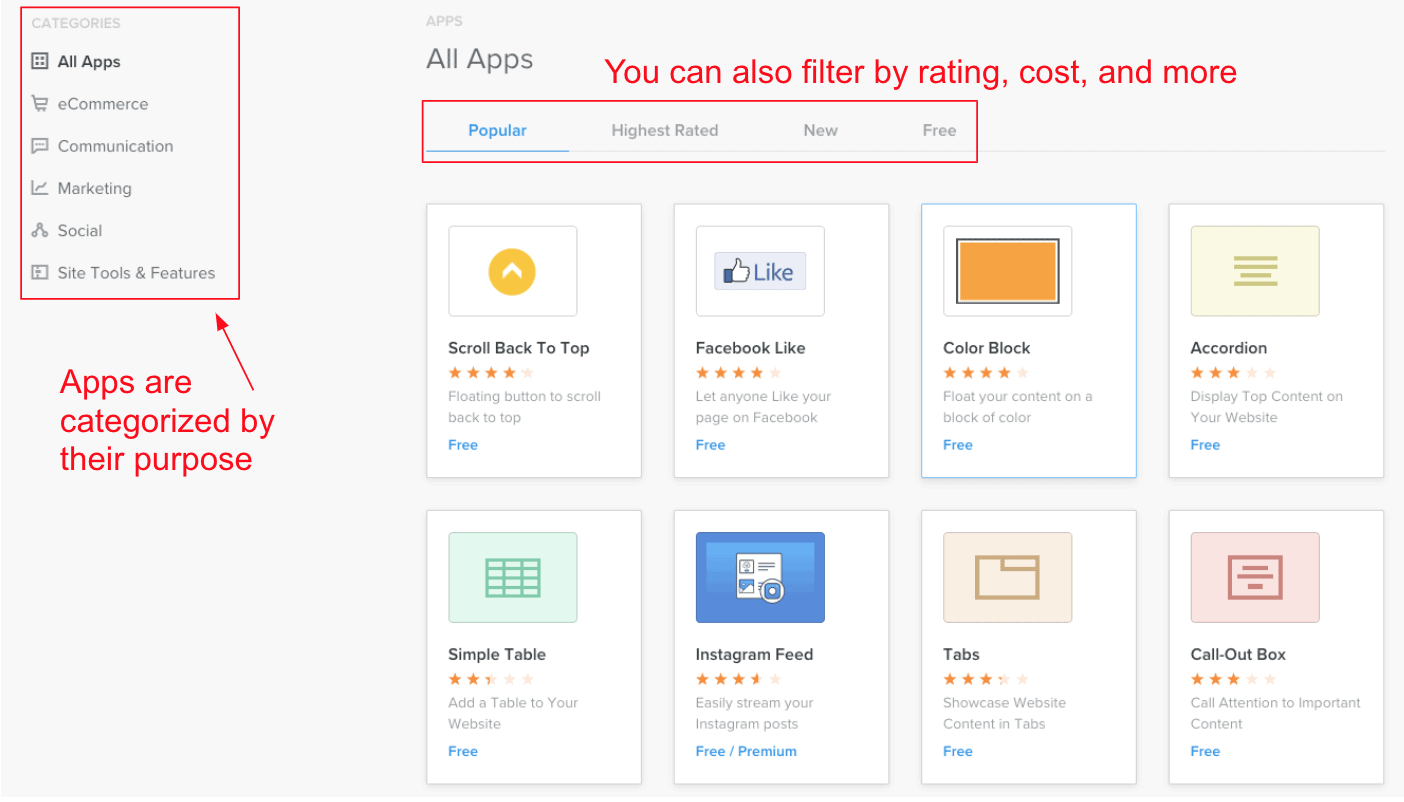
The App Center includes options for adding social feeds, managing comments or contact forms, incorporating live chat into your customer service, and much more. There’s also a good selection of e-commerce apps, particularly around shipping and fulfilling your dreams. Or fulfilling your orders, at the very least.
There aren’t a lot of big name integrations in the app market – you can’t find MailChimp or ChowNow here, for example. You can still add these, but you’ll have to use embed codes (i.e., you will have to embed a code, provided from the external platform, into your website’s HTML). That’s a bit more work than the typical one-click installation. Despite this drawback, the Weebly App Center still offers a lot of free options for expanding your site’s functionality.
If you’re using the e-commerce builder, you’ll get some app functions, like social media feeds, built into the builder. For everything else, you’ll use the Square App Marketplace, not the original Weebly one.
This does require a Square account in addition to a Weebly one, but it’s worth it: there’s a much bigger selection of apps in the Square Marketplace. It includes those big names like ChowNow and MailChimp, and also some niche categories like healthcare and insurance.
Built-In Email Marketing Tools
Weebly offers an add-on email marketing platform called Weebly Promote, which fully integrates with your website and works with both the classic and the e-commerce builder. You can use the same drag-and-drop builder to both compose your email campaigns and build your website (a moment of appreciation for website builders that don’t reinvent the wheel for every new task) and it tracks all the statistics (e.g., open rates, click-throughs) on your website dashboard.
This tool includes email templates for a few different purposes, and it walks you through each step for setting up and sending an email campaign. You can also build contact lists and segment them based on any demographic data you’ve gathered (e.g., location, profession, gender).
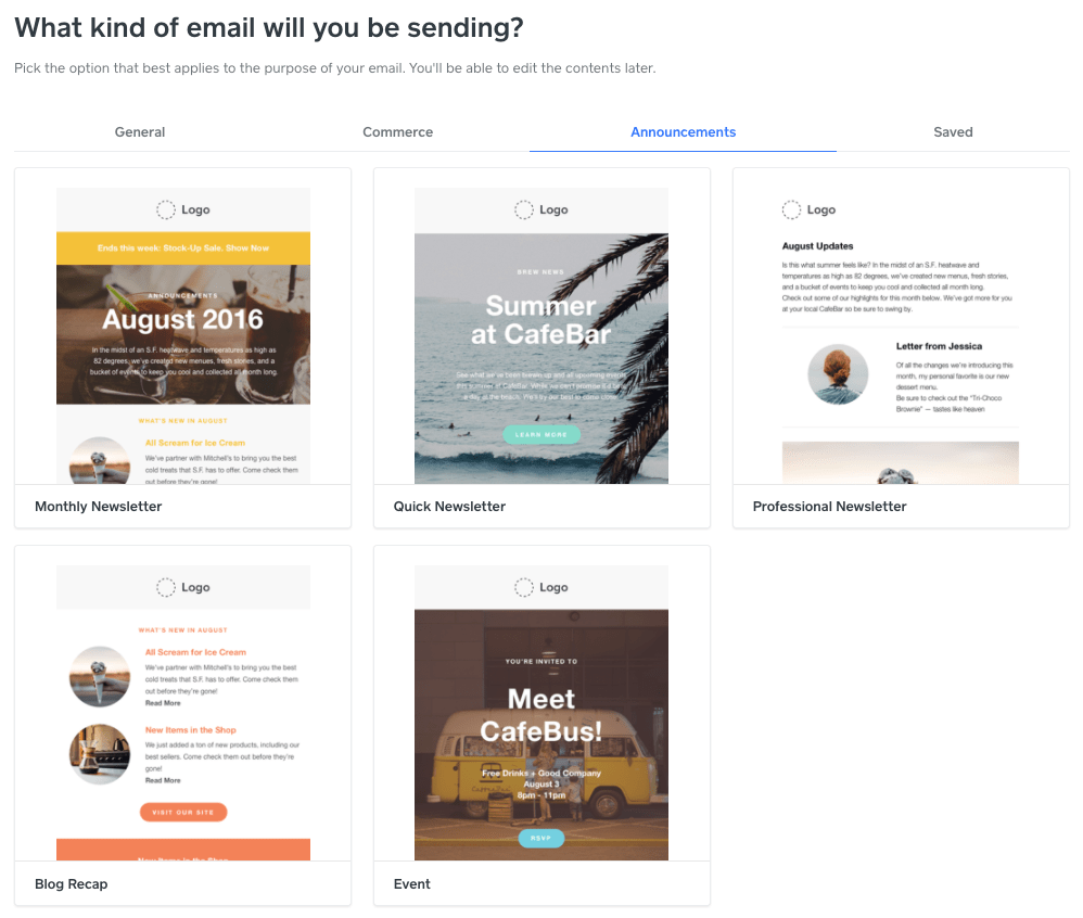
Weebly Promote isn’t included with any of Weebly’s paid plans – you have to pay for it separately, in addition to your regular plan. But Weebly Promote allows you to pay for the exact number of campaigns you need, while still getting the benefit of managing your site and campaigns in the same dashboard. If only every marketing tool let you pay for only what you actually need!
E-commerce Features by Square
Weebly’s e-commerce builder is one of my personal favorites for managing online stores. When I first started testing website builders, the e-commerce features always felt a little intimidating, but Weebly’s online store tools are really approachable and easy to learn.
A lot of this ease of use originates from Weebly’s acquisition by Square, the payment processing tool that you might have last seen in a hipster coffee shop. They’ve done a lot in all areas of retail to empower and support small businesses, and this venture into e-commerce is no exception.
If you’re already using Square tools for a brick-and-mortar store, choosing this builder is a no-brainer. All of your payment, order, and inventory data will be synced in your physical and online stores.
But if you don’t have a physical store because you want to run your business entirely from your couch, or if you’re not in one of the five countries where Square operates, Weebly’s e-commerce builder is still a good choice. You’re not going to build the next Amazon on it, but you can do a lot.
Adding products is a straightforward, intuitive process, walking you through adding product variants like size or color, updating fulfillment options, and even optimizing your product pages for SEO. You can even add GIFs and 360-degree images in addition to standard photos so visitors can get more information about a product before they buy.
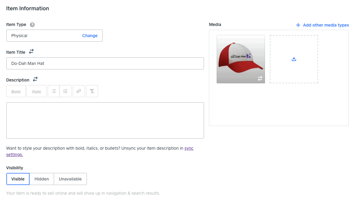
Here are some other things you can do with the e-commerce builder:
- Accept card payments online, in-person, or via mobile app using the transaction technology in the Square Point of Sale app
- Sell gift cards
- Allow customers to leave reviews for specific products
- Print shipping labels and set other fulfillment options
- Customize email templates to remind customers of things like abandoned carts (and more)
Another thing I like is that you don’t have to use the Square payment processor, which is only available in the United States, Canada, the United Kingdom, Australia, and Japan. You can also use Stripe or PayPal to accept online payments, both of which allow you to accept payments in more than 130 countries.
Some of these features are a little confusing: certain things, like item categories or tax settings, don’t synchronize between the Weebly online store interface and the Square dashboard. In general, it seems like Square considers Weebly a very small part of its product offerings for small retailers, and the two tools aren’t fully integrated. This seems to be changing as more updates are rolled out, and I hope to see more updates in the future.
Regardless, there’s still a lot of power in the Weebly e-commerce builder – it competes surprisingly well against other big e-commerce builders like Volusion or BigCommerce – but some things definitely need to be smoothed out.
Customize Blog Posts with Content Blocks
In the classic Weebly editor, you can build your blog posts using the same editor you use for all the pages on your site. I love this feature, because few things irritate me more than figuring out a whole new site editor only to open up the blogging tools to find…another whole new site editor.
Weebly keeps it simple, and gives you more flexibility in how your blog posts look. You can easily break up your text with images, videos, or block quotes, and even include a call-to-action (CTA) with a sign-up form to capture contact info or leads.
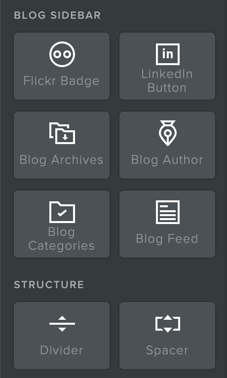
There are some blog-specific blocks you can use, such as the Blog Author block, which allows you to create a byline for posts and search by author, and the Blog Categories block, which allows you to tag each blog with related categories so your readers can search topics that interest them. The blocks appear in the sidebar while editing blog posts. You can also edit the SEO title and description fields on each individual post, potentially improving your search engine ranking.
The new blog feature on the Weebly e-commerce editor, called Stories, operates similarly. You don’t get content blocks, but the editor is just as smooth of an experience as it is for any other page type. You can even add other types of layouts below your blog post text to make those pages more unique.
Ease of use
Beginners, You’re In Luck: Both Builders Are Incredibly Easy to Use
Both the classic builder and the e-commerce builder rank pretty highly for me in terms of how easy they are to use. Even though they’re pretty different in style, everything just seems to make sense as you work on building your site.
These builders aren’t totally equal though. The e-commerce builder is easier to use in general, but the classic builder makes it much easier to customize your site. This is partially because there are just more customization options on the classic builder (like for colors), but it’s also because the editor style is more flexible.
I can’t give you a clear answer on which builder will be the best for you, so instead, I’m going to walk you through the pros and cons of each one.
Classic Weebly Builder
You Can Customize Page Layouts with Content Blocks
With Weebly’s classic editor, the process starts with page layouts from your template, but you can modify them by adding content blocks. These blocks let you add text, images, and other features like maps or contact forms just by dragging and dropping them onto the page.
The editor is pretty straightforward to use, but arranging and manipulating the blocks can feel clunky and awkward at times, especially when using dividers or spaces to create your layout. While you have some freedom in where you can put your content blocks, there is a grid you have to adhere to. The grid is meant to help to keep your design looking clean, but in practice, it’s sometimes more annoying than it is helpful.
Every block you add has its own customization menu that appears when you click on that element, allowing you to change things like font, color, alignment, and more, depending on the exact block you’re editing.
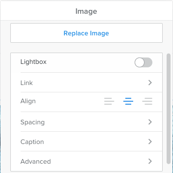
There aren’t tons of block options, but you can get more by installing apps from the App Center. By adding new images and fonts, you’ll also be able to stretch the limited block selection a bit further as far as aesthetics go.
I’ve found that block editors like this one can often miss the mark, but this one doesn’t. It’s a good introduction to building websites, and you’ll be able to accomplish a lot with the options available to you.
More Design Options
The classic editor does allow for more design flexibility than the e-commerce editor. You can choose any custom color that you want, to use anywhere on the site. You also have seven different options for customizing each text field (e.g., font, style, size, weight).
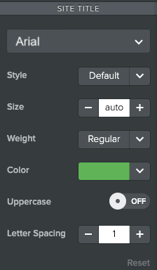
In theory, the block editor also allows for even more layout customization. You can use dividers and spacers to build sections and edit standard blocks (like contact forms). However, I found these tools somewhat difficult to use, particularly when trying to get contact forms to align properly.
I know a lot of people who think having more options is always better, but I’d offer a caveat in this case: sometimes more customization options can mean you risk ending up with an unattractive layout, especially if you’re new to web design.
If this is a concern for you, the e-commerce builder might have some features that make it a little easier to guarantee a good design.
E-commerce Builder by Square
Toggle Section Layout Pieces On & Off
The e-commerce builder is much easier to use than the classic editor, and it results in better-looking websites (in my opinion). Instead of building a layout for a section using content blocks, you can choose from a variety of predefined layouts.
“Layouts” and “content blocks” sound like basically the same thing, so let me clarify. On the classic editor, content blocks are individual elements like a text box, an image, or a button. The layouts in the e-commerce editor combine these for you in different styles.
When you select a section layout, you essentially add three or more content blocks with a simple click. Afterward, you can customize these section layouts by toggling images, headlines, or other elements on or off based on your preferences.
In other words, if you like a text and image layout but want to add or remove a button, you can do so with one click. The button will always be perfectly aligned with your other content.
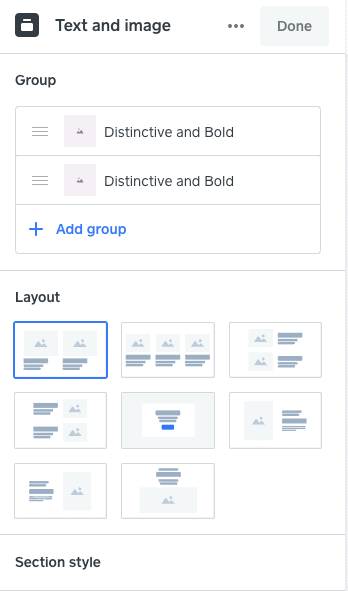
While you might find this editing process limiting to your design, I found it to be really fun, and it eliminates some of the headache of trying to get things to line up the way I want them. It strikes a good balance, giving you design freedom without letting you mess things up too badly and keeping the process fast and easy.
Streamlined Design Options
In an effort to keep things uncluttered, Weebly’s e-commerce builder removes some of the more in-depth design options you can find on the classic builder. You get far fewer color options and have to manually input an HTML color code instead of picking from a color-picker tool. Additionally, there are only a few places you can customize the color in the overall theme.
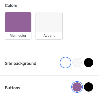
Similarly, there are only two font options for customization: titles and body text. This is a much smaller selection compared to the classic editor, where you could potentially use over 20 different fonts on your site (I don’t recommend doing that, though).
Having simpler design options isn’t always negative. They make the Weebly e-commerce website builder straightforward and user-friendly. I managed to build my first website, including various product pages, in less than an hour. Even if you lack a design background, you can still craft a site that gives the impression you have one.
Online Store Management
The e-commerce builder’s online store management interface is one reason I rated Weebly so high on ease of use. It offers a lot of options for describing, categorizing, and managing products – but not so many options that it becomes overwhelming. The interface is smooth and intuitive, and you shouldn’t have any difficulty finding what you need, when you need it.
The e-commerce builder’s store management dashboard has an extra advantage—it closely resembles the Square dashboard. If you’re already using Square for payment processing, you’ll find the dashboard familiar and intuitive. This seamless integration lets you easily switch between the two tools, effectively managing your retail store.
Support
Weebly Support Is Sometimes More Confused Than I Am
Weebly has a pretty robust knowledge base for both the classic builder and the e-commerce builder (although the knowledge base is split into two, one section per builder).
This is good because Weebly doesn’t actually have a live support option (although you can email them, see below). If you choose Contact within the support center, you’ll be directed to a chatbot that is surprisingly helpful. In addition to bringing up a relevant support article, it lists out each step you need right in the chat box so you can follow along as you work. The Chatbot gives steps in batches, waiting for you to complete one step before moving on to the next.
Although this chatbot is really useful for FAQs, it doesn’t respond well to more complex questions, like when I asked how to add a blog to my online store. Below, you can see the chatbot steps for connecting a domain on the left (an FAQ) along with its attempt to answer my more complex question on the right:
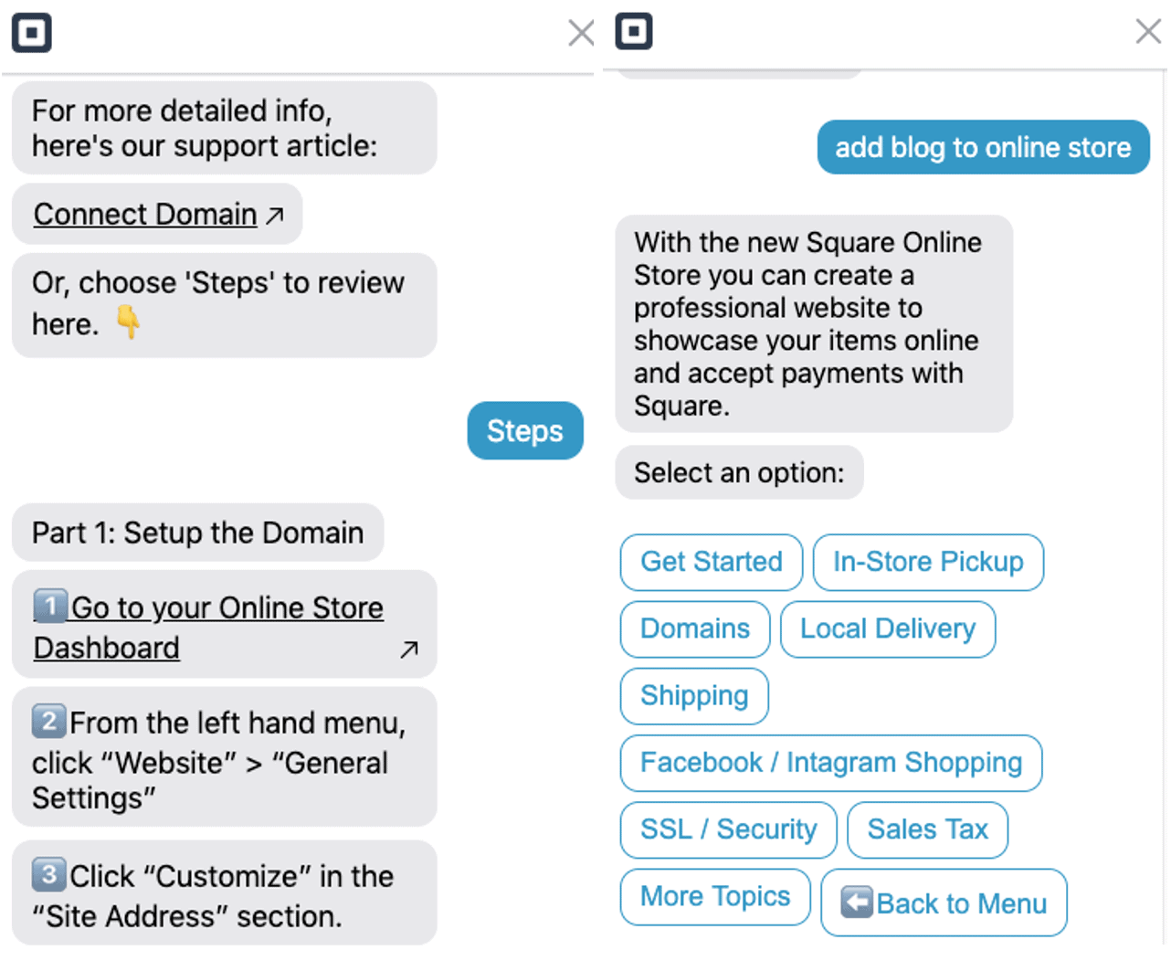
There is an email support option, however, so I asked how to add a blog to my online store. I got a response in about 30 minutes, but with the incorrect information – they got it wrong because they didn’t ask which builder I was using. When I clarified my question, they took a little longer to respond (about 24 hours), but they did provide me with useful information in the end.
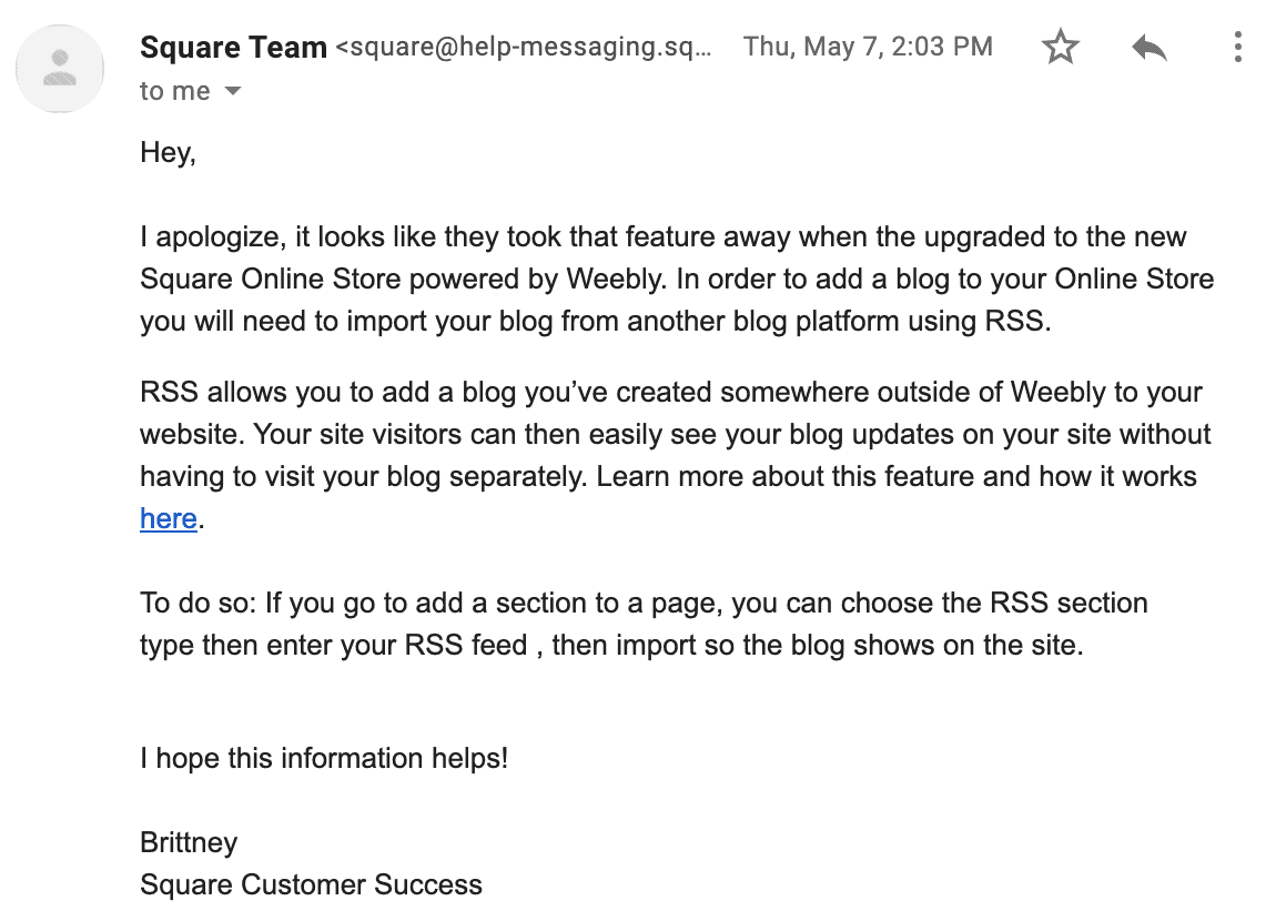
This wasn’t the most confidence-inspiring support interaction I’ve ever had, but it highlights my earlier point that it seems like Weebly isn’t yet fully incorporated into Square’s overall toolkit for small retailers. It’s on the way, but don’t be surprised if you run into a few situations like this.
Pricing
Weebly Is a Powerful Site Builder – and a Good Deal
Weebly might be one of the best-value website builders out there. You can access most major features even on the free plan, regardless of which builder you’re using (classic or e-commerce). This is a great way to try out the platform and make sure it’s right for you. Once it’s time to connect your own domain, you’ll need to at least upgrade to the personal plan, since the free plan doesn’t allow a custom domain.


Save up to 33 % on your Weebly plan!
Limited-time offer - Don't miss it!
The higher tiers include more advanced e-commerce features like printing shipping labels, getting shipping discounts, and accessing advanced e-commerce analytics. The good news is that even after you upgrade, the cost is very reasonable compared to other e-commerce solutions.
Some of the features I’ve mentioned, like Weebly Promote (the built-in email marketing tool), cost extra. However, like the main subscription plans, all the add-ons are affordably priced and provide great value.
Weebly accepts MasterCard, Visa, Discover, American Express, and PayPal.
Cancellations & Refunds
You can get a full refund within 30 days of purchasing a Weebly subscription by contacting the support team. Since so many features are available on the free plan, you can likely run your own trial of the tool before committing to a paid plan. However, if you do decide to sign up for a paid plan and end up canceling, the process is painless and straightforward.
Comparison
Weebly REVIEW: BOTTOM LINE
FAQ
Are Weebly websites secure?
Yes! Like all of the best website builders, Weebly websites come with a free SSL certificate, regardless of your plan. On higher-tier plans, you can add password protection to keep portions of your website available only to users you provide access to.Is Weebly Good for SEO?
Yes. Weebly provides excellent SEO options, including custom page titles and descriptions, a sitemap, and SEO-friendly HTML formatting. You can also add custom image alt tags and other advanced features. If you’re unfamiliar with SEO and don’t know where to start, Weebly offers an extensive SEO guide to get you started. Not sure if Weebly is right for you? Check out our list of the best SEO website builders.What’s Better – Wix or Weebly?
I found that Wix can do everything Weebly can do – and then some. Wix offers more design flexibility and more apps and integrations for increased functionality. It’s also a bit easier to use. Weebly may be a better choice if your small business is already using Square for point-of-sale transactions, since it integrates into the Square ecosystem. Whichever one you choose, be sure to check our website builder coupon page to make sure you’re getting the best deal.What Is Weebly for Education?
Weebly for Education is a website builder designed exclusively for teachers and students. Teachers can use these websites to manage class projects and assignments, distribute materials, and foster class discussions. Most teachers will be able to manage their projects on ]the free plan, but add-ons and pro plans are available for extra features or bandwidth at affordable prices. Read more in our Weebly for Education review.Weebly vs. Squarespace – Which One Should I Choose?
Weebly is better if you’re looking for a simpler site editor or if you have a lower budget. Squarespace is slightly more complex and expensive, but it offers better design options. To learn more, read our in-depth Squarespace review.- English (17)
- Français (3)
- Deutsch (4)
- Italiano (5)
- Русский (6)
- Español (3)
- Tiếng Việt (1)
- Česky (1)
- Suomi (1)
- Nederlands (2)
- Newest
- Oldest
- Best
- Worst
My website went down with an error message 404. I emailed Weebly as there was no discernible phone number to call and has a msg back saying help would arrive in 3 days time. There has been little or no support as yet. I am losing customers and cannot do my job efficiently without my site Things have definitely become worse since they joined up with Square. I have had enough after 8 years and am leaving for pastures new. Please don’t bother with them, things are ok until things go wrong- you’re on your own then as there is no support at all.
Weebly landing page shows great templates, but when you click Start suddenly you're in Square. All those templates are gone, & you can't get a real human being for support - just a stupid bot. NOT a good choice for newbies like me. Taking our business elsewhere!
Are you aware that Weebly does not allow new sites to be created with the drag and drop editor you're reviewing? Their new editor allows for far fewer choices. It asks you to choose a theme but does not implement it. This, from their tech support: "Rather than having preset layouts and themes, we have decided to give you the ability to fully control the look and feel of your website." Unfortunately, they also took out a LOT of functionality, including css editing. This, also from tech support: "It does not have all of the customization abilities that our old platform has because this was created to build quick sites and sell online quickly." From a marketing and design standpoint, the new platform is very limiting.
It was confusing in the beginning, til' I finally figured it out. Also, my website on a phone doesn't look very good compared to on the computer... and I don't think I can change it on the phone either. On the good side, I like how my website looks.
To start off totally dislike the new update I cannot see the total sales for the day, and to top it off to many clicks we should have a choice on which dashboard to use. another con is customer service is horrible I cannot get anyone on the phone and it requires some kind of code?? really I have had enough of this bad service I have not been able to contact customer support will be making a change.
I used to be with Weebly years ago and was really happy with them. I just rejoined two days ago and need support but I am not able to get support anywhere either via chat or via phone. All their links send you in a circle back to the help center which goes nowhere. If you need support go somewhere else. I subscribed to their Startup package which isn't listed below.
It is not working in so many areas: The video is malfunctioning permanent on mobile (look it up), it is partly responsive, it is slow, it is the WORST. Stay away!!!!!!! I am switching to WordPress as I am embarassed and loosing business over my Weebly business site. This is not good either in customer service.
I was on weebly for a short time and found their web interface to be very user friendly and easy to use. However, the support was so bad that and non courteous that i would never use them again. The support agents do not know the concept of listening to your questions. They assume and give you wrong information or in my last interaction with an agent named cassie she reversed my pland to a free plan out of spite.


