


We’ll finish up our marketing agency site by creating a “Cases” page for visitors to examine previous success stories in depth. Showing your expertise can be the tipping point for customers when deciding whether to hire your business.
We’ve already learned how to create a lot of different sections through the previous modules too, so this last page (and any other pages you might want to add) should hopefully go by with ease.
Let’s start by creating a new page, and naming it “Cases”.
6.1 Hero Section
We’ll begin this page with a simple hero section with a main heading and a subheading.
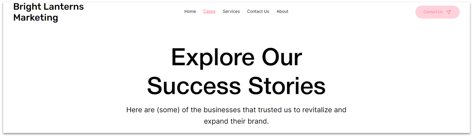
Step 1: Copy the hero from the “Services” page.
Step 2: Paste the section on the “Cases” page.
- Remove the default blank section, so the hero is the only section on the page.
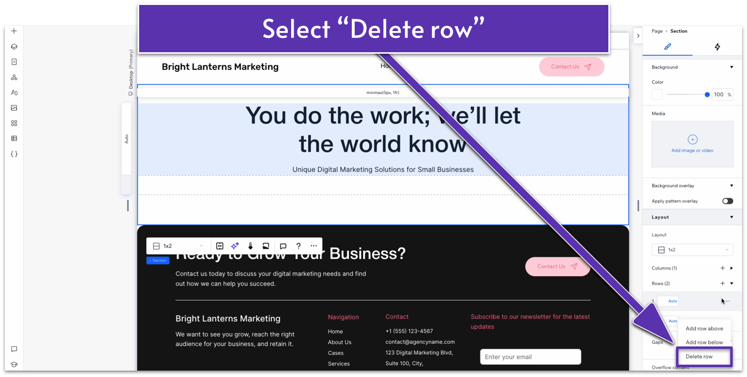
Step 3: Delete the bottom content.
- Delete the image on the bottom row.
- On the row layout, hover over the second row and select the three dots icon ( ) to open the “More actions” menu.
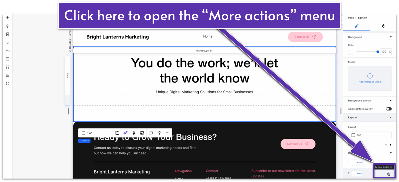
- On the “More actions” menu, select “Delete row.”
Step 4: Style the header.
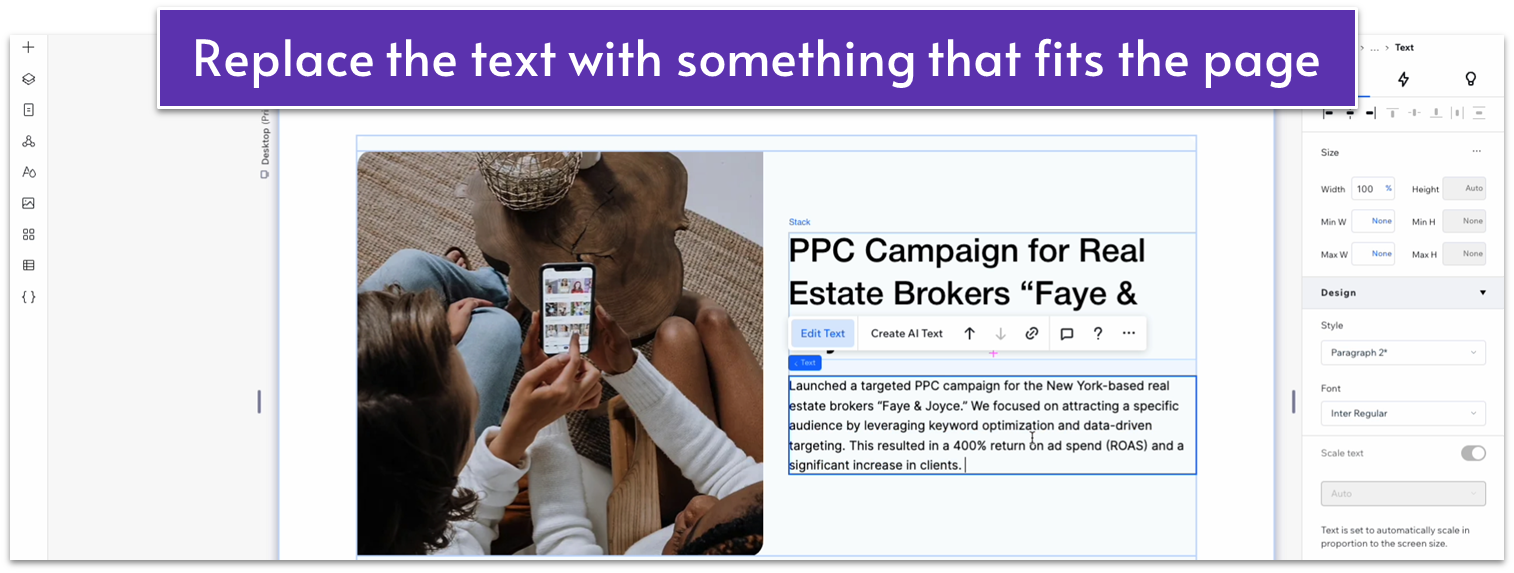
- Change the heading and subheading text to something that fits this page.
- Change the width of the text stack to 580px.
- Set all margins ( , , , ) for the header to 0.
- Set the bottom padding ( ) for the section to 0.
Adapt for Tablet and Mobile Views
Step 1: Adapt for tablet view.
On tablet view ( ):
- Delete the bottom row from the section.
- Set all margins for the stack to 0.
- Set the bottom padding ( ) for the section to a 30px scale.
Step 2: Adapt for mobile view.
On mobile view ( ):
- Delete the bottom row from the section.
- Set all margins for the stack to 0.
- Align both text elements to the left ( ).
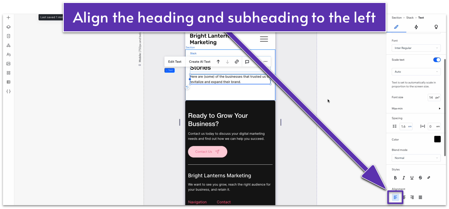
- Set the bottom padding ( ) for the section to a 30px scale.
6.2 Cases Section
For the rest of the page, we’ll use a simple card design that gives us enough space to add more detailed descriptions of our most successful cases and a high-quality image of each.
Step 1: Add a new section and apply an advanced CSS grid to it.
- Set the top padding ( ) to a 50px scale.
Step 2: Drag a repeater into the section.
- Set all margins to 0.
- Set the repeater’s width to 1080px.
- Set the number of items per row to 1.
- Set the vertical gap ( ) of the repeater to 20px.
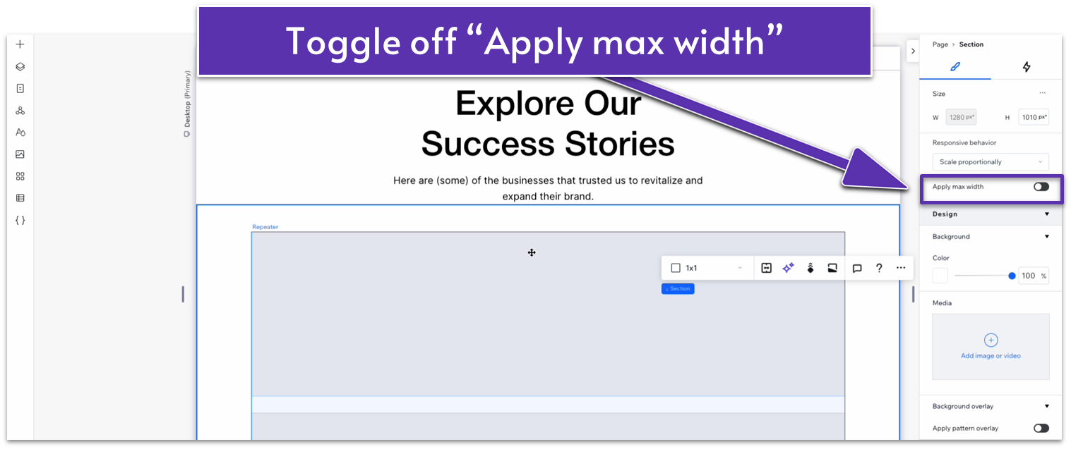
Step 3: Toggle “Apply max width” off for the section.
Step 4: Style the repeater items.
- Set the background for the repeater items to #8B614F (HEX).
- Set the corner radius to 20px.
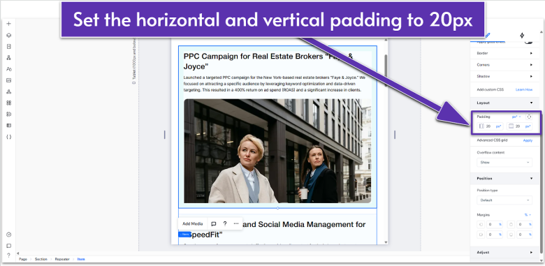
- Set the horizontal ( ) and vertical ( ) padding to a 20px scale.
- Add as many items as you want to have on the page.
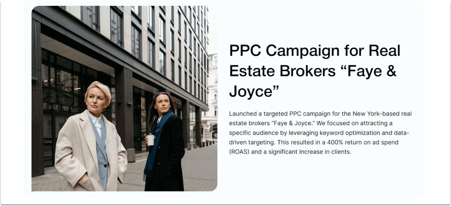
Step 5: Copy a container from the “Services” page.
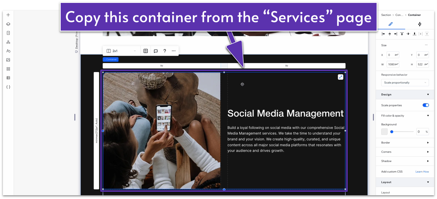
Step 6: Paste the container into one of the repeater items.
- Set all margins of the container to 0.
- Change the font color to black (#000000 HEX).
- Set the text box’s width to 100%.
Step 7: Replace the headings and paragraph texts with something that fits this page.
Step 8: Replace the images for the section.
Adapt for Tablet and Mobile Views
Step 1: Adapt for tablet view.
On tablet view ( ):
- Set the width for the repeater to 720px.
- Set the vertical gap ( ) for the repeater to 20px.
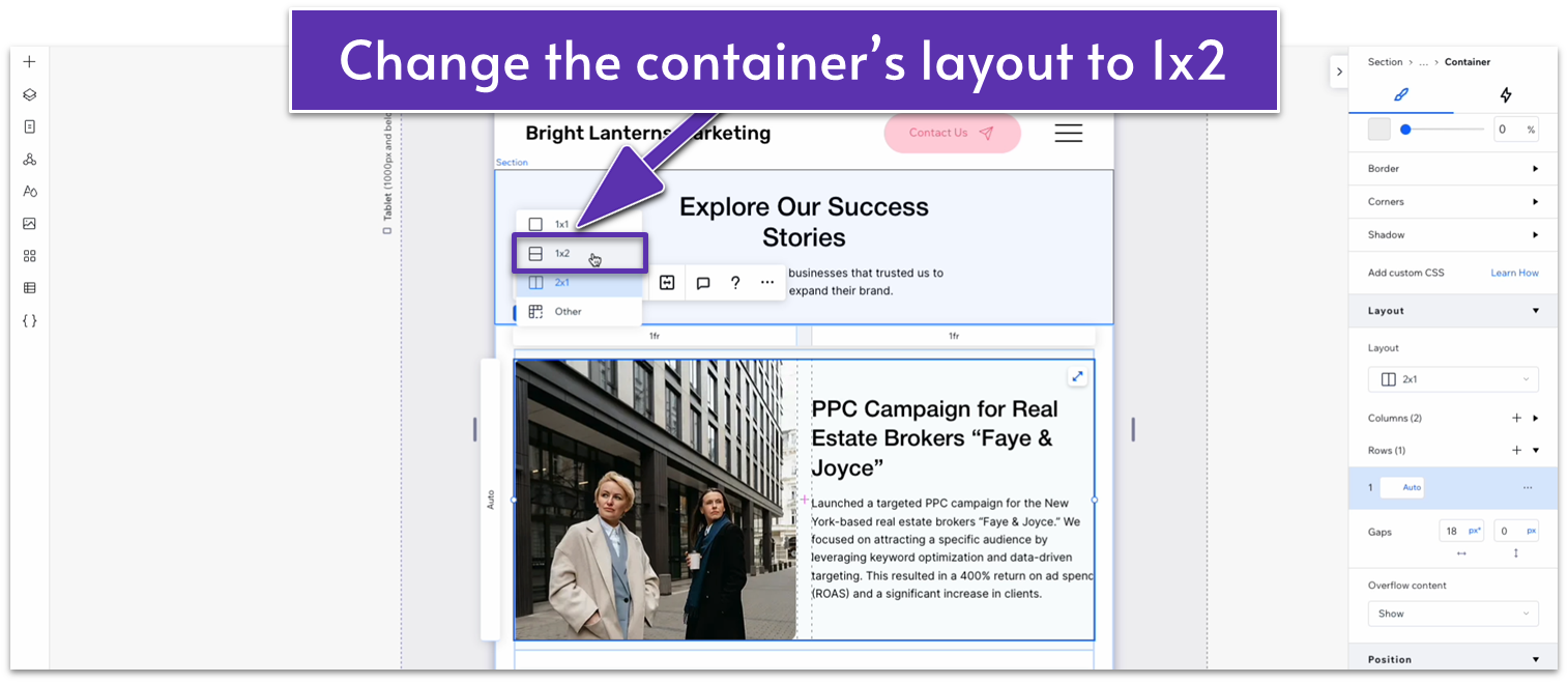
- Change the container’s layout to 1×2 ( ).
- Set the location in grid cells for the text stack to the top row.
- Set the location in grid cells for the image to the bottom row.
- Set the vertical ( ) gap for the container to a 20px scale.
- Set the behavior of both rows to auto ( ).
- Unlock the image’s aspect ratio ( ) and set its height to 400px. Then, lock the image’s aspect ratio again ( ).
- Set the horizontal ( ) and vertical ( ) padding for the repeater items to a 20px scale.
- Set the width of the container to 100%.
- Set the corner radius for the repeater items to 20px.
Step 2: Adapt for mobile view.
On mobile view ( ):
- Set the vertical gaps ( ) for the container to 20px.
- Set the horizontal ( ) and vertical ( ) padding for the repeater items to 20px.
- Set the container’s width to 100%.
- Set the vertical gap ( ) for the container to 20px.
- Set the corner radius for the repeater items to 20px.
6.3 Blog Section

We already have a global “Blog” section ready to go, so we’ll simply add this section to the page and move it to the bottom.
