

Since we’ve already created a contact form for our site, we’ll just add some additional information to the “Contact” page of our local business site and a more in-depth form for visitors to reach out.
We’ll have to create a new page before we start the building process. Since we already know how to do this, I’ll simply give you a gentle reminder to change the name of the new page to “Contact.”
4.1 Hero Section
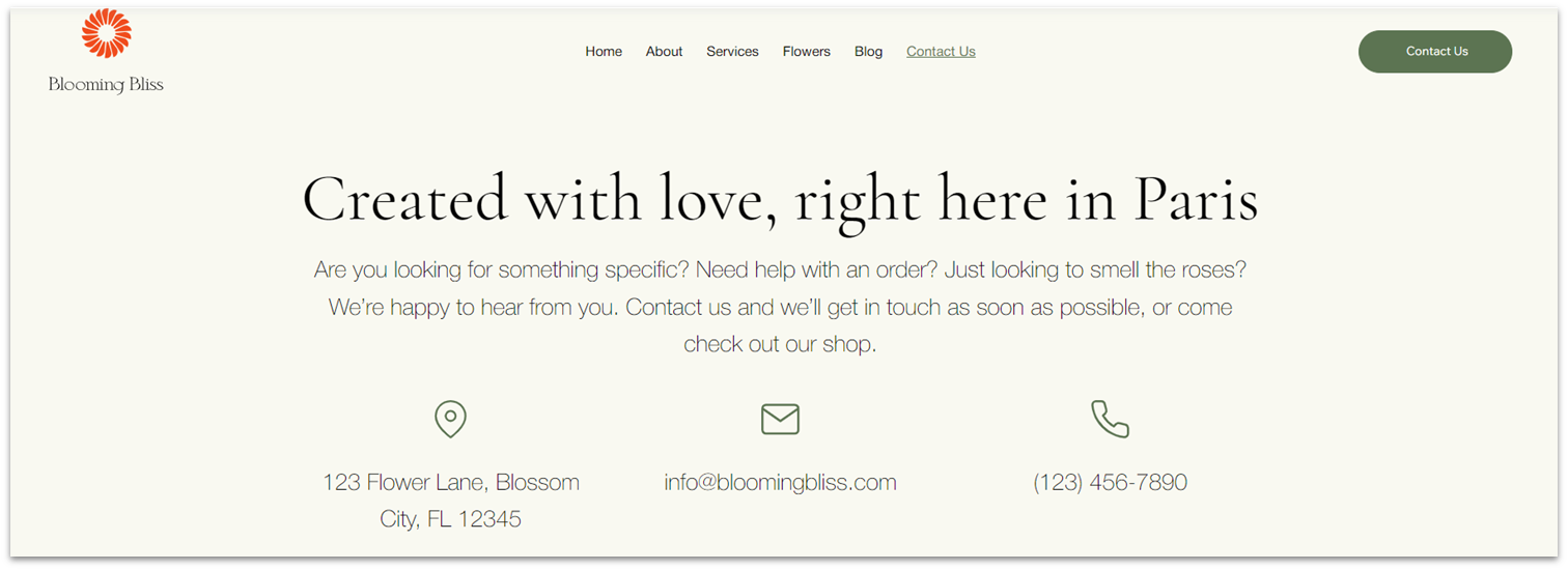
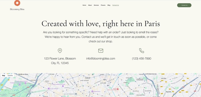
The hero section for this page will be exceedingly simple, just a heading, some paragraph text, and information about the business’ address, email, and phone number.
Step 1: Copy the hero section from the homepage and paste it into the “Contact” page.
- If the section appears below a blank one, delete the section above so it’s the only one on the page.
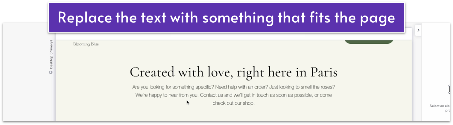
Step 2: Change the text to something that fits this page and delete the button.
Step 3: Delete the image in the bottom row.
Step 4: Drag a repeater into the bottom row.
- Move the repeater element so it’s centered.
- Set the horizontal gaps ( ) to 30px.
- Set all margins ( , , , ) for the repeater to 0.
- Stretch the width of the repeater item to match the paragraph text above.
- Apply an advanced CSS grid to the repeater items.
- Remove the background from the repeater items.
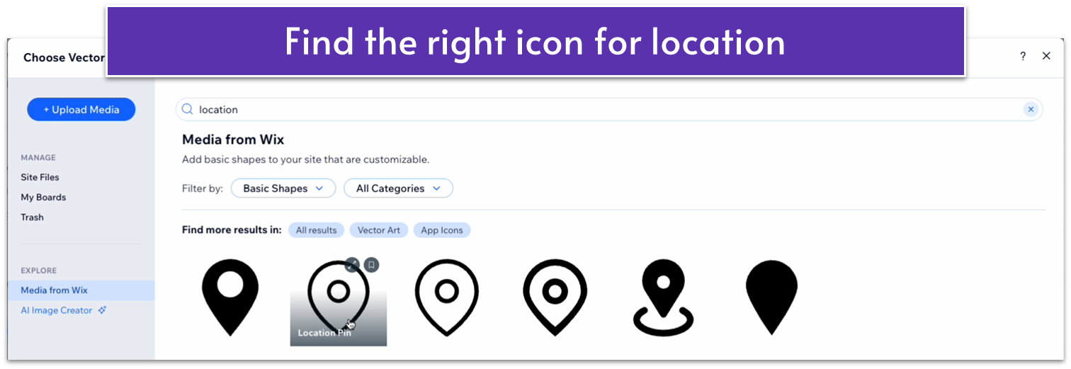
Step 5: Add a shape to the repeater’s item.
- Head over to “Add Elements” ( ), “Decorative,” and “Basic Shapes.” Then select the “More Basic Shapes” option.
- Search for an appropriate location pin icon.
- Drag the shape into the top center of the repeater’s item.
- Set its responsive behavior to “scale proportionally” and width to 30px.
- Set its color to a soft gray (#5C7452 HEX).
Step 6: Add paragraph text to the repeater’s items.
- Copy the paragraph text from the row above and paste it into the repeater’s item.
- Set the text’s width to 100%.
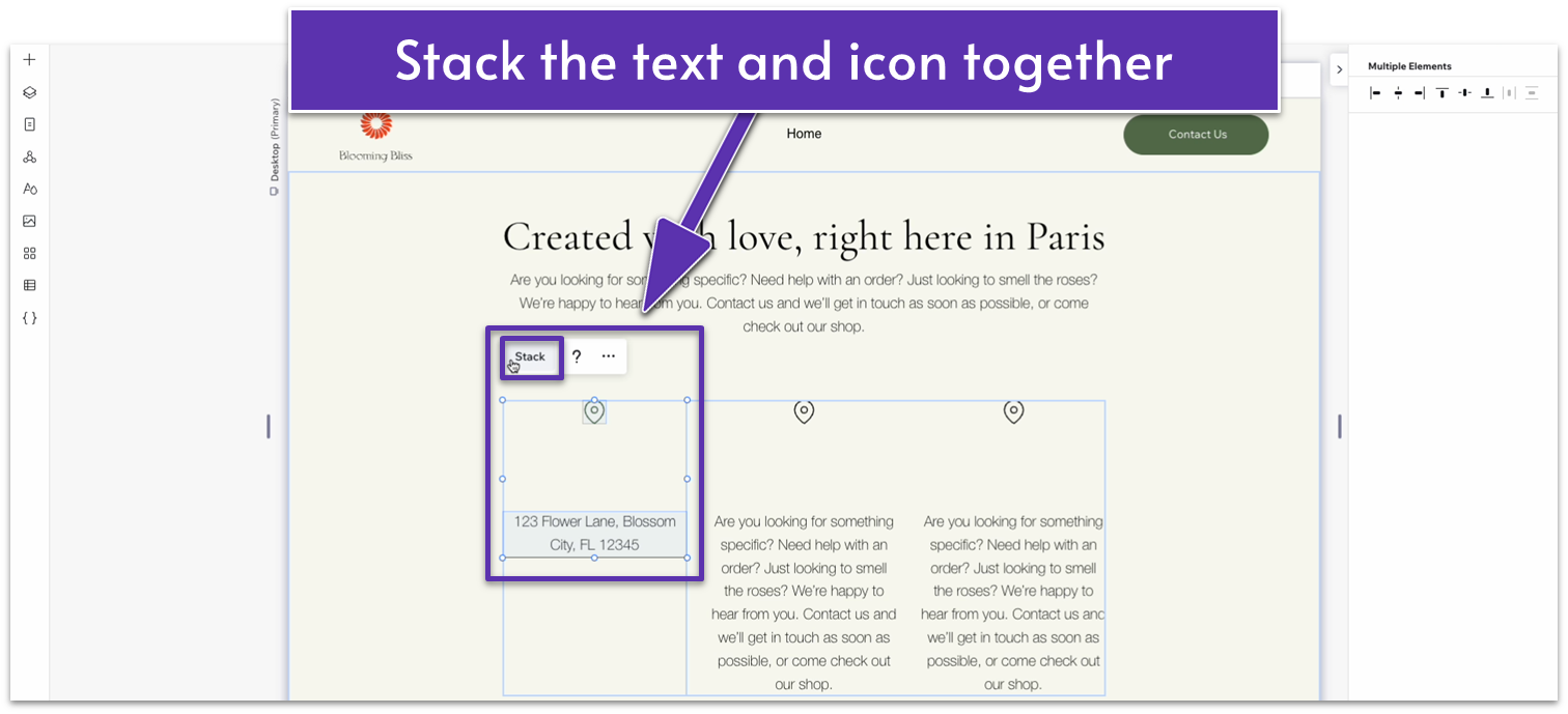
- Replace the text with your information for address, email, and phone number
- Stack the icon and text together.
- Set the item spacing to 20px scale.
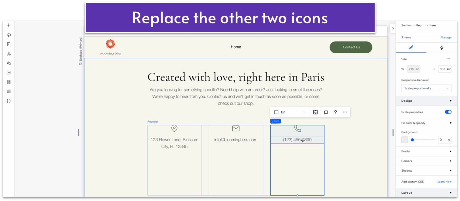
- Replace the other two icons.
Step 7: Add links to the phone number and email.
- Click on the text for the phone number, then click on the “link” option ( ) in the pop-up menu.
- There, select “phone number” and add your business phone number.
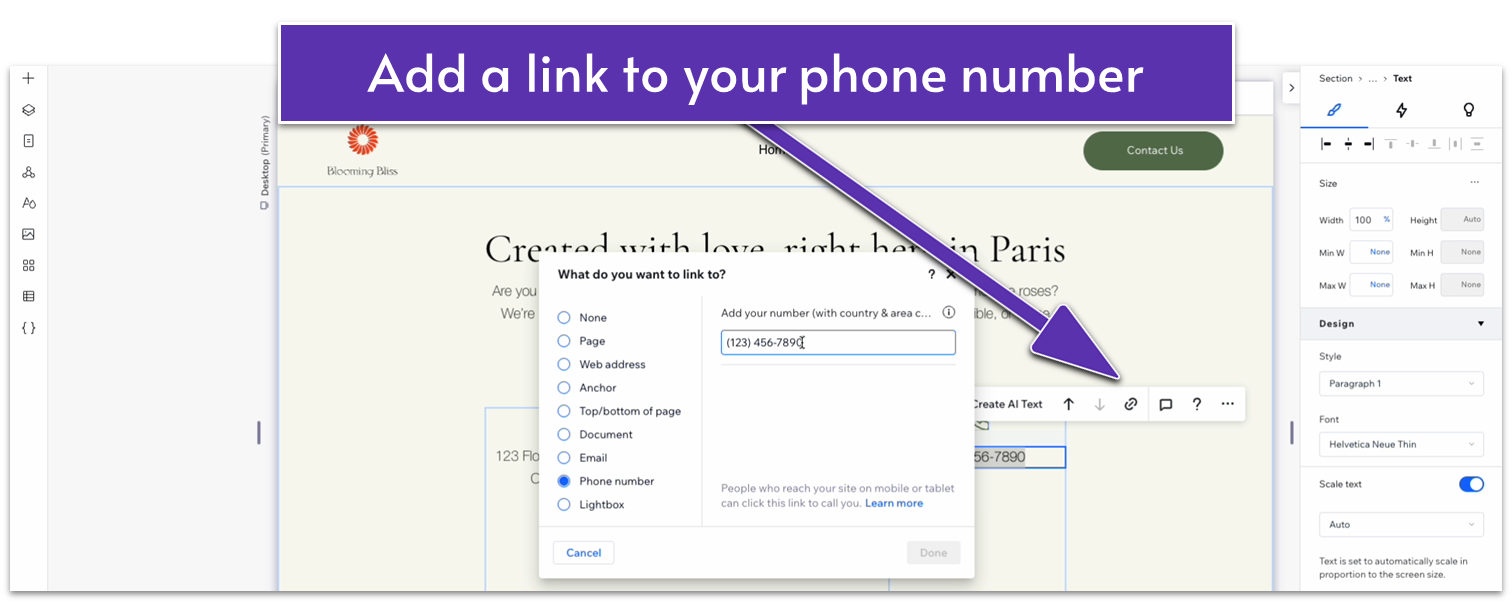
- Remove the underline from the text.
- Repeat the same actions to add a link to your email.
Step 8: Change the row sizing.
- Set the row behavior for the repeater items to auto ( ).
- Set the row behavior for the bottom row of the section to auto ( ).
- Set the vertical gaps ( ) for the section to 30px.
Adapt for Tablet and Mobile Views
Step 1: Adapt for tablet view.
On tablet view ( ) :
- Set the width of the paragraph text on the top row to 600px.
- Set the width of the repeater to 720px.
- Set the item spacing for the stack inside the repeater’s items to 20px.
- Set the horizontal gap ( ) for the repeater to 30px.
- Set the bottom row’s behavior in the section to auto ( ).
Step 2: Adapt for mobile view.
On mobile view ( ):
- Set the width of the paragraph text on the top row to 100%.
- Set the width of the heading to 280px.
- Set the bottom row’s behavior to auto ( ).
- Set the number of items per row for the repeater to 1.
- Set the vertical gap between repeater elements to 20px.
- Change the size of the icons to 25px in width and height.
4.2 Map Section
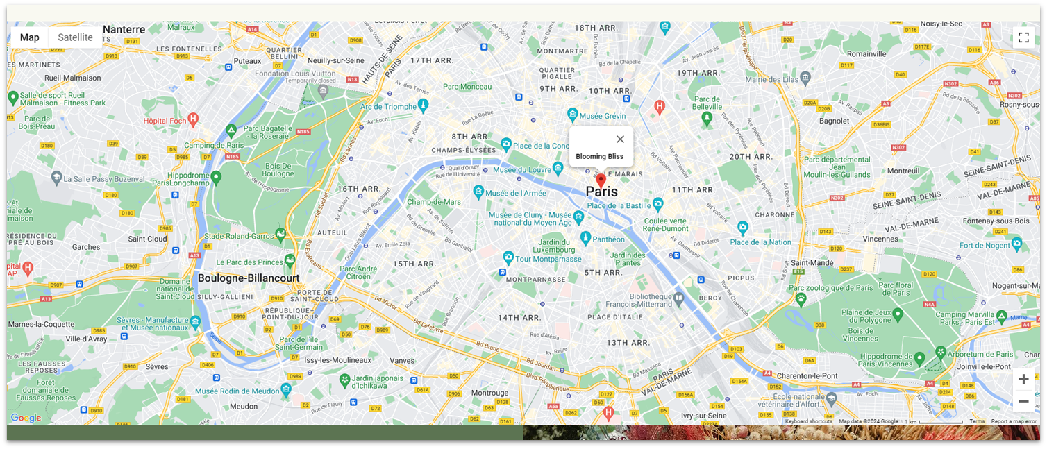
We’ll add a section with a map below.
Step 1: Head back to the homepage and copy the map from the “Contact” section.
Step 2: Head back to the “Contact” page and create a new section.
- Apply an advanced CSS grid to the section.
- Apply a top padding ( ) of 50px scale.
Step 3: Paste the map into the section.
- Undock the map from all sides ( , , , ) and set all margins to 0.
- Change the map’s width to 100%.
Since we already set up this map, there’s not much more to do here.
Adapt for Tablet and Mobile Views
Step 1: Adapt for tablet view.
On tablet view ( ):
- Make sure the map’s width is set to 100%
Step 2: Adapt for mobile view
On mobile view ( ):
- Make sure the map’s width is set to 100%
- Set the top padding ( ) for the section 30px scale.
- Set the row’s behavior for the section to 250px scale.
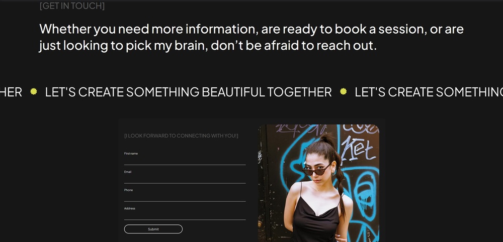
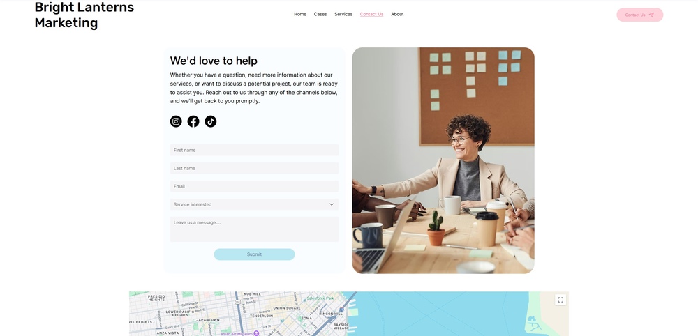
4.3 Contact Form
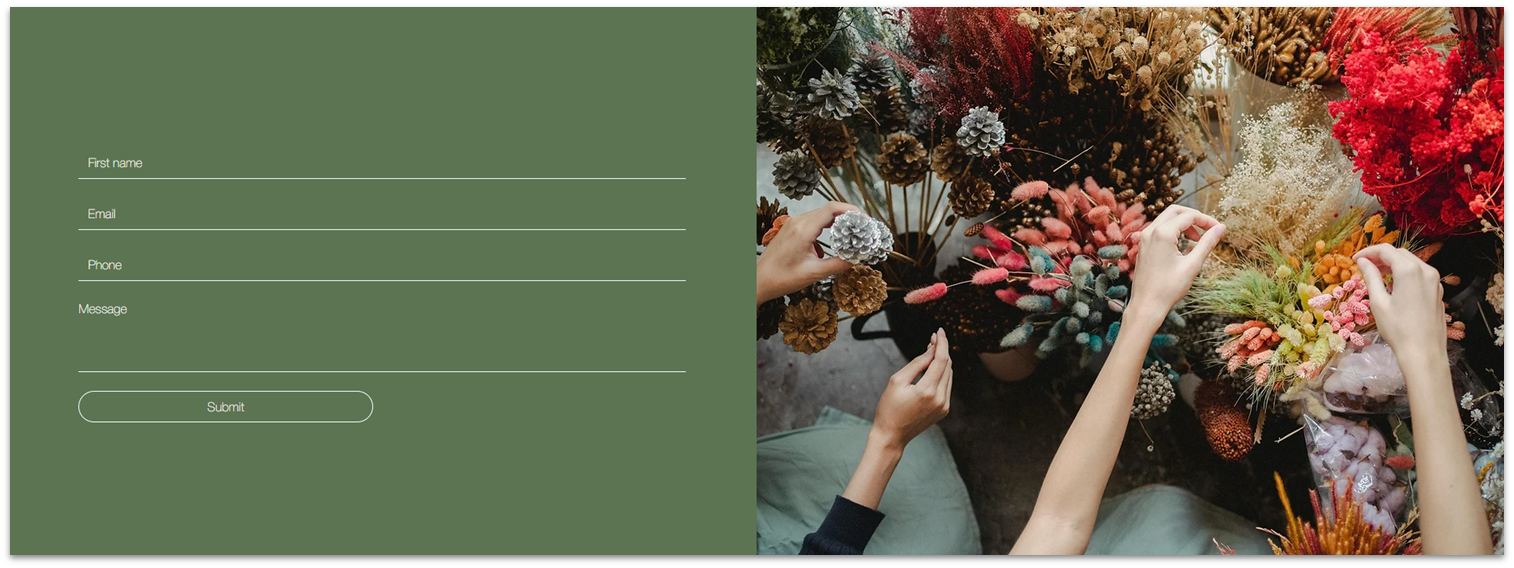
The contact form will be the star of the show for this page. Instead of copying the form we created on the homepage, we’ll create a new form with a different design and more detailed input fields.
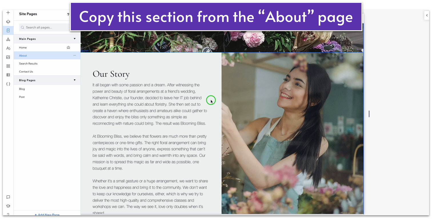
Step 1: Head back to the “About” page and copy the “Our Story” section.
For the contact section, we’ll use a two-column format with a picture on the right. Since we’ve already created something similar on the “About” page, we can copy and tweak the section as needed.
Step 2: Paste the section at the bottom of the “Contact” page.
- Delete the text stack on the left.
- Replace the image on the right with something different.
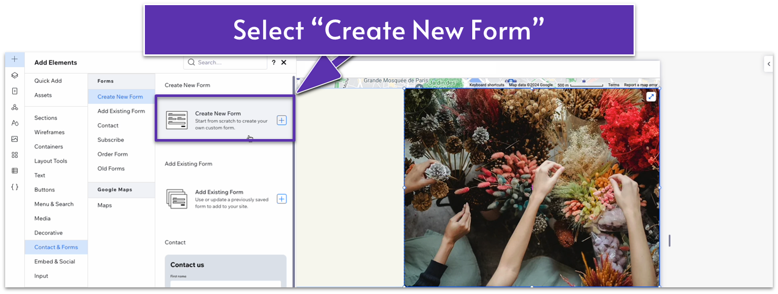
Step 3: Create a new form.
- Create a new form from the “Add Elements” menu ( ).
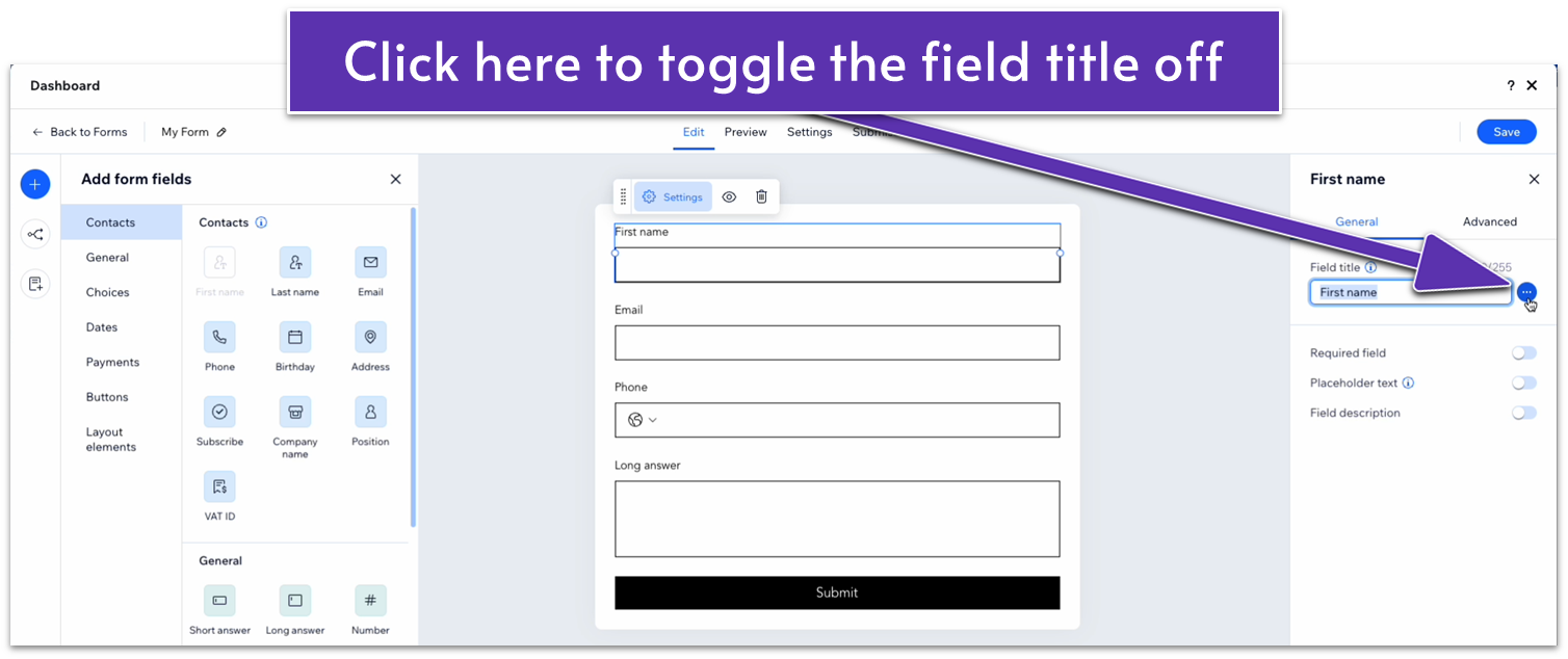
Step 4: Edit the form.
- On the form builder dashboard, add “First name,” “email,” “phone,” and “Long answer” fields.
- Select the “First name” field and head to the right-hand menu. Click on the three dots ( ) icon next to “Field title” to hide the field title.
- Toggle “required field” from the same right-hand menu.
- Toggle “placeholder text” on and change the placeholder text to “First Name.”
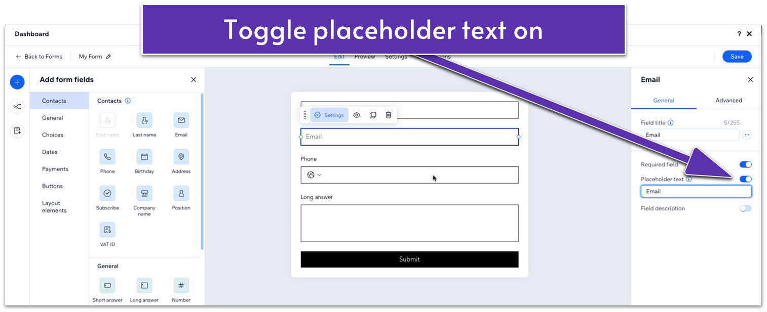
- Repeat the same process for all the fields below.
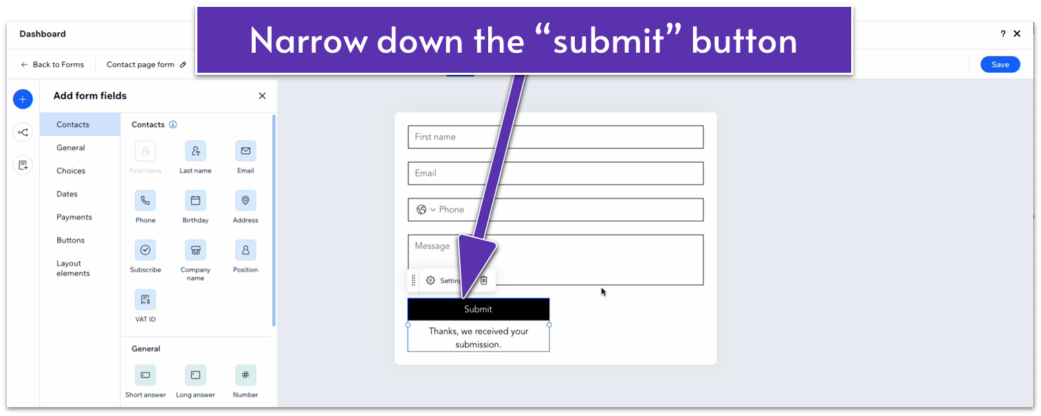
- Toggle “Required field” off for the long answer field. You can change the placeholder text to something like “message.”
- Narrow the “Submit” button on the bottom.
- Click on the “My Form” option in the upper-left corner of the dashboard.
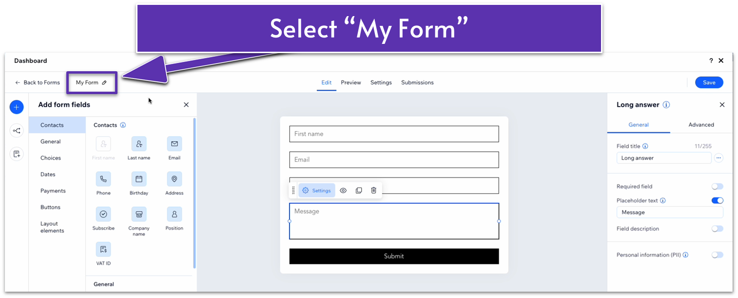
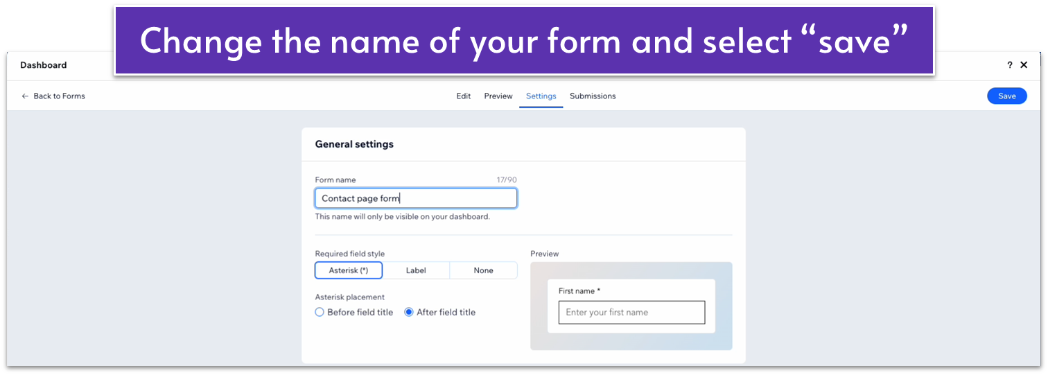
- Change the name and select the “Save” button in the upper-right corner.
Step 5: Drag the form to the left-side column.
- Undock all margins and set them all to 0.
Step 6: Style the contact form.
- Set the color of the overall section to a dark green (#5C7452 HEX).
- Set the width of the form element to 520px.
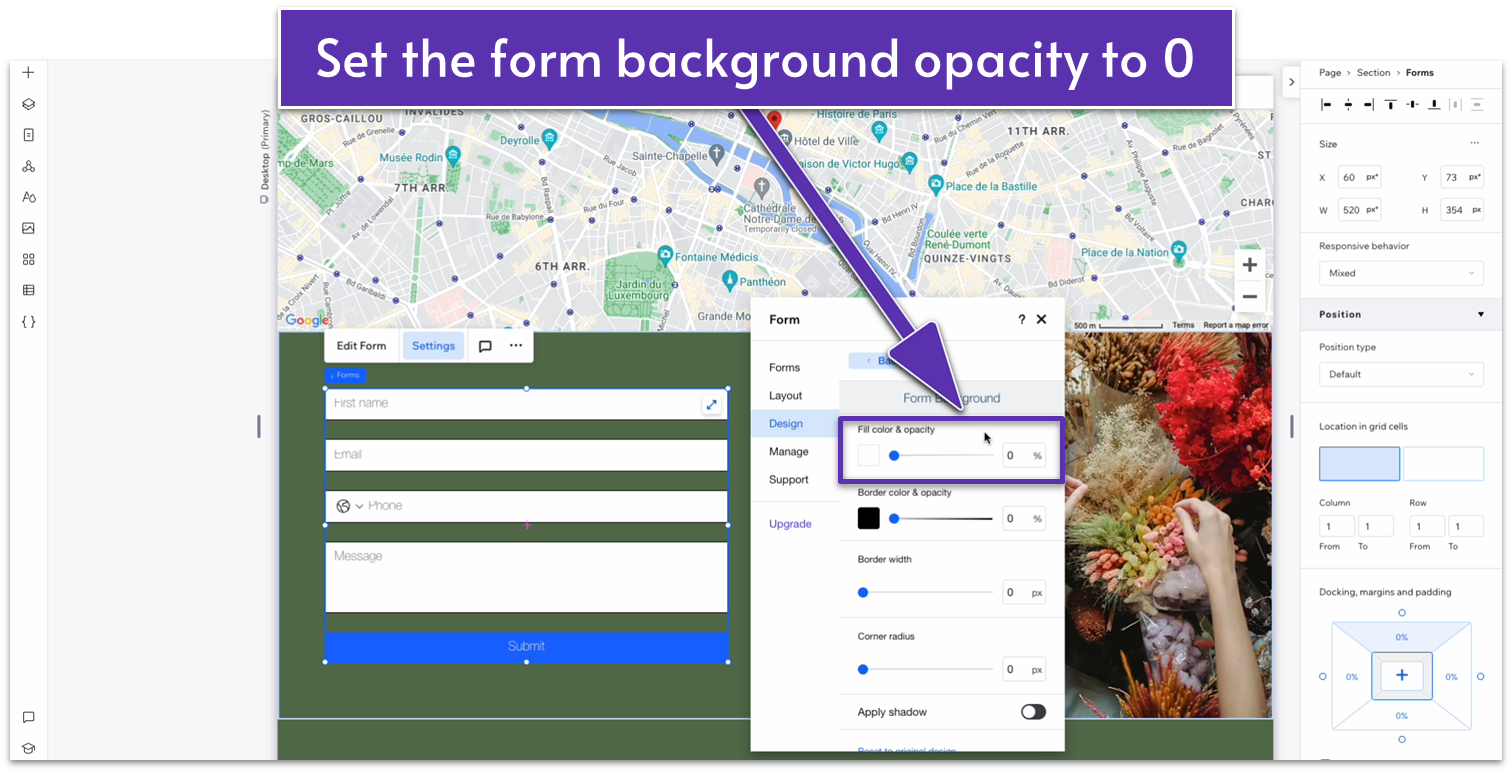
- Click on “Settings” in the pop-up menu for the form to open the “Settings” menu.
- Head over to “Design” and then “Form background.” Set the fill color opacity to 0%.
- Head back to “Design” and then “Form Fields.” Change the input style to “Bottom.”
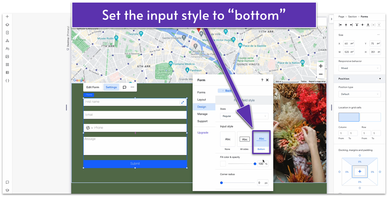
- Set the fill color opacity below to 0%.
- Set the border color to white (#FFFFFF HEX) and opacity to 100%.
- Change the “checked color option” to white.
- Set all font colors for the “Font field text” segment to white.
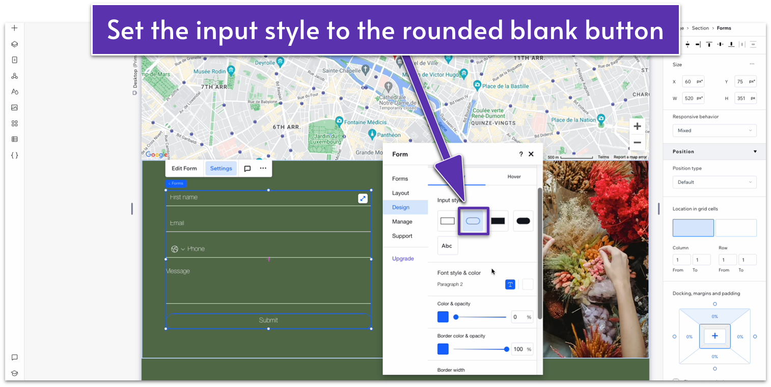
- Back on “Design,” head to “Buttons,” then “Submit Buttons.” Set the input style to the rounded blank style ( ).
- Set the border color to white and its opacity to 100%.
- Select the “Hover” option at the top to change the button’s behavior when hovering. Set the color on hover to white and the opacity to 100%.
- Set the border color on hover to white and its opacity to 100%.
- Change the text color on hover to a dark green (#5C7452 HEX).
- Set the top ( ) and bottom ( ) margins for the form to 70px scale.
Adapt for Tablet and Mobile Views
Another benefit of copying this section from a previous one is that it’s already formatted to change into a 1×2 ( ) layout for tablet and mobile viewing, so all we need to adjust is the contact form itself.
Step 1: Adapt for tablet view.
On tablet view ( ):
- Set the contact section’s width to 520px.
Step 2: Adapt for mobile view.
Our contact form already looks pretty good for mobile viewing, so we don’t need to do much in this step.
4.4 Instagram Section

Since we already built an Instagram section and turned it into a global one, we only need to paste it into the “About” page.
Since we already built an Instagram section and turned it into a global one, we only need to paste it into the “About” page.
Step 2: Using the “Layers” menu, drag the Instagram section to the bottom of the page.
