

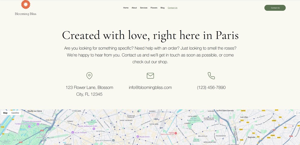
To keep up with the minimalism theme of the overall site, we’ll make sure that the “Contact” page for our photography portfolio site is rather simple. This isn’t only an aesthetic choice since we’re also ensuring that we remove any possible distractions.
Of course, before we start, we’ll have to create a new page and rename it “Contact.” We already know how to do that, so let’s proceed with the hero section.
4.1 Hero Section
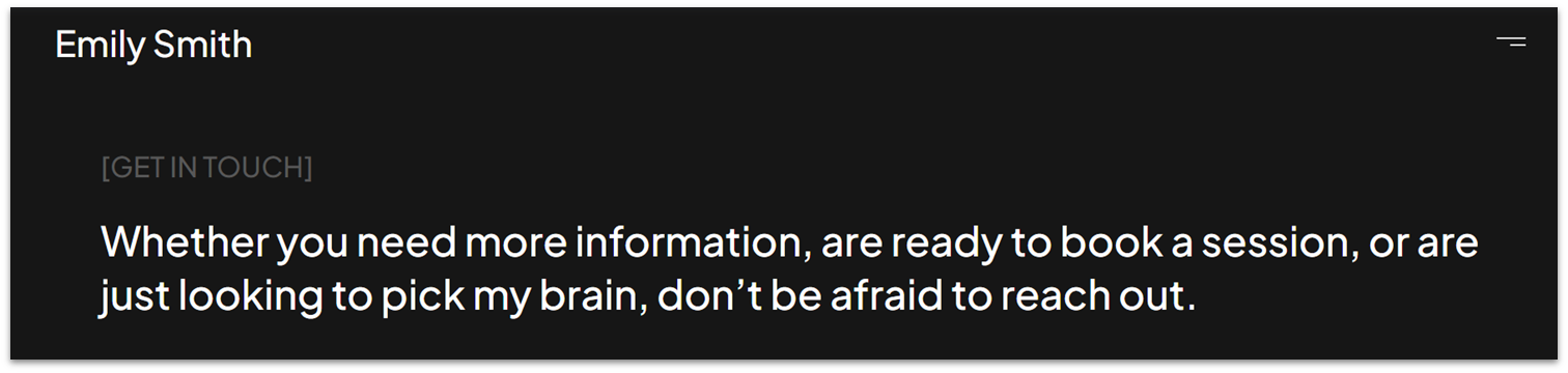
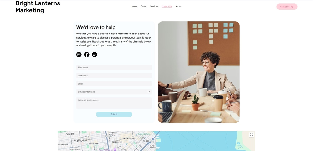
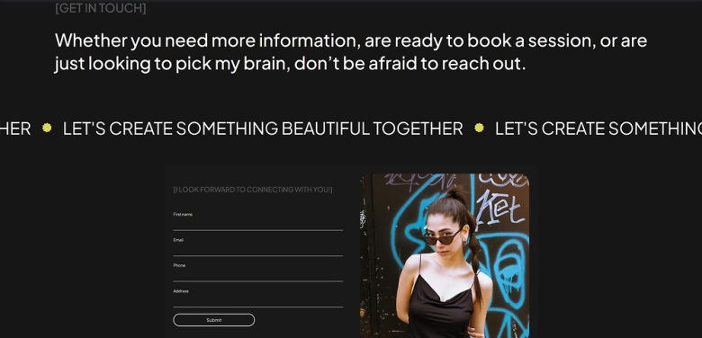
The hero of this page will be a simple bit of text inviting visitors to connect. We’ll make sure that it doesn’t take up too much space so that it doesn’t distract from the contact section.
Step 1: Copy the hero section from the “About” page and paste it into this one.
- If the section appears below a blank one, delete the section above so it’s the only one on the page.
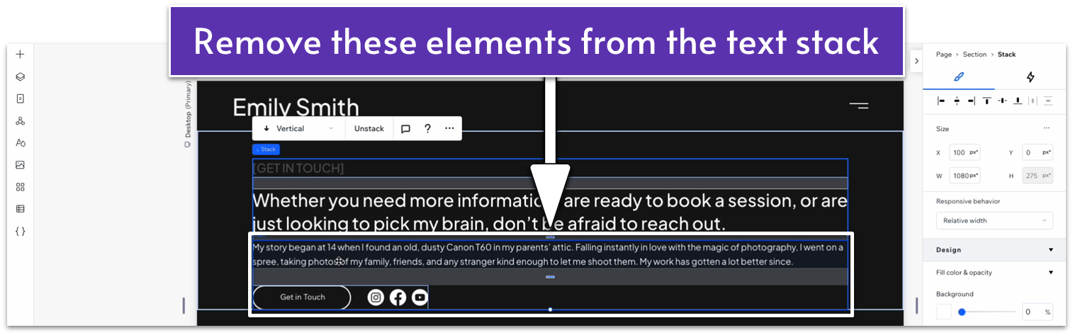
Step 2: Edit the text stack.
- Replace the dark gray heading and white text for something that fits the section.
- Delete the smaller paragraph text, buttons, and social bar.
Adapt for Tablet and Mobile Views
This section has already been adapted for both tablet and mobile views, so we don’t need to make any changes.
4.2 Marquee
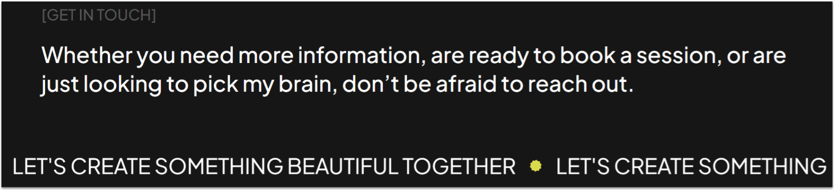
We’ll add simple infinity text – just like on the homepage – to further motivate visitors to take action.
Step 1: Head to the homepage and copy the infinity text.
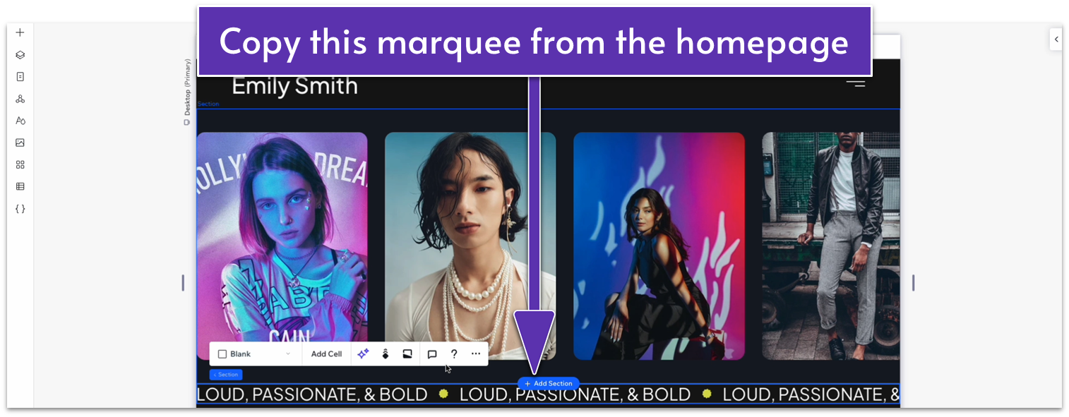
Step 2: Paste the text just below the hero section.
- Set the top margin for the marquee to an 80px scale.
- Change the text for this marquee.
Adapt for Tablet and Mobile Views
Step 1: Adapt for tablet view.
On tablet view ( ):
- Set the top margin ( ) for the marquee to a 70px scale.
- Set the font size for the marquee to 22px.
Step 2: Adapt for mobile view.
On mobile ( ) view:
- Set the top margin ( ) to 70px.
- Set the font size for the marquee to 22px.
4.3 Contact Form
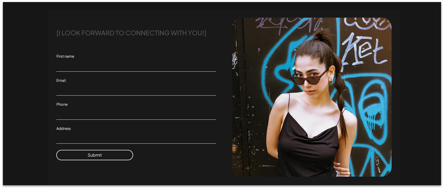
Now it’s time to add the star of the page: the contact form. We’ll include more detailed fields than the ones on the contact form for our homepage, as well as an image from our portfolio, to add a bit of visual interest.
Step 1: Create a new section and apply an advanced CSS grid to it.
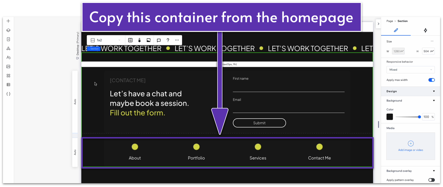
Step 2: Copy the contact form container from the homepage.
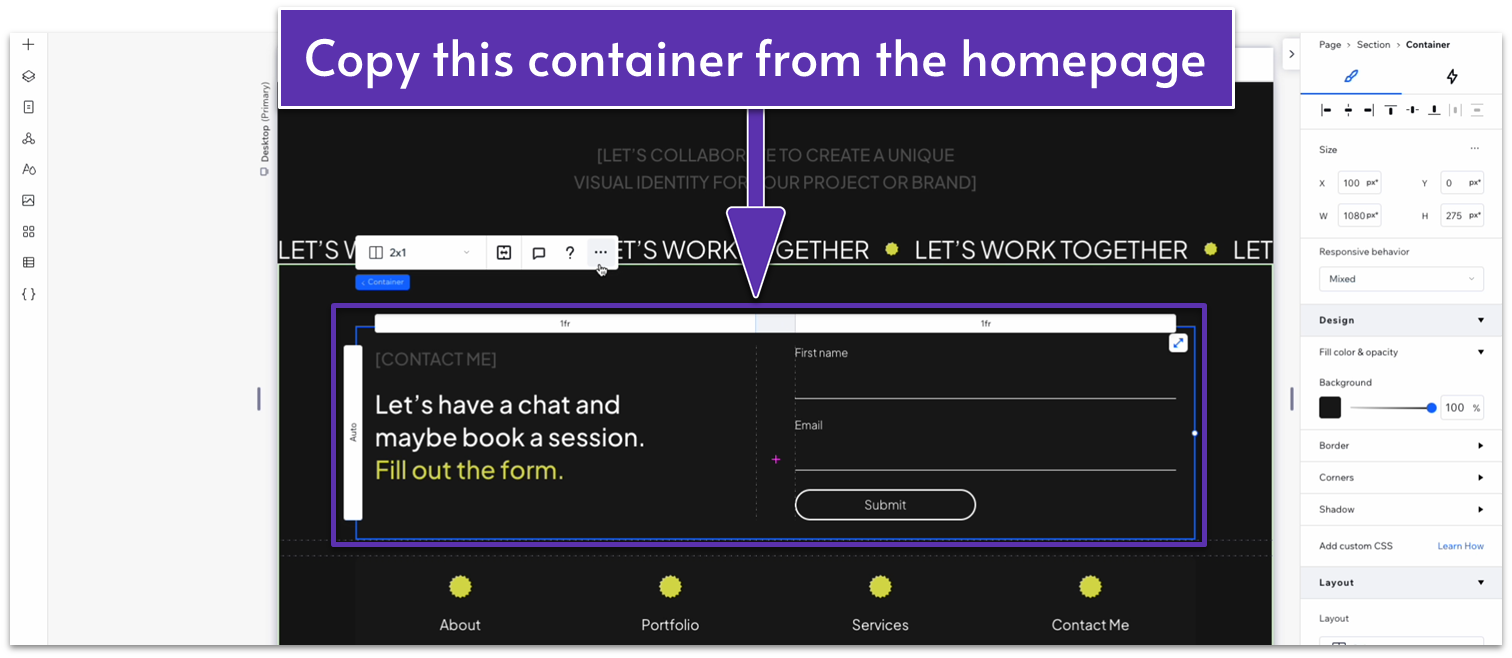
Step 3: Paste the container into the new section.
- Set all margins ( , , , ) for the container to 0.
Step 4: Edit the contact form container.
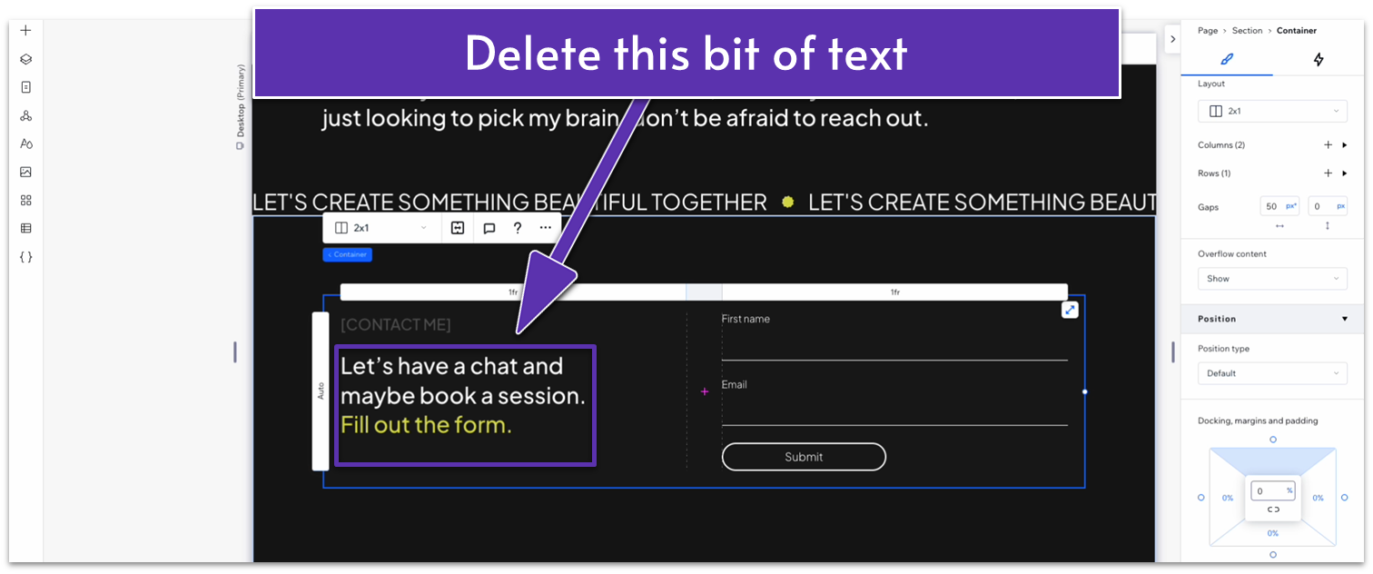
- Delete the paragraph text in the left-side column.
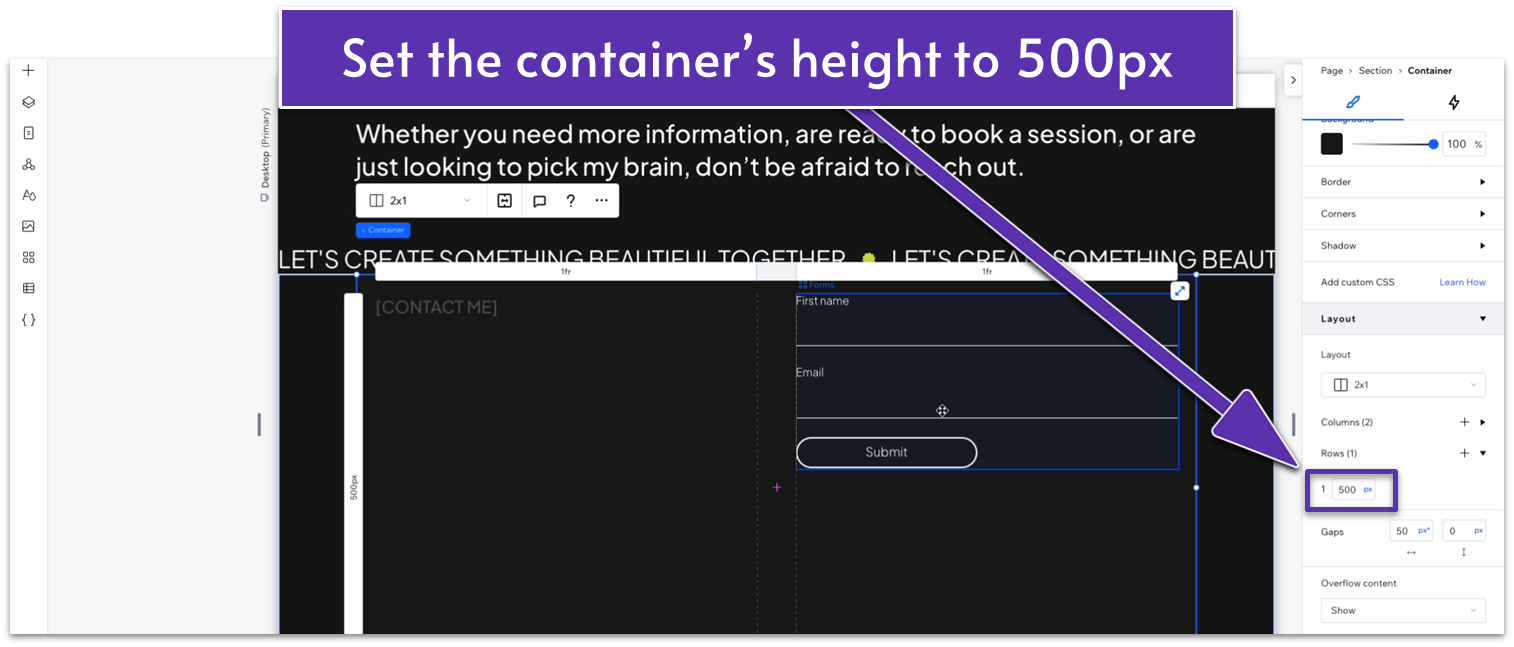
- Set the height of the container to 500px.
- Move the contact form to the left-side column.
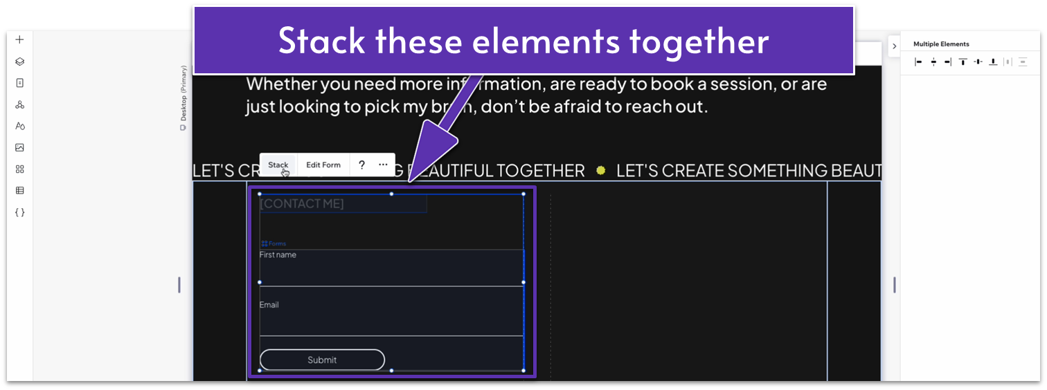
- Stack the heading and form elements together.
- Set the heading text box’s width to 100% and change the text to something appropriate for this section.
- Set the item spacing for the stack to a 30px scale.
- Set the font size for the top heading to 20px.
- Set the height of the container row back to auto ( ).
Step 5: Drag an image into the right-side container.
- Set all margins to 0.
- Lock the image’s aspect ratio ( ).
- Drag the image into the upper-left corner of the right-side column.
- Set the image’s width to 490px. If the image stretches beyond the borders of the column, set all margins to 0 again to adjust the container’s width.
- Set all margins for the stack with the heading and contact form to 0.
Step 6: Create a new contact form.
Since we’ve copied and pasted this form, any changes you make to it will automatically apply to the rest of your site. However, we can start with this section to create a new contact form quickly.
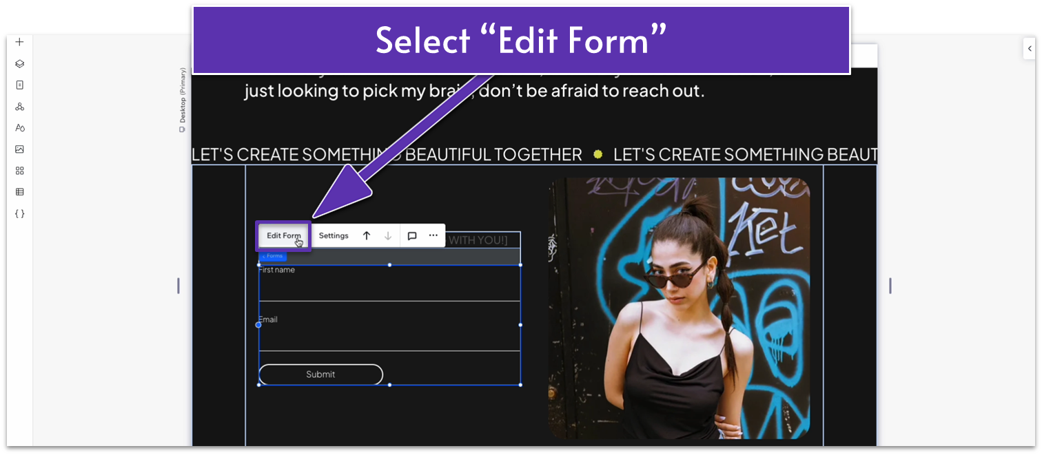
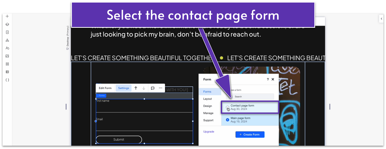
- Click on the contact form and select “Edit Form” on the pop-up menu.
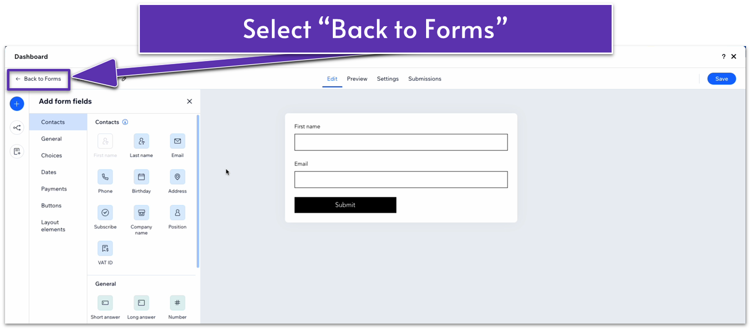
- On the form creation dashboard, select “Back to Forms” in the upper-left corner.
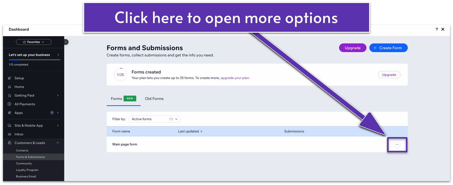
- Click on the three dots icon ( ) next to the main page form to open the “More settings” menu.
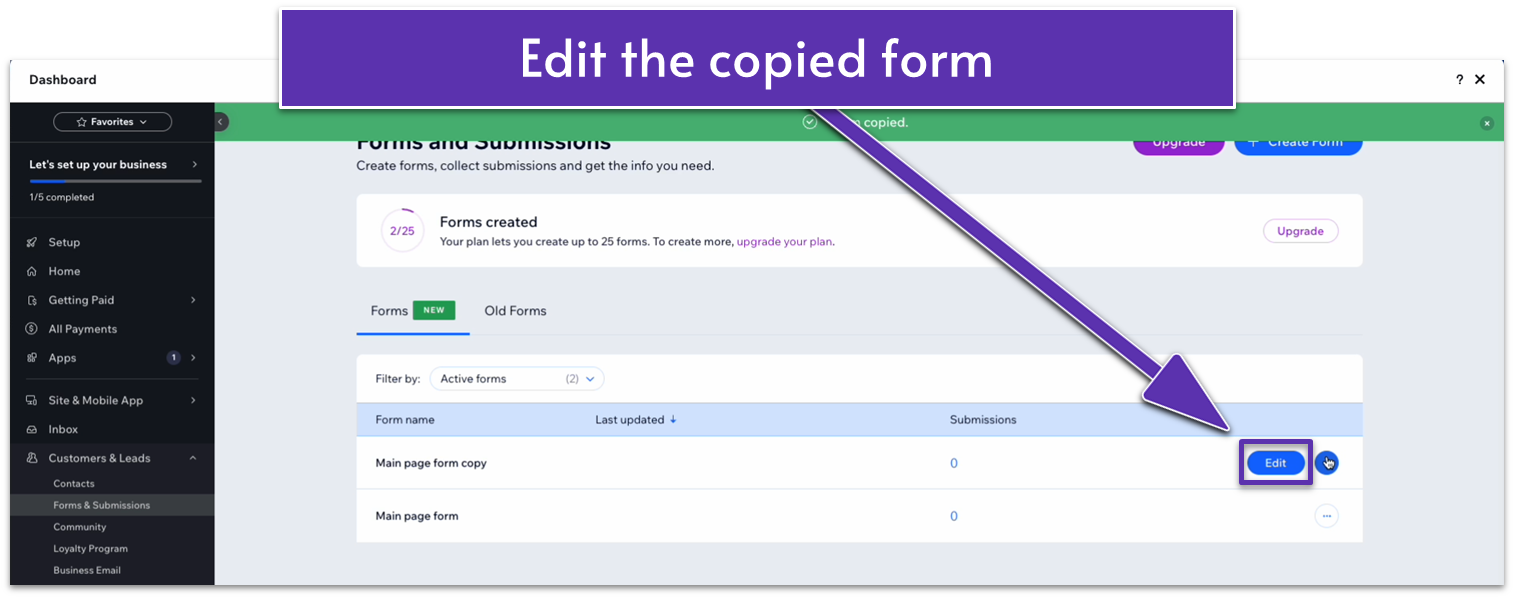
- Select “Make a Copy.” A new copy of the main page form will appear in the forms dashboard.
- Click on the “Edit” button next to the copied form.
- In the upper left corner, rename your form. We’ll go with “Contact page form.” Remember to click “Save” in the upper right corner to save the change.
- Add phone and address fields to your form.
- Select “Save” and exit the form dashboard.
- Click on the form again and select “Settings” on the pop-up menu.
- Go to the “Forms” submenu inside “Settings.” Then, select the “Contact Page Form.”
Step 7: Set the top padding ( ) for the entire section to an 80px scale.
Adapt for Tablet and Mobile Views
Step 1: Adapt for tablet view.
On tablet view ( ):
- Set the top padding ( ) for the section to 70px.
- Set the container’s width to 680px.
- Set the image’s height and width to 100%.
- Set the item spacing for the stack on the left-side column to 20px.
Step 2: Adapt for mobile view.
Since we copied this section from the homepage, the section will automatically change to a 1×2 ( ) layout when we go to the mobile view. However, we still need to make sure the elements we’ve added work properly.
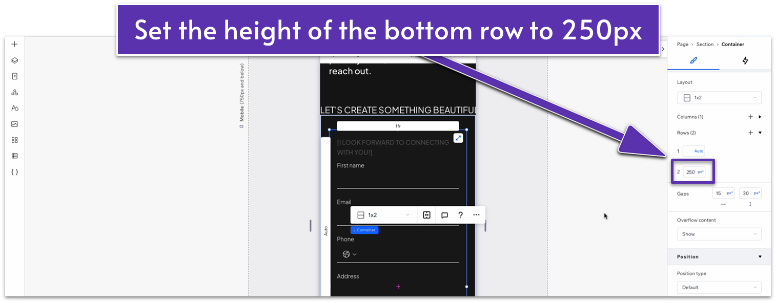
On mobile view ( ):
- Select the image and set its location in grid cells to the bottom row.
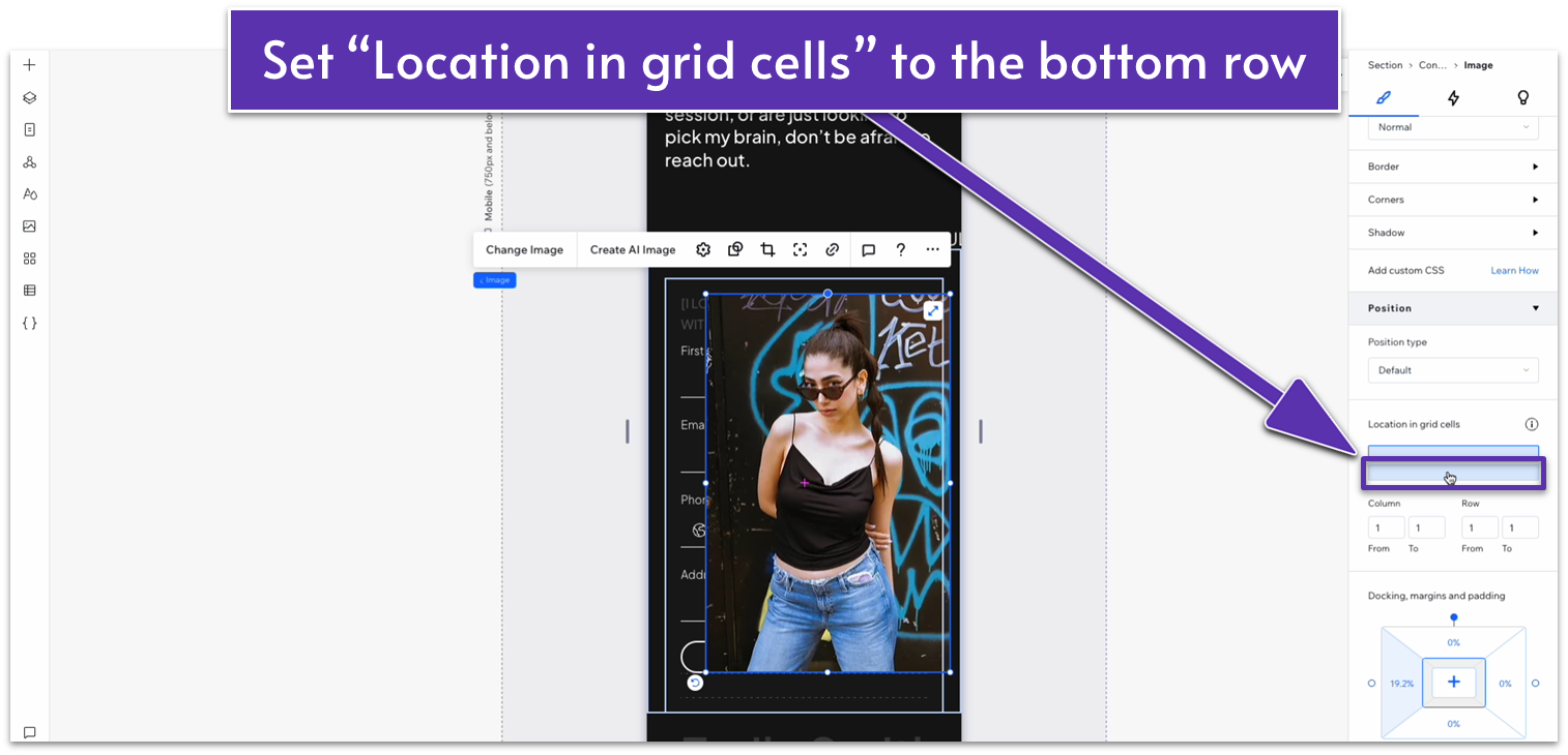
- Set all margins for the image to 0.
- Set the height of the bottom row to 250px scale.
- Set the item spacing for the stack on the top row to 20px.
4.4 Social Media and Navigation Section
Finally, we’ll add a really simple section with social media navigation buttons. We can use some pre-existing elements, but we will have to adapt them somewhat.
Step 1: Copy the bottom container from the “Contact” section on the homepage.
Step 2: Create a new section in the “About” page and apply an advanced CSS grid to it.
- Set the layout to 1×2 ( ).
- Set the vertical gaps ( ) between rows to 20px.
- Set the top padding ( ) for the section to an 80px scale.
Step 3: Paste the container into the bottom row.
- Set all margins to 0.
Step 4: Copy the entire container for the contact form above and paste it into the top row.
- Set its position in grid cells to the top row.
- Set all margins to 0.
- Delete the stack from the left-side column.
Step 5: Copy the paragraph text from the hero section and paste it into the left-side column.
- Make sure its location in grid cells is set to the left.
- Replace the text with something that fits this section.
- Set all margins to 0.
- Dock the text to the left ( ).
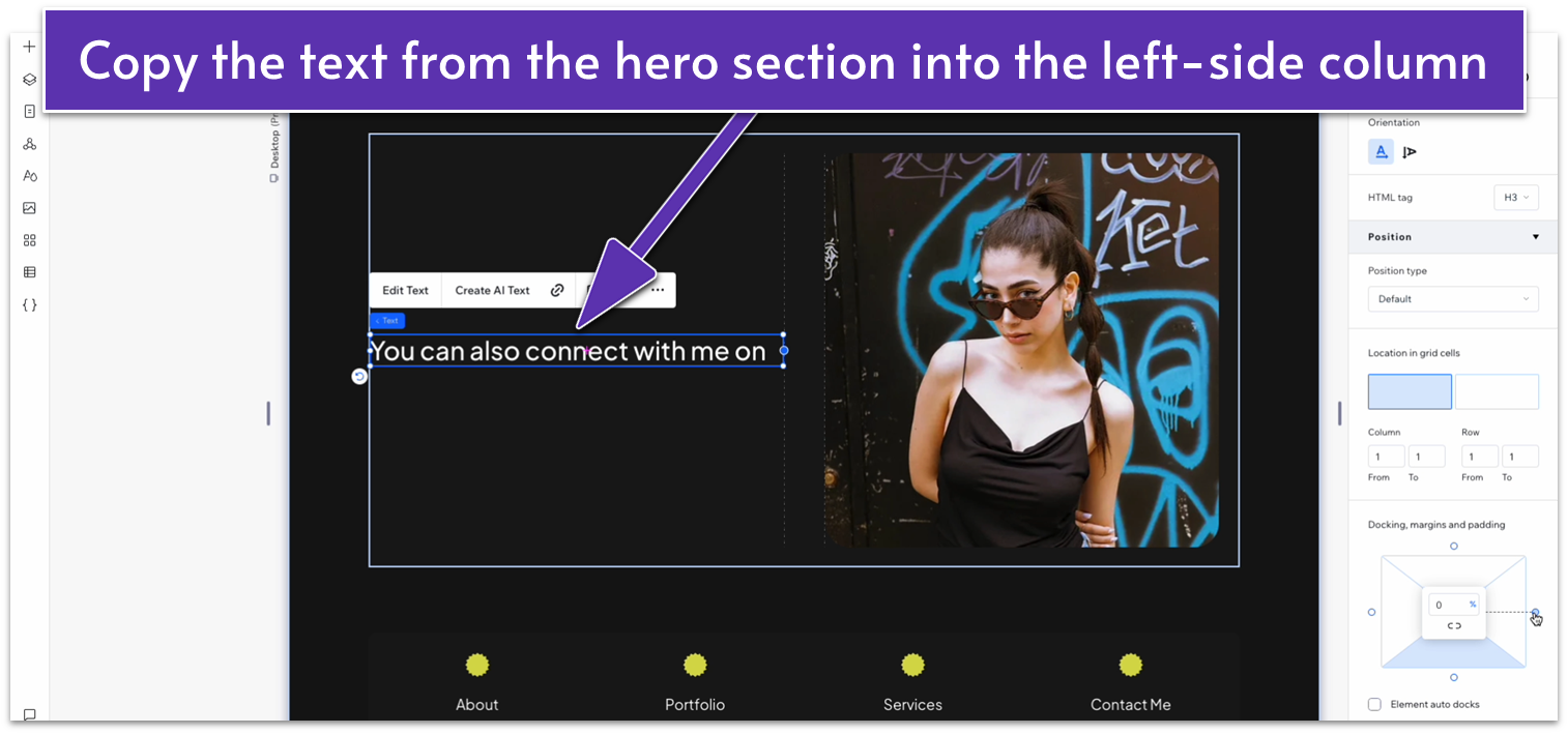
- Set the text width to 100%.
Step 6: Delete the image from the right-side column.
Step 7: Copy the social links from the “About” page.
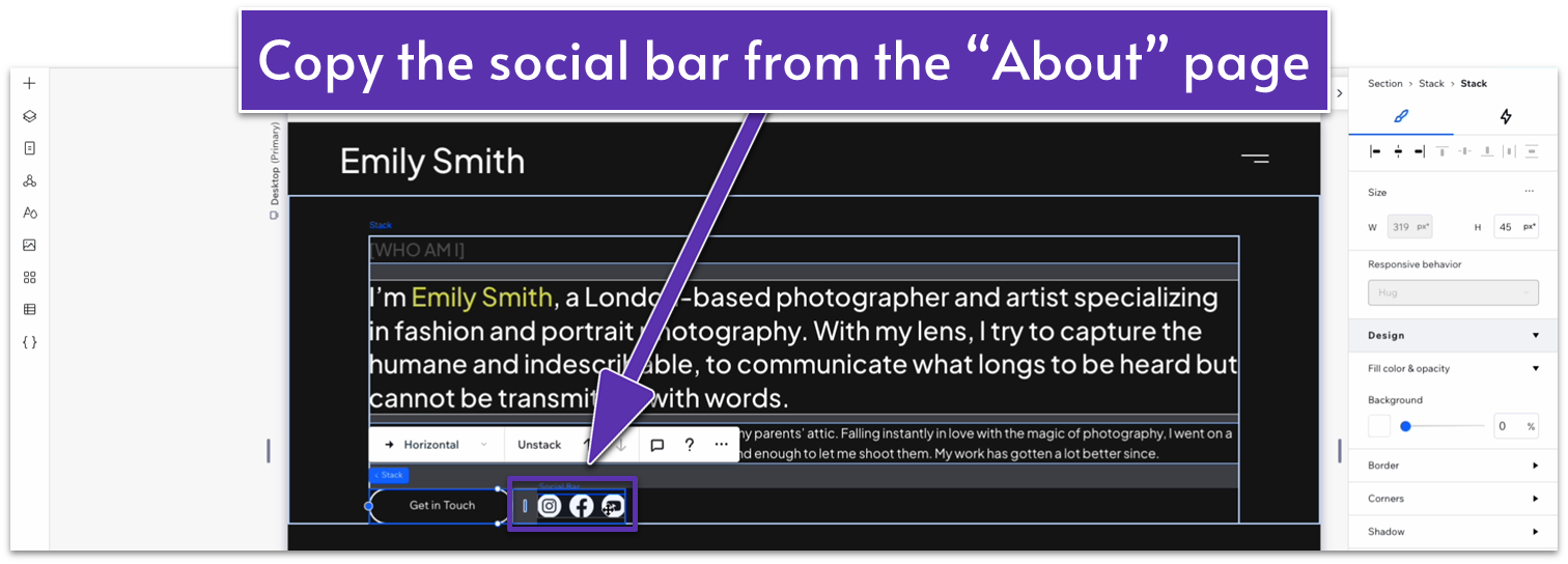
Step 8: Paste the links into the right-side column.
- Dock the social links to the right side ( ).
- Set all margins to 0.
Step 9: Change the left-side column’s width to 1.2fr.
Step 10: Set the behavior for both rows to auto ( ).
Adapt for Tablet and Mobile Views
Step 1: Adapt for tablet view.
On tablet view ( ):
- Set the top padding ( ) for the section to 70px.
- Set the width of the container on the top row to 680px.
- Set the width of the left-side column on the container to 1.6fr.
- Set the vertical gaps ( ) for the section to 20px.
- Set the width for the container on the bottom row to 680px.
Step 2: Adapt for mobile view.
On mobile view ( ):
- Set the top padding ( ) for the section to 70px.
- If the icons get moved around, make sure their location in grid cells is set to the bottom row.
- Dock the social icons to the left ( ) and top ( ) sides and set all margins to 0.
- Set the height for the bottom row of the container to auto ( ).
- Set the vertical gaps ( ) for the container to 20px.
- Open the “Layout” menu ( ) for the social icons.
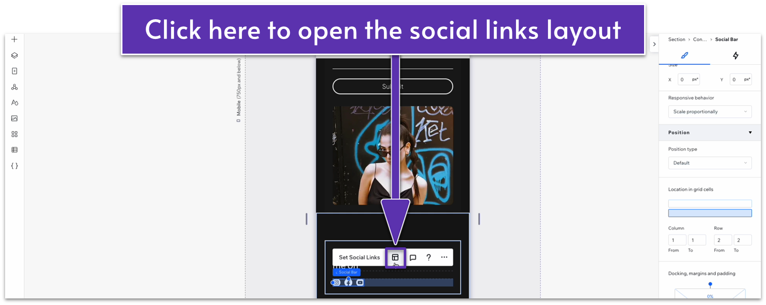
- On the layout menu, set the icon size to 30px.
