

3.0 Adding a New Page
Since this is our first time adding a new page, let’s see exactly how we do it. The process is the same for every page we add later down the line.
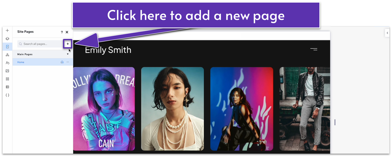
Step 1: Go to the pages menu.
- Click on the icon that looks like a rectangle with some horizontal lines ( ) on the left-side menu. It’s just below the “Layers” menu.
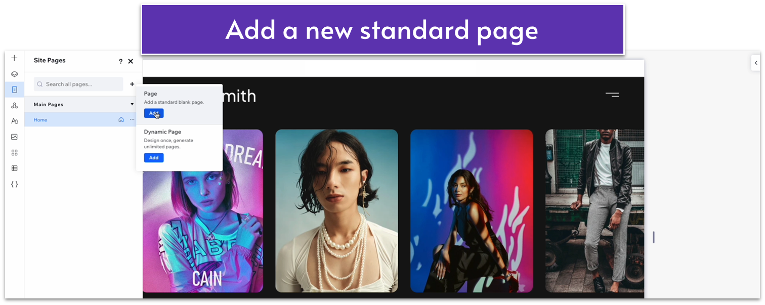
Step 2: Open the pages menu and select “Add a New Page”
- On the pages menu, click on the plus symbol ( ) beside the search bar to create a new page.
- You will see two options: “Page” and “Dynamic Page.” We’ll select “Page” for this one.
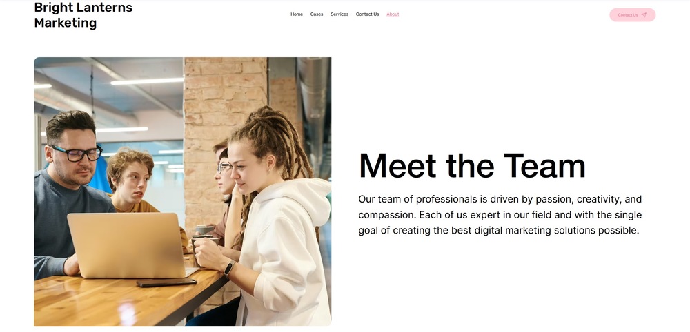
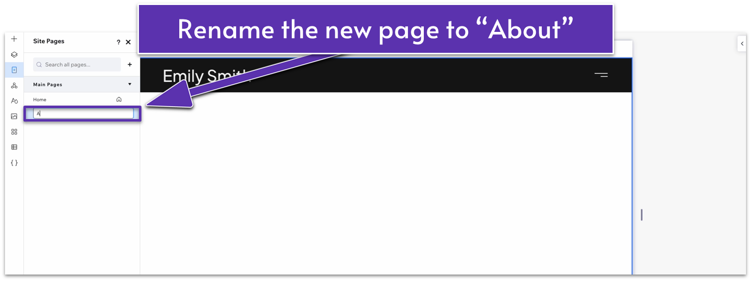
- You’ll be redirected to a blank page. A new name will also appear below “Home” on the “Main Pages” list. Rename the new page – for this example, we’ll go with “About.”
Step 3: Close the pages menu.
3.1 The Hero Section
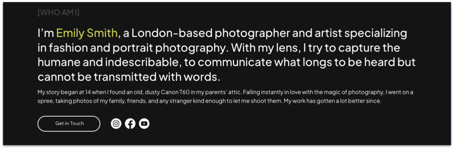
We’ll add a new section with some text, a couple of headings, a button, and icons for your socials. We’ve already created each of these elements before, so we can copy-paste a bunch of the elements we created for the homepage and simply change the content.
Remember to change the background color to the same dark gray as the previous sections (#161616 HEX). Unless stated otherwise, this will be the universal background color for our site.
Step 1: Create a new section and change the background color.
Step 2: Apply an advanced CSS grid to the section.
Step 3: Copy a dark-gray heading from the homepage and paste it into the section.
- Open the pages menu ( ) and head back to the homepage.
- We’ll copy the “[MY PORTFOLIO]” heading just below our hero section.
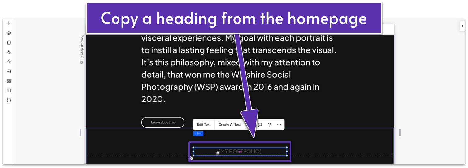
- Paste the heading into the section and move it into the top-left corner.
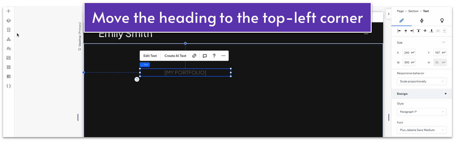
- We did this by eyeballing it, and we’ll change the specific location down the line, but if you want more specific information on its position, we moved it so the gridlines showed it was 8.3% from the top and 18.7% from the left.
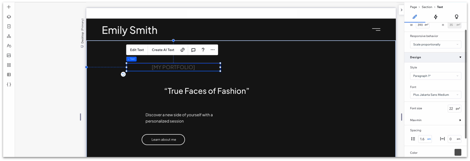
Step 4: Copy a white heading from the homepage and paste it into the section.
- We’ll copy one of the headings below the photos on the portfolio section of our homepage.
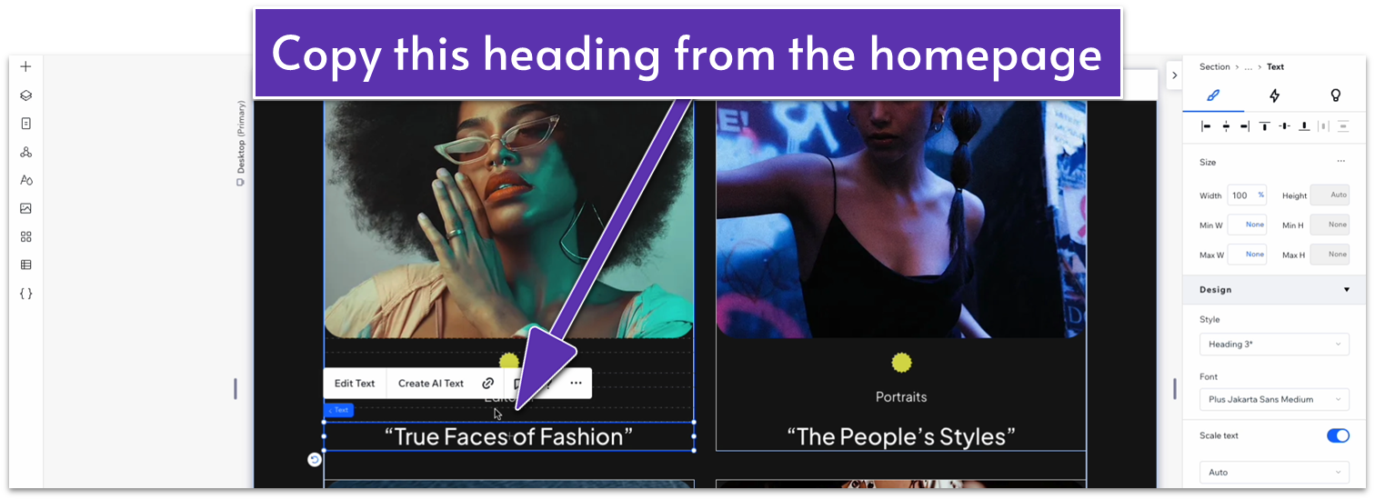
- Paste it and move it just below the dark gray heading.
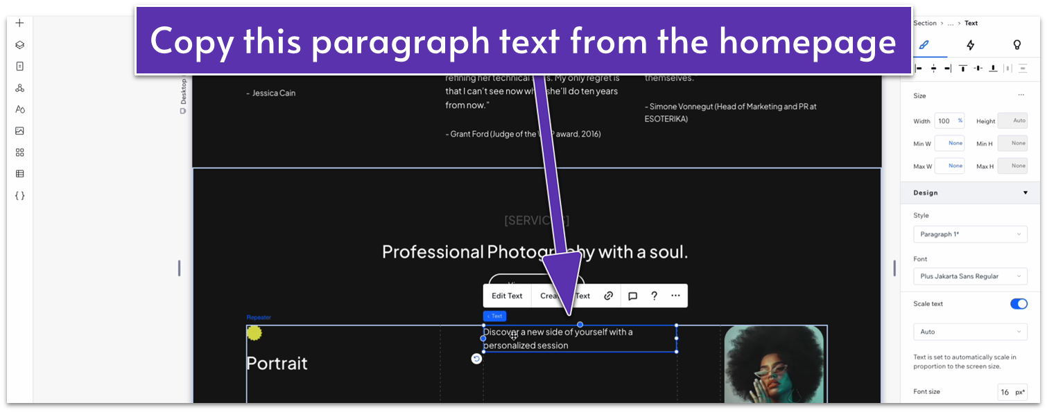
Step 5: Copy paragraph text from the homepage and paste it into the section.
- Same deal as before. We’ll use the description text from the services section.
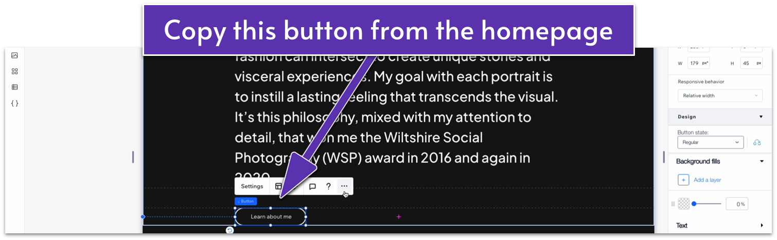
Step 6: Copy a button from the homepage and paste it into the section.
- We’ll copy the “Learn about me” button under the header.
- This is how all the elements in the new section looked for us before making any changes:
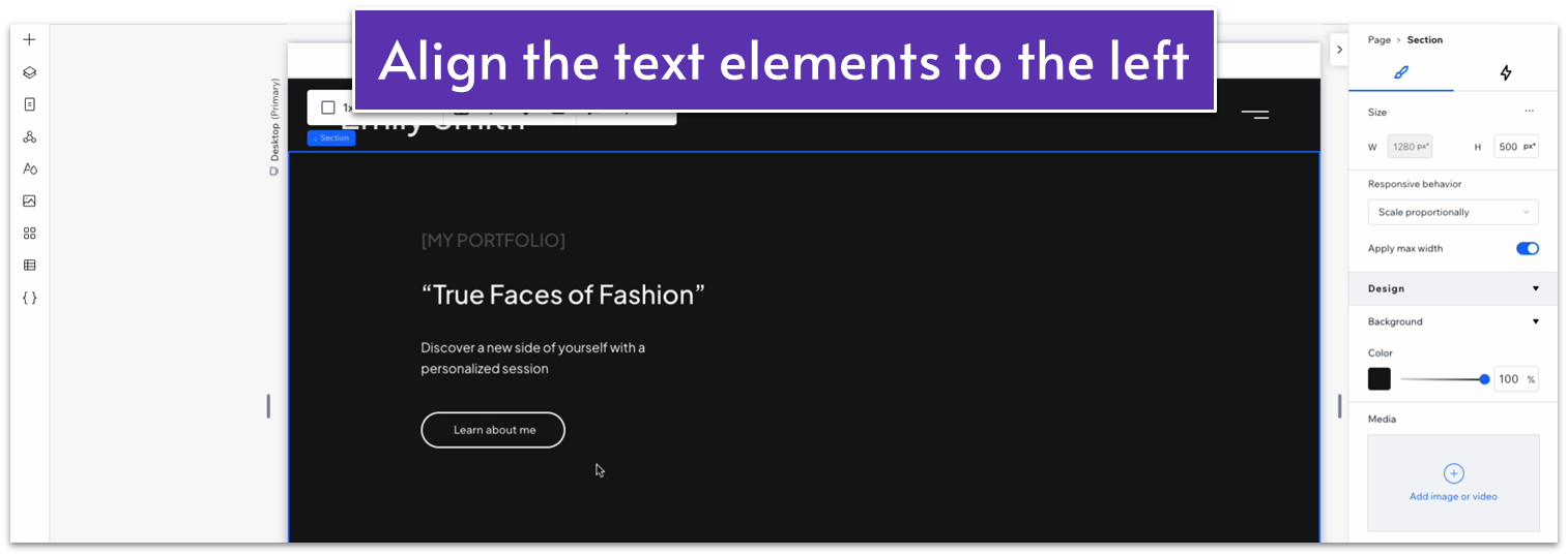
Step 7: Align all text elements to the left.
- Select each of the different headings and text elements, and make sure the text is aligned to the left ( ).
- Move the text boxes by eye until the spacing looks good. Again, we’ll change the specific values later, so this is just us cleaning up our workspace.
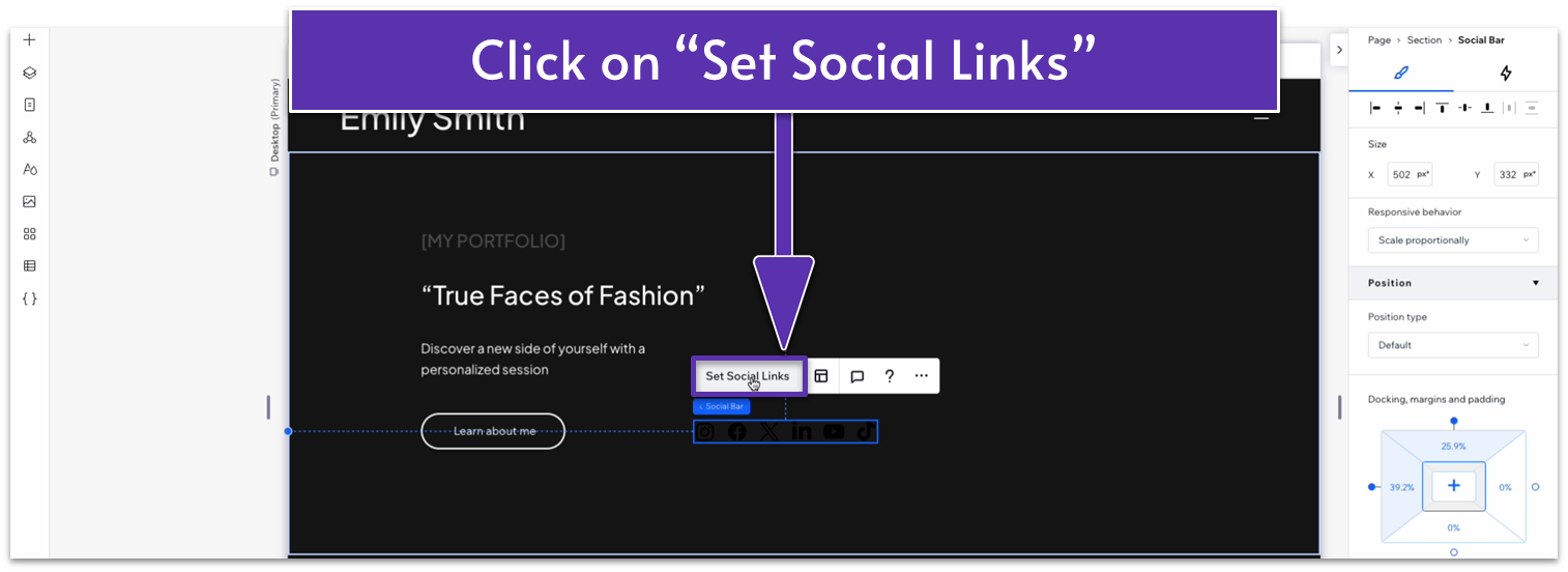
Step 8: Add a social bar to the section.
- Go to the “Add Elements” menu ( ), then head to “Embed & Social,” and then “Social Bars.”
- Drag a Social Bar to the section.
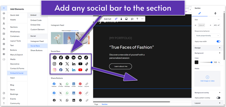
- Click on “Set Social Links” on the pop-up menu.
- Select the icons for each social media section and click on “Replace Icon.”
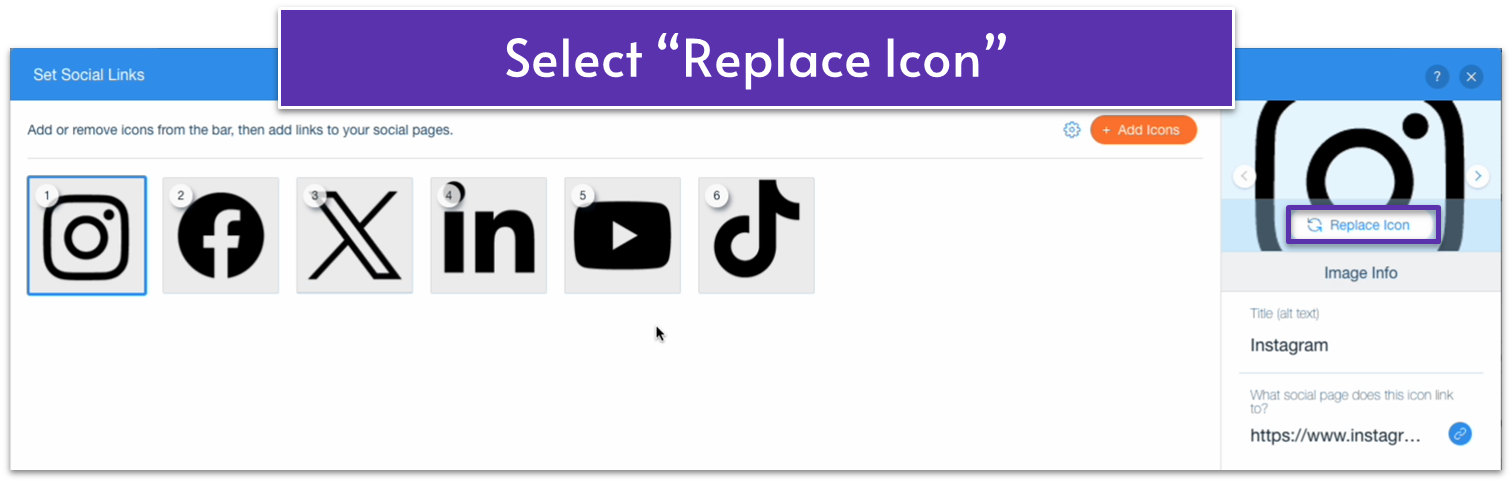
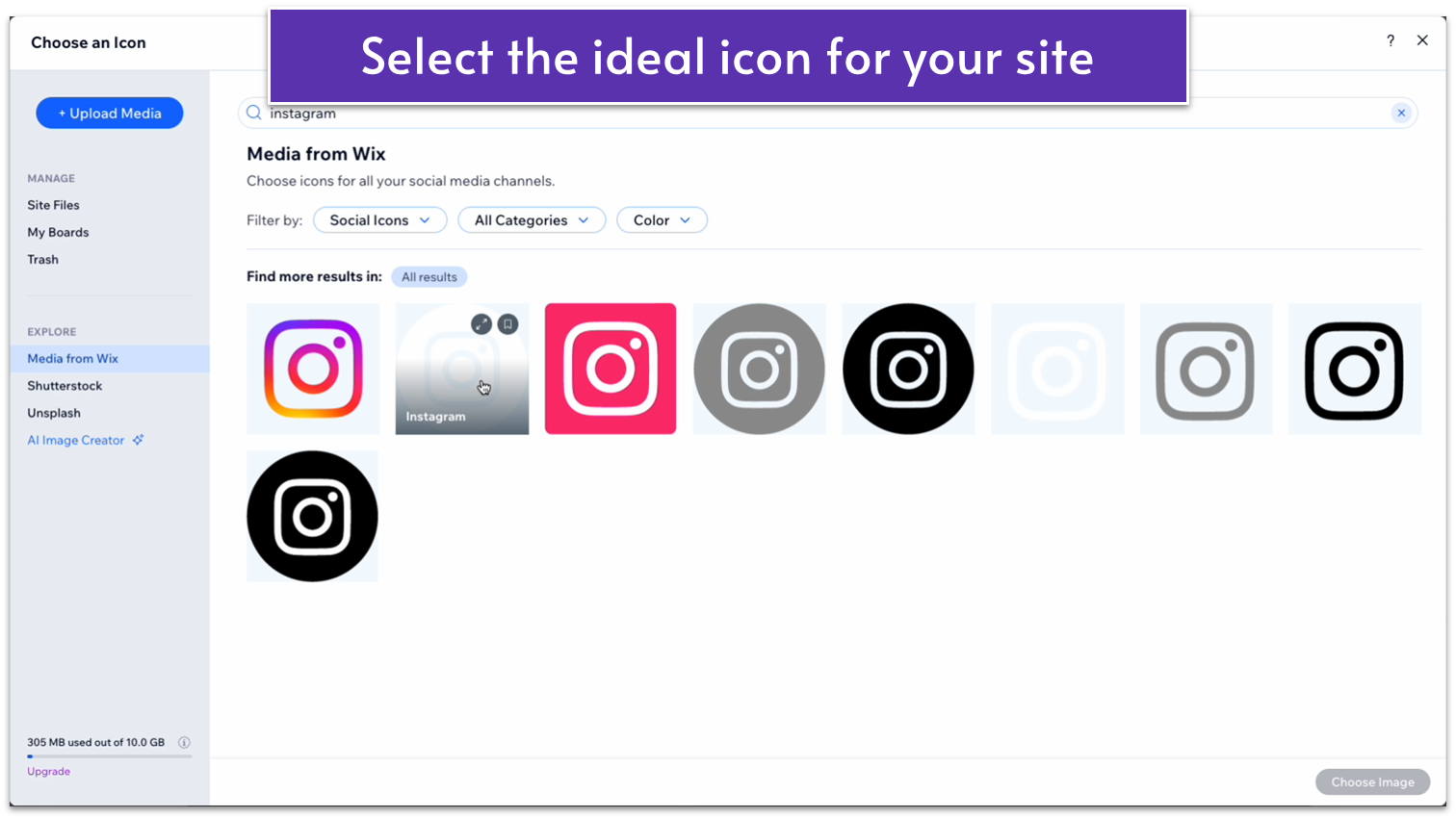
- Search for the perfect icon using the search bar and select the perfect icon for your site.
- Repeat the process for all the socials you want to display and remove the icons for the ones you don’t.
- Once you’re happy with your social links, select “Done.”
Step 9: Change the text to your own and re-align as needed.
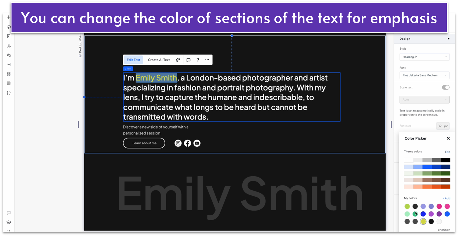
You can change the color of a specific section of text for emphasis. Highlight the text and select the color you want to change the font to. In our case, it will be dark yellow (#D8DB4D).
- Move the text boxes so they’re all at the same distance from the left side.
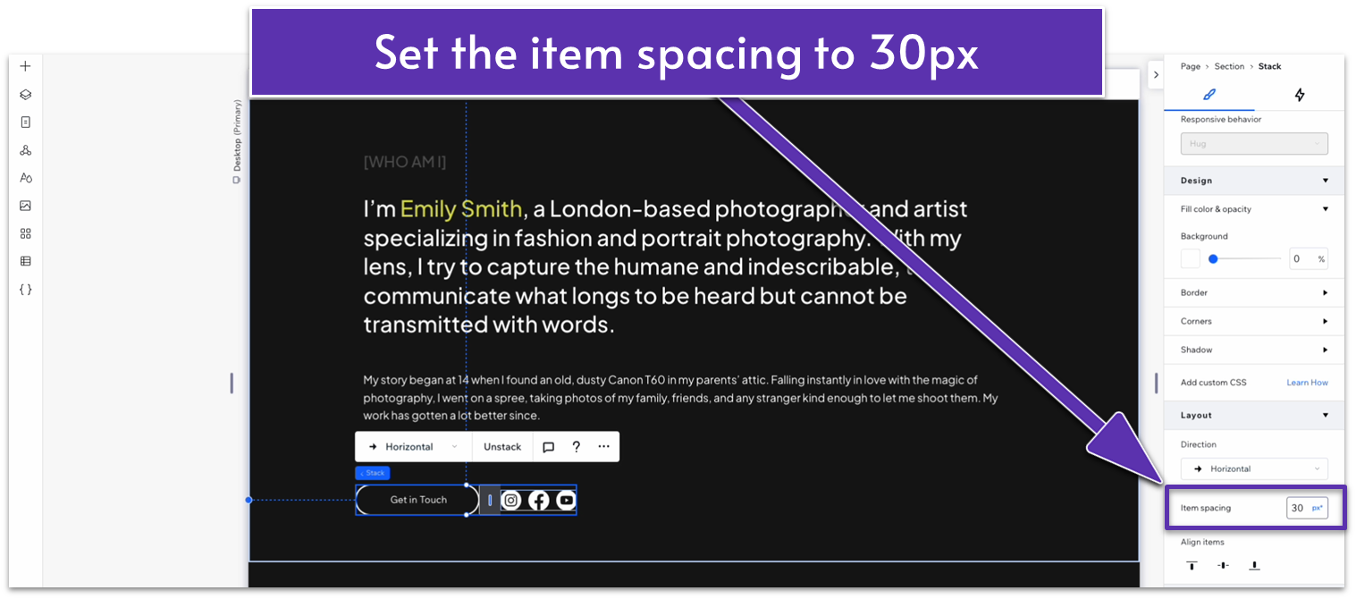
Step 10: Stack the button and icons together.
- Move the contact button and social icons so they’re side-by-side. Stack the button and icons together in a horizontal stack.
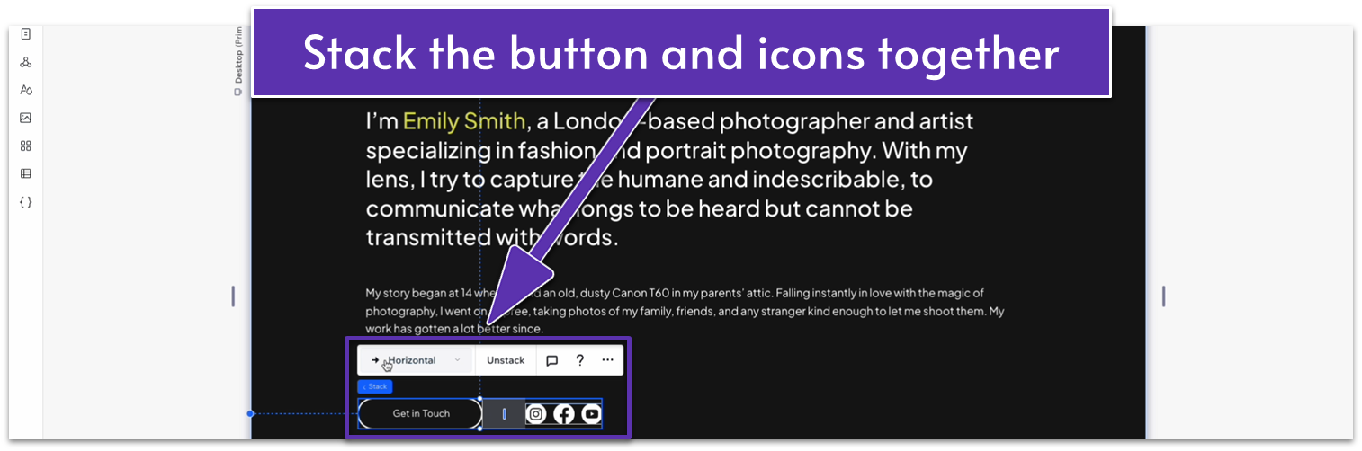
- Set the item spacing to 30px.
Step 11: Stack the text elements together.
- Stack all the text elements together, including the stack with the button and icons.
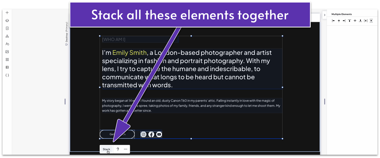
- Set the left-side margin to 0 for all individual elements in the stack.
- Set the width for all text elements to 100%.
- Set the width for the whole stack to 1080px.
- Set all margins for the whole stack to 0.
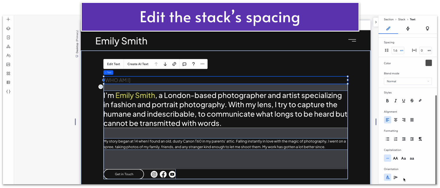
- Set the bottom margin ( ) for the top heading to a 20px scale.
- Set the bottom margin ( ) for the text below to a 10px scale.
- Set the bottom margin ( ) for the text on the bottom to a 30px scale.
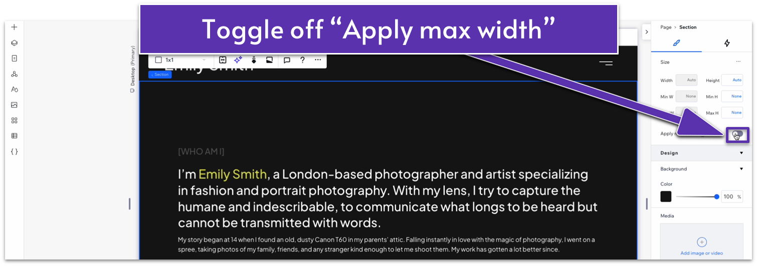
Step 12: Toggle off “Apply max width” for the entire section.
Step 13: Set the spacing for the section
- Set the row behavior for the entire section to auto ( ).
- Set the top padding ( ) for the entire section to 50px.
Adapt for Tablet and Mobile Views
Step 1: Adapt for tablet view
On tablet view ( ):
- Set the width for the entire section to 680px.
- Set the top padding ( ) for the entire section to a 50px scale.
- Set the bottom margin ( ) for the top heading to 20px.
- Set the font size to the paragraph text in the middle to 30px.
- Set the bottom margin ( ) for the paragraph text in the middle to 10px.
- Set the bottom margin ( ) for the bottom text to 30px.
- Set the button’s width to 150px.
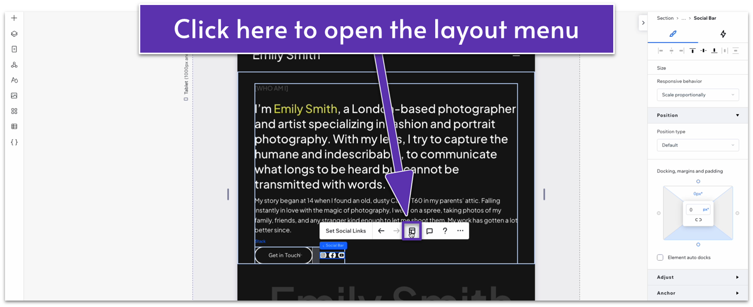
- Set the top ( ) and bottom ( ) margins for the social bar to 0.
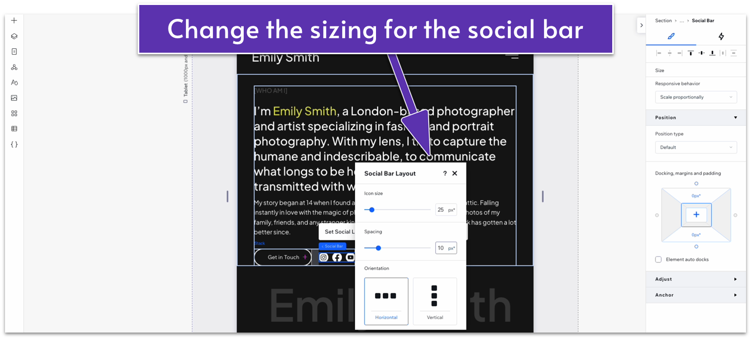
- Click on the social icons and open the “layout” menu ( ) from the pop-up menu.
- Change the icon size to 25 and the spacing to 10 px.
- Set the item spacing for the stack with the button and social bar to 30px.
Step 2: Adapt for mobile view.
On mobile view ( ):
- Set the top padding ( ) for the entire section to a 30px scale.
- Change the bottom margin ( ) for the top heading to 20px.
- Change the bottom margin ( ) for the middle text to 10px.
- Change the bottom margin ( ) for the text on the bottom to 30px.
- Set the width of the button to 150px.
- In the layout menu ( ), change the icon size of the social bar to 20px and the spacing to 10px.
- Set the item spacing for the stack with the button and social bar to 30px.
- Change the font size of the middle text to 22px.
3.2 Gallery Section
We don’t have to get too crazy with this gallery since it will consist of just a couple of images to break up the visual monotony of the page.
Step 1: Create a new section and apply an advanced CSS grid.
- Set the top padding ( ) to 80px scale.
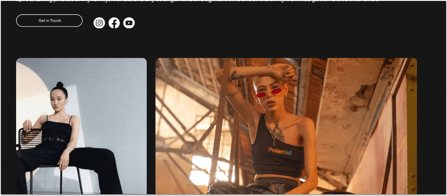
Step 2: Copy the gallery from the hero section of the homepage and paste it into the section.
- Stretch the gallery’s edges to align with the edges of the section above. Its width should be 1080px.
- Toggle advanced size settings off for the gallery.
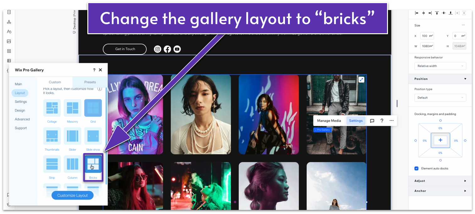
Step 3: Change the gallery’s layout.
- Open the “settings” menu for the gallery and go to “Layout.”
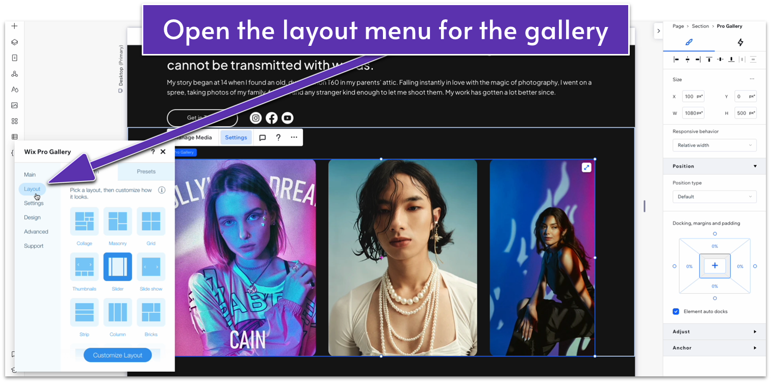
- Change the layout to “bricks.”
- Click “Manage Media” on the pop-up menu and change the gallery images.
Adapt for Tablet and Mobile Views
Step 1: Adapt for tablet view.
On tablet view ( ):
- Stretch the gallery’s width to match the section above.
- Set the top padding ( ) for the entire section to 70px.
Step 2: Adapt for mobile view.
On mobile view ( ):
- Set the top padding ( ) to 70px.
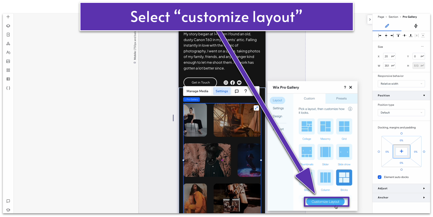
- Click on the gallery and open the “settings” menu. Go to layout and click on “Customize Layout.”
- Change the spacing to 10.
3.3 “My Vision” Section
We’ll create another section with text, this time describing the photographer’s artistic vision. We’ll keep this section rather simple, but we’ll use the text with a scrolling animation from our homepage to make it a little more dynamic.
Step 1: Add a new section and apply an advanced CSS grid to it.
- Toggle “Apply max width” off under “Responsive Behavior.”
- Set the top padding ( ) to an 80px scale.
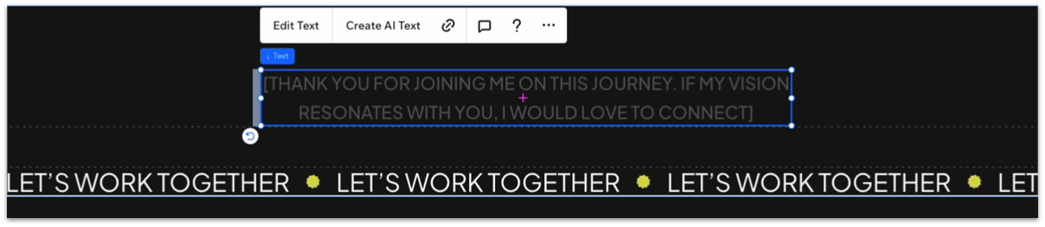
Step 2: Copy the scroll-animation text from the homepage.
- Go back to the homepage and select the text paragraph under the infinity scroll.
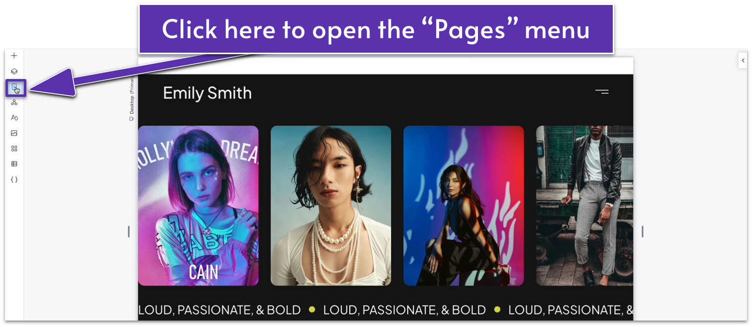
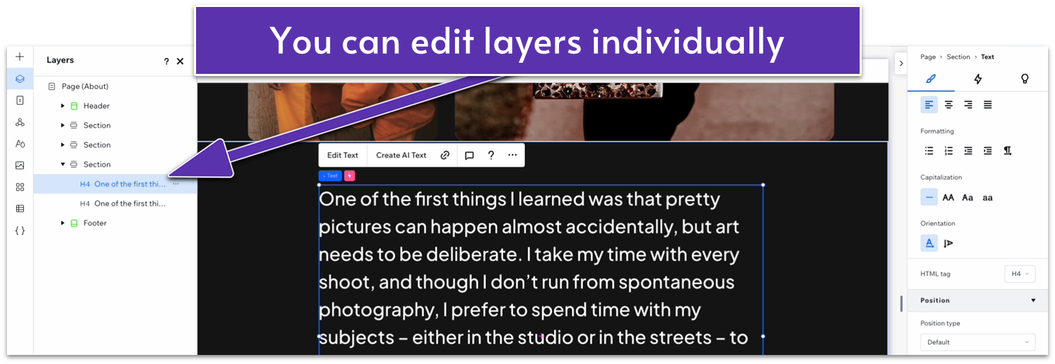
- Click on the icon with two squares overlapping ( ) just below the plus icon to open the “Layers” menu.
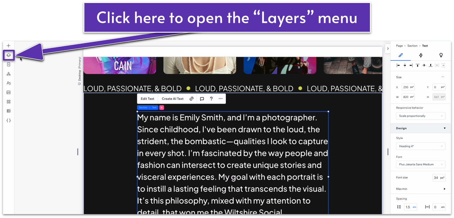
- The “Layers” menu lets you see the different elements on a page and how they’re organized from front to back.
- Use the shift key to select both text layers (the white text that appears as you scroll and the soft gray underneath).
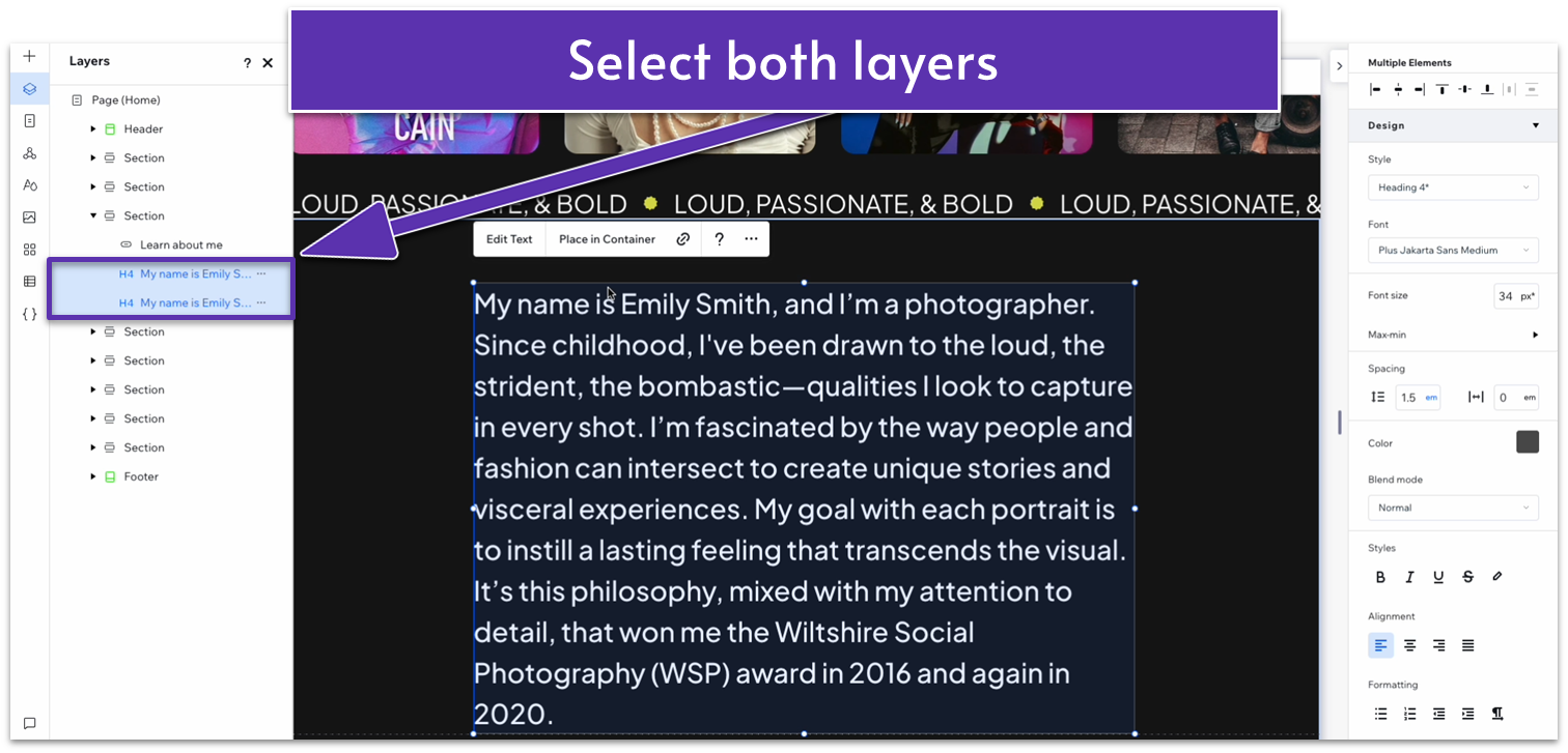
- Copy the layers and paste them into the new section of our “About” page.
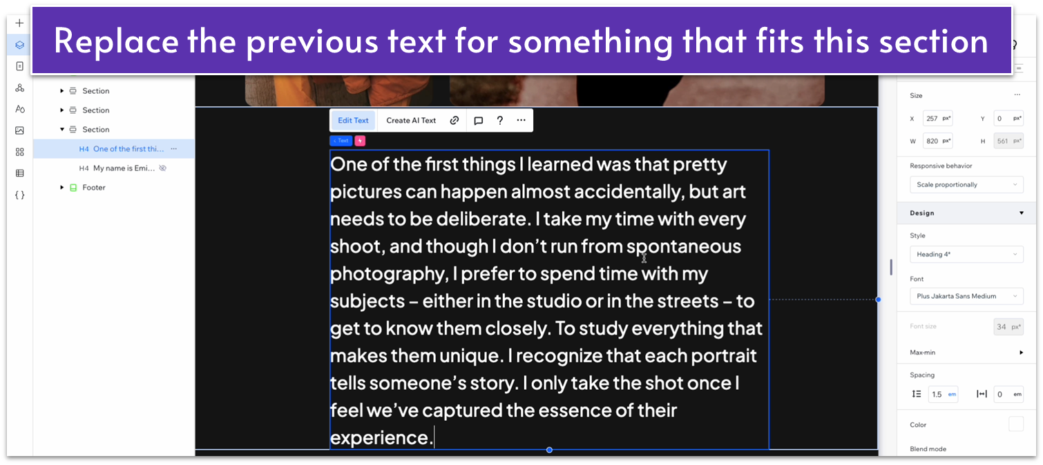
Step 3: Replace the text for both layers.
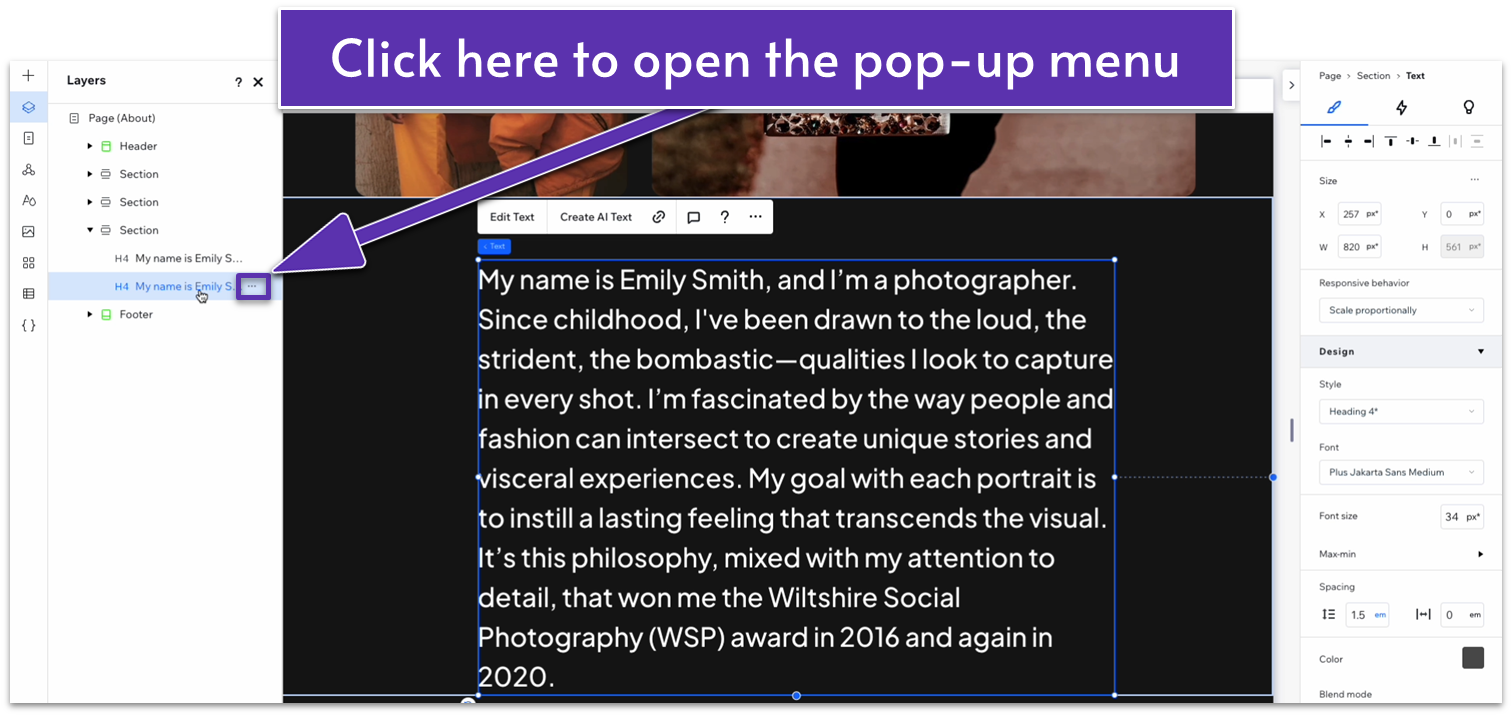
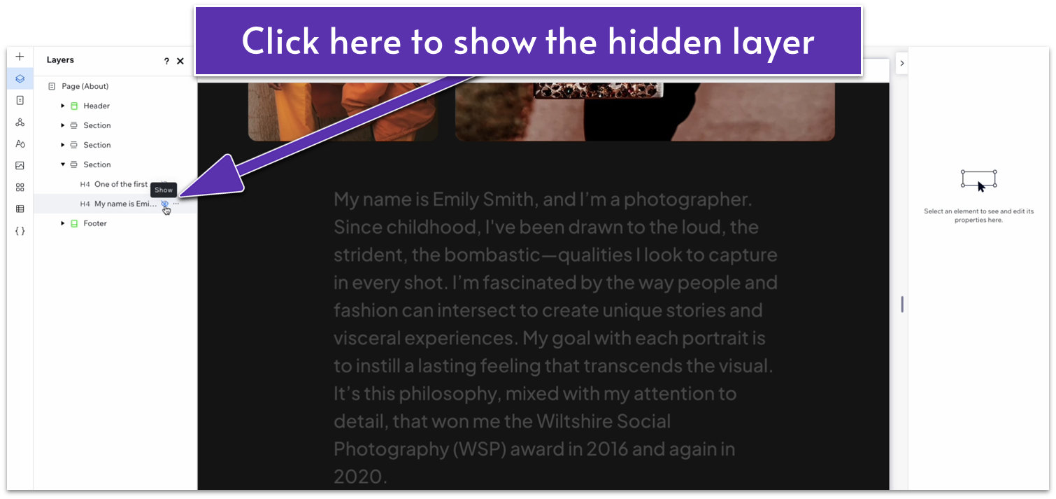
- Return to the “Layers” menu on our “About” page. Select only the bottom text layer and then click on the three-dot icon to open the pop-up menu.
- Select “Hide” on the pop-up menu.
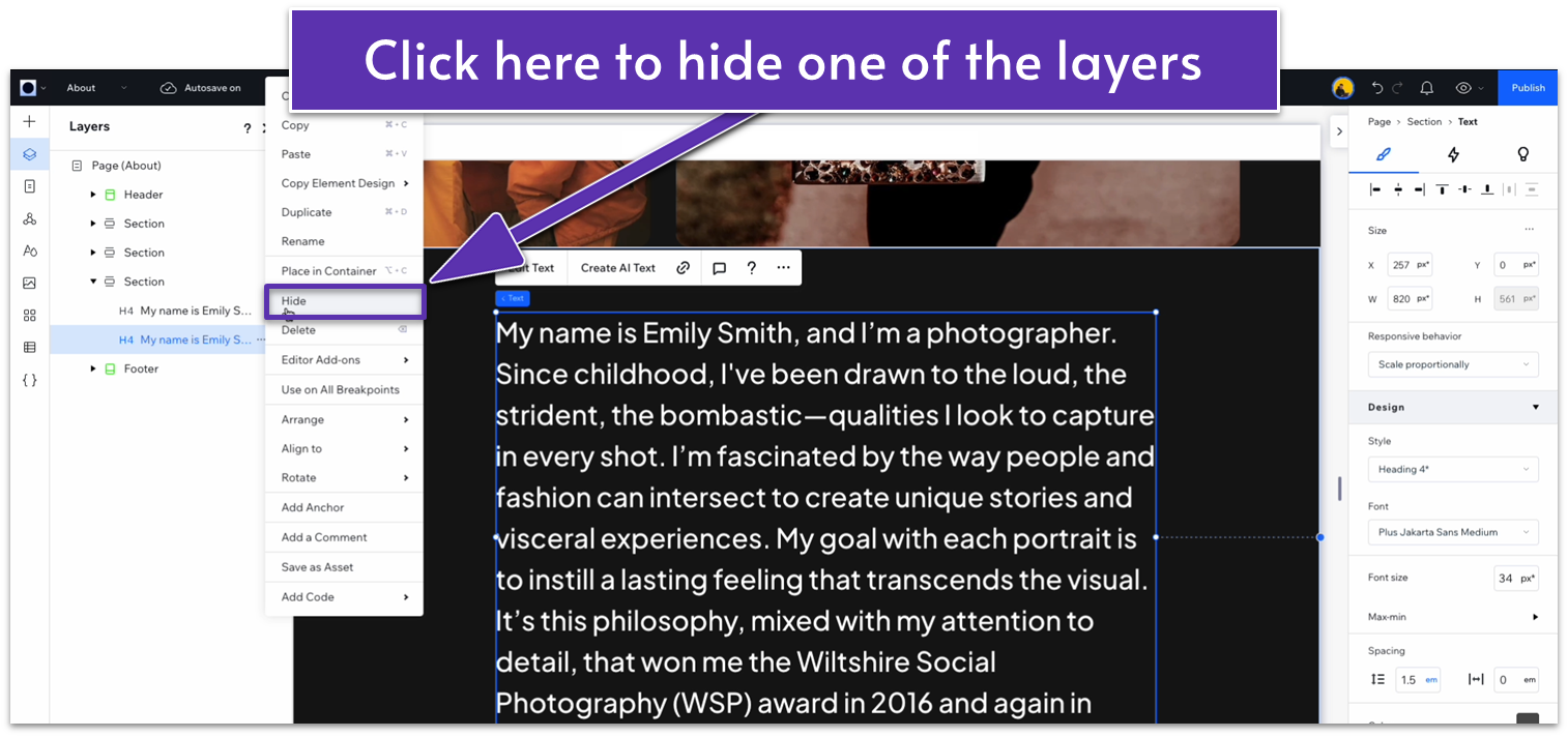
- Replace the text for your “vision” text in the top layer.
- Now hide the bottom layer, and click on the crossed-out eye icon ( ) to show the bottom layer.
- Replace the bottom layer text with the text you used before.
- Click on the layers one at a time, making sure that the white top is on top of the dark grey one and that all of the margins for both text boxes are set to 0.
Adapt for Tablet and Mobile Views
Step 1: Adapt for tablet view.
On tablet view ( ):
- Stretch the edges of the text box to match the section above.
- The bottom layer will now stick out from underneath. Simply select the bottom text box and stretch its edges to the same dimensions.
- Set the top padding ( ) for the entire section to 70px.
Step 2: Adapt for mobile view.
On mobile view ( ):
- Stretch the edges of the text box to match the section above.
- The bottom layer will now stick out from underneath. Simply select the bottom text box and stretch its edges to the same dimensions.
- If both text layers still don’t match, make sure all margins for both are set to 0.
- Set the top padding ( ) for the entire section to 70px.
3.4 Services Section
For this section, we’ll add a section divided into two rows: the first one will show just two offered services, while the bottom one has a button that takes you to a dedicated page. If you want more items at the top, feel free to keep them.
Step 1: Create a new section and apply an advanced CSS grid.
- Toggle “Apply max width” off.
- Set the layout to 1×2 ( ).
- Set the gaps between rows to 50px.
- Set the top padding ( ) to an 80px scale.
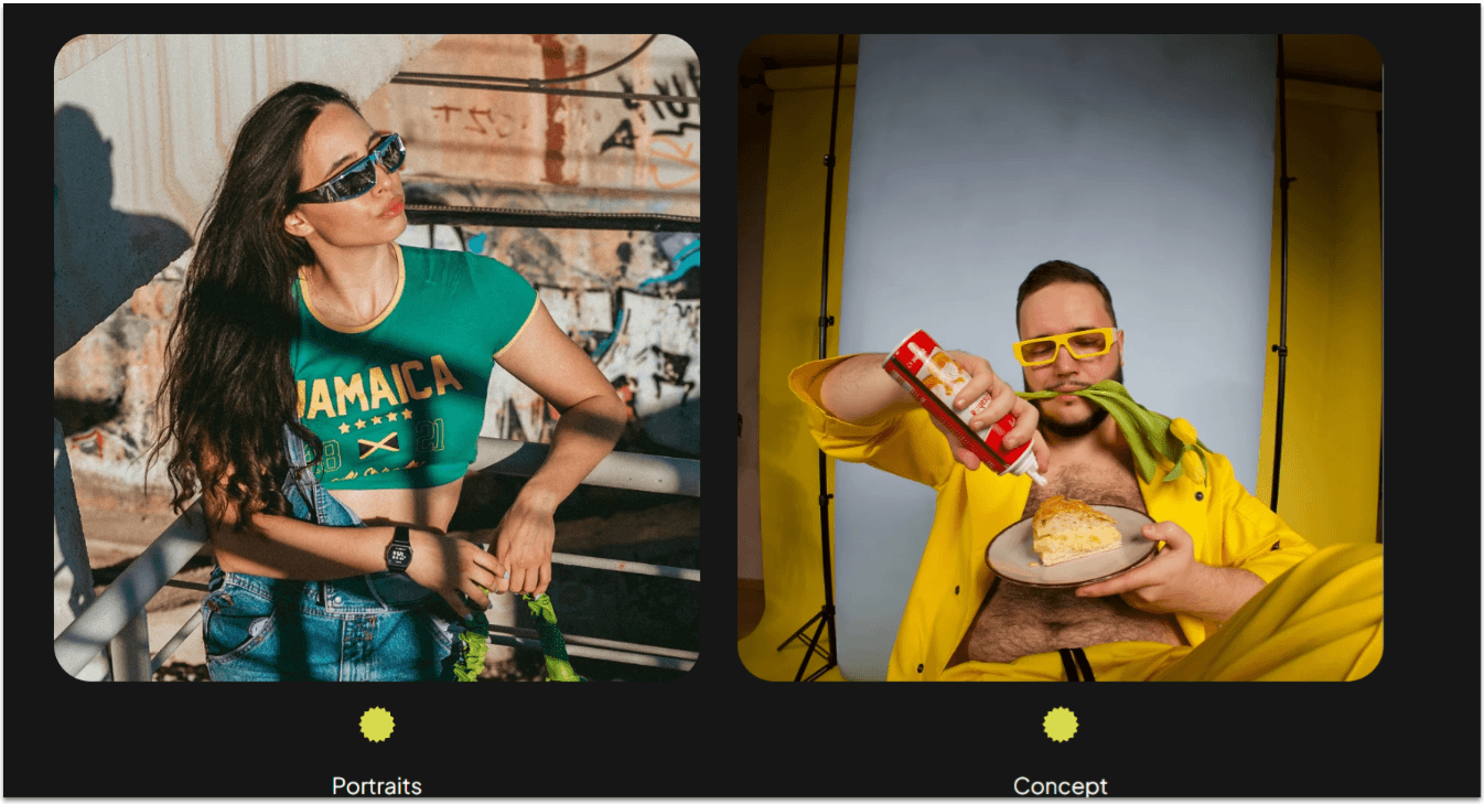
Step 2: Copy the repeater from the portfolio section of the homepage and paste it into the top row.
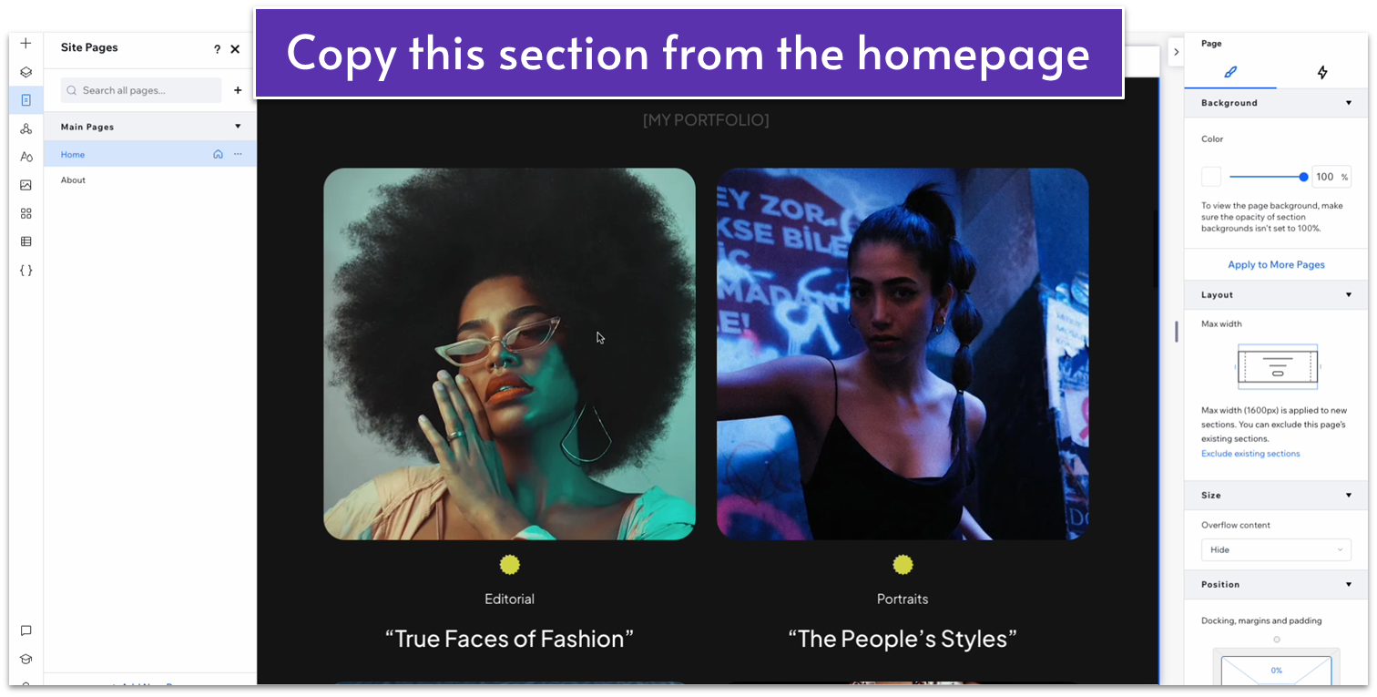
- Set the location in grid cells to the top row.
- Set all margins to 0 for the overall repeater.
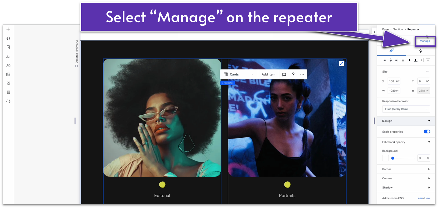
Step 3: Style the repeater.
- On the inspector, click on the “Manage” option in the top-right corner.
- Click on the three dots icon ( ) next to one of the items to open options for that particular item.
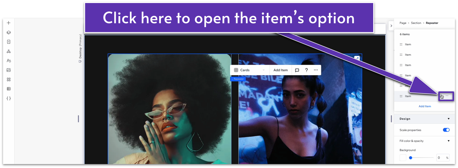
- Select “Delete” to delete one of the items. Repeat the process until there are only two items in the repeater.
Step 4: Copy the button from the hero section and paste it into the bottom row.
- Set all margins to 0.
- Open the “Settings” menu to change the button’s text.
- Set the behavior of both rows to auto ( ).
Step 5: Change the content as needed, or leave it as it is.
In our case, we decided to change only the photographs for other examples in the same collection, but you can change the content as much or as little as you wish.
Adapt for Tablet and Mobile Views
Step 1: Adapt for tablet view
On tablet view ( ):
- Stretch the edges of the repeater to match the section above.
- Set the button’s width to 150px.
- Set the top padding ( ) for the entire section to 70px.
Step 2: Adapt for mobile view
On mobile view ( ):
- Set the top padding ( ) for the entire section to 70px.
- Set the vertical gap ( ) between rows to 30px.
- Set the button’s width to 150px.
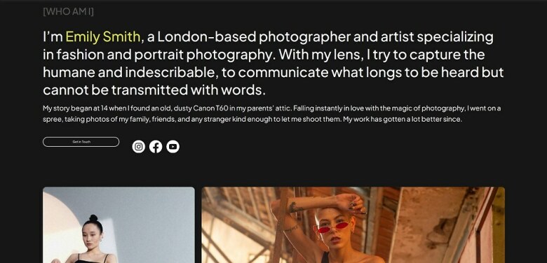
3.5 Experience Section
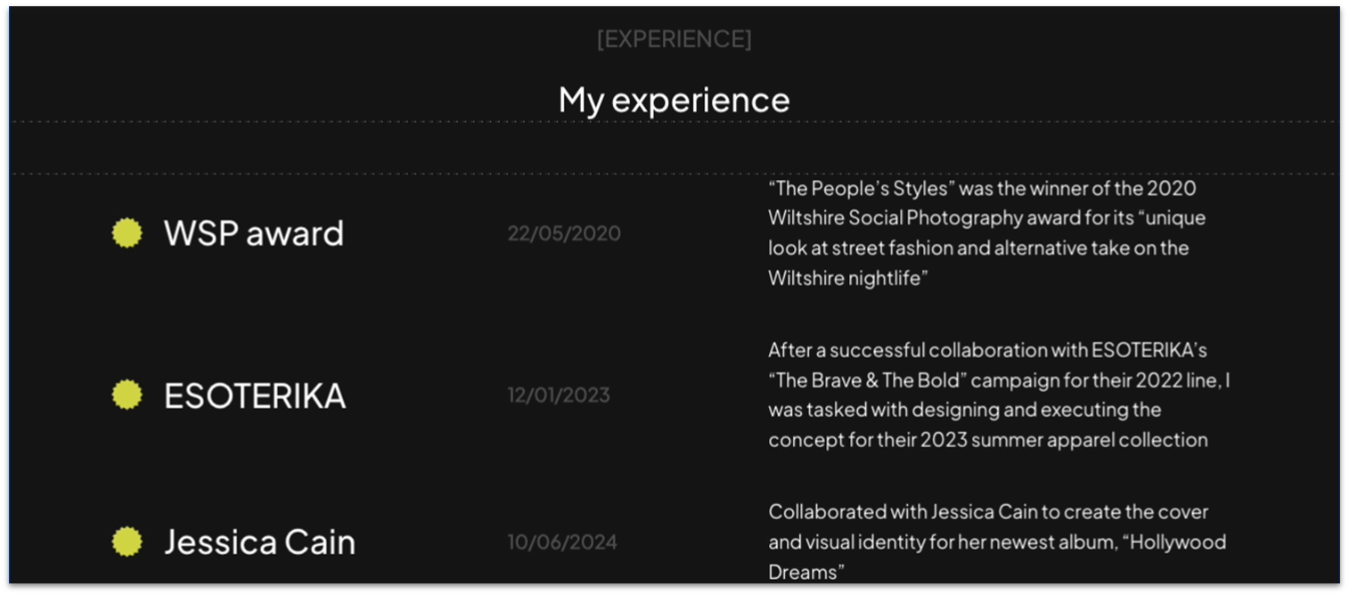
This section will resemble a more traditional CV. We’ll include specific information about the photographer’s past work in different rows.
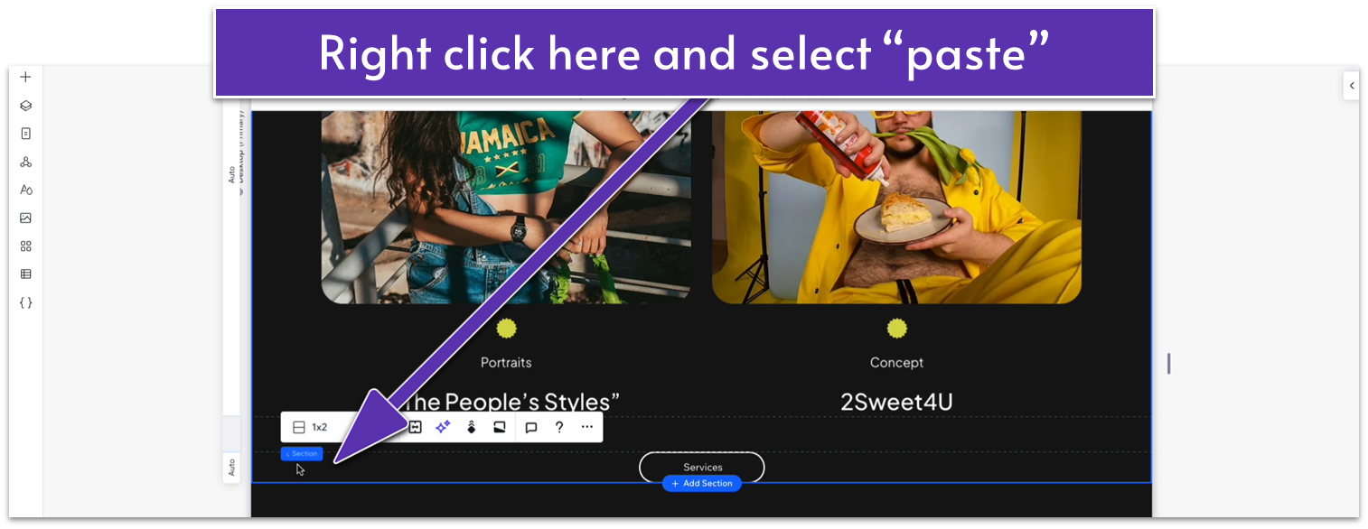
Step 1: Copy the services section from the homepage and paste it at the bottom of the about page.
- Head to the homepage, click on the “services” section there, and use the three dots icon ( ) to copy the entire section.
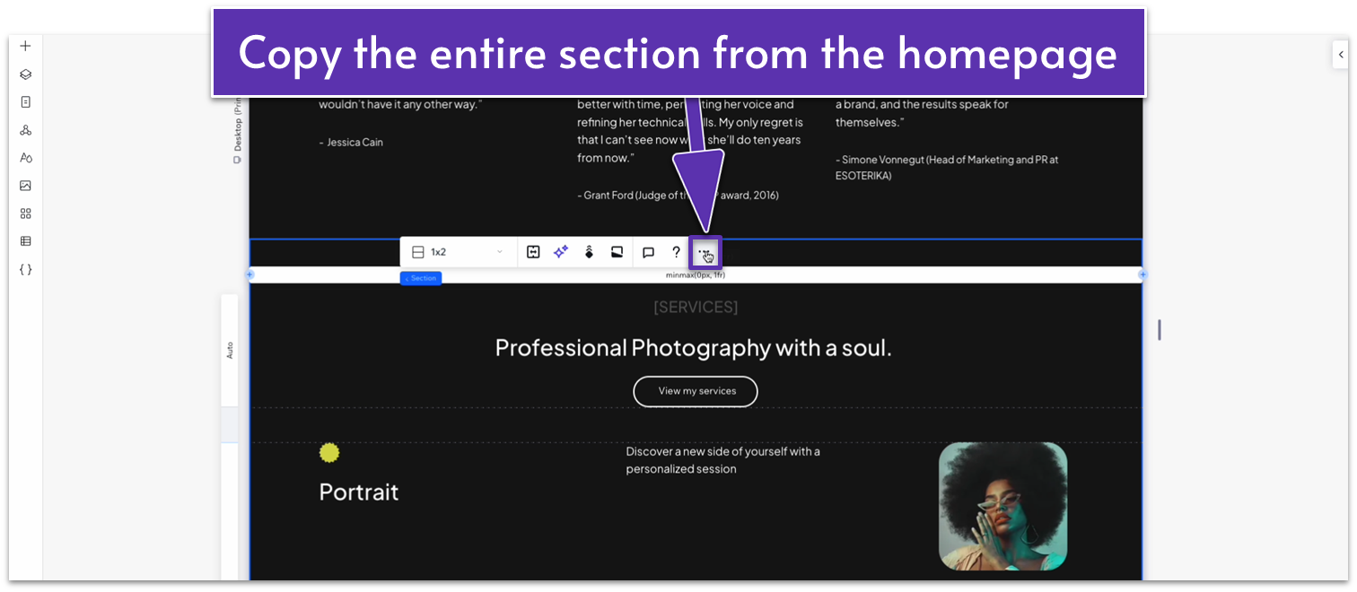
- Click at the bottom of the previous section (the row with the “Services” button) and select “Paste.”
Step 2: Replace the heading text with something appropriate and remove the button at the bottom.
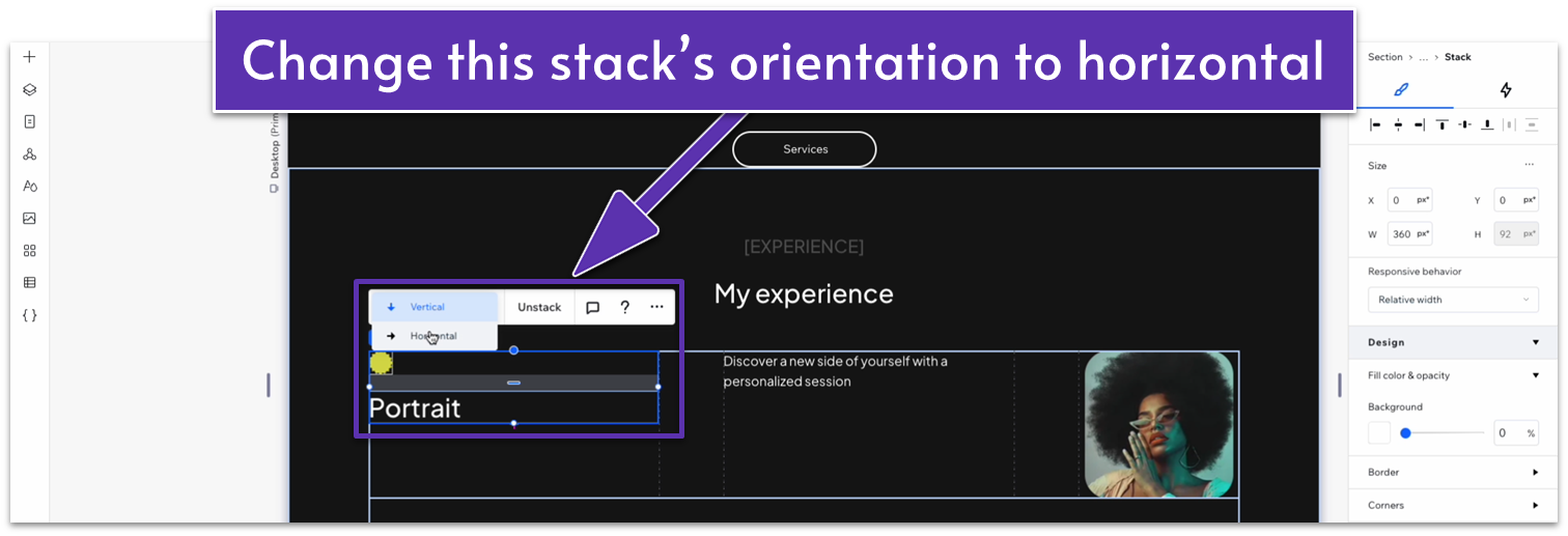
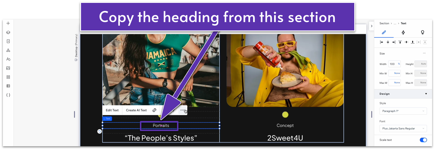
Step 3: Edit the content in the repeater below.
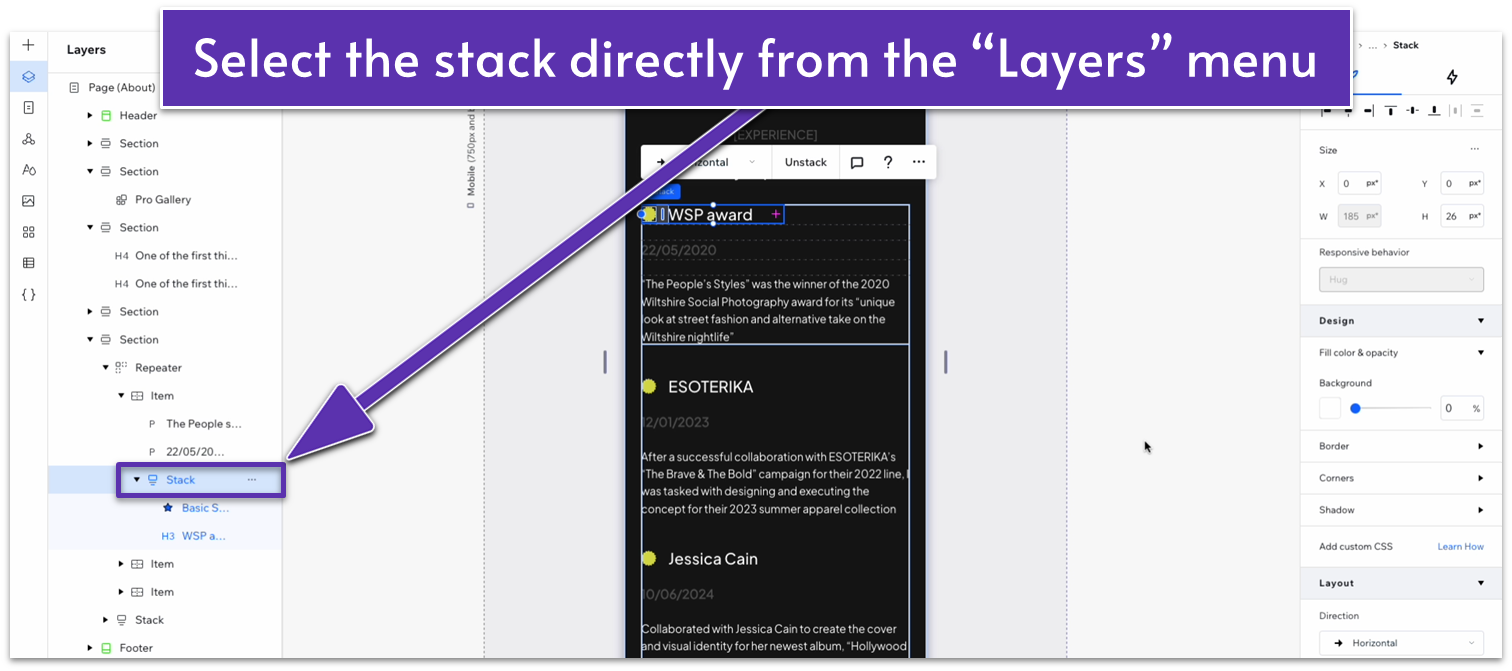
- Change the orientation of the stack on the left-side column to horizontal.
- Set the top ( ) and bottom ( ) margins for the vector art to 0.
- Change the font color for the text in the middle to a soft gray (#575757 HEX).
- Delete the image on the right-side column.
- Replace the text on the left-side headings with the title of your work and the soft-gray text for its date.
- Copy the smaller heading text from the section above and paste it into the right-side column.
- Set the location in grid cells for the heading text to the right-side column.
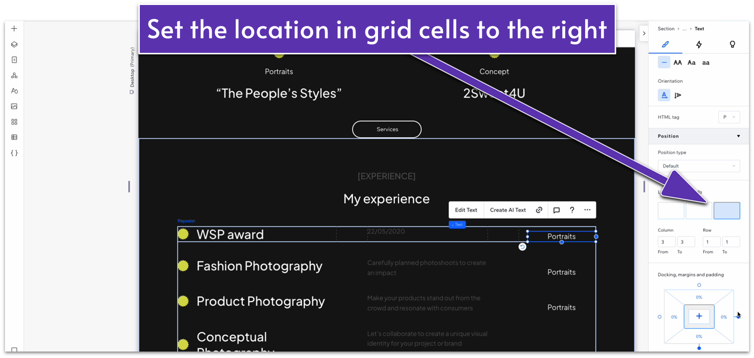
- Dock the heading to the top ( ) and left ( ) sides and set all margins to 0.
- Align the text to the left ( ).
- Set the width for the text box to 100%.
- Replace that for descriptive text about each item of work.
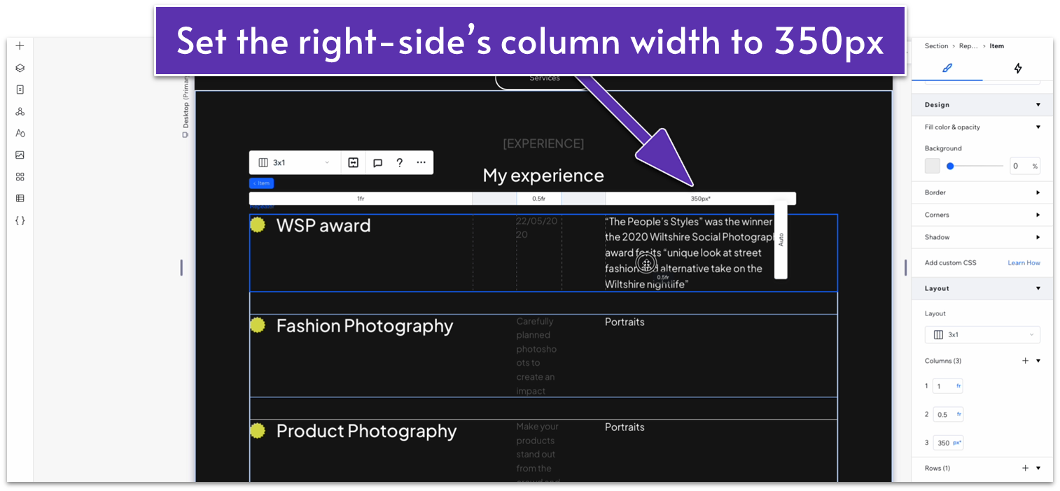
- Set the width for the right-side column to 350px.
- Set the font size for the date text to 18px.
- Bold the date text.
- Undock the date text from the top ( ) and bottom ( ) and set all margins to 0.
- Undock the left-side heading from the top ( ) and set all margins to 0.
Step 4: Style the content to adapt it to this page.
We started with a rough idea of what this section should look like, but we didn’t love how it looked after we added the content. So, we changed the design of this section slightly so it better fit the page. We took the steps below to fit our content, but based on the length of your text, you may need to make different adjustments to the sizes of your columns.
- Change the width for the right-side column to 450px.
- Set the width for the text box on the left-side column to 250px.
- Set all margins for the same text box to 0.
Adapt for Tablet and Mobile Views
Step 1: Adapt for tablet view.
On tablet view ( ):
- Stretch the sides of the repeater to match the section above.
- Change the font size for the left-side heading to 15px.
Step 2: Adapt for mobile view.
On mobile view ( ):
- Select the white heading and change the location in grid cells to the bottom row.
- Dock the heading to the left ( ) and set the margins to 0.
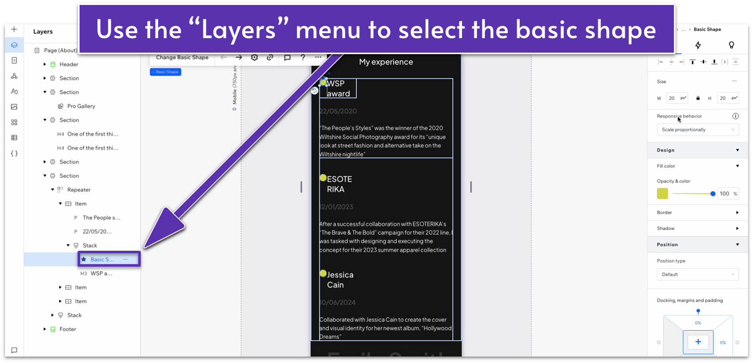
- Open the “Layers” menu ( ) and select the basic shape. Change its width to 20px.
- Set the bottom margin ( ) for the shape to 0.
- Change the width of the white heading to 150px.
- Set item spacing for the stack to a 15px scale.
- Change the font size for the “My Experience” heading to 10px.
- Change the location in grid cells for the date text to the bottom row.
- Change the location in grid cells for the description text to the middle row.
3.6 Call to Action
In our least-effort maneuver yet, we’ll simply copy the call to action from the homepage.
Step 1: Copy the call to action section from the homepage and paste it on the bottom of the “About” page.
Step 2: Change the text if needed.
If the new text is longer, try to stretch the width of the text box so there are no more than two lines of text in total.
Adapt for Tablet and Mobile Views
The section we copied this from should already be optimized for tablet and mobile views, but you can stretch the size of the text box for both so the text on top takes no more than two lines of space.
3.7 Contact Form
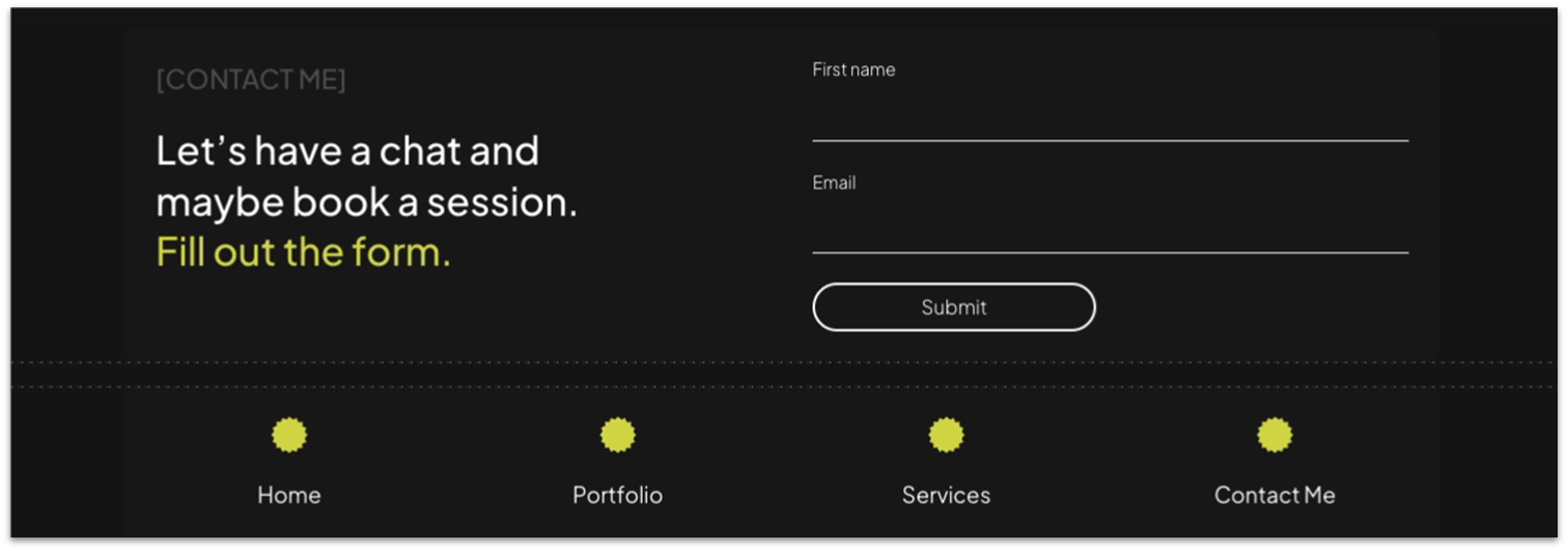
Let’s start by taking a quick break after the exhausting “call to action” section. Once you feel like you’ve recovered from the exertion, we’ll add a contact form as the last section for this page. We want every page to include this contact form, so instead of copy-pasting it again, we’ll turn it into a global section.
Step 1: Head to the homepage and turn the contact form into a global section.
- Open the settings menu for the entire section with the contact form, then select “Set as Global” and then “Section.”
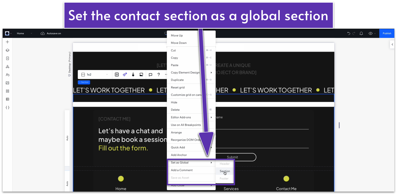
- The “Global Sections” menu will open automatically. Rename this section to “Contact”
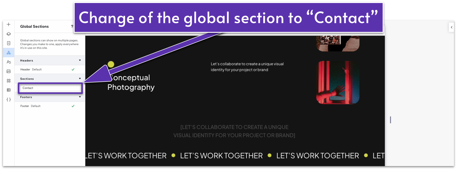
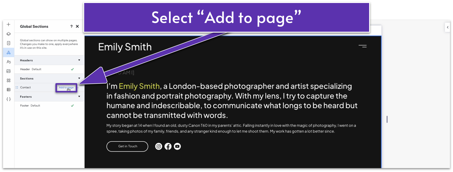
Step 2: Add the contact section to the page.
- On the left-side menu, click on the icon with three circles connected by a triangle, this is the “Global Sections” menu.
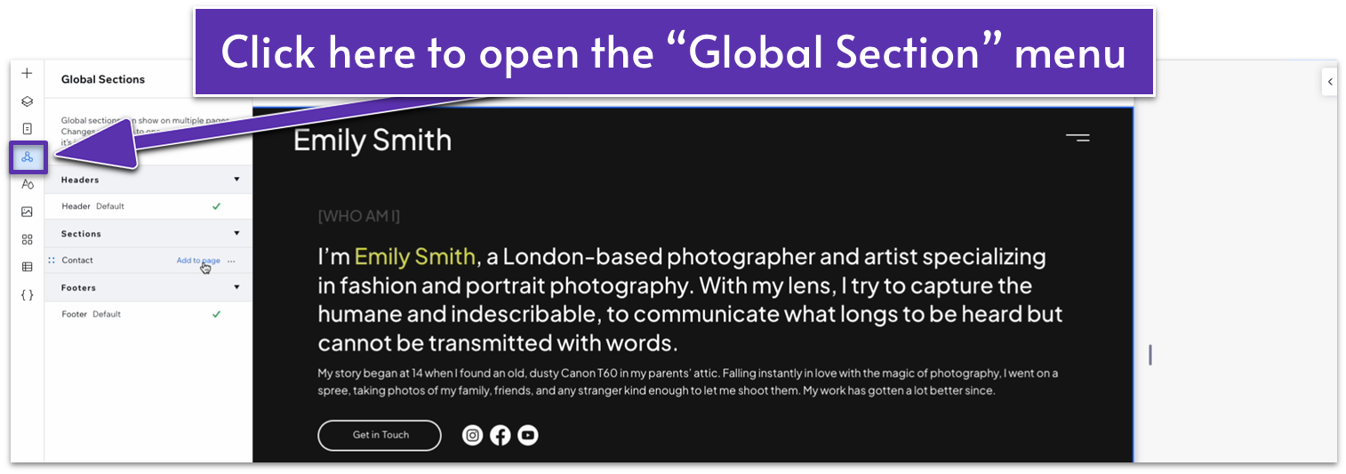
- Hover over the contact section and select “Add to page.”
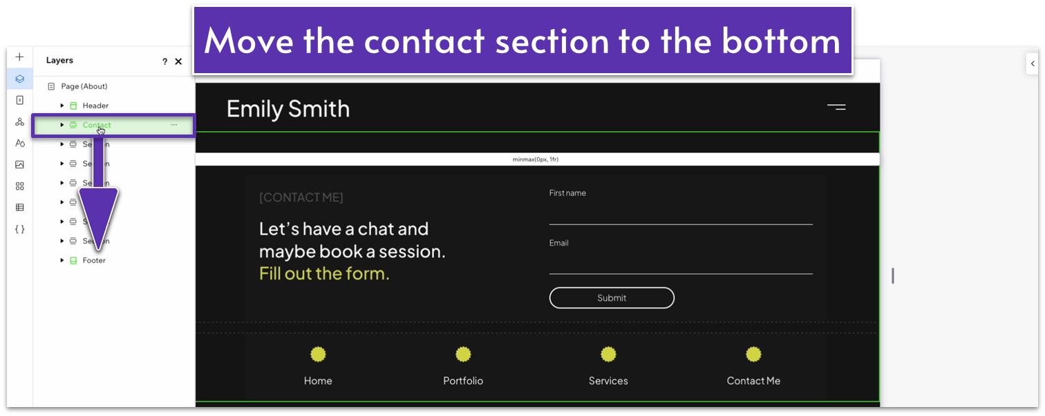
Step 3: Move the contact section into place.
Wix will automatically add the section to the top of the page. In order to rearrange it, simply go to the “Layers” menu and drag the “contact” section just above the footer.
Adapt for Tablet and Mobile Views
Since we already adapted this section for tablet and mobile viewings on the homepage, it shouldn’t need any further changes. However, we always recommend previewing new sections just to double-check.
