

Time to Complete Module: 4 hours
Last updated: 20 February 2025
IN THIS MODULE

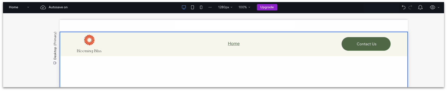
2.1 The Header
Each module in this guide includes instructions for building a specific page based on a sample design created by our Wix expert (Portfolio Website, Digital Agency, Local Business). You can switch to an alternative version of this module by clicking a different design in the left sidebar under “Alternative Designs.“
Adding a Logo to Your Header
Upload Your Logo From a File
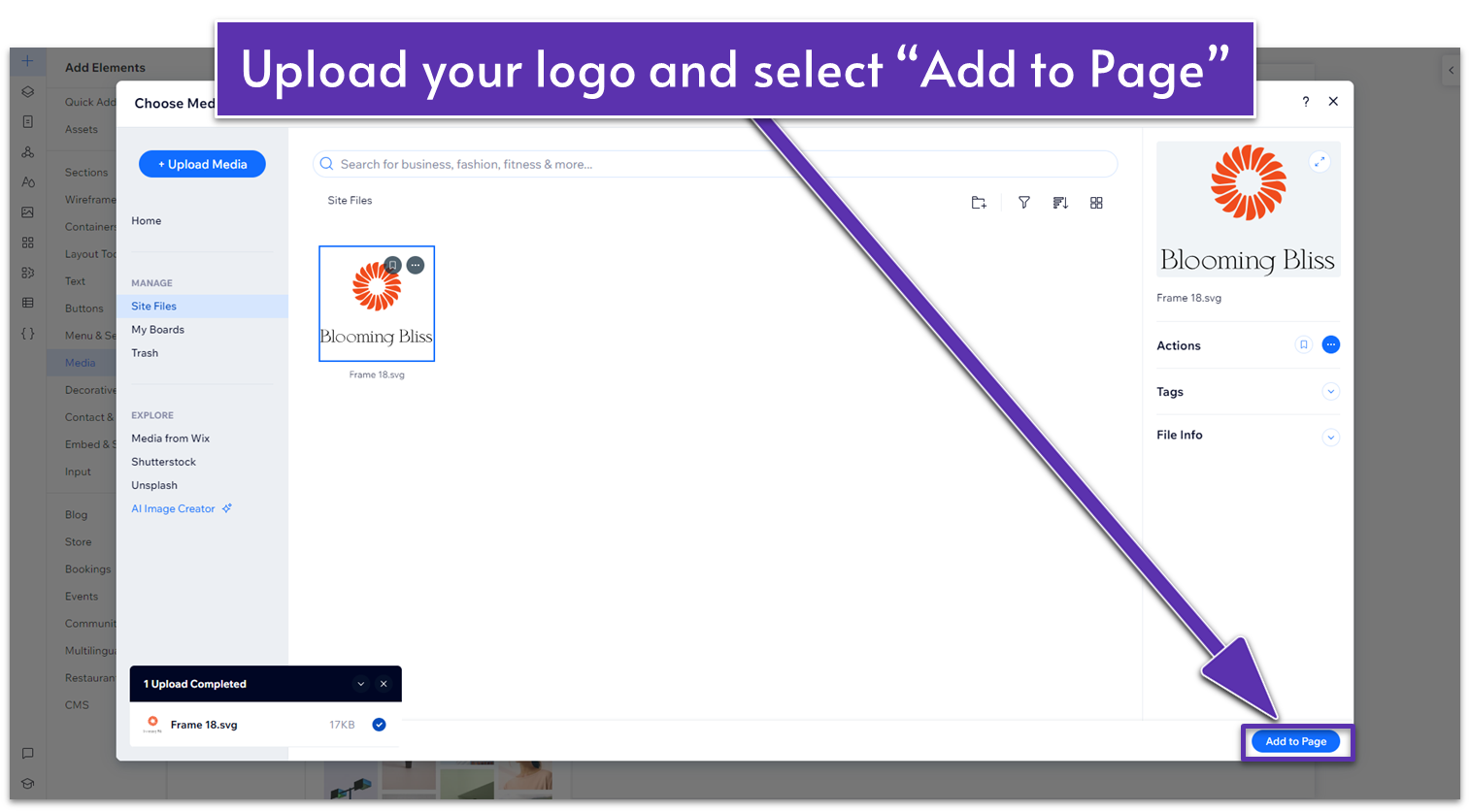
Step 1: Upload your logo to Wix.- Click on the “+” sign in the top left corner to open the Add Elements menu.
- Then, go to the “Media” tab, “My uploads,” and upload your logo.
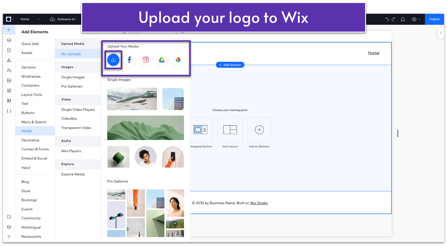
- Once your logo is uploaded, click the “Add to Page” button.
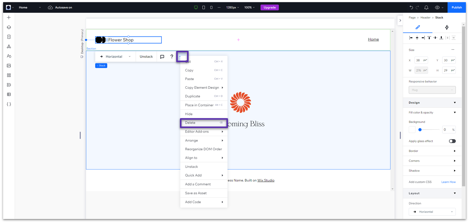
 Step 2: Delete the default logo.
- Select the stack for the default logo on your header.
- Delete it using the backspace or delete key or right-click on it and select “Delete” on the submenu.
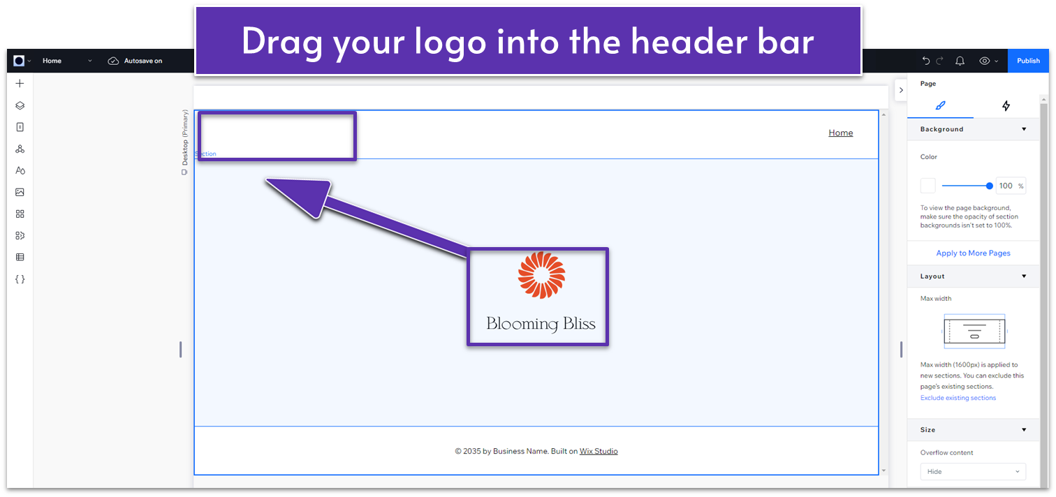
 Step 3: Resize your logo so it will fit nicely in the header area.
- You can change the size of your logo after it’s in the header, so don’t stress too much about this step.
- Click on your logo and drag it into the header.
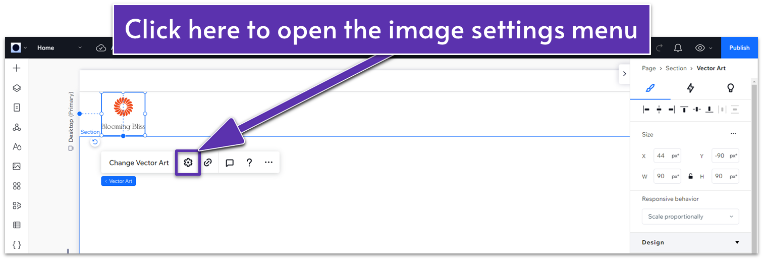
- Right-click on your logo.
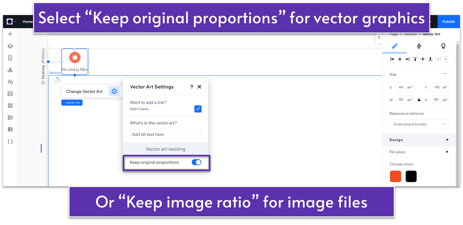
- Select the gear icon to open the “Image Settings” menu.
- Change the “Display Mode” to “Keep Image Ratio.”
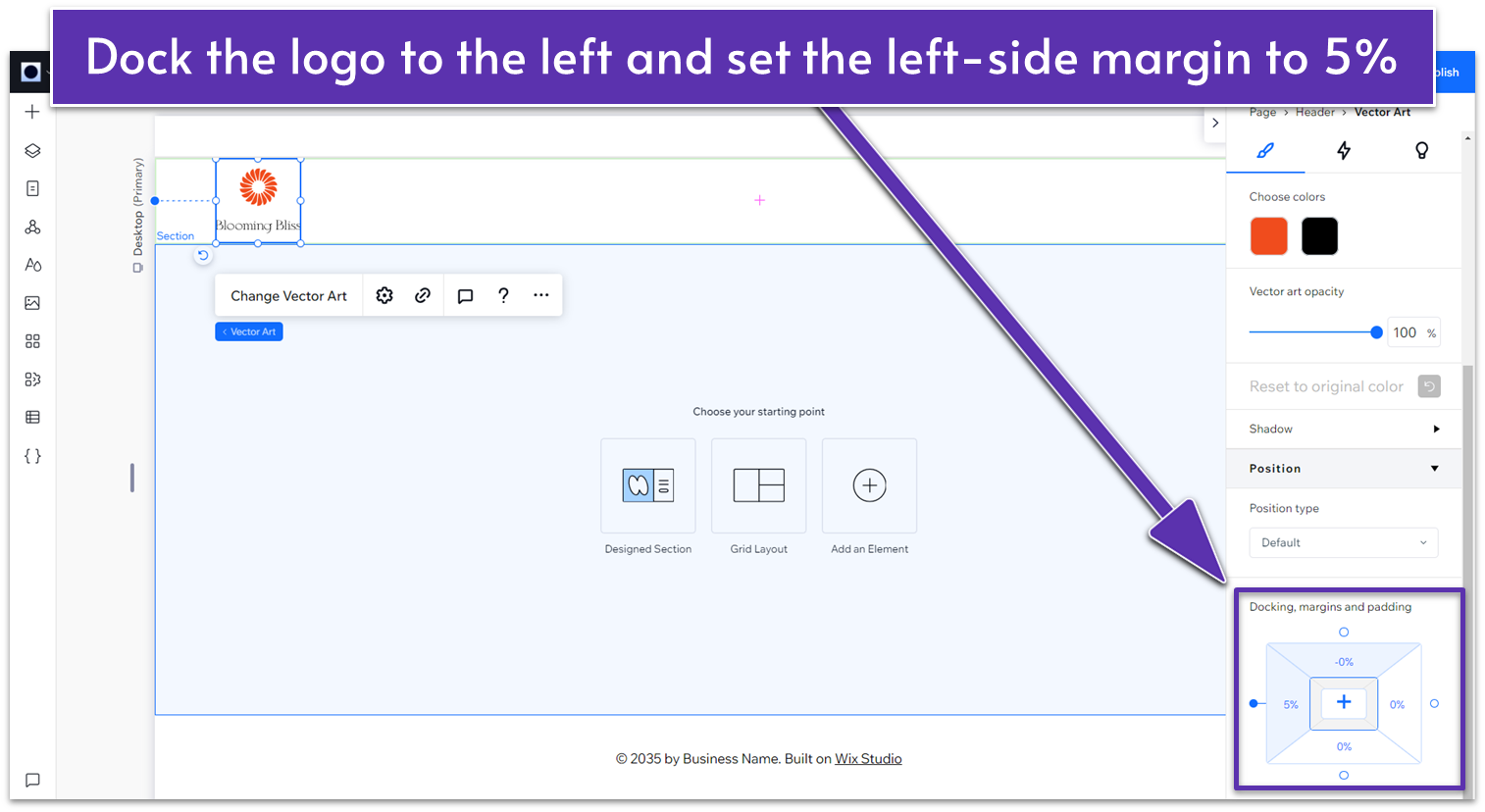
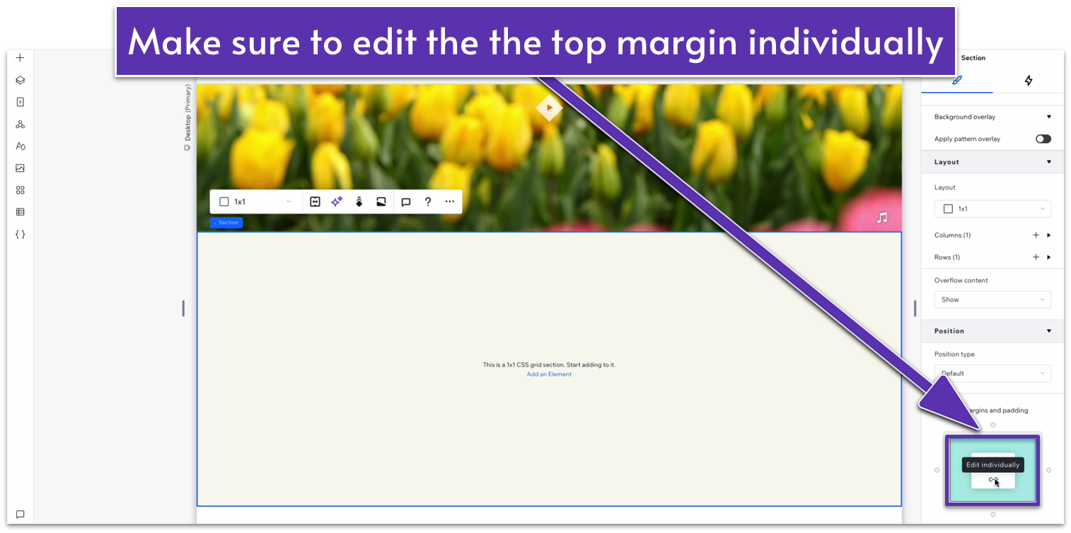
 Step 5: Format and position your logo.
- If needed, use the inspector menu (the menu on the right that we’ve been using to change an element’s properties) to scale your logo.
- In the Inspector menu, scroll to the “Position” submenu and find “Docking, margins and padding.”
- Click on where it says “0px” on the left side of the diagram to set the left margin to 5 and then set all other margins to 0.
- Click the dot next to “5%” on the left side of the diagram to dock the logo to the left.
 Below, I’ve included a quick guide to creating a text-based logo in Wix. But if you have your own logo already, feel free to jump to the next step.
Create Your Logo in Wix
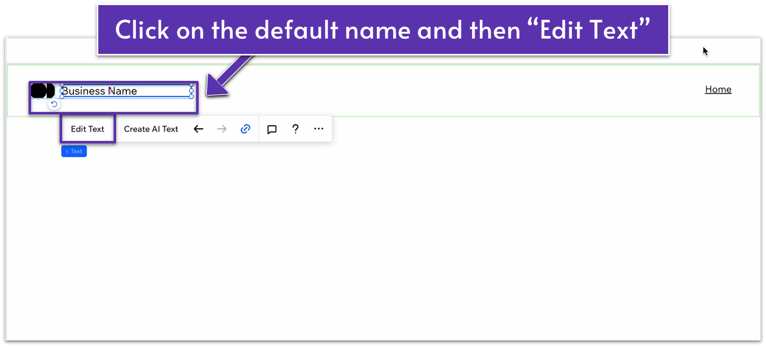
You can create a simple logo directly in the Wix Studio editor with the following steps: Step 1: Change the name on your header- Double-click on your header.
- Double-click again on the default “Business Name” text.
- Select “Edit Text” and change the name there to your own.
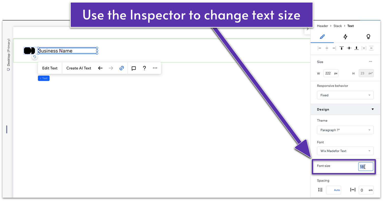
 Step 2: Make the font bigger
- On the right-hand popup menu, you can change the font size to make your text bigger or smaller.
- We don’t recommend making the font so big that it changes the size of the header box.
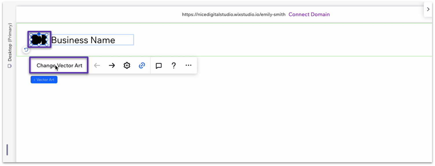
 Step 3: Change the vector art next to your name
- Double-click the symbol next to your business name and select “Change Vector Art.”
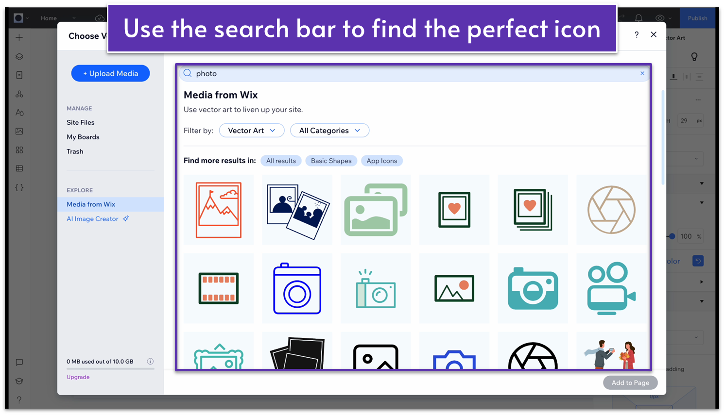
 Wix offers a huge library of vector graphics, so you can either use the search box to find something you like or browse by category until something catches your eye.
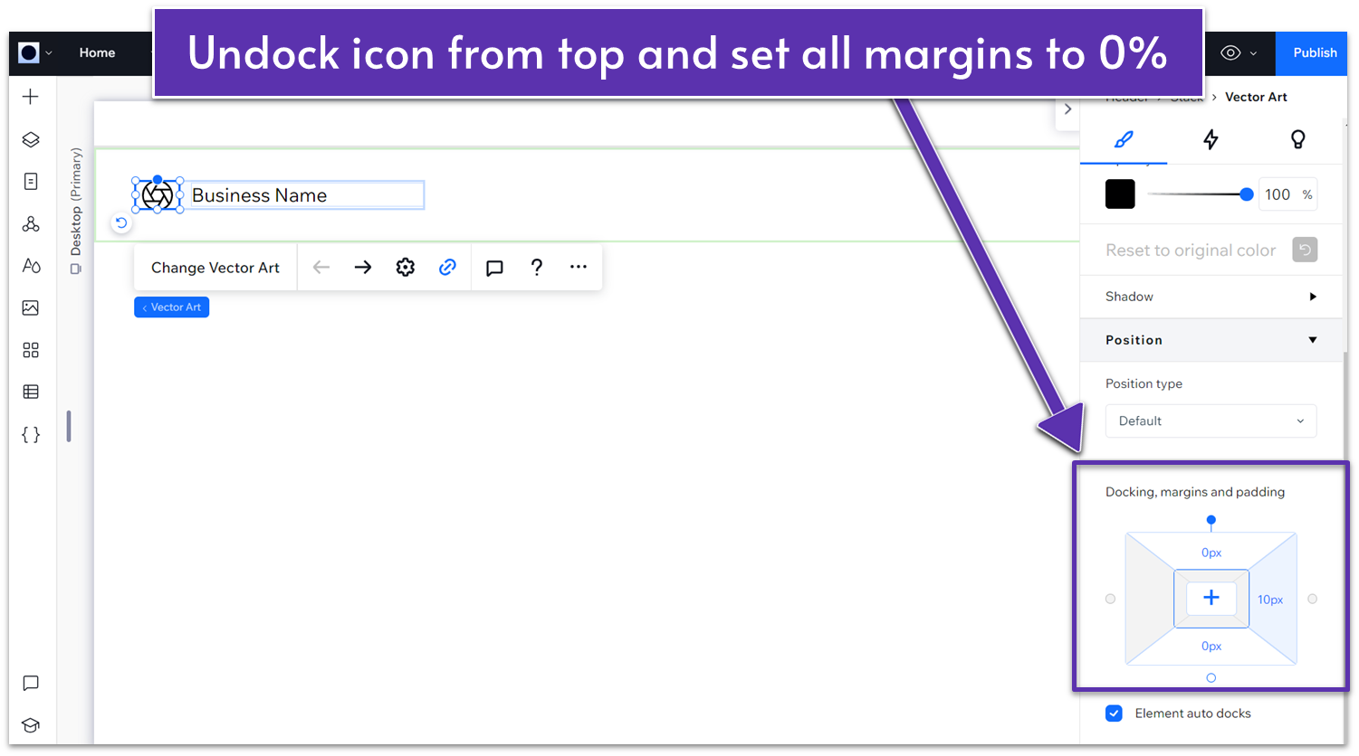
 Step 4: Center the Icon
- On the “Position” submenu, click on the little circle in the “Docking, margins, and paddling” diagram to detach it from the top.
- Set all margins to zero.
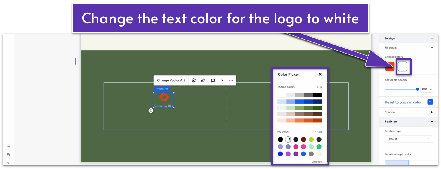
 Step 5: Choose the colors for your icon and text
- Using the “Design” submenu, choose the color you want for the icon and text.
Change Header Background Color
Step 1: Click on the header area at the top of your page to select it.- In the inspector menu, head over to “Design.”
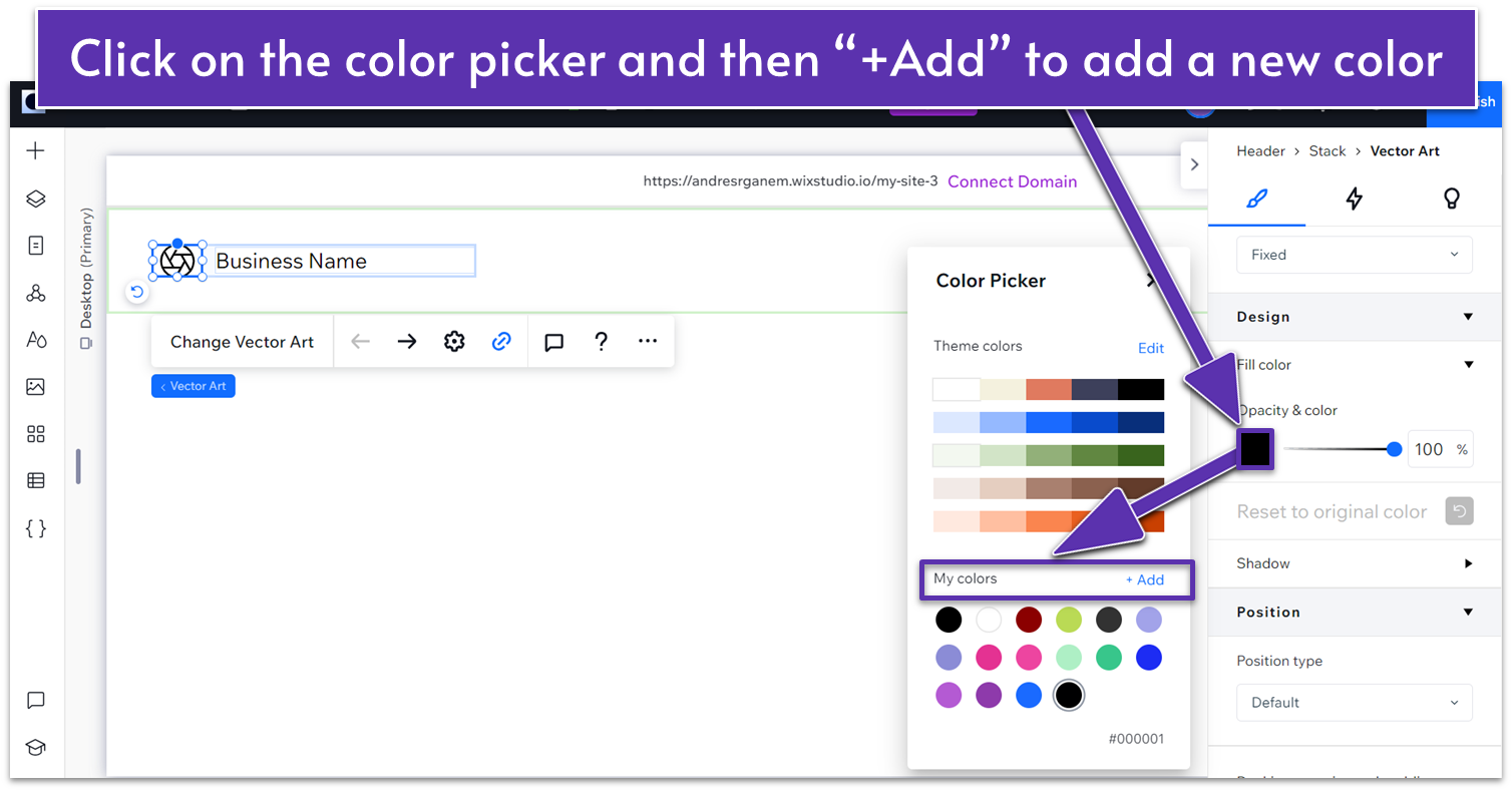
- Click on the color to open the “Color Picker”.
- Choose one of the preset colors from the palette you set up earlier.
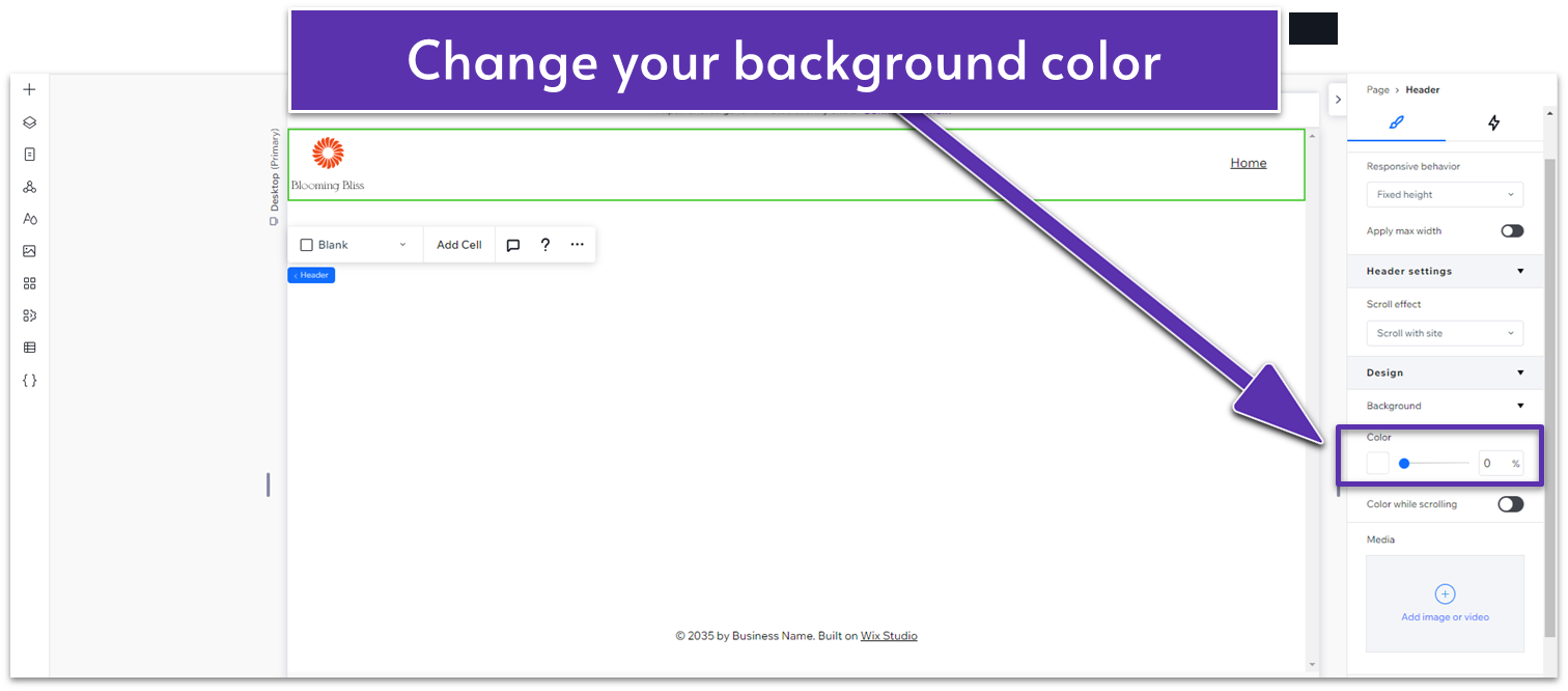
- If you want to change it to a specific color, click the color picker.
- Then, click on the “+Add” button on “My Colors.”
- Select a custom color visually or input its exact color code (e.g., HEX or RGB).
- We used (HEX): #F9F9F1 for this site.
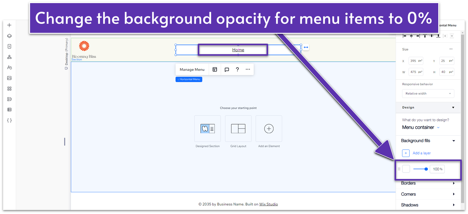
- In the menu inspector, select “Menu Items.”
- Change the background opacity to 0%.
Customize the Menu
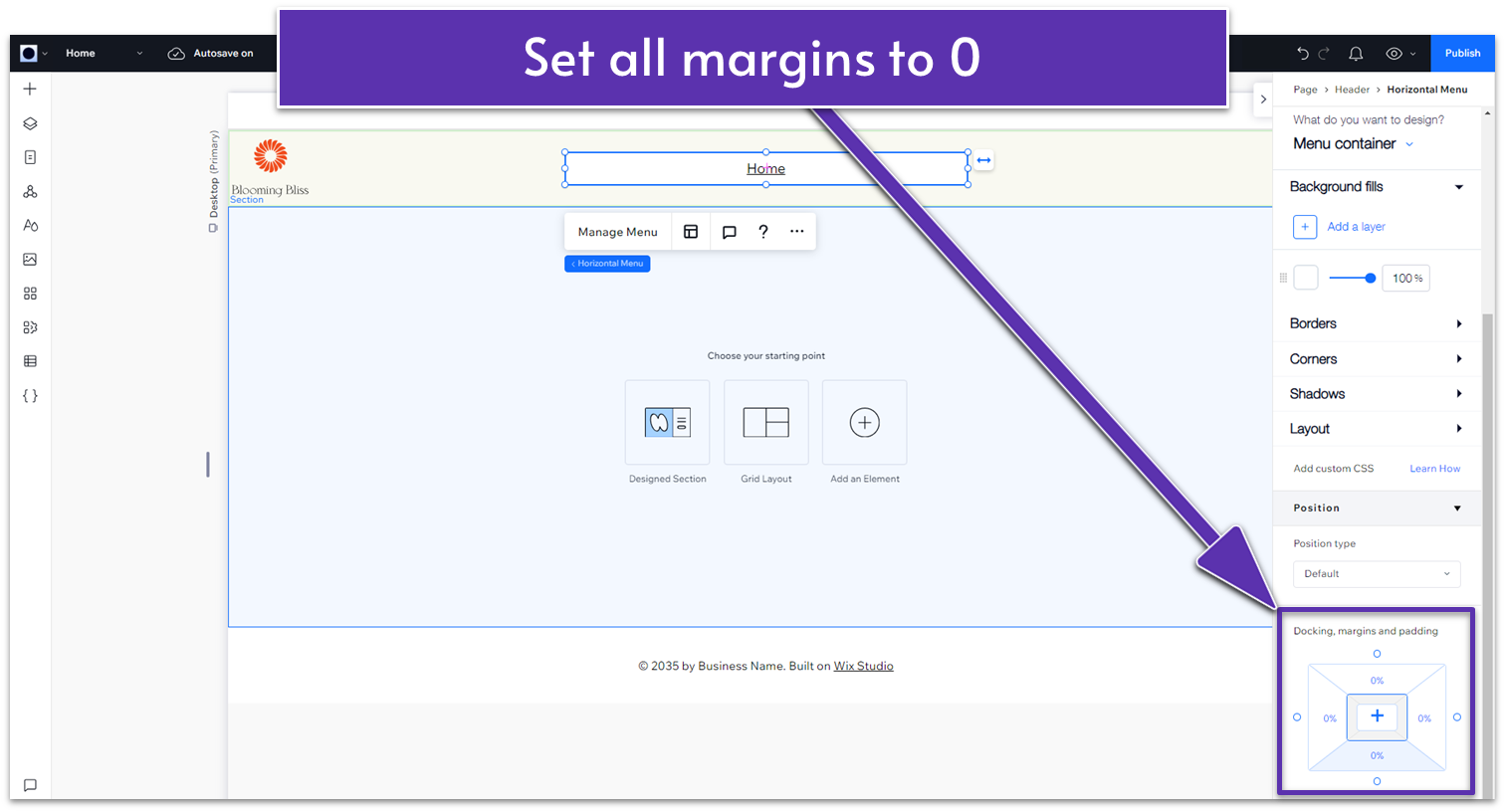
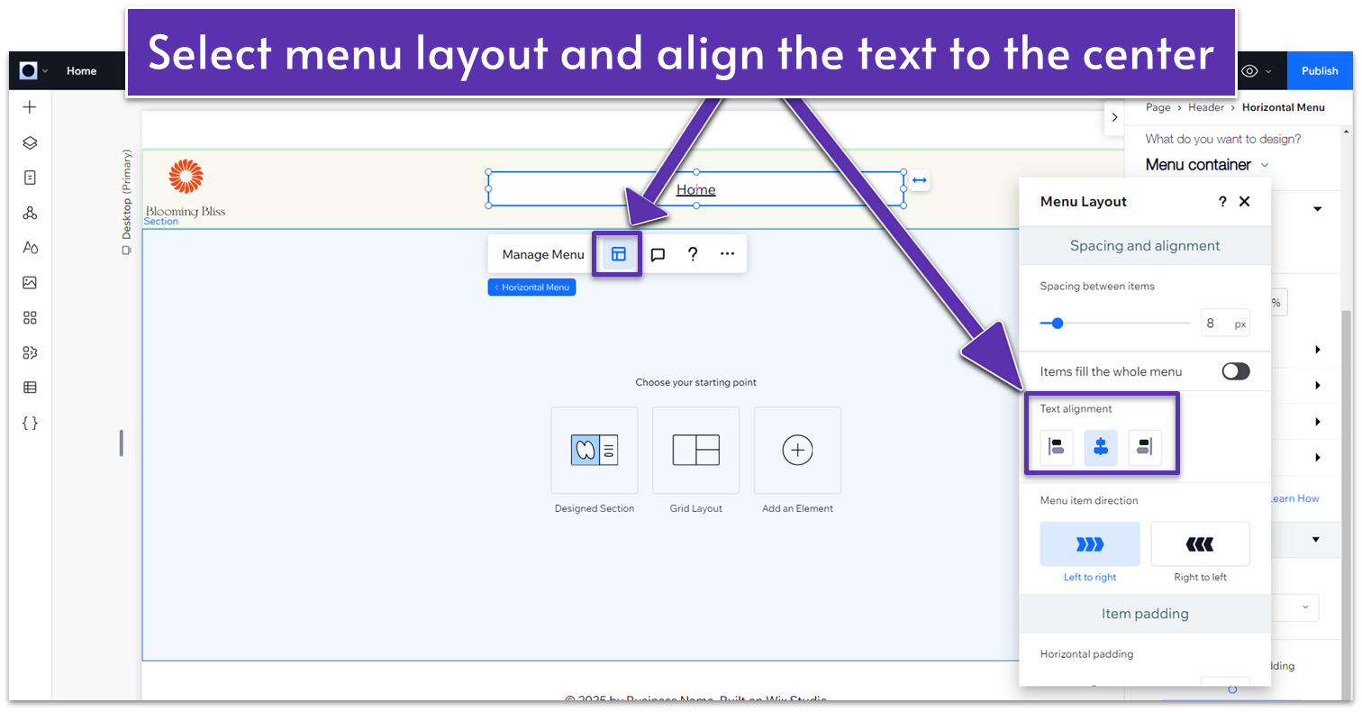
Step 1: Move the menu to the center of the header.- Open the Inspector menu for the default menu.
- Go to “Docking, margins and padding” and set all margins to zero.
- Then, click on the icon that looks like a sectioned page to open the “layout” menu.
- Scroll down until you see the “Text alignment” option.
- Set the menu alignment to the center.
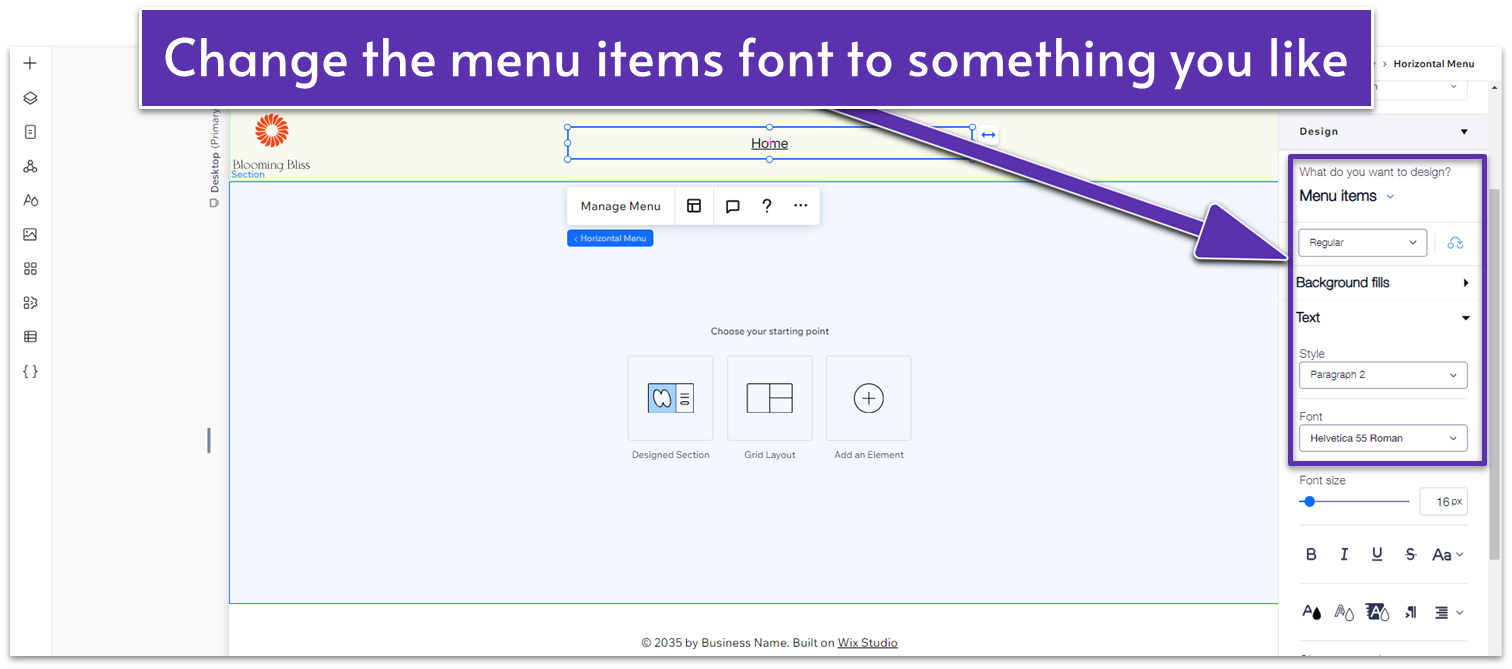
 Step 2: Change the menu’s font.
- Go to the inspector.
- Select “Menu Items” under the “What do you want to design?” prompt.
- Scroll down to the font, and change it to Helvetica Neue Roman, 16px, or something you like.
 Step 3: Design a Hover Effect.
This hover effect will change the color of the menu text when a visitor hovers over a menu item. We’ll also set it to change the color of the menu item based on which page the user is on.
Step 3: Design a Hover Effect.
This hover effect will change the color of the menu text when a visitor hovers over a menu item. We’ll also set it to change the color of the menu item based on which page the user is on.- Go back to the inspector.
- Under the “What do you want to design?” prompt, choose “Hover”.
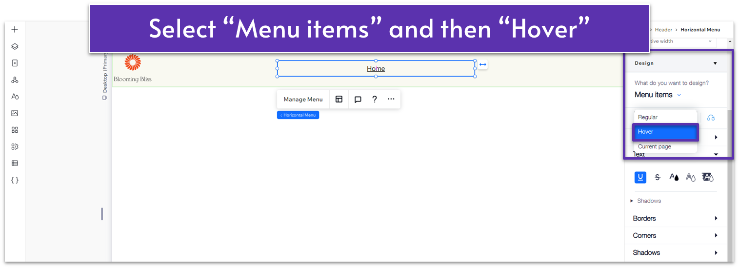
- Change the font color to (HEX): #5C7452.
- Go back to the menu and change the behavior from “Hover” to “Current page.”
- Select the same color as the “Hover” option.
- Drag the edges of the menu box so it’s properly centered. You’ll see grid lines that will let you know when the box is centered.
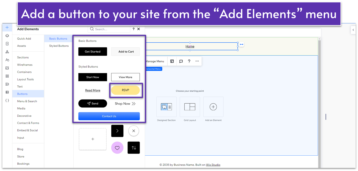
Adding the Button to Your Header:
Step 1: Choose and add your button.- Go to the “Add Elements” menu, then “Buttons,” and select a button design you like. We used the default “RSVP” button.
- Change the button width to 180 and the height to 50 by dragging the edges of the icon.
 Step 2: Change your button properties.
- Go to the Inspector and change the background color to (HEX): #5C7452.
- Go to the “Text” submenu in the inspector and change the font text color to (HEX): #FFFFFF.
- Scroll down to the “Borders” submenu:
- Change borders to 1px
- Change color to (HEX): #5C7452.
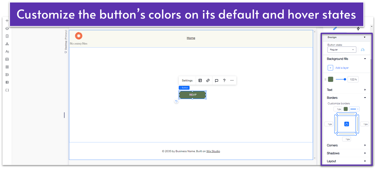
- Scroll up and change the button state to hover.
- Change the background color to (HEX): #5C7452 and set the opacity to 80%.
- Change the border color to (HEX): #5C7452.
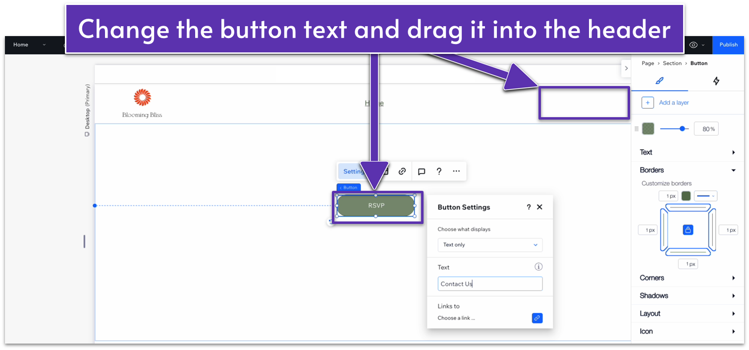
- Double-click the button to open the “Settings” menu.
- Change the text to “Contact Us.”
- Drag the button into the header bar and set the right margin to 5%.
- We’ll link this button to the contact page after we’ve created it.
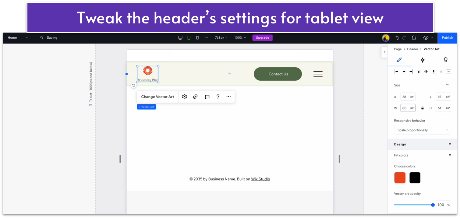
Adapting the Header for Tablets and Phones
Because we’ve added a button to the header, we’ll need to make some changes so everything still looks pretty on tablets and mobile devices. The good news is that Wix automatically swaps out a horizontal menu for a hamburger on smaller screens, so you don’t need to worry about those extra steps. Step 1: Move the button slightly to the left in tablet view.- Click the icon on the top of the screen to switch to tablet view.
- Drag the button a little to the left so the spacing looks nicer.
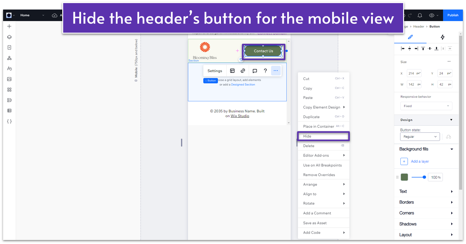
 Step 2: Hide the button in mobile view.
- Click the icon on the top of the screen to switch to mobile view.
- Double-click on the button and then on the three dots symbol (or right-click on the button).
- Choose the option to hide the button.
2.2 The Hero Section
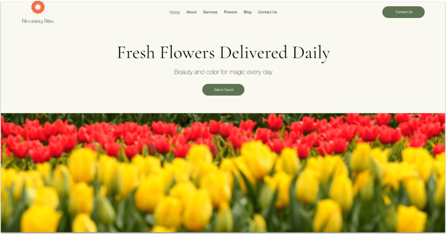 The hero for our local business site will be really simple. Its only job is to convey the brand’s voice and include a short CTA for people to reach out.
Designing the Hero Section
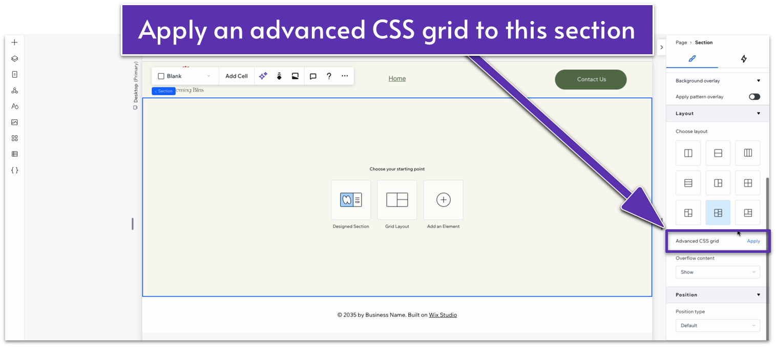
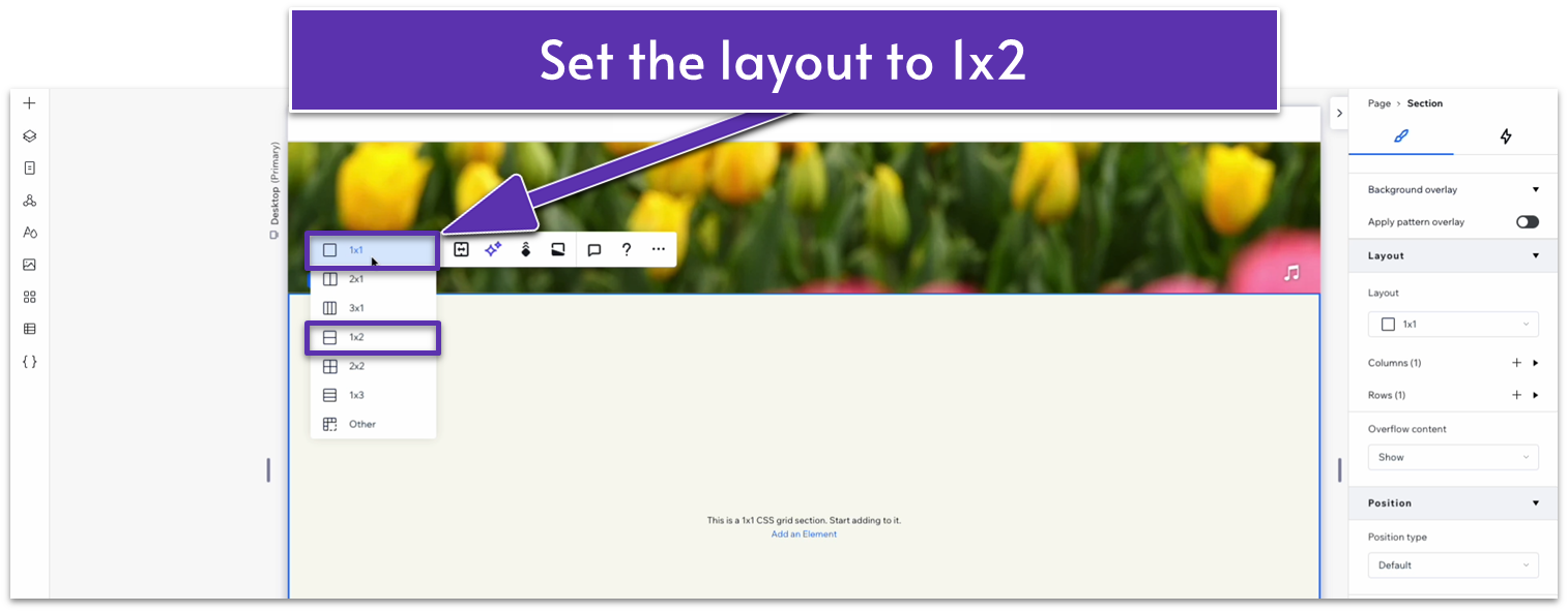
Step 1: Add a blank section and change the background color.- Start by selecting the blank section below the header, or add a new one by clicking on the “+ Add Section” button under the header.
- Open the inspector and change the background to HEX: #F9F9F1.
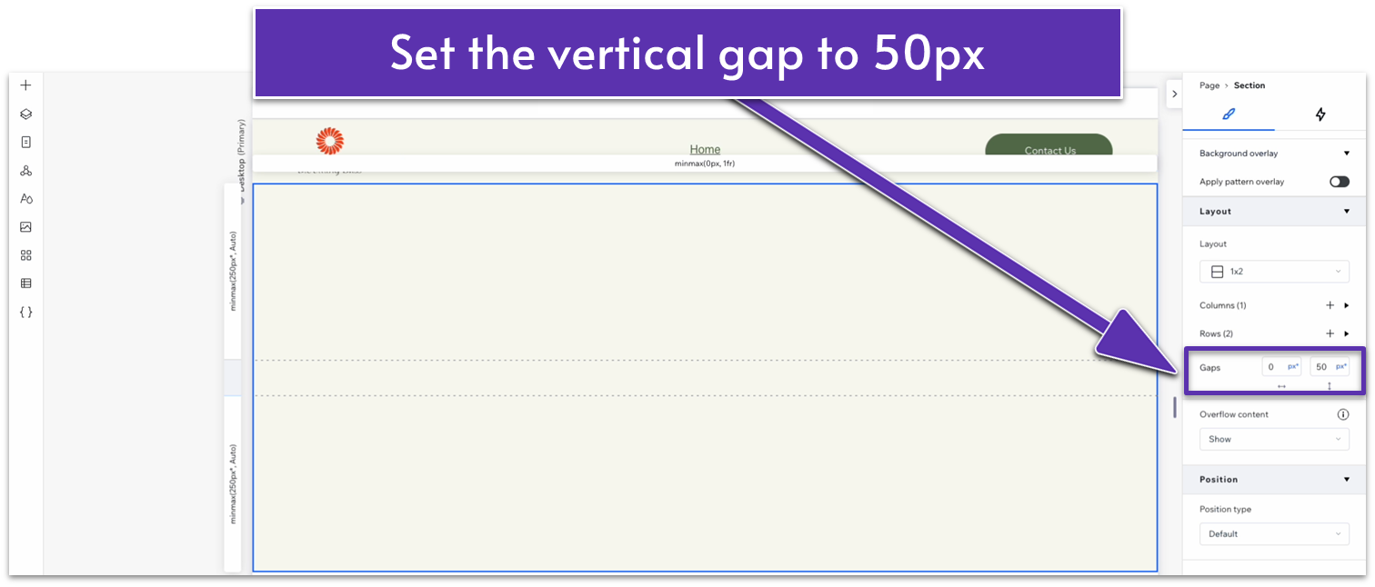
- In the Inspector, click “Apply” next to “Advanced CSS grid.”
- Then, select the icon on the upper left corner and change the grid layout from 1×1 to 1×2.
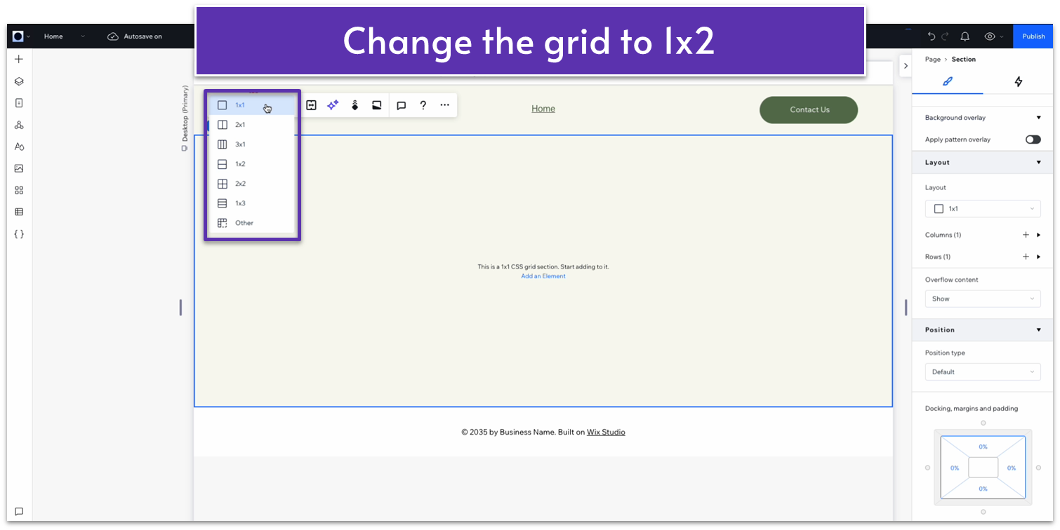
- Head to the “Gaps” option under “Layout” and set the vertical gap to 50px.
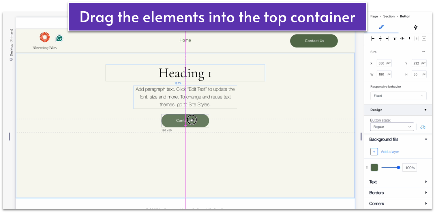
 Step 3: Add a heading, paragraph, and button to the top container.
- Click “+ Add Element” and add a heading and paragraph element.
- Add a copy of the “Contact Us” button from the header.
- Double-click the button.
- Click the 3 dots to open the menu.
- Copy the button.
- Right-click anywhere in the top container.
- Paste the button.
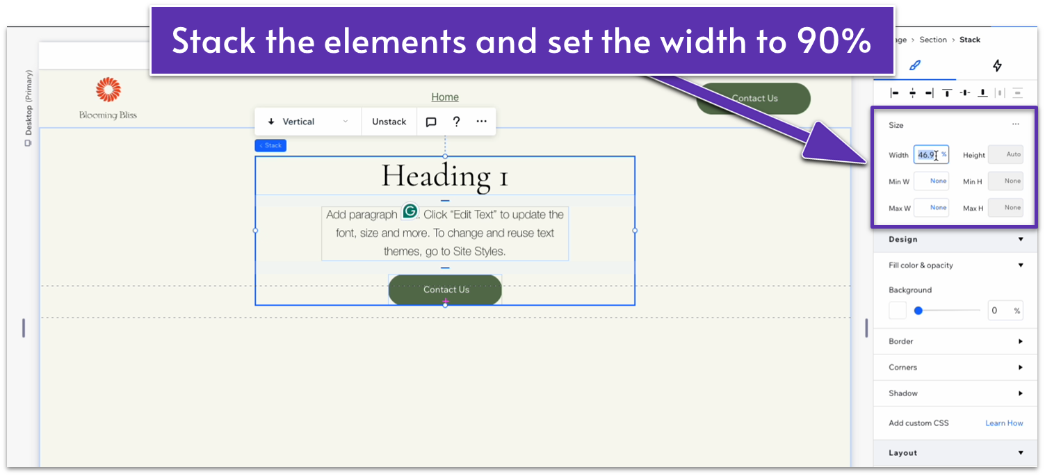
 Step 4: Organize and stack these elements.
- Use the grid lines to center the heading, paragraph, and button.
- Select all three elements and click “Stack” to stack them together.
- Toggle “Advanced Settings” for spacing, and set the width for the whole stack at 90%.
- Undock each element from all corners in the “Docking, margins and padding” diagram.
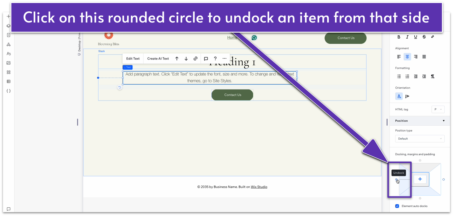
- Set the bottom margin for the heading at 10px, the bottom margin for the paragraph at 20px, and all other margins at 0%.
- Click the button.
- Go to button settings.
- Change the text to “Get in Touch.”
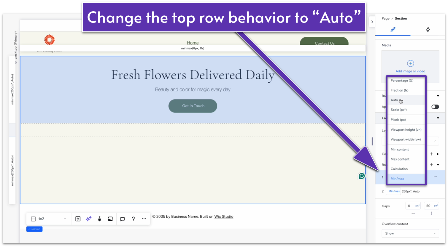
- Open the Inspector for the container.
- Head down to “Rows” under “Layout.”
- Change the behavior for the top row from “Min/max” to “Auto.”
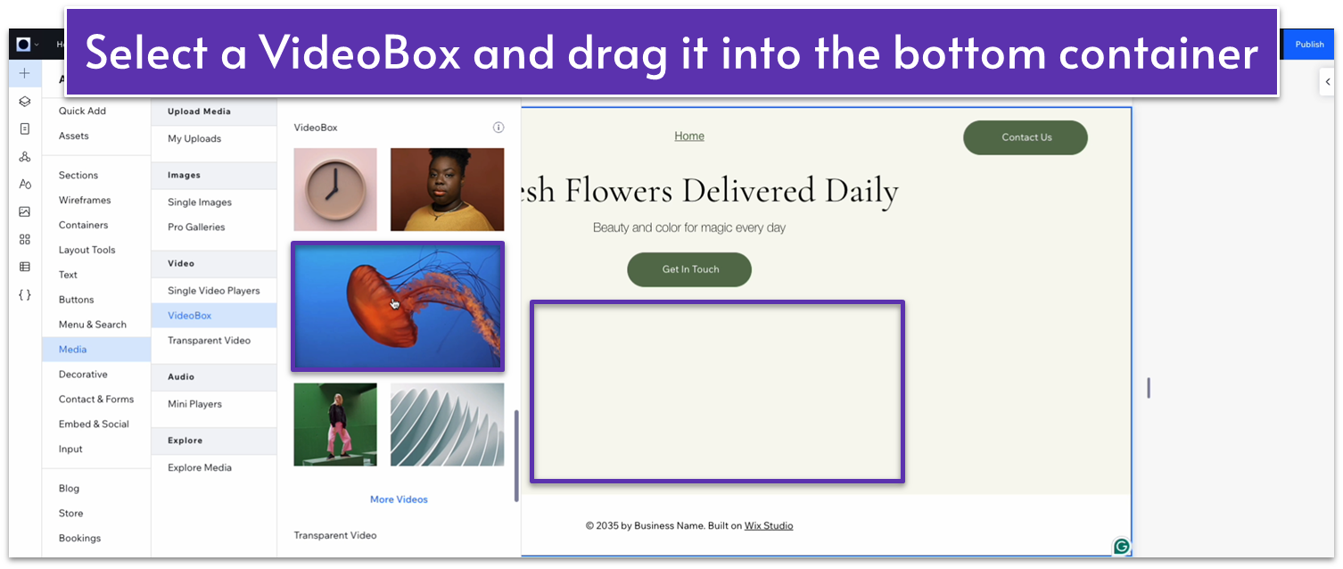
 Step 7: Add a video to the bottom container.
- Upload a video to Wix in the “My Uploads” area, or select one from the Wix library.
- Using the “Add Elements” menu, choose “video box” and drag it into the bottom container.
 Step 8: Change the video box properties.
- Open the Inspector menu for the video box, and:
- Undock the video box from all sides and set all margins to 0%.
- Toggle advanced sizing settings on and set width and height to 100%.
- Open the video box settings by clicking on the gear icon.
- Select “Change Video.”
- Choose the video you uploaded to Wix and click “Update.”
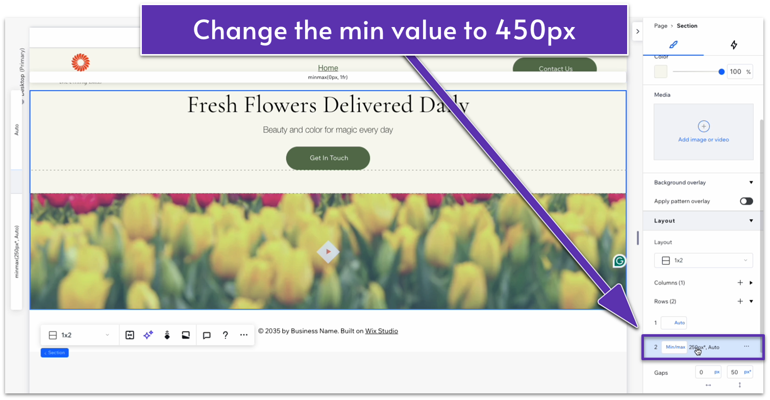
- In the Inspector for the whole section, select the bottom row.
- Change the min value from 250px to 450px.
 Step 11: Add some padding to the entire hero section.
- Open the Inspector for the entire section and add a padding of 50px to the top.
- Head to advanced sizing options and toggle off “Apply max width.”
Adapting This Hero for Tablets and Phones
Looking at this hero using the tablet and mobile views, it looks pretty okay for both already. We changed the padding, margins, and font sizes, but there were no significant changes to make.Tablet
These are the settings we changed for the tablet version of the hero:- Heading font size: 32px
- Heading bottom margin: 12px
- Paragraph font size: 16px
- Paragraph bottom margin: 20px
- Button height: 45px
- Bottom row Min size value: 300px
Mobile
These are the settings we changed for the tablet version of the hero:- Heading font size: 28px
- Heading bottom margin: 10px
- Paragraph font size: 14px
- Paragraph bottom margin: 20px
- Layout vertical gap size: 30px
- Bottom row Min size value: 250px
2.3 “Our Story” Section
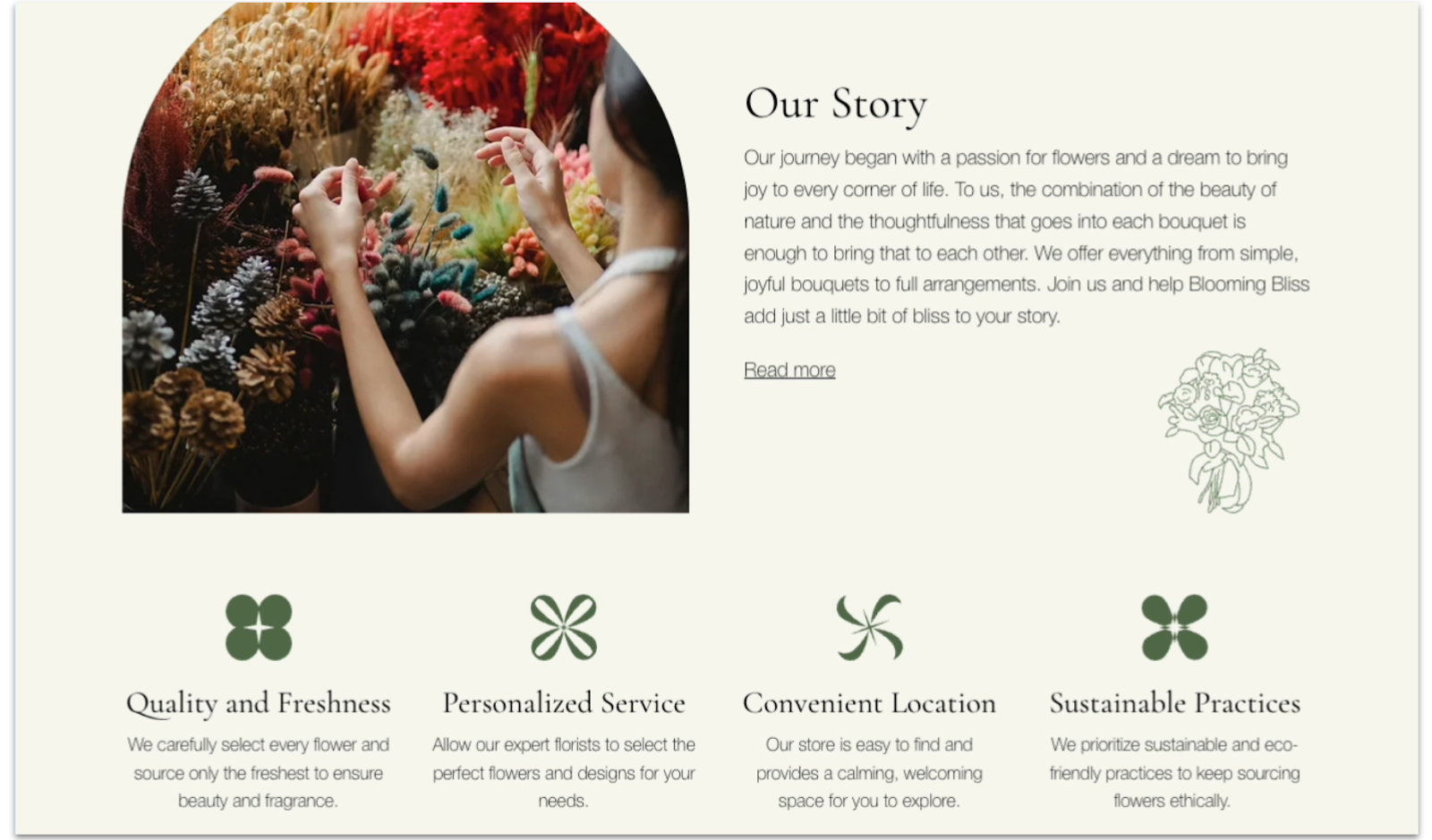 Since we’re trying to convey a more personal feeling with this website and reach customers directly, we’ve tweaked this About section to be more personal than a larger non-local business. We included a little back story and some of our business’s unique benefits.
Adding Photo, Text, and Graphics
Step 1: Create a new section and divide it into two parts.- Click the plus button below the hero section to add a new section.
- Set the background color to #F9F9F1 (HEX) this will be the default background color for all sections unless stated otherwise.
- Apply an advanced CSS grid and set the top padding to an 80px scale.
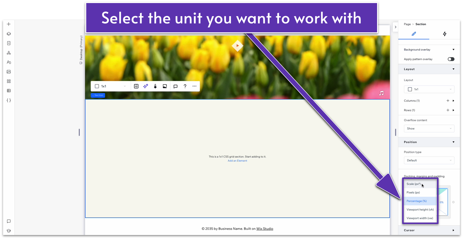
- To change the unit of measurement in the Docking, margins and padding menu, click on the number value where you want to make the change.
- Then click the icon that looks like a chain link.
-
- Click the unit of measurement to bring up the menu, then choose which unit you want to change to. In this case, click “Scale(px).”
- Set the vertical gap between rows to 50px.
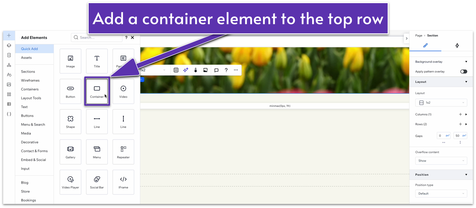
- From the Add Element menu, drag a container into the top row of the section.
- Fix its location in grid cells to the top row.
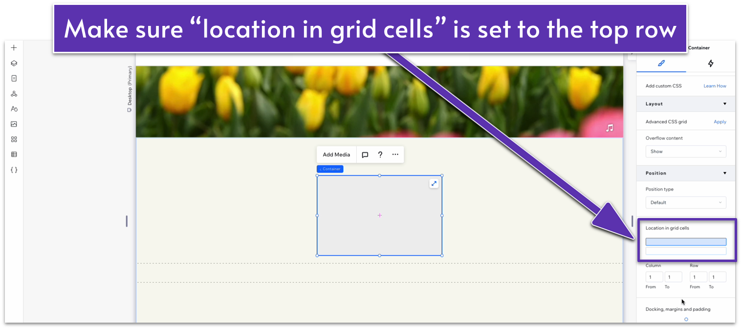
- Center it by setting all margins to 0 in the Docking, margins and padding diagram.
- Apply an advanced CSS grid.
- Change its width to 1080 px.
- Set the background opacity to 0% to remove the container’s background.
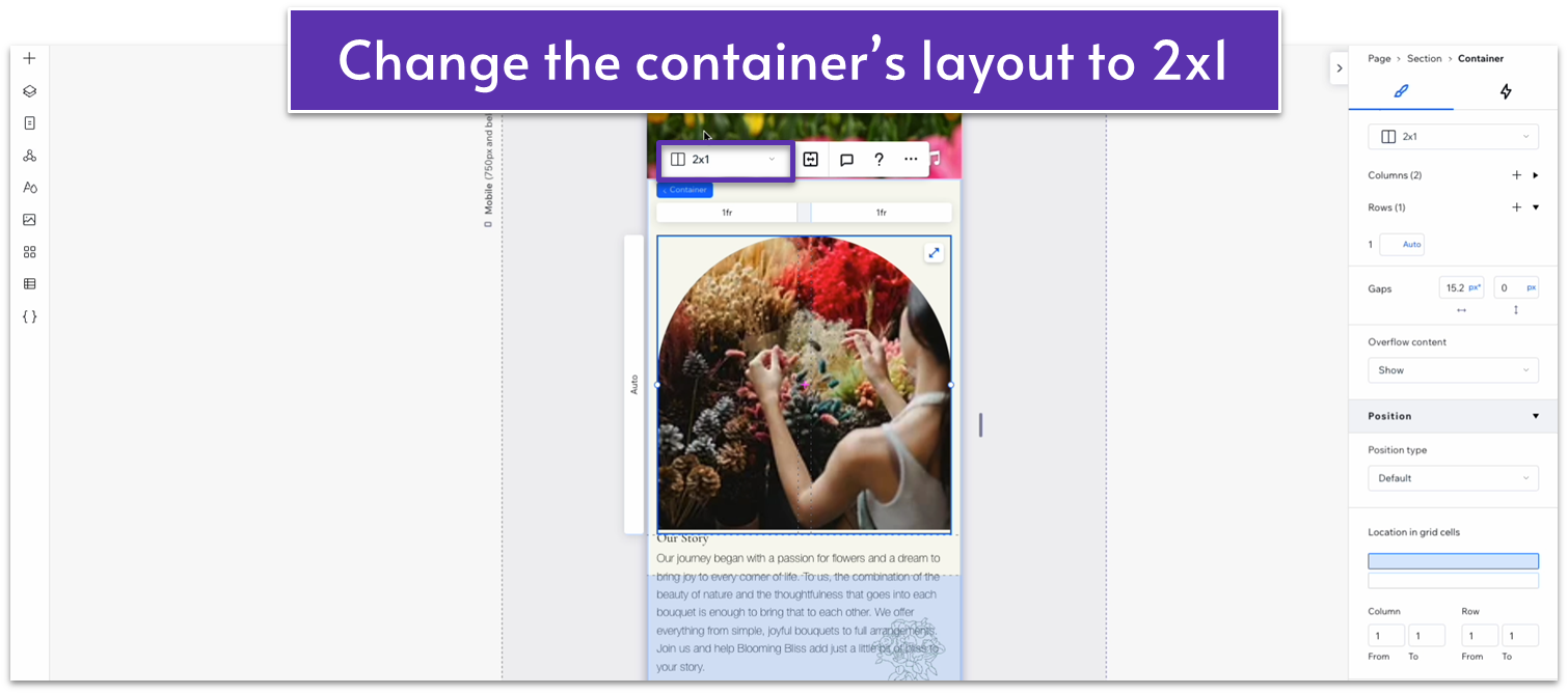
- Set the container’s layout to 2×1.
- Set the horizontal gaps between columns to 50px.
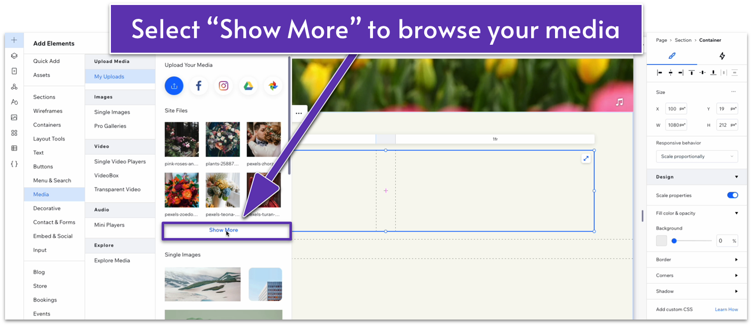
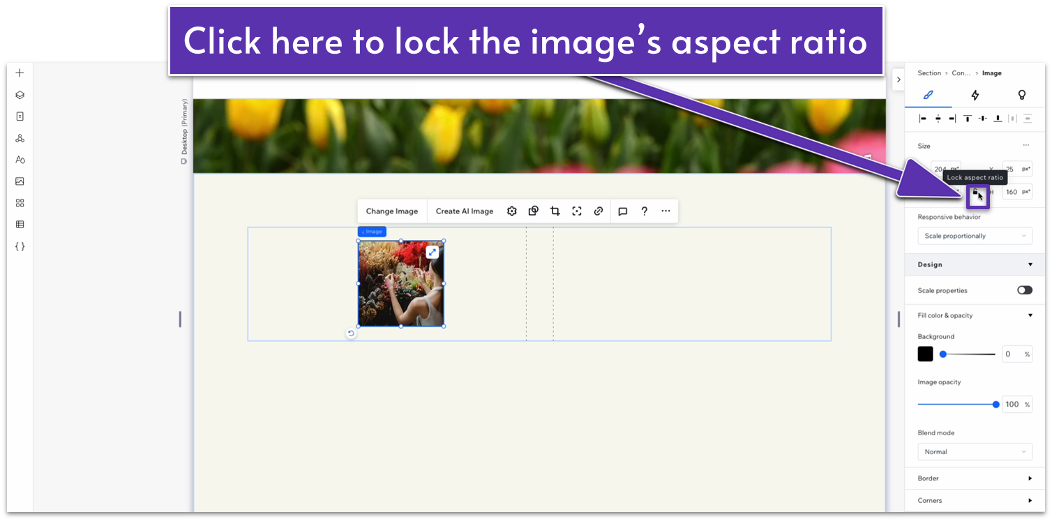
- Select an image for this section and drag it into the left-side column.
- Scale down the image and use the grid lines to align it to the section’s center.
- Drag the image’s sides to set its width and height to 160.
- Head over to the size menu and click on the lock icon to lock that aspect ratio.
- Drag the image to the top-left corner of the column
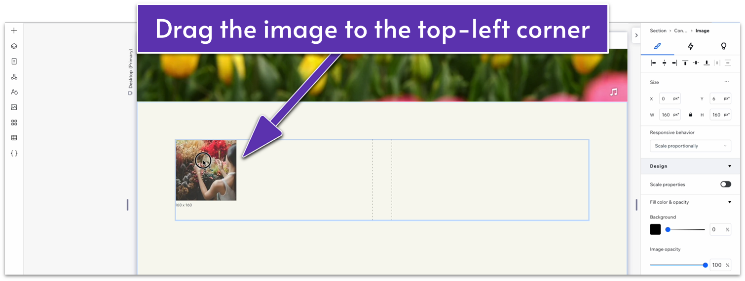
- Scale the image until its width is aligned with the edge of the column.
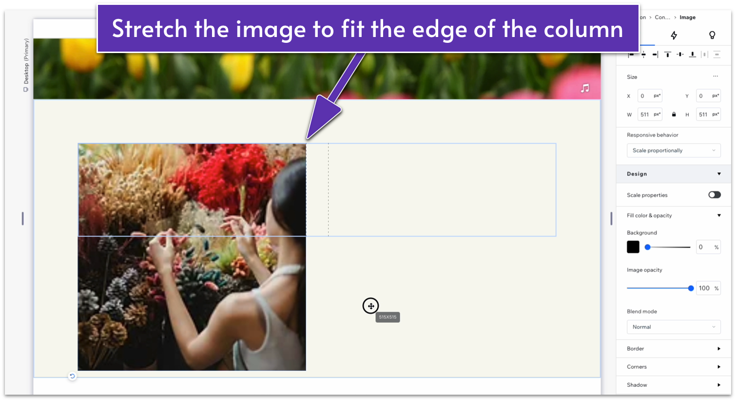
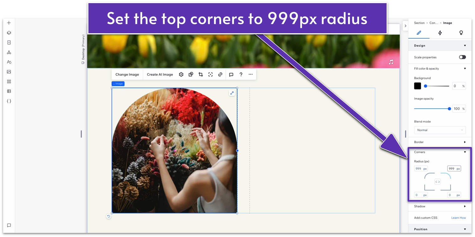
- On the “docking, margins and padding” menu, dock the image to the right margin and undock it from all other margins.
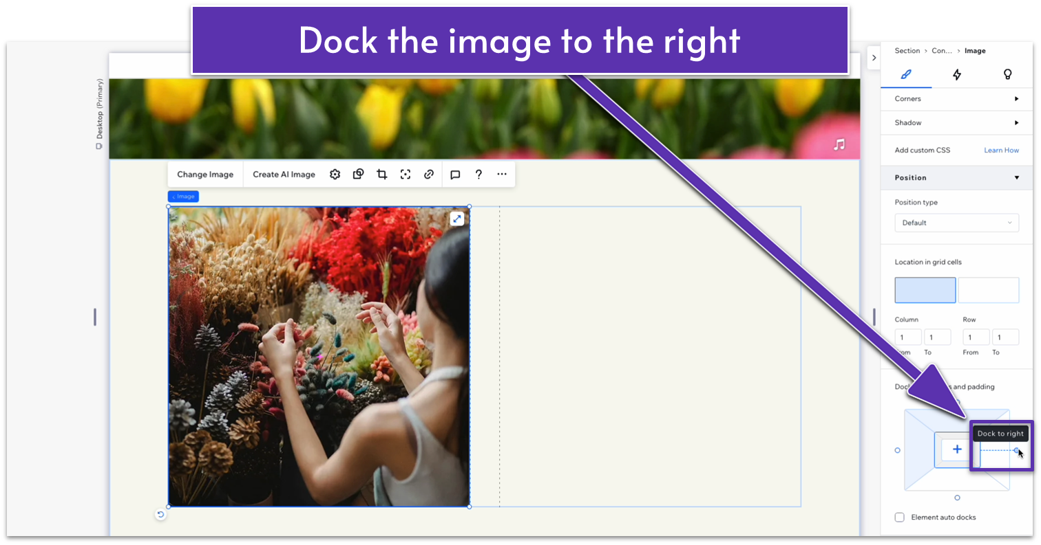
- In the inspector, head to “Corners.” Unlink the corners and set the corner radius for the top two corners to 999px.
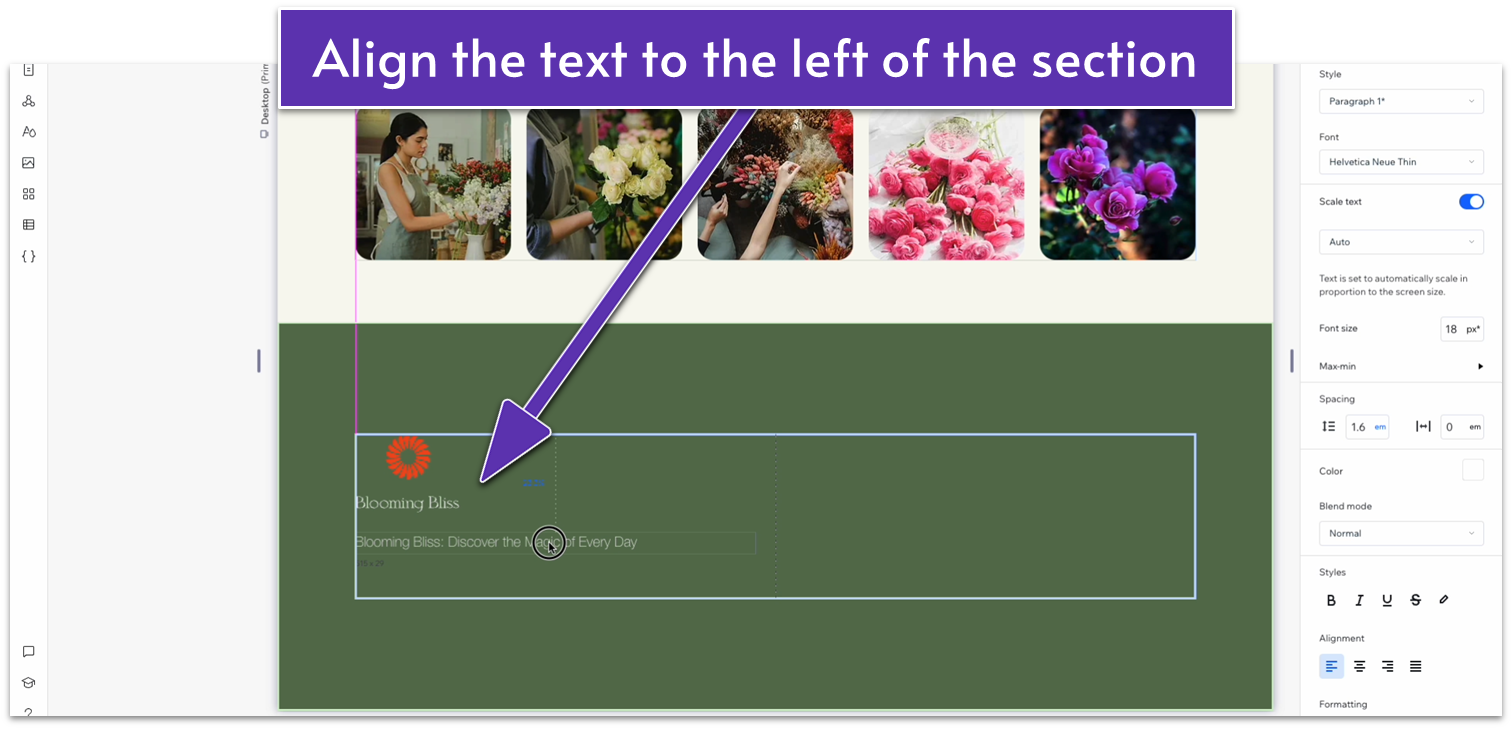
 Step 4: Add the “Our Story” text to the right side of the container.
- Copy and paste the title heading from the header section into the right-side column.
- Stretch the text box to fit into the right-side column.
- Change its style from “Heading 1” to “Heading 2” below “Style” in the inspector.
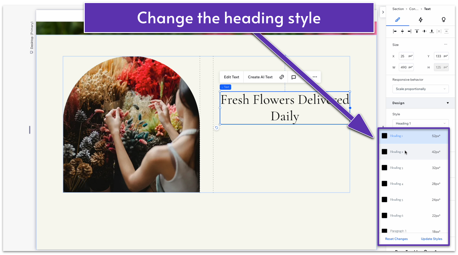
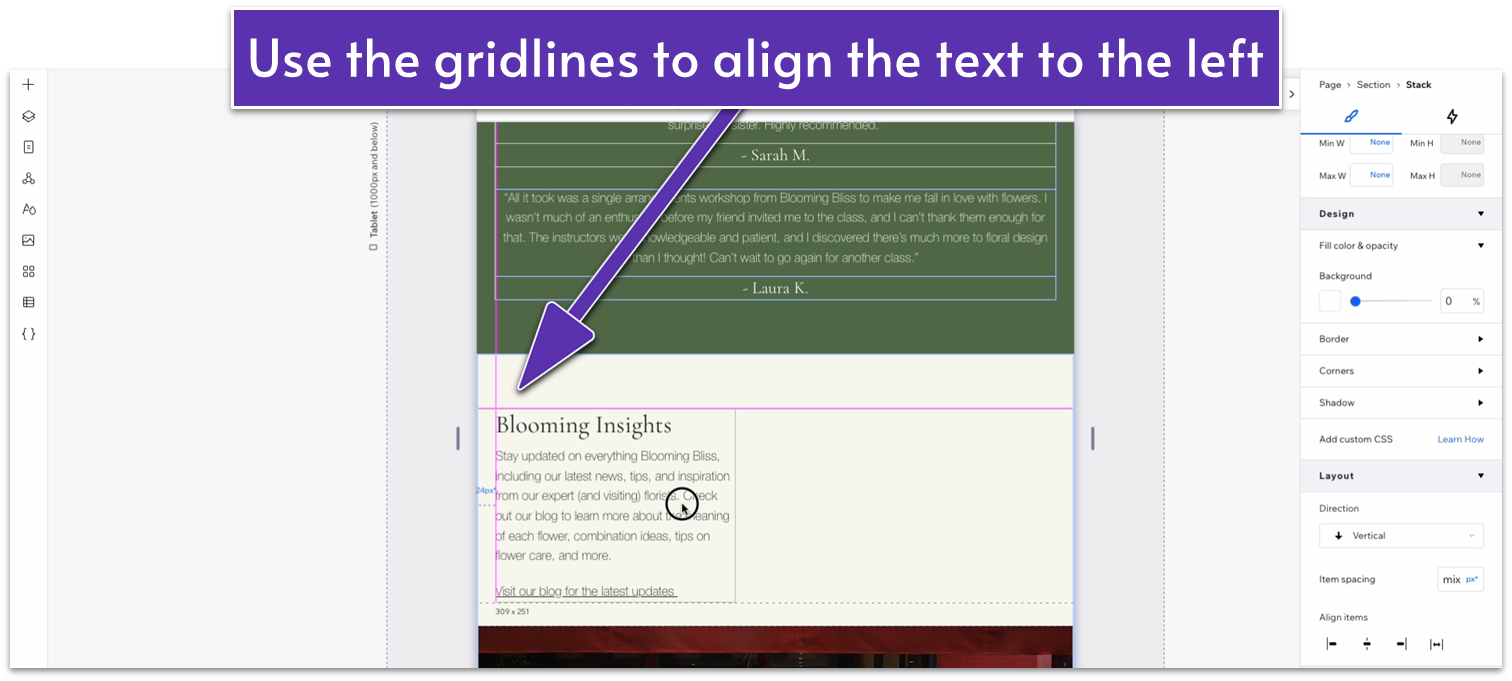
- Align the text to the left and replace it with something that fits the section.
- Drag the text box to align it with the upper-left corner of the right-side column.
- Copy and paste the text below the hero’s heading into the right-side column.
- Stretch the text box to fit that column, align the text to the left, and then duplicate it.
- To duplicate an element, double-click on the element, click on the three dots, then choose duplicate.
- Move the duplicated text down.
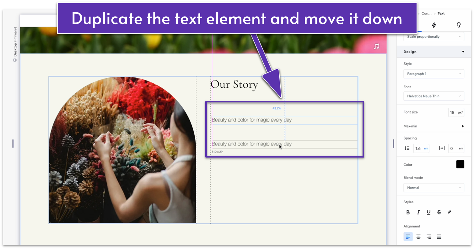
- Replace the middle text for the brief paragraph with your business’s story.
- Use command/ctrl to select all 3 text elements and stack them together.
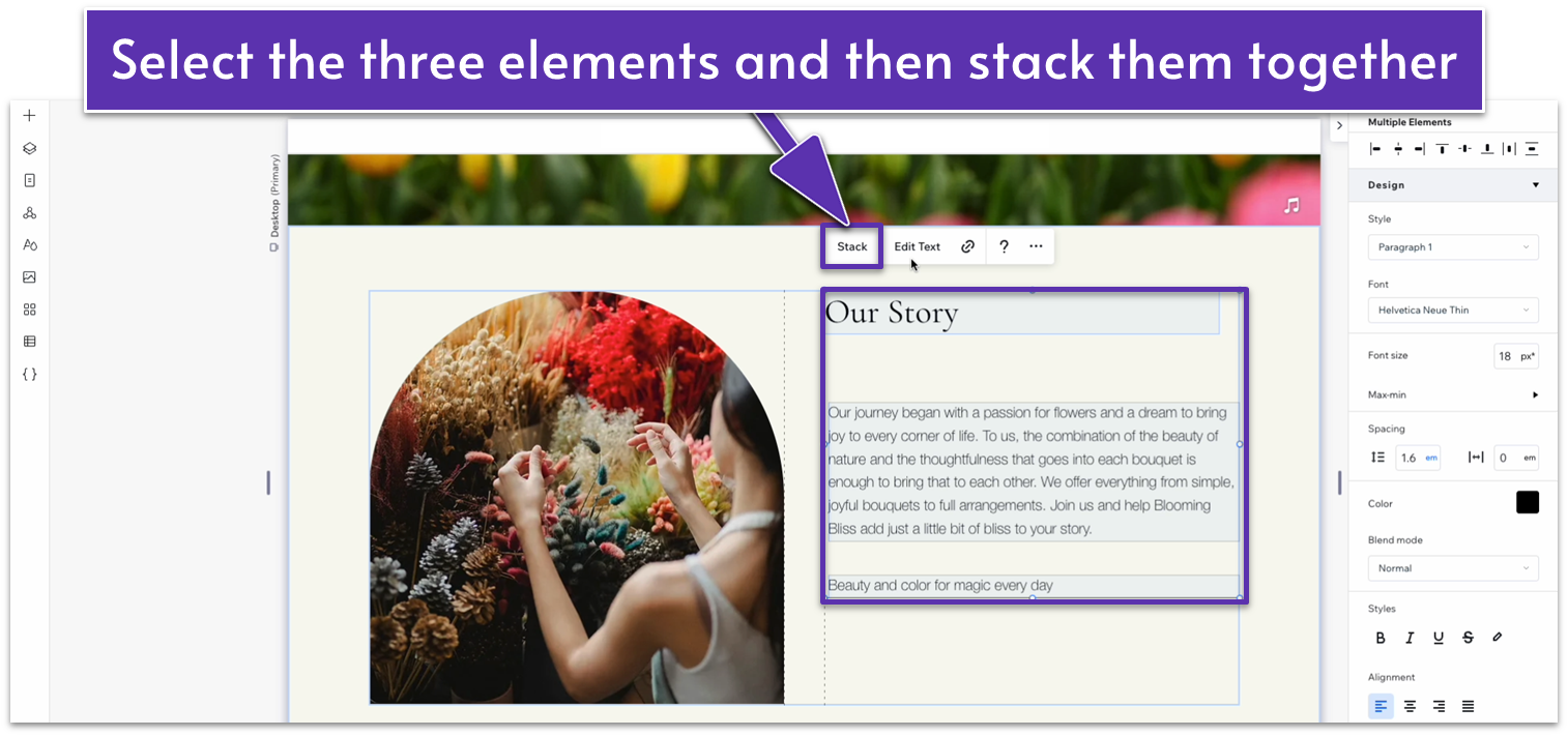
- Apply advanced size settings to the stack and each text element.
- Set the width of the stack and all 3 elements within it to 100%.
- Set the left and right margins of the text elements to 0 to center the text.
- Set the bottom margin for the header to a 10px scale.
- Set the bottom margin for the middle text to a 20px scale.
- Change the bottom text to something that invites visitors to read more. We’ll use this text as a link to the “about us” page.
- Underline the bottom text. We’ll add the link later on when we’ve built the remaining pages for this site.
- Set all margins for the entire stack to 0.
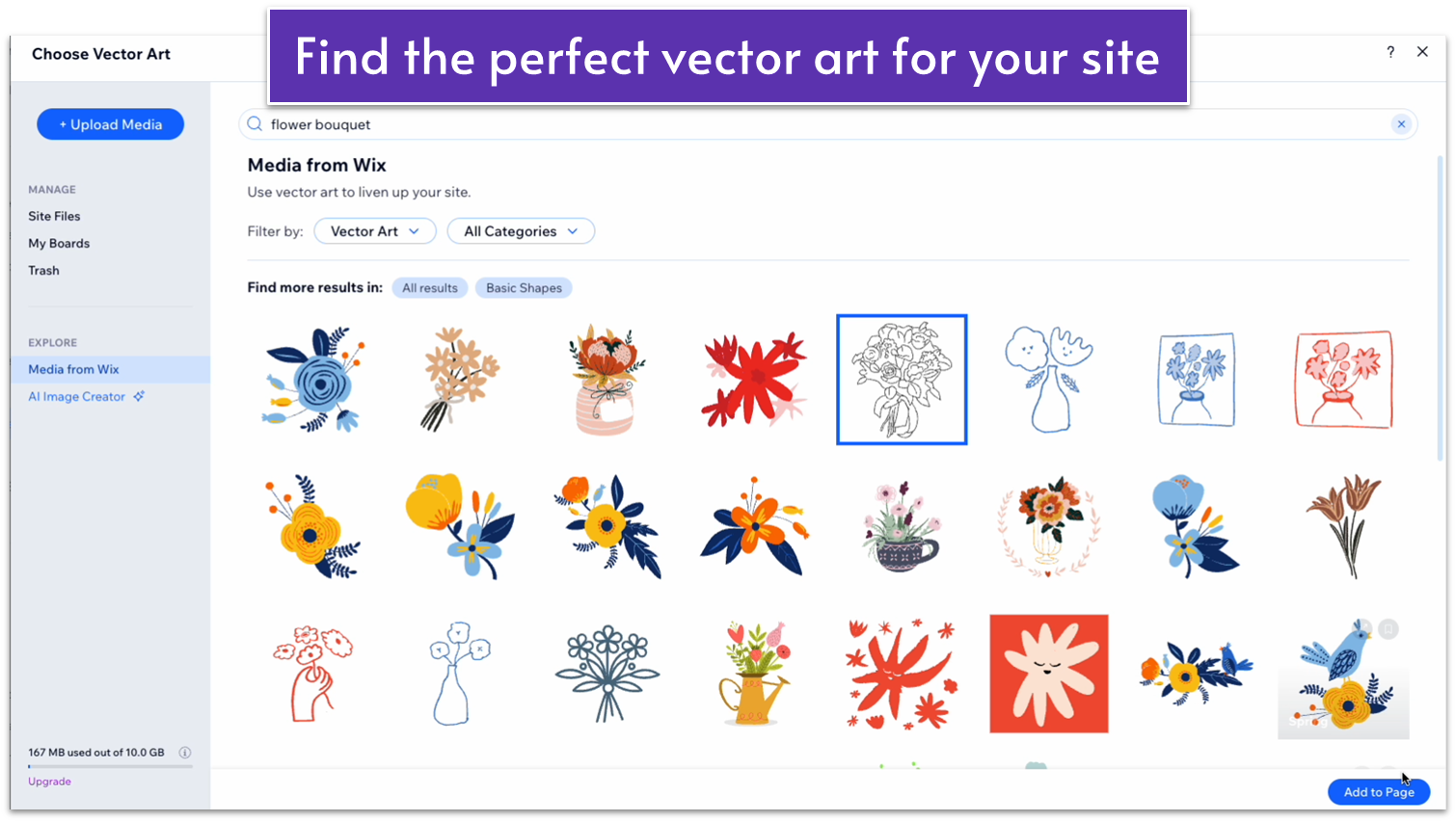
- Go to “Add Elements,” “Decorative,” and then select “More Basic Shapes.”
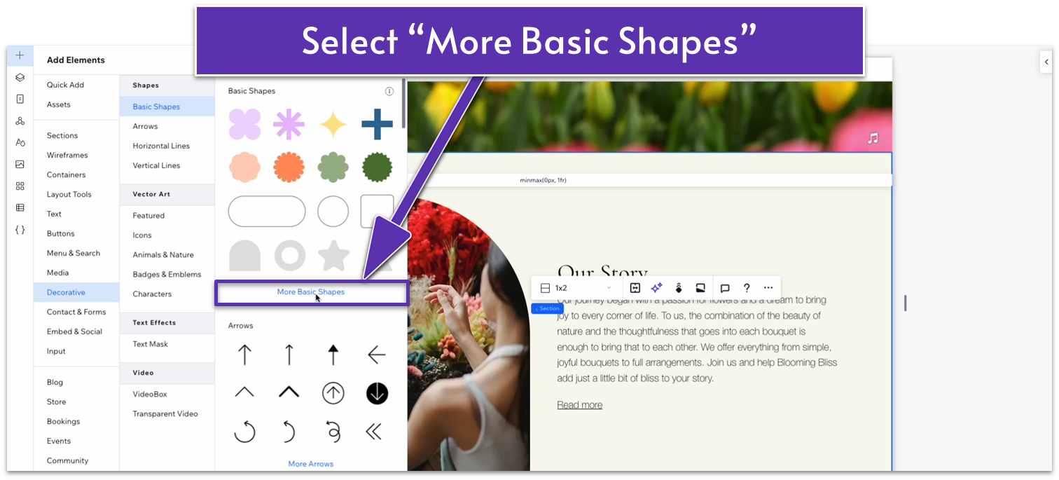
- Change the filter to “vector art,” and search for “flower bouquet.”
- Select an element you like and click on “Add to Page.”
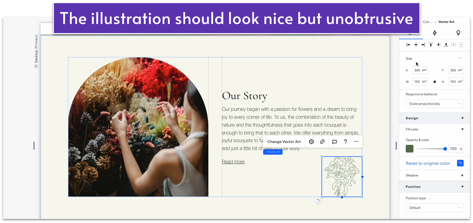
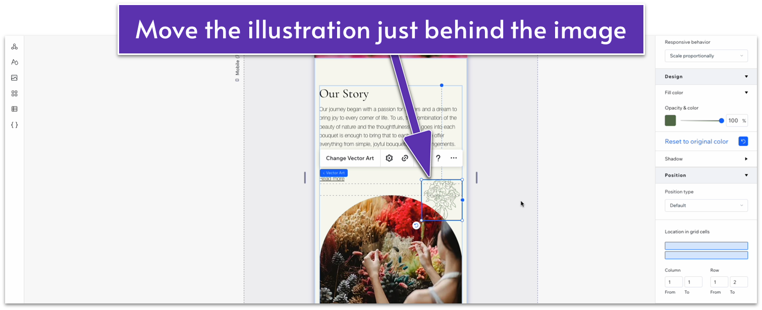
 Step 6: Move and scale the illustration.
- Drag the illustration to the bottom-right corner of the right-side column and set all margins to 0.
- Change the illustration’s color to a soft green (#5C7452 HEX).
- Change the illustration’s responsive behavior to “scale proportionally.”
- Change its width to 150px.
Adding Unique Services
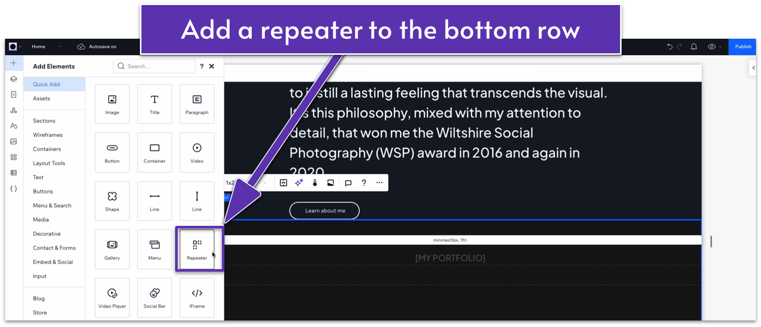
Step 1: Add a repeater to the bottom row. Repeater elements help you create multiple elements with consistent design but different content, and we’ll be using them a lot in the sections below. Since repeaters apply the same design consistently, they’ll also allow us to make style changes to the whole section instead of one element at a time.- In the “Add Elements” menu, select “repeater” from the “Quick Add” options and drag it into the bottom row.
- Open the inspector for the repeater, select the bottom row in “location in grid cells,” and set all margins to 0.
- Change the repeater’s width to 1080px.
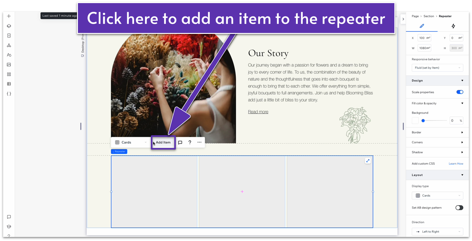
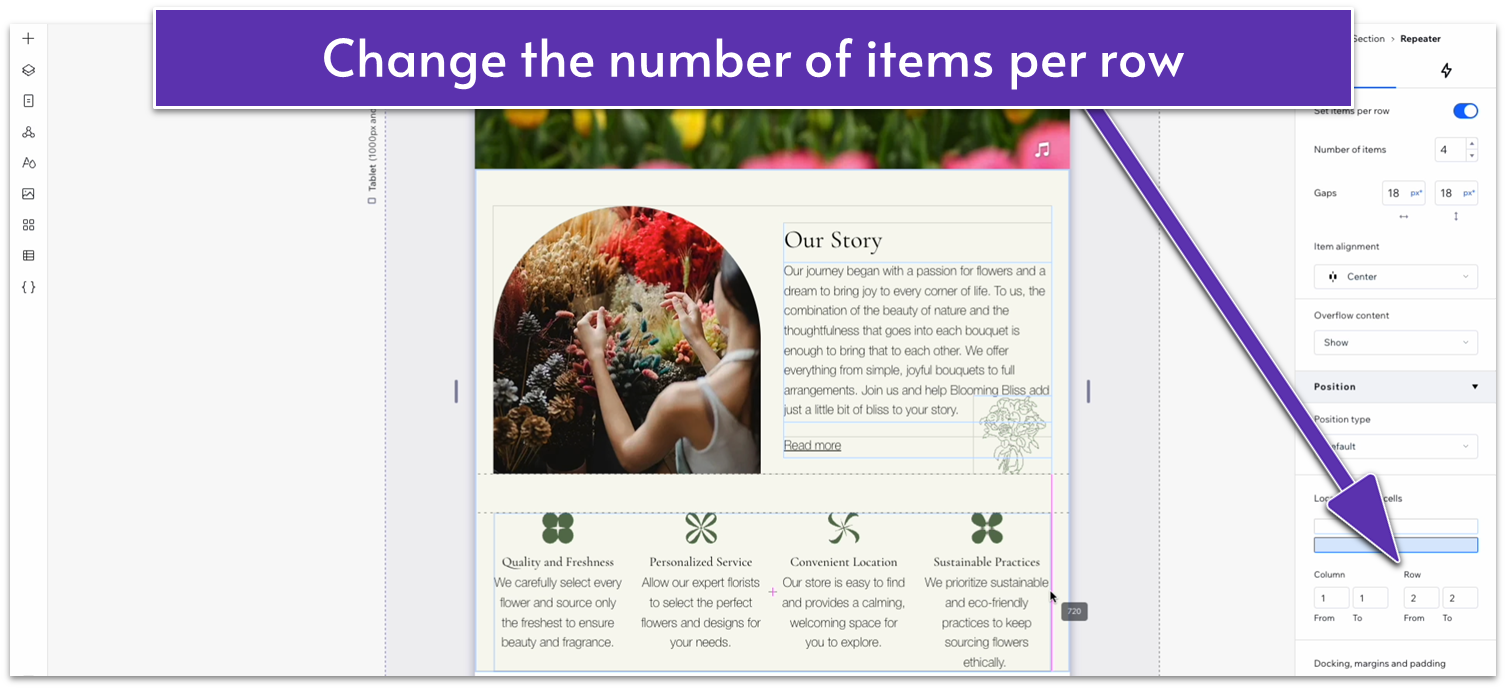
- Click on “Add Item,” so there are 4 repeater items in total.
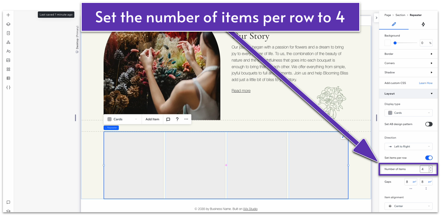
- Change the number of items per row to 4.
- Set the horizontal and vertical gaps between items to 30px.
- Drag and drop any shape into the repeater.
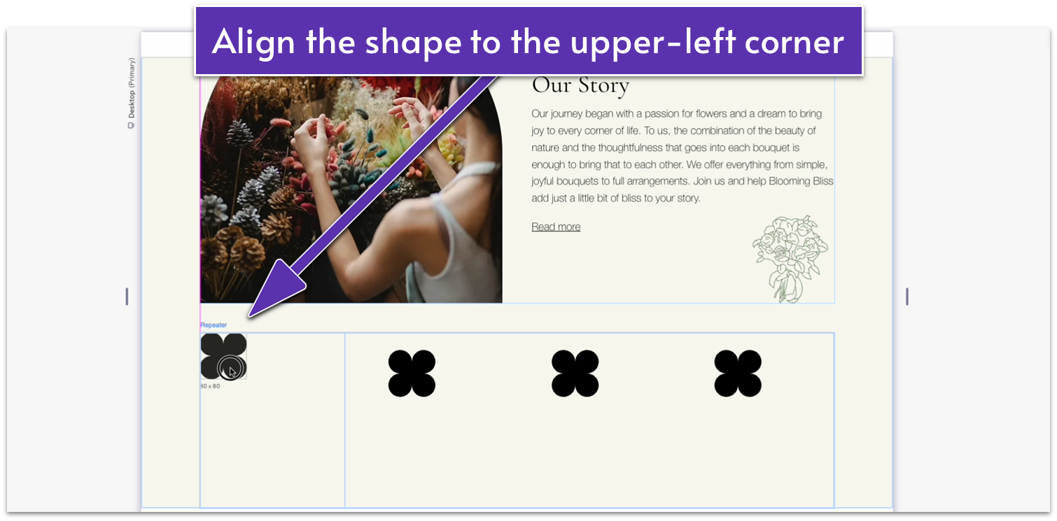
- Align the shape with the upper-left corner of the repeater’s item.
 Step 4: Replace the icon with your own shapes
- Click on the shape and select “Change basic shape.”
- We’ll go to “Site Files,” and then select one from our pre-prepared icons.
- If you don’t have your own icons, you can select one from Wix’s library.
- Set the shape’s height and width to 60px.
- Replace each shape inside the repeater elements so all 4 are different.
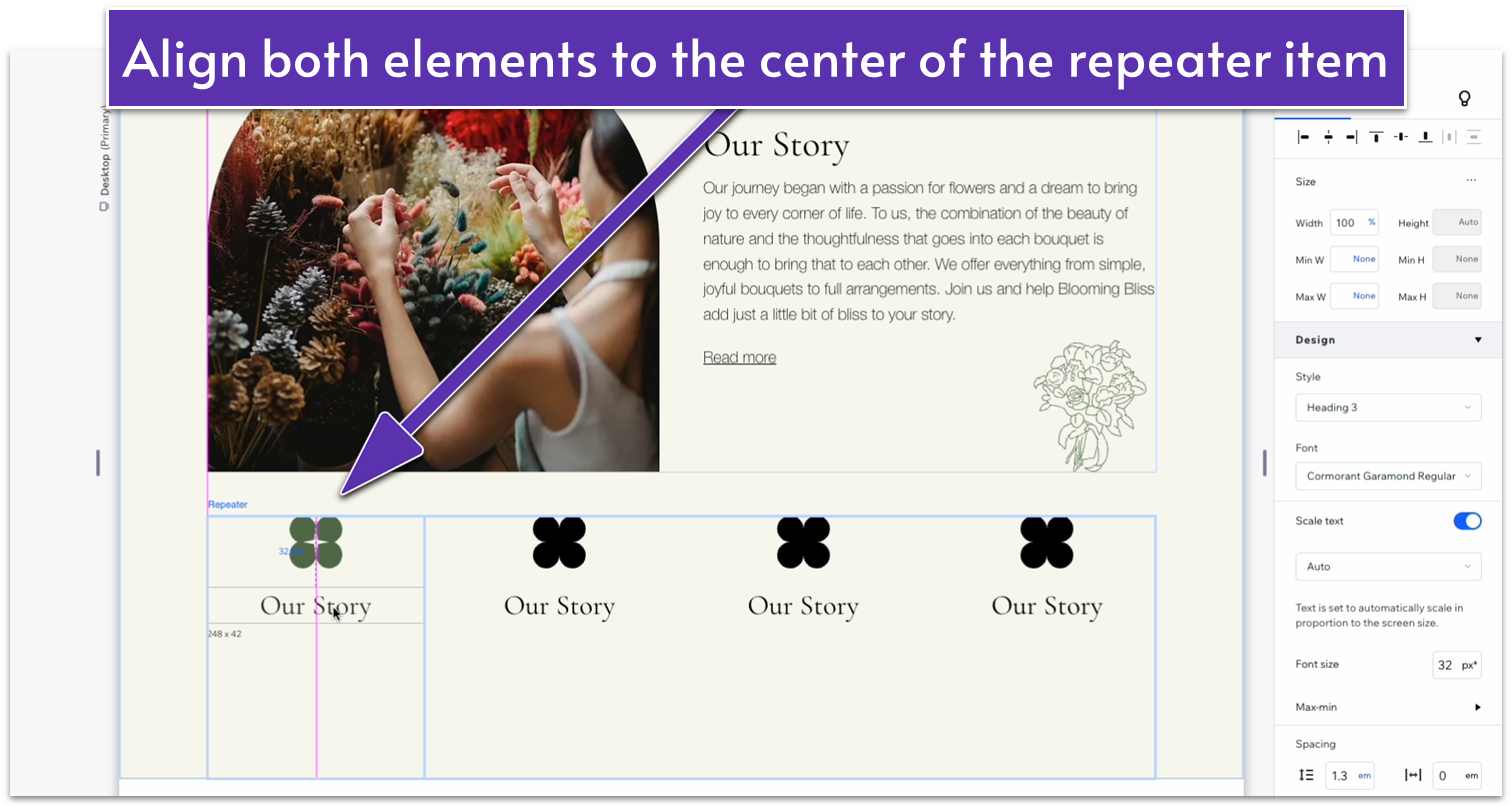
- Copy the heading from the row above and paste it into one of the repeater’s items.
- Stretch the text box to match the width of the item.
- Change its style from “heading 2” to “heading 3.”
- Align the text to the center.
- Align the shape to the center as well and move the text up so it’s just below the shape.
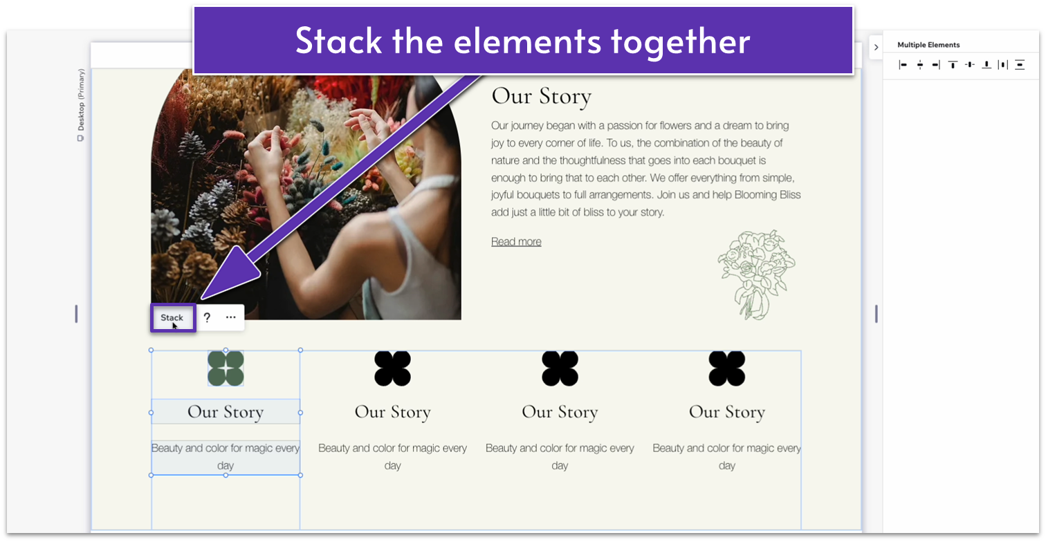
- Copy some paragraph text from above and paste it into the repeater’s item.
- Toggle on advanced settings for size, and set the width to 100% so it fits perfectly inside the item.
- Replace text with your own in each repeater element.
- Move the text up so it’s roughly the same distance from the heading as the heading is from the shape.
- Stack the three elements together.
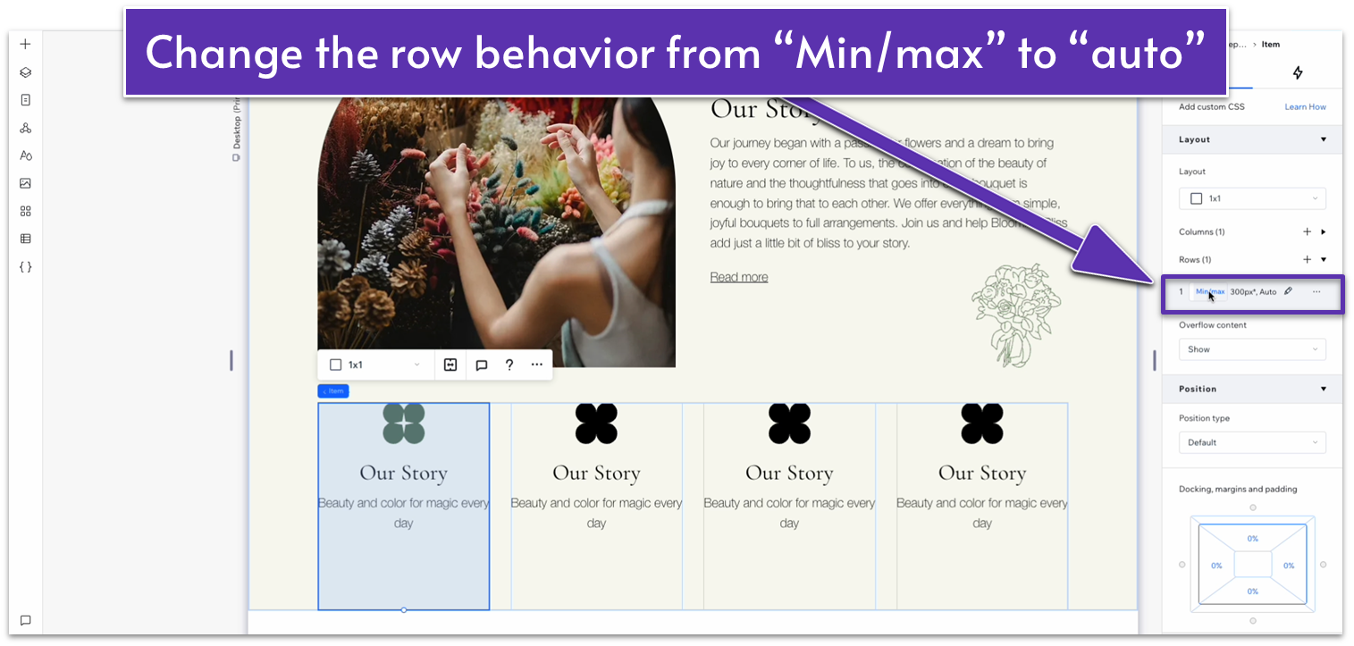
 Step 6: Adjust the spacing between elements.
- Set all margins except the bottom one to 0 for the shape. Set the bottom margin to a 20px scale.
- Undock the heading from the sides and set the bottom margin to a 10px scale.
- Change the row behavior for the repeater items to auto.
 Step 7 (Optional): Readjust colors and font styles.
At this stage, you might find that your text is too long or that you don’t like the colors you chose. Now that all the settings are ideal and everything is in place, you can go back and make any adjustments you want.
Step 7 (Optional): Readjust colors and font styles.
At this stage, you might find that your text is too long or that you don’t like the colors you chose. Now that all the settings are ideal and everything is in place, you can go back and make any adjustments you want.
Adapt for Tablet and Mobile Views
Step 1: Adapt for tablet view On table view:- Set the vertical gap for the whole section to 50px.
- Set the width of the container on the top row to 720px.
- Set the row’s behavior to auto.
- Set the font size for the “Our Story” text to 32px.
- Set the bottom padding for the “Our Story” text to 10px.
- Set the bottom padding for the paragraph text to 20px.
- Stretch the repeater to align with the edges of the section above.
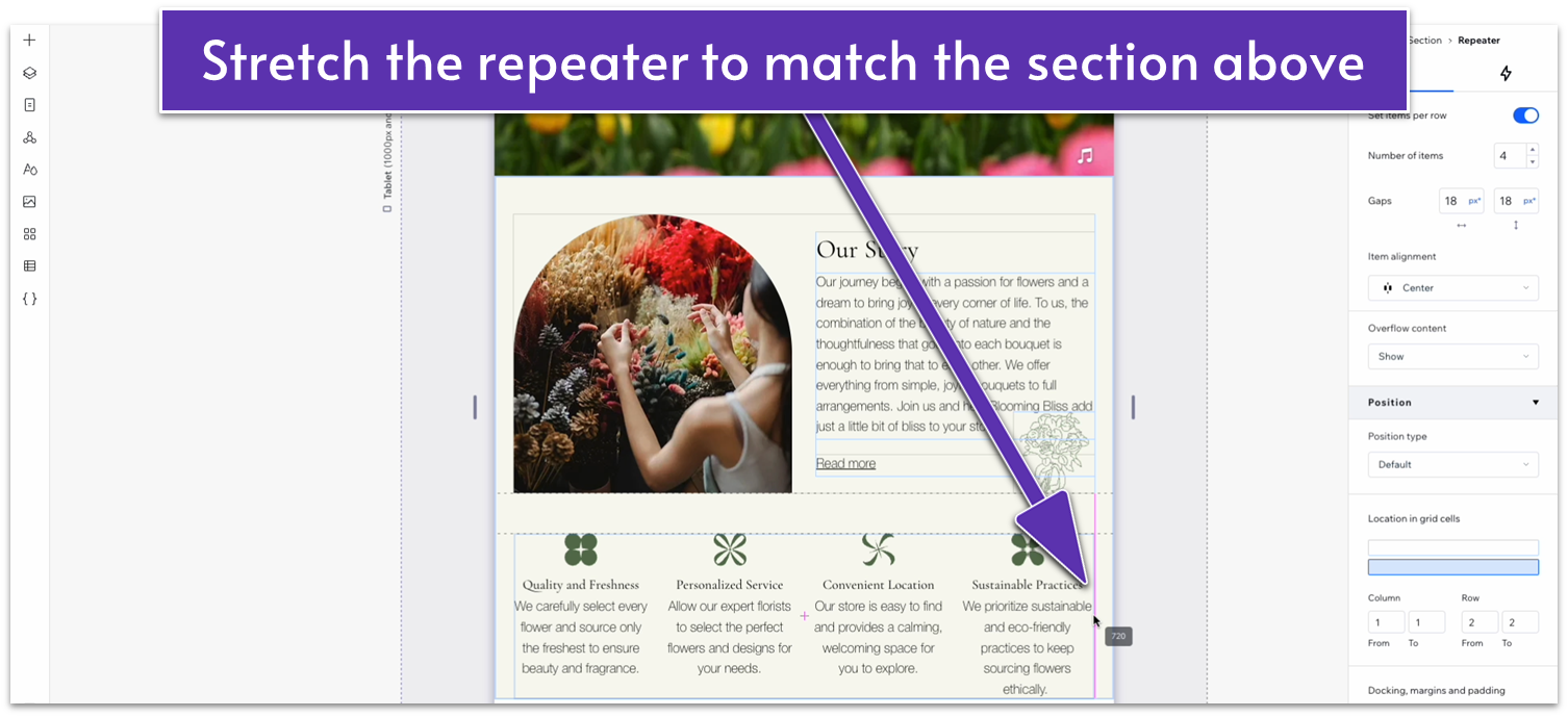
- Set the number of items per row on the repeater to 2.
- Set both the horizontal and vertical gap for the repeater to 30px.
- Change the width of the vector art to 60px.
- Set the bottom margin for the vector art to 20px.
- Set the bottom margin for the heading below the vector art to 10px.
- Set the font size for the heading below the vector art to 22px.
- Set the behavior for both rows inside the section to auto.
- Set the top padding for the entire section to 70px.
- Set the top padding for the entire section to 70px.
- Set the vertical gaps for the entire section to 50px.
- Change the layout for the top container from 2×1 to 1×2.
- Set the location in grid cells for the text stack and illustration to the top row.
- Set the location in grid cells for the image to the bottom row.
- Set the behavior for both rows to auto.
- Set the vertical gap between rows for the container to 30px.
- Set the font size for the “Our Story” heading to 32px.
- Set the bottom padding for the heading to 10px.
- Set the bottom padding for the paragraph text to 20px.
- Move the illustration down so it’s peeking behind the image.
- Change the font size for the “read more” text to 16px.
- Set the vertical and horizontal gaps for the repeater to 30px.
- Change the width of the vector art inside the repeater’s items to 50px.
- Set the bottom padding for the vector art to 20px.
- Set the font size for the heading below the vector art to 18px.
- Set the bottom padding for the heading below the vector art to 20px.
2.4 “Our Arrangements” Section
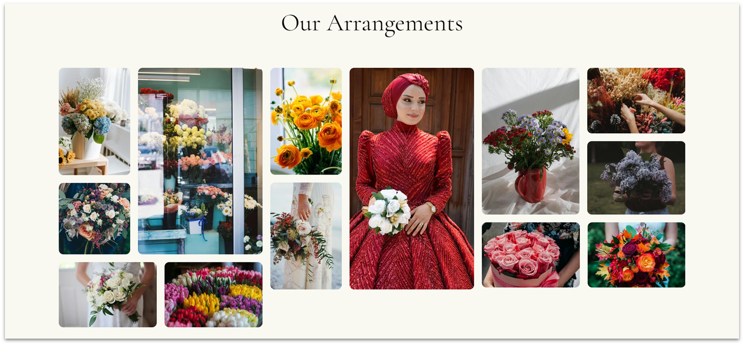 We’re looking to put our best foot forward by proudly displaying some of this business’ best work. So, we’ll include an image gallery with some of our best floral arrangements. To avoid visual monotony, we’ll arrange this gallery with all kinds of different image sizes and orientations.
Step 1: Add a new section and split into 2 sections.
We’re looking to put our best foot forward by proudly displaying some of this business’ best work. So, we’ll include an image gallery with some of our best floral arrangements. To avoid visual monotony, we’ll arrange this gallery with all kinds of different image sizes and orientations.
Step 1: Add a new section and split into 2 sections.- Apply an advanced CSS grid and apply a 1×2 layout to it.
- Set the vertical gap between rows to 50px.
- Set the top padding for the entire section to a scale of 80px.
- To save time, we’ll copy the “Our Story” heading from above and paste it into the top row.
- Set all margins to 0 and align the text to center.
- Replace the text for the title of this section.
- Set the top row’s behavior to auto.
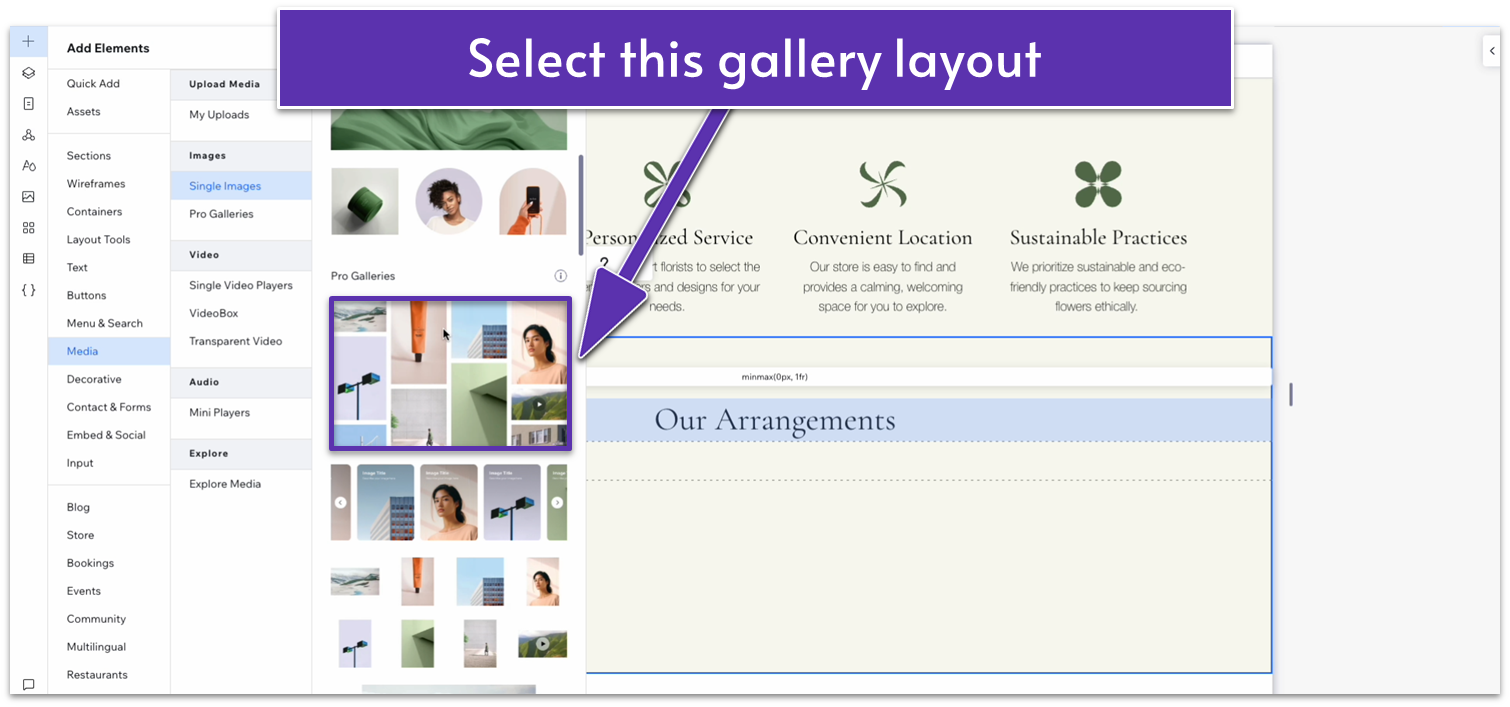
- Go to “Add Elements,” then “Media,” and “Pro Galleries.” Select the one with different sizes and orientations.
- Drag the gallery to the bottom row.
- Change the gallery’s width to 1080px, set all margins to 0, and undock all margins.
- Click on “add media” in the gallery’s pop-up menu and replace the default images with your own.
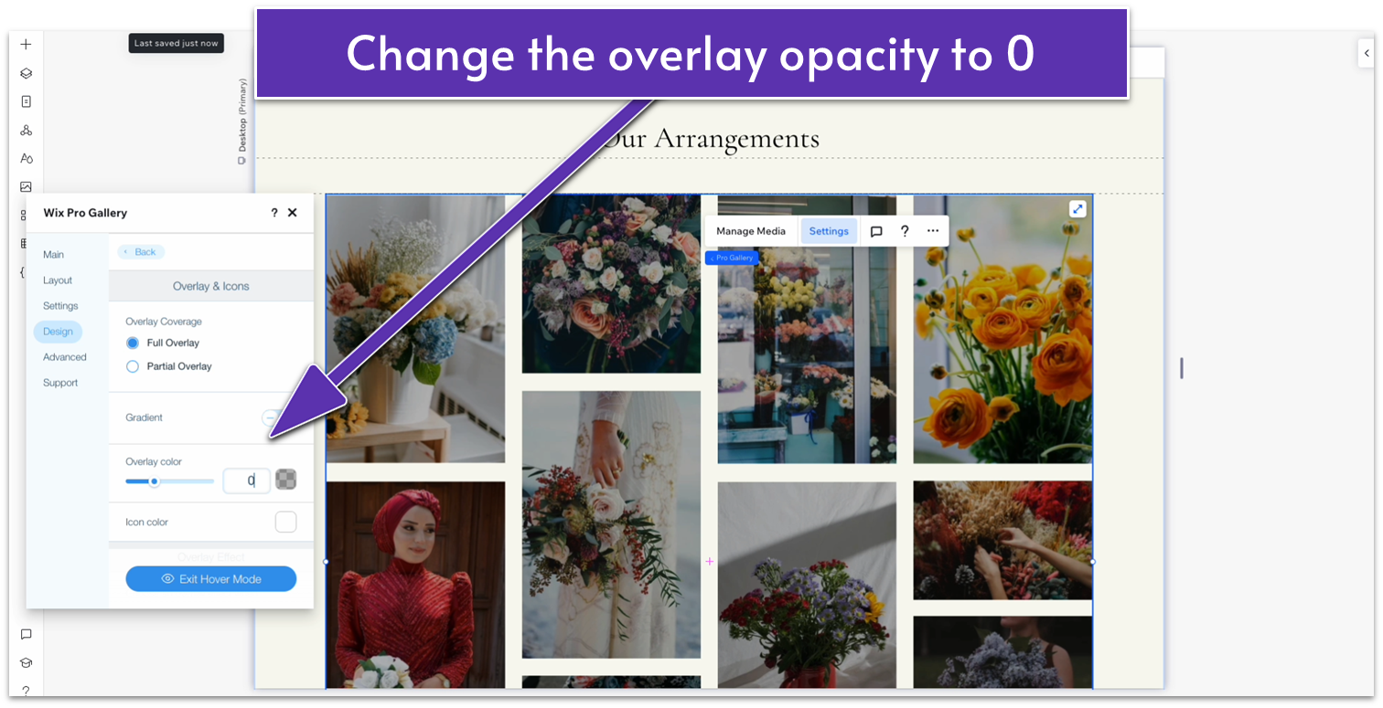
- Click on the gallery and then on “settings” in the pop-up menu. Then, head over to “design” and “overlay & icons.” Change the overlay color opacity to 0.
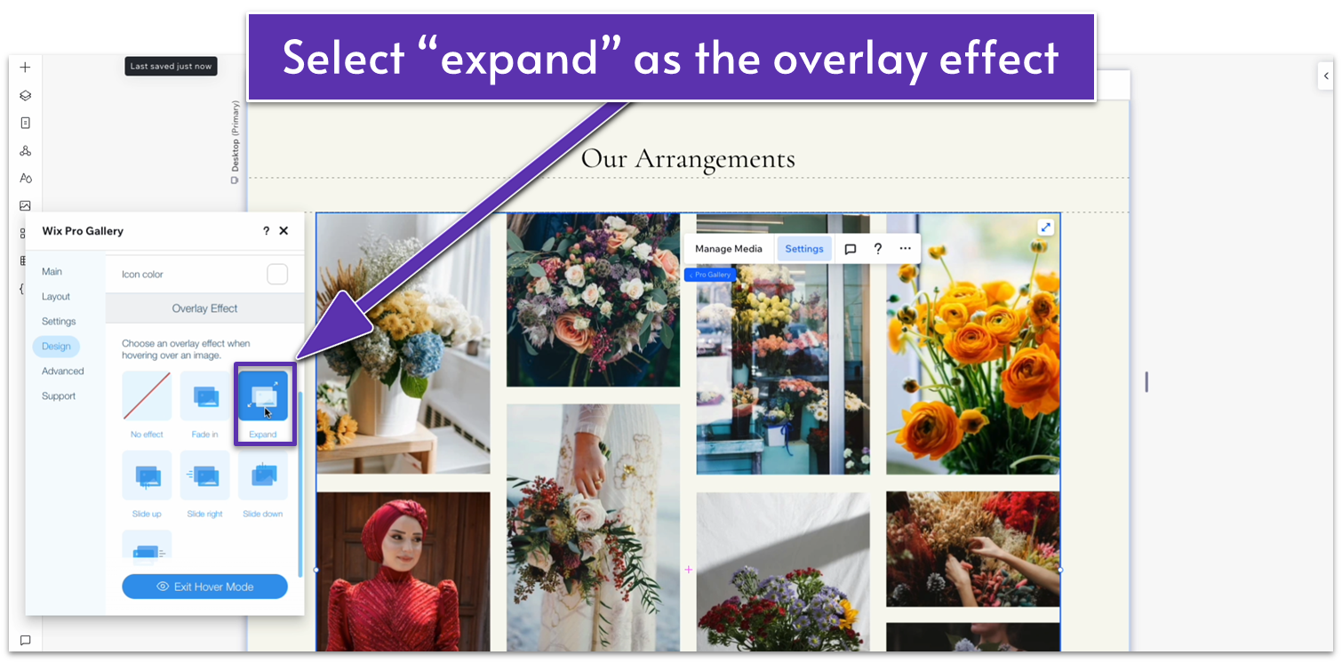
- Scroll down and set the overlay effect to “Expand.”
- Head back to “design” and then select “texts.” Toggle off the title and description displays.
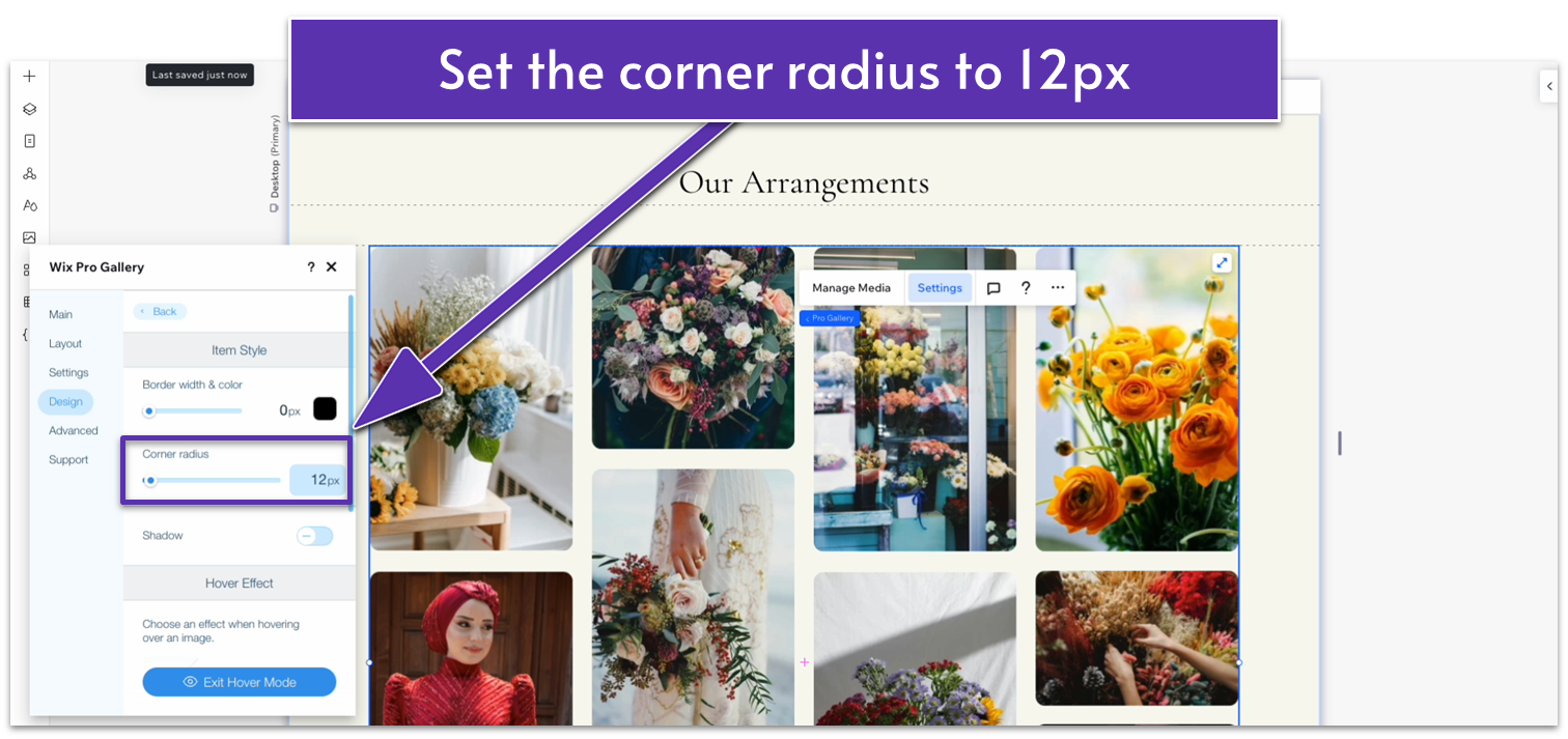
- Head to “Item Style” and set the corner radius to 12px.
- Scroll down and set the hover effect to “Shrink.”
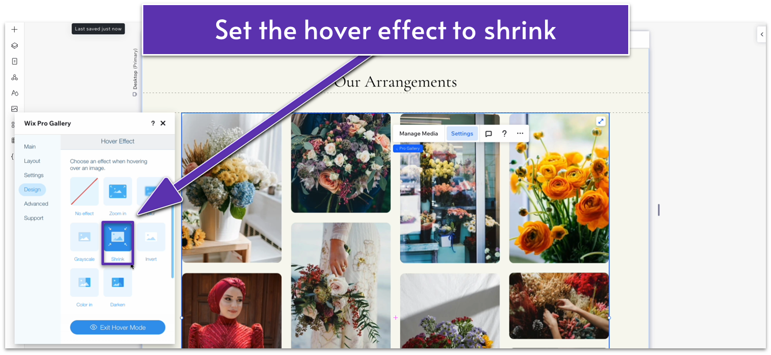
- Back on “Design” head over to “Scroll animation” and set the scroll animation to “Fade in.”
- In the gallery settings, head over to “Design,” and then “Expand Mode.” Click on “Customize Expand Mode.”
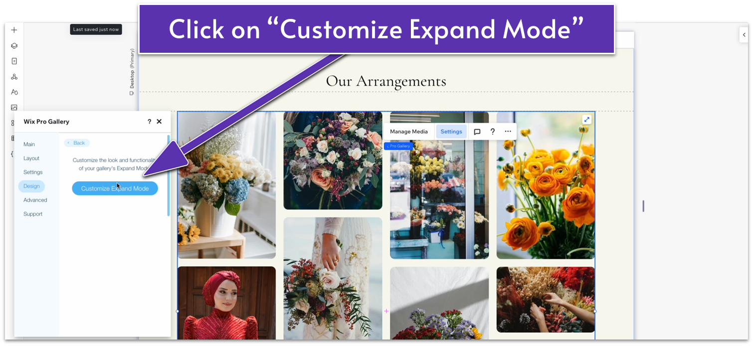
- The “Expand Mode Settings” menu will open, showing you a list of options.
- Untoggle the info for the title, description, and link.
- Change the “Where does it appear” option to “Bottom.”
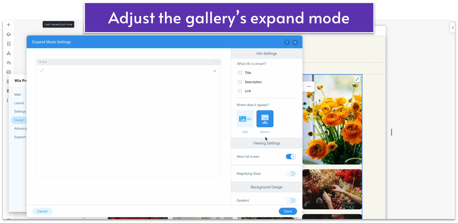
- Click on “Done” to save your changes and exit the expand mode settings.
- Set the bottom margin for the entire section to an 80px scale.
Adapt for Tablet and Mobile Views
Step 1: Adapt for tablet view. On tablet view:- Set the width for the “Our Arrangements” text box to 720px.
- Stretch the gallery to align with the edges of the text box above.
- Set the top padding for the entire section to 70px.
- Set the vertical gaps for the entire section to 30px.
- Set the top padding for the section to 70px.
- Stretch the edges of the gallery to match the edges of the text box above.
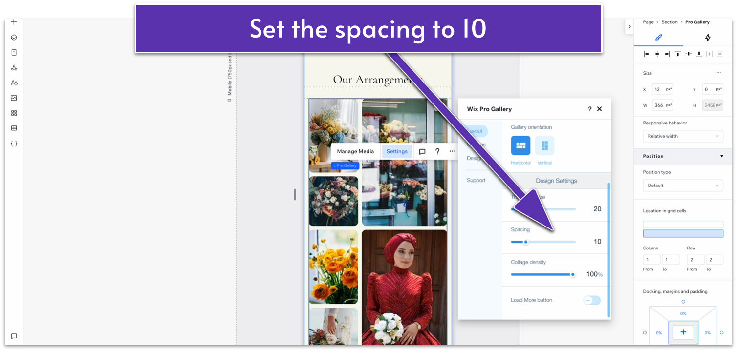
- Click on the gallery and open the “Settings” menu. Go to “Layout” then “Customize Layout.” There, set the spacing to 10.
2.5 Testimonials Section
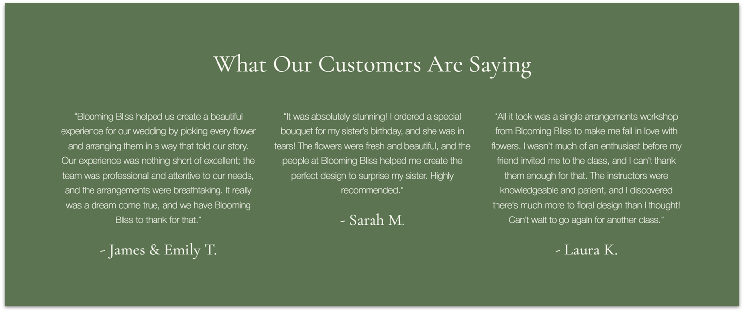 We’ll add a simple section with three testimonials and no additional design elements.
Step 1: Add a new section with a different background color.
We’ll add a simple section with three testimonials and no additional design elements.
Step 1: Add a new section with a different background color.- We’ll set the background color for this section to a darker green (#5C7452 HEX).
- Set the top and bottom padding to an 80px scale.
- Apply a 1×2 layout to the section.
- Set the vertical gap between rows to 50px.
- Copy the header for the section above and paste it into the top row.
- Change the text color to a light gray (#F9F9F1 HEX).
- Undock all margins and set them to 0.
- Replace the text with the title of the section.
- Set the top row’s behavior to auto.
- Undock and set all the repeater’s margins to 0.
- Set the repeater’s width to 1080px.
- Change the horizontal gaps between columns to 30px.
- Apply an advanced CSS grid to the repeater’s items.
- Set the background opacity to 0%.
- Copy and paste some paragraph text from the “Our Story” section.
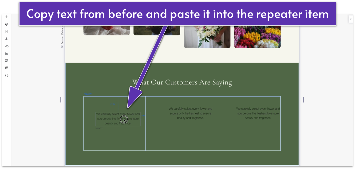
- Align the text box to the center using the grid lines.
- Change the text color to the same as the heading.
- Apply advanced size settings and set the text width to 100%.
- Copy the headings from the “Our Story” repeater and paste them below the text.
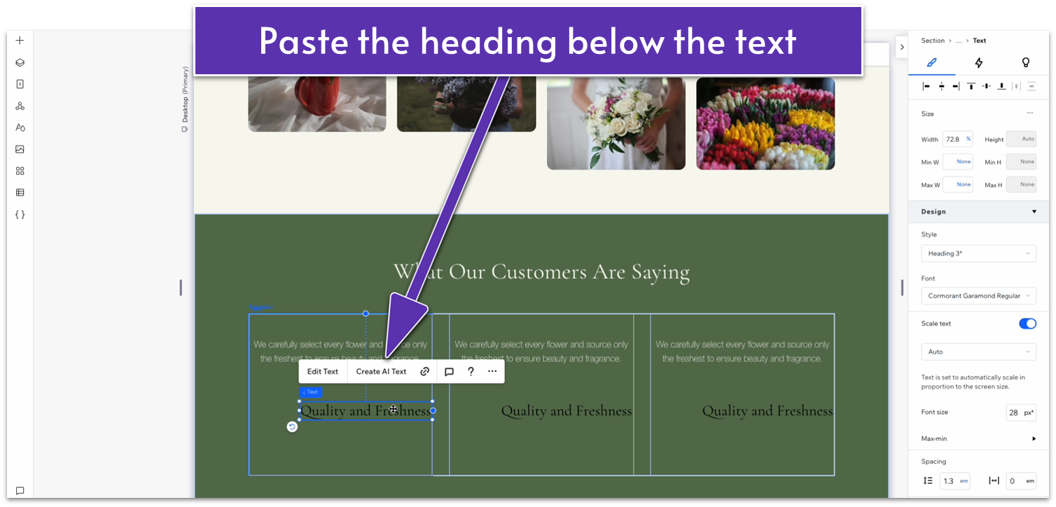
- Set the text box width to 100%.
- Change the color to match the text above.
- Stack the text elements together.
- Set the item spacing to 20px scale.
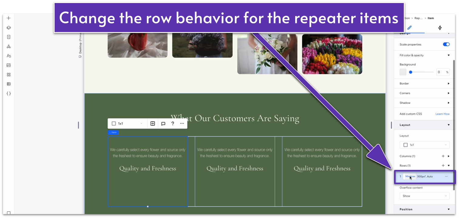
- Inside the repeater’s items, set the row behavior to auto.
- Set the top margin for the top text to 0.
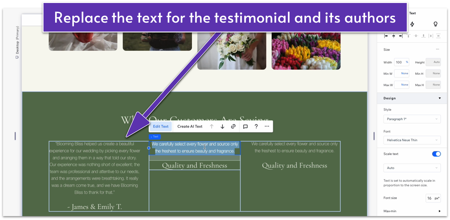
- Replace the text for the content of the testimonial and the heading for its author.
- Set the row behavior for the entire bottom row to auto.
Adapt for Tablet and Mobile Views
Step 1: Adapt for tablet view. On tablet view:- In the repeater, change the number of items per row to 1.
- Set the horizontal and vertical gaps in the repeater to 30px.
- Set the repeater’s width to 720px.
- Set the item spacing for the text stack inside the repeater to 10px.
- Set the top and bottom margins for the entire section to 70px.
- Set the top and bottom margins for the entire section to 70px.
- Set the vertical gaps for the section to 30px.
- Set the vertical gaps inside the repeater to 30px.
- On the text stack inside the repeater, set the item spacing to 10px.
2.6 Blog Section
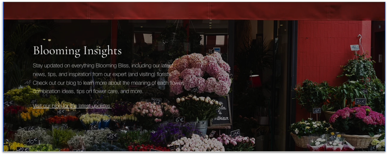 Having a blog that we can update occasionally can help bring traffic and visibility to our local business site. However, we don’t want too many visual elements on the homepage, so instead of post previews, we’ll add a brief section with some text encouraging visitors to check out the blog.
Step 1: Add a new section and apply an advanced CSS grid to it.
Step 2: Drag an image into the section.
Having a blog that we can update occasionally can help bring traffic and visibility to our local business site. However, we don’t want too many visual elements on the homepage, so instead of post previews, we’ll add a brief section with some text encouraging visitors to check out the blog.
Step 1: Add a new section and apply an advanced CSS grid to it.
Step 2: Drag an image into the section.- This will be the background image for this section, so make sure it’s high quality, has plenty of horizontal space, and isn’t so complicated that a text overlay would become illegible.
- Center the image and drag it horizontally to fit the edges of the section.
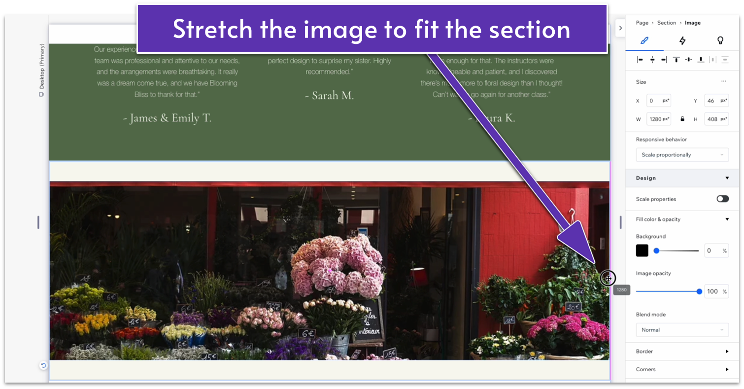
- Stretch the bottom of the image to fit the bottom of the section too.
- Set the top padding for the section to an 80px scale.
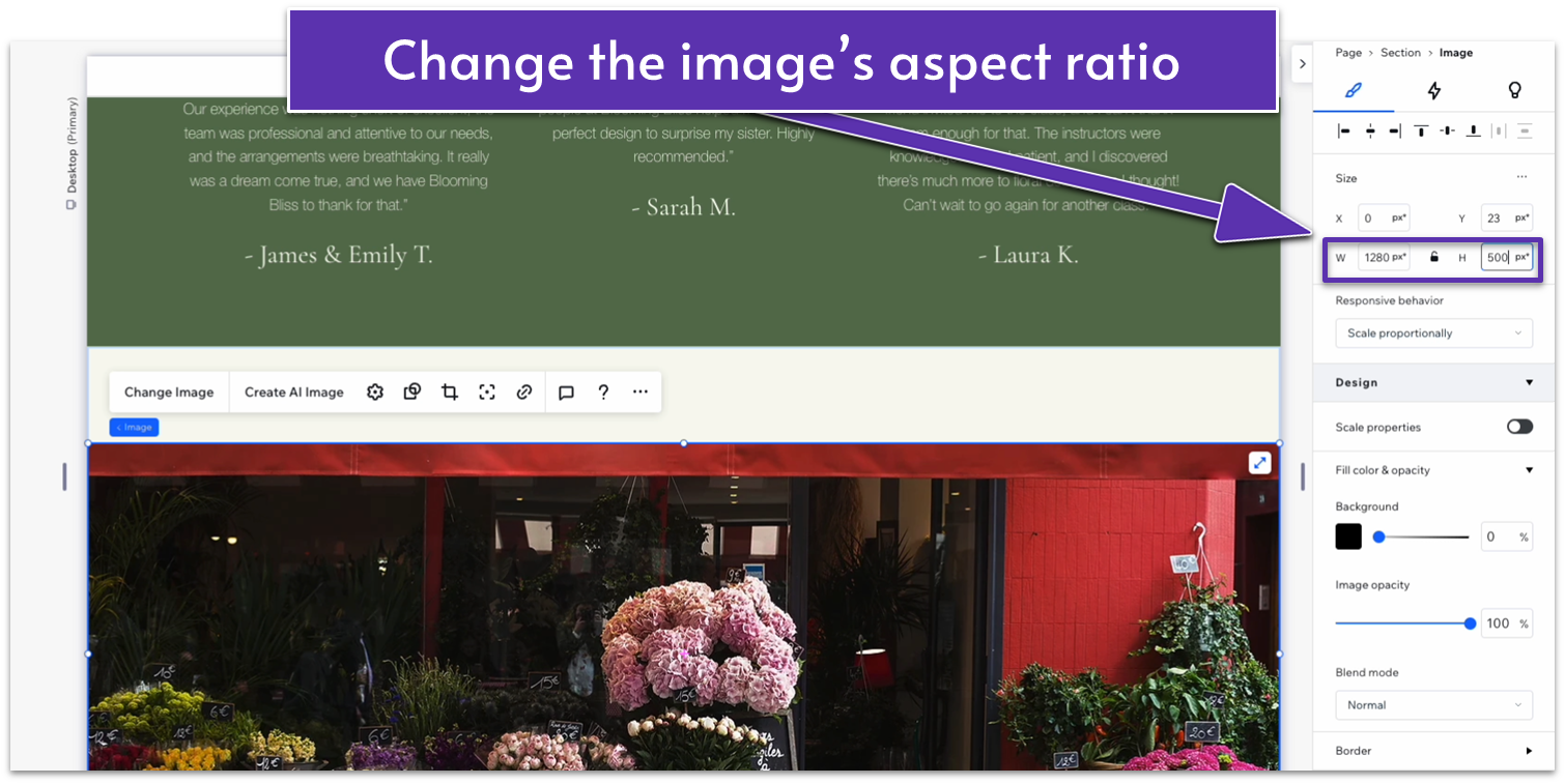
- Make sure that all margins for the image are set to 0.
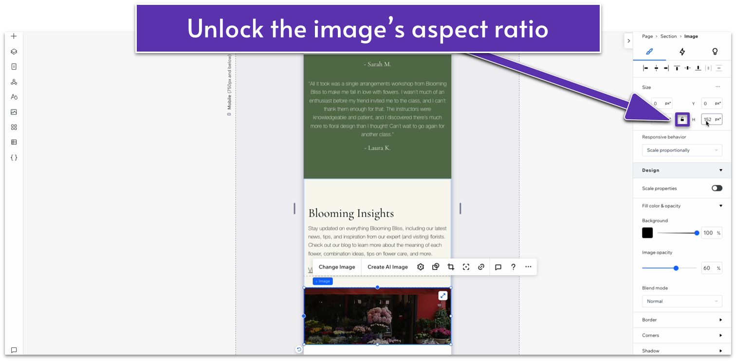
- Unlock the image’s aspect ratio and set its height to 500px.
 Step 4: Copy a text block from an earlier section and paste it over the image.
- We’ll use the text stack we created for the “our story” section since its format is already pretty similar to what we want.
- Change the color of the header, paragraph text, and link to white (#FFFFFF HEX).
- Center the text stack to the section horizontally using the grid lines.
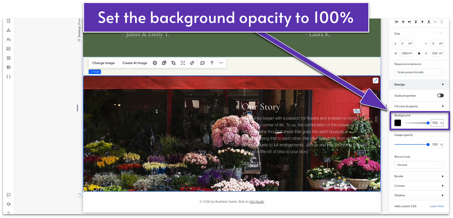
- Click on the image again, and under “Design” change the background color’s opacity to 100%.
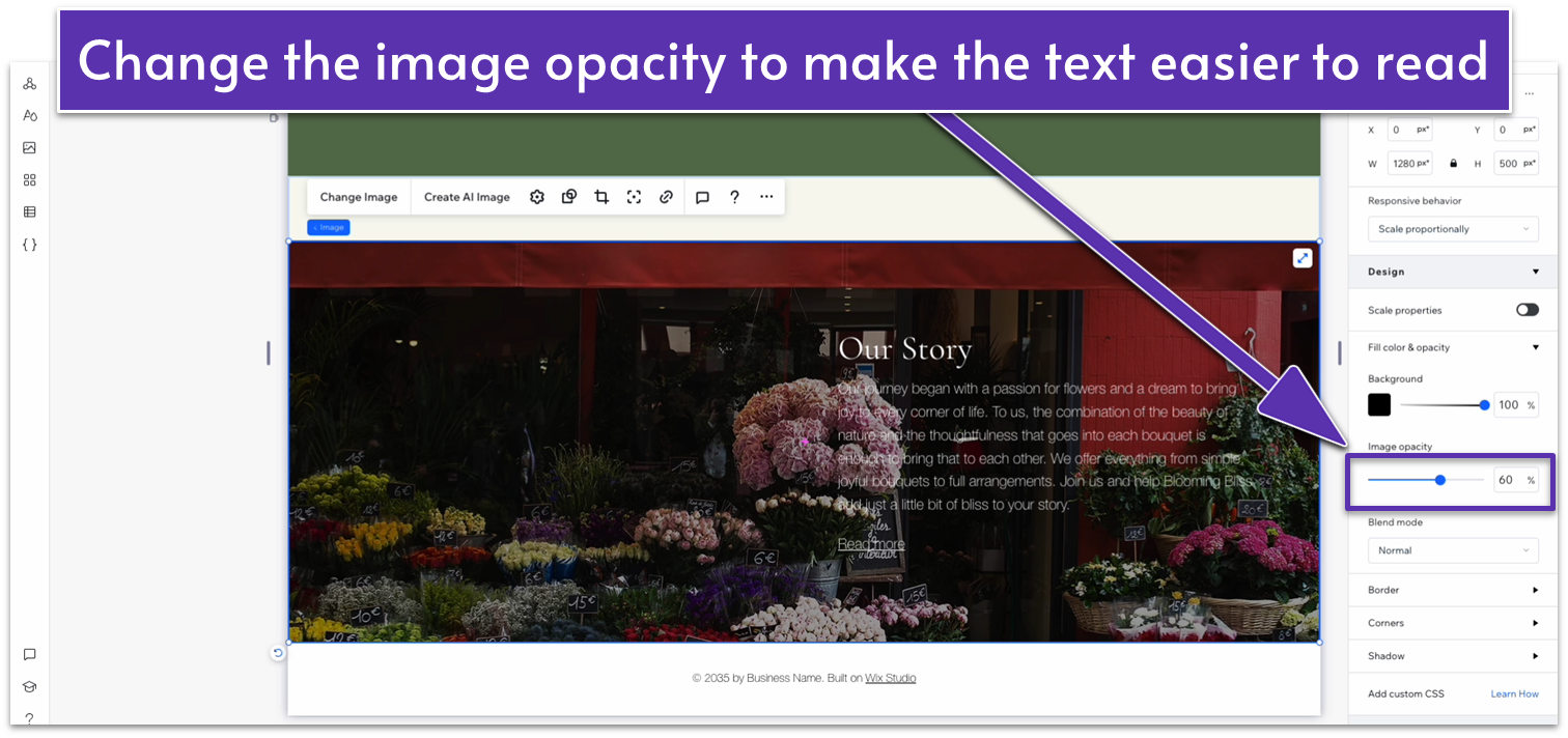
- The default color should be black (#000000 HEX). We’ll leave it like that, but you can also set the background to a lighter color and the text color to a darker one.
- Change the image opacity. We changed ours to 60%, but yours will likely be different depending on the colors in your picture and the color of your text.
 Step 6: Replace the text with something that fits the section.
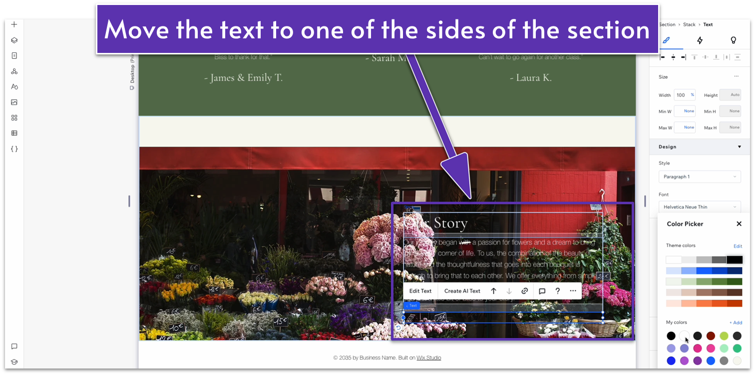
Step 7: Move the text to one side of the image.
Step 6: Replace the text with something that fits the section.
Step 7: Move the text to one side of the image.- We’ll move the text to the left side. To do this, we’ll set all margins to 0 except the left one, which we’ll set to a 100px scale.
Adapt for Tablet and Mobile Views
Step 1: Adapt for tablet view. On tablet view:- Set the top padding for the entire section to 70px.
- Change the layout for the section from 1×1 to 1×2.
- Set the vertical gaps for the entire section to 30px.
- Set the location in grid cells for the image to the bottom row.
- Set the location in grid cells for the text stack to the top row.
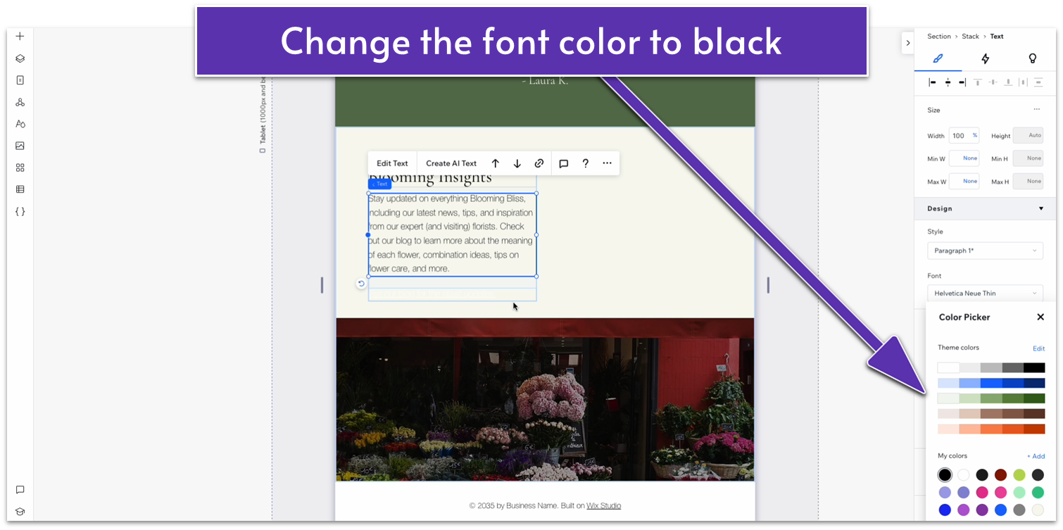
- Change the color of the text inside the stack to black (#000000 HEX).
- Align the text stack on the left with the section above using the gridlines.
- Stretch the right edge of the text stack to match the section above.
- Change the behavior of both rows to auto.
- Set the vertical gaps for the entire section to 30px.
- Set the top padding for the entire section to 70px.
- Click on the image and unlock the aspect ratio by clicking on the lock icon in the inspector. Then, set the height to 250px.
- After making the change to the image’s height, lock the ratio again.
2.7 Contact Section
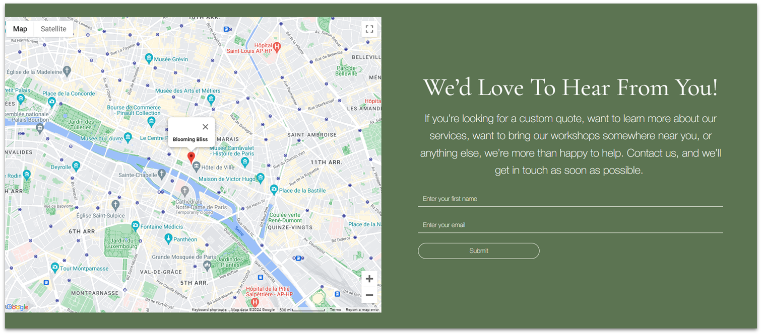 Since this business has a physical location, we’ll include a map alongside the usual contact form. Since we’re shooting for an earnest and personal tone, we’ll also include a bit more text inviting visitors to get in contact.
Step 1: Add a new section and apply an advanced CSS grid.
Since this business has a physical location, we’ll include a map alongside the usual contact form. Since we’re shooting for an earnest and personal tone, we’ll also include a bit more text inviting visitors to get in contact.
Step 1: Add a new section and apply an advanced CSS grid.- Set the background color to a dark green (#5C7452 HEX).
- Set the top padding to an 80px scale.
- Set the layout to 2×1.
- Go to “Add Elements,” “Contact & Form,” and “Maps.” Drag a map element to the left-side column.
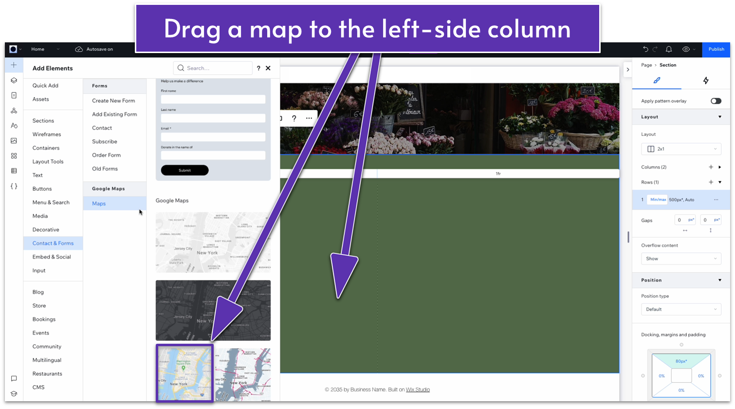
- Change the responsive behavior to “scale proportionally.”
- Apply advanced size settings and set the map’s width to 100%.
- Set the height to 100%.
- Set all margins to 0.
- Click on the map and select “manage locations” in the pop-up menu
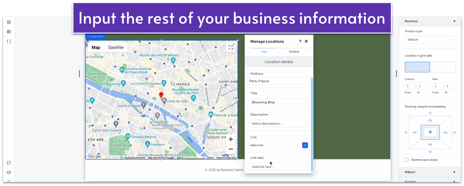
- Write down your address in the “address” field.
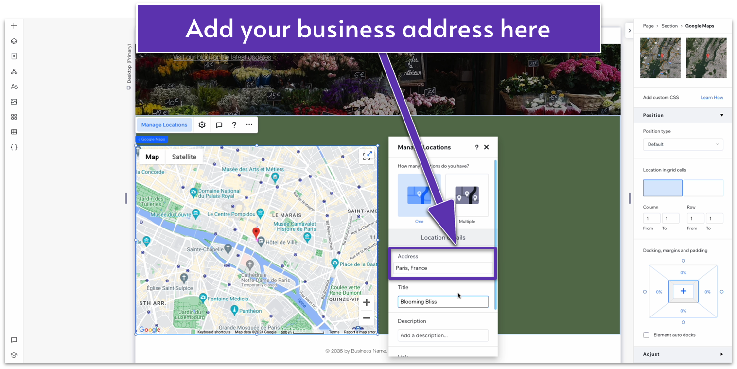
- Add the title of your business and a brief description.
 Step 4: Copy text from earlier sections and paste it to the right-side column.
Maybe it feels like a little too much copy and paste, but you’ve already worked hard on designing other sections, so why do the work twice?
Step 4: Copy text from earlier sections and paste it to the right-side column.
Maybe it feels like a little too much copy and paste, but you’ve already worked hard on designing other sections, so why do the work twice?- Copy the heading from the blog section above and paste it into the right-side column.
- Copy the paragraph text from the blog section above and paste it into the right-side column.
- Align the heading text to the center and replace it with this section’s heading.
- Align the paragraph text to the center and replace it with appropriate text.
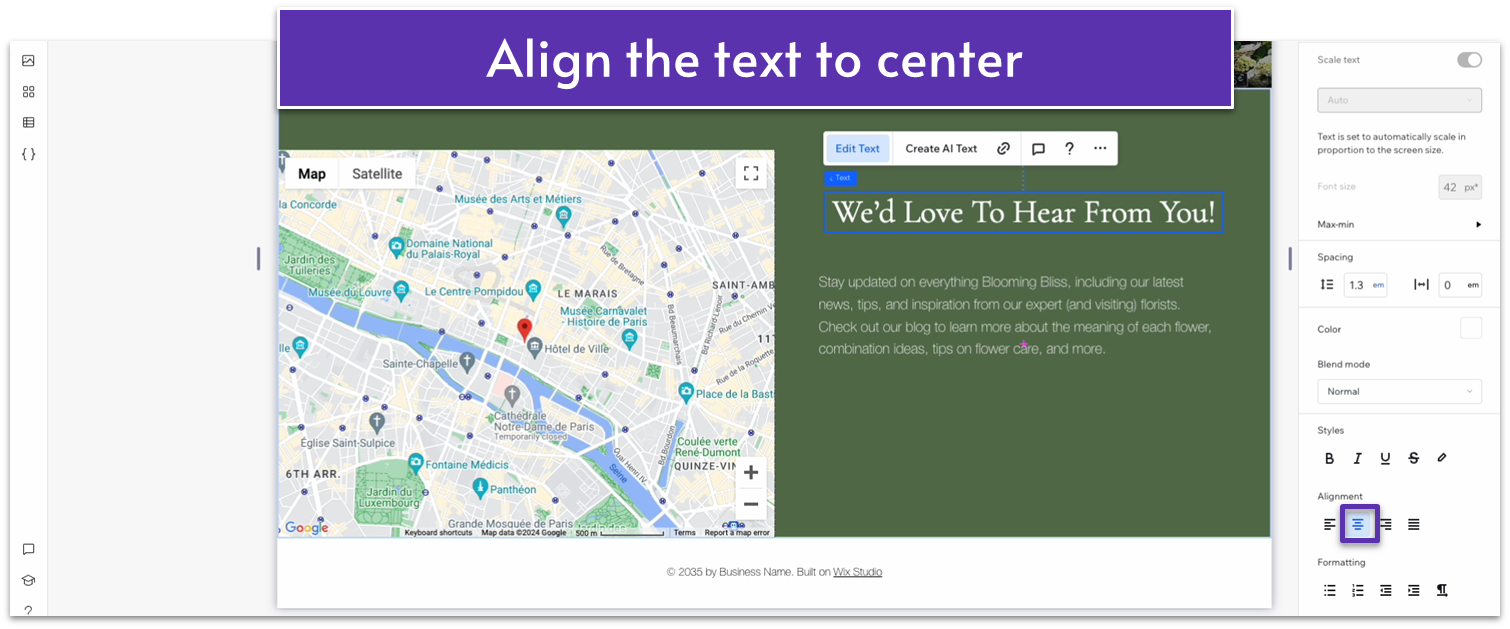
- Align both text boxes to the center vertically and place the paragraph text below the heading.
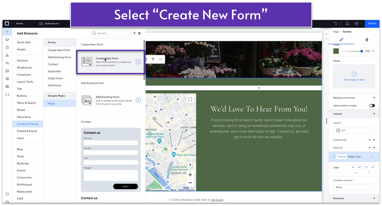
 Step 5: Add a contact form underneath the section’s text.
- Go to “Add Elements,” then “Contact & Forms,” and then “Create New Form.”
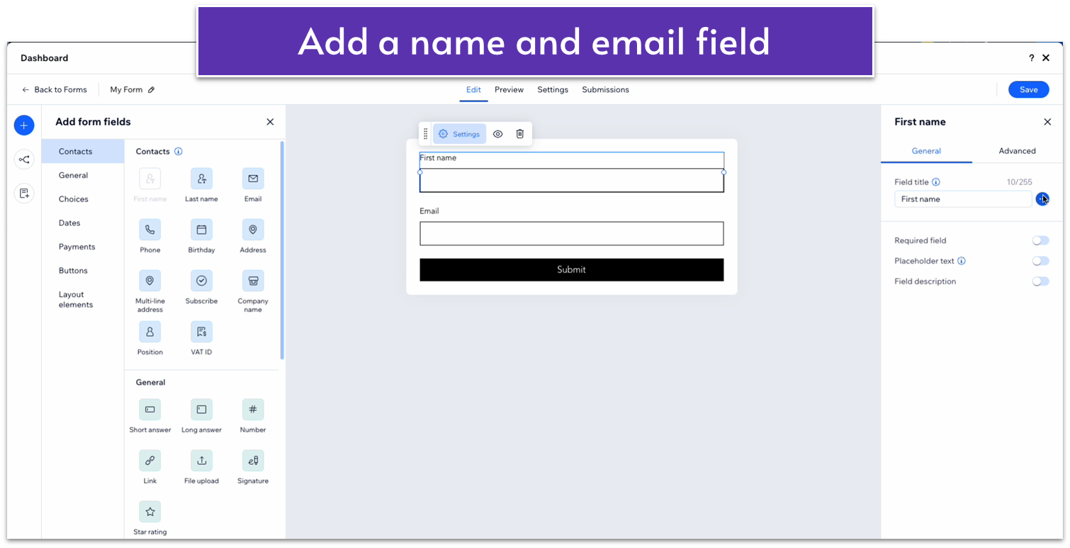
- Add a field for “first name” and one for “email.”
- Click on the “First name” field and go to the right-hand menu. Click on the three dots next to the field title and select “hide field name.”
- Toggle on “Required field.”
- Toggle on “Placeholder text” and write the text you want the empty field to show.
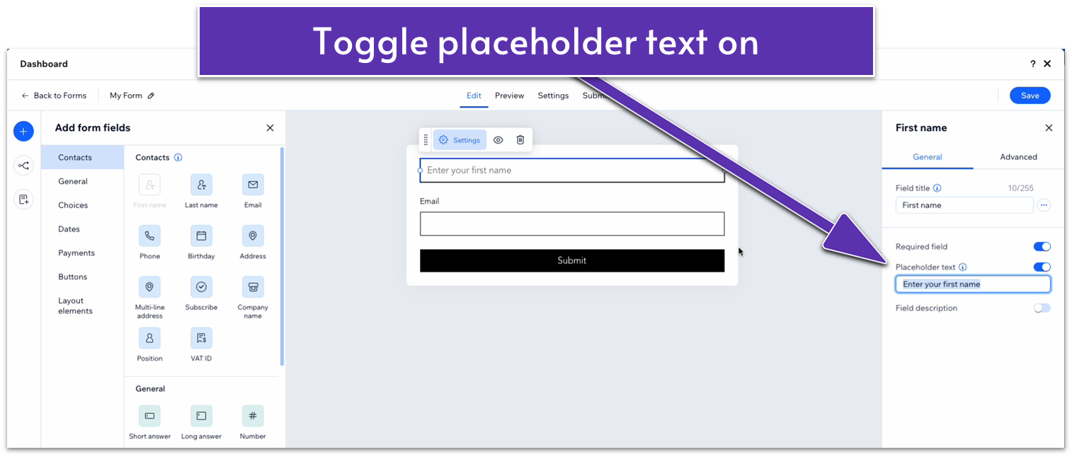
- Hide the field title for the email field.
- Toggle on “Required field.”
- Toggle on “Placeholder text” and write the text you want the empty field to show.
- Stretch the “Submit” button to make it smaller.
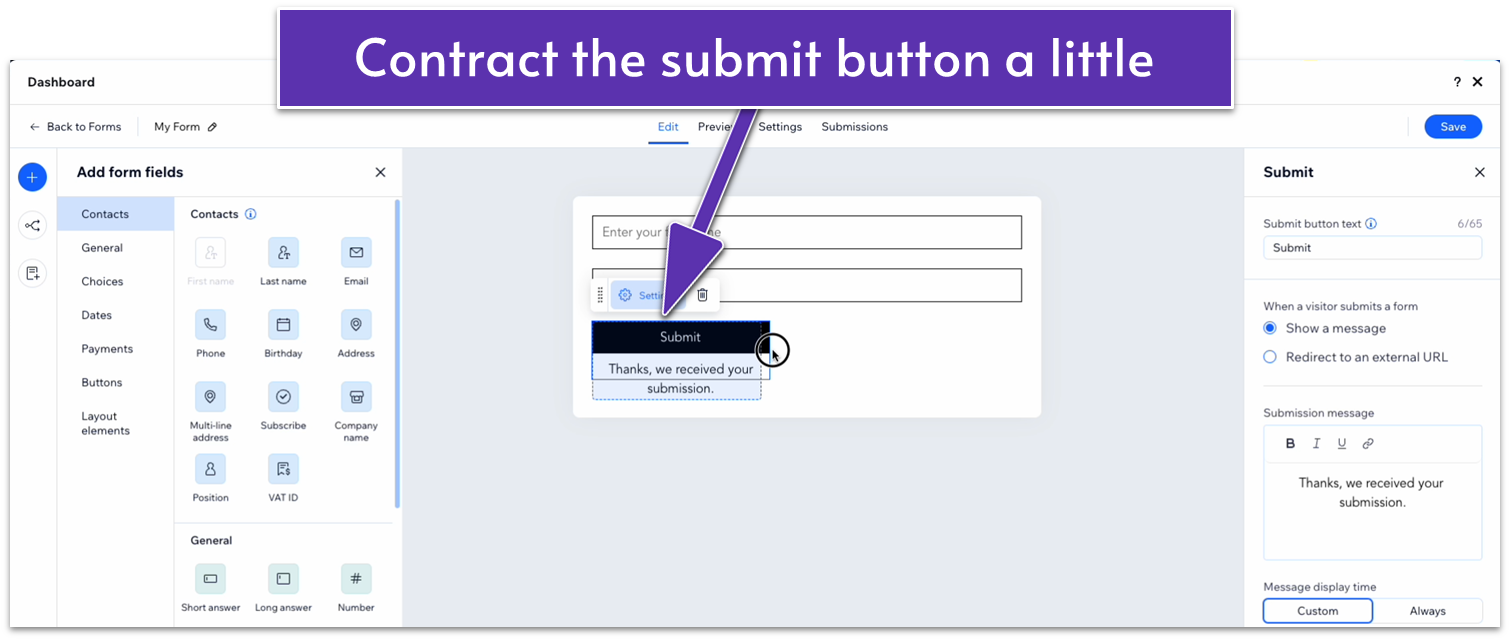
- Click on “Save” in the top-right corner.
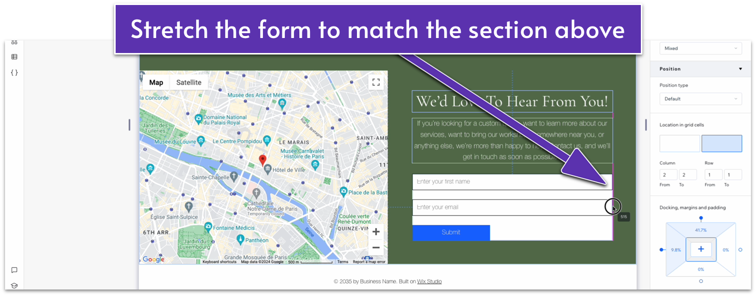
- Stretch the corners of the form element to match the edges of the text boxes.
 Step 7: Stack the text elements and form together.
Step 8: Edit the stack’s spacing.
Step 7: Stack the text elements and form together.
Step 8: Edit the stack’s spacing.- Set the bottom margin for the header to 10px scale.
- Set the bottom margin for the paragraph text to 20px scale.
- Set all margins for the stack to 0.
- Set the bottom margin to an 80px scale.
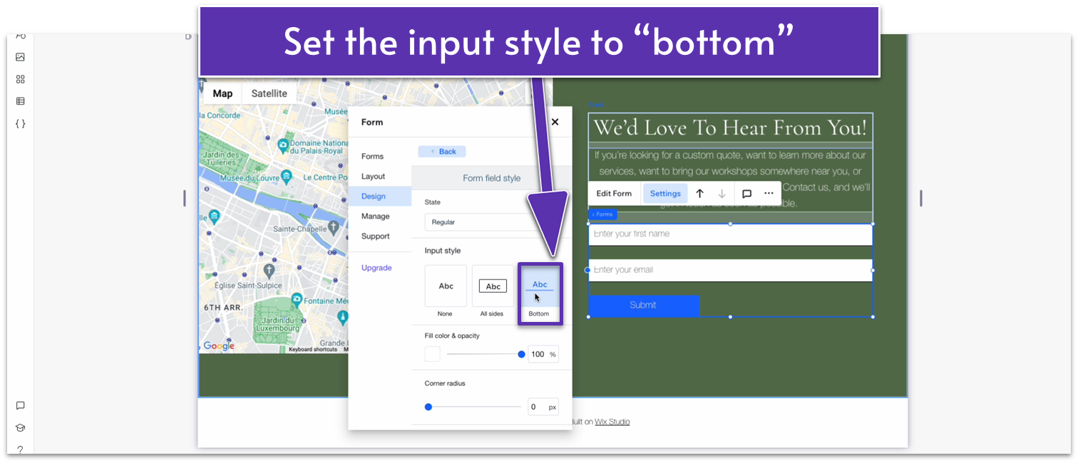
- Click on the form and then select “Settings” on the pop-up menu.
- Head to “Design” and then “Form background.” There, set the background color opacity to 0%.
- Go back to “Design” and then “Form fields.” Change the input style to “Bottom.”
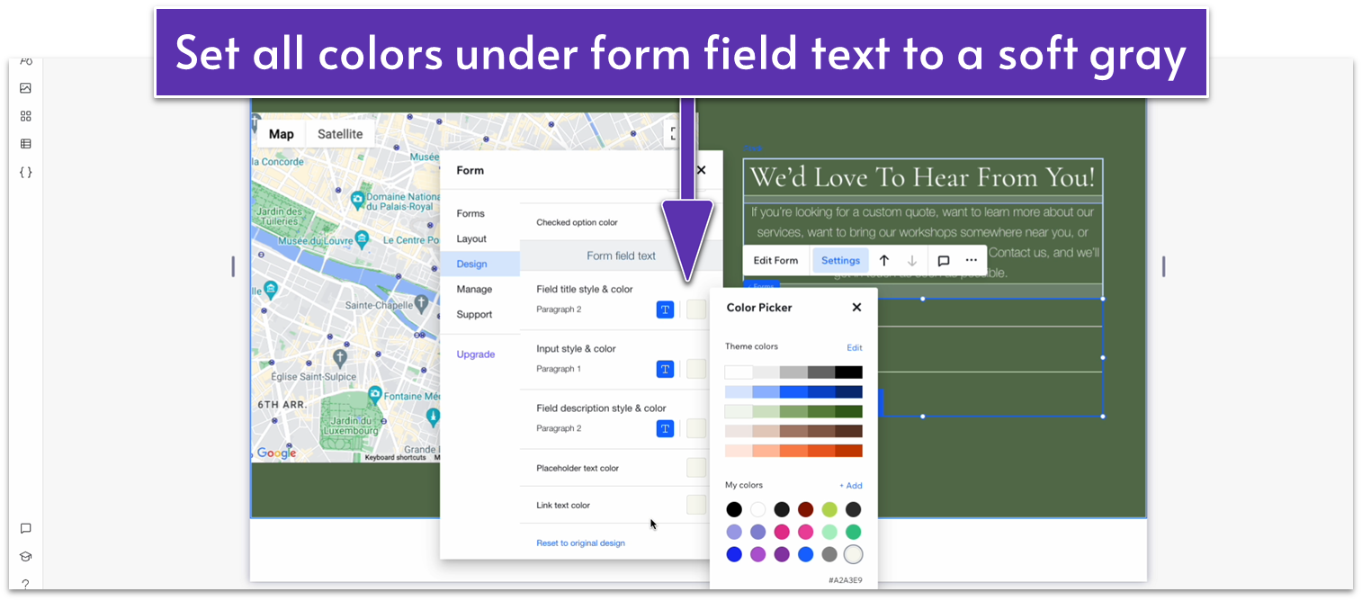
- Still on “Form fields,” set the fill color to 0%.
- Set the border color to a soft gray (#323232 HEX).
- Set the “Checked option color” to white (#FFFFFF HEX).
- Set all colors under “Form field text” to a soft gray (#F9F9F1 HEX
- Go back to “Design” and then head to “Buttons.” Select the rounded hollow button under “Input style.”
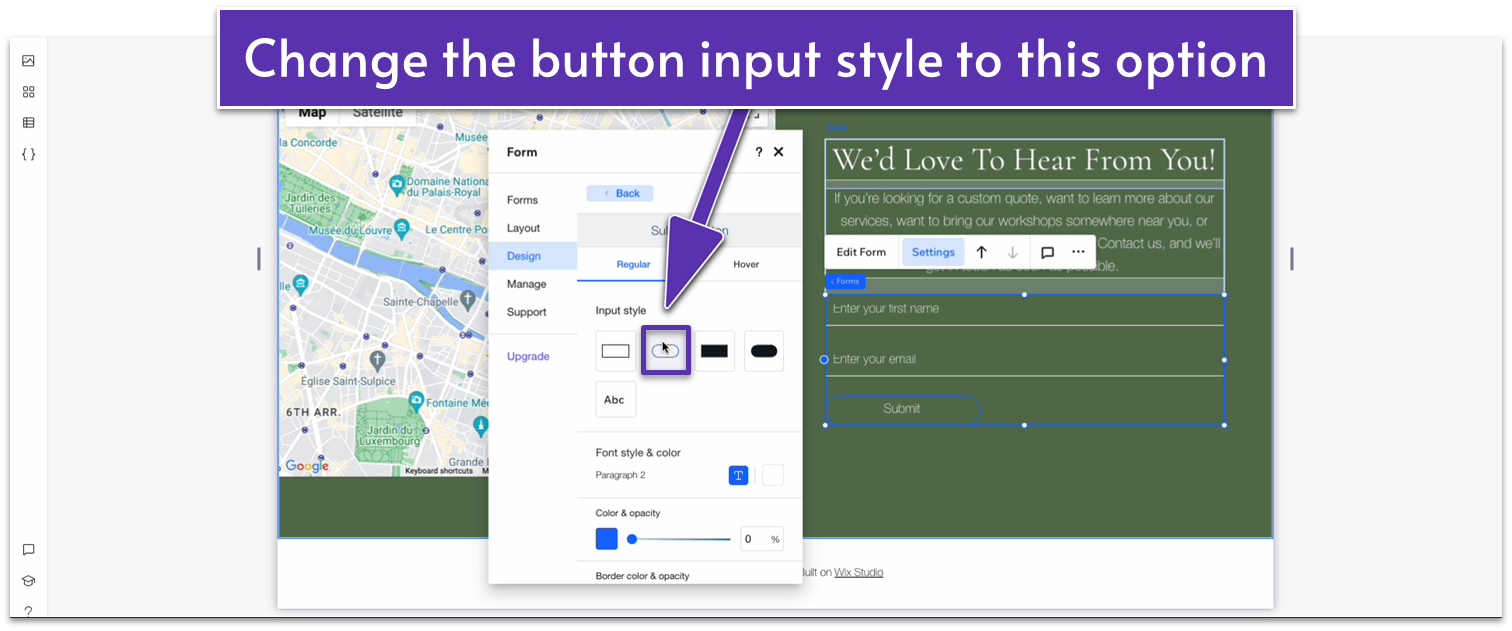
- Scroll down to “Font style & color” and change the color to the same soft gray as before (#F9F9F1 HEX).
- Change the color under “Border color & opacity” to the same soft gray (#F9F9F1 HEX).
- Scroll back up and select the “Hover” option to change the button’s behavior when hovering.
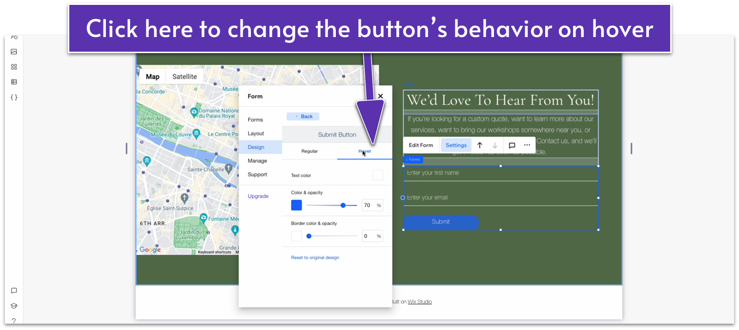
- Change the button’s color on hover to the same gray (#F9F9F1 HEX) and set the opacity to 100%.
- Change the button’s border color to (you guessed it) gray (#F9F9F1 HEX) and set the opacity to 100%.
- Change the text’s color on hover to a dark green (#5C7452 HEX).
Adapt for Tablet and Mobile Views
Step 1: Adapt for tablet view. On tablet view:- Change the sections layout from 2×1 to 1×2.
- Set the location in grid cells for the text stack to the top row.
- Set the location in grid cells for the map to the bottom row.
- Set the top and bottom padding for the entire section to 70px.
- Set the vertical gaps for the entire section to 30px.
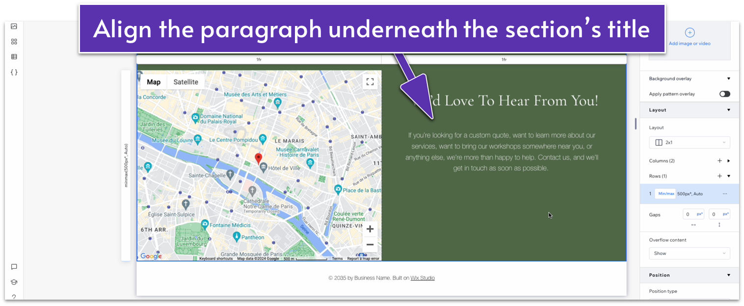
- Change the color for the “We’d Love To Hear From You!” text to white (#FFFFFF HEX).
- Change the color for the paragraph text below to white (#FFFFFF HEX).
- Stretch the text stack to align its edges with the section above. Its width should now be 720px.
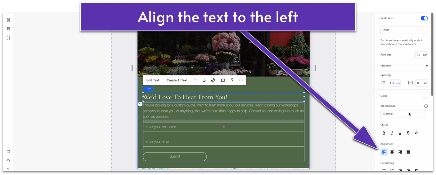
- Align both text elements to the left.
- Set the bottom padding for the heading text to 10px.
- Set the bottom padding for the paragraph text to 20px.
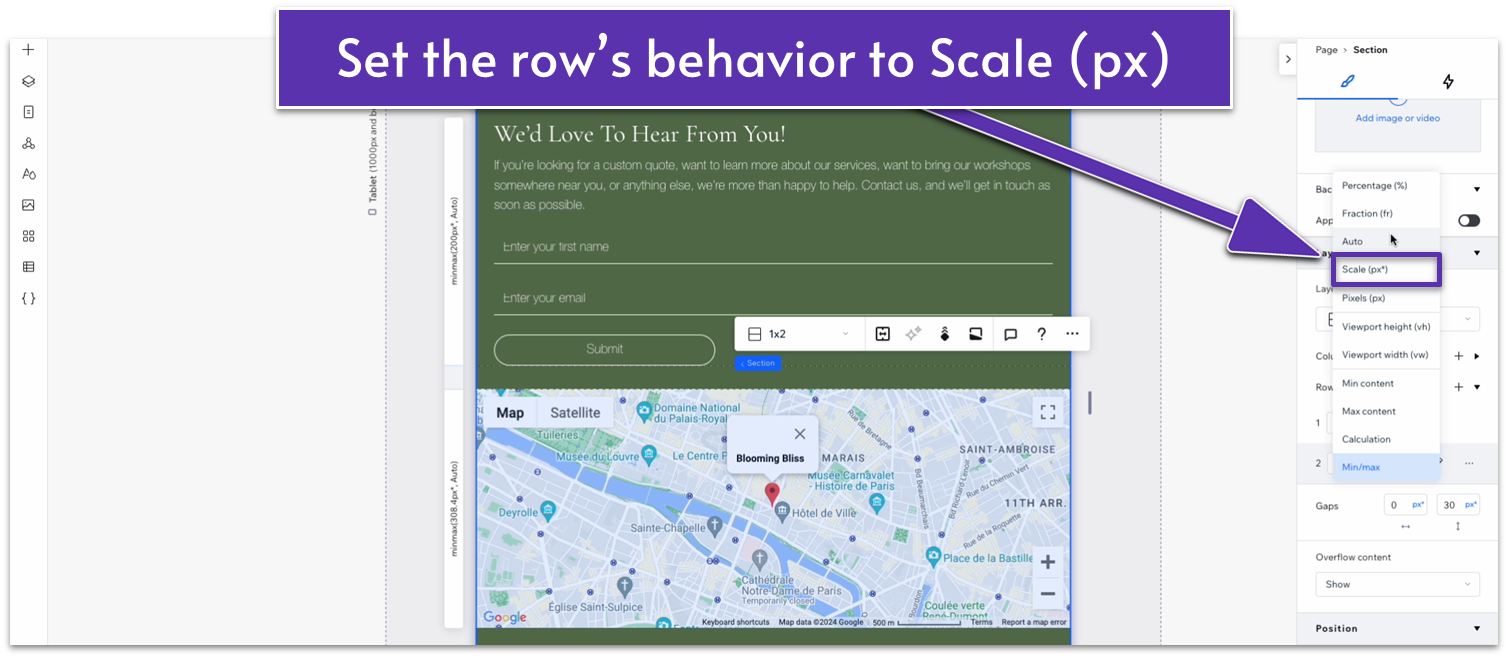
- Set the behavior for the bottom row to Scale (px) and set it to a 400px scale.
- Set the top row’s behavior to auto.
- Set the bottom padding for the heading to 10px.
- Set the bottom padding for the paragraph to 20px.
- Set the top and bottom padding for the entire section to 70px.
- Change the vertical gap for the entire section to 30px.
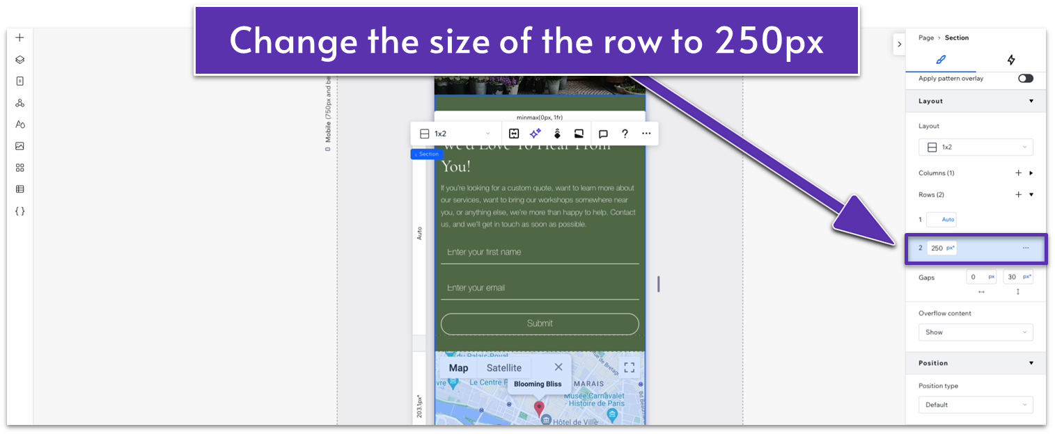
- Change the scale for the bottom row to 250px.
- Set the width for the heading text to 280px.
2.8 Instagram Section
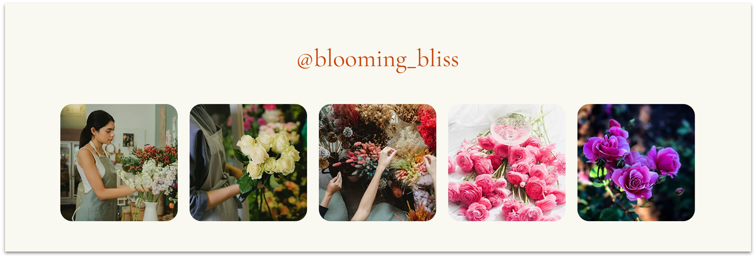 Instagram is a very effective way to reach customers and keep them updated on our business’ latest news. We’ll add a small section linking our homepage and social media presence.
Step 1: Add a new section and apply an advanced CSS grid.
Instagram is a very effective way to reach customers and keep them updated on our business’ latest news. We’ll add a small section linking our homepage and social media presence.
Step 1: Add a new section and apply an advanced CSS grid.- Set the top and bottom padding to 80px scale.
- Set the section layout to 1×2.
- Set the vertical gap between rows to 50px.
- Copy the heading from the section above and paste it into the top row.
- Change the font color to a contrasting orange (#C94001 HEX).
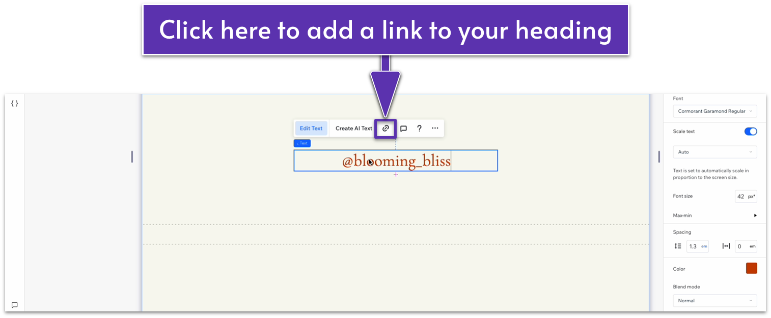
- Replace the text with your business’ Instagram user name.
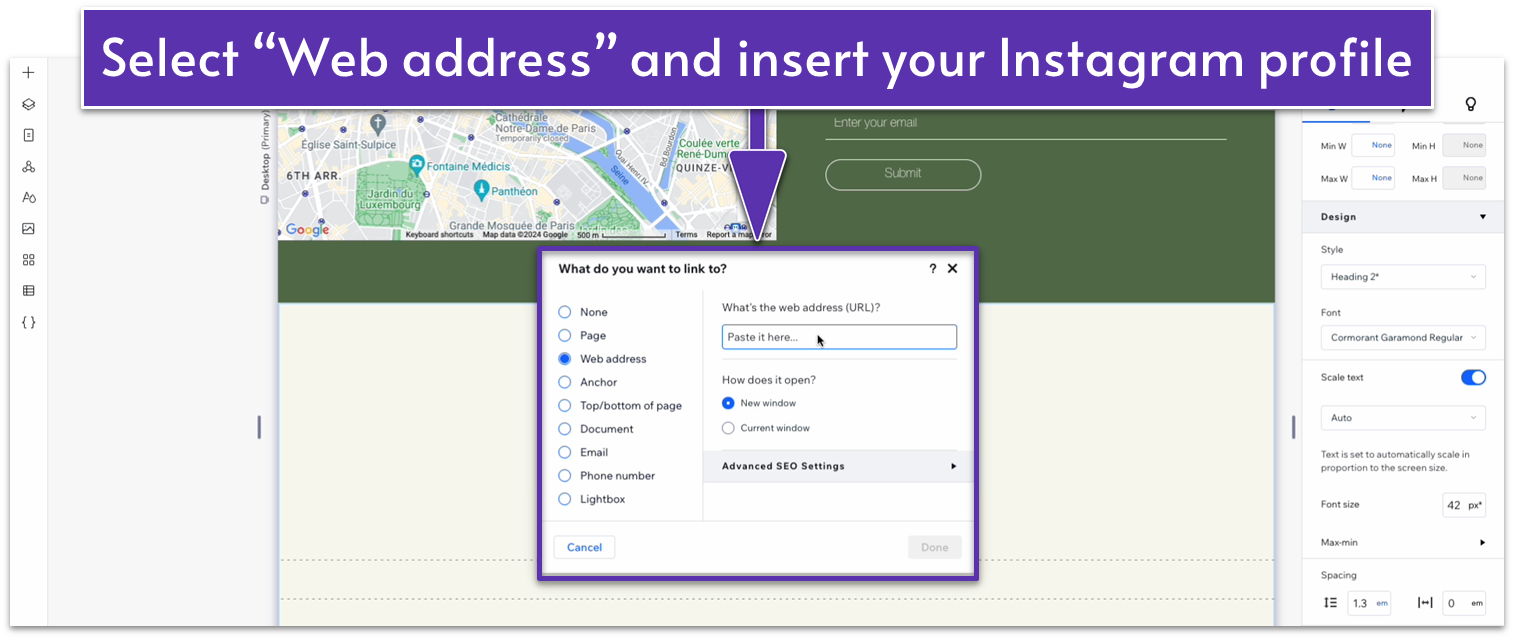
- Add a link to the heading and select “web address.” Insert your Instagram address (we’ll use placeholder text now since we don’t have Instagram for this business).
- Set all margins to 0.
- Set the row’s behavior to auto.
- Set all margins to 0.
- Change the repeater’s width to 1080px.
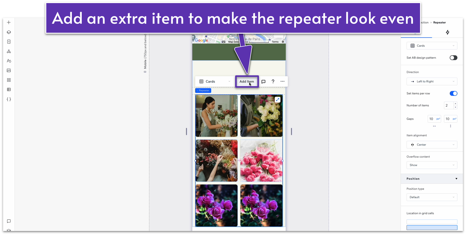
- Set the number of items per row to 5 and add two more items so there are 5 total.
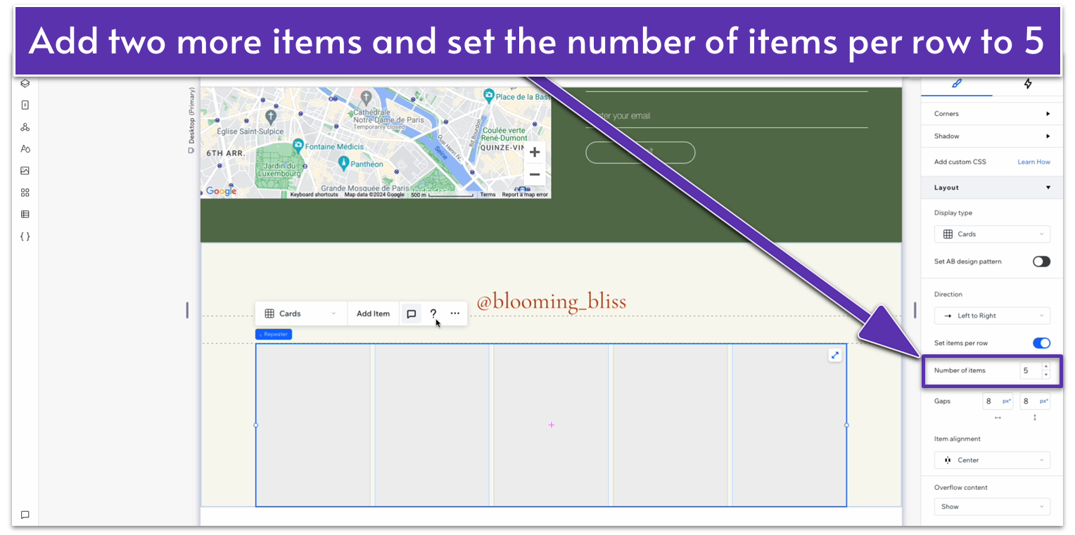
- Set the horizontal and vertical gaps to 20px.
- Remove the background for each item.
- Click on the blue link above the image box that says “Image.”
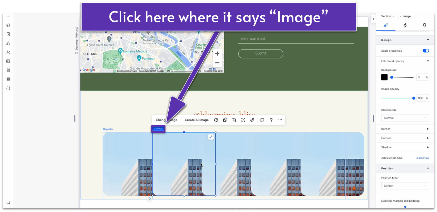
- Select “Item” on the blue expandable menu.
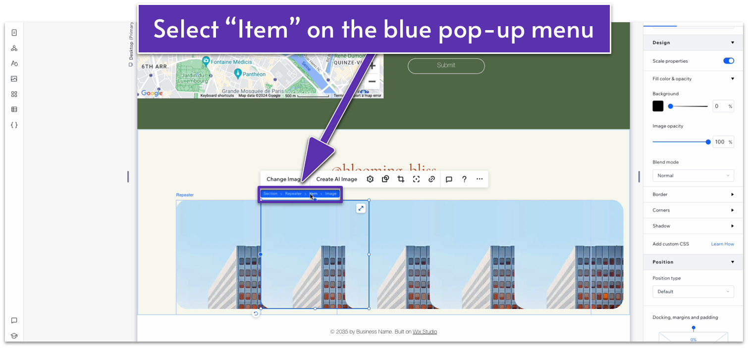
- Check the item’s width, then click on the image and set its width to that same value (200 px in this case).
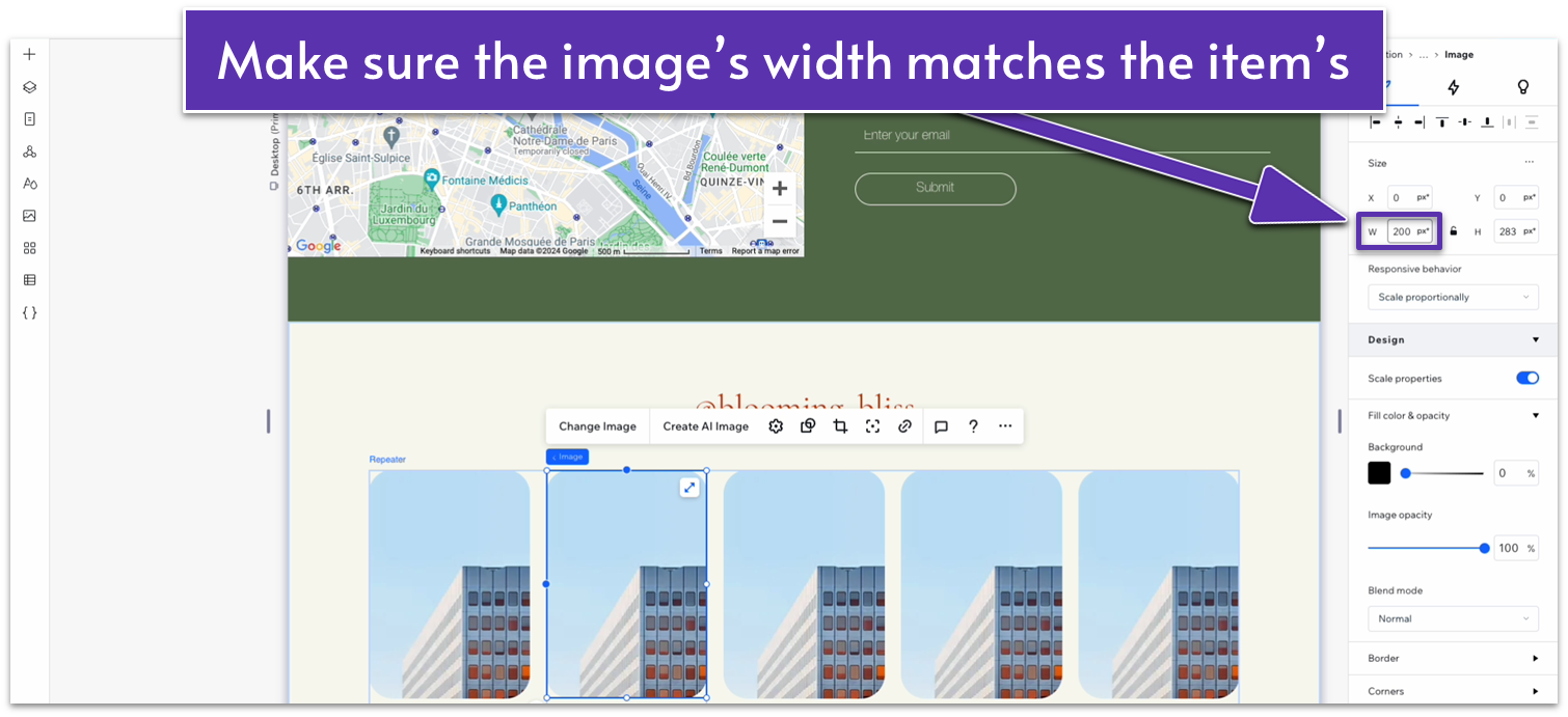
- Set the image’s height to match the width.
- Click on the lock icon to lock the aspect ratio.
- Set the row behavior for the repeater items to auto.
- Set all image corners to a 20px radius.
- Click on one of the photos and then on the chain icon. Add a link to a web address and link them to your Instagram page.
- Repeat the process for all images.
Adapt for Tablet and Mobile Views
Step 1: Adapt for tablet view On tablet view:- Align the text with the username to center.
- Stretch the sides of the image repeater to align with the section above.
- Stretch the sides of the text box to match the edges of the section above.
- Set the vertical gap for the entire section to 30px.
- Set the top and bottom padding for the entire section to 70px.
- Change the number of items per row on the repeater to 2.
- Set the vertical and horizontal gaps for the repeater to 10px.
- Set the corner radius for the repeater’s items to 12px.
- Add an extra item to make the repeater look even.
- Change the image for another one from your Instagram.
- Go back to the tablet view and change the number of items per row to 3.
- Go back to the desktop view and change the number of items per row to 6.
2.9 Footer
 We’ll finish with a simple footer section with essential navigation elements, contact information, and a copyright notice at the bottom.
You don’t have to add a new section here because the footer appears by default.
Step 1: Check the bottom padding for the previous section.
Regardless of the section above, we want to ensure that it has some padding before going into our footer. In our case, we’ve already set the bottom padding for the section above to 80px scale.
Step 2: Change the background color of the footer.
We’ll finish with a simple footer section with essential navigation elements, contact information, and a copyright notice at the bottom.
You don’t have to add a new section here because the footer appears by default.
Step 1: Check the bottom padding for the previous section.
Regardless of the section above, we want to ensure that it has some padding before going into our footer. In our case, we’ve already set the bottom padding for the section above to 80px scale.
Step 2: Change the background color of the footer.- We’ll set it to the same dark green as some previous sections (#5C7452 HEX).
- Set the footer’s height to 500px.
- Remove the default footer text.
- Apply an advanced CSS grid to the footer section
- Center the container and set its width to 1080px.
- Set all margins to 0.
- Apply an advanced CSS grid to the container and remove the background.
- Set the layout to 2×1.
- Copy the logo from the header and paste it into the left-side column.
- Since our logo is a vector graphic, we can change its colors in the inspector under “Design.” Set the text color to white (#FFFFFF HEX).
- Stretch the logo to make it a little bigger and align it to the upper-left corner of the container.
- Copy text from one of the dark-green sections above and paste it into the container.
- Replace the text with a brief description of your business and align it to the left.
- Place the text just below the logo and stack them together.
- Set the item spacing for the stack to 20px scale.
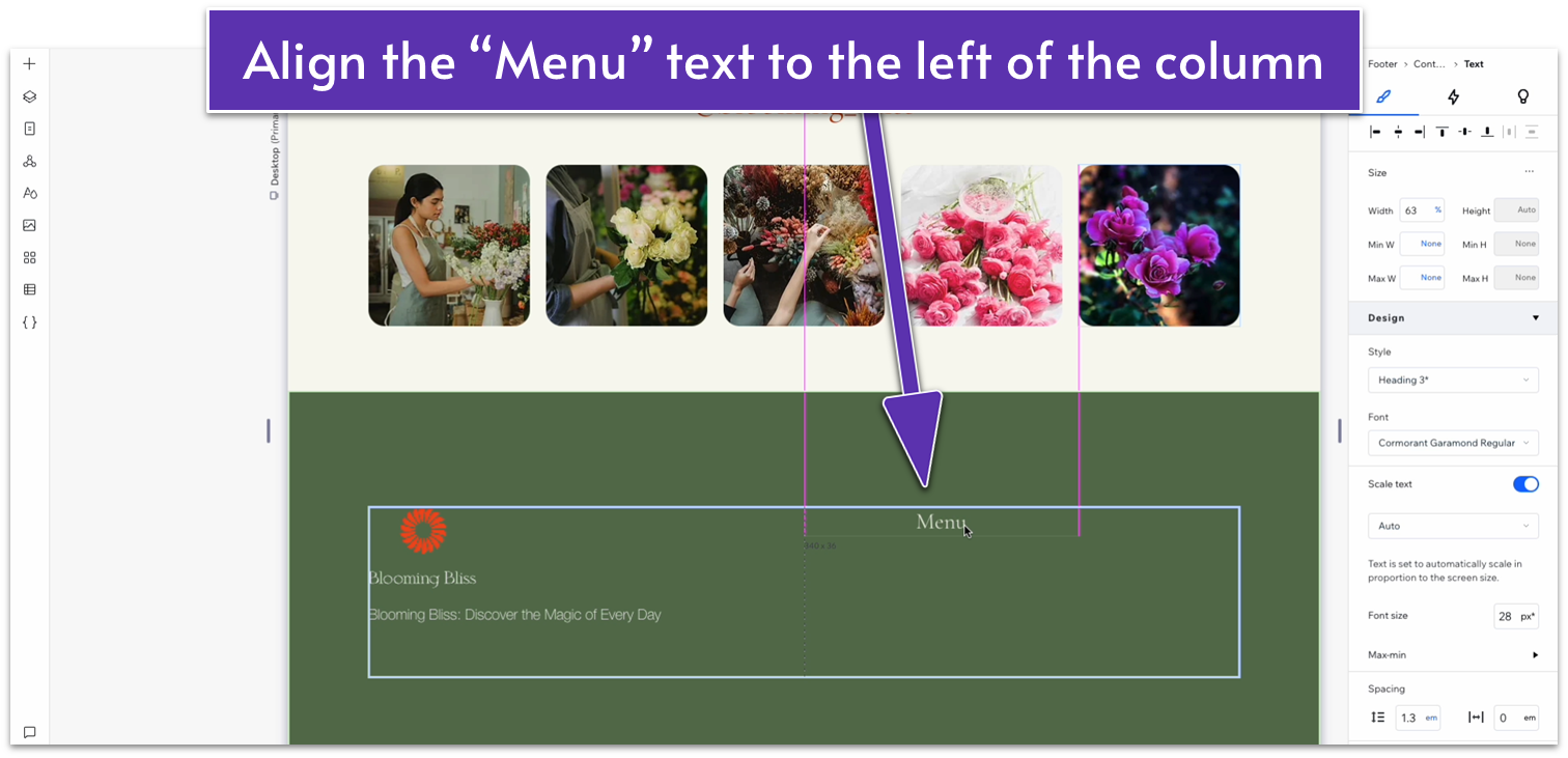
- Align the heading with the top-left corner of the right-side column.
- Set the text box width to 190px.
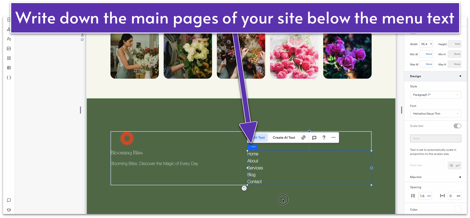
- Copy the description text below the logo and paste it under the menu heading.
- Replace the text with the name of the most important pages your site will have, each on a new line.
- Align the menu header’s text to the left.
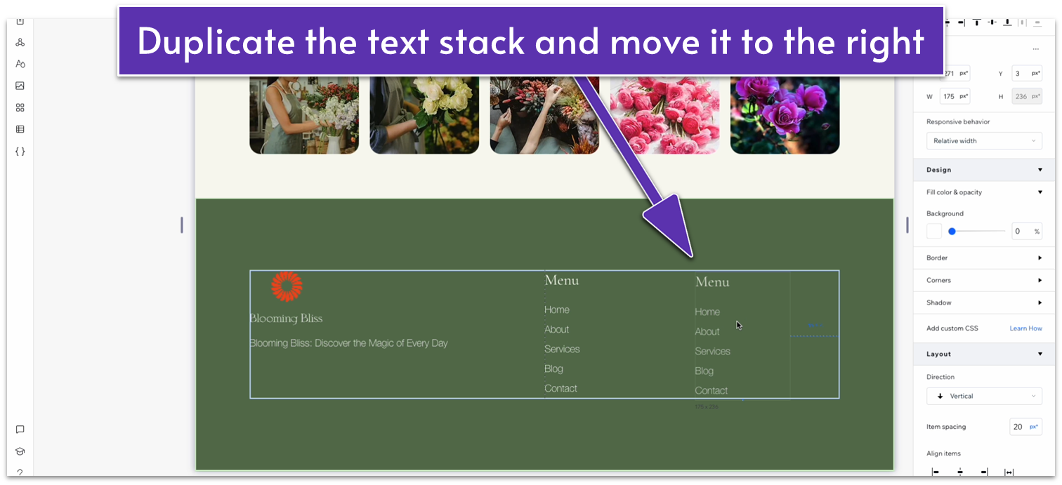
- Move the navigation text just below the menu.
- Stack the menu and navigation elements together.
- Set the item spacing to a 20px scale.
- Set the line spacing for the navigation text to 2 em.
- Set the stack’s width to 175px.
- Set the menu and navigation text width to 100%.
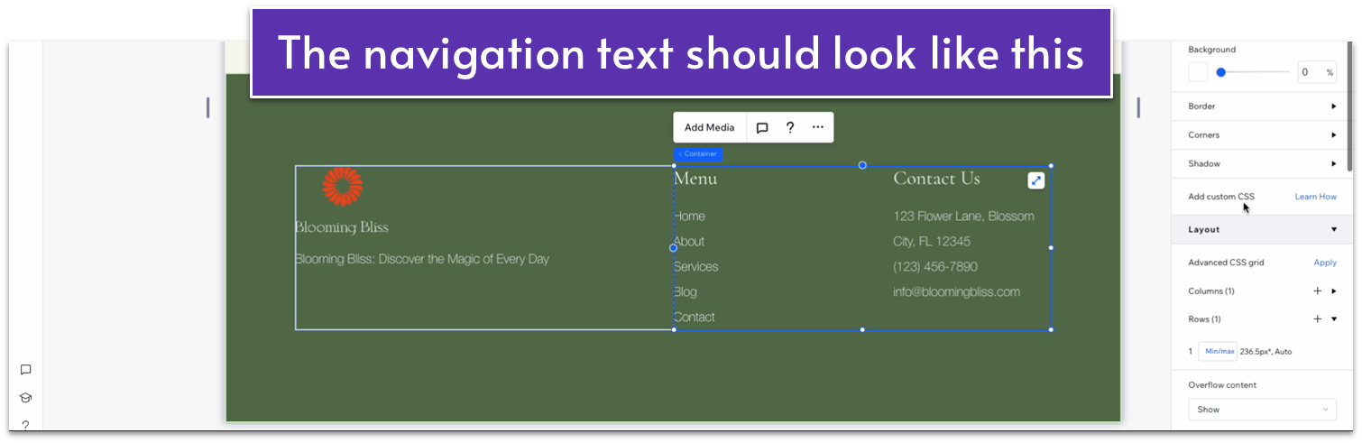
 Step 9: Change the second stack’s text to contact information.
- Replace the “Menu” heading with “Contact Us.”
- Replace the navigation text with your business address.
- Stretch the text box’s width to 225px.
- Re-align the contact stack to the top of the container if necessary.
- Add your business phone number in a new line under your address.
- Add your business email under your phone number.
- Highlight your phone number and add a phone number link to it.
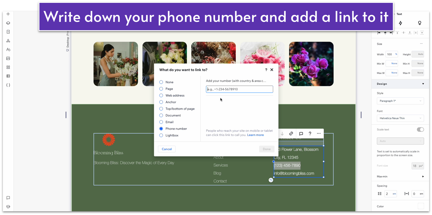
- Highlight your business email and add an email link to it.
- Remove the text underline from both links.
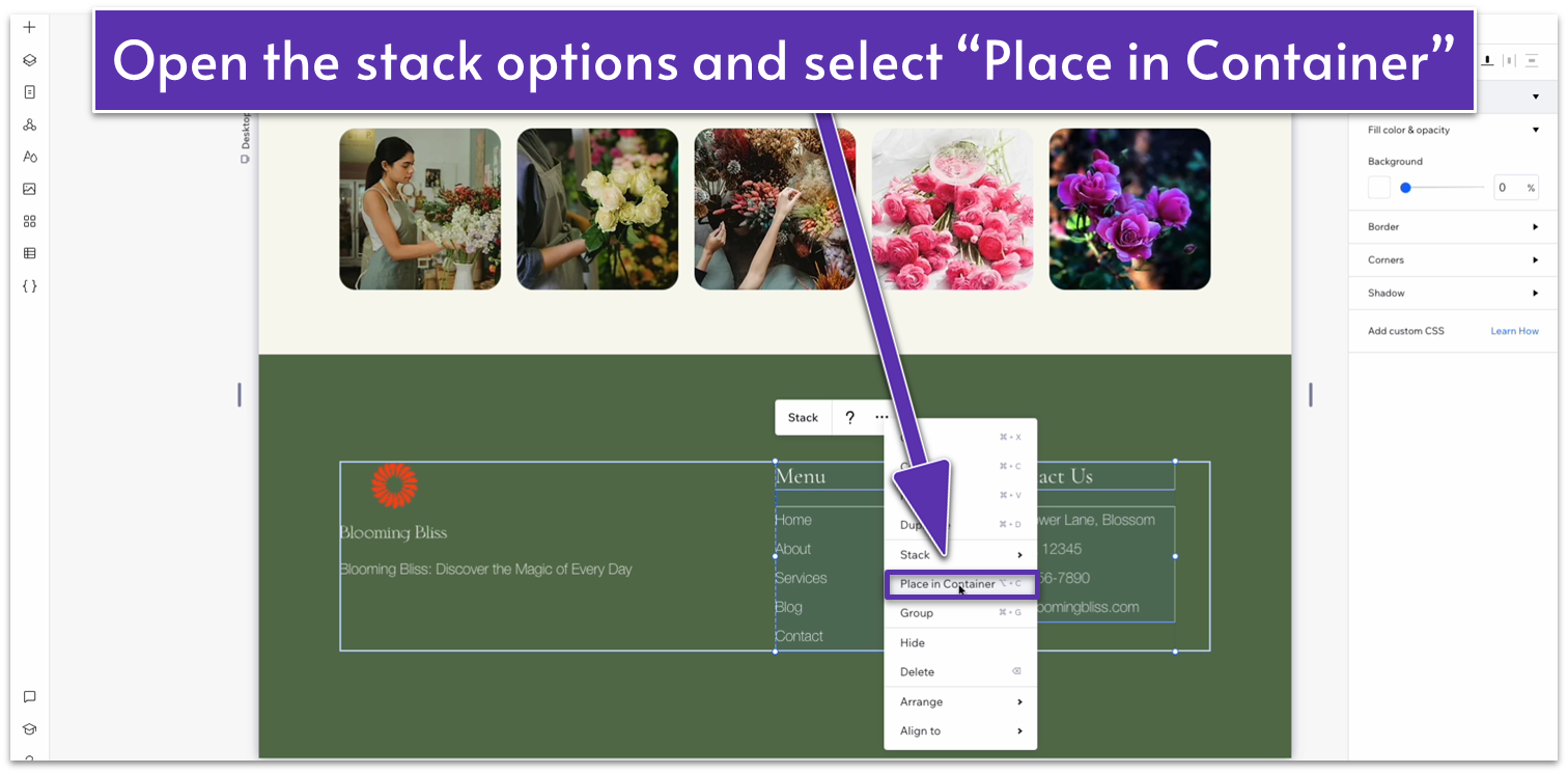
- Select both text stacks and then select “Place in Container” on the pop-up menu.
- Apply advanced size settings and change the container’s width to 100%.
- Apply an advanced CSS grid to the container and set the layout to 2×1.
- Change the horizontal gaps between columns to 30px.
- Make sure the width for both stacks is set to 100%.
- Set the row behavior for the whole container box to auto.
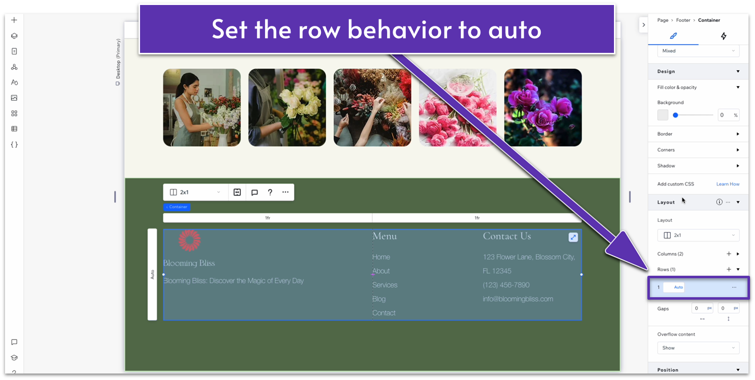 Step 13: Set the footer’s layout to 1×2.
- Set the vertical gap between rows to a 50px scale.
- Select the container with all our content so far and set its location in grid cells to the top row.
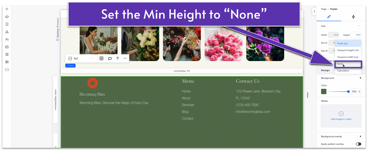
- Apply advanced size settings to the footer and change the “Min H” to “None.”
- Set the top row’s behavior to auto.
- Set the top padding for the footer to a 70px scale.
- Set the bottom padding for the footer to a 30px scale.
- Copy the text under the logo and paste it into the bottom row.
- Center the text box to the bottom row and align the text to the center.
- Replace the text with your copyright notice.
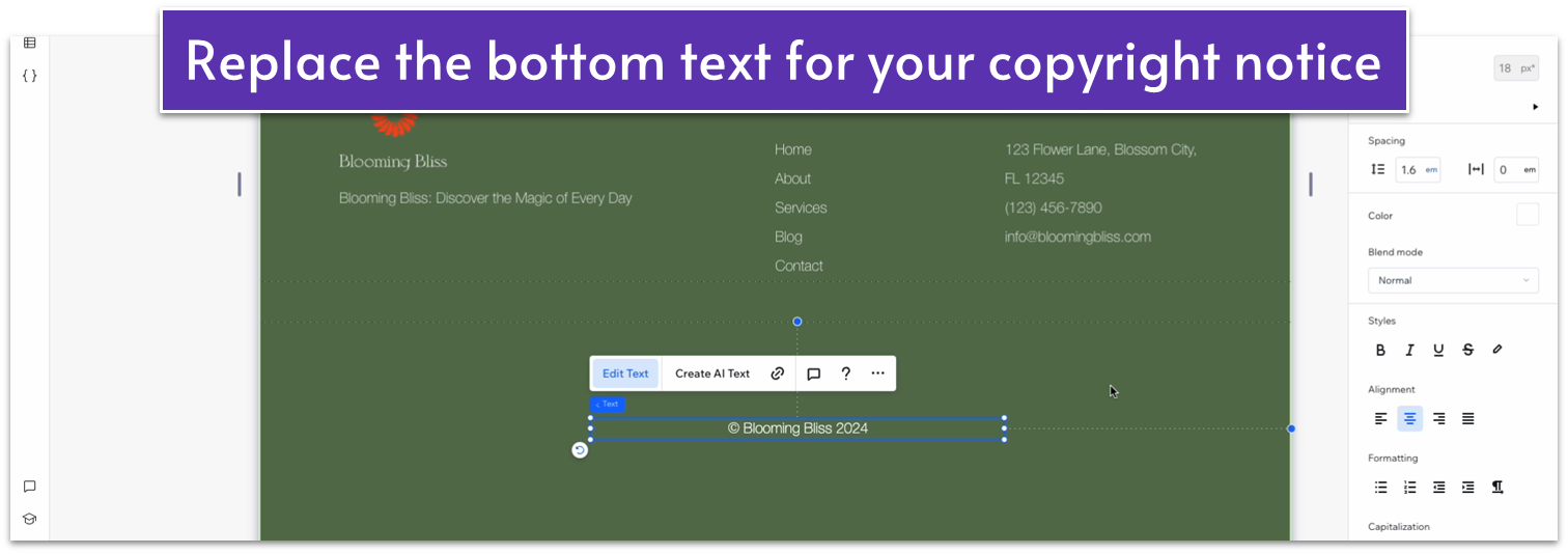
- Set all margins to 0 for the text box.
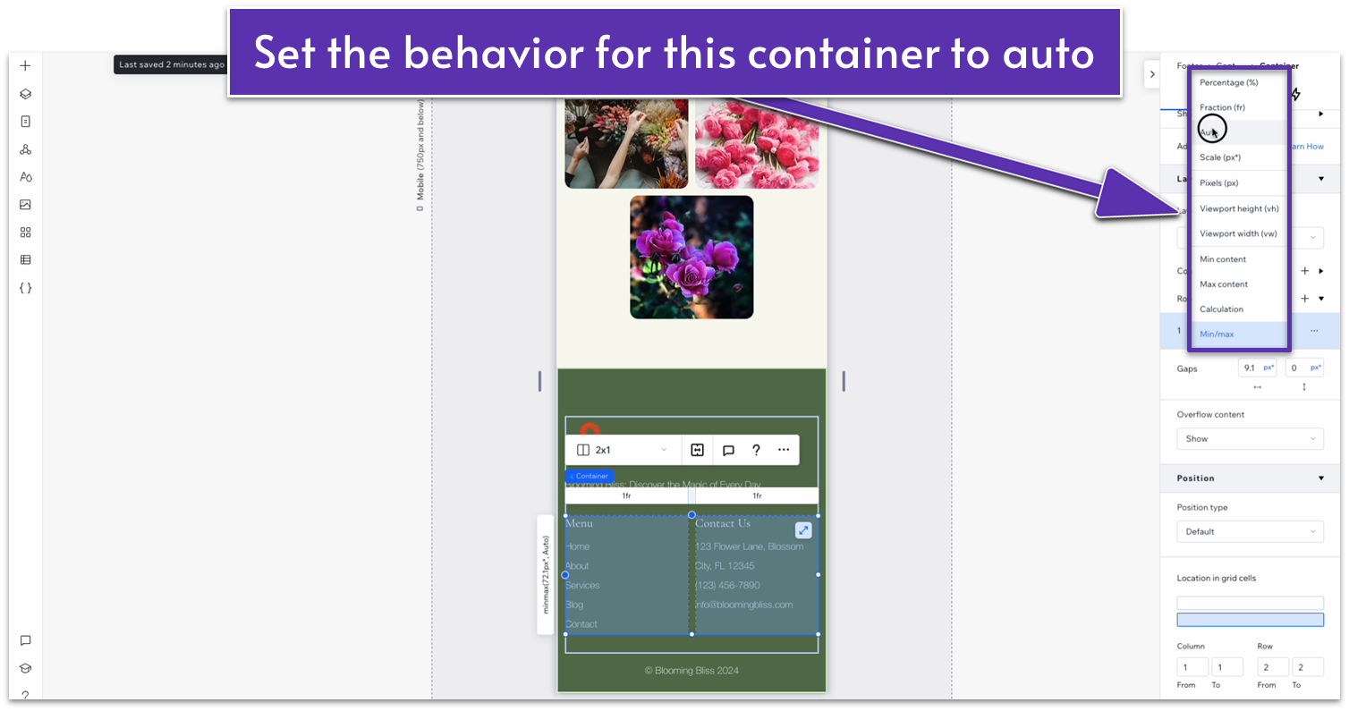
- Change the bottom row behavior to auto.
Adapt for Tablet and Mobile Views
Step 1: Adapt for tablet view On tablet view:- Stretch the sides of the container on the top row to match the edges of the section above.
- Set the top padding for the entire section to 70px.
- Set the bottom padding for the entire section to 20px.
- Set the horizontal gap within the container to a 30px scale.
- Change the width for the left-side stack to 244px.
- Set the width for the logo to 80px.
- Set the item spacing for all three stacks to 20px.
- Change the layout for the top row from 2×1 to 1×2.
- Set the vertical gaps for the container to a 30px scale.
- Set the behavior of both rows to auto.
- Change the item spacing for the top stack to 20px.
- Apply advanced size settings to the top stack and set its width to 100%.
- Set the width for the logo to 80px.
- Set the top padding for the entire section to 50px.
- Set the bottom padding for the entire section to 20px.
- Set the behavior of the container in the bottom row to auto.
- Set the vertical gaps for the entire section to 30px.
- Change the item spacing for the “Menu” and “Contact Us” text stacks to 20px.
