

Time to Complete Module: 2 hours
Last updated: 20 February 2025
IN THIS MODULE
Define the Main Purpose of Your Website
This guide will contain detailed instructions for building and adding many sections, which means it’s important for you to choose which parts you should pay attention to and which ones you can skip. Before doing anything, you’ll need to be completely clear on what you’re trying to accomplish with your site. This quiz is meant to help you get a sense of where to place your focus. It’ll help define the main purpose of your site, the pages you should include from the start, how to structure your copy, and more.
What are the most important goals for your site?
Multiple answers possible*
Step 1/3
Next
Who is your main target audience?
Multiple answers possible*
Step 2/3
Back
What main thing do you want visitors to do once on your site?
Multiple answers possible*
Step 3/3
Back
Start Again
- Define the main purpose of your site.
- Narrow down your target audience.
- Decide which main action you want visitors to take when they land on your site.
- Structure.
- Logo.
- Color palette.
Fonts. - Starter copy.
- Starter images.
Decide on the Structure of Your Website
You have two options here, depending on how creative you want to get with the sample sites we’ve built for you. If one of the sample sites is a perfect fit for your needs as is, you don’t need to worry about the site structure. Simply follow this guide step-by-step, use your own images and copy, and you’ll be able to hit “Publish” as soon as you’ve completed the guide. If, on the other hand, you want to customize your site beyond elements like images and copy – for example, if you want to mix and match pages or sections from multiple sample sites included in this guide – now is a good time to make these decisions. First, consider which pages you want to include on your website. If you took the quiz above, you should already know which pages are a must-have. If not, I recommend doing that now! Then, think about the structure of each page. You may even want to sketch each page on a piece of paper to make sure the different sections fit together well and to help guide your work once you start building. Here’s an example of a homepage sketch, with multiple segments illustrated side-by-side: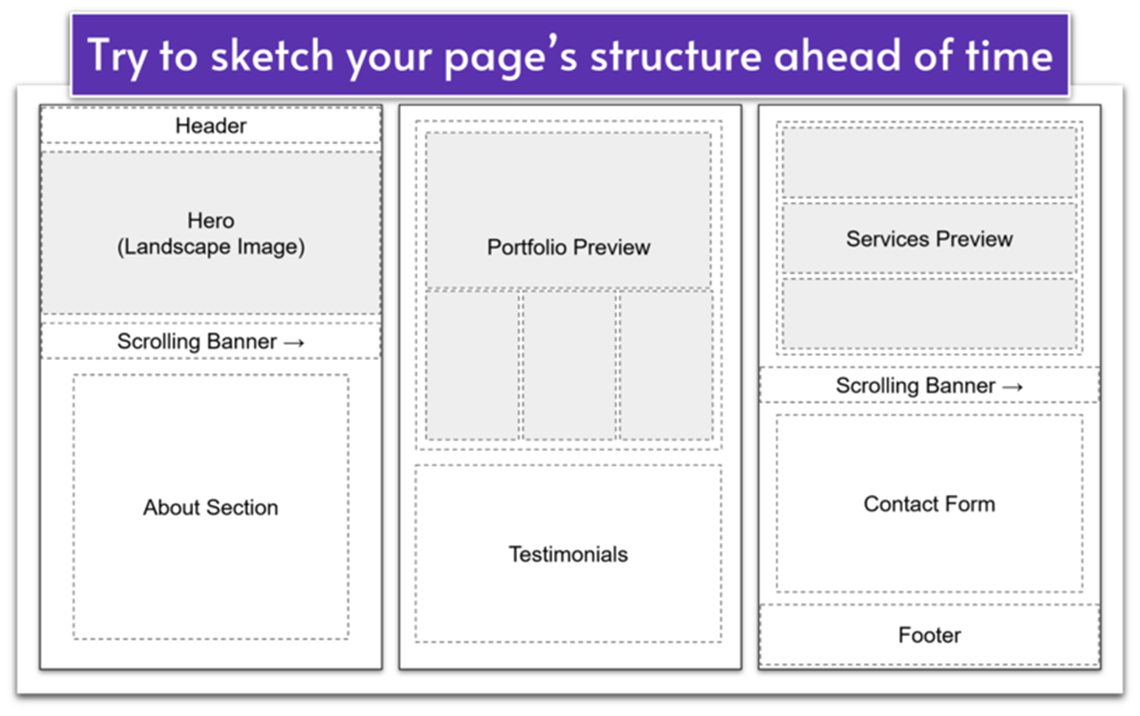 Don’t be afraid to mix and match. This guide includes the most common “building blocks” in Wix web design, and these blocks can be rearranged in many ways to create truly unique websites.
For example, maybe you’re building a photography website, but want your homepage hero section to include a stunning landscape image instead of a scrolling collage. You can achieve this by using the step-by-step guide for the Blooming Bliss homepage hero instead of Emily Smith.
Have a look around the three sample sites and sketch your ideal page structure for each of the pages you want to include on your website. The final design should feel like it represents your brand, but when in doubt, remember to keep things simple for a clean, cohesive look and easy navigation.
Don’t be afraid to mix and match. This guide includes the most common “building blocks” in Wix web design, and these blocks can be rearranged in many ways to create truly unique websites.
For example, maybe you’re building a photography website, but want your homepage hero section to include a stunning landscape image instead of a scrolling collage. You can achieve this by using the step-by-step guide for the Blooming Bliss homepage hero instead of Emily Smith.
Have a look around the three sample sites and sketch your ideal page structure for each of the pages you want to include on your website. The final design should feel like it represents your brand, but when in doubt, remember to keep things simple for a clean, cohesive look and easy navigation.
Sign Up or Log in to Wix Studio
We’ll begin with a completely blank site, ensuring that anything you add is intentional with a solid understanding of the underlying principles. This will empower you to make informed decisions and adjustments as you go, and it will also ensure your website doesn’t feel like a Wix template. So, let’s start at the beginning. All you have to do at the moment is:- Go to Wix.com/studio.
- Create an account if you don’t have one, or log in if you do.
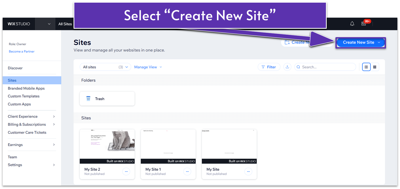
- Once there, click on the “My Workspace” tab under your user icon.
- Then click “Create a New Site.”
 Now that you have created your blank template, you must set up a few things before adding elements to your site.
Create a Logo
You can think of your logo as the smallest unit of information necessary to identify your website or brand. In other words, the thing that takes the least amount of effort for someone to say: “Hey! I know where that’s from!” If you already have a logo, you’re one step ahead of the rest, and you can (and should) plan to use it and skip to the next step. If you need to create a logo from scratch, you have a couple of options: you can hire freelance designers to create a logo for a modest fee, or you can create a simple text-based logo directly from Wix. For the purposes of this guide, I suggest you go ahead and create your own text-based logo now.Create Your Logo With Wix
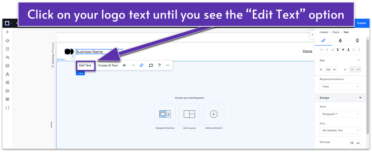
In the editor, simply choose a font for your business name, make the text bigger, and change the default icon to one of the available designs. Here’s the step-by-step process to create a logo in Wix: Step 1: Open your website on Wix studio and select the default logo- Click on the default logo on the header, then click again on the text of your logo.
- Select “Edit text.”
 Step 2: Change the text for your business name
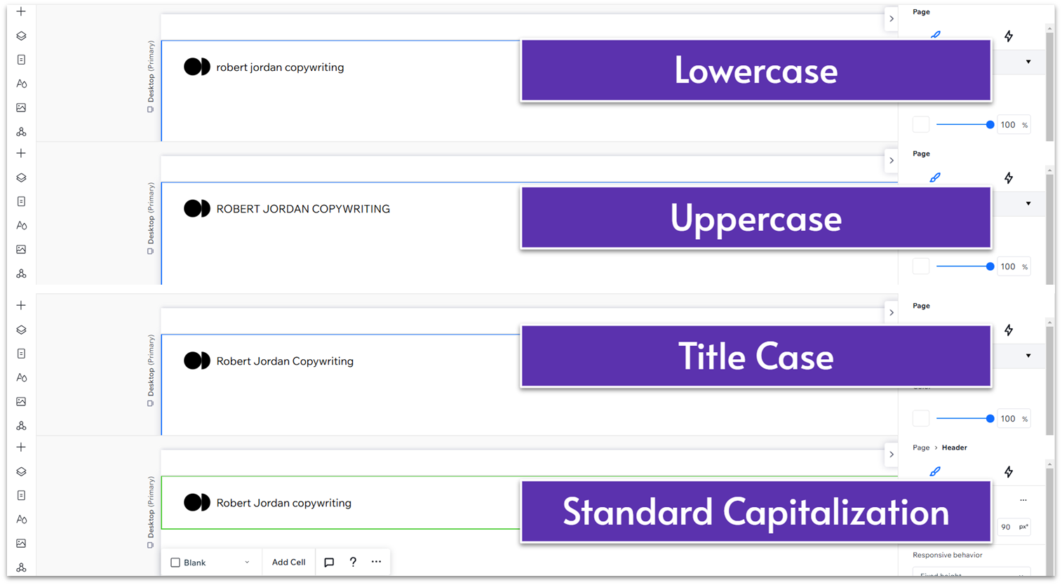
You can experiment with capitalization here. Try to get a feel for what fits your brand. Capitalizing most words except for articles like “the,” “a,” “an,” and short prepositions and conjunctions (less than four letters long) is what’s known as title case. Title case capitalization is probably the most common for web-based logos, as It Looks Both Professional and Attractive.
If you don’t capitalize any letter on your title, that’s lowercase capitalization. A text-based logo will look friendlier and more consistent, but you lose the formality of title case capitalization. You can also go the opposite way and capitalize every letter (uppercase capitalization). Uppercase can be great if you really want to have a VISUAL IMPACT, BUT IT CAN LOOK WORSE IF MISHANDLED OR OVERUSED.
Finally, you can just capitalize your logo normally. This is the most understated approach, and while you don’t run the risk of seeming unprofessional, it won’t make your logo stand out.
Step 2: Change the text for your business name
You can experiment with capitalization here. Try to get a feel for what fits your brand. Capitalizing most words except for articles like “the,” “a,” “an,” and short prepositions and conjunctions (less than four letters long) is what’s known as title case. Title case capitalization is probably the most common for web-based logos, as It Looks Both Professional and Attractive.
If you don’t capitalize any letter on your title, that’s lowercase capitalization. A text-based logo will look friendlier and more consistent, but you lose the formality of title case capitalization. You can also go the opposite way and capitalize every letter (uppercase capitalization). Uppercase can be great if you really want to have a VISUAL IMPACT, BUT IT CAN LOOK WORSE IF MISHANDLED OR OVERUSED.
Finally, you can just capitalize your logo normally. This is the most understated approach, and while you don’t run the risk of seeming unprofessional, it won’t make your logo stand out.
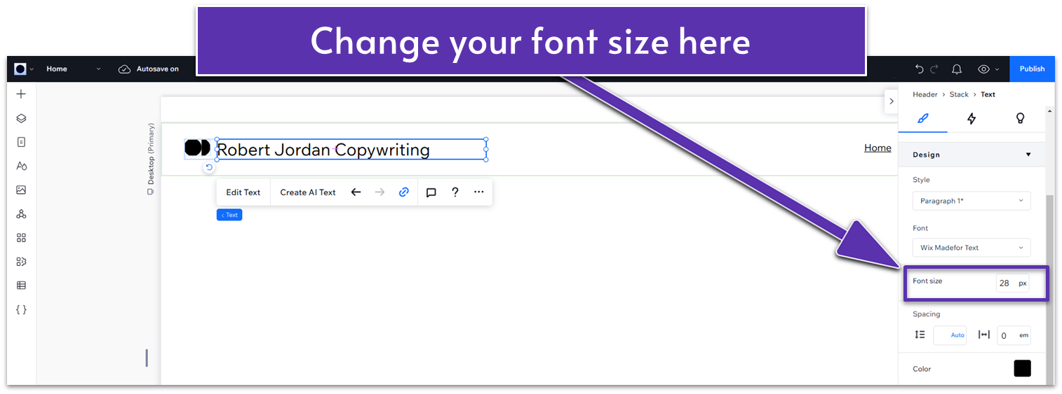
 Step 3: Change the font size
You’ll usually want to make it a little bigger than the default option, but play around with it to find the ideal size for you. I will set mine to 28px.
Step 3: Change the font size
You’ll usually want to make it a little bigger than the default option, but play around with it to find the ideal size for you. I will set mine to 28px.
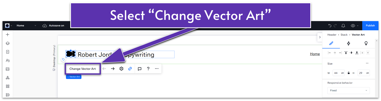
 Step 4: Change the icon of your logo
- Double-click on the icon next to your logo.
- Select “Change Vector Art” on the pop-up menu.
- In the vector art dashboard, use the search bar to find something that relates to your industry or concept.
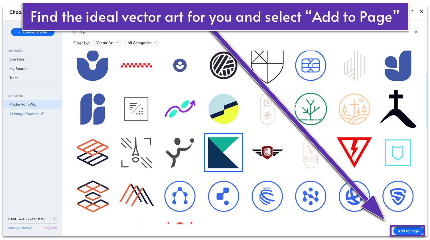
- Select “Add to page.”
- Click on the text again and scroll down to “design” and then “font.”
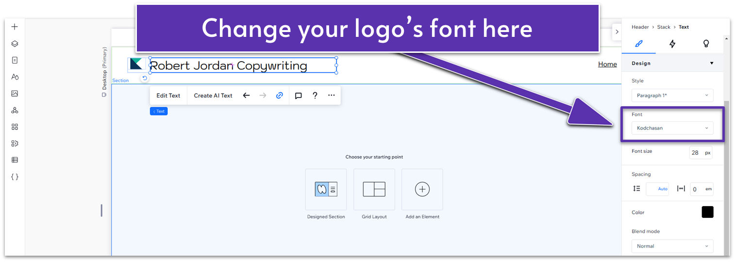 Change the font to something that better matches the design of your site. Usually, you might not want to go for something too over-stylized, as it might give your logo an amateurish look. This rule is not set in stone, though. It all depends on how well you know your brand.
Step 6: Change the colors for the icon and text
Change the font to something that better matches the design of your site. Usually, you might not want to go for something too over-stylized, as it might give your logo an amateurish look. This rule is not set in stone, though. It all depends on how well you know your brand.
Step 6: Change the colors for the icon and text- Click on your text, head over to the “design” section, and change the font color. Remember to select something with enough contrast that it stands out from the rest of your site.
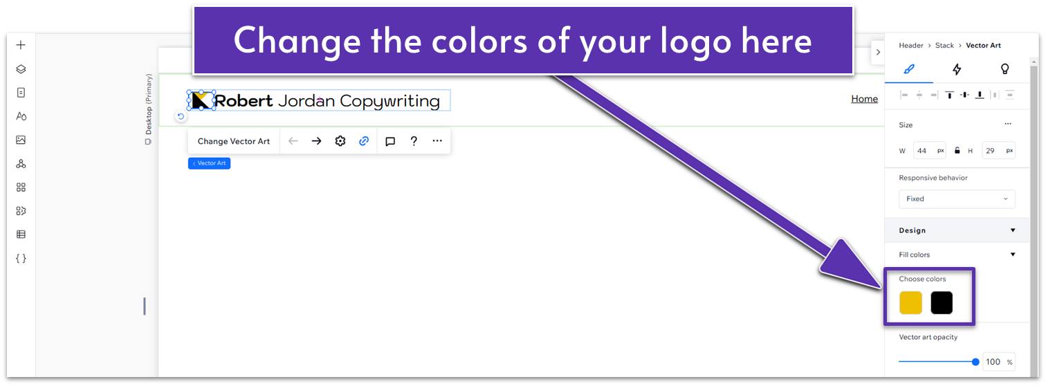
- Now, click on the icon and change its color as well. If it has two or more colors, ensure they complement each other well.
- Use your tools with intention. You can capitalize, underline, outline, bold, italicize, and do a bunch of stuff to the text. Sometimes, beginners make the mistake of overusing these tools because the logo doesn’t look “designed” enough, e.g., a simple text-based logo just doesn’t have the weight it should. The opposite is usually true. You want to avoid overstuffing your logo, so use these tools sparingly. Assume that less is more unless you’re sure that doing “more” will have a positive effect.
- Match your colors. Try to use as few colors as possible, and if you’re going to use many, make sure they are complementary. Shades of gray might look good. Three bright primary colors almost definitely will not.
Choose Your Colors
Color is another crucial aspect of your site’s visual identity. Usually (though not always), a site’s palette will comprise two contrasting colors that serve as its main visual signifiers and three or so complementary colors to balance it out and give the site some depth. Again, if you want to build one of the sample sites as is, you don’t need to worry about colors. These sites were created by a Wix web designer using harmonious colors that work together to convey a specific message, different for each sample. However, you might want to vary this message by changing one or more of the colors. If you already know the tone you want to convey, there are some tried-and-true color combinations to evoke distinct tones. For example: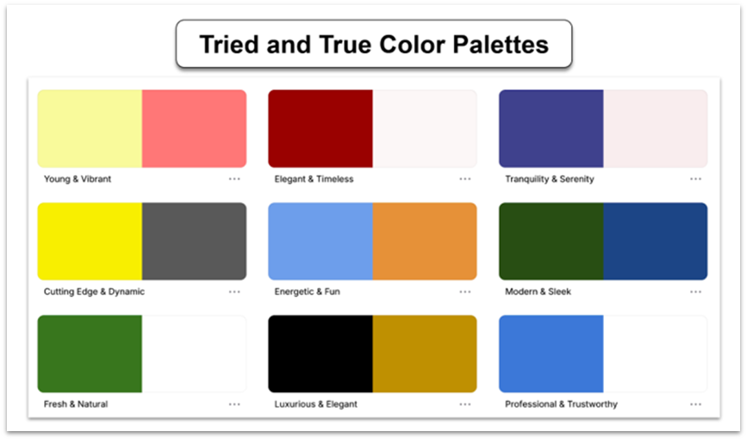 If none of the above options strike your fancy, and you don’t have much experience with color theory, there are a ton of free palette tools online. I suggest you check out the Explore and Trending options using the resources below to get a feel for what’s out there.
Color Palette Tools
-
Adobe Color.
- Go to the Adobe Color website.
- Check out Trends and the Explore section.
- Play around with different color combinations until you find something you like.
- Save your favorite color schemes to use later.
-
Coolors.
- Visit Coolors.
- Check out trending colors.
- Generate color palettes.
- Lock in colors you like and keep generating until you’re happy with the palette.
-
Paletton.
- Go to Paletton.
- Create color schemes by adjusting the color wheel.
- Experiment with different types of color harmonies (monochromatic, adjacent, triadic, etc.).
- Try the randomize button to generate a new palette.
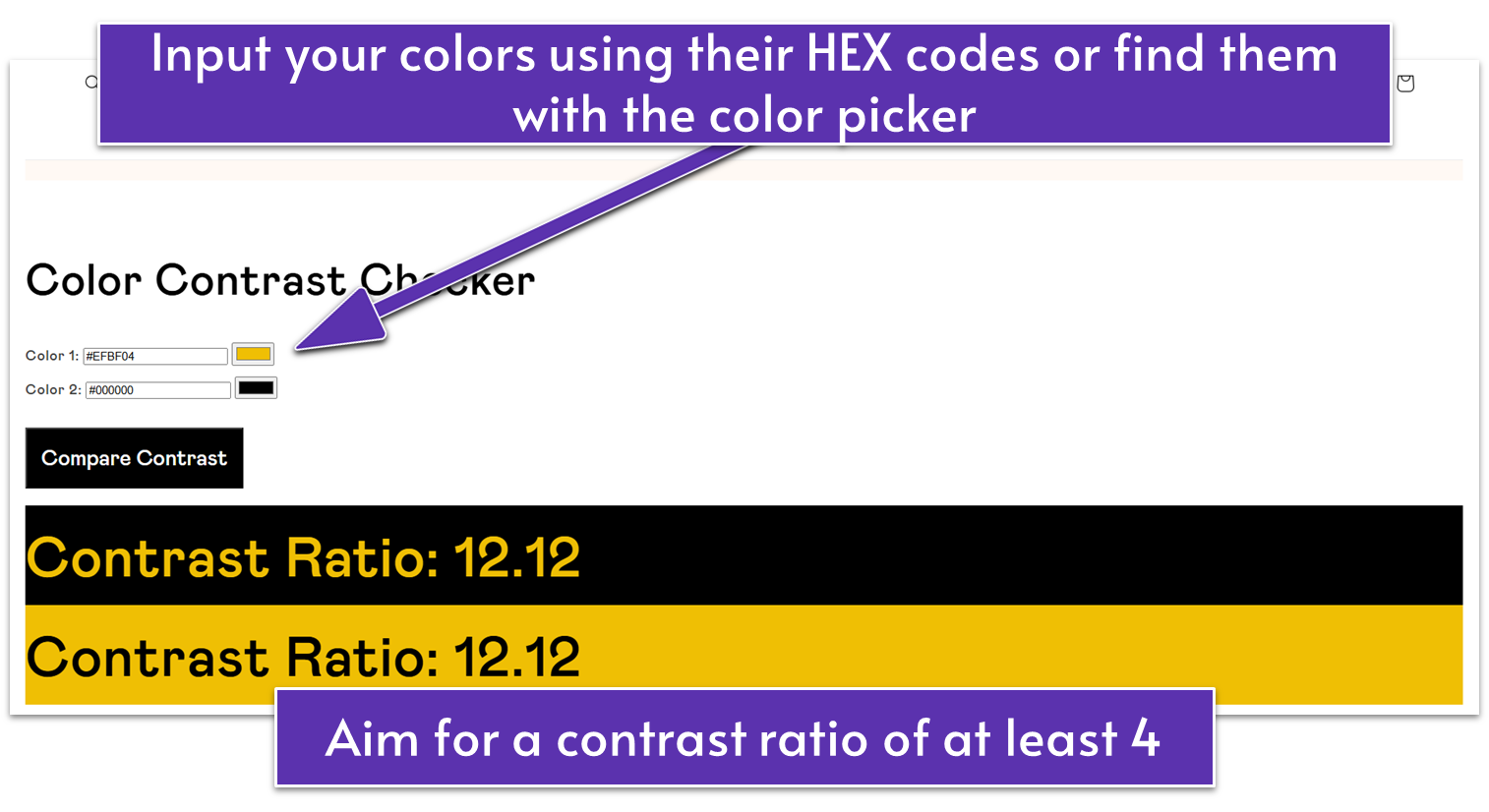
- Go to this free color contrast checker https://thecolorpalettestudio.com/pages/free-color-contrast-checker, add your colors, and check if your colors combine well for background and text combinations.
- Aim for a contrast level of 4 or 5 and higher.
- If your colors don’t meet that contrast level, try experimenting by adding one darker or lighter color or adjusting the tone of one or more colors in your palette.
 When you have finished refining your palette, it’s easy to apply it in Wix.
Add Your Color Palette in Wix
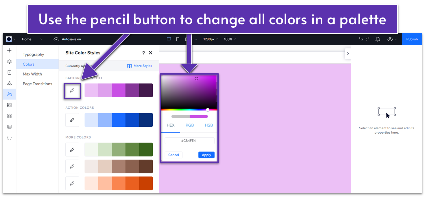
Though Wix doesn’t offer palette tools per se, you can experiment with different color combinations and change your colors in real time. Here’s how you can do it: Step 1: Change your Site Styles.-
-
- On the editor, click on the letter “A” with the drop symbol on your left-hand side to access the site styles menu.
- From there, click on “Colors.” You’ll see a selection of 5 monotone color palettes. One for background and text, one for action colors, and three extra “more colors” palettes.
- Click on the pencil button (Edit color range) next to each palette to change all five colors on a palette based on the color you choose.
-
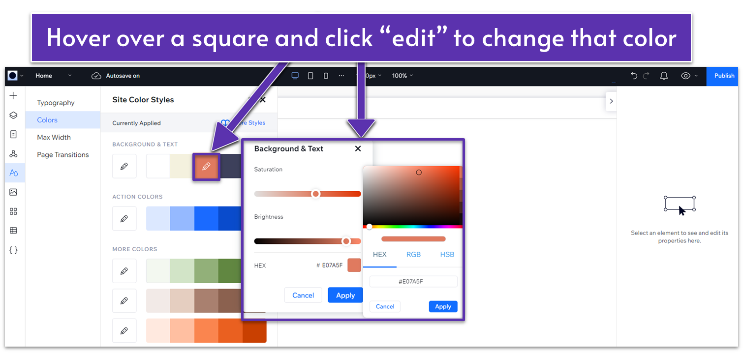
 Step 2 Optional: Edit individual colors.
-
-
- Hover over a color and click the “edit” option to change individual colors in a palette.
- Change the brightness and saturation by using the sliders or by clicking on the color rectangle next to the HEX code to choose your color freely.
-
 Step 3: Save your color scheme.
-
-
- Save your overall styles by clicking the “More Styles” button and selecting “Save Colors to Library.”
- Your color choices will be applied throughout your site, giving it a cohesive and professional look.
-
Choose Your Fonts
Your choice of fonts for your site relies on two main factors: The first is to ensure that all the text on your site is easy to read and clear. The second is to reinforce your visual identity. We can broadly categorize fonts into Serifs, Sans-serifs, and display fonts. Each category is especially suited to convey a distinct style.- Serif. The traditional, elegant fonts you’d see on a printed work. They’re ideal for conveying formality, elegance, and refinement.
- Examples include Times New Roman, Garamond, and Merriweather.
- Sans-serif. Clean and modern fonts. Used to signal something contemporary, new, and accessible.
- Examples include Arial, Helvetica, and Open Sans.
- Display Fonts. Eye-catching, unique fonts. Perfect to convey creativity, playfulness, or excitement, great for headings, but not recommended for long stretches of text.
- Examples include Playfair Display, Lobster, and Pacifico.
Changing Your Font Presets
You can preset fonts for different uses directly from Wix. That way, you ensure that your font usage remains consistent and save the trouble of double-checking if you used the right font each time. Here’s how you do it:-
Open the Wix Editor:
- Log in to your Wix account and open your site in the Wix Editor.
-
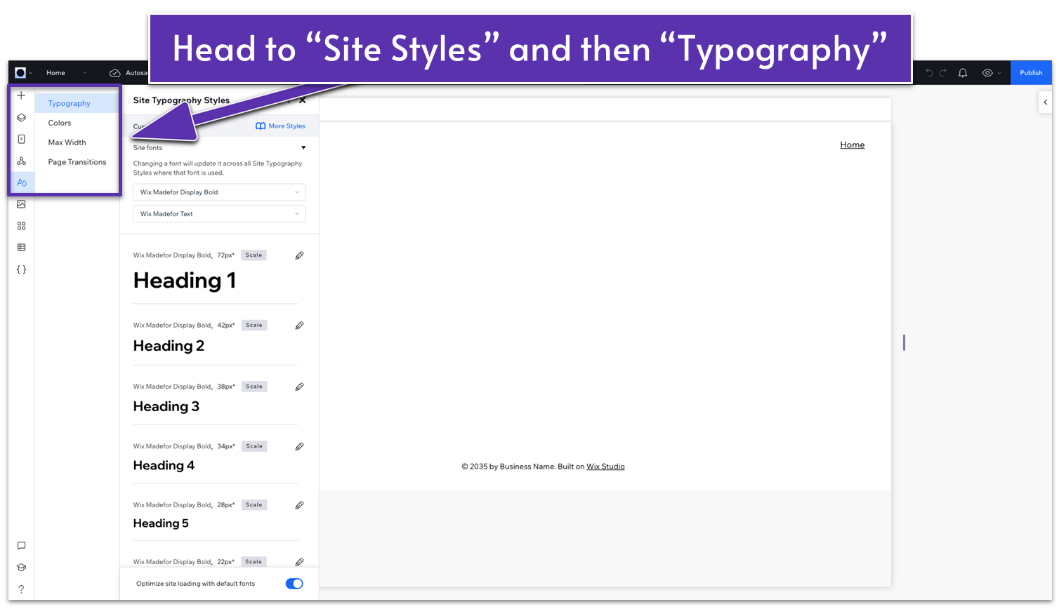
Access Site Typography Styles:
- Click on the “Site Design” option on the left.
- Click on “Typography” to open the Site Typography Styles settings.
![asdfghhjj45678 14]()
-
Select Site Fonts:
- At the top of the Site Typography Styles panel, you will see the “Site fonts” section.
- Here, you can select the primary fonts for your site. Choose from the dropdown menus to set your preferred fonts for headings and text.
-
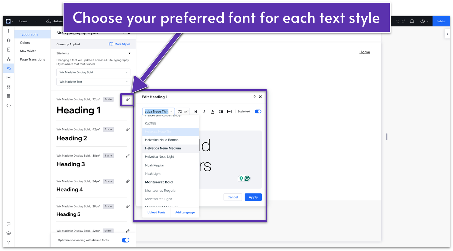
Customize Font Styles:
- Below the Site Fonts section, you’ll see different text styles, such as Heading 1, Heading 2, Heading 3, etc.
- Click on the pencil icon next to each heading or text style to customize the font size, weight, and style.
- As you adjust the settings, you’ll see a preview of how the text will look.
![asdfghhjj45678 15]()
Content and Images
If you love one of the sample sites we’ve created for this guide and plan to build something very similar, you already have a fairly good idea of what copy and images you’ll need — so you can source these right away and then pop them into the right pages. However, if you plan to make more significant design changes, it might be a good idea to leave the copy and images for after you’ve finalized the design — and use placeholder text and images in the interim. Whether you’re looking for placeholder images or you don’t have access to high-quality images for your site right now, there are plenty of websites where you can find high-quality stock photos. Here are some options that are either free or highly affordable:- Wix Media: Wix offers a built-in library of free and premium images that you can use directly on your site.
- Unsplash: High-quality, free stock photos. https://unsplash.com
- Pexels: Free stock photos and videos. https://www.pexels.com
- Shutterstock: Paid but extensive collection of stock photos. https://www.shutterstock.com
Note: Clicking “NEXT” below will take you to the homepage module for our portfolio sample site. If you want a different design, you can easily switch using the alternative designs menu on the next page.
