

We want to create a good-looking “services” page that showcases this photographer’s range. To do that, we should add photographs we haven’t shown so far to represent each service and add minimal text to allow each image to speak for itself.
We will add an introductory section and description for each service so potential clients know exactly what they’ll be getting. Since we don’t plan to saturate this page with images either, we should do our best to give the whole page an attractive visual design without going overboard.
As always, we’ll begin by creating a new page.
5.1 Hero Section
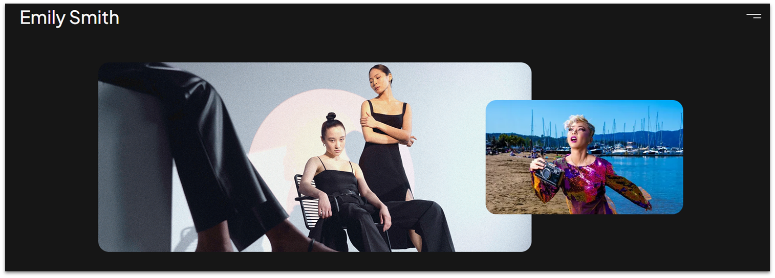
Let’s start with a simple hero section that showcases two high-quality photos creatively.
Step 1: Create a new section and apply an advanced CSS grid to it.
Step 2: Drag a container into the section.
- Set all margins ( , , , ) to 0.
- Set the container’s width to 1080px.
- Remove the container’s background.
- Set the container’s height to 370px.
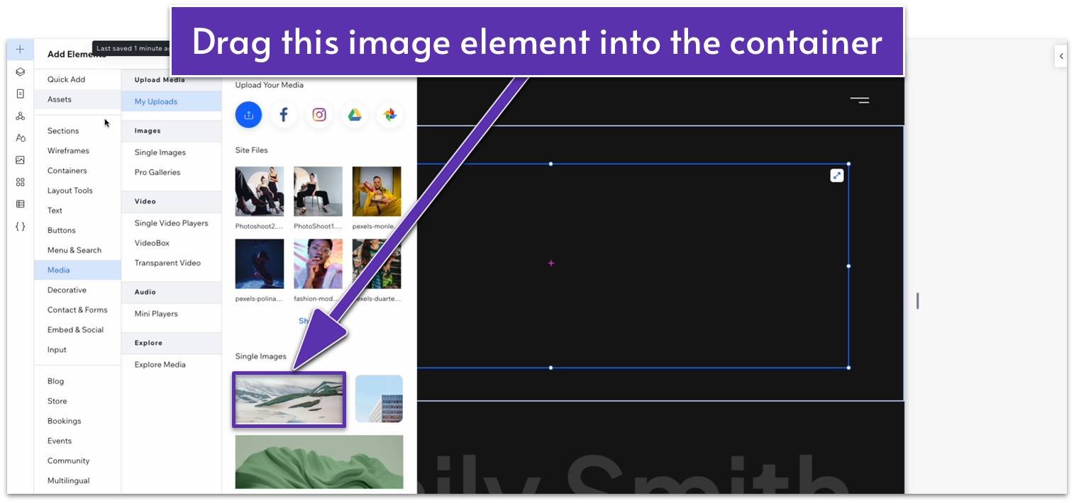
Step 3: Drag an image element into the container.
We’ll go with the landscape image box since it already has dimensions similar to the ones we want.
- Align the image with the upper-left corner of the container.
- Dock the image to the left ( ) and set all margins to 0.
- Set the image’s height to 350px and its width to 800px.
- Set the corner radius of the image to 20px.
Step 4: Duplicate the image and move the copy to the right.
- Set the width of the duplicated image to 365px and its height to 270px.
- Align the smaller image with the center of the container and move it to the right so it’s slightly overlapping the larger image.
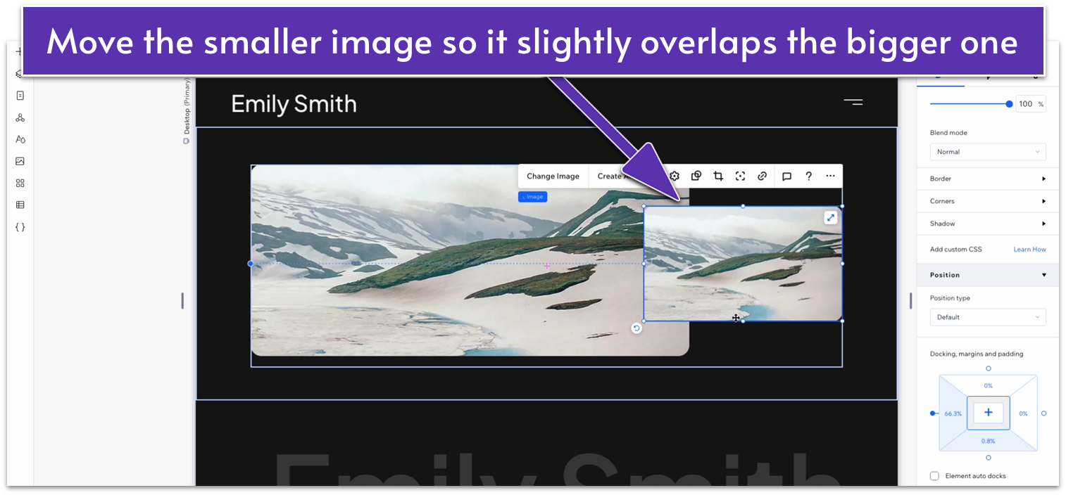
- Dock the smaller image to the right ( ).
Step 5: Apply an advanced CSS grid to the container.
- Set the row’s behavior to auto ( ).
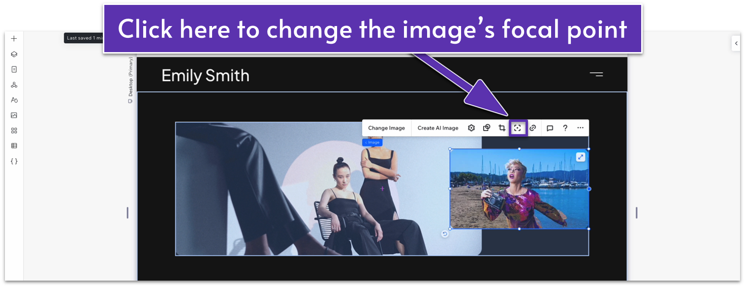
Step 6: Replace the default images with your own.
- If necessary, click on the image and then on the symbol with rounded corners and a dot in the middle ( ) to adjust the image’s focal point.
Step 7: Set the top margin of the section to 50px scale.
- Set the behavior of the section’s row to auto ( ).
Adapt for Tablet and Mobile Views
Step 1: Adapt for tablet view.
On tablet view ( ):
- Set the responsive behavior of the section to “Scale Proportionally.”
- Set the container’s height to 350px.
- Set the larger image’s height to 350px.
- Set the smaller image’s height to 180px and its width to 250px.
Step 2: Adapt for mobile view.
On mobile view ( ):
- Set the section’s height to 350px.
- Set the larger image’s height to 250px.
- Dock the larger image to the top ( ).
- Dock the smaller image to the bottom ( ).
- Set the smaller image’s height to 150px and its width to 220px.
- Set the top padding ( ) of the section to a 30px scale.
5.2 Text Heading Section
Let’s add a small section with an introductory text before we dive into the list of services.
Step 1: Copy the hero section from the “About” page and paste it under the hero images.
Step 2: Replace the heading and paragraph text.
Step 3: Remove the stack with the buttons and social media bar.
Adapt for Tablet and Mobile Views
Since we’re copying this from a previously optimized section, there’s no need to optimize it further.
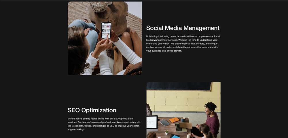
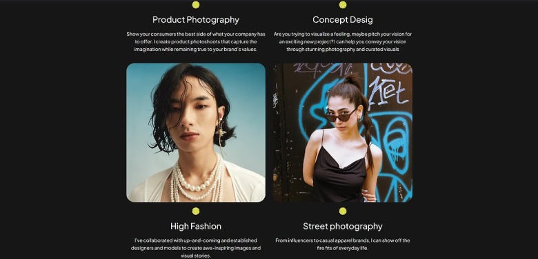
5.3 Services Section
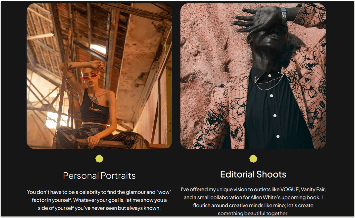
Now, we’ll add the main section for this page. We’ll create a card-like grid where we’ll showcase each service, a brief description, and a high-quality image of the service in question.
Step 1: Create a new section and apply an advanced CSS grid to it.
Step 2: Go to the homepage and copy the “My portfolio” repeater.
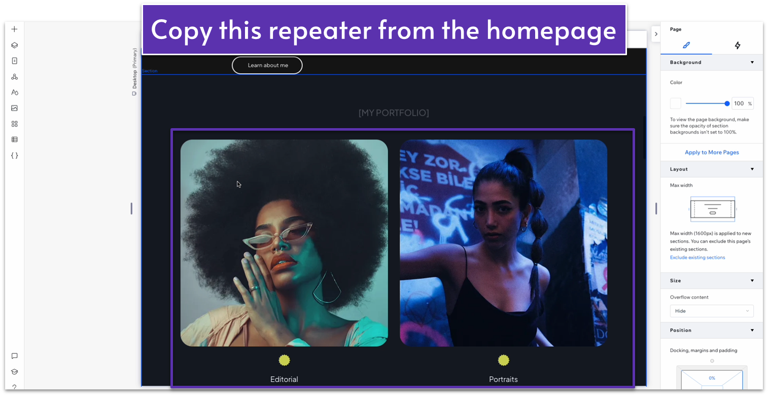
Step 3: Paste the repeater into the new section.
- Undock the repeater from all sides and set all margins to 0.
- Then, set the top padding for the section ( ) to an 80px scale.
Step 4: Add descriptive text for the services.
- Select the smaller text that we used for each category on the homepage.
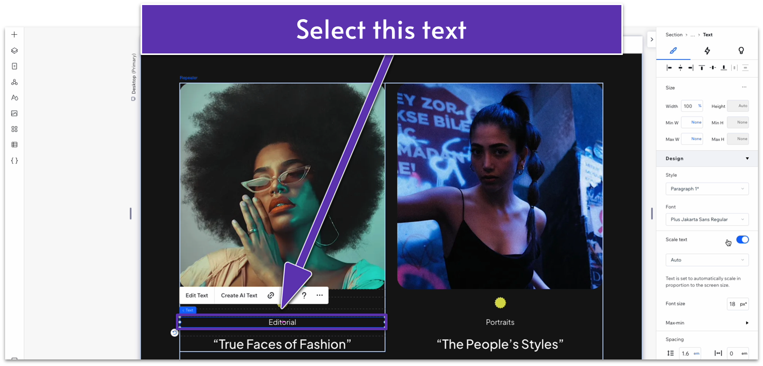
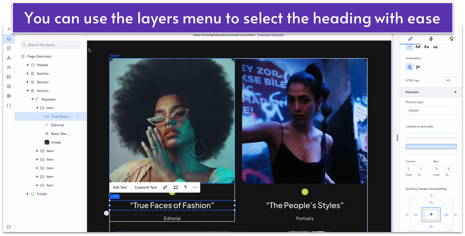
- Change its location in grid cells to the bottom row (inside the repeater).
- Change the location of the heading text in grid cells to the top row.
- Replace the bottom text for a brief description of each service.
Step 5: Replace the content in the repeater.
Now, we’ll need to replace each heading with the name of that service and each image with one that represents it. You already know how to add or remove items to the repeater if you need it.
Adapt for Tablet and Mobile Views
Since we’re copying this from a previously optimized section, there’s no need to optimize it further.
5.4 Infinity Text

This is like the fourth time we’ll add a text marquee element to our site, so we’ll skip step-by-step for this one.
Just head over to the “About” page, copy the marquee, and paste it at the bottom of the page. Then, edit the text to fit the section, and you’re done. We don’t need to optimize this section for tablet and mobile views.
5.5 Contact Form
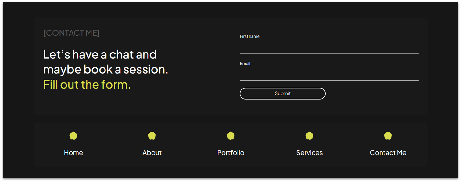
Another quick and easy one. Simply head over to the “Global Sections” menu ( ), add the “Contact” section to the page, and then use the “Layers” menu ( ) to move it all the way down to the bottom.
