


2.1 The Header
We’ll start by creating the first sections visitors will see when they visit your site: the Header and the Hero. First impressions matter, so these should immediately convey your site’s purpose, style, and tone.
For the header, we wanted to keep things minimalistic, so we chose a text-based logo and a discrete hamburger menu.
Adding the Logo to Your Header
Since we used a simple, text-based logo, we made it directly in the Wix Studio editor with the following steps:
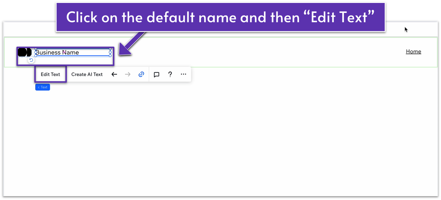
Step 1: Change the name on your header.
- Double-click on your header.
- Double-click again on the default “Business Name” text.
- Select “Edit Text” and change the name there to your own.
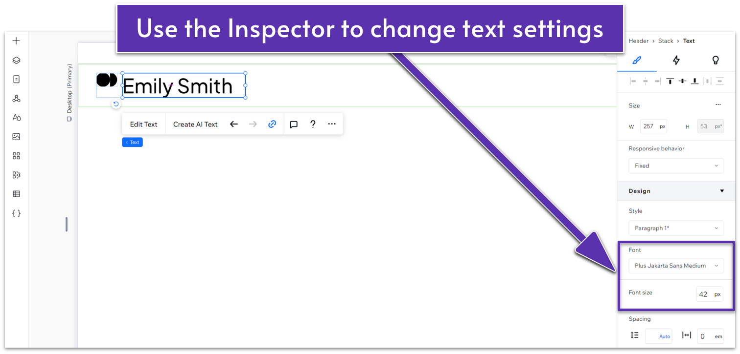
Step 2: Customize the font.
- Click the arrow on the right side of the screen ( ) to open the pop-out menu (the Inspector menu.)
- Change the font size to 42px.
- Stretch the text box so it doesn’t occupy 2 lines.
- Change the font to Plus Jakarta Sans.
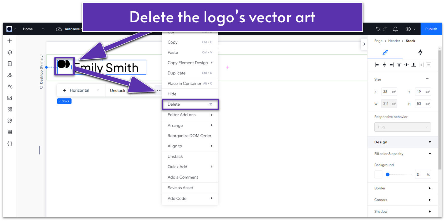
Step 3: Delete the vector art next to your name.
- Double-click the symbol next to your business name and use the backspace button or click the 3 dots ( ) and choose delete.
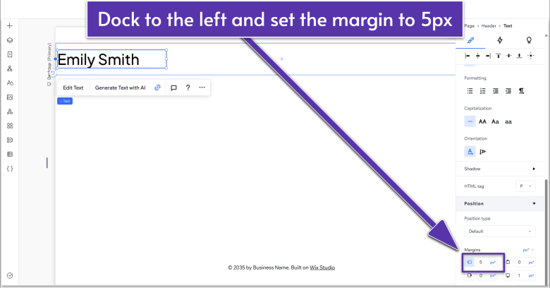
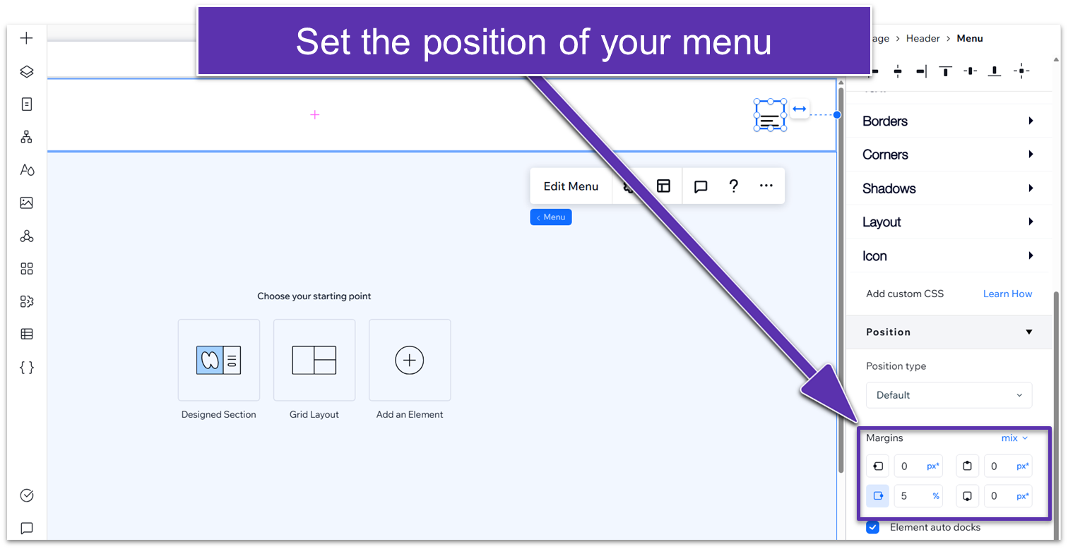
Step 4: Set the position of your logo.
- In the Inspector menu, scroll to the “Position” submenu to adjust the margins.
- Click on where it says “0px” on the left side diagram ( ) to set the left margin to 5 and then set all other margins to 0.
- Click the left-side margin icon ( ) to dock the logo to the left.
Adding the Menu to Your Header
Step 1: Delete the default menu.
- In the header section of your site, go to the upper-right corner, click on the default menu, and then delete it.
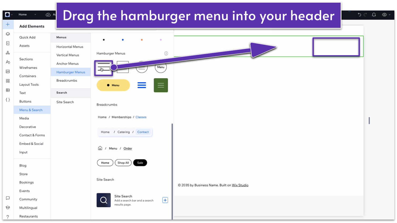
Step 2: Add a hamburger menu.
- From the “Add Elements” menu ( ), go to “Menu & Search.”
- Then choose “Hamburger Menus” ( ).
- Select one and drag it into the header. It doesn’t matter which one – we will replace it with a custom one.
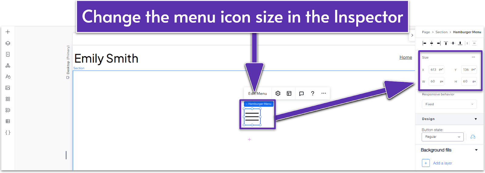
Step 3: Change menu icon size
- Click on the menu you just added.
- Change its size on the inspector menu to 35 x 35px.
Step 4: Set the position of the menu.
- Dock it to the right (by clicking on the right-side docking button ( ).
- Set the right margin to 5%.
Styling Your Hamburger Menu
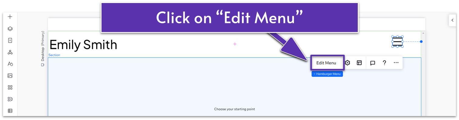
Step 1: Select “Edit Menu”
- Click on your hamburger menu item ( ).
- Then click on “Edit Menu.”
- There, you can see how your hamburger menu looks when it’s fully expanded and edit its properties.
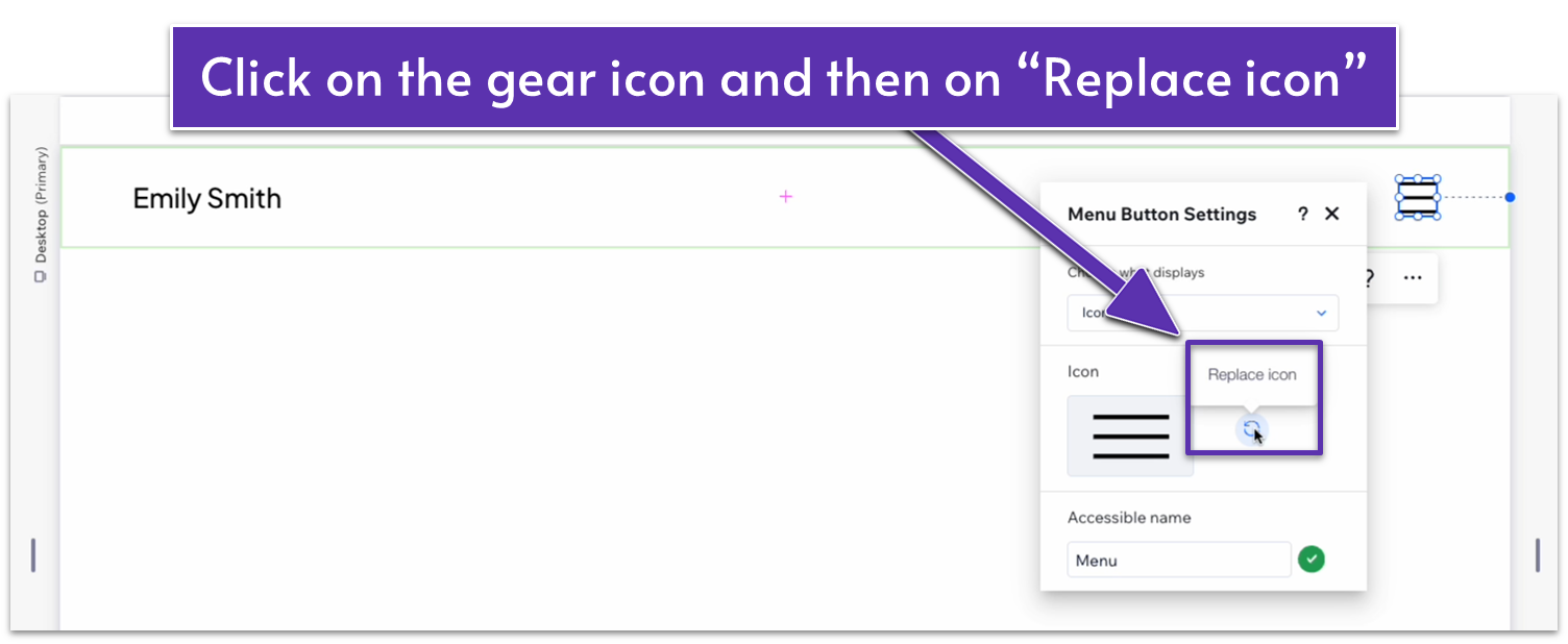
Step 2: Click on the “Replace icon” option.
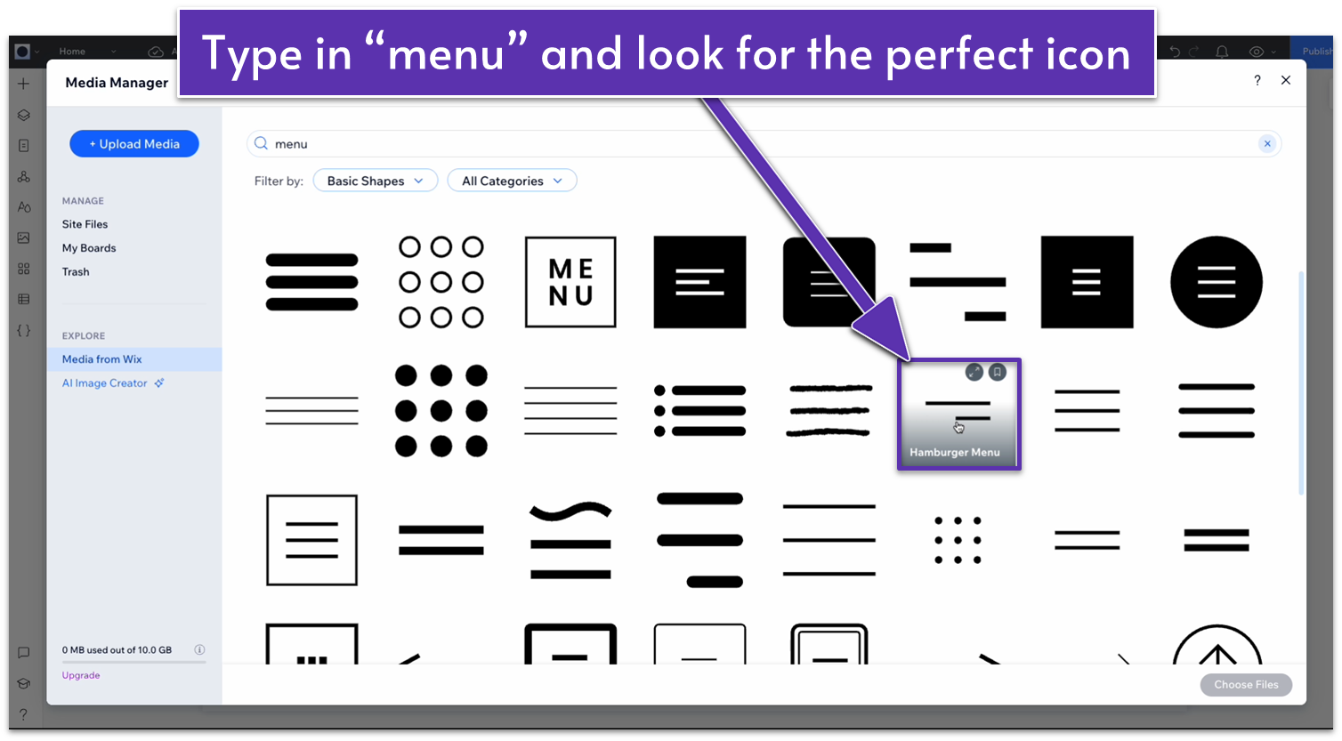
Step 3: Choose your menu.
- Type “menu” on the search bar and find one you like.
- We chose a simple icon with only two lines instead of the classic three.
This is a good example of an easy place to make your own customization. In our case, we chose the menu, placed it, styled it, and then didn’t feel like it fit the vibe of our site. So, we went back and swapped it out for something that fit what we were looking for.
Customize the Colors
Step 1: Choose the Header Background Color.
- Click on the header area at the top of your page to select it.
- In the inspector menu, head over to “Design.”
- Click on the color square ( ) to open the “Color Picker.”
- Choose one of the preset colors from the palette you set up earlier.
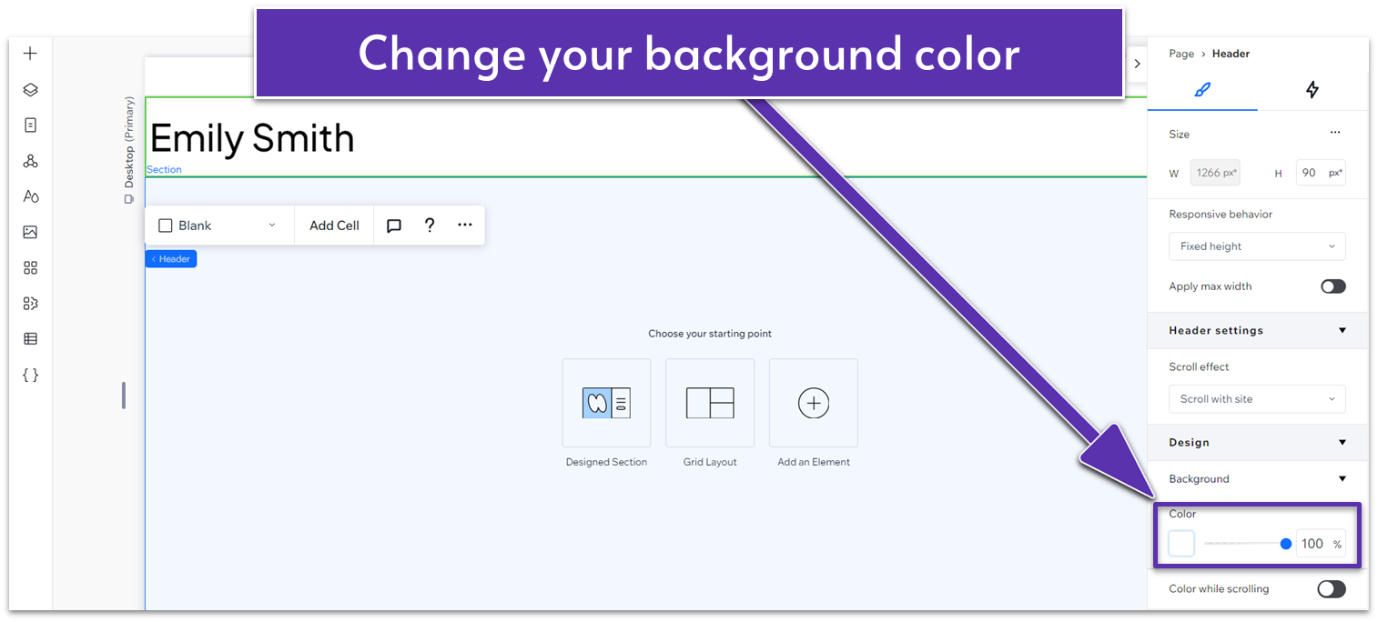
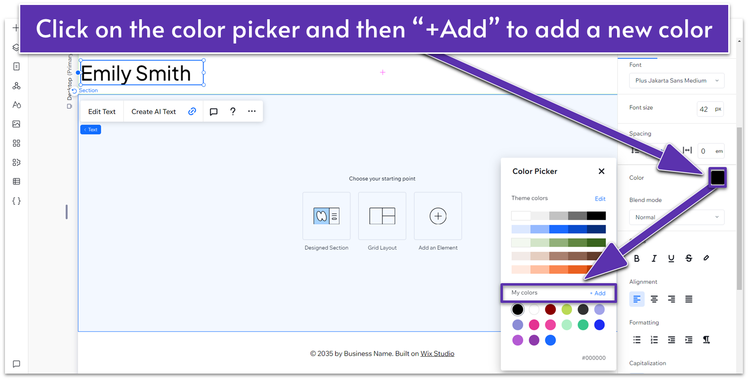
- If you want to change it to a specific color, click the color picker.
- Then, click on the “+Add” ( ) button on “My Colors.”
- Select a custom color visually or input its exact color code (e.g., HEX or RGB).
- We used (HEX): #161616.
- Make note of this color, it’s our default background for new sections on this page.
Step 2: Choose the color for your logo.
- Click on your logo.
- Open the inspector and scroll down to the “Design” submenu.
- Under “Design,” scroll down to “Icon” and change it to the same color as your text.
Step 3: Choose the color for your menu.
- Click on your menu.
- Using the “Design” submenu, choose the same color for your text.
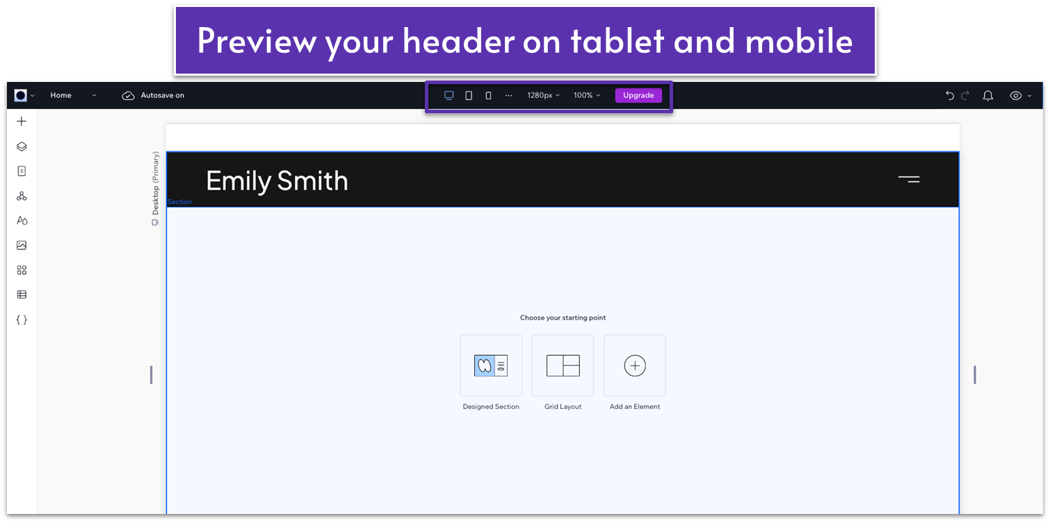
Adjusting the Header for Tablets and Phones
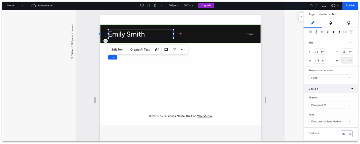
Step 1: Click on the tablet icon ( ) in the middle of the top of the screen.
Step 2: Change the logo size.
- Click on the logo.
- Change the size to 32px.
- The logo will still have the original 42px size for desktop screens but will now apply the new 32px size for tablets and smartphones.
Step 3: Check the mobile preview ( ).
- The 32px looked fine in mobile view, so we didn’t change it.
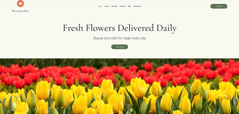
2.2. The Hero Section
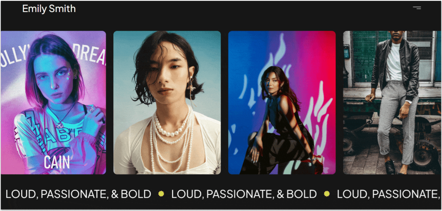
Since we’re aiming to capture the imagination of potential clients with our photography portfolio, we need to put our best foot forward and display our best photographs right away. So, the hero section for our portfolio website will comprise an auto-scrolling gallery and some interesting text.
Adding an Auto Scrolling Gallery to Your Hero Section
Step 1: Add a blank section and change the background color.
- Start by selecting the blank section below the header, or add a new one by clicking on the “+ Add Section” ( ) button under the header.
- Open the inspector and change the background to the same black as our header (HEX #161616).
Step 2: Add a media gallery to the section.
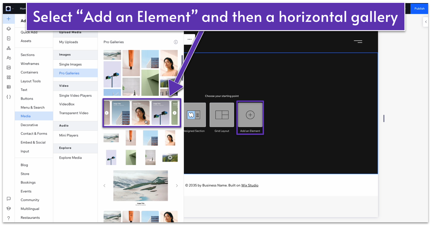
- On your blank section, click on “Add an Element” ( ).
- Go to “Media,” and then choose “Pro Galleries.”
- We chose the one with vertically aligned images arranged in a line.
Step 3: Change the gallery sizes.
- On the inspector, click on the three dots icon ( ) next to Size.
- Toggle on the “Advanced settings” option.
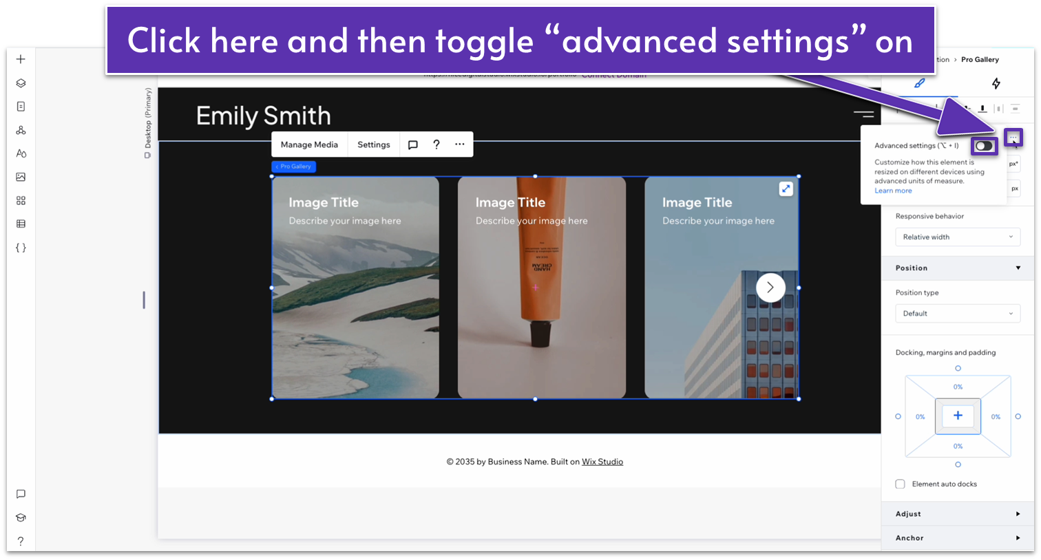
- Change the width to 100%.
- Change the height measuring units from pixels (px) to viewport height (vh) and set the height to 60vh.
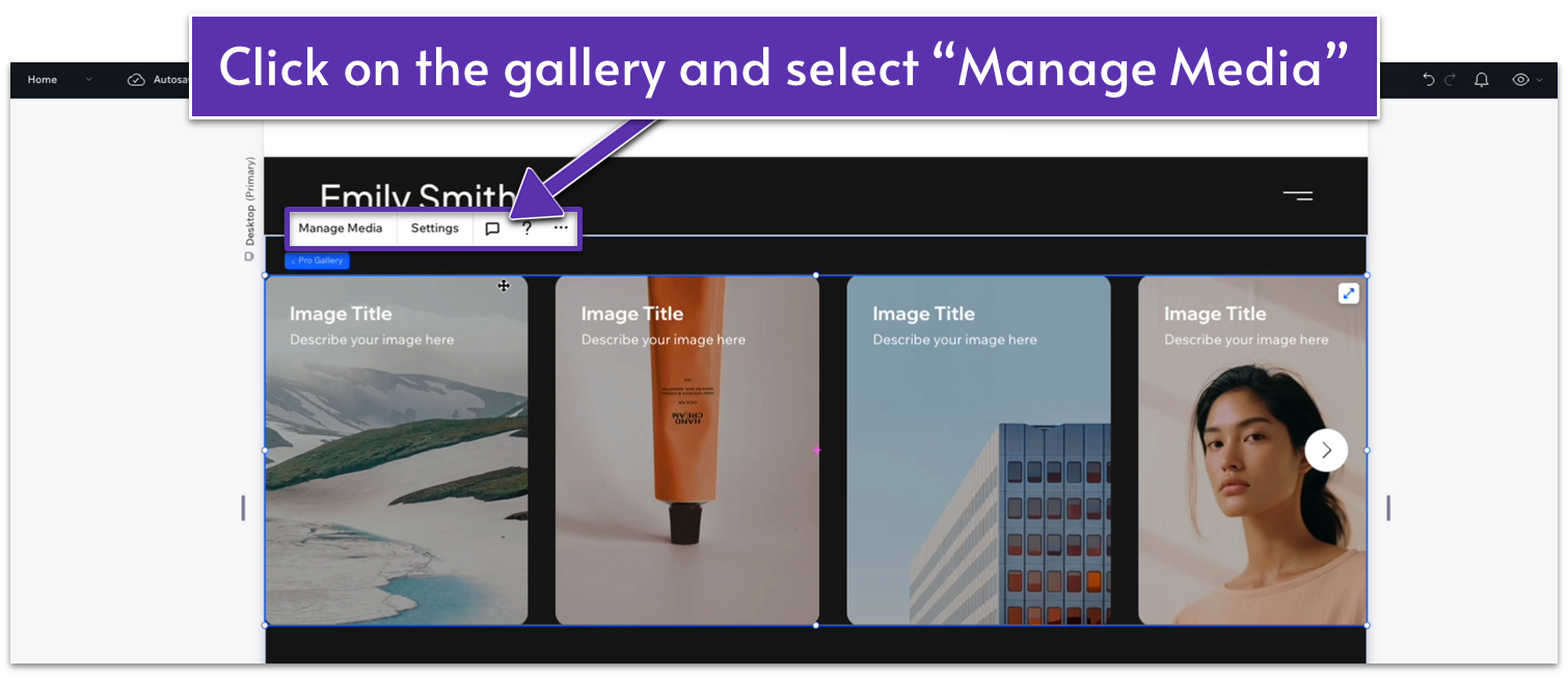
Step 4: Change the default images to your own.
- Click on the image gallery and select the “Manage Media” option.
- Delete all the default images and add about 10 of your own pictures.
- Drag and drop them to organize the order in which they’ll appear.
Step 5: Add the animated auto-scroll effect.
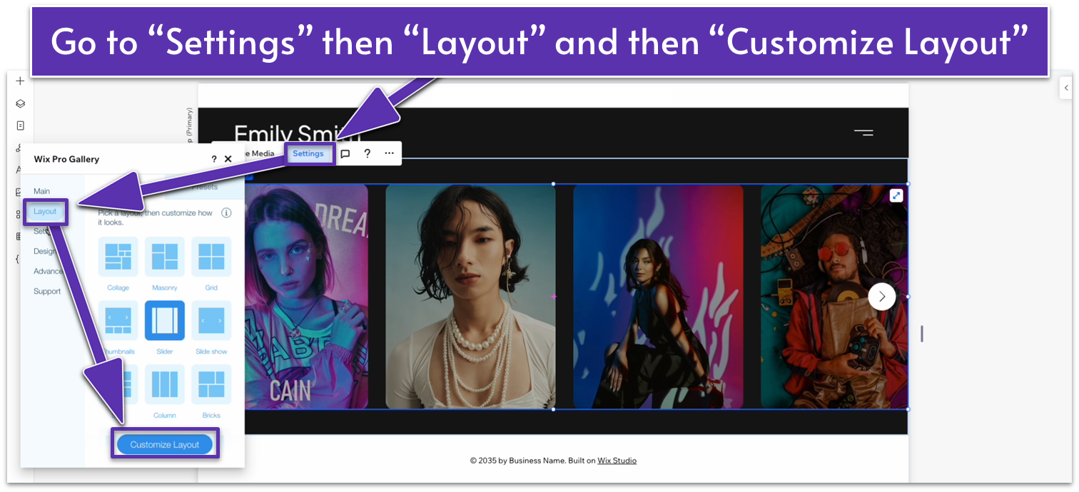
- Click on your gallery again and go to “Settings.”
- On the “Layout” submenu, select “Customize Layout.”
- Scroll down to the “Slide Automatically” option and toggle it on.
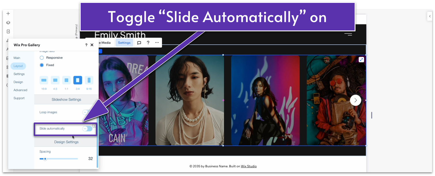
- Change the timing option from “Intervals” to “Continuous.”
- Toggle off “Pause on hover.”
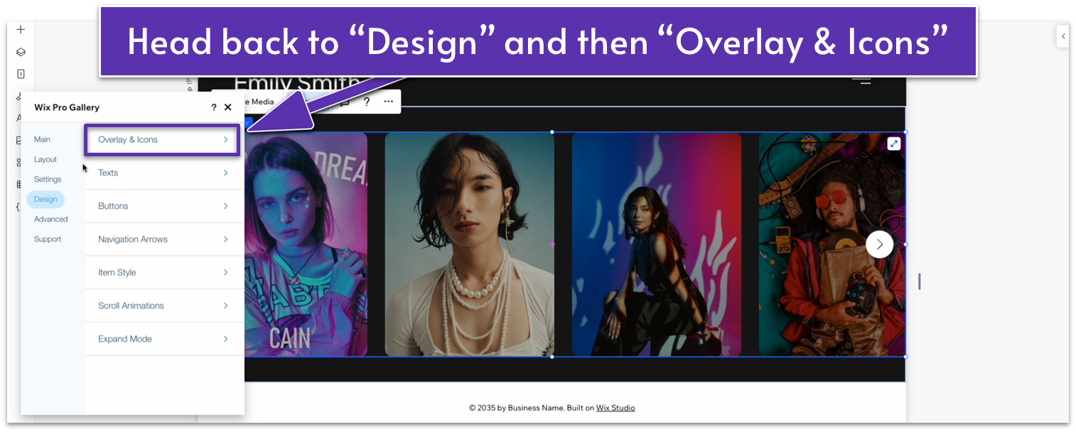
Step 6: Remove shadow.
- On the same settings menu, go to “Design.”
- Select “Overlay & Icons.”
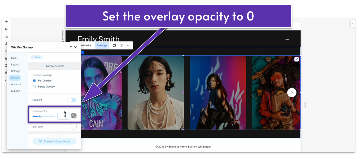
- Change the opacity of the overlay color from 30% to 0%.
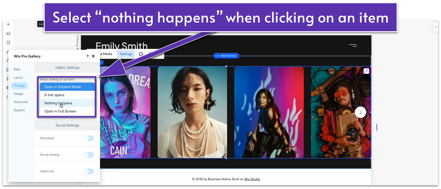
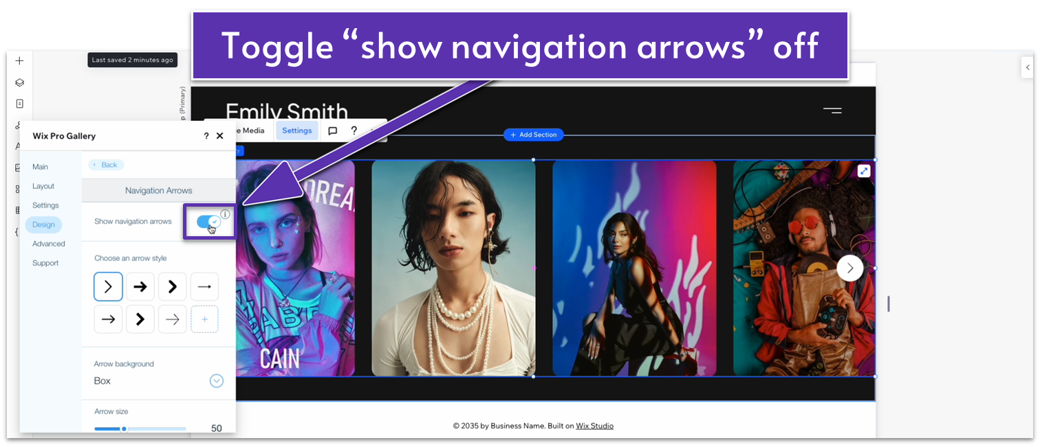
Step 7: Remove the slide navigation buttons and expand mode.
- Go to the “Settings” submenu inside of the “Settings” menu.
- Change the option under “When clicking on an item:” from “Open in Expand Mode” to “Nothing happens.”
- Head back to the “design” submenu, go to “Navigation Arrows,” and toggle “Show Navigation Arrows” off.
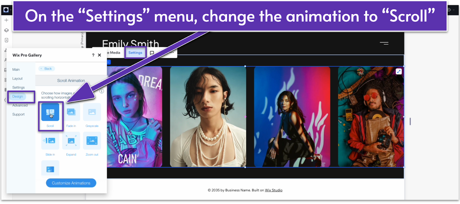
Step 8: Change the scroll animation.
- Go back to “Design.”
- Head over to “Scroll Animations.”
- Change the behavior from “Slide in” ( ) to “Scroll ( ).”
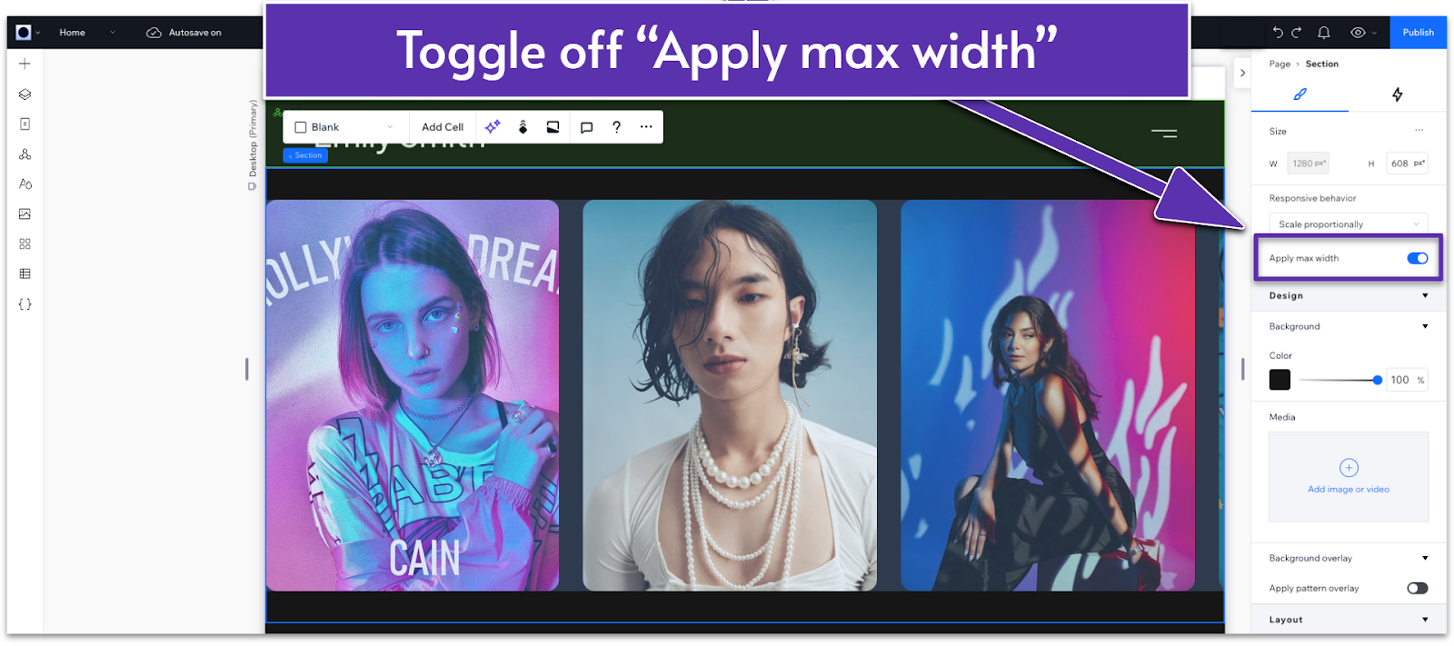
Step 9: Delete the max width for the gallery.
- Head back to the main editor.
- Click on the gallery, and open the inspector.
- Toggle off the “Apply max width” option.
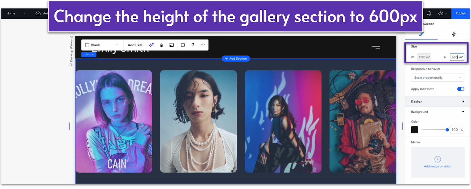
Step 10: Increase the height of the gallery section.
- On the inspector, increase the height to 600px to make the entire gallery more visually appealing.
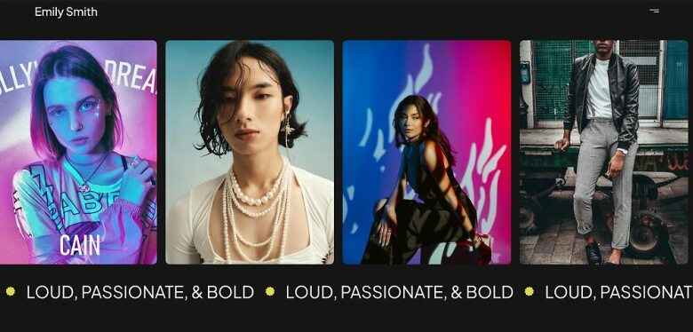
Adding an Infinity Auto-Scrolling Text Line
Step 1: Add a new section and change the background color.
Same process as before:
- Clicking on the “+ Add Section” ( ) button under the header.
- Open the inspector and change the background color to the same black as the gallery and header to keep things minimalistic.
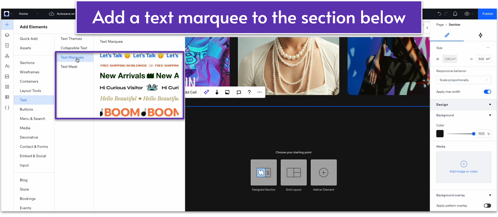
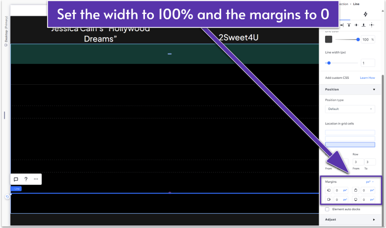
Step 2: Add an infinity text element.
- Click on the “Add an Element” ( ) button.
- Then head over to “Text.”
- Choose any of the available “Text Marquee” options.
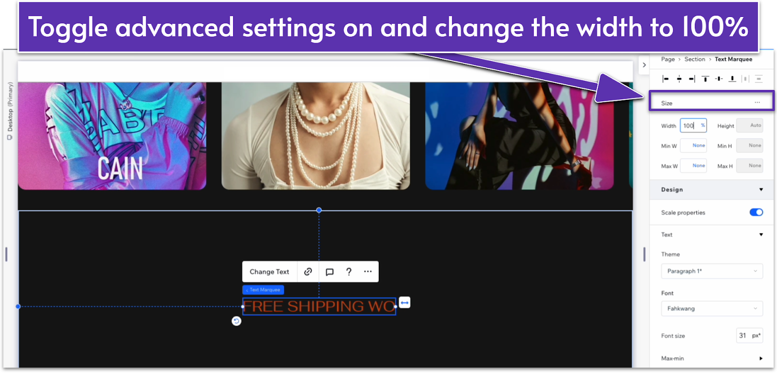
Step 3: Change the size properties.
- On the inspector, go to the size options and toggle “Advanced Settings” on.
- Change the width to 100%.
- Set all margins to 0% and undock from all points ( , , , ).
Step 4: Change the text font and color
- Go to the text options and change the font. We used Plus Jakarta Sans Regular.
- Change the text color to white (HEX #FFFFFF).
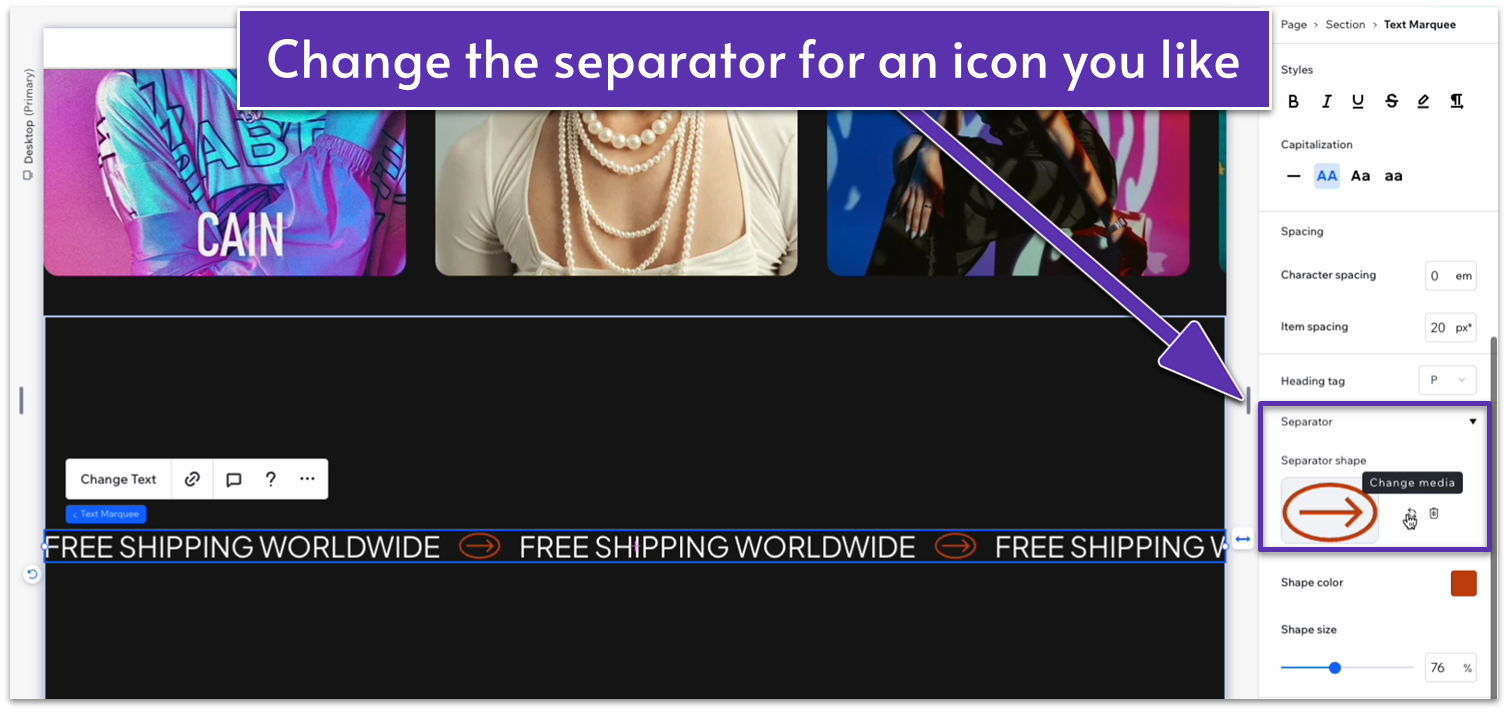
Step 5: Change the separator icon.
- Scroll down on the inspector menu until you find the “Separator” options.
- Head over to “Separator shape” and select “Change media.”
- Search for a vector graphic that you’d like to use and select it. In our case, we’ll upload a .svg file we had previously prepared.
Step 6: Change the separator size and color.
- Change the shape color to a bright yellow (HEX #D8D84D) and the size to 50%
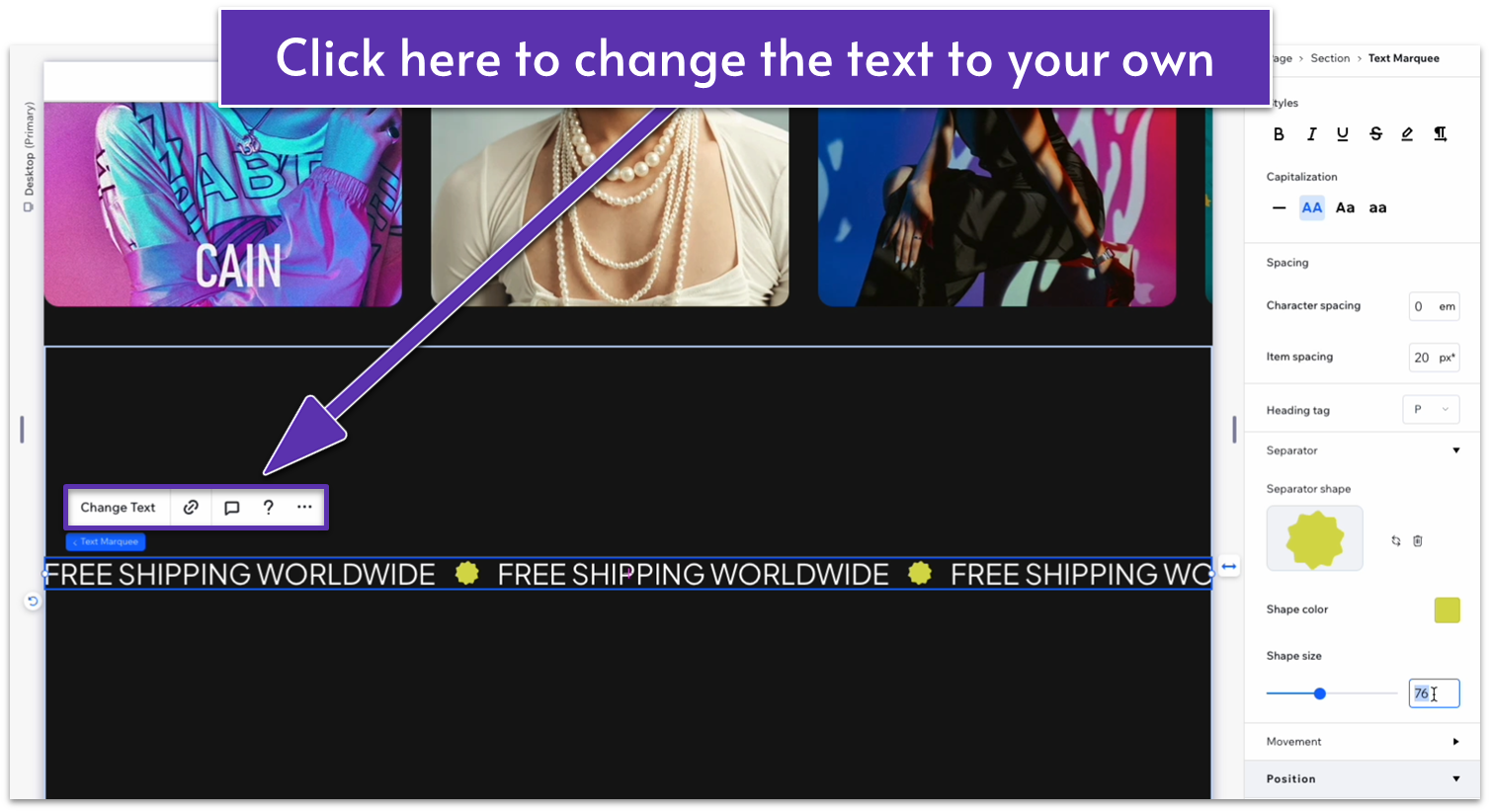
Step 7: Change the text.
- Click on your infinity text and then select “Change Text.” Write down the text you’d like to see repeated for your site.
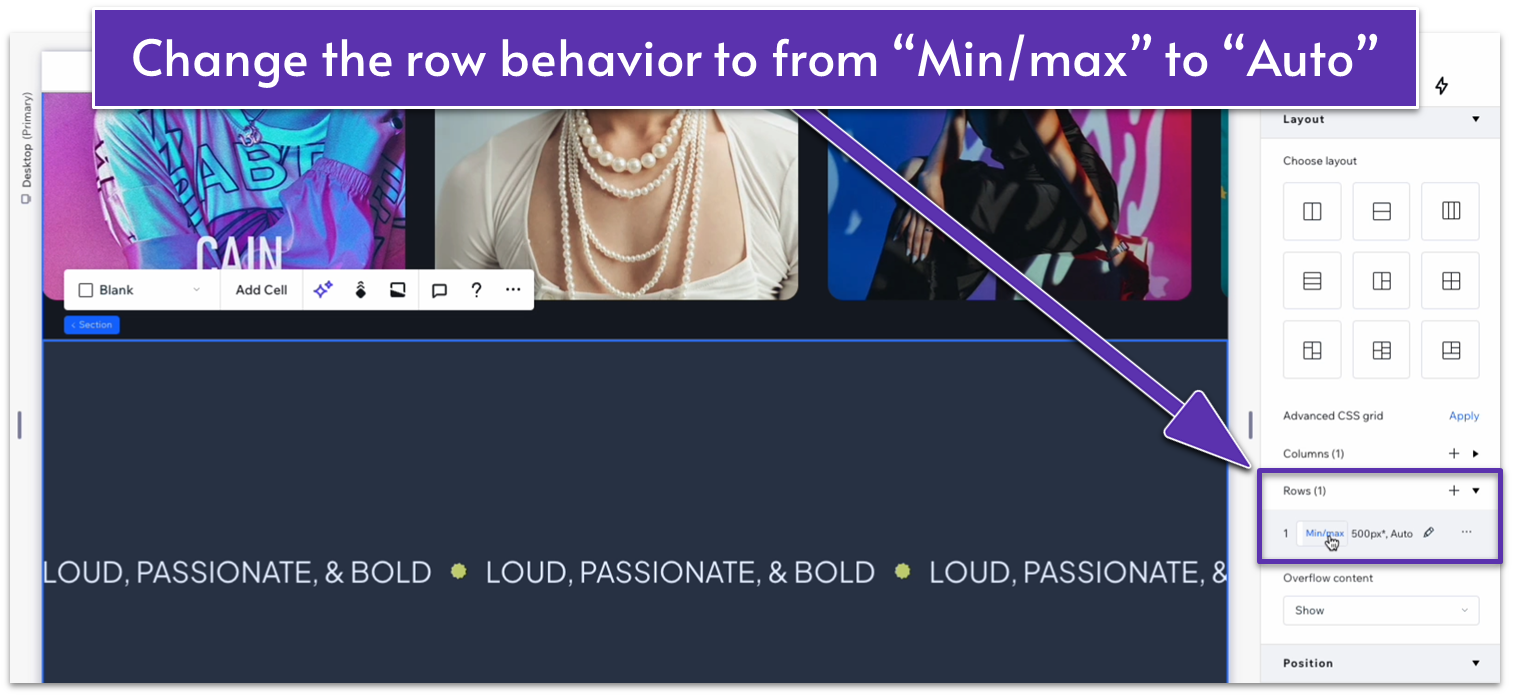
Step 8: Delete max width and set section height to auto.
- Toggle off the max width option for this section.
- Apply an advanced CSS grid to the section.
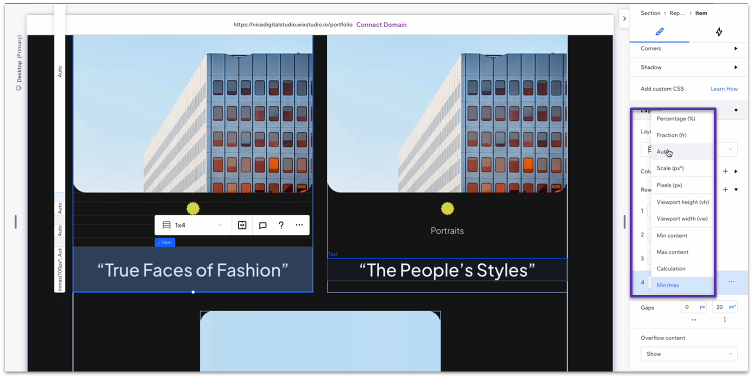
- Go to “Layout,” open the “Rows” tab and select the row.
- Change the height from “Min/max ( )” to “Auto ( ).”
Adapting the Hero for Tablets and Phones
Tablet
The hero looks pretty good on tablets. You may want to adjust the section height and font size of the scrolling text so it doesn’t take up too much of the screen, but we left everything the same.
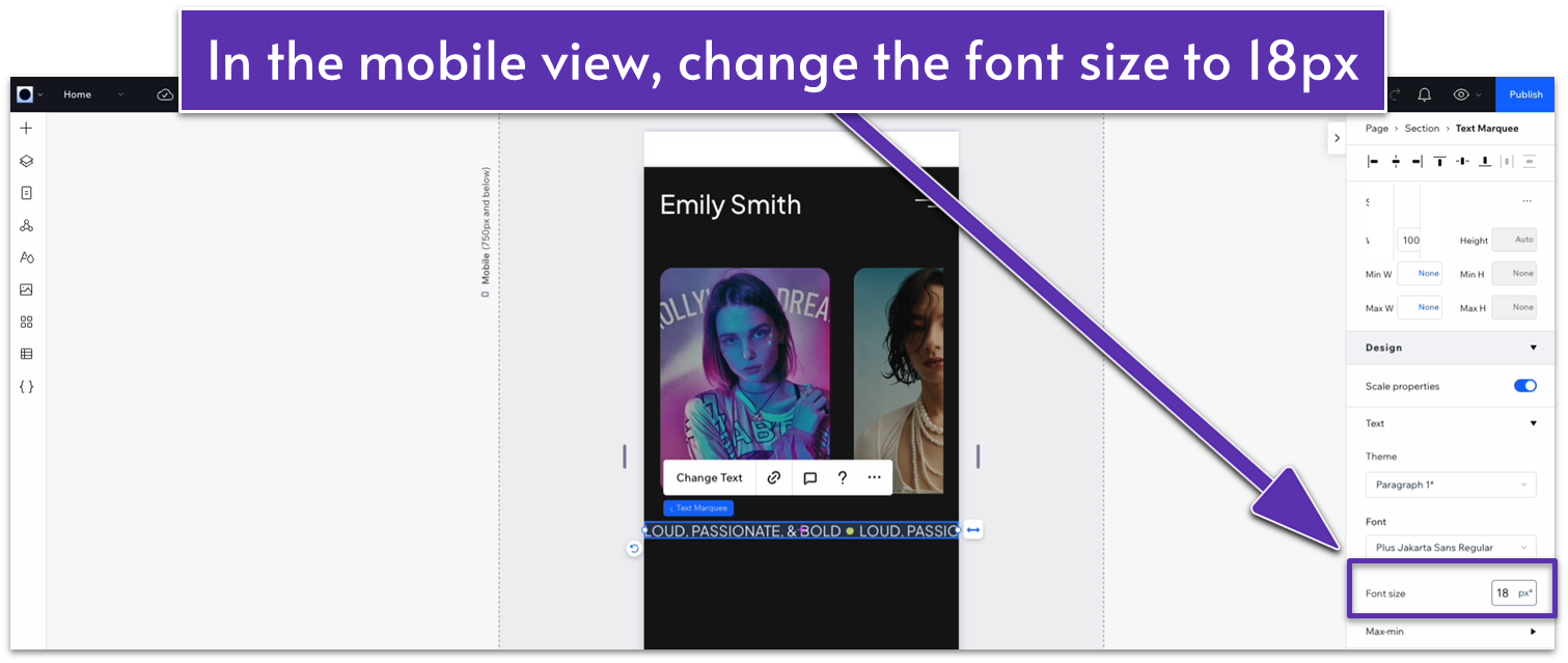
Phone
In mobile view ( ), let’s change the infinity text font size to 18px for better visibility.
2.3 The About Section
Here, we’ll create a small text section with important information about you or your business. It also includes a button at the end that will lead to a more detailed “about” page. We’re giving this section an interesting visual design so it captures visitors’ attention.
Step 1: Add a new section and divide it into two vertical containers.
- Add a new section using the “Add Section” ( ) button at the bottom of the hero section.
- In the Inspector, change the background color to match the hero section (HEX #161616).
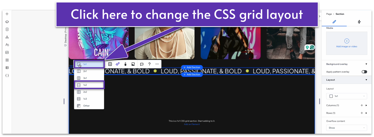
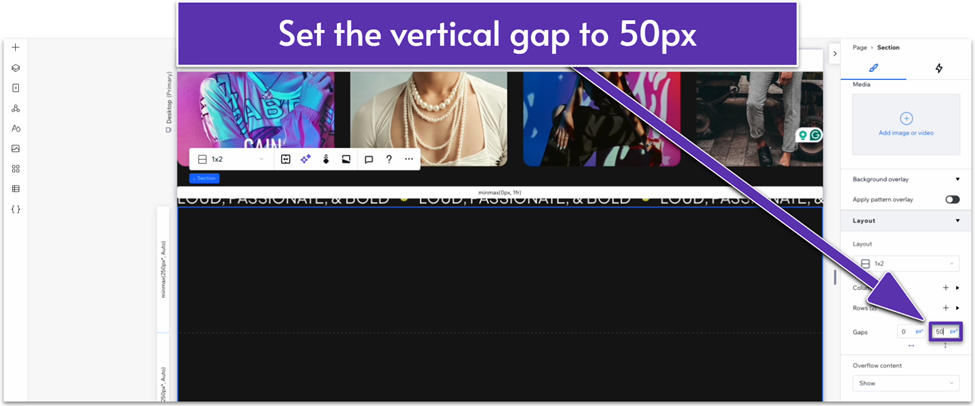
- Scroll down in the inspector and apply an advanced CSS grid.
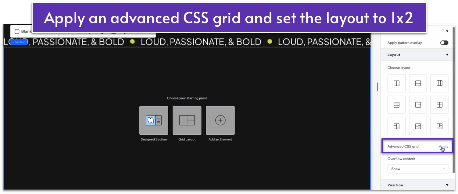
- Change the layout to a 1×2 ( ) grid with a 50px vertical gap ( ).
Step 2: Add 80px scale padding to the top of the section.
- Select the whole section and open the Inspector.
- Scroll to “layout” and then “padding” and click the “edit individually” ( ) icon. Then, select the “Top padding” ( ) section.
- Click the pixel icon, then click the % symbol to change the measurement unit.
- Change the unit to “Scale (px),” then change the number value to 80.
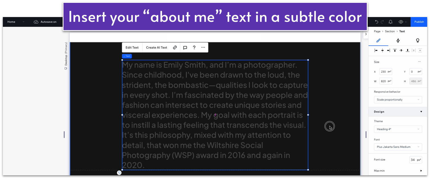
Step 3: Add the text to the top container and edit it.
- Insert a Heading 4 into the top container.
- Change the text color to HEX #535353.
- Replace the default text for your “About me” text.
- Change all margins to 0 and set the text width to 820.
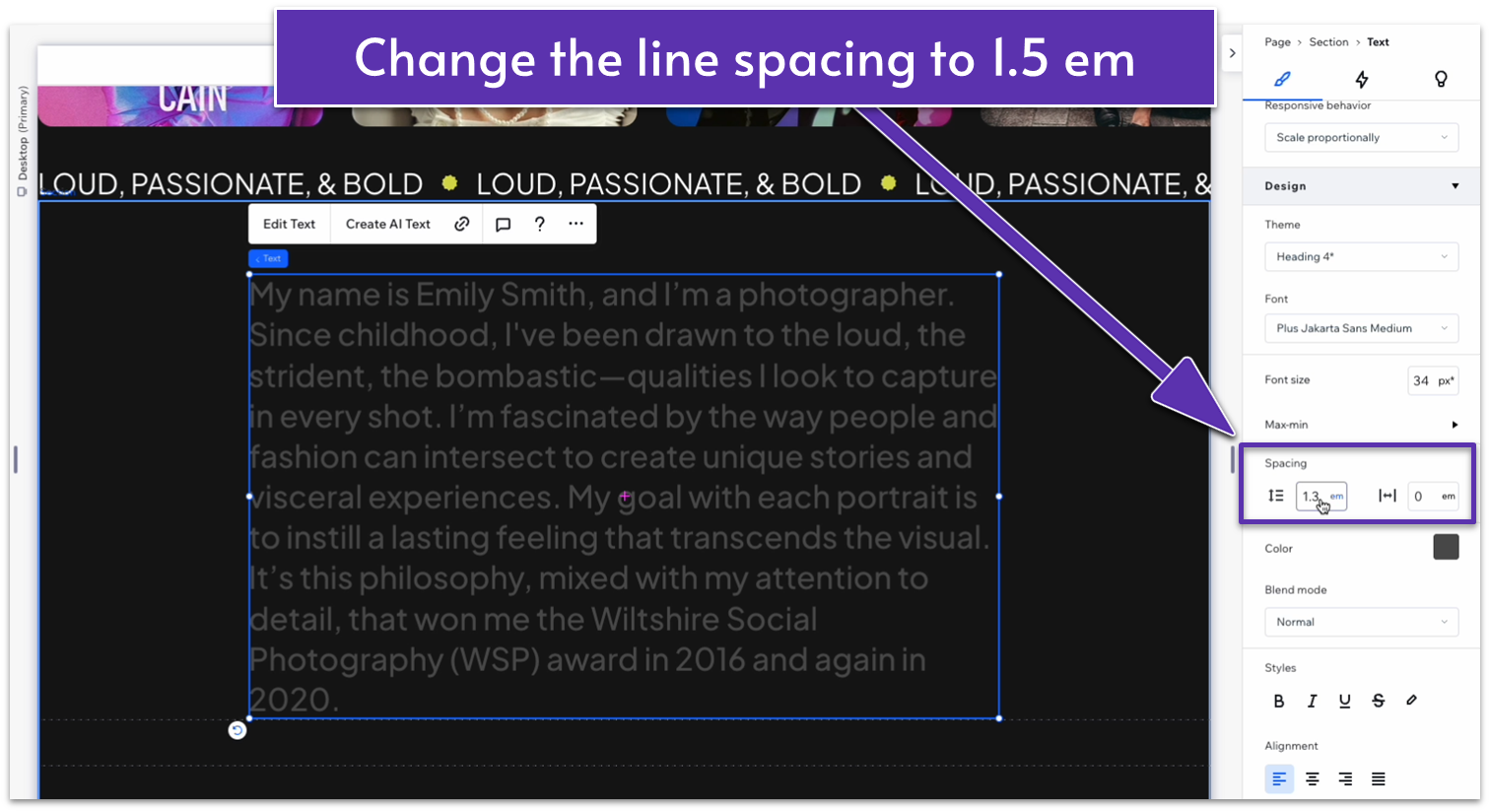
Step 4: Change the text line spacing.
- Go to the inspector, scroll down to “design,” and set the text’s line spacing ( ) to 1.5 em.
Step 5: Adapt the text for mobile and tablet viewing.
- We’ll adapt this element for tablet and mobile viewing before we usually would, so it will retain its properties in the next step.
- In the tablet view ( ), change the width to 580px and the font size to 24px.
- In the mobile view ( ), change the text width to 320px and the font size to 16px.
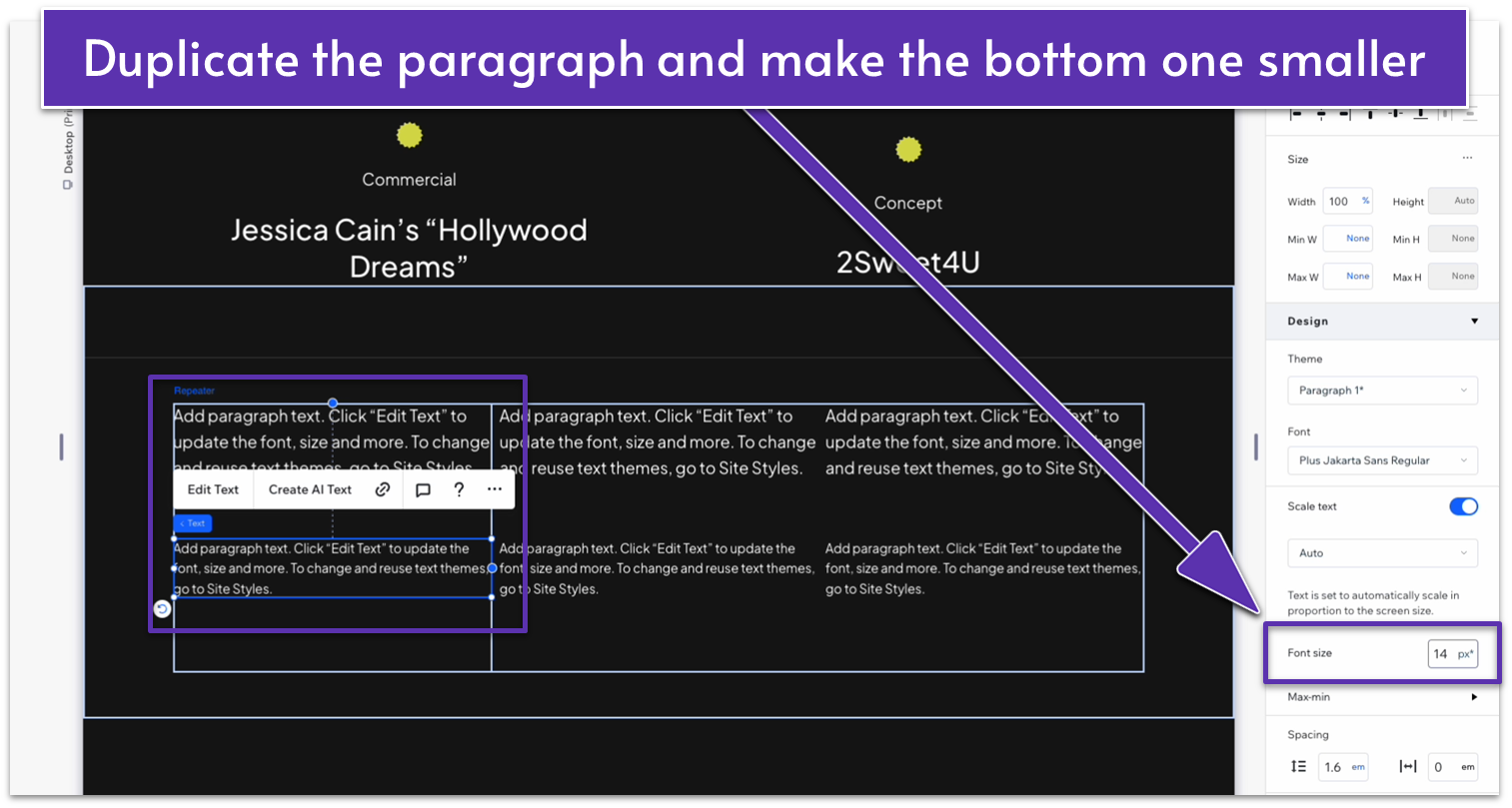
Step 6: Duplicate and overlay the text.
We started by adding the text in a really subtle color so we could add an overlay that makes it brighter as the visitor scrolls down, making it just a little more visually interesting.
- Open the “more actions” menu by clicking on the text and then on the three dots ( ) in the upper right corner of the popup menu or simply by right-clicking the text. Then, select “duplicate” (you can also just use the shortcut for this action with ctrl+D on pc or command+D on Mac).
- Change the text color to white (HEX #FFFFFF).
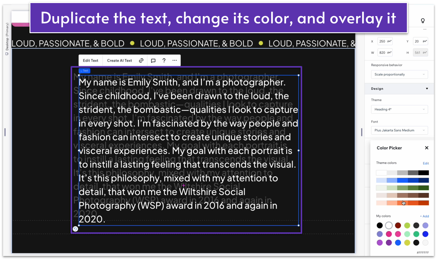
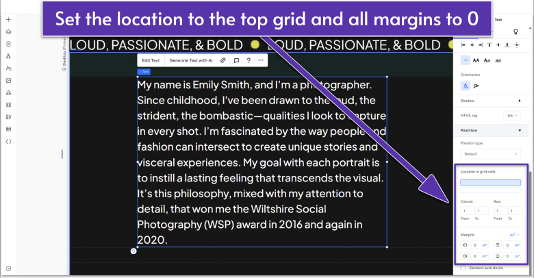
- Lock the text to the top container using the “location in grid cells” option in the inspector for the section.
- Set all text margins to 0 so the white text covers the text below perfectly.
- The duplicated text should perfectly cover the text below for the mobile and tablet views as well.
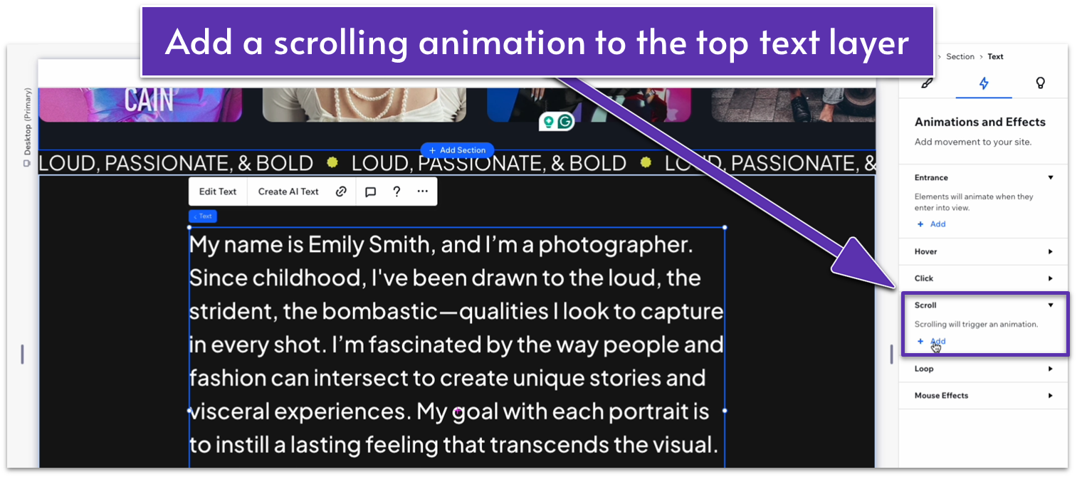
Step 7: Add a scrolling animation to the top text layer.
- Click on the top-layer text, then open the inspector.
- Click the lightning bolt symbol ( ) at the top to select the “Animations and Effects” option.
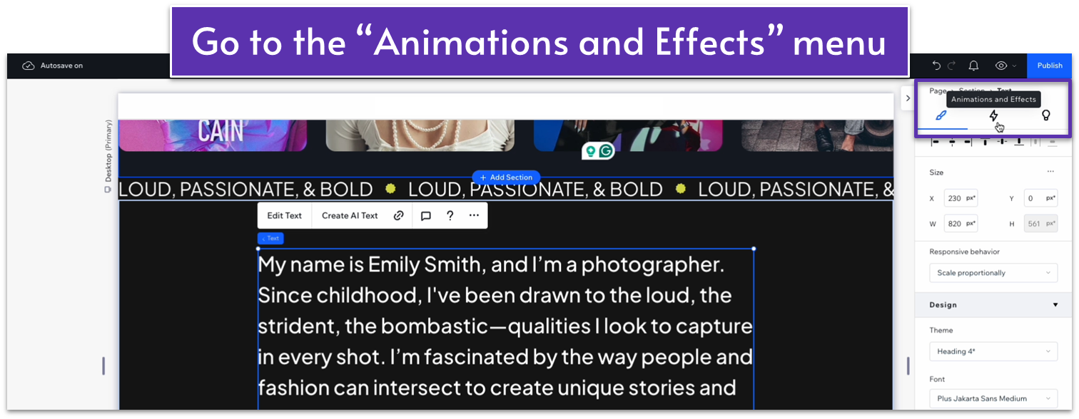
- Scroll down to the “Scroll” option and click the “+Add” ( ) button to add a scrolling animation.
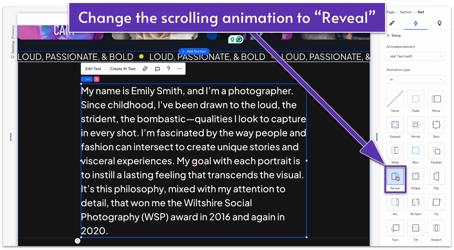
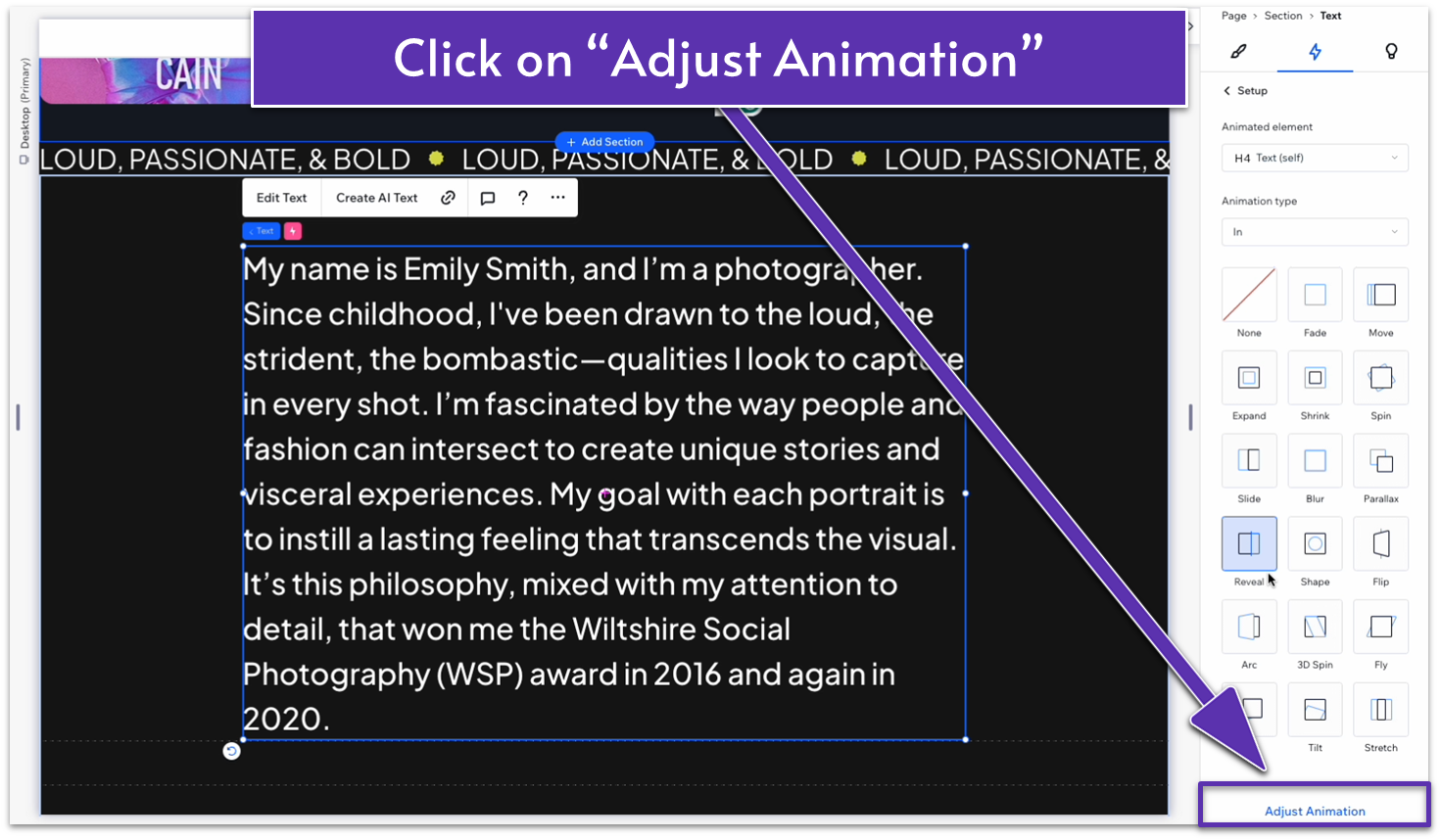
- Select the “reveal” ( ) animation and then click on the “Adjust Animation option at the bottom”
- Change the direction to “from left.”
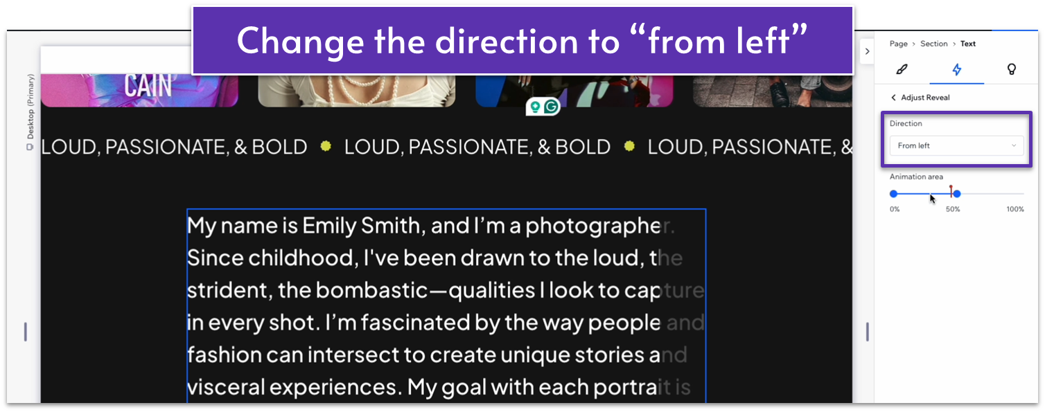
The upper text layer will now reveal itself as you scroll down the page.
Step 8: Add a button below the text.
- Use the “Add Elements” menu ( ) to add a button to the bottom container.
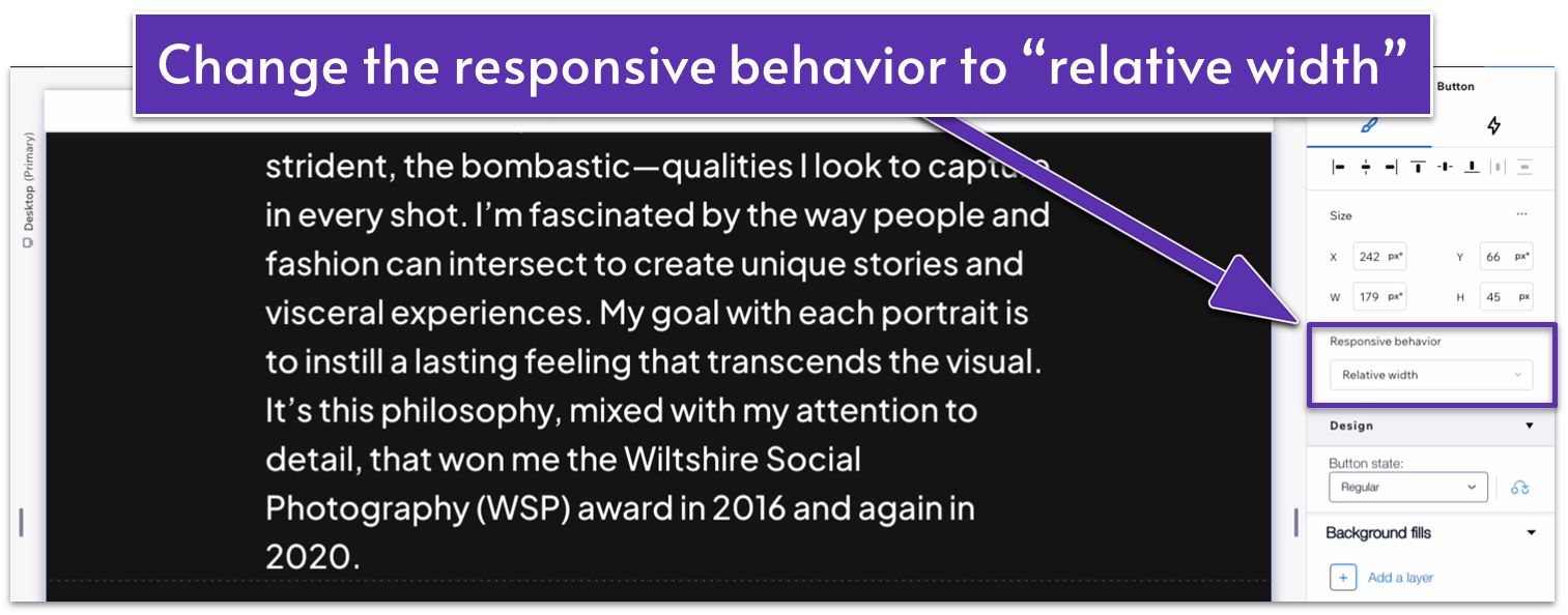
- In the Inspector, Change the “Responsive Behavior” option under “size” to “relative width.”
- Set the button width to 180px and height to 45px.
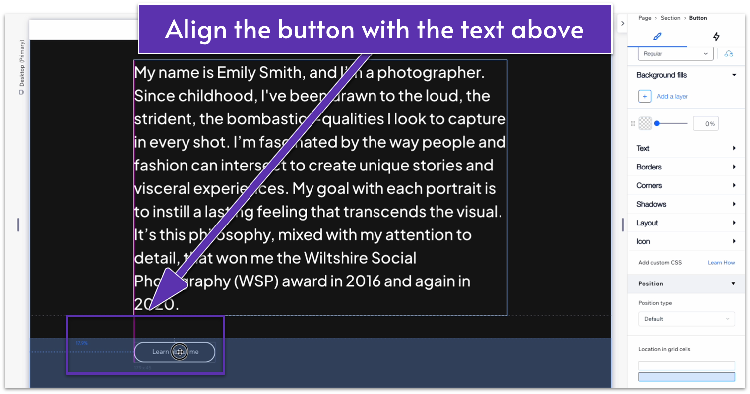
- Align the button with the left side of the text. To do this, drag the button to the left until a pink line appears, indicating that it’s in the same position as the text.
- Then, set the left margin to 230px and undock the button from the top ( ).
Step 9: Style the button’s regular and hover states.
We’ll set the following style for the button:
- Button text: Learn about me
- Regular background opacity: 0% (color doesn’t matter)
- Regular text color (HEX): #FFFFFF
- Regular border width: 2px
- Regular border color (HEX): #FFFFFF
- Hover background color (HEX): #FFFFFF (100% opacity)
- Hover text color (HEX): #000000
- Hover border width: 2px
- Hover border color (HEX): #FFFFFF
Step 10: Change the bottom container’s height
- Click on the section, head over to layout, and change the behavior of the bottom row from “Min/max ( )” to “Auto ( ).”
- Set the behavior for the top row to “Auto” ( ) as well.
- If the button doesn’t look quite right yet, you can drag it into a position that feels right.
Adapt for Tablet and Mobile Views
Step 1: Adapt the button for tablet and mobile viewing
- In the tablet view ( ), change the button width to 180px. Repeat this process for the mobile view ( ).
- Change the vertical gap between rows ( ) to 30px for tablet and mobile views.
Step 2: Update the padding between sections for tablet and mobile viewing
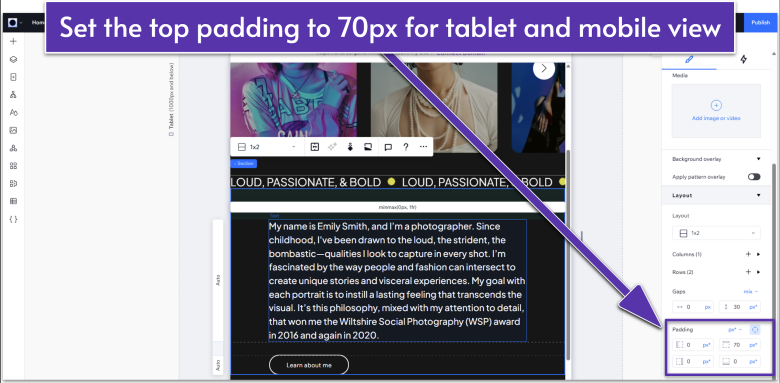
- For the tablet and mobile views, set the top padding ( ) to 70px.
2.4 Portfolio Section
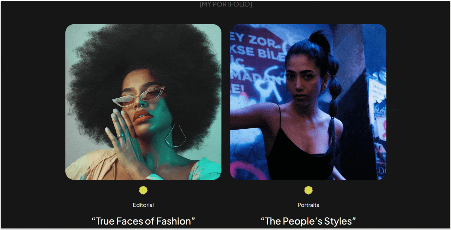
This portfolio section will divide the photographer’s work into different “collections,” displaying the collection’s name, its category, and the best-looking photo from that collection. Clicking on each photo will take you to a separate page with the full portfolio.
Step 1: Add a new section and divide it into two containers.
- Set the background color.
- Apply an advanced CSS grid and set the layout to 1×2 ( ).
- Change the vertical gap ( ) to 50px.
- Set the bottom padding ( ) to 80px.
- Scroll to the “padding” and click the number value in the “Top padding” ( ) section.
- Change the unit to “Scale (px),” then change the number value to 80.
Step 2: Add a title to the top container.
- Add a paragraph element to the top container.
- Set the font color to HEX #575757.
- Change the font to “Plus Jakarta Sans Medium.”
- We’ll change the text to “[MY PORTFOLIO].”
- Set the text alignment to the center ( ).
- Set all padding to 0.
- Change the top row behavior to “auto ( ).”
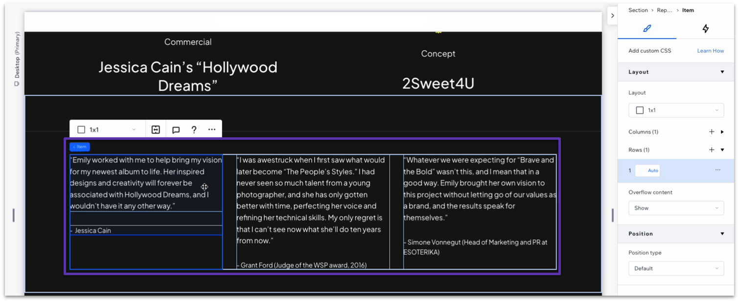
Step 3: Add a repeater to the bottom container.
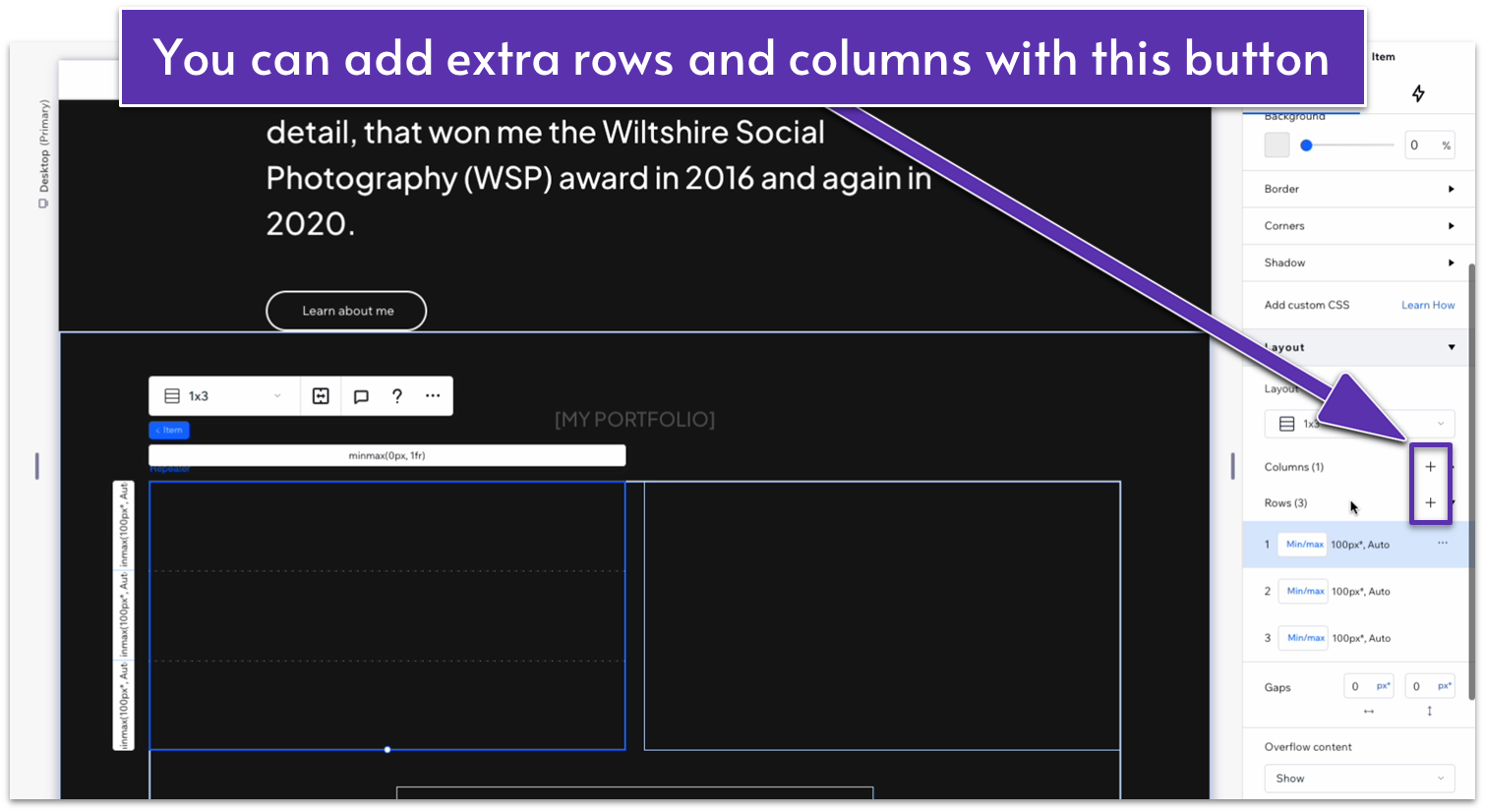
Repeater elements help you create multiple elements with consistent design but different content, and we’ll be using them a lot in the sections below. Since repeaters apply the same design consistently, they’ll also allow us to make style changes to the whole section instead of one element at a time.
- In the “Add Elements” menu ( ), select “repeater” from the “Quick Add” options and drag it into the bottom row.
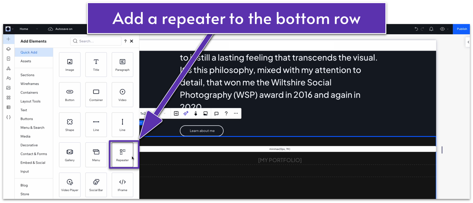
- Open the inspector for the repeater, select the bottom row in “location in grid cells,” and set all margins to 0.
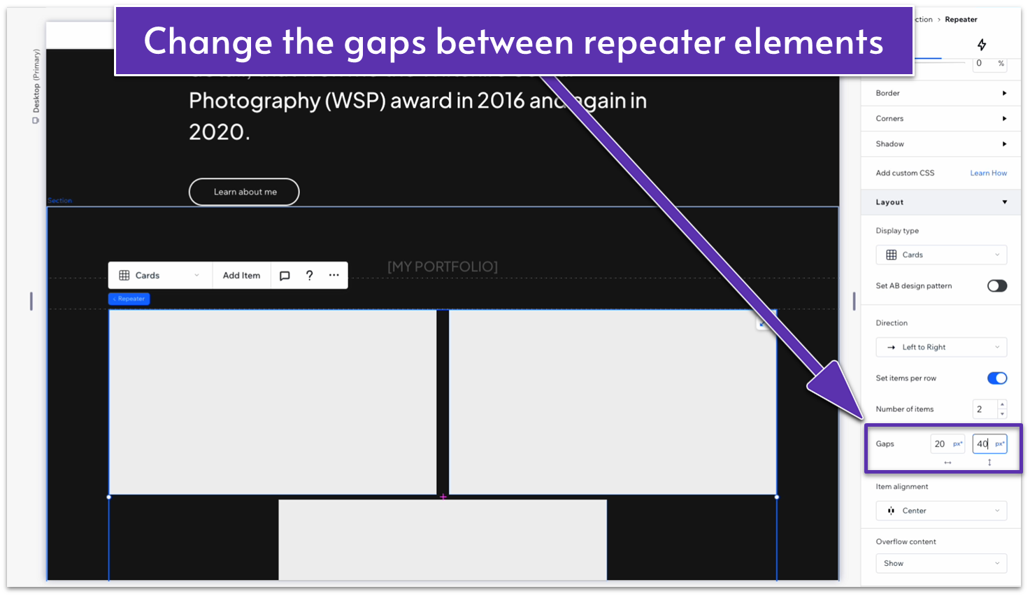
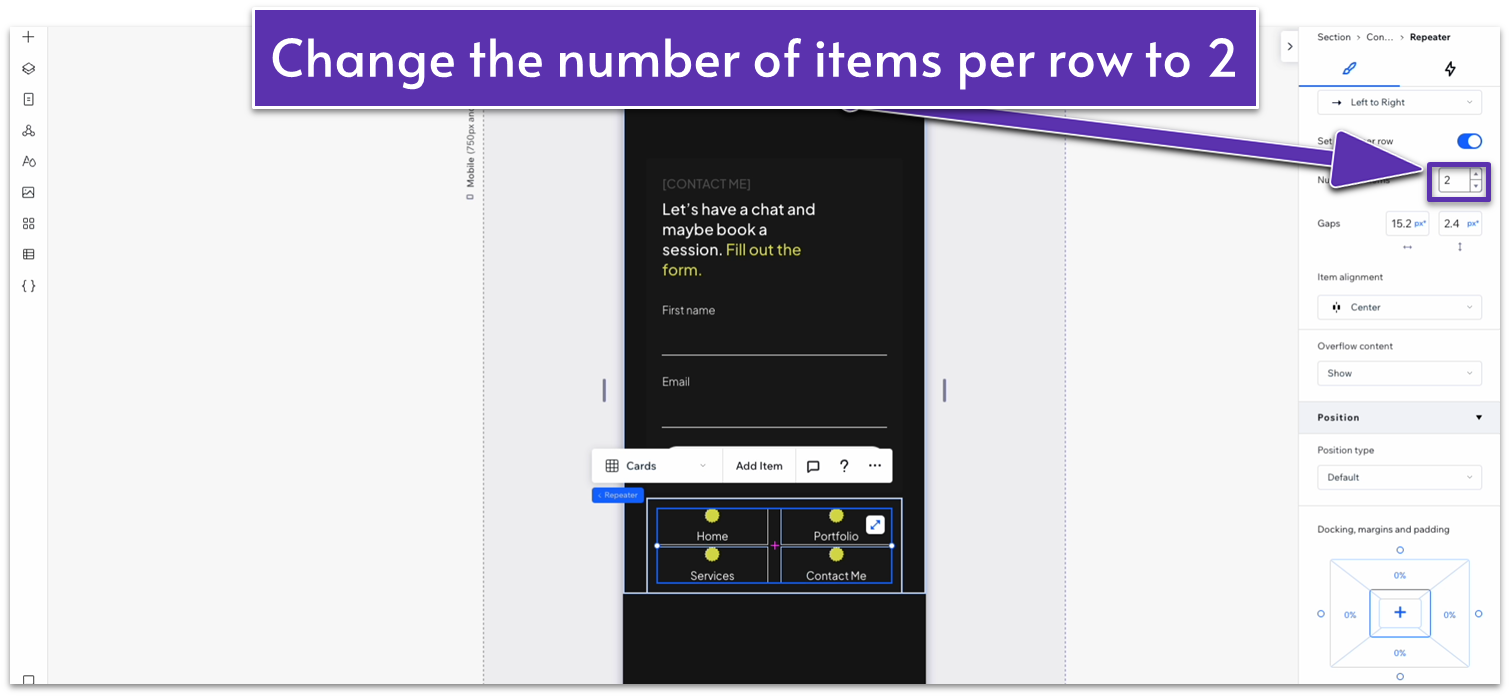
Step 4: Change the repeater’s elements’ width.
- Open the inspector for the repeater and change the width to 1080px.
- Scroll down to “Layout” and change the number of items per row to 2.
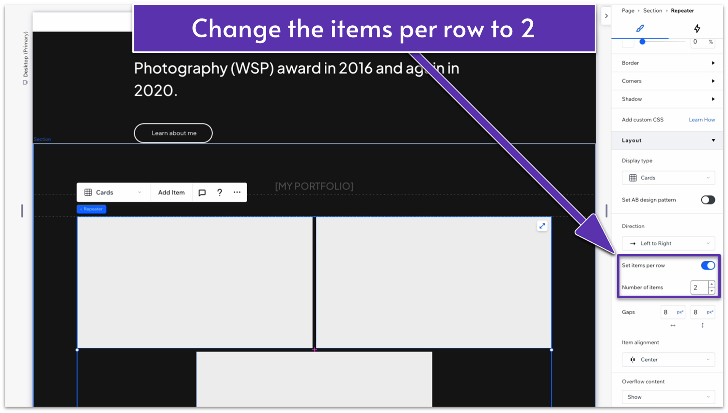
- Set the gaps between elements to 20px horizontal ( ) and 40px vertical ( ).
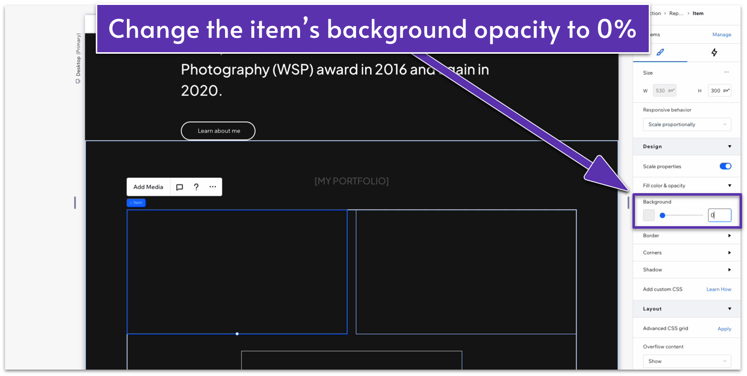
Step 5: Remove the background from the items.
- In the inspector, change the background opacity to 0% for all items.
Step 6: Divide each element into 4 vertical containers.
- Click on one of the elements in the repeater to open the inspector, apply an advanced CSS grid, and change the layout to 1×3 ( ).
- Click on the plus icon ( ) next to “rows” to add an extra row.
- Set the vertical gap ( ) to 20px.
Step 7: Add an image and vector graphic to the container
We’re now dealing with containers within elements within containers (I’d make an Inception joke if that reference was still relevant), so I’ll be as specific as possible about where you need to make each change.
- From the Media section of the “Add Elements” menu ( ), drag and drop an image element into one of the repeater’s containers.
- You can see how all the elements within the repeaters will now have an image element.
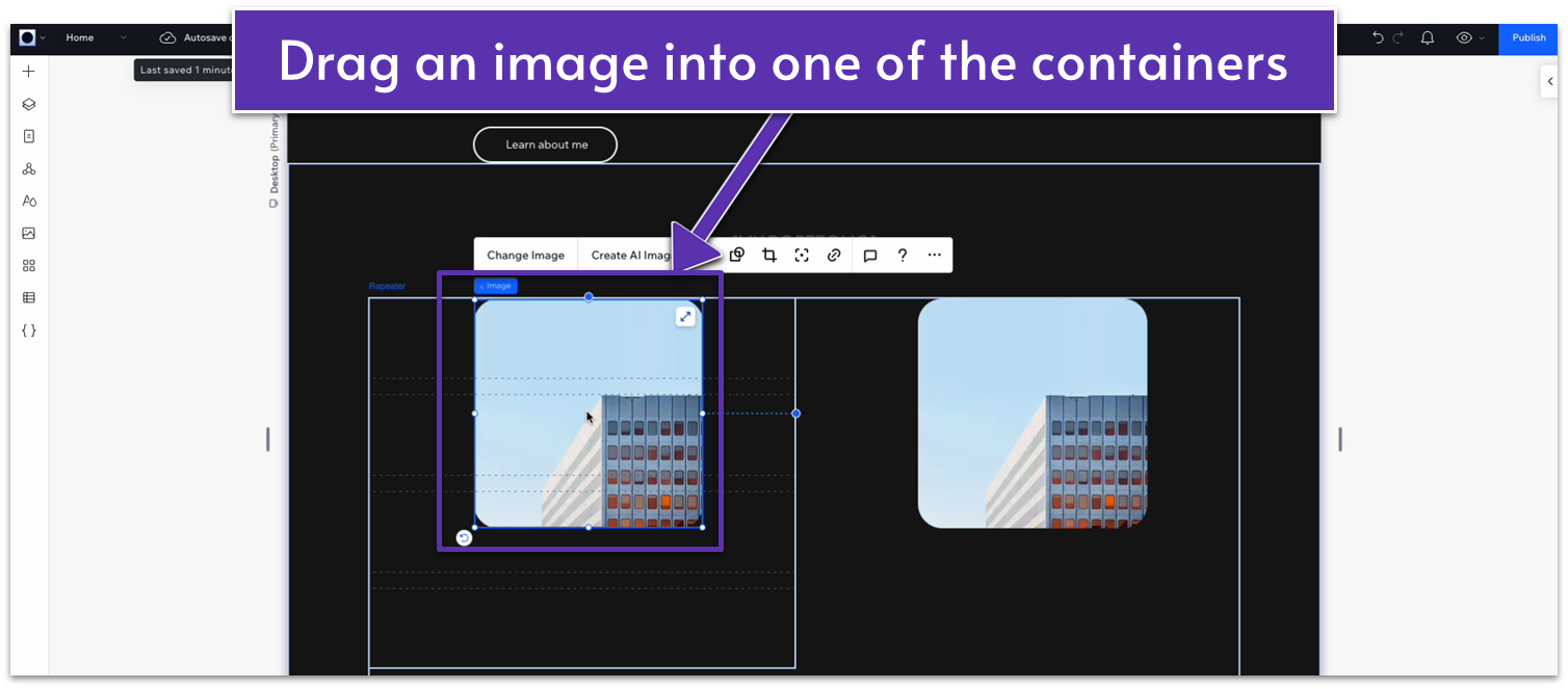
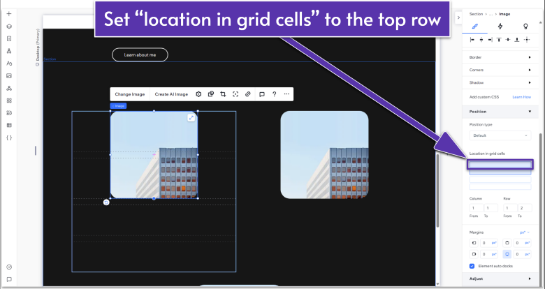
- Using the inspector, change the “location in grid cells” to the top grid within the repeater.
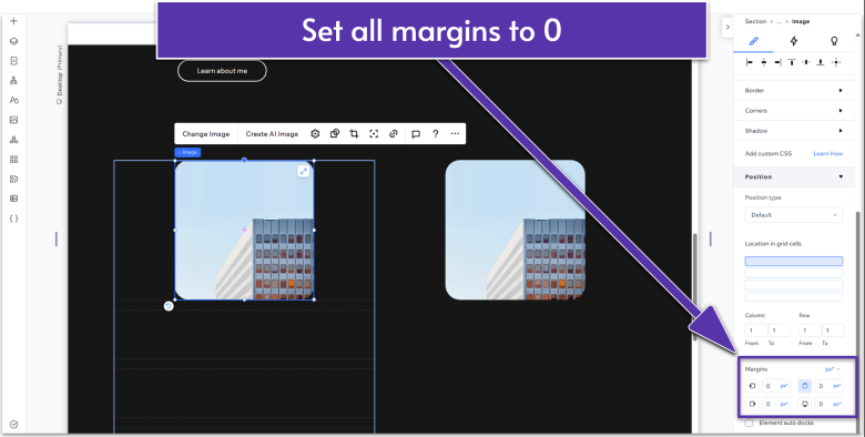
- Set all margins to 0.
- Add a graphics element into the second row (from top to bottom) of the elements within the repeater.
- Set all margins to 0.
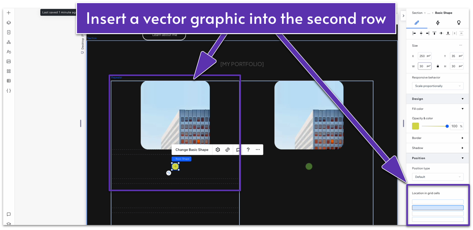
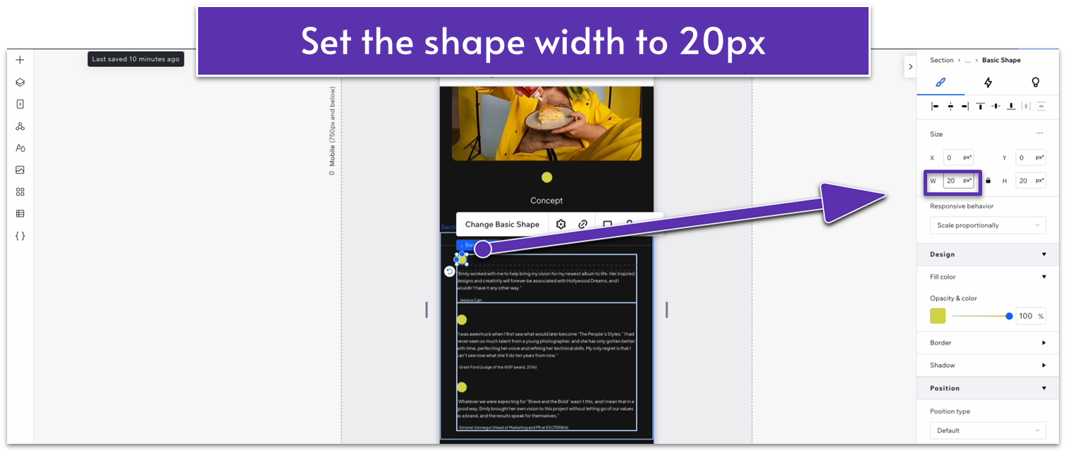
- Set the shape’s width to 30px.
- Change the shape’s color to #D8D84D (HEX).
- You’ll notice that this will change the color of a single shape within the repeater, not all. So, change the color of the other two shapes to match. When we add a new repeater element, that color will be the shape’s default.
Step 8: Set the image to match the full width of the container
- Click on a single container within the repeater and check its width. This time, it should be 530px.
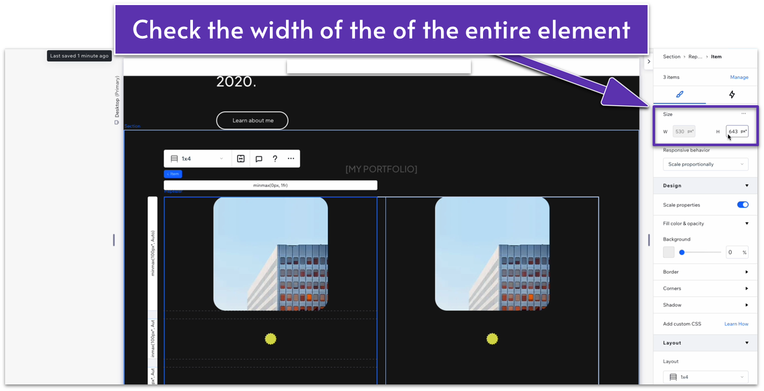
- Click on the image and change its width to match.
- Make sure the lock icon next to its width is activated, this means that the height of the image will change as well to preserve its aspect ratio.
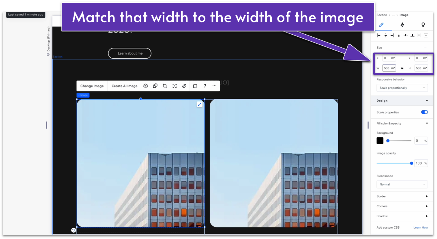
- Set the gaps between elements to 30px horizontally ( ).
Step 9: Adjust the spacing between blocks
- Set the behavior of the top two rows within the repeater’s element to “auto ( ).”
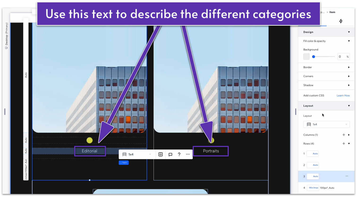
Step 10: Add text to the third row
- Add paragraph text to the third row, change the size, color, and alignment, and set the margins to 0. These are the settings we used:
- Text font: Plus Jakarta Sans Light (the default paragraph font we’ve set for this site)
- Text color (HEX): #FFFFFF
- Text alignment: Center ( )
- Font size: 18px
- We’ll change the text within each element to the name of that category (i.e. “Editorial” or “Portraits”).
- Undock text from all margins.
- In the inspector, toggle on advanced settings for size and set the text box’s width to 100%.
- Change the row behavior of the text to “auto ( ).”
Step 11: Add text to the bottom row
- Set the gaps between elements to 30px horizontally ( ).
Step 9: Adjust the spacing between blocks
- Set the behavior of the top two rows within the repeater’s element to “auto ( ).”
Step 10: Add text to the third row
- Add a heading 3 to the bottom row, change its size, color, and alignment, and set all margins to 0. The settings we used for this row’s text are:
- Text font: Plus Jakarta Sans Medium (the default heading 3 font for this site)
- Text color (HEX): #FFFFFF
- Text alignment: Center ( )
- Font size: 38px
- Toggle advanced size settings on and set the text box width to 100%.
- Change the text within each element for the name of that collection.
- Set the row behavior to auto ( ).
Step 12: Add more elements to the repeater
- Click on any item in the repeater and select “Add Item” on the pop-up menu. We’ll add items until we have a total of 6 on the homepage (3 rows of 2 elements each).
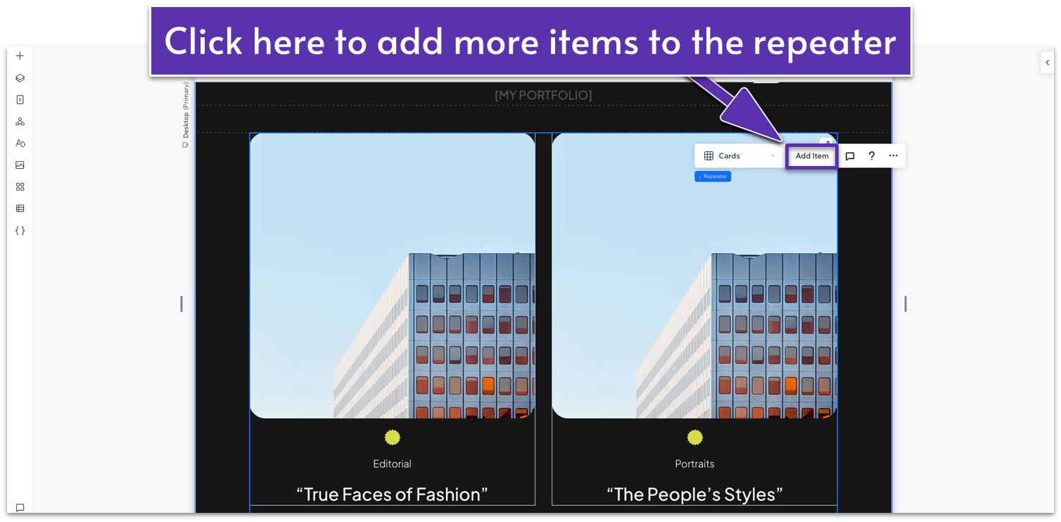
- Each of these elements will have the name of a different noteworthy collection. Don’t add too many more here – you don’t want to overwhelm your viewer. You can include more collections in the “portfolio” page when we get to it.
Step 13: Replace the default photos
- Select “Change Image” on the pop-up menu after clicking on an image container.
- Replace each image with a photo that’s representative of that collection.
Adapt for Tablet and Mobile Views
Step 1: Adapt for tablet devices
- On tablet view ( ), change the font size for the “[MY PORTFOLIO]” text to 16px.
- Set the width of the repeater’s containers to 680px.
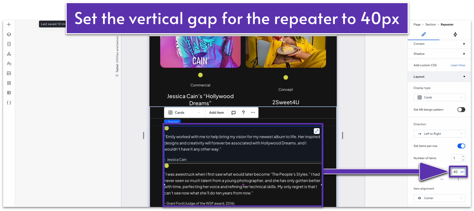
- Set the horizontal gap ( ) to 20px and the vertical gap ( ) to 40px.
- Click on the image within the containers, then set the vertical gap ( ) for the top row inside the repeater’s elements to 40px.
- Set the vertical gap ( ) for the third container to 20px.
- Change the text size for the third container to 14px.
- Change the text size for the bottom container to 22px.
Step 2: Adapt for mobile devices
- Change the font size for the “[MY PORTFOLIO]” text to 16px and the text box’s width to 205.
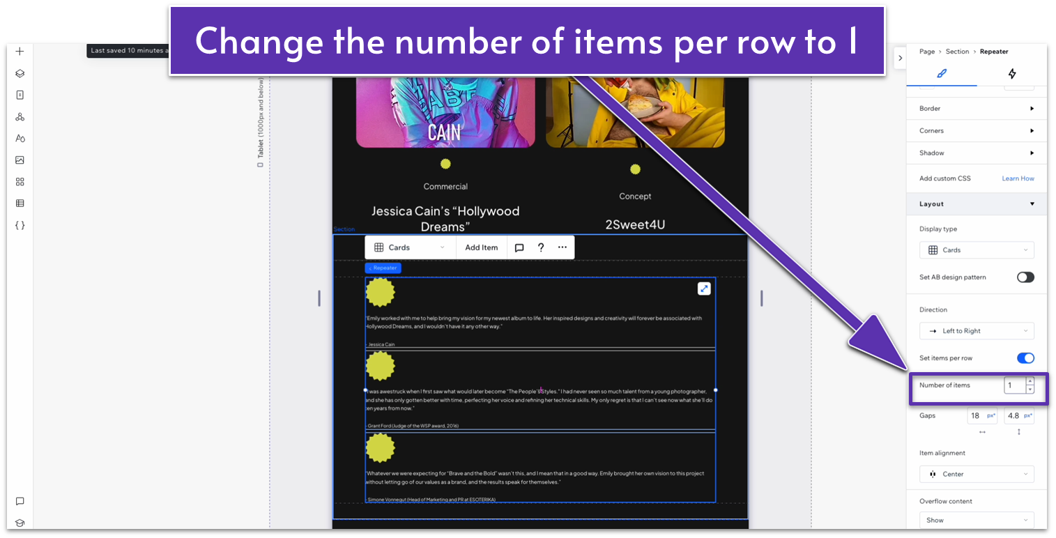
- In the mobile view ( ), change the number of items per row to 1.
- Click on one of the repeater’s elements and change the vertical gap ( ) to 20px.
- Change the text size for the third container (within the repeater’s element) to 14px.
- Change the text size for the bottom container to 20px.
- Set the vertical gap ( ) between the repeater’s elements to 40px.
Step 3: Change the top padding for tablet and mobile views
- Set the padding on top of the section ( ) to 70px for both tablet ( ) and mobile views ( ).
2.5 Testimonials Section
We’ll use repeater elements again to make the design process for this section easier. We’ll also use a couple of visual elements, like simple lines, to add visual interest.
Step 1: Add a new section and divide it into 3 horizontal containers ( ).
- Set the vertical gap ( ) between containers to 50px.
- Change the top padding ( ) to the entire section to 80px.
Step 2: Add lines to the top and bottom containers.
- On the “Add Elements” menu ( ), head over to “decorative,” then “basic shapes,” and then “horizontal lines.” Drag one of the horizontal lines to the top container.
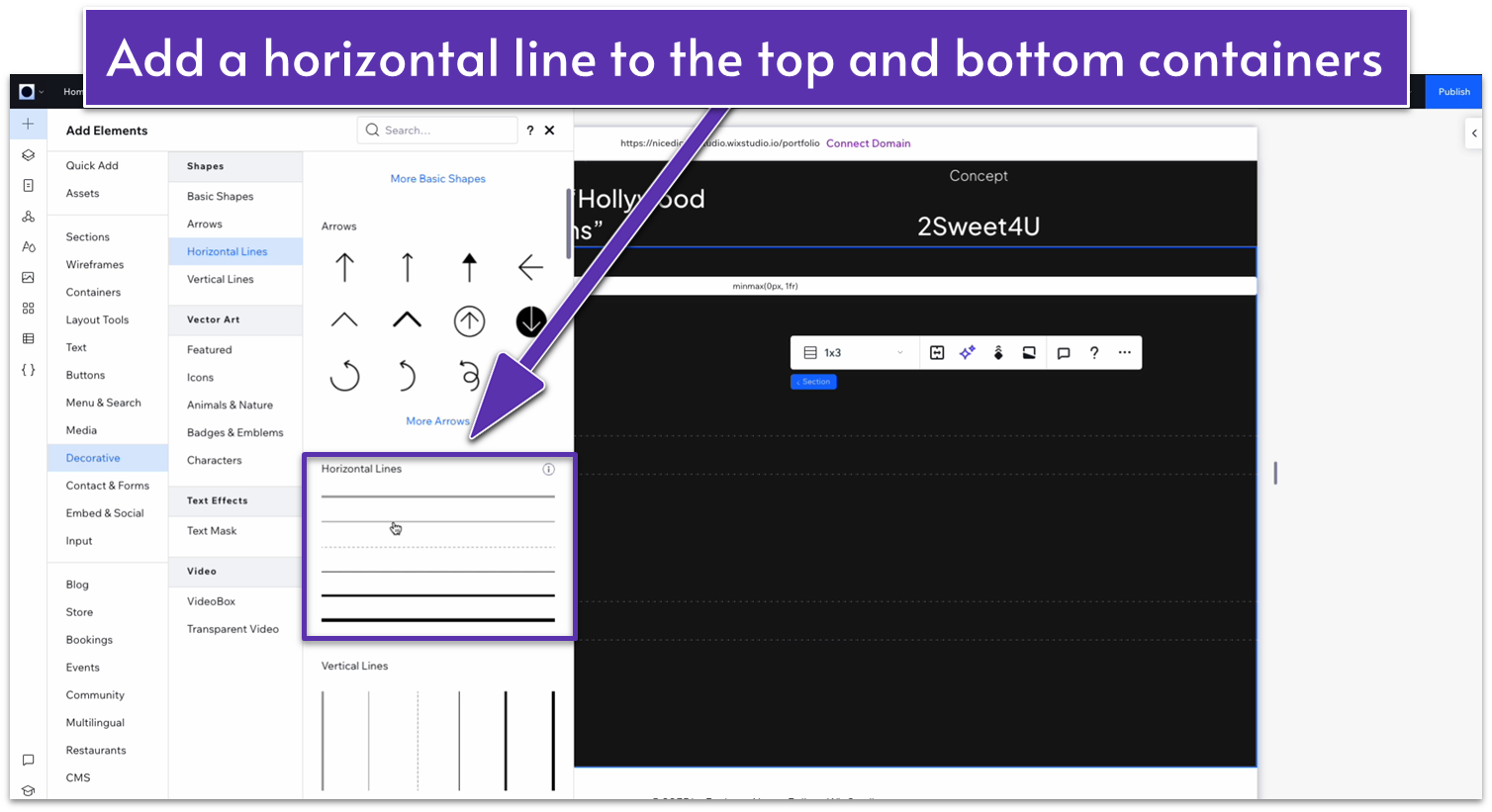
- Set all margins to 0 for the line.
- Change the line color to a light gray (HEX #3F3F3F).
- Toggle the advanced size settings on and set the width to 100%.
- Duplicate the line and move it to the bottom row. Set all margins to 0 again.
Step 3: Add a repeater to the middle container.
- Add a repeater and set the location in grid cells to the middle row.
- Set all margins to 0.
- Change the width of the entire repeater element to 1080px.
Step 4: Set the behavior for all rows to “auto.”
Step 5: Remove the items’ background and add the testimonial text.
- Set the repeater elements’ background opacity to 0%.
- Drag a paragraph into one of the repeater’s elements.
- Set the text color to white.
- Toggle advanced size settings on and set the paragraph’s width to 100%.
- Duplicate the paragraph and drag it down.
- Set the font size for the bottom text to 14px.
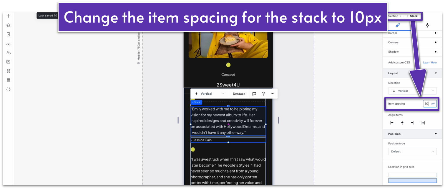
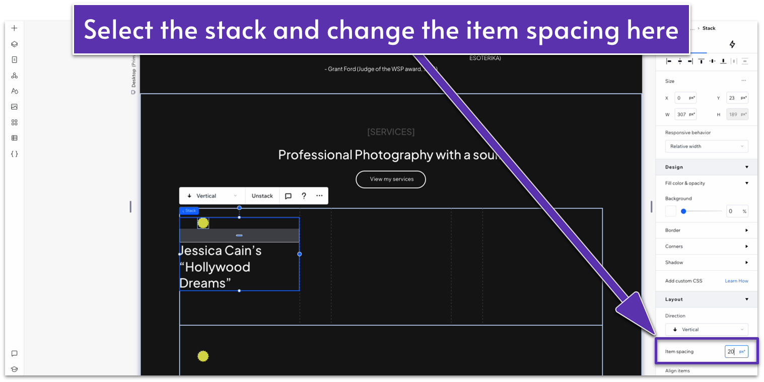
- Select both text elements and stack them.
- Change the layout to vertical and set item spacing to 30px.
Step 6: Add a grid to the repeater’s elements.
- Apply an advanced CSS grid and then change the behavior of the only row to auto ( ).
- Set the horizontal gap between elements ( ) to 30px.
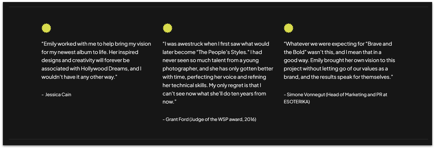
Step 7: Add the testimonials.
- Replace the default text for the top paragraph with the testimonials.
- Replace the default text on the bottom paragraph with the author’s name.
Step 8: Add an icon for the testimonials.
- Select one of the repeater’s elements and change its layout to 1×2 ( ).
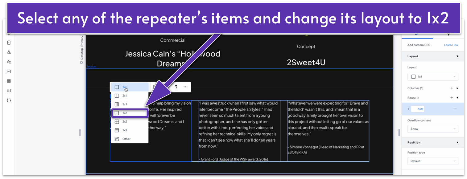
- Select the text stack with the testimonials and author’s name and move it to the bottom row using the “location in grid cells” option.
- Copy one of the shapes from our portfolio section above and paste it into the top row of the element.
- Set all margins for the shape to 0.
- Set the top row’s behavior to “Max content ( ).”
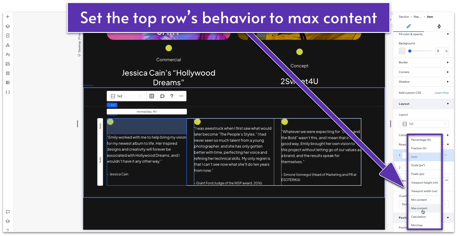
- Change the vertical gap ( ) to 20px of scale.
Adapt for Tablet and Mobile Views
Step 1: Organize the testimonials vertically for tablet and mobile viewing.
- On tablet view ( ), change the number of items per row to 1 in the repeater.
- Change the width of the shape to 20px.
Step 2: Adjust the text spacing and size for tablets.
- Change the font size for the testimonial paragraphs to 16px.
- Change the font size for the author’s name to 14px.
- Set the vertical gap ( ) between items to 40px.
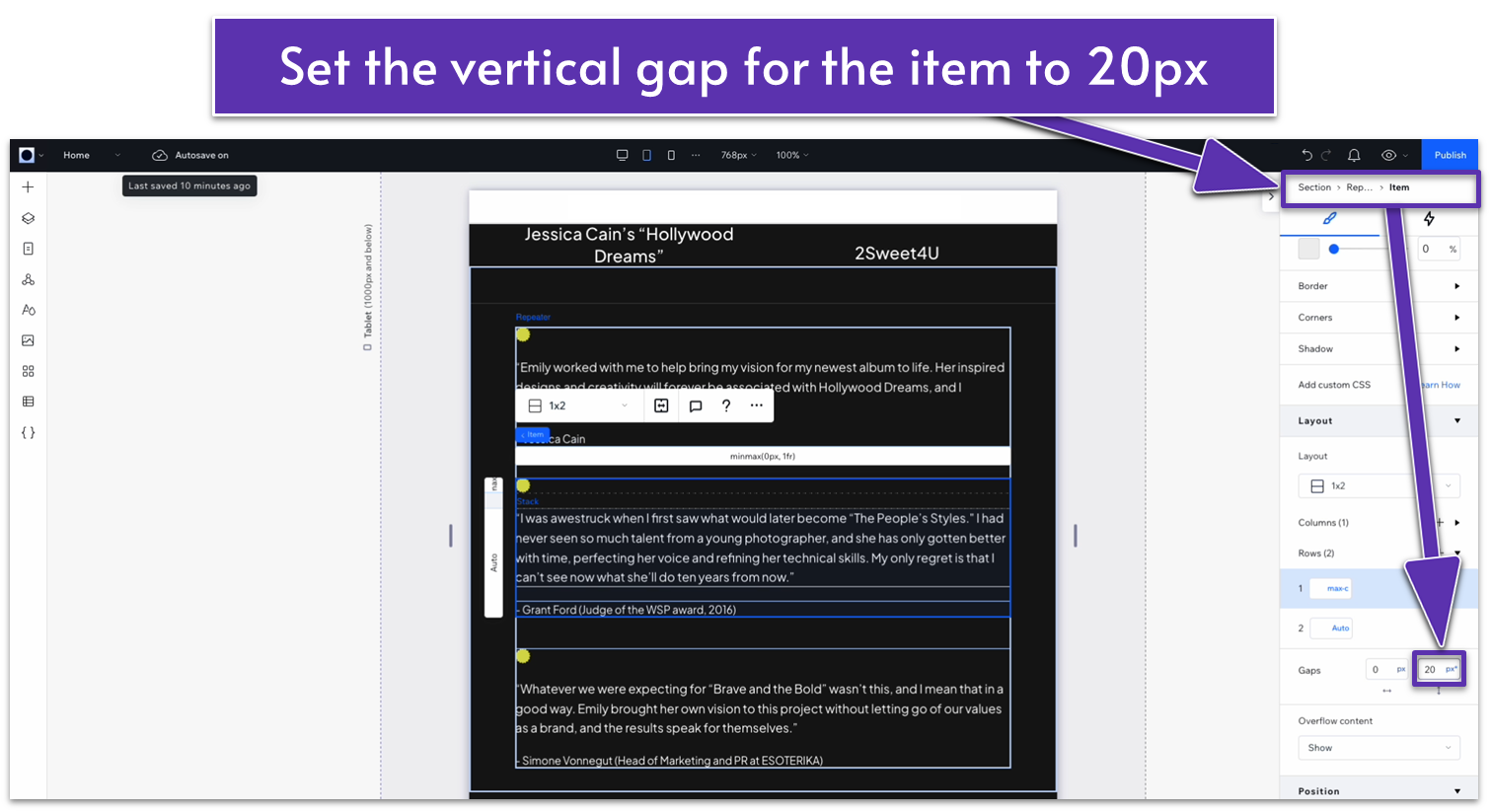
- Inside the repeater’s elements, set the vertical gap ( ) between the two rows to 20px.
Step 3: Adjust the text spacing and size for mobile devices.
- On mobile view ( ), change the shape width to 20px.
- Change the font size for testimonial paragraphs to 16px.
- Change the font size for the author’s name to 14px.
- Set the vertical gap between elements ( ) to 30px.
- Set the item spacing for the text stack to 10px.
Step 4: Adjust the padding.
Set the top padding ( ) for both tablet and mobile views to 70 px.
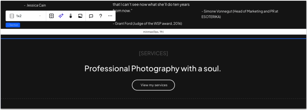
2.6 Services Section
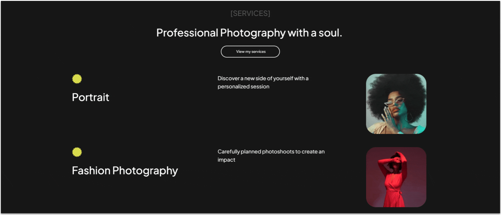
The services section will be a simple, vertically arranged list of the different services available.
Step 1: Add a new section and divide it into two vertical containers.
- Apply an advanced CSS grid, select a 1×2 ( ) layout, and set the vertical gaps ( ) to 50px.
Step 2: Add text and a button to the top container.
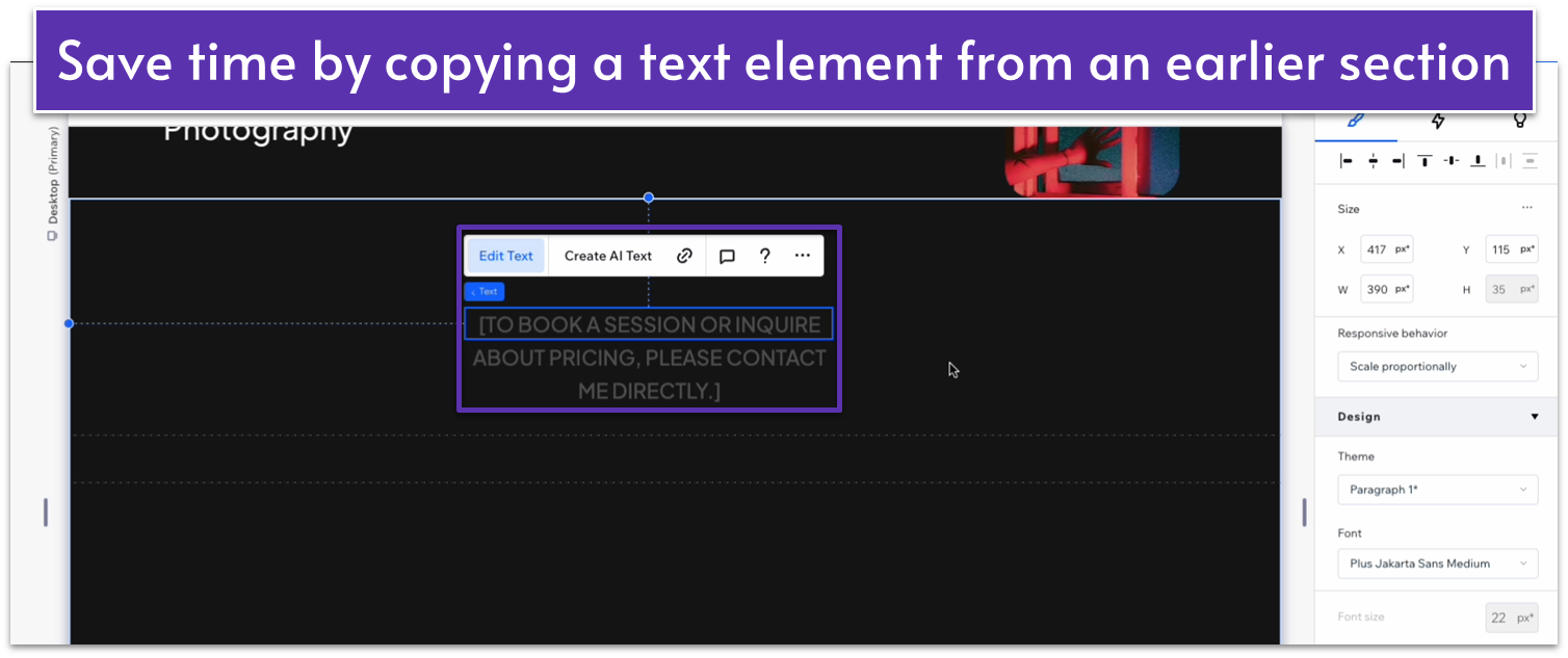
- We’ll add a light-gray text, a white heading, and a button underneath.
- To save time, you can copy these elements from other sections we’ve already built.
Step 3: Group the text and button into a stack.
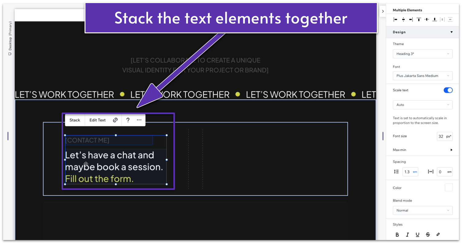
- Align all text elements vertically and stack ( ) them together.
- Set the item spacing to a scale of 20px.
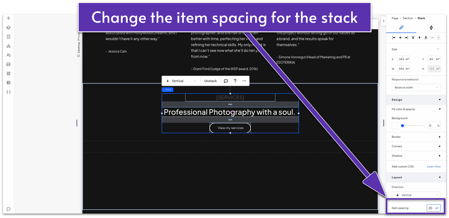
- Set all margins to 0 to center the stack.
- Change the top row’s behavior to auto ( ).
- Change the top padding ( ) size to a scale of 80px.
Step 4: Add a repeater to the bottom container.
- Set all margins to 0 and the width to 1080px.
- Remove the background from the repeater’s elements.
- Change the number of items per row to 1 and change the vertical gap ( ) to 40px.
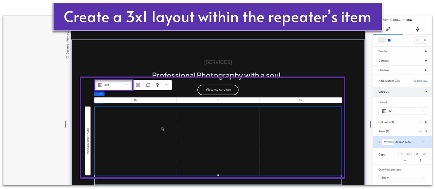
Step 5: Turn the repeater’s elements into three horizontal containers.
- Create an advanced CSS grid within any one of the repeater’s elements and set the layout to 3×1 ( ).
- Set the horizontal gap between the columns ( ) to 80px.
Step 6: Add content to the left-side container.
- Copy and paste one of our shapes from before into the left-side column’s top left corner.
- Copy and paste one of the titles from the portfolio section and place it below the shape.
- Select its location in grid cells to the left side.
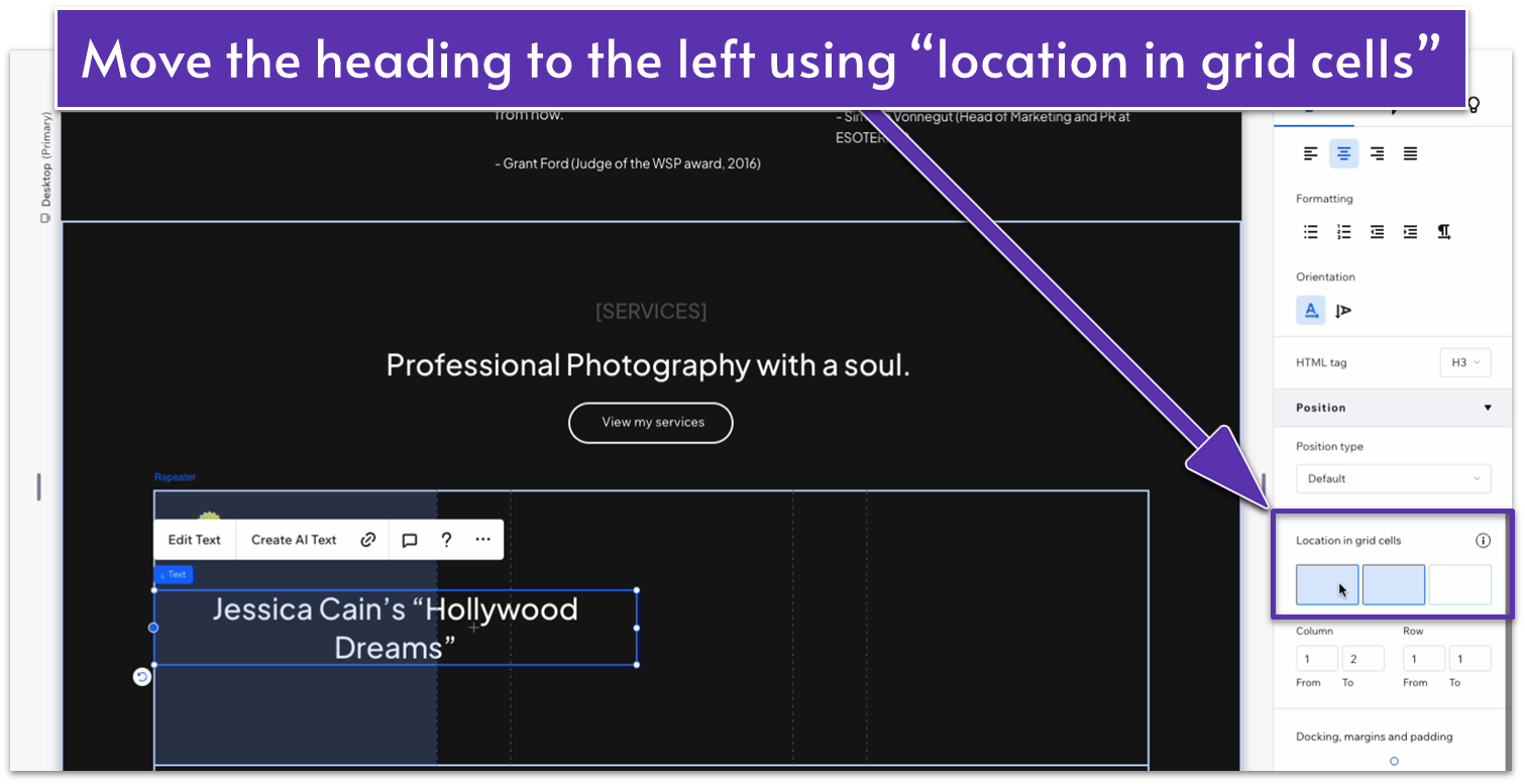
- Align the text to the left.
- Stack the elements together and change the spacing to a scale of 20px.
- Make sure that the title text fits within the container completely, undock all margins except the top one ( ), and set them all to 0.
- Dock the icon to the left ( ) and set all margins but the bottom one to 0.
- Set the bottom margin ( ) for the icon to a 20px scale.
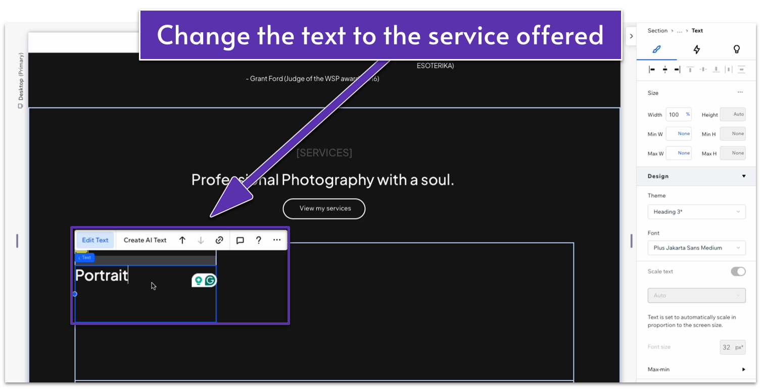
- Change the text to the name of one of the services offered.
Step 7: Add content to the middle container.
- Copy and paste one of the paragraphs from our “testimonials” section and place it into the middle container using the “location in grid cells” option.
- Change the text width to 100%.
- Replace the text with something describing the service in more detail.
Step 8: Add content to the right-side container.
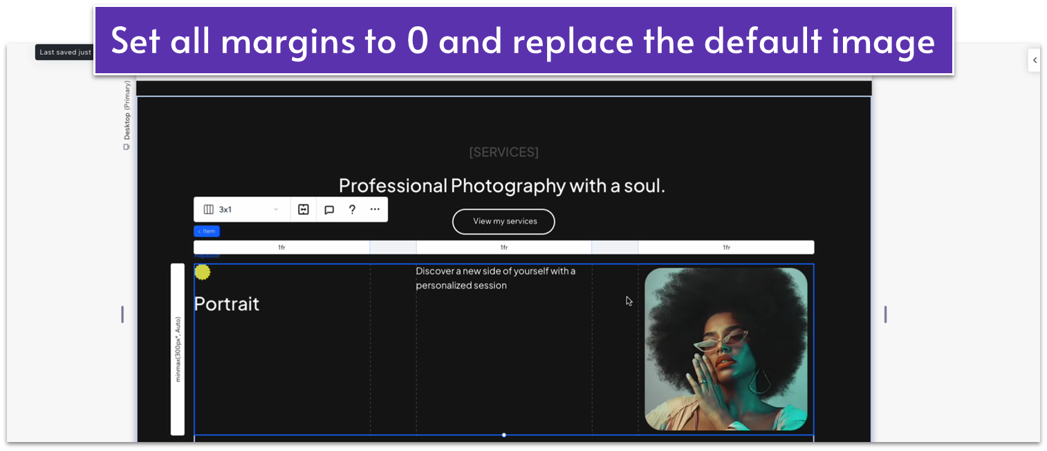
- Add an image box into the right-side container and fix it using the “location in grid cells” option.
- Set all margins to 0 to center the image.
- Replace the default image for one that shows an example of that service.
Step 9: Adjust the size of the containers for a harmonious look.
- Click on one of the repeater’s elements. On top of the grid layout, you’ll see a number describing the relative size of each column.
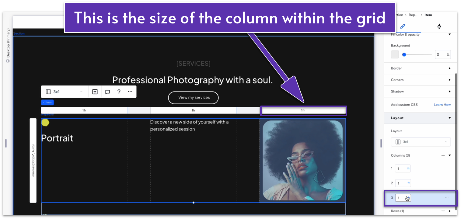
- In the inspector, go to “layout,” then scroll down to the third column, and change its units from “fraction” to “scale (px).”
- Set the column width to a scale of 200px.
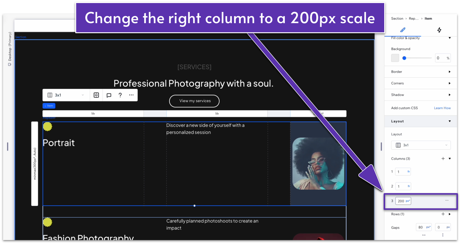
- Head back to the overall repeater element and change the behavior per row to auto ( ).
Adapt for Tablet and Mobile Views
Step 1: Adjust the spacing for tablet views ( ).
On tablet view:
- Select the button and set its width to 180px.
- Set the item spacing for the text stack on the top row to 20px.
- Change the text stack’s width to 404px.
- Set all margins for the text stack to 0.
Step 2: Adjust the spacing for mobile views.
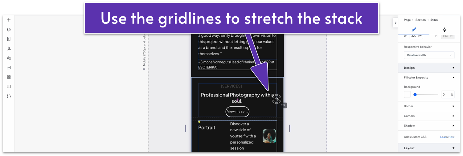
On mobile view ( ):
- Stretch the text stack’s width to the edges of the page using the gridlines.
- Set the button’s width to 180px.
- Set the left and right margins ( , ) for the “services” heading to 0.
- Set the stack’s item spacing to 20px.
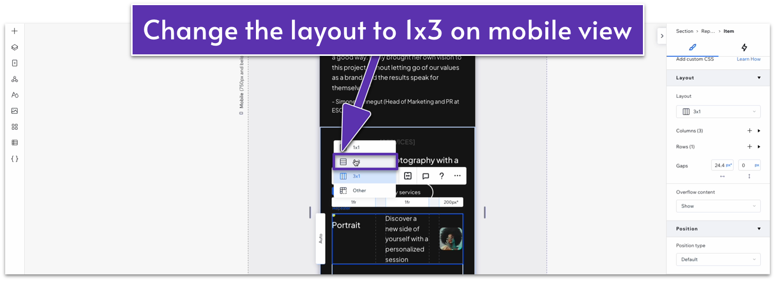
- Change the vertical gap ( ) between rows for the entire section to 20px.
- Select the repeater on the bottom row and change the vertical gaps between rows to 40px.
- Change the repeater’s layout from 3×1 ( ) to 1×3 ( ).
- Change the shape’s width to 20px and its bottom margin ( ) to 20px as well.
- Set all rows’ behavior to auto ( ).
- On the top row, change the vertical gaps ( ) to 30px.
- Click on the repeater item, check its width (it’s 329 px in our case), then lock the image’s aspect ratio ( ) and set that width to the same value.
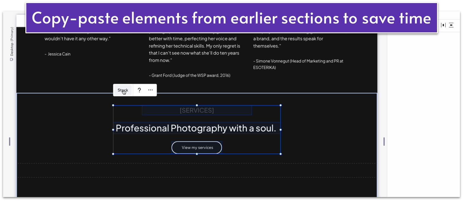
2.7 Call to Action

Let’s add a small bit of scrolling text after the services section and before the contact form to make the page a little more dynamic and tie it together.
Step 1: Create a new section and copy-paste some of the text from earlier.
- We’ll create a new section with a 1×2 ( ) layout and a 50px vertical gap ( ).
- Copy-paste the “[SERVICES]” text from the section above and replace it with a brief bit of text incentivizing the reader to reach out.
- Set the width to 500px and all margins to 0.
- Set the top row’s behavior to auto ( ).
- Set the padding ( ) of that row to a scale of 80px.
Step 2: Copy-paste the marquee from before and change the text.
- Copy and paste the same infinity-scrolling text from the hero section into the bottom row.
- Change the text to something that calls visitors to contact you.
- Set the bottom row’s behavior to auto ( ).
Adapt for Tablet and Mobile Views
Step 1: Adjust the spacing for tablet view.
- Stretch the text box to 450px.
- Set all margins to 0 for the text box.
- Set the top padding for the section ( ) to 70px scale.
Step 2: Adjust spacing for mobile view.
- Change the text box width to 330px.
- Set all margins to 0 for the text box.
- Set the vertical gap ( ) between rows to 30px.
- Set the top padding ( ) to 70px scale.
2.8 Contact Form
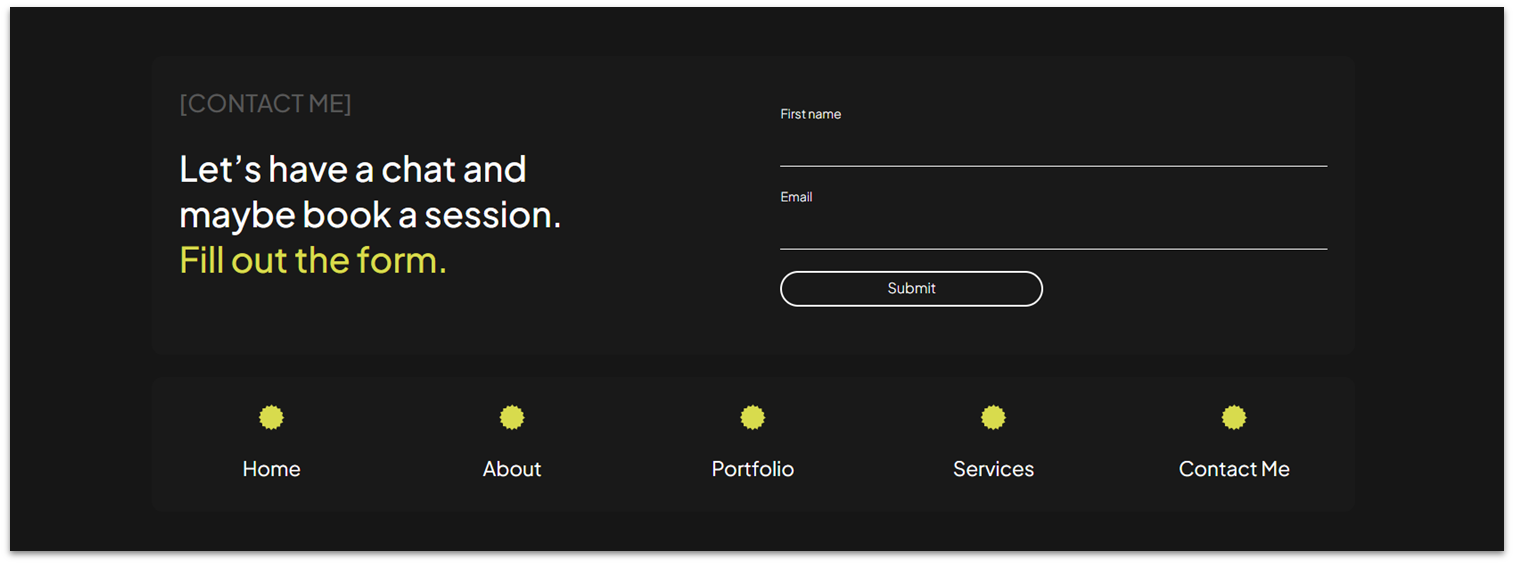
Now that we’ve presented our work, testimonials, and story on the homepage, we’ll add a simple contact form at the bottom.
Step 1: Create a section with two vertical containers and change the padding.
- Set the vertical gaps ( ) to 20px.
- Change the top padding ( ) to 80px scale.
Step 2: Add a container block into one of the top row.
- In the “Add Elements” menu ( ), drag a container element into the top row.
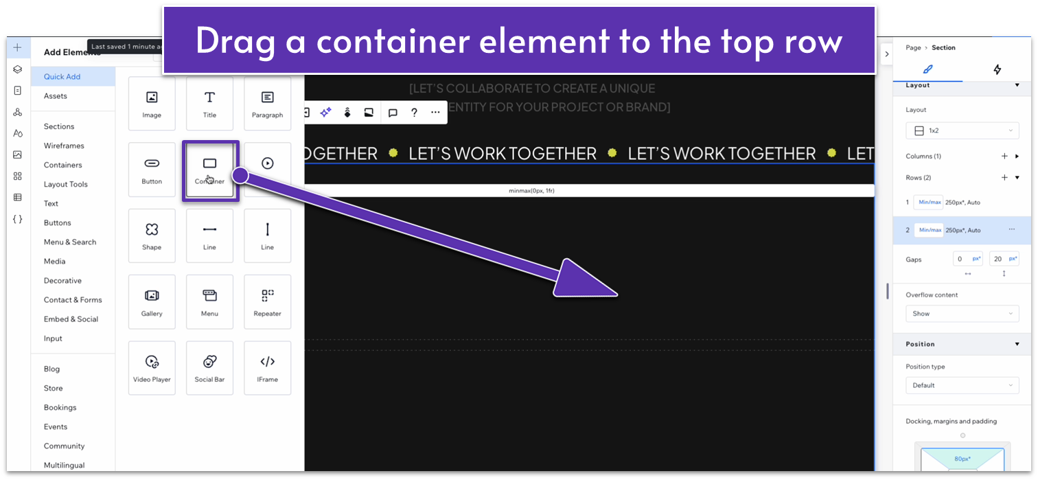
- Set all margins for the container to 0.
- Set the width to 1080px.
- Change the background color of the container to HEX #191919.
- Set the corner radius to 10px.
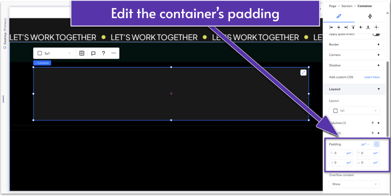
- Apply an advanced CSS grid to the container.
- Select the left-side padding ( ) to a 25px scale.
- Set the behavior of the top row to auto ( ).
Step 3: Duplicate the container element and make its position the bottom row.
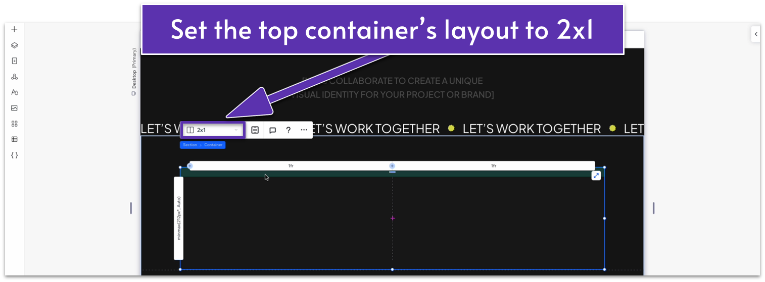
Step 4: Divide the top container block into two horizontal sections.
- Change the layout for the container to 2×1 ( ) with a horizontal gap ( ) of 50px.
Step 5: Add introductory text in the left-side section.
- Copy the dark-gray text from the section above and paste it into the left column.
- Resize the text box to fit the section.
- Set the text’s alignment to the left ( ).
- Copy some of the white text from the section above and paste it below the gray text.
- Change the bottom text.
- Stack the elements together.
- Change the item spacing to 20px scale.
- Set the margins for the stack to 0.
- Set the row’s behavior to auto ( ).
Step 6: Add a contact form in the right-side section.
- Go to the “Add Elements” menu ( ) section and drag a contact form to the right side.
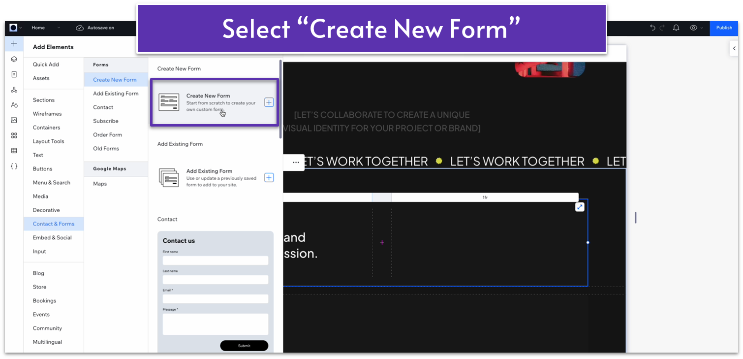
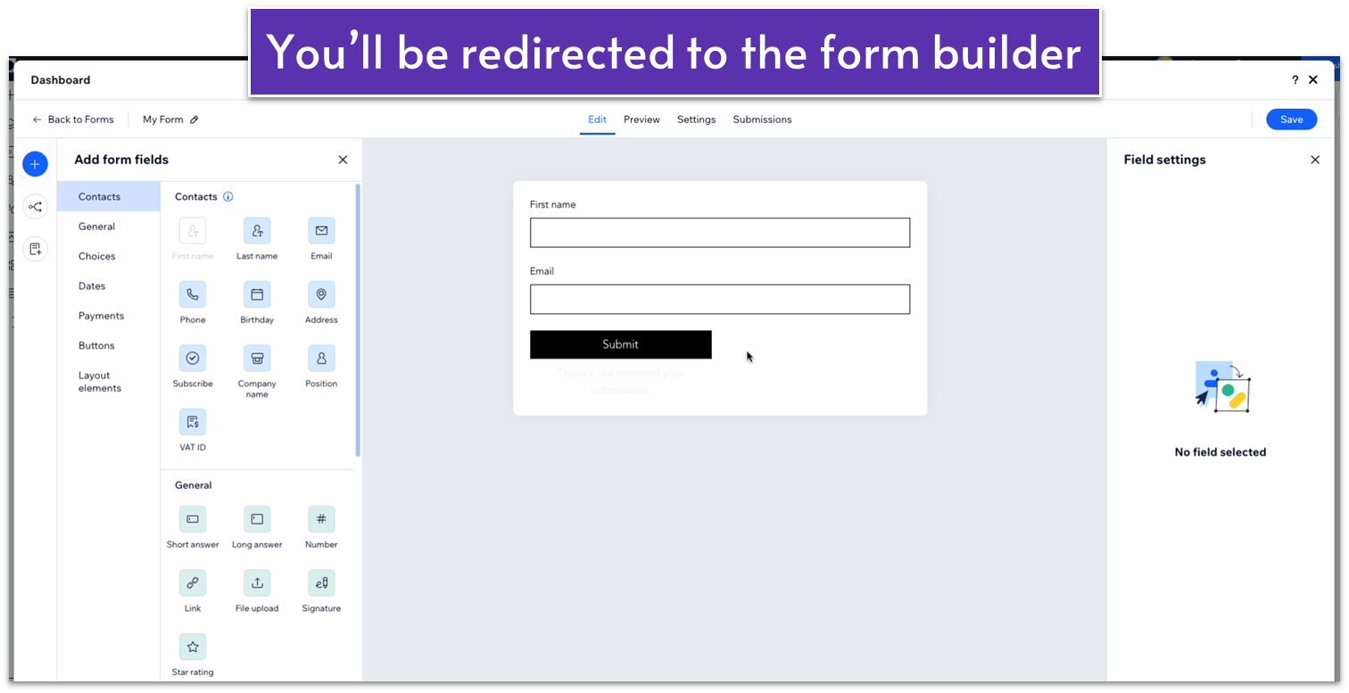
- You’ll be redirected to a separate form builder. There, add the appropriate fields for visitors to fill.
- Once you’re happy with the form fields you’ve chosen, click on the “my forms” option in the upper right corner.
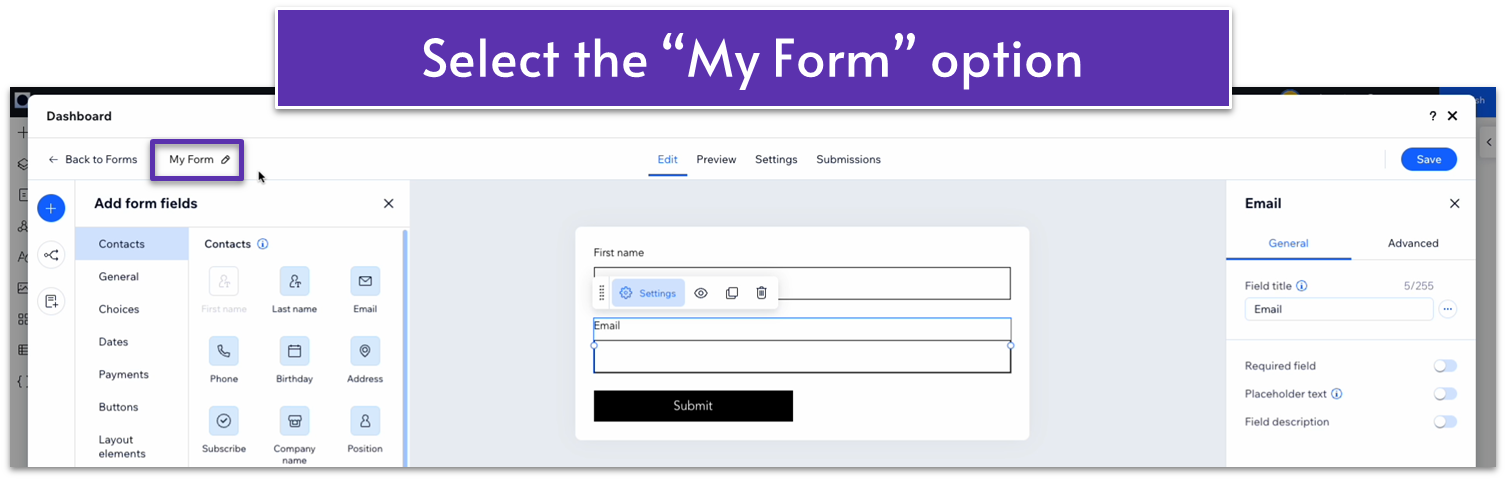
- Change the form’s name and settings, then click “save.”
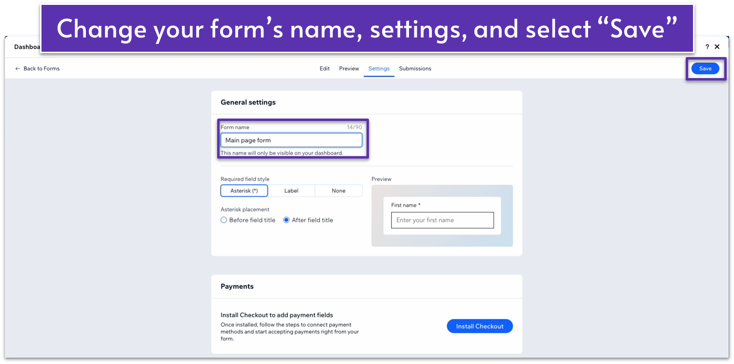
Make sure to save the design, then exit the forms builder.
Step 7: Style the contact form.
- Set the form’s location to the right-side grid.
- Apply advanced sizing options and change the width to 100%.
- Set the min width to “none” and the height to “auto ( ).”
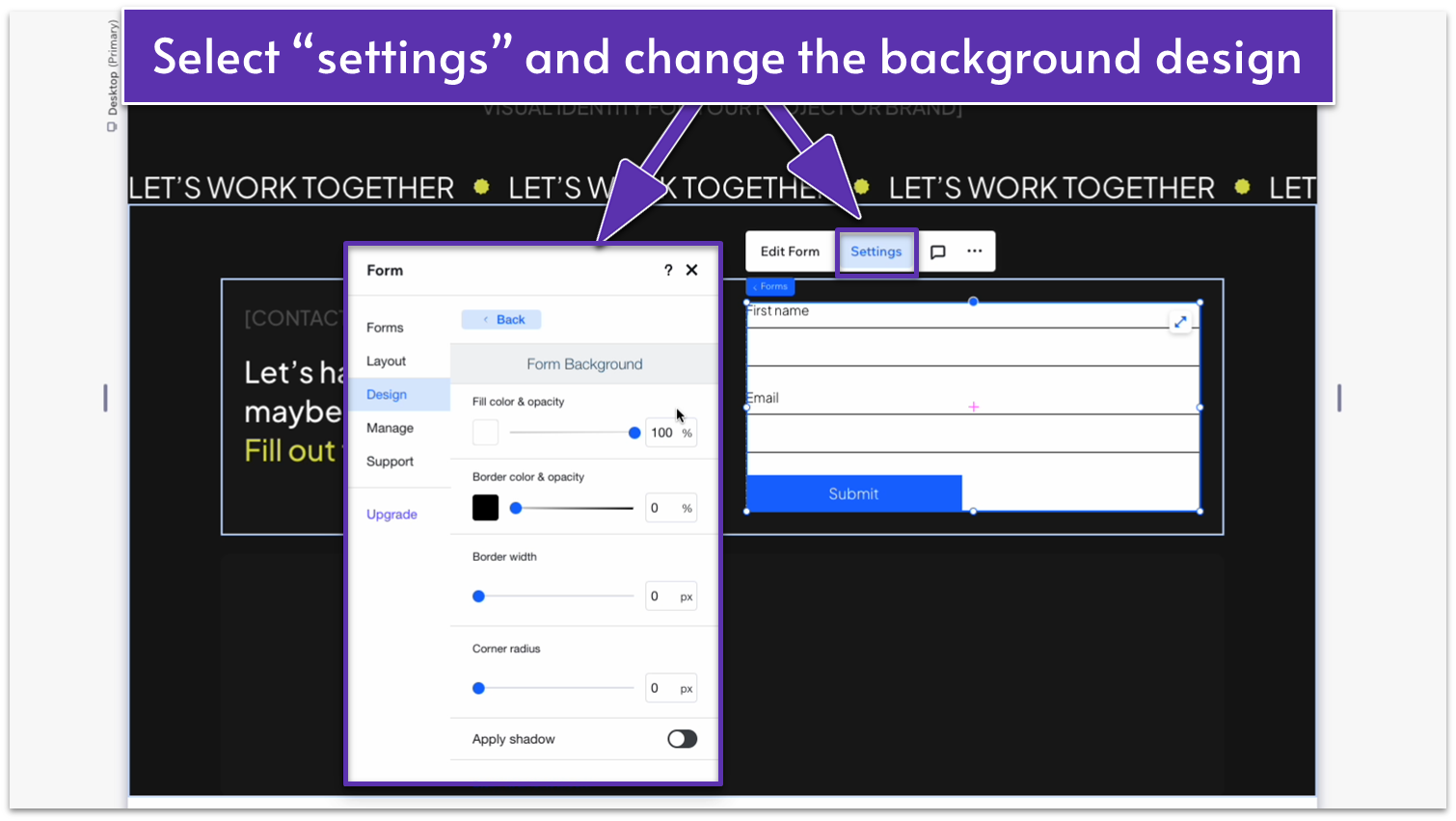
- Click on the contact form and select the “settings” menu. Head over to design, then “Form Background,” and change the background opacity to 0%.
- On “form fields,” change the background color’s opacity to 0%.
- Select the right-side option under “input style.”
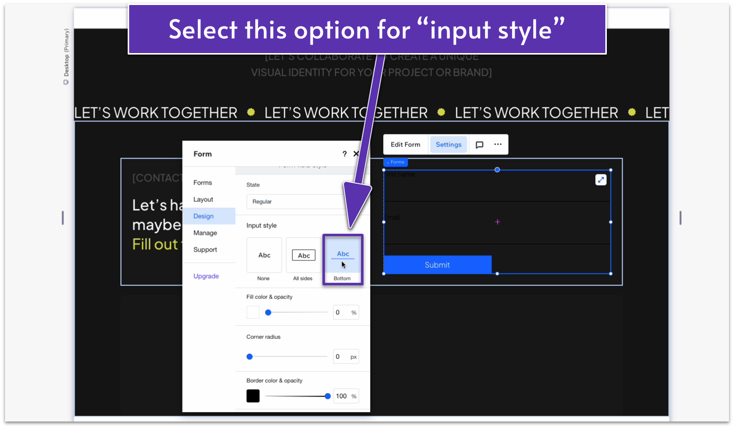
- Change the border color to white (HEX #FFFFFF).
- Change the font’s color to white as well.
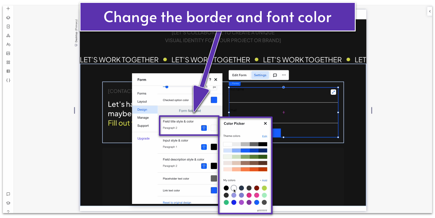
- Head to the “Header and Paragraph” submenu within “design.”
- Change the headers’ text colors to white.
- Go to the “buttons” submenu and then go to the “submit button.”
- Change the input style to the oval with a white background.
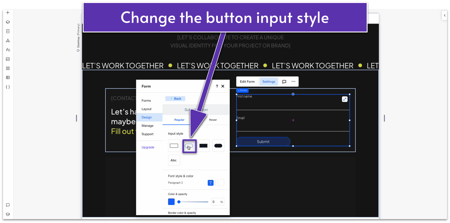
- Change border width to 2px.
- Change the border color and opacity to white.
- Change the hover background color to white.
- Change the hover text color to black.
Step 8: Add a 4-item repeater to the bottom block.
- Set the margins for the repeater to 0.
- Set the horizontal gap between elements ( ) to 50px.
- Change the number of items per row to 4.
- Toggle advanced size settings on and set the width to 100%.
- Change the background opacity per item to 0%.
Step 9: Add an icon and text to each repeater item.
- Copy one of the previous shapes into each container.
- Copy and paste some text from the sections above.
- These will be navigation buttons, so change the text to the names of the pages your finished site will have. For example, we will have: Home, Portfolio, Services, and Contact Me.
Step 10: Scale the repeater items.
- Select the shape and the text, and stack the elements.
- Change the item spacing to 20px scale.
- Select the whole container and change the row behavior from Min/max ( ) to Auto ( ).
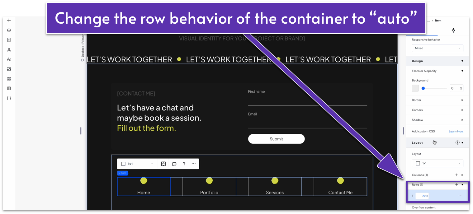
- Select the whole row (all of the repeater items), and change the row behavior from Min/max ( ) to Auto ( ).
Adapt for Tablet and Mobile Views
Step 1: Adjust the spacing for tablet views
On tablet view:
- Set the top padding ( ) of the section to 70px scale.
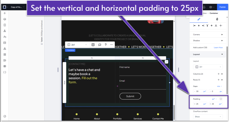
- Select the upper container element and set its horizontal ( ) and vertical ( ) padding to 25px.
- Set the vertical gap between rows ( ) to 20px.
Step 2: Adjust the spacing for mobile views
On mobile view:
- Set the top padding ( ) to 70px scale.
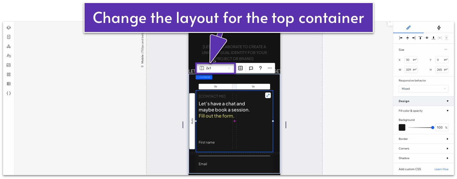
- Change the layout for the top container 2×1 ( ) to 1×2 ( ).
- Set the behavior of both rows to auto ( ).
- Change the vertical gap ( ) between rows to 30px scale.
- Set the horizontal and vertical padding for this element to 20px.
- Change the number of items per row for the bottom repeater to 2.
- Set the horizontal and vertical gaps in the repeater to 20px.
- Select the stack with the shape and text, set the item spacing to 10px.
2.9 Footer

We’ll create a simple, attention-grabbing footer for this page. Just like the header, the footer will be a recurring element between pages.
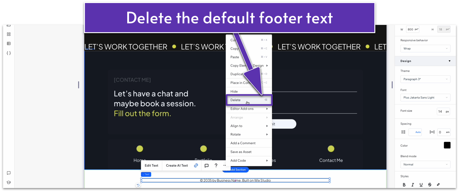
Step 1: Delete the default footer text
Step 2: Style the footer
- Change the footer’s background to #161616 (HEX).
- Set the footer’s height to 500px.
Step 3: Drag a heading 1 into the footer
- Change the heading’s font color to a light gray (#3F3F3F HEX).
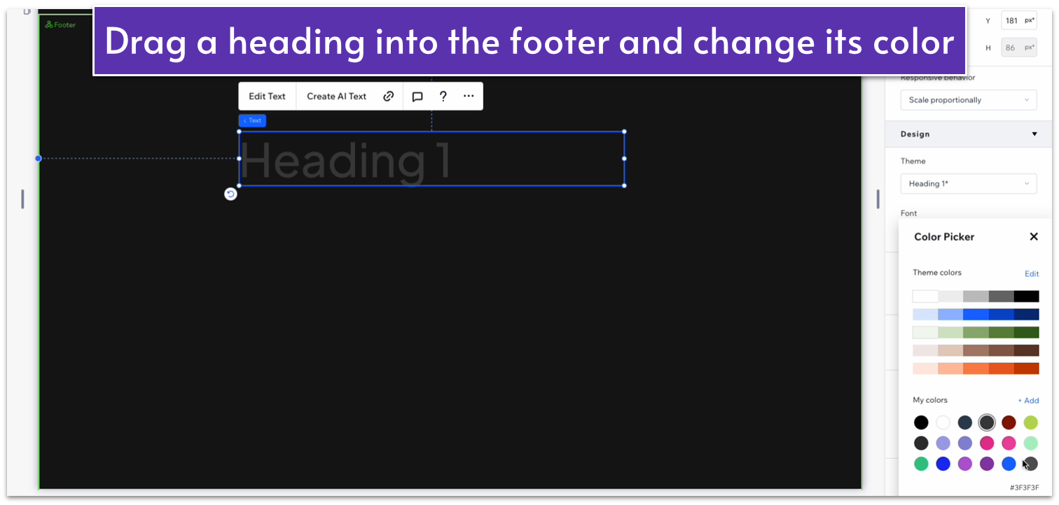
- Align the heading’s text to the center ( ).
- Replace the default text with your own.
- Change the text’s font to Plus Jakarta Sans Semi Bold.
- Set all margins to 0.
- Change the font size to 194px.
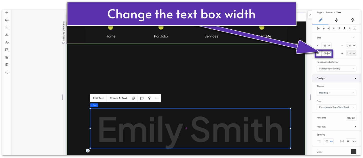
- Change the text box width to 1080px.
- Apply an advanced CSS grid to the footer.
- Set the row behavior to auto ( ).
- Toggle advanced size settings on and change the “Min H” to “none.”
- Set the section’s vertical padding ( ) to 50px scale.
Adapt for Tablet and Mobile Views
Since this footer is pretty simple, we didn’t make any changes.
