

To access the “Portfolio” version of this module, please click here.
You’ve done the work, you’ve planned your website and built its pages, and by now you should be close enough to a finished site that it can probably tell what brand of deodorant you use. All that’s left between you and your finished site is one more step – or rather, a bunch of small steps.
Let me expand a little – while you’re done with the detailed (but hopefully enjoyable) work of building each page block by block, now’s the time for the little additions that round out your website. This part should take considerably less effort, so much so that we bundled all these steps together in a single module. That doesn’t mean that you should overlook it though, since these small details will elevate the work you’ve already done.
But enough of my rambling – here’s what we’ll do:
- Create your site’s header
- Create your site’s footer
- Optimize your site for search engines
- Test your site to ensure everything works
- Make small tweaks if needed
After you complete these steps, your website will be all but ready to be shared with the world. So, without further ado, let’s begin.
6.1 Design the Header
You might have noticed that throughout this guide, there was a constant element that we didn’t really mention: the header.
The header is the small section that appears at the top of most sites and houses the site’s logo and main navigation tools (e.g., page links, menu icon, search bar). You’ll see that your “Main Navigation” pages – About, Services, and Testimonials – already appear as links in the header. Now, let’s enhance it by adding a logo and custom buttons.
I’ll start with a service page for this example, but the design should remain consistent across different pages.
Step 1: Edit a page header
- Select a page and click “Edit” to open the page editor. We selected the “Conversation Closer™” page under the “Services” dropdown menu.
- Hover over the header (the top menu with your site title and links to Services and About pages) and select “Edit Site Header.”
Step 2: Add your logo
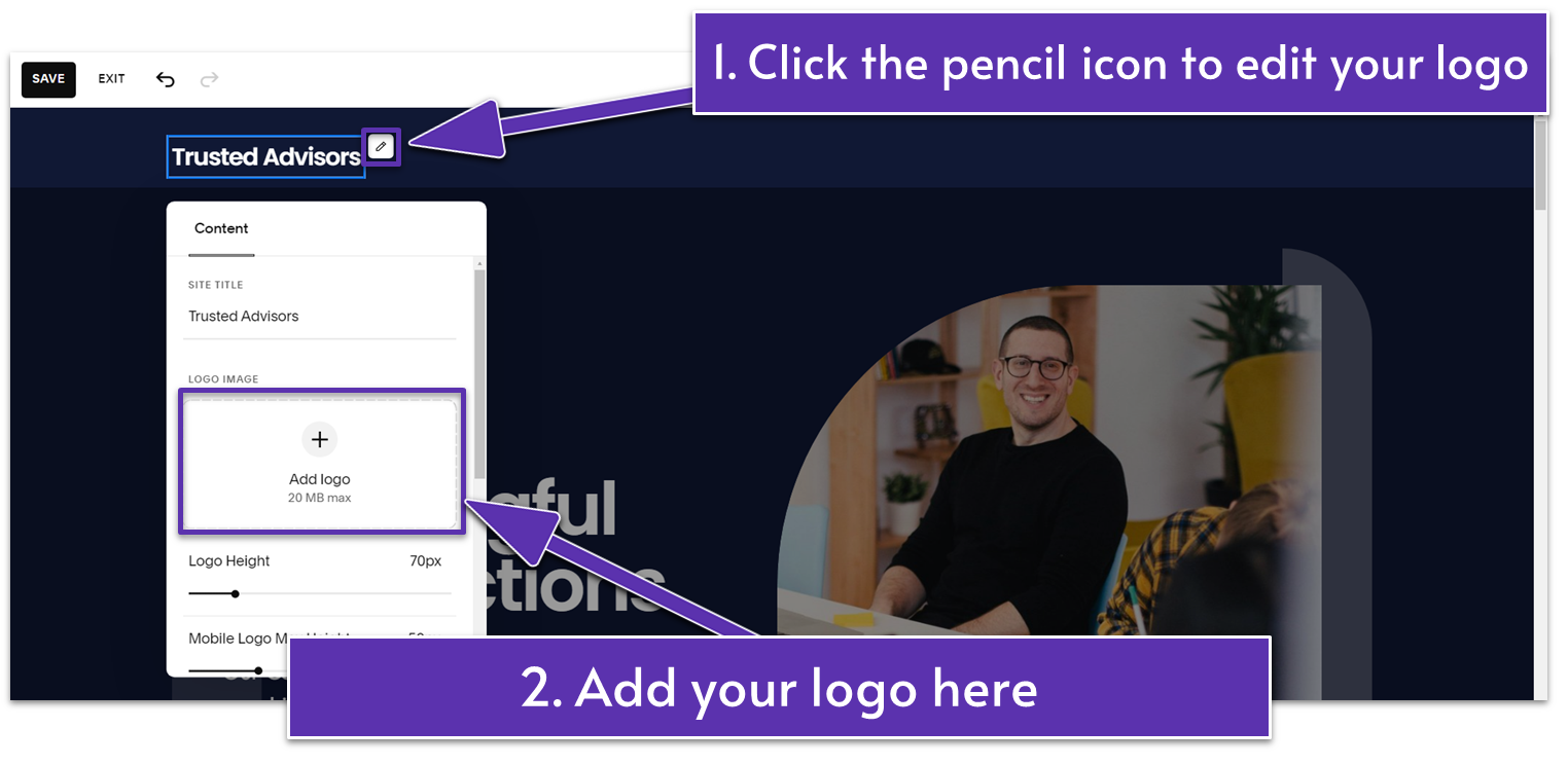
- Click on your current site title inside the “Site Title & Logo” block on the left side of the header.
- Click on the pencil icon ( ) to open the block’s “Content” tab.
- Upload your logo file under “Logo Image.”
- Adjust the sliders to customize your logo’s “Logo Height” and “Mobile Logo Max Height.” For example, we set the logo height to 70 px and the mobile height to 50 px.
- If you have a mobile variation for your logo, you can add it to the box under “Mobile Logo Image.”
Step 3: Add elements to your header
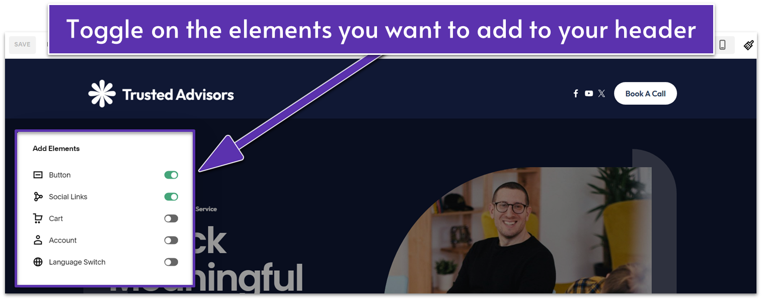
- Exit the “Site Title & Logo” panel and select “Add Elements” on the left.
- Toggle on “Social Links” to connect your website to your social media accounts.
- Toggle on “Button” to add a quick link to your Contact page.
- Enable any other elements you’d like to display on your header. This includes cart, account, and language options.
Step 4: Customize the social links
- Select the “Social Links” block and click the pencil icon ( ).
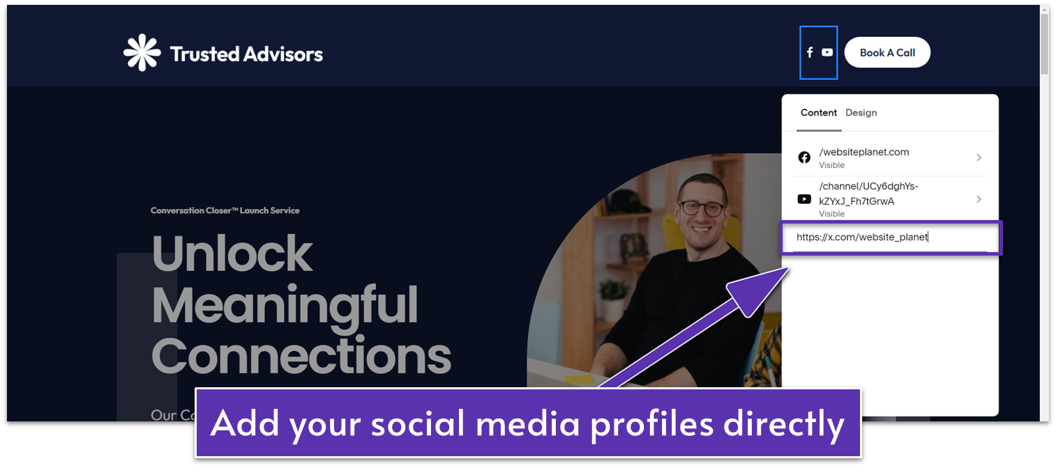
- In the “Content” tab, click on any preset social link item to edit the link or delete the item.
- Select the “Add Social Link” option and paste your profile link to add more social media links. The respective social icon should appear automatically.
- To edit the order of the icons displayed, click “Edit” in the top-right corner of the panel. Then, drag the social links until they match your preferred order.
- In the “Design” tab, you can edit the size and border of your social links. For this example, we set the “Social Icon Size” to 20 px with no border ( ).
Step 5: Customize the button
- Click on the “Button” block and click the pencil icon ( ).
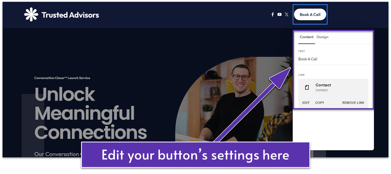
- In the “Content” tab, change the text to a short call-to-action (CTA) that clearly leads your visitors to the next step, like going to your Contact page. For example, we wrote “Book A Call.”
- Select “Edit” under “Link” to change the outgoing link. We connected the button to the “Book Your Call” contact page.
- Go to the “Design” tab to change the button’s style. For this example, we kept the default “Primary Button” style.
Step 6: Customize the header’s design
- Select the header and click the “Edit Design” button on the right.
You can change your header’s layout, spacing, and other design elements as needed. Here’s what we did:
- Set “Link Spacing” and “Element Spacing” to 1 vw.
- Toggle on “Fixed Position” under “Effects.”
- Set “Height” to 1 vw.
- Set “Width” to “Inset” to add margins and align the header with the main content.
- Go to the “Color’” tab. Set the color to “Adaptive” so the header will adjust to the color of each page.
Your header should look like this. Remember to save your changes.

Step 7: Check your header on “Mobile View”
- Go to “Mobile View” ( ).
- Click on your header and select “Edit Design” to change the header layout, effects, and color.
- Select “View Menu” to see how the navigation links and other header elements look on mobile. Adjust the content and design of the header elements if necessary.
For this particular example, we didn’t make any additional changes to the mobile header.
6.2 Create the Footer
Just like the header, the footer is a constant element across your site. But this one appears at the bottom of the page. It provides less flashy but complete navigation, additional information, and a way to bookend your pages.
Think of links to pages like “Our Policy” or even your copyright notice. You don’t want them overcrowding the header, but it’s important to add them – so off to the footer they go.
Step 1: Add a footer
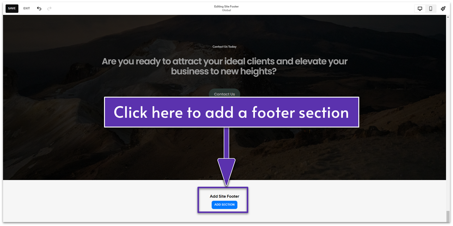
- Choose any page and select “Edit” to open the page editor.
- Go to the bottom of the page and click the “Add Section” button under “Add Site Footer.”
Step 2: Choose a section layout for your footer
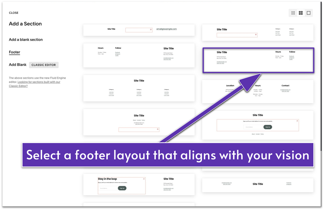
- We went with a simple footer layout divided into three columns.
Step 3: Adjust the footer elements
- Resize and move the text blocks in your chosen footer layout if needed.
If you want to follow our approach, follow these steps:
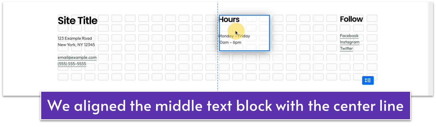
- Make the “Site Title” text block narrower.
- Place the “Hours” text block near the center of the page.
- Move the “Follow” text block slightly to the left.
- Apply “Heading 4” and “Bold” formatting to all titles.
Apply “Paragraph 2” to details like contact information and links.
Extend the height of the “Hours” and “Follow” text blocks all the way to the bottom.
You can follow the footer layout’s preset structure and update the details with your own. Alternatively, you can swap out the text blocks entirely for other details. In our case, here’s what we changed:
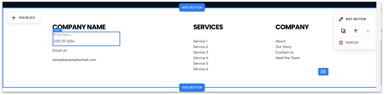
- “Site Title” to company name with phone number and email (address removed)
- “Hours” to “Services” with a list of services
- “Follow” to “Company” with navigation links
Step 5: Add a copyright notice to the footer
- Add a text block below the first three blocks.
- Write your copyright notice in the text block. For example, we wrote “© 2024 Sample Website | All Rights Reserved.”
- Set the text to “Paragraph 3” or as desired.
Step 6: Change the section’s background color
- Select “Edit Section.”
- Go to the “Colors” tab and choose a dark color theme as your background. We set it to “Dark 1.”
Step 7: Add links as needed
- Highlight the text you want to turn into a link.
- Click and select a “Main Navigation” or hidden page to link to.
- Click the URL dropdown menu to select other link categories that allow you to link to phone numbers, files, and email addresses.
6.3 Add a Footer Section for Your Subscription Form
Though we already have a good basic footer, this page will benefit from an additional section that allows your visitors to subscribe to a newsletter, so we’ll add that as well.
Step 1: Add a blank section over the first footer section
- Select the current footer first and click the “Add Section” button above it.
The new section also counts as part of the footer, so it will appear on every page.
Step 2: Add a newsletter block to the blank footer section
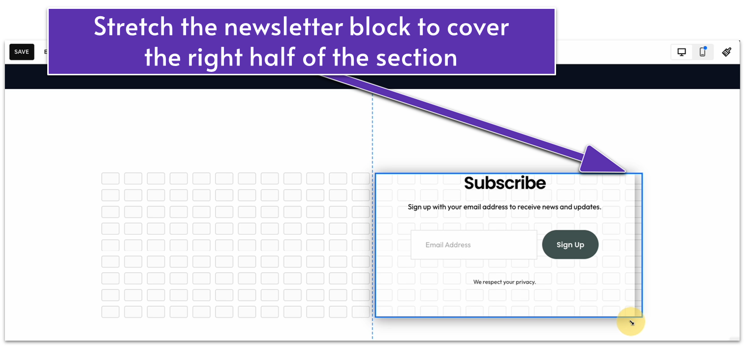
- Click “Add Block” and select “Newsletter.”
- Drag the newsletter block to the right side of the footer section or anywhere you prefer.
- Resize the block if needed. We stretched the newsletter’s corners to fill the space on the right half of the section.
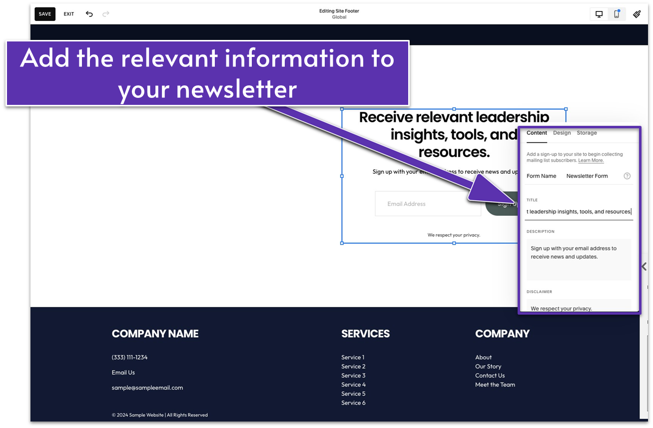
Step 3: Edit the newsletter block’s content
- Click on the pencil icon ( ) to edit the newsletter block.
- In the “Content” tab, update the “Form Name” field with your desired form name. You can also stick to its default “Newsletter Form” name.
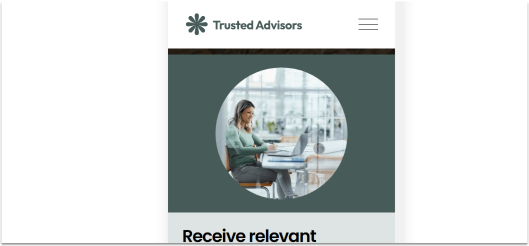
- Update the “Title” field to something that will attract your visitors. For example, you can tell visitors what they’ll get by signing up like “Receive relevant leadership insights, tools, and resources.”
- Add more details about your newsletter in the “Description” field. We wrote “Subscribe to our twice-monthly leadership newsletter.”
- Fill out the “Disclaimer” field with any legal or informational notes if needed.
- Change the button text to your desired call to action. We set it to “Sign Up Now.”
- Toggle “Require Name Field” on.
Step 4: Customize the newsletter block’s design
- Go to the “Design” tab in the same editing panel.
- Select a layout. We chose “Stack,” which arranges elements in a single column, but you can also choose “Float” to display them side by side.
- Choose alignment. We aligned the content to the left.
Step 5: Add an image to the left side of the section
- Add an image block and stretch it to fill the left half of the section.
- Upload an image.
- Click the pencil icon ( ) to edit the image.
- Go to the “Design” tab and select ”Shape.” The image will automatically turn into a circle.
- Click next to “Shape” and select your desired shape.
Step 6: Add a background shape behind the newsletter form on the right
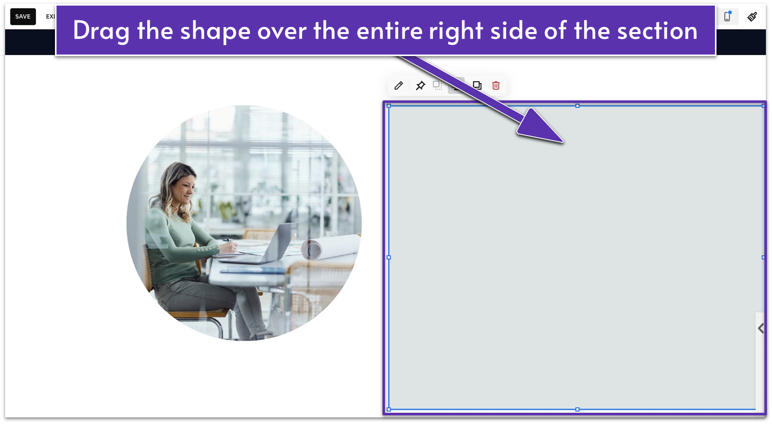
- Add a shape block and place it over the newsletter form.
- Make the shape larger so it fills the entire height of the section and the entire width of the right half.
- Click to send the shape to the background.
- Click the pencil icon ( ) to open the “Design” tab. Select “Color” and change the shape’s color.
- Move the newsletter block inside the shape, away from the center line.
- Adjust the size and position of the shape and newsletter block as needed.
Step 7: Add a background shape behind the image on the left
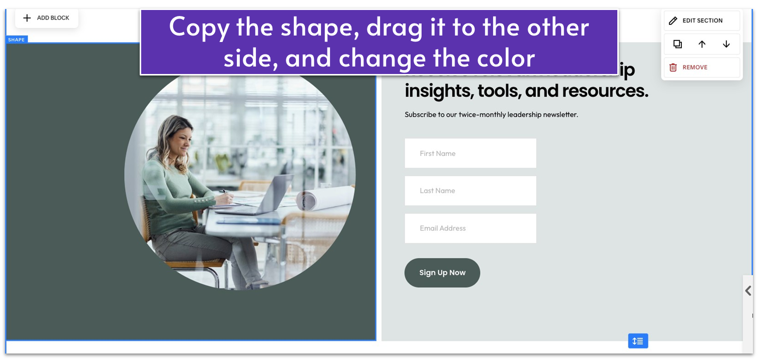
- Duplicate ( ) the shape you made in the previous step. Move it to the left side over the image.
- Change the color of the shape to a darker shade for contrast.
Step 8: Refine the footer section’s spacing
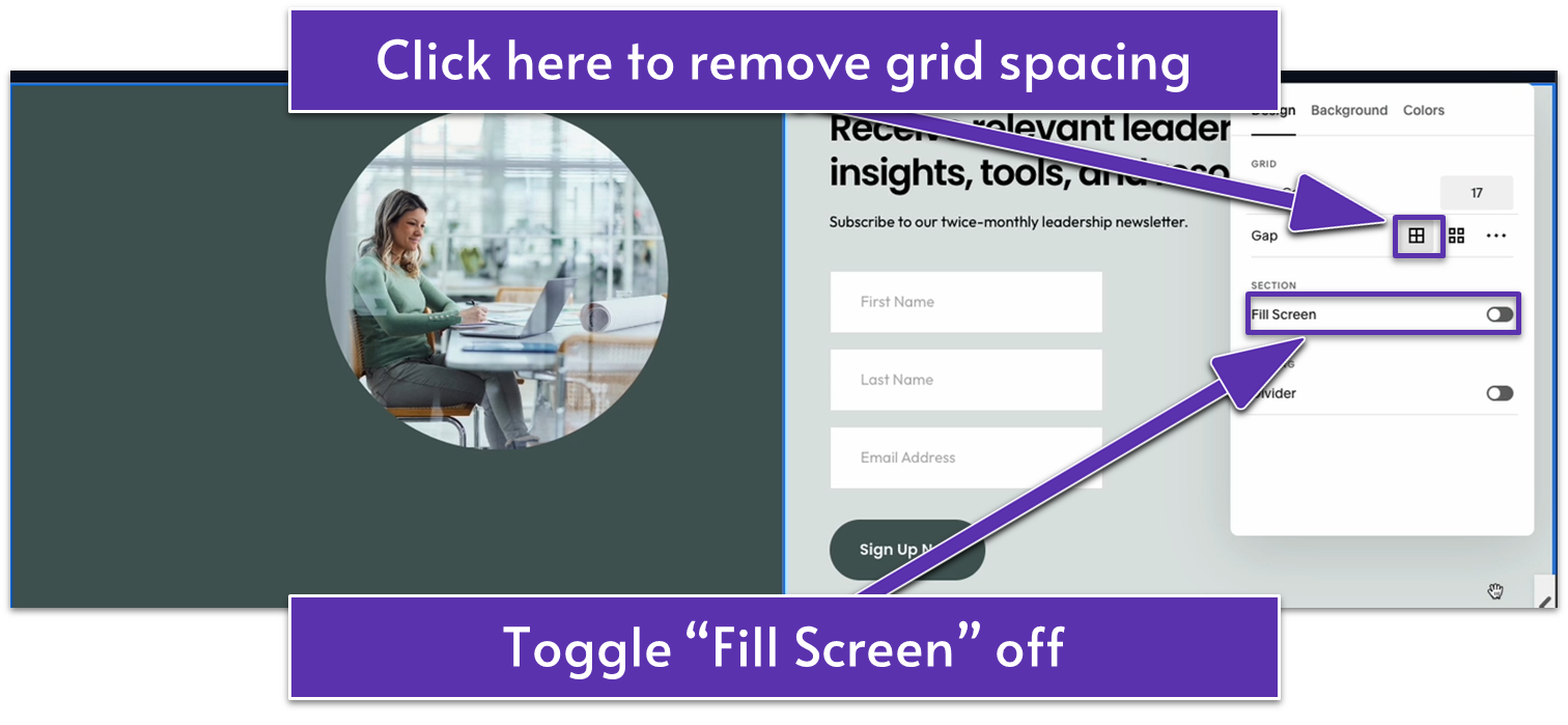
- Click “Edit Section.”
- In the “Design” tab, click the “No Gap” icon ( ) in the “Gap” settings to remove the spacing between the grid cells. This will make the two shape blocks on either side touch.
- Toggle off “Fill Screen” to remove the extra white spaces in the section.
- Extend the section by dragging down to add a few more rows at the bottom.
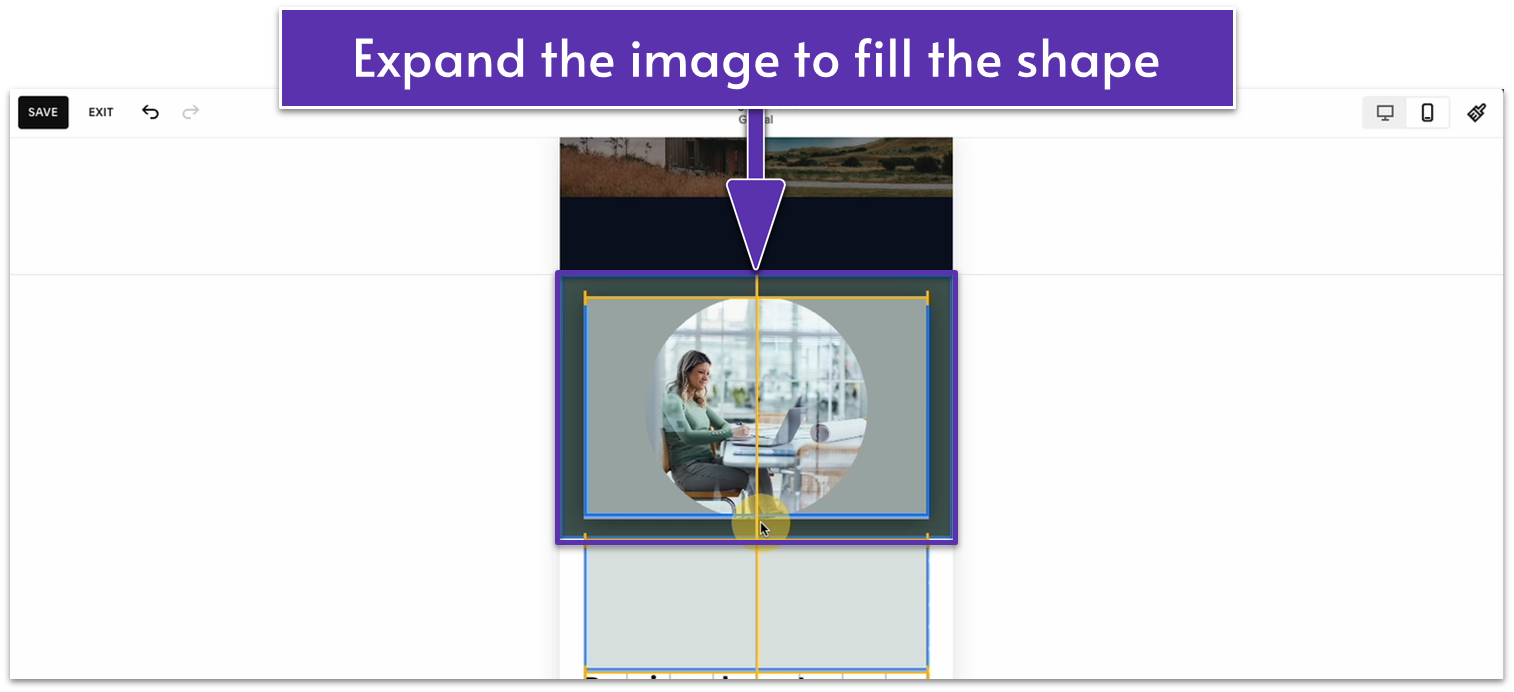
- Increase the image size so it fills the section’s height. Do the same for the two background shapes behind the image and newsletter form.
- Center the image and newsletter block vertically.
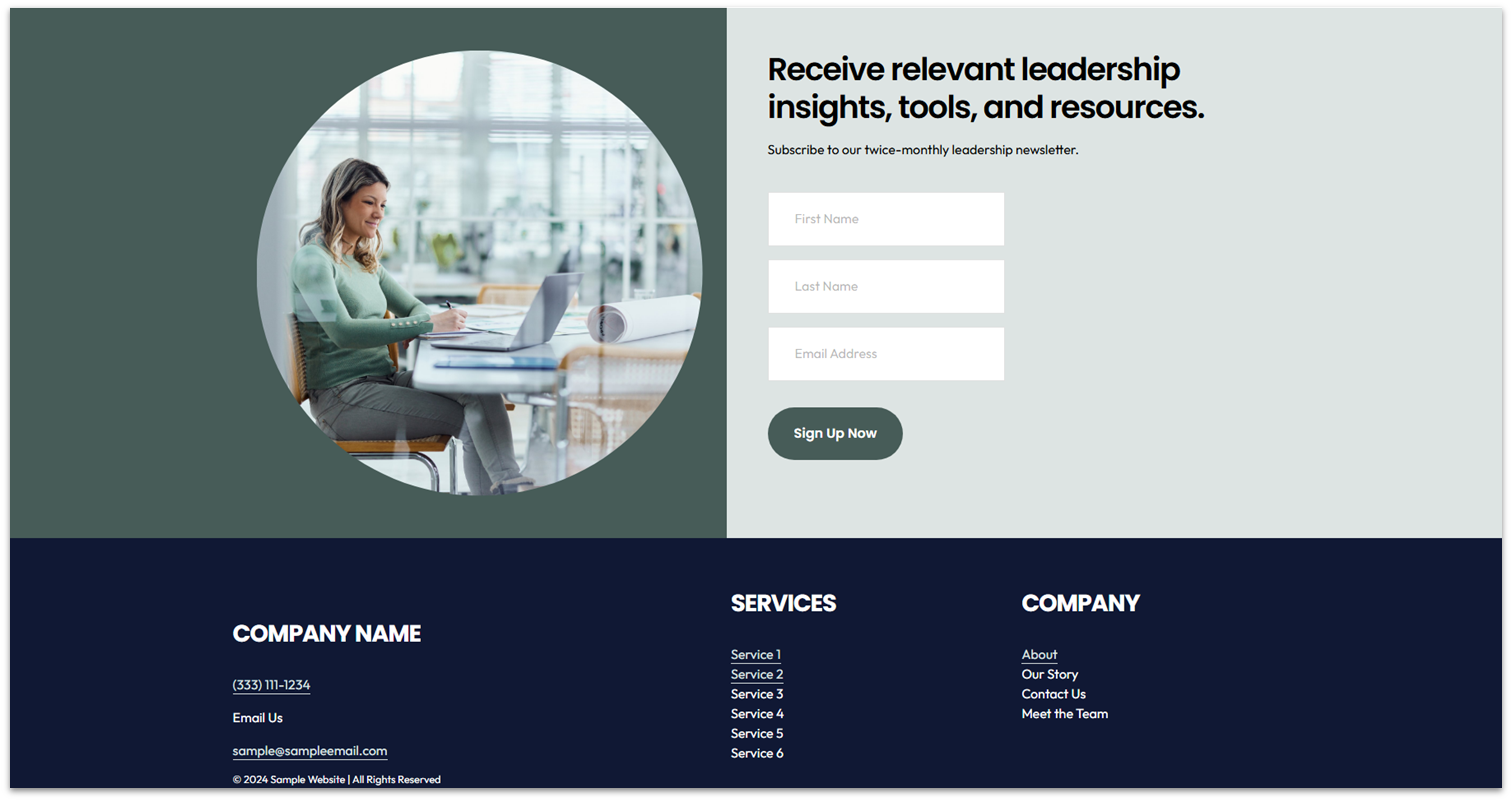
The final row count (section height) for this footer section is 25 (you can check this by going to “Edit Section”), but feel free to adjust it. It should look like this:
6.4 Optimize the Footer for Mobile
I promise you, we’re almost done talking about the footer, but we still have to optimize it for mobile navigation. If you created the same format as our example, you’ll need to make some adjustments, especially to the misplaced background shapes in mobile view.
Step 1: Switch to “Mobile View” ( )
Step 2: Adjust the background shape for the image
- Move the darker-colored shape to the top of the section, extending it to touch the top, right, and left edges.
- Extend the shape to your desired height, large enough to cover the image.
- Click to bring the shape to the background.
Step 3: Center the image
- Resize the image to your desired height so it fits within the resized shape.
- Center the image within the background shape.
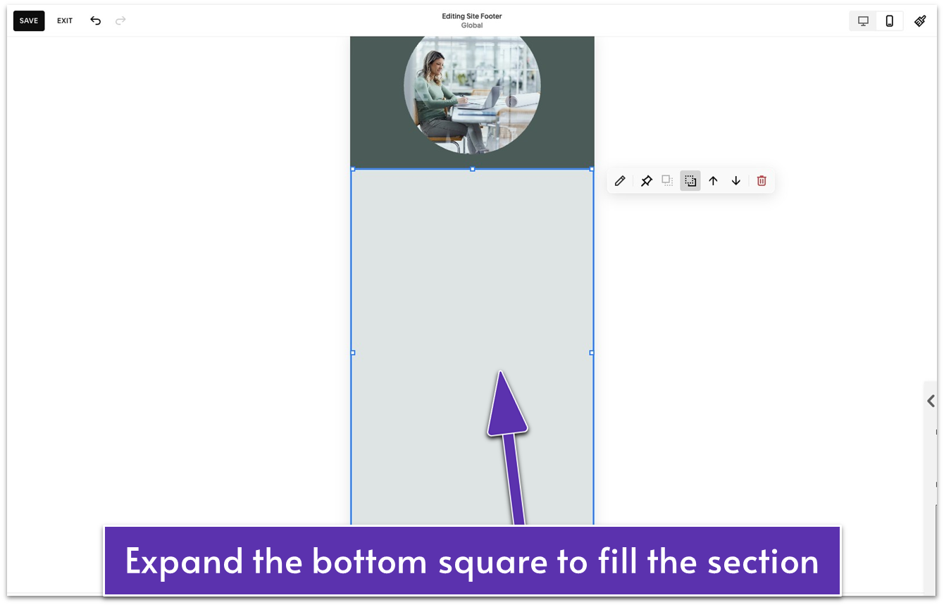
Step 4: Resize the other background shape for the newsletter form
- Adjust the width and height of the background shape to cover the white space behind the newsletter form.
- Click to move the shape behind the image.
Step 5: Center the newsletter form
- Move and resize the newsletter block to align it with the center of the background shape.
- Drag up to remove the unnecessary spaces at the bottom of the section.
Step 5: Organize the text in the bottom footer section
The default positioning isn’t terrible if you’ve followed our approach. But you can edit it just a little more so it’s completely to your liking. For example, you can apply the following changes:
- Extend the block with the company name and contact details to span the full width of the section. This will serve as the top portion of the footer.
- Place the “Services” and navigation blocks below the company name block, arranged side by side in two columns.
- Move the copyright notice to the very bottom of the footer, below the “Services” and navigation blocks.
- Arrange the blocks so the spacing between them is even.
- Select all the elements and move them up so there are two rows of space at the bottom of the footer section. This will make the mobile navigation experience more enjoyable for your visitors.
The final product should look like this:
6.5 Get Found in Search Results
Spend enough time looking to create an online presence and you’re bound to run into the SEO acronym. The goal of search engine optimization (SEO) is simple: to help your website get found and rank as high as possible on search engines like Google.
Squarespace already takes care of some technical SEO tasks, like setting up markups and sitemaps, to help search engines find your website. To boost your chances of being seen online, you should add these elements to every page so your content is more organized and discoverable:
- Headings. Clear headings, such as Heading 1 for the title and Heading 2 or Heading 3 for subsections, structure your content. They help search engines understand your topics and subtopics. If you followed the text formatting style in the previous modules, you’ve already included this key component.
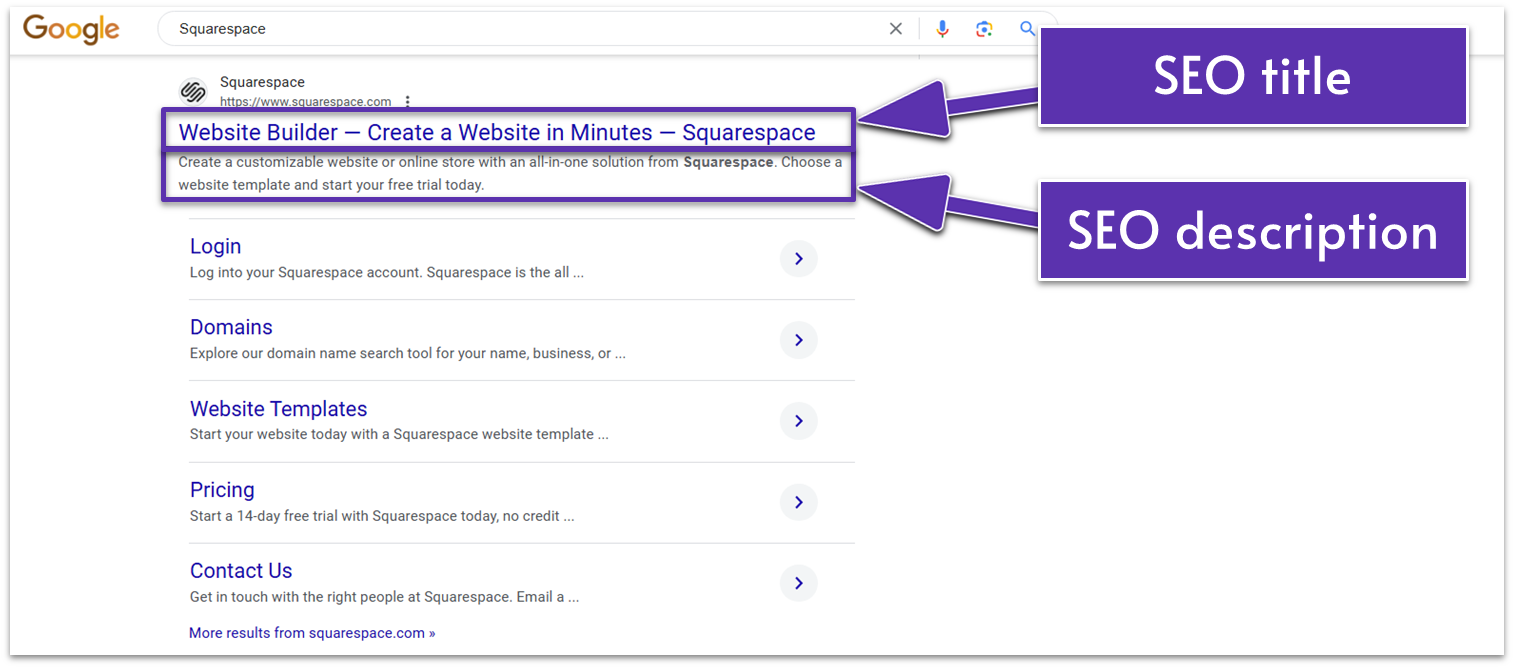
- SEO title. This is the name of your site page or the clickable blue text in your search snippet (the page preview in search results). For example, Squarespace’s homepage title is “Website Builder — Create a Website in Minutes — Squarespace.”
- SEO description. This is the text below the SEO title that gives searchers and search engines more details about the page. A good rule of thumb is to keep it as close to 160 characters as possible.
Like learning a basic jab in boxing or how to hold a pencil for drawing, these components aren’t the entirety of what SEO can be. However, they need to be firmly in place for any of the most showy stuff to work. Beyond the basics, you’ll also learn how to make your website more SEO-friendly with images, blog posts, social media images, and regional settings.
Okay then, with that out of the way, let’s get started.
6.5.1 Add an SEO Title and Description to Your Homepage
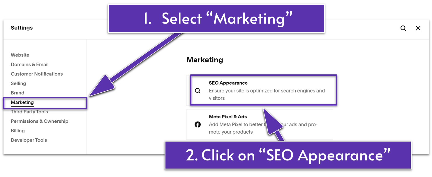
Step 1: Open “Settings”
- Click the gear icon ( ) at the bottom of the website’s main sidebar menu.
Step 2: Go to “Marketing” and select “SEO Appearance”
Step 3: Update the SEO title of your homepage
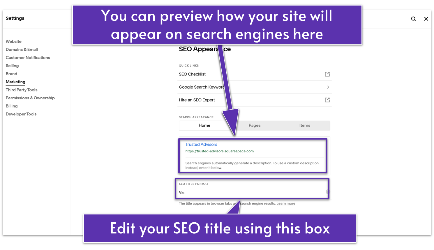
In the “Search Appearance” section’s “Home” tab, you’ll see a preview of your homepage snippet as it appears in search engine results. By default, your site title will be used as the SEO title for your homepage. For example, the default SEO title of our website is “Trusted Advisors.”
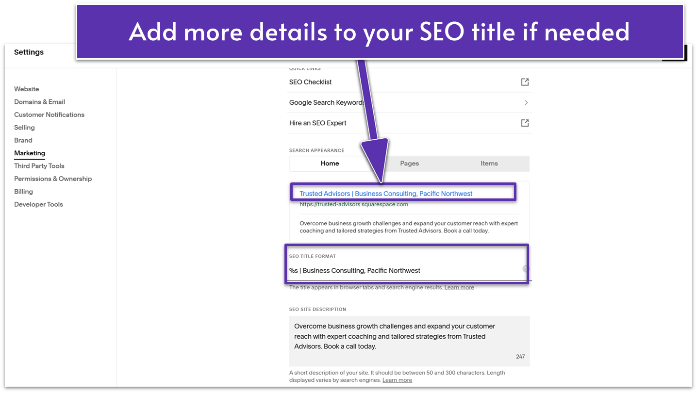
- Add or replace the text in the “SEO Title Format” field if necessary. For example, we added “| Business Consulting, Pacific Northwest” right next to the original homepage title (%s) to tell the business type and location.
Step 4: Add your homepage’s SEO description
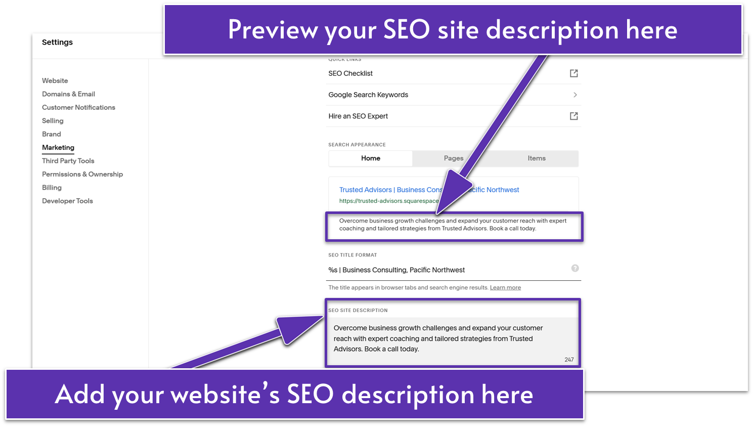
- Write a short, clear sentence about what your business does. Include important words people might search for and invite them to learn more. For example, we wrote “Overcome business growth challenges and expand your customer reach with expert coaching and tailored strategies from Trusted Advisors. Book a call today.”
6.5.2 Add SEO Titles and Descriptions to Your Pages
Instead of going page by page, Squarespace simply gives you the option to automatically use the page title as your SEO page title. The same applies to “Collection Items” like blog posts and product pages.
Step 1: Set up the SEO title format of your pages and items
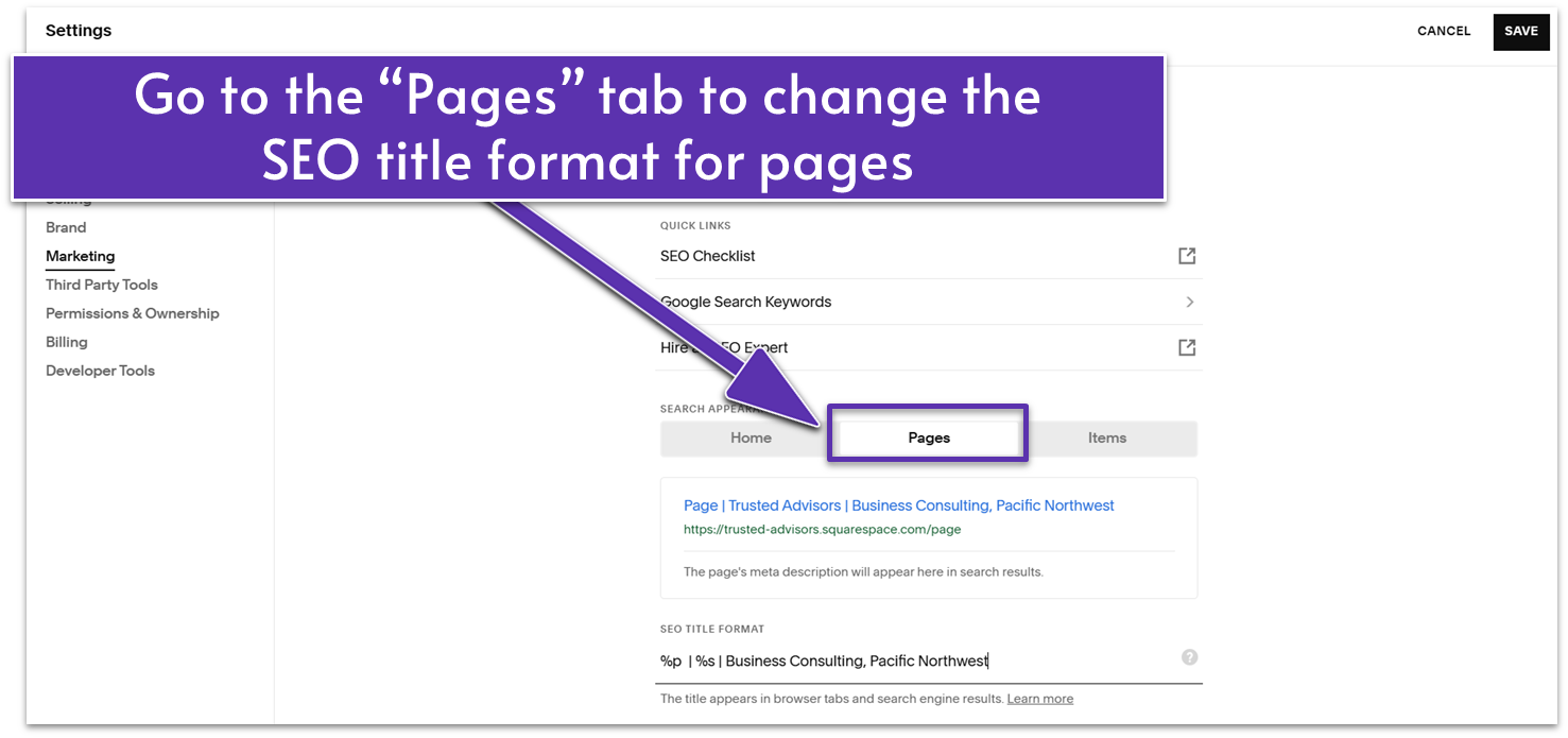
- In the “SEO Appearance” panel, go to the “Pages” tab.
- Edit the “SEO Title Format” field if needed. In this example, we updated the SEO title to “%p | %s | Business Consulting, Pacific Northwest.” With this format, a page like the About page would show as “About | Trusted Advisors | Business Consulting, Pacific Northwest” in search results.
- Go to the “Items” tab if you want to change the SEO title format used by “Collection” content items like blog posts, products, and events.
Step 2: Access the “Page Settings” of your chosen page
- Return to the main website menu and select “Pages” under “Website.”
- Click on the gear icon ( ) next to your selected page’s name to open “Page Settings.”
- Click on “SEO” in the “Page Settings” menu.
Step 3: Add your page’s SEO title and description
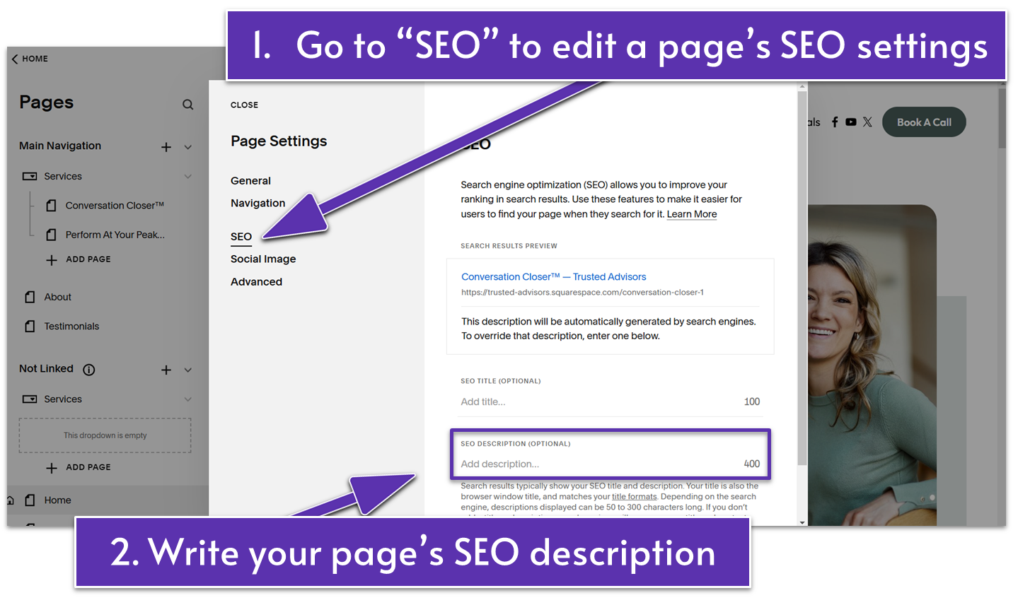
- Write a description for the page in the “SEO Description” field. For example, we wrote, “Learn more about Trusted Advisors, a business consulting service dedicated to helping organizations thrive with expert strategies and personalized solutions.” for our About page’s SEO description.
- Optional: Write a custom SEO title for a specific page (e.g., a shorter blog post title) in the “SEO Title” field.
- Select “Save” on the upper-left corner to save your changes.
Repeat steps 2 and 3 for all the pages you want to appear in search engines.
6.5.3 Add Image Alt Text to Images
Image alt text is a brief image description that helps images show up in a search engine’s image results. It also makes your site more accessible for people with visual impairments, as screen readers use it to describe your images aloud.
Step 1: Identify the images to optimize
Step 2: Edit the page that contains the images
Step 3: Add image alt text to your images
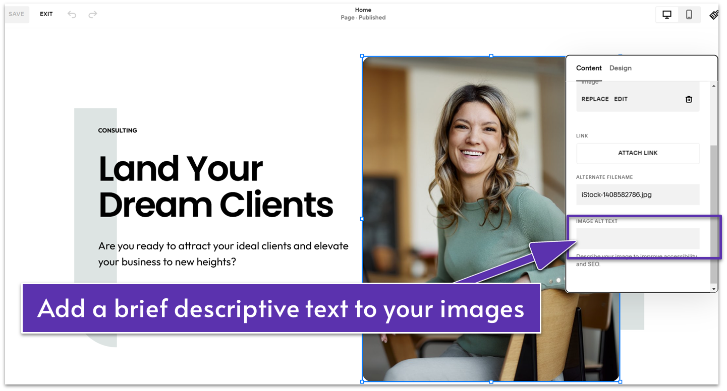
- Select an image and click the pencil icon ( ).
- In the “Content” tab, write a short image description in the “Image Alt Text” text box.
6.5.4 Enable AMP and Comments for Blog Posts
Blog posts can be a great boom for your SEO if they’re engaging and fast, especially on mobile. A quick way to do that is by allowing comments on your blog posts so your visitors can engage and stay on your site longer. For faster loading speeds, you can use Squarespace’s Accelerated Mobile Pages (AMP) feature.
Step 1: Open “Blog Preferences”
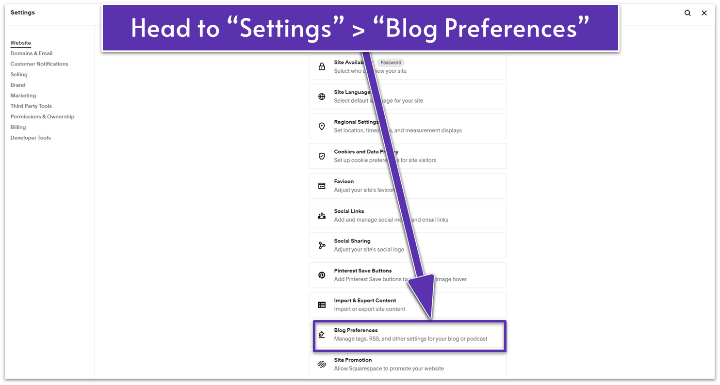
- Go to “Settings” ( ) from the main sidebar menu.
- Select “Blog Preferences” under the “Website” menu.
Step 2: Turn on Accelerated Mobile Pages
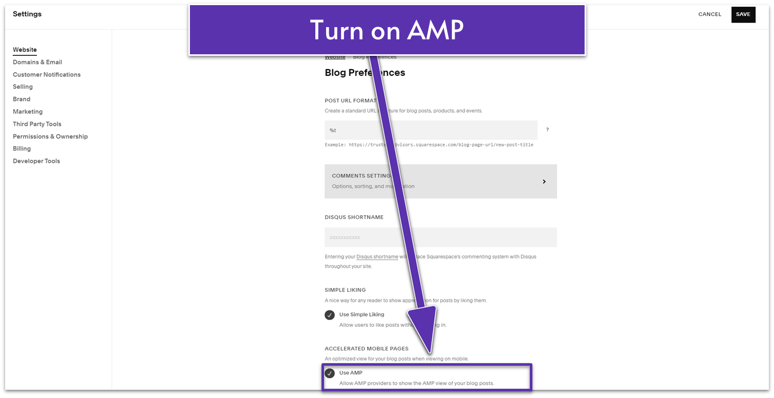
- Enable the “Use AMP” option to improve your blog posts’ mobile speed.
- Click “Save” on the upper-right corner of the panel.
Step 3: Click “Comments Settings”
Step 4: Turn on “Enable Comments Globally”
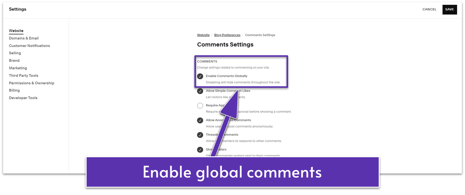
- Play around in this menu to alter comment settings like requiring moderation approval or giving other users the option to “like” comments.
- Click “Save.”
6.5.5 Set Up Your Website’s Featured Image for Social Sharing
Make sure that links from your site look professional and adequate when shared on social media. Squarespace already handles a very big part of this process, so all you’ll have to do is add the featured image.
Step 1: Head to “Settings” ( )
Step 2: Select “Social Sharing” under “Website”
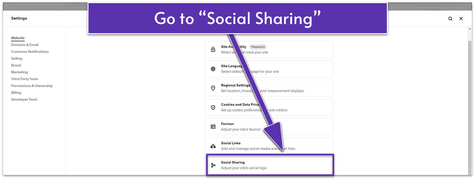
Step 3: Add a custom image of your choice
Set Your Location for Local Search Results
Regional SEO (optimizing for search results in your specific area) is very important for small businesses. A strong local SEO presence helps you cut through the noise and directly translates to better business.
With that in mind, let’s go over how to check your regional SEO settings.
Step 1: Head to “Settings” ( )
Step 2: Select “Regional Settings” under “Website”
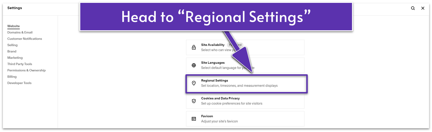
Step 3: Double-check your regional settings
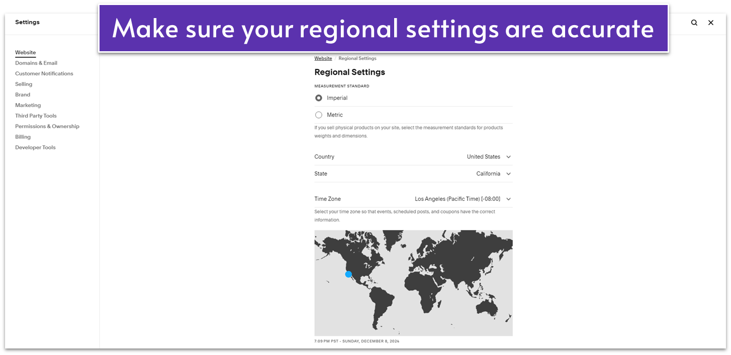
- Set your country, state (if applicable), time zone, and measurement standard here. Make sure the information matches that of your physical location.
6.6 Test and Review All Website Elements
Once you’re finished setting up the SEO foundations of your website (you’re never truly finished with SEO itself), you should – at least in theory – have a finished website in your hands. You’ve added everything that needed to be added, modified everything that needed modifications, and moved… you get the idea. Before we can move to publishing though, let’s make sure that we didn’t miss any step and double-check if there’s anything you want to change.
It’s important to give the would-be-finished site a final look-over before going live, since a single broken link or misspelled work may affect search engine rankings and visitor trust. All the hard work you’ve done could get overshadowed by a slight oversight. I’m not trying to scare you though. As long as you test your site thoroughly before publishing, you should be fine.
6.6.1 Test Your Links and Buttons
Broken links and buttons can affect your search engine rankings and your visitors’ overall site experience. It’s important to check and fix them before you publish your site.
Before you open the site’s preview for testing, I recommend you go to the “Pages” menu and write a list of all the different pages on your site on a piece of paper. This part is especially helpful for bigger sites to ensure you don’t miss any part of the site when testing.
With your list in hand, here’s what to do next:
Step 1: Open site preview to test all links and buttons
- Click on the “Preview” icon ( ) in the upper-right corner of the editor to open your site’s preview.

- Go page by page and click on every link and button to ensure that it leads where it has to.
Step 2: Fix broken links and buttons
If you find any broken links or buttons, simply do the following:
- Exit the preview by clicking in the upper-right corner.
- Click “Edit” to edit the page.
- Select the broken text link or button. Click to edit the link and assign the correct outgoing link to it.
- Save the page and repeat this step as many times as necessary.
6.6.2 Test Your Forms
Here’s how to check if your visitors’ submitted form details appear in Squarespace.
Step 1: Submit a test form
- Submit a response to the newsletter signup form you’ve just created in the footer and the form on the “Book Your Call” contact page.
Step 2: Check if the submitted form shows up in your contact list
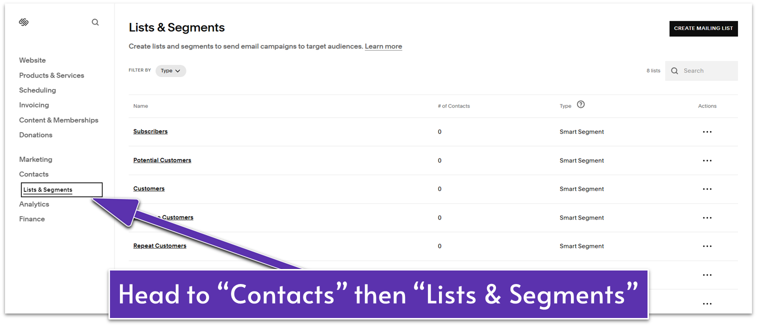
- In the main sidebar menu, head to “Contacts.” You should see the sample form entries you’ve submitted under “Contacts.”
- Click “Lists & Segments.”
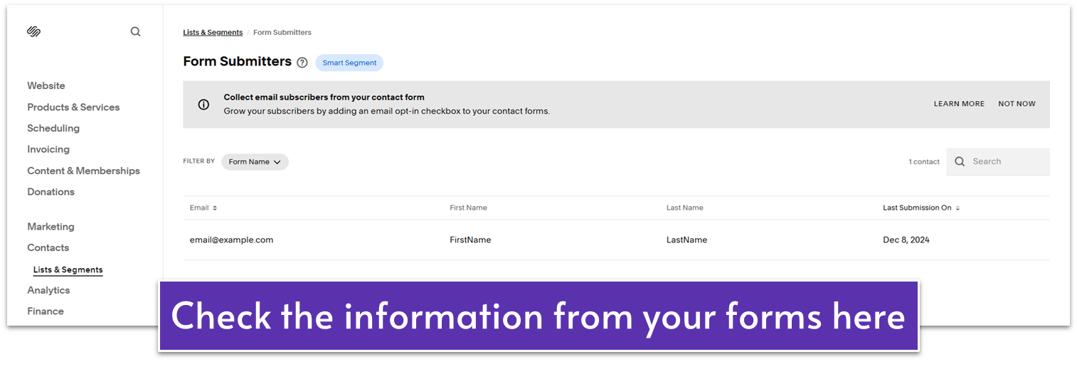
- Check the following segments:
- Open “Subscribers” to see the sample entry from the newsletter signup form. Click the entry to see more details.
- Open “Form Submitters” to view the sample “Book Your Call” form entry. Click the contact’s name to open form details. Then, click the form entry under “Forms Submitted” to see the form answers.
Step 3: Delete your testing profiles
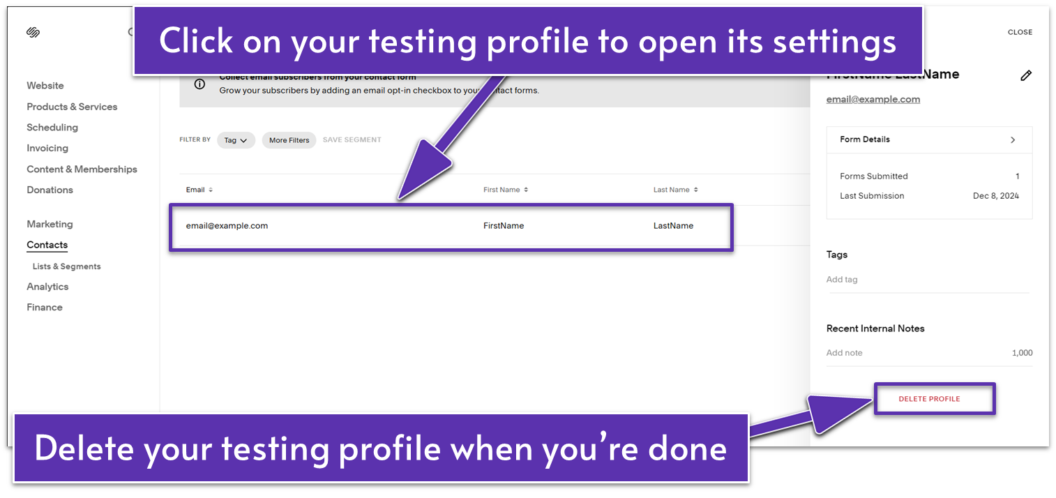
- Go back to “Contacts” once you’ve made sure that every submission contains the information you need.
- Click the sample contact entry to open the contact details sidebar on the right.
- Click “Delete Profile.”
6.6.3 Make Sure the Site Works on Mobile
We’ve gone through how to set up the mobile version of each page as we’ve moved through the modules, so this one shouldn’t be too much of an issue. However, it’s still worth mentioning. Over half of all internet traffic happens on mobile devices, so you cannot neglect the mobile version of your site.
Step 1: Select the mobile icon ( ) on the top-right corner of the screen
Step 2: Preview your site by clicking
Step 3: Go through each page on mobile view
Make sure every page not only works well but also feels good to navigate on mobile devices.
7.6.4 Label Pages Clearly
Make sure to have clear, descriptive titles and headlines labeling your pages and brief descriptions providing further context. This eases visitors into the page’s content and helps search engine algorithms classify each page’s content.
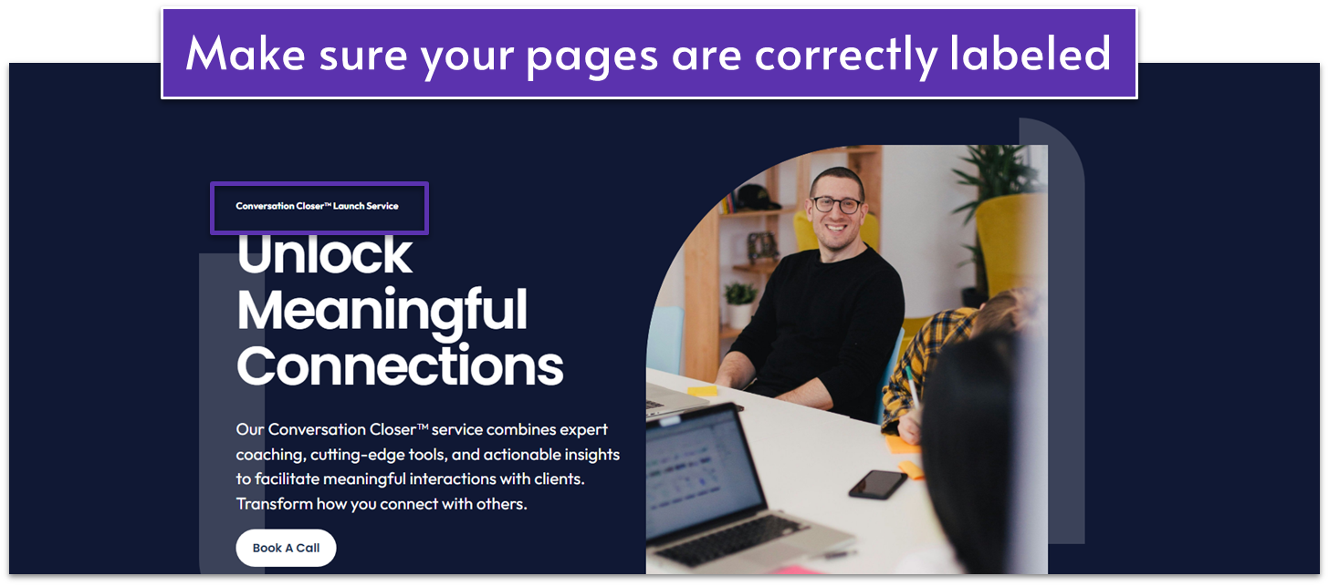
Also, remember that any major landing page (especially your homepage) should always have a headline, some body text, and a call to action like “Book a Call.”
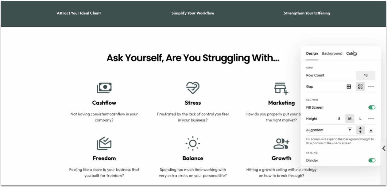
6.7.5 Check for Section Height Consistency
For your site to have some harmony, you should ensure that most sections have similar height and structure. As you can see in the GIF below:
Here’s what you need to do for every page:
Step 1: Click “Edit”
Step 2: Hover over a section and click “Edit Section”
Step 3: Check section height
- In the “Design” tab, look for “Height” under “Section.”
- Check if the height is set to S, M, L, or a custom value. Adjust it to match the other sections on the page (if necessary).
Step 4: Repeat steps 2 and 3 for the other sections
Of course, you can vary some sections, but those variations will only work if they are a break from the norm, not the norm itself.
6.6.6 Use Proper Line Spacing
It’s a common beginner mistake to have too much space between lines. To check your line height:
- Click the paintbrush icon ( ) to open “Site Styles.”
- Click the arrow button ( ) next to “Fonts.”
- Go to “Headings” and adjust the “Line Height” slider.
- Go back to the “Fonts” menu and select “Paragraphs.” Adjust the line height.
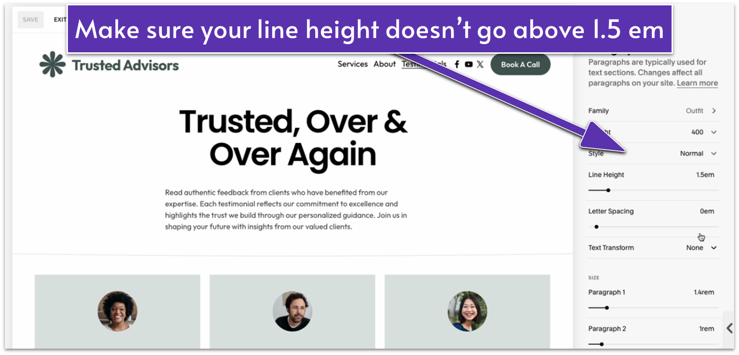
- Feel free to adjust the line height according to your personal preference, but I wouldn’t recommend going over 1.5 em.
6.6.7 Resize Header Elements
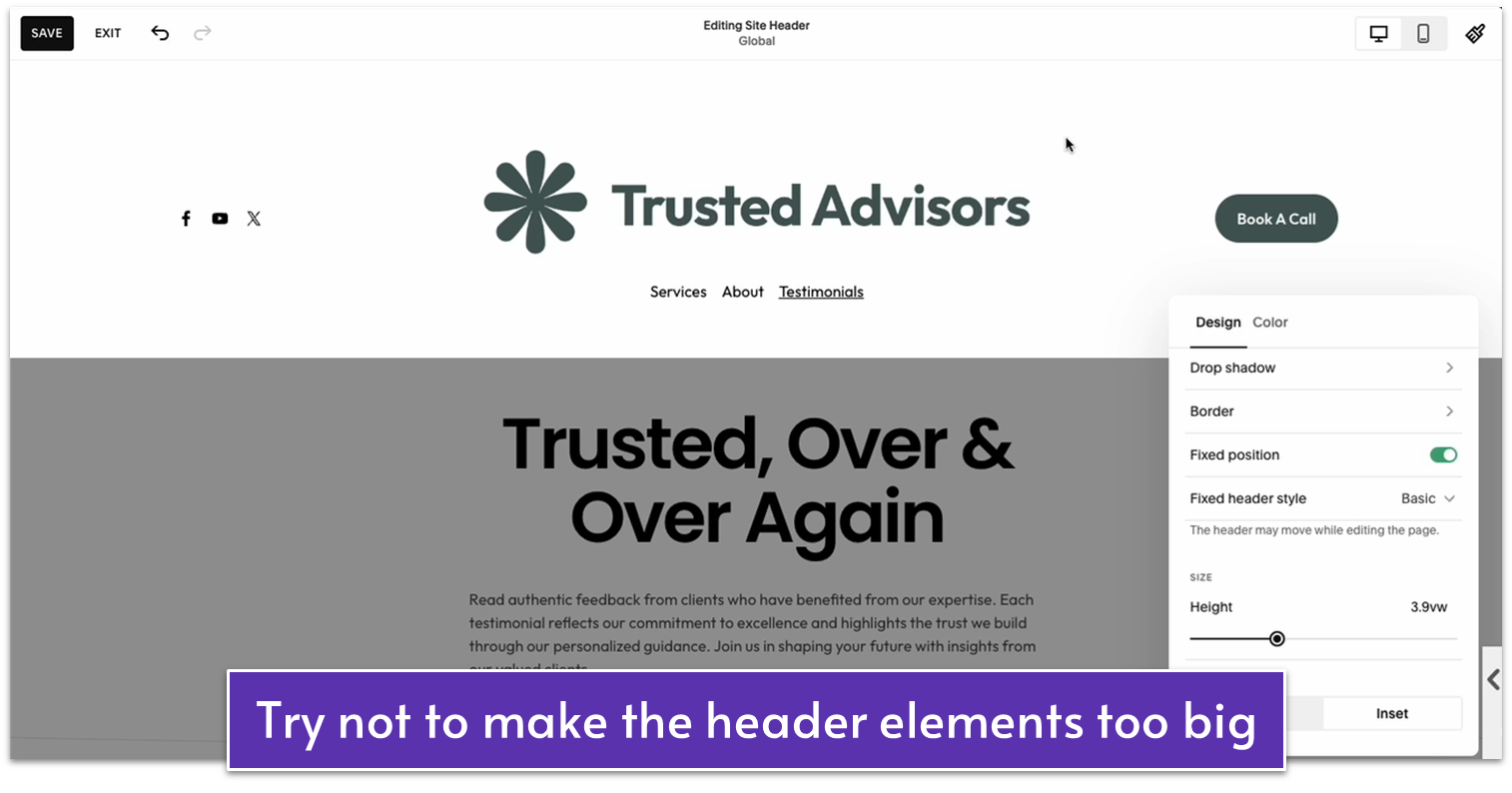
If your logo is way too big, it might push the navigation links and buttons to the side. You might use the stacked header layout and increase the section height to solve the issue, but this will make the header way too large.
The more you keep things economical on the user experience, the more professional your site will look. So make sure that nothing takes more space in the header than it has to.
As a bonus, I recommend setting the content of the header to “Inset” instead of “Full” to align the header content with the main content. Here’s how to do it:
Step 1: Hover over the header and click “Edit Site Header”
Step 2: Select “Edit Design”
Step 3: Change header width
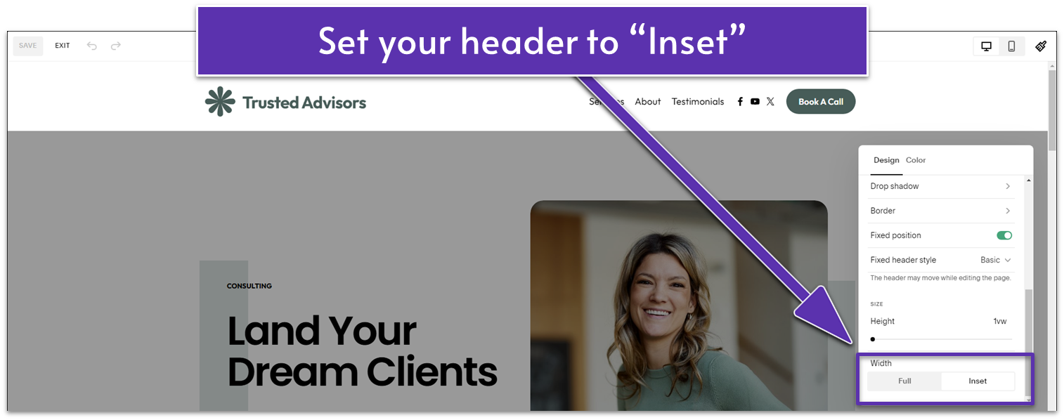
- In the “Design” tab, go to “Width” under “Size.”
- Select “Inset.”
- Click “Save” on the upper-left corner of the screen.
That one isn’t a hard rule, but it often makes a difference for the better of the overall look of your header.
6.7 Apply Small Tweaks
Finally, let’s quickly go over how to apply some small tweaks to our website’s design before going live.
Step 1: Adjust site styles
You already know how to go over the different options in the “Site Styles” menu. Take another look at your website and decide if you want to adjust any fonts, colors, or other basic settings.
Step 2: Add a flex animation
- Still on “Site Styles,” click on “Miscellaneous.”
- Head over to “Animations.”
- Select “Flex” as the animation and “Fast” as the speed.
The flex animation is a small thing, but it will add visual interest to your site whenever your visitor changes pages.
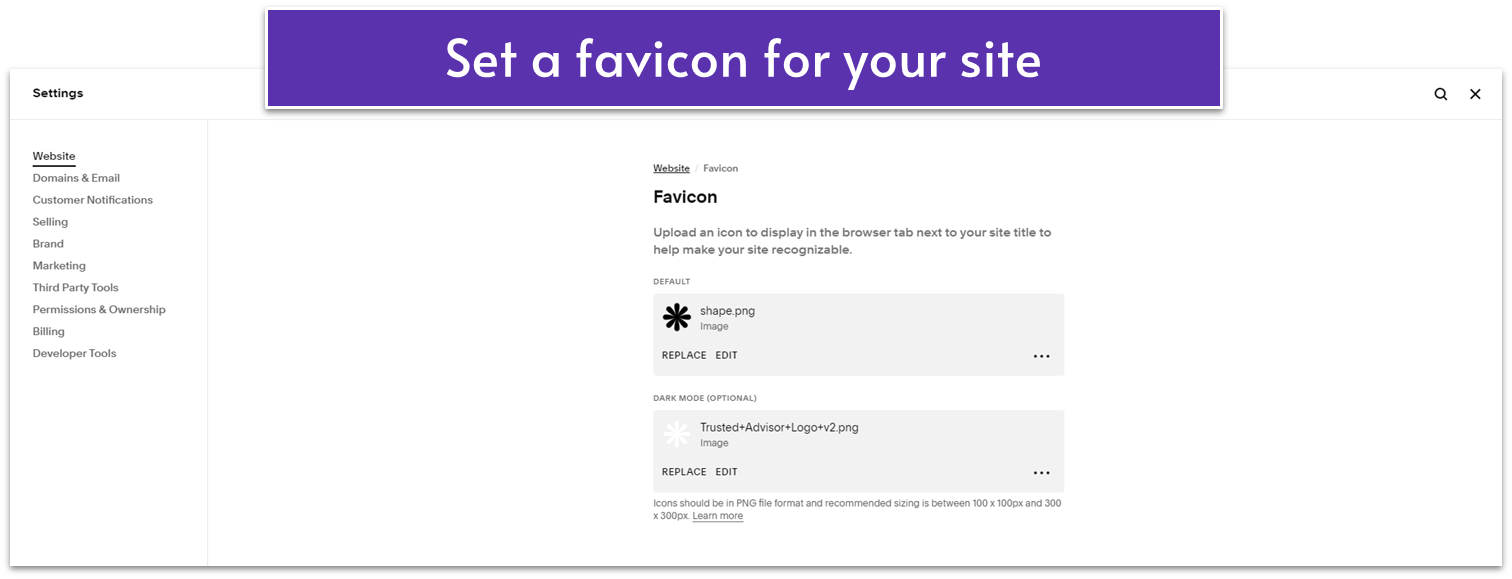
Step 3: Add a favicon
A favicon is a small icon on a browser’s tab next to your site’s name. To add one, all you have to do is:
- Head over to the main “Settings” menu ( ).
- In the “Website” menu, select “Favicon.”
- Upload a small PNG image file for your favicon. Add a lighter-colored variation for browsers in dark mode.
Make any additional tweaks that you might deem necessary, move elements if you need to, change font sizes, or even rearrange sections within a page. Just remember to only change something if you’re sure that it’s necessary. If you’re content with your site as it is, there’s no reason to change it just for the sake of it.
Once you’re done making your final tweaks, you will be ready to move on to publishing your site.
