

Time to Complete Module: 2 hours
Last updated: April 11, 2025
IN THIS MODULE
5.1 Add a New Page5.2 Introduce Your Business (First Section)5.3 Add a Small But Mighty Section To Show Your Top Benefits (Second Section)5.4 Show You Understand Your Visitors’ Problems (Third Section)5.5 Describe Your Process (Fourth Section)5.6 Introduce Yourself and Your Method (Fifth Section)5.7 Present Your Services (Sixth Section)5.8 Call Them To Take Action (Seventh Section)5.9 Optimize Your Homepage for Mobile5.10 Save Your Homepage
Alternative Designs
Each module in this guide includes instructions for building a specific page based on a sample design created by our Squarespace expert (Digital Agency, Local Business, Portfolio Site). You can switch to an alternative version of this module by clicking a different design in the left sidebar under “Alternative Designs.“
5.1 Add a New Page
As always, you’ll begin with a clean slate, allowing you to create a homepage that feels authentically yours. Let’s transform this blank canvas into the flagship centerpiece of your website. Step 1: Add a “Not Linked” blank page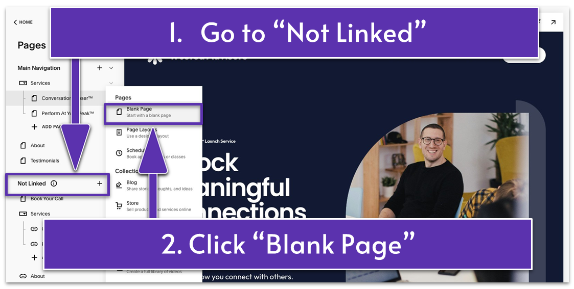
- In the “Pages” menu, click the plus icon (
) next to “Not Linked.” - Select “Blank Page.”
- Rename the new blank page to “Home.”
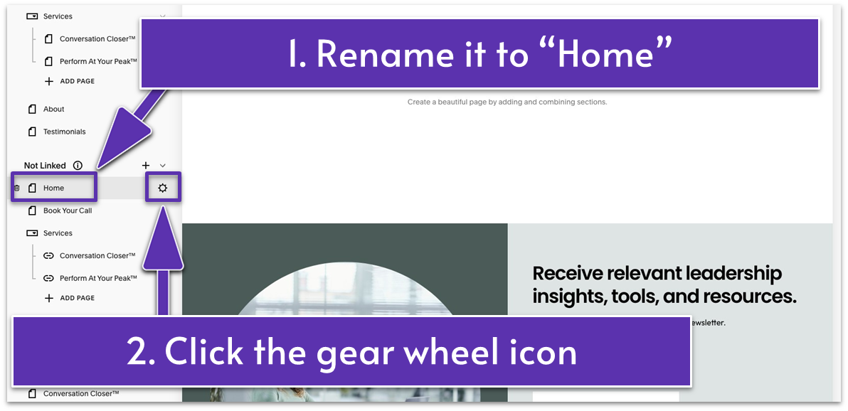
- Click the gear wheel icon (
) on the right side of “Home” to open “Page Settings.”
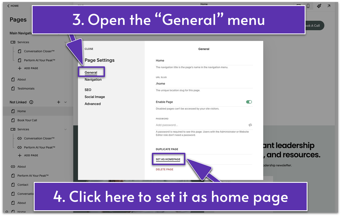
- Scroll down to the bottom of the “General” menu and click “Set as Homepage.”
- A pop-up message will ask you to approve the action – click “Confirm.”
5.2 Introduce Your Business (First Section)
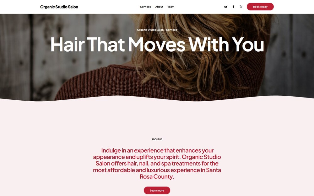
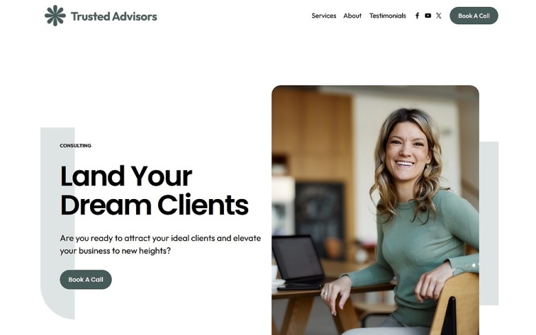
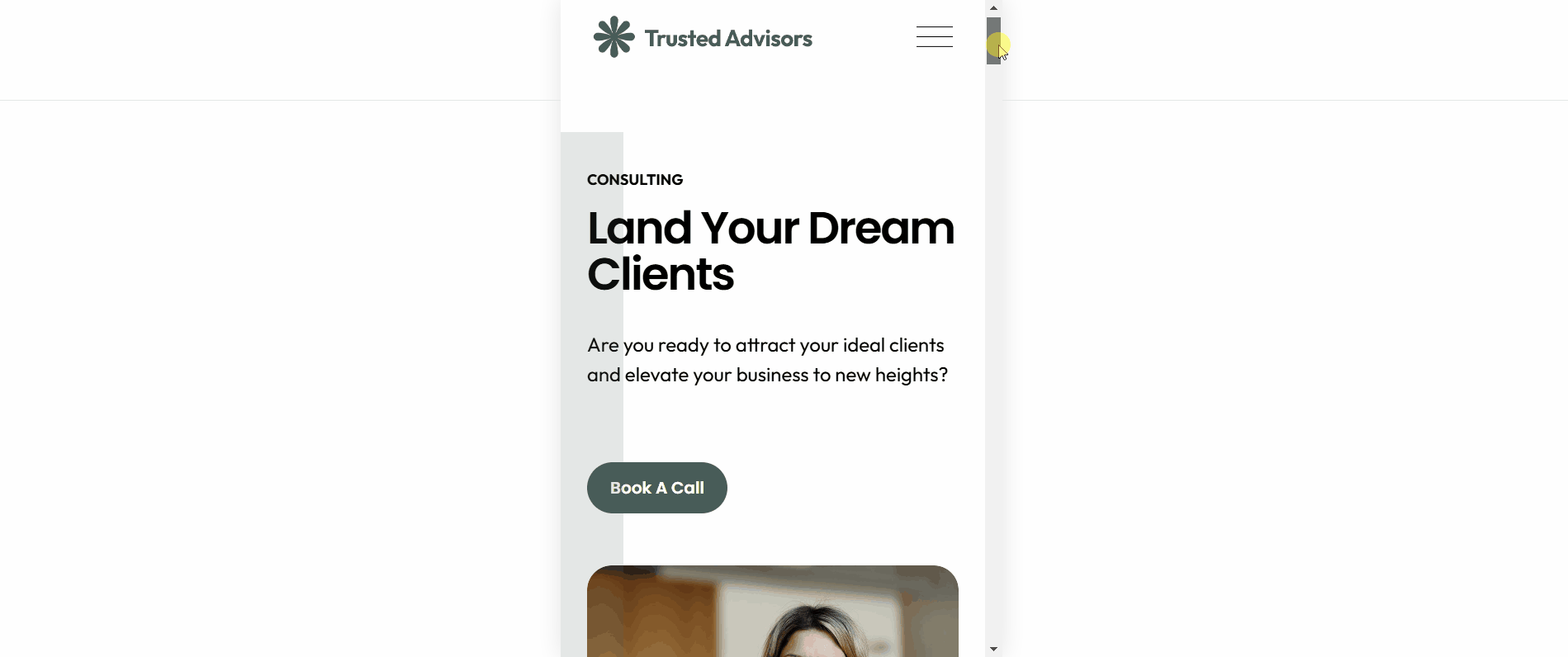
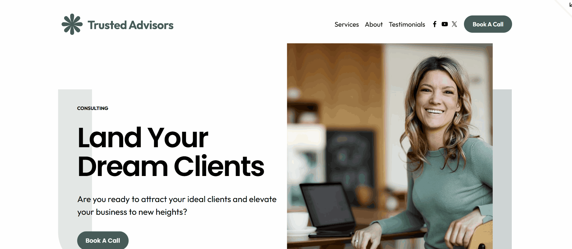
You never get a second chance to make a good first impression. When visitors stand at your digital doorstep, make them feel welcomed and understood. Create an inviting experience that will attract them to walk in and explore further. The first section of your homepage should speak loudly and clearly about the benefits your visitors get from working with you. For example, our homepage starts with the headline “Land Your Dream Clients” to communicate that hiring us will help them get more ideal clients and drive growth for their business. You should also include high-quality visuals that align with your brand and a clear call to action (CTA) to encourage your visitors to click, subscribe, or purchase. Starting is typically the most challenging part, but not this time – you’ll reuse a section you built in one of the previous modules as the first section of your homepage. Step 1: Add a saved section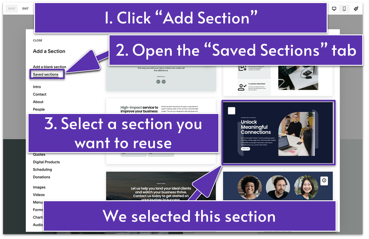
- In the blank section, click the blue “Add Section” button.
- Open the “Saved Sections” menu.
- Choose a saved section layout that you want to reuse on your homepage. We selected the first section of our Services page.
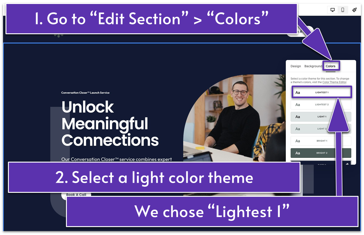
- Go to “Edit Section” and open the “Colors” tab.
- Select a color different from the section’s original color. We went with “Lightest 1” here.
- Double-click the section title in the first text block at the top. Then, replace it with your main business title. We wrote “CONSULTING.”
- Replace the headline in the second text block with new text. This should highlight what your business can do for your visitors. We wrote “Land Your Dream Clients” as an example.
- Replace the text below the headline with a new description to support your new headline.
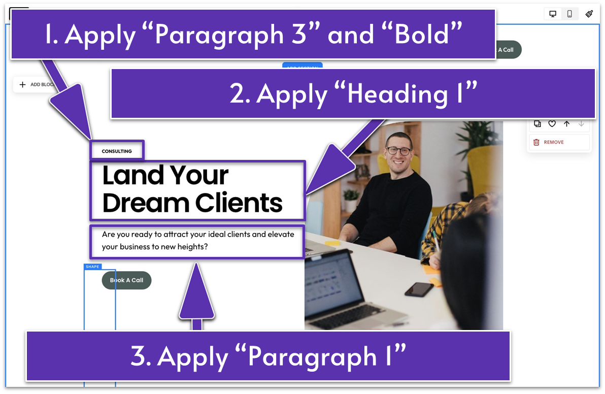
- Check if the previous formatting works for your new text. We kept the original formatting, which is “Paragraph 3” and “Bold” for “CONSULTING,” “Heading 1” for “Land Your Dream Clients,” and “Paragraph 1” for the description.
- Lift the first shape higher and place it on the left side of the text.
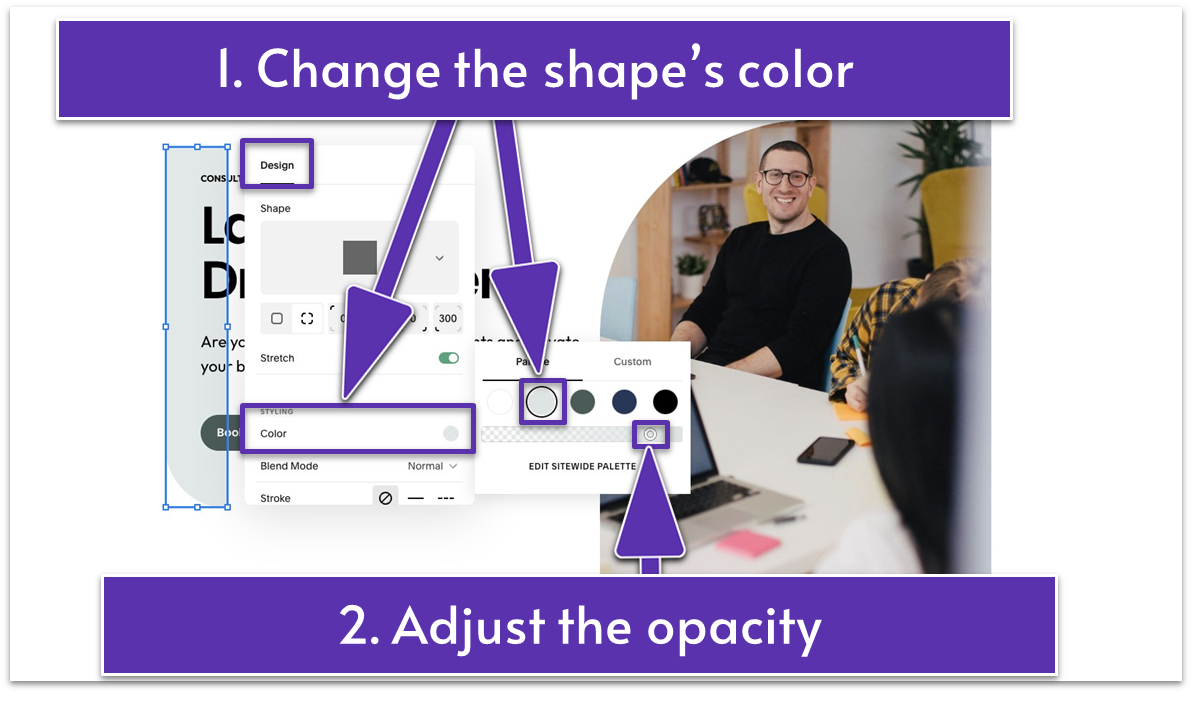
- Click the pencil icon (
) in the toolbar, and click “Color” under the “Design” tab. - Select another light color from your site palette.
- Move the slider below the color palette all the way up to make your chosen color fully opaque.
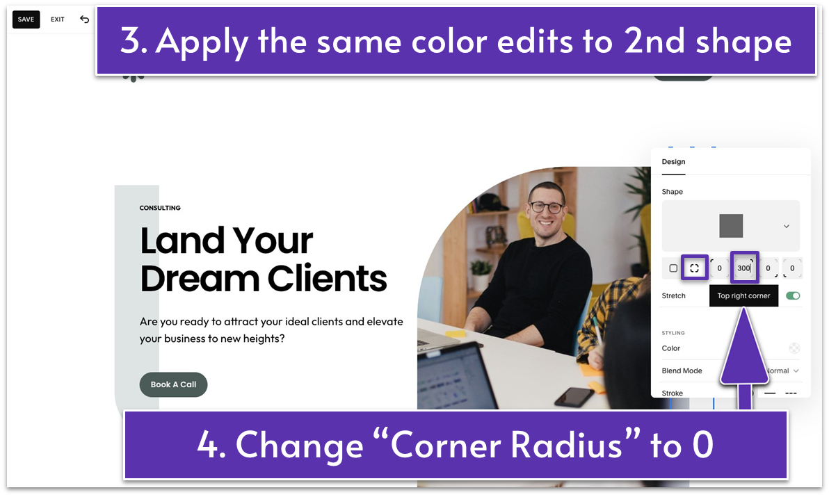
- Apply the same color edits to the second shape, which goes behind the image on the right side of the section.
- Adjust the shapes’ corner roundness if needed. For example, we removed the roundness of the second shape’s top right corner by changing the “Corner Radius” from 300 to 0.
 Step 5: Replace the image with a new image
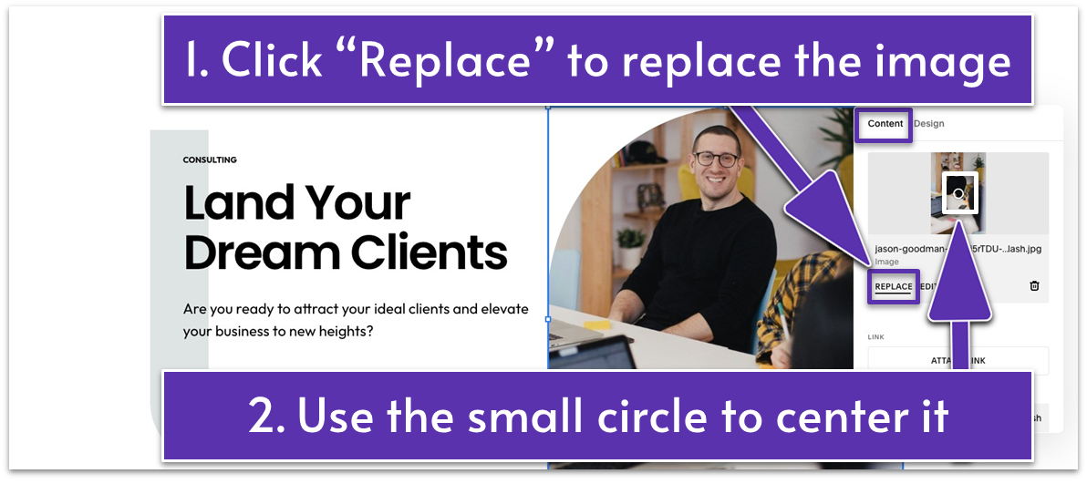
- Double-click the image and click “Replace” to add a new image.
- If needed, edit your image using Squarespace’s photo editing tools and change its main focus. We only needed to center the image better using the small circle on the image under the “Content” tab.
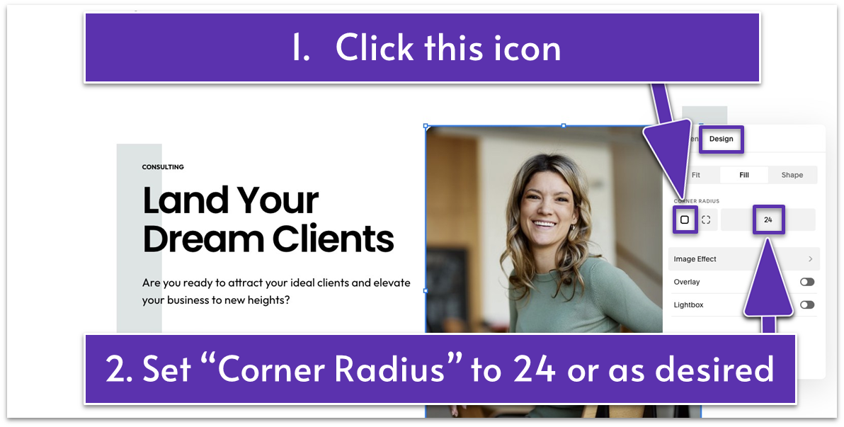
- Click the pencil icon (
) and open the “Design” tab. - Slightly round all corners of the image by applying a custom “Corner Radius” of 24, or adjust as desired.
- Slightly shorten the shape that appears behind the image.
- Enlarge the image.
- Center-align the headline and description in the second text block by clicking
from the main block toolbar. - Select all elements on the left side of the section (text, shape, and button). Drag them a bit lower to align them with the center of the image on the right.
- Adjust spacing tightly by dragging up the grid adjuster (
).
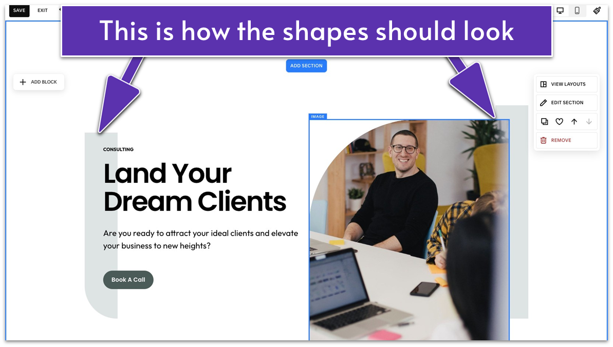
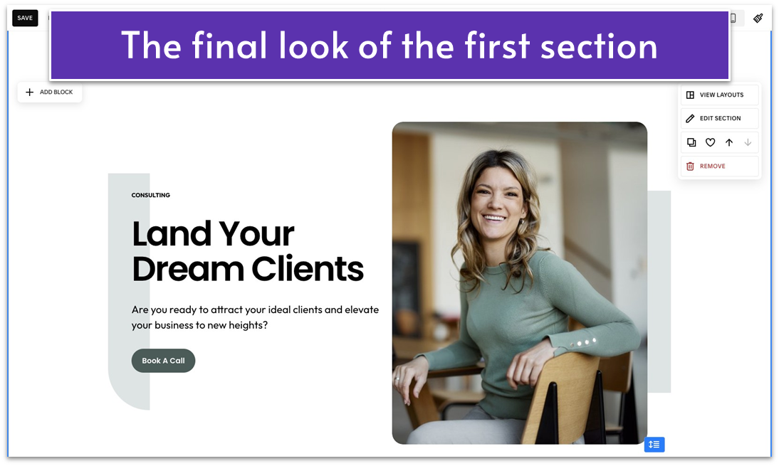 There you have it! The intro section of your homepage is ready to greet visitors.
Let’s keep the progress rolling – moving to your second homepage section!
There you have it! The intro section of your homepage is ready to greet visitors.
Let’s keep the progress rolling – moving to your second homepage section!
5.3 Add a Small But Mighty Section To Show Your Top Benefits (Second Section)
After introducing your business, it’s time to build momentum with a brief but impactful section. This space acts as a visual break while reinforcing the value of your services. Focus on highlighting the key benefits clients will gain from working with you. This section helps keep your visitors engaged while smoothly guiding them into the next part of your homepage. Step 1: Add a new blank section Step 2: Add a text block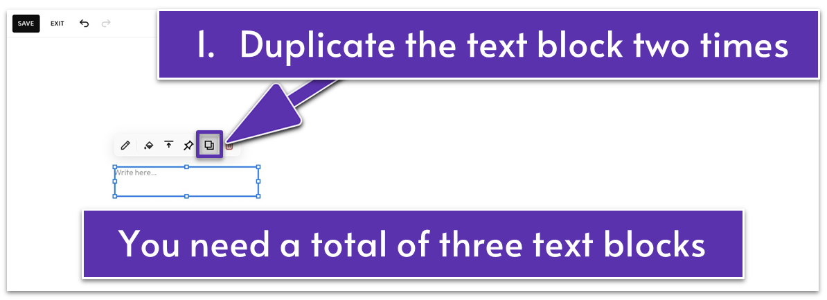
- Duplicate the text block two more times by clicking
in the main block toolbar.
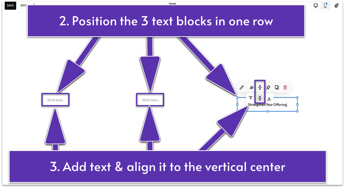
- Place the three text blocks in one row.
- Drag up
to reduce the grid rows and keep this section short. We set it to 2 rows. - Write your business’ key benefits in these blocks.
- Format the text to “Paragraph 2” and “Bold.”
- Align the text vertically to the center of the text blocks using
from the main block toolbar. - Click the pencil icon (
) to open the editing toolbar.
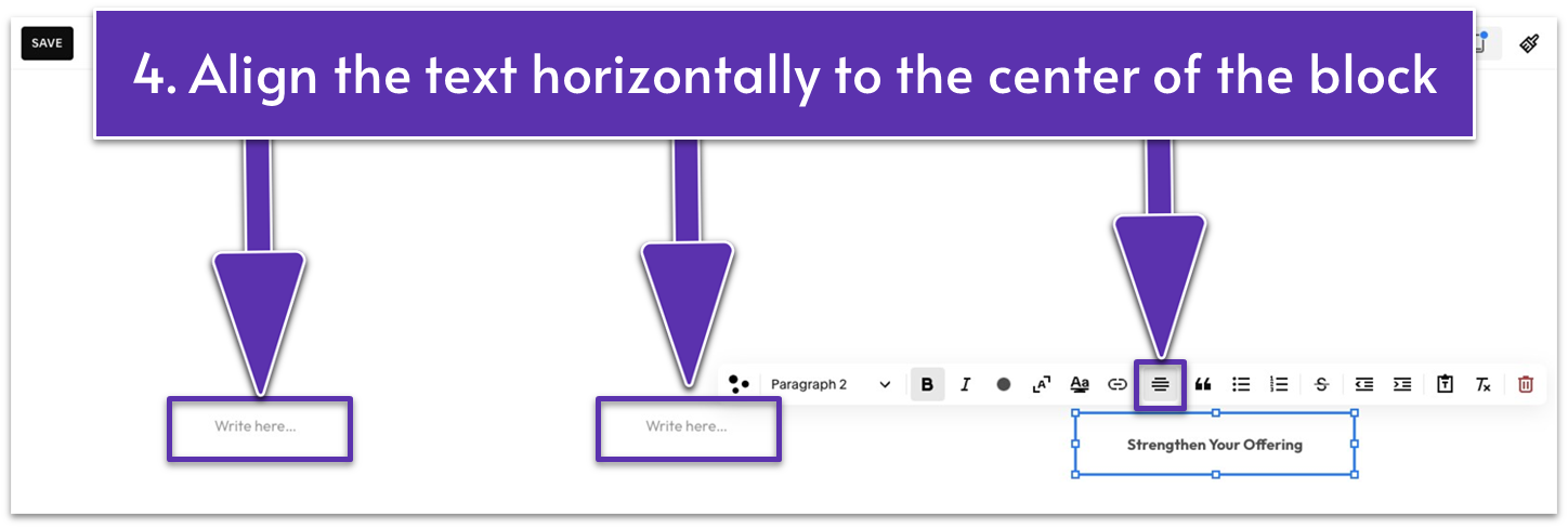
- Click
to align the text horizontally to the center of the text block.
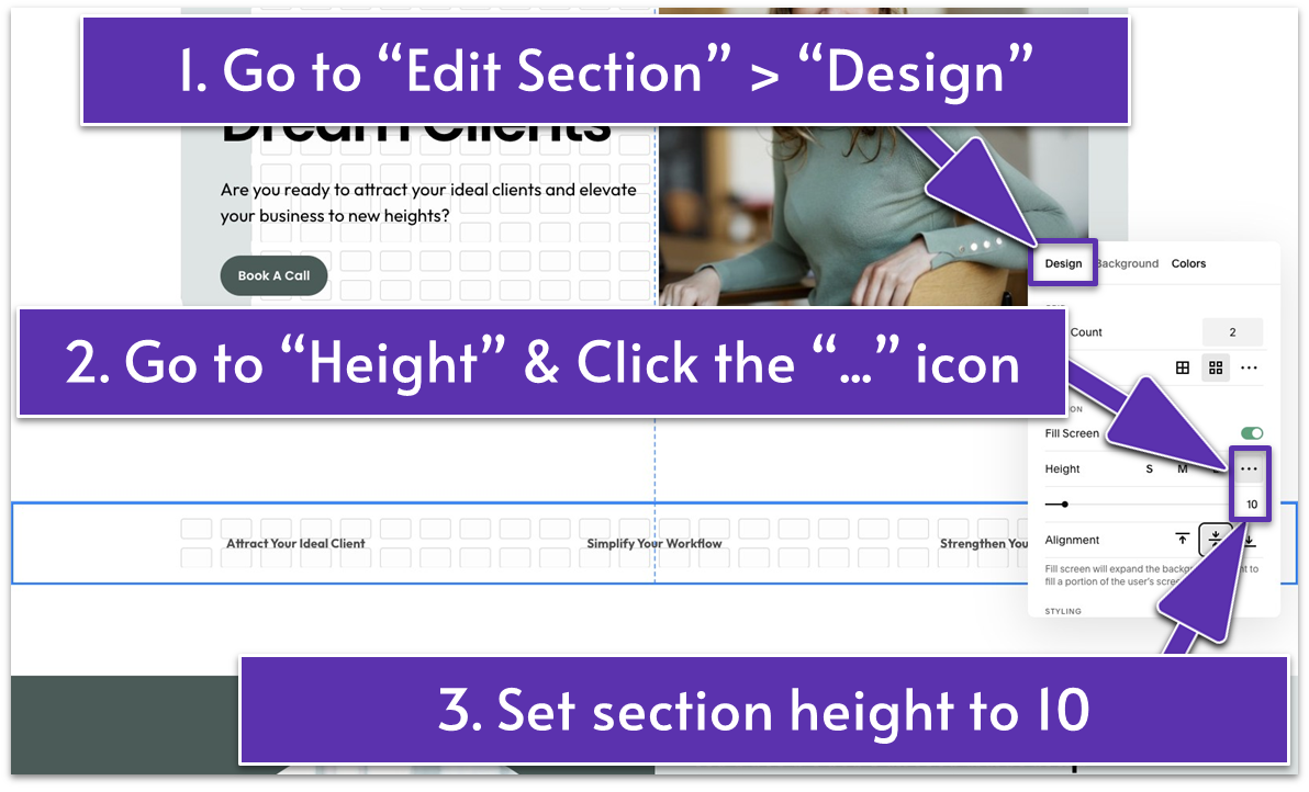
- Click “Edit Section.”
- Go to “Height” under the “Design” tab.
- Click the three-dot icon (
) to set a custom height. Set it to 10 to turn this section into a gap section.
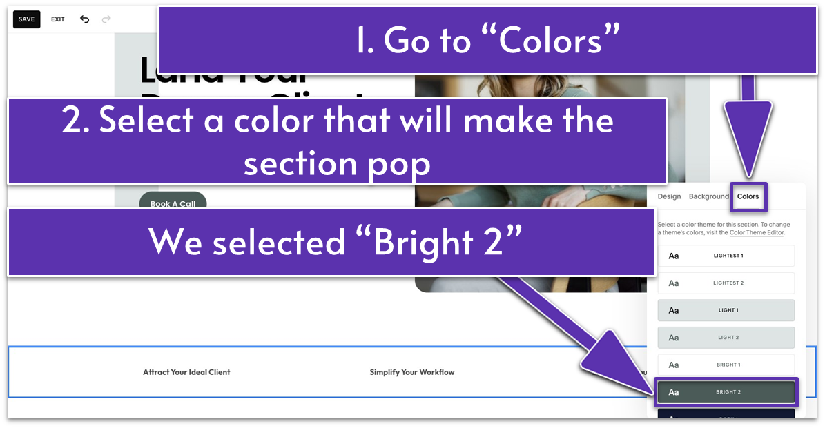
- Go to the “Colors” tab and select a color that sets the section apart from the previous and following sections. We selected “Bright 2” to make this gap section pop.
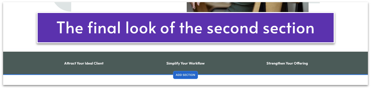 You see how easy this was – just a few clicks and presto! Your homepage already has two sections.
Let’s continue with this momentum!
You see how easy this was – just a few clicks and presto! Your homepage already has two sections.
Let’s continue with this momentum!
5.4 Show You Understand Your Visitors’ Problems (Third Section)
Now that you’ve captured your visitors’ interest, it’s time to address their pain points. This section should focus on their challenges or frustrations. Once you acknowledge their problems and demonstrate that you truly understand their needs, lead with a CTA that invites them to learn more about how your services can provide solutions. Step 1: Add a new blank sectionStep 2: Add a text block
- Stretch the text block across the section and center it.
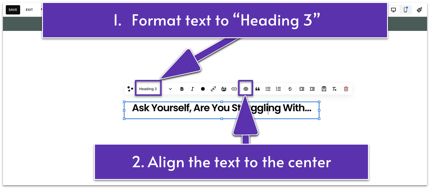
- Add a headline in this text block to prompt visitors to think about the common challenges they might have. We wrote “Ask Yourself, Are You Struggling With…” on our website.
- Format it to “Heading 3” and center-align it using
.
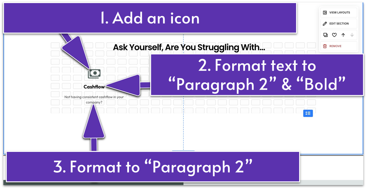
- Place the image block on the left side for the first featured challenge.
- Add an icon in this image block.
- Center-align the icon vertically and horizontally by clicking
and in the main block toolbar.
Tip: You can source icons from Google Fonts. It allows you to search by name and category like “Home,” “Social,” and “Common actions.” You can also customize the design of your icons by adjusting “Weight,” “Grade,” and other settings.
Step 4: Add another text block- Place the text below the icon.
- Write your customers’ common struggle as the title. Then, add a brief description below it for more context. Our text block’s title, “Cashflow,” is formatted to
- “Paragraph 2” and “Bold” while the description is set to “Paragraph 2.”
- Center-align the title and the description in the text block.
- Align the icon above the text block. Center both vertically, as shown in the image above.
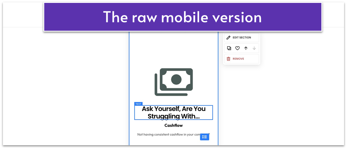
- Open “Mobile View” (
) - Bring the title above the icon.
- Make the icon smaller.
- Place the text block right below the icon.
- Make the text a bit thinner to fit mobile screens better.
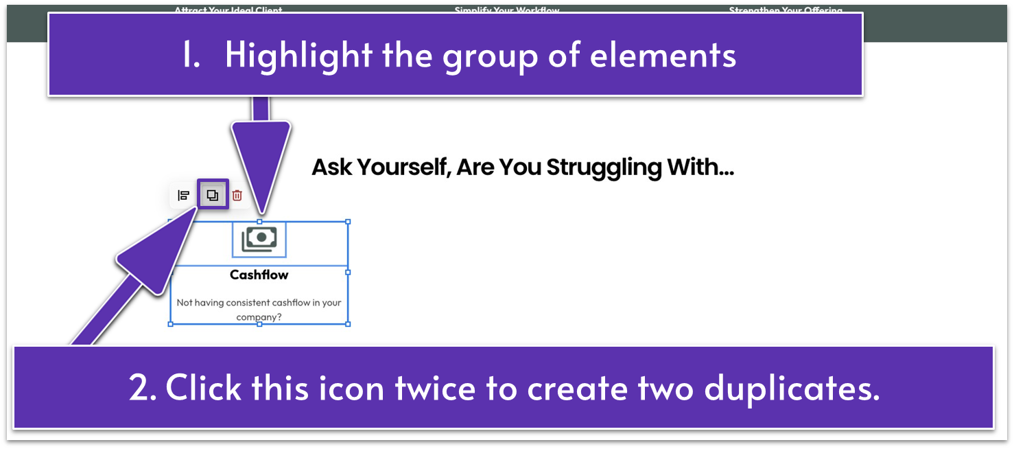
- Highlight the icon and the text together. Click
twice to create two duplicates of the selected blocks. - Place the duplicates in the same row as the original.
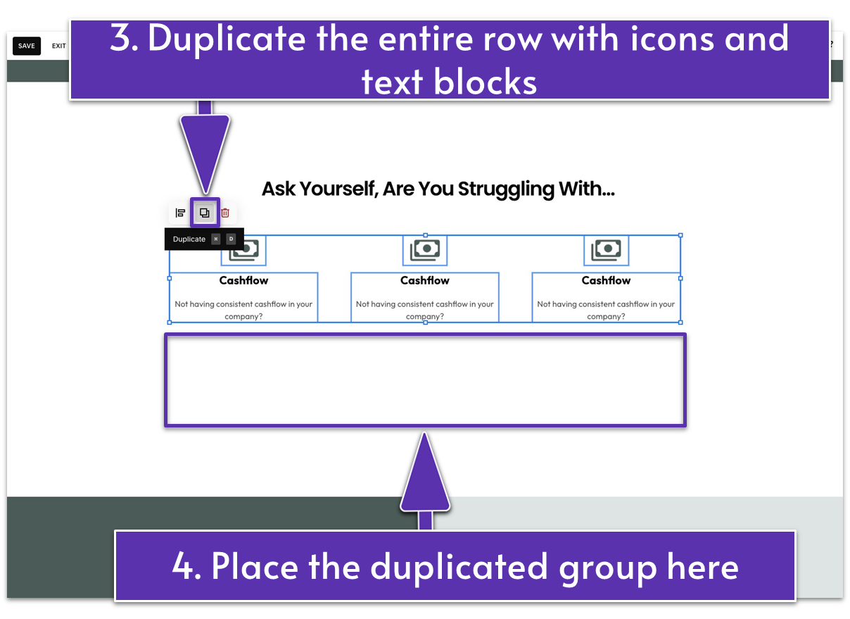
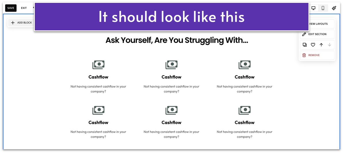
- Highlight and duplicate the entire row containing the three icon-text sets. Move the duplicated row below the original.
 Step 7: Add and customize a button
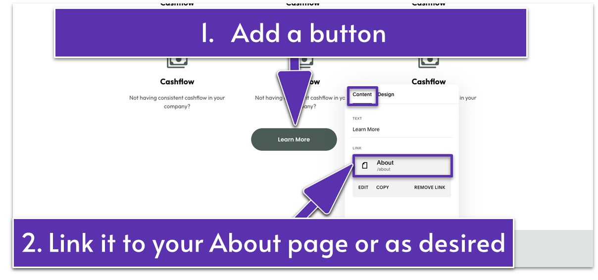
- Go to “Add block” and select “Button.”
- Place and center the button below the second row of icon-text sets.
- Add button text. Our button text for this section is “Learn More.”
- Link the button to your About, Service page, or anywhere relevant.
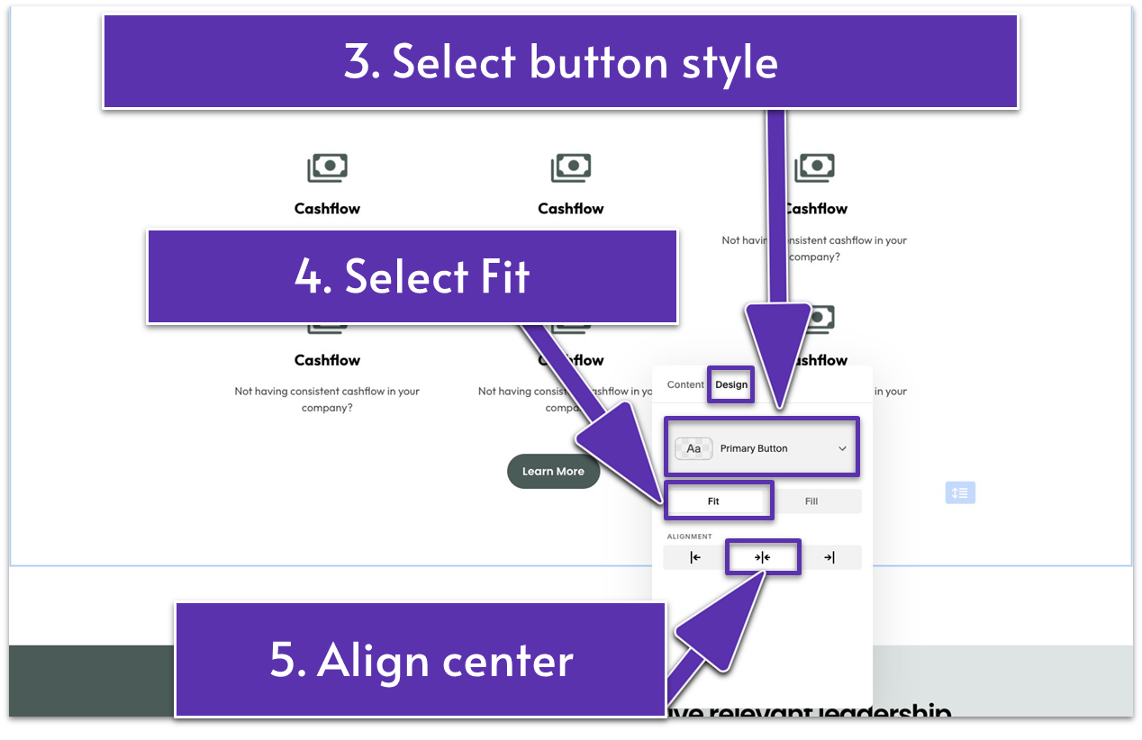
- Click the pencil icon (
) above the button. Go to the “Design” tab. - Select the preferred button style. We stuck with “Primary.”
- Select “Fit.”
- Align the button centrally by using.
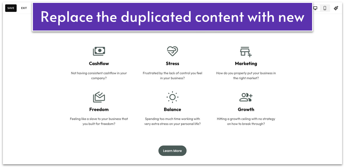 Update each duplicated icon and text with another common challenge your potential clients are likely facing.
5.5 Describe Your Process (Fourth Section)
Now that you’ve identified your visitors’ problems, it’s time to outline your process step by step to show them what it’s like to work with you. Highlight each phase – from booking an initial call to selecting the right service and seeing real results. A clear breakdown of your approach helps build trust, encouraging visitors to take the next step – in our case, clicking “Book a Call.” Step 1: Add a saved section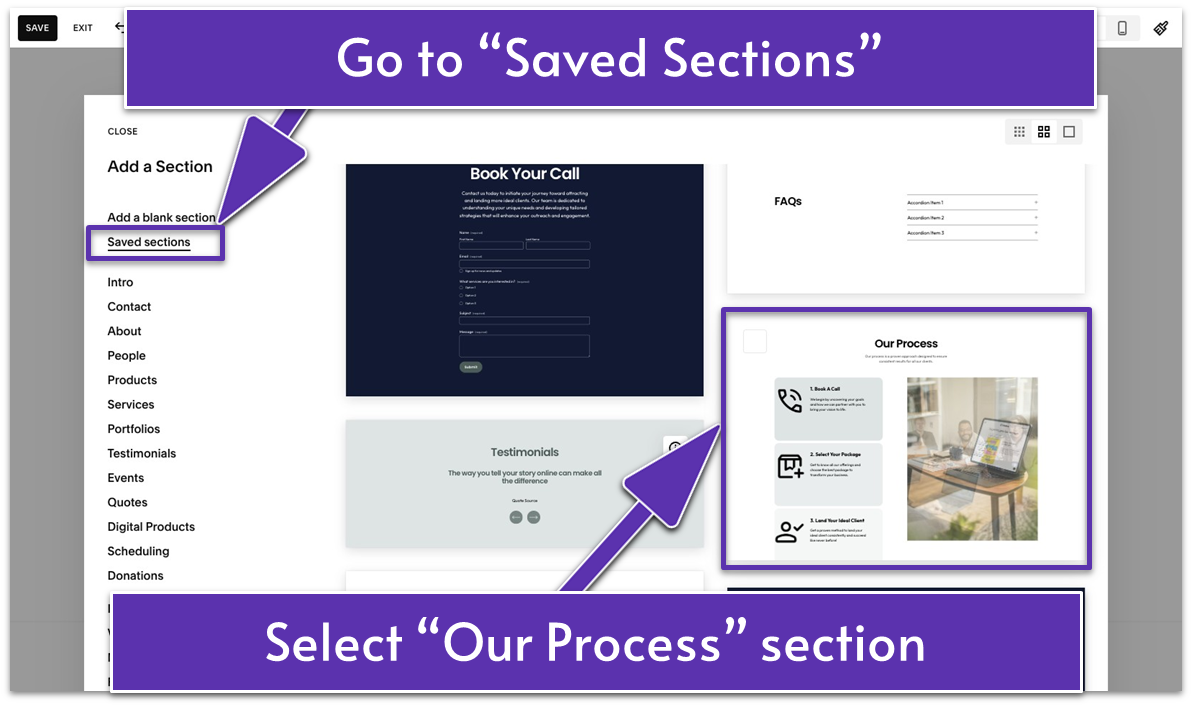
- Go to your saved sections and select a layout. Choose the “Our Process” section layout you built in the previous module.
5.6 Introduce Yourself and Your Method (Fifth Section)
At this point, visitors are curious about who’s behind the business. Use this section to introduce yourself or highlight your unique approach, but keep the focus on how it benefits them. The goal here is to build trust and intrigue, encouraging visitors to click “Learn More” and see how your services can improve their situation. Step 1: Add a new blank section Step 2: Change the section’s color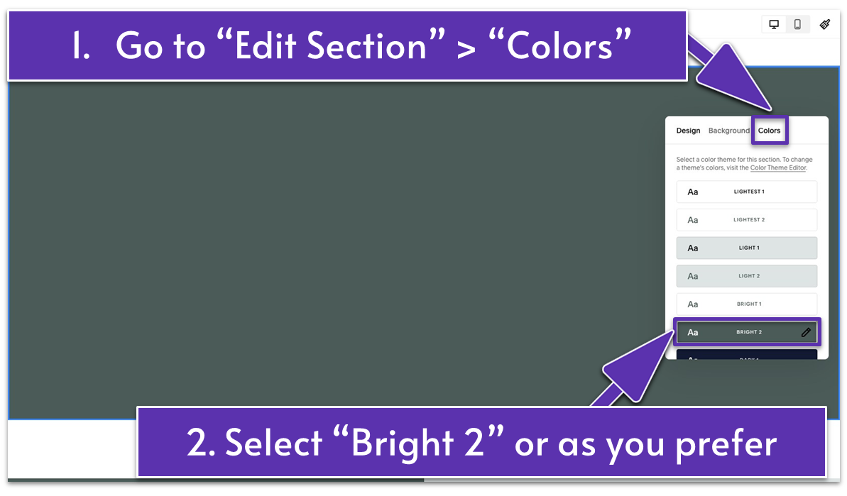
- Go to “Edit Section” and open the “Colors” tab.
- Select a color of your choice. We went with a darker color here to contrast the previous section with a light background. We used “Bright 2” from our site color themes.
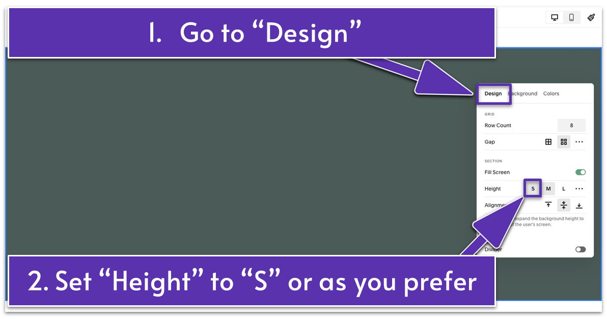
- Open the “Design” tab.
- Set “Height” to “S” or your preferred section height.
- Stretch the text block to fill the left half of the section.
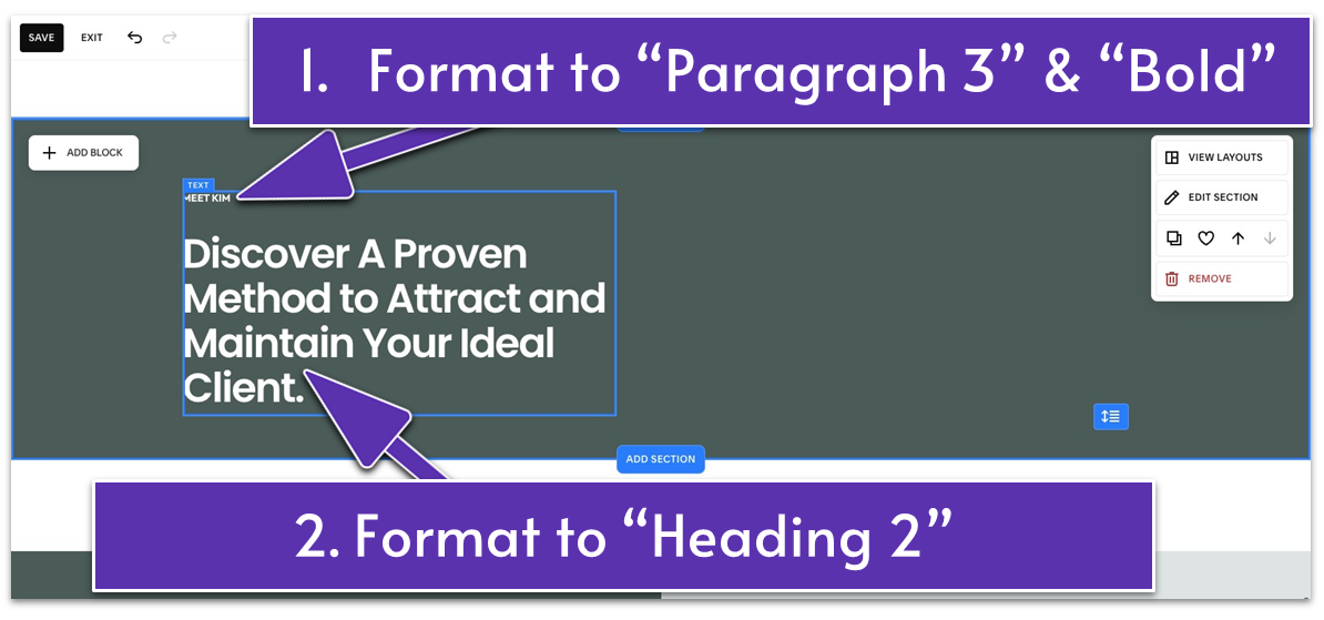
- Add a straightforward section title that introduces the content. We wrote “MEET KIM” in all caps and formatted it to “Paragraph 3” and “Bold.”
- Write a short headline to spark visitors’ interest and guide them to learn more about you and your services. We wrote “Discover A Proven Method to Attract and
- Maintain Your Ideal Client” and formatted it to “Heading 2.”
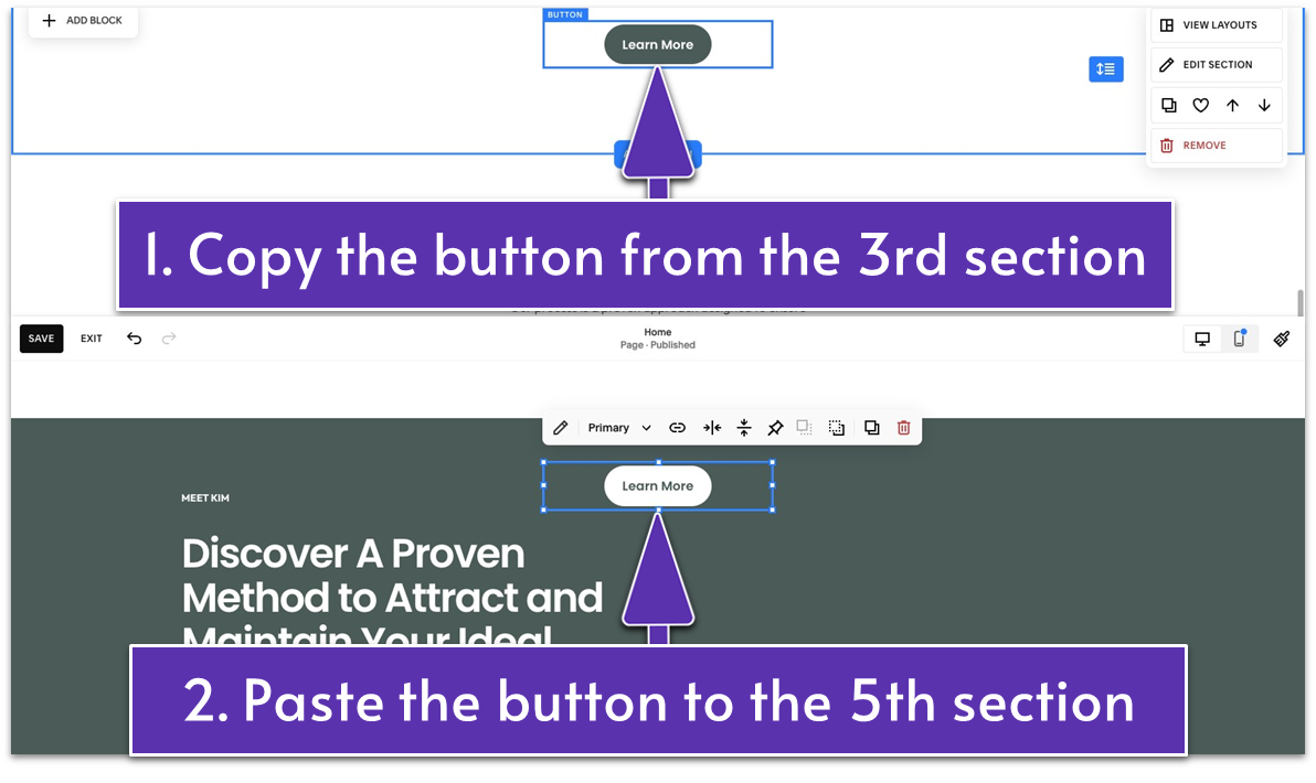
- Go back to the third section.
- Copy the button. Press Ctrl + C if you use Windows or Command + C if you use Mac.
- Go back to the current section you’re building.
- Paste the button. Press Ctrl + V if you use Windows or Command + V if you use Mac.
- Place the button below the section’s headline.
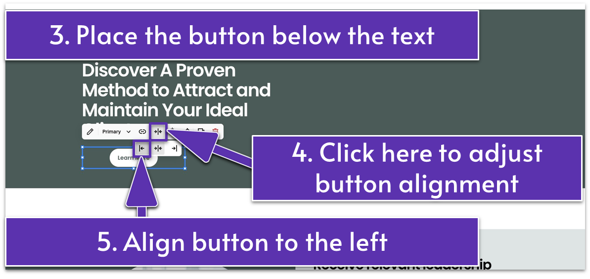
- Click
from the main block toolbar. - Select
to align the button to the left side of the block.
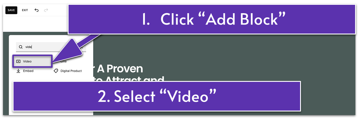
- Drag the video block to the right side of the section and stretch it to fill this side of the section.
- Click the pencil icon (
) or double-click the block to open the “Content” tab. - Click the plus icon (
) to add your video. You have two options for adding a video:
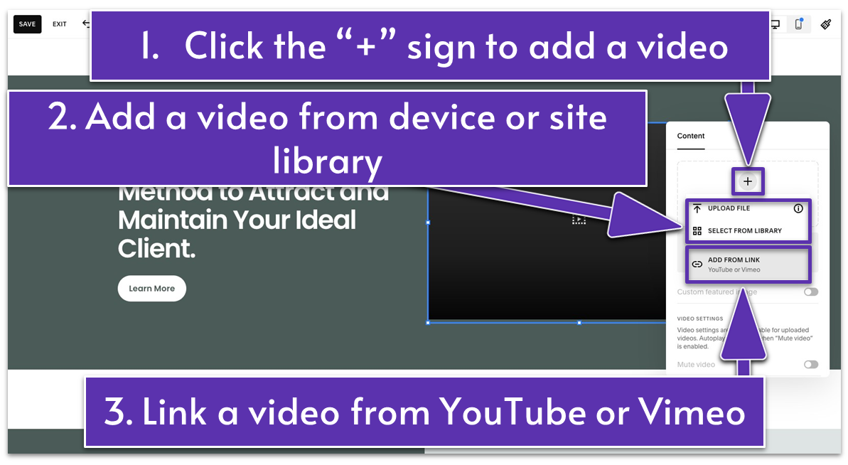 Option 1: Add a video from your device or Squarespace website library. You can do this by clicking “Upload File” or “Select From Library.”
Option 2: Link a video from YouTube or Vimeo. You can do this by selecting the option “Add From Link” and pasting the video link in the box that will pop up.
Option 1: Add a video from your device or Squarespace website library. You can do this by clicking “Upload File” or “Select From Library.”
Option 2: Link a video from YouTube or Vimeo. You can do this by selecting the option “Add From Link” and pasting the video link in the box that will pop up.
Tip: You can source videos from Pexels. It’s a free stock photos and videos website offering millions of high-quality, royalty-free visuals.
Step 7: Edit the video- Click the pencil icon (
) or double-click the video block to open the “Content” tab.
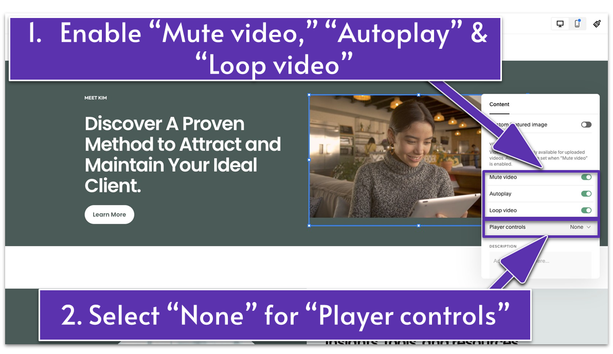
- Set your preferences from the available settings. We enabled “Mute video,” “Autoplay,” and “Loop video.” We also selected “None” for “Player Controls.”
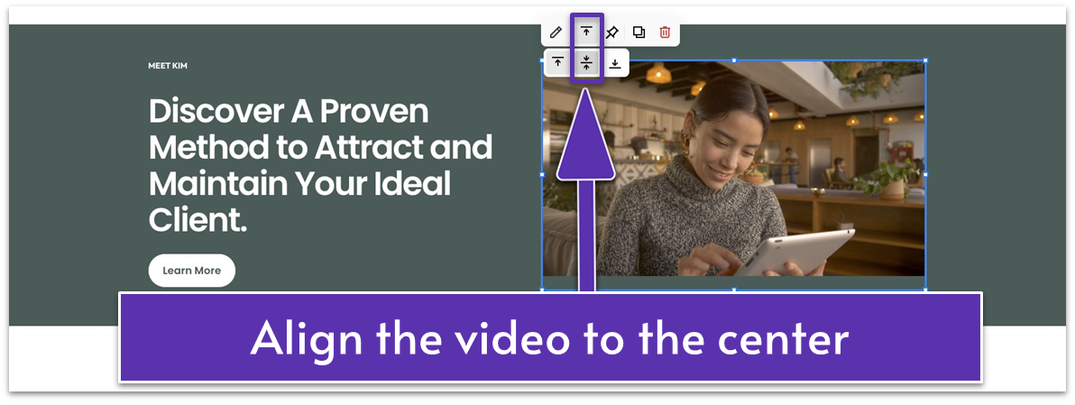
- Align the video to the center or as you prefer by using the alignment icons.
- Evaluate if you need to make any tweaks to the section. We highlighted all elements as a group and moved them higher. We also dragged up
to tighten the spacing.
5.7 Present Your Services (Sixth Section)
We’ll reuse the Services section in the Testimonials page you’ve built in the previous module. Step 1: Add new section Step 2: Go to “Saved Sections” Step 3: Select the saved Services section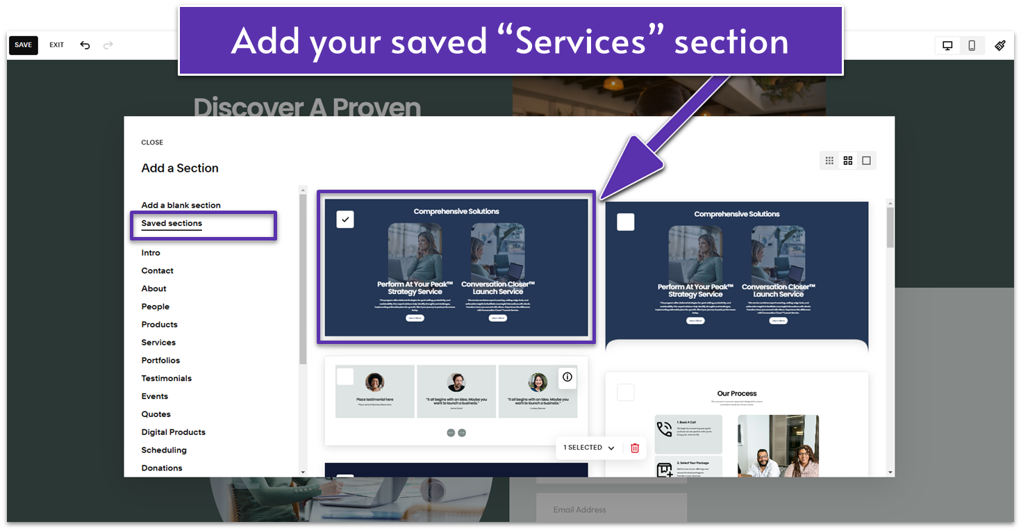 That’s it! You’ve added a section to let visitors know about your services. You can customize it to make it unique, or keep the original section as is. For now, we’ve used the original version with a dark-colored background.
Let’s stay on a roll!
That’s it! You’ve added a section to let visitors know about your services. You can customize it to make it unique, or keep the original section as is. For now, we’ve used the original version with a dark-colored background.
Let’s stay on a roll!
5.8 Call Them To Take Action (Seventh Section)
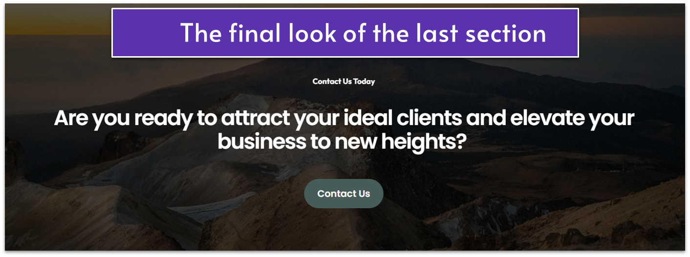
Your homepage should culminate with a powerful CTA that motivates visitors to take the next step. This dedicated section serves as a final push, but don’t use aggressive sales language. Instead, encourage them to connect with you directly and take it from there. Use a CTA button that leads to your Contact page to make reaching out easy for potential clients. Step 1: Add a blank section Step 2: Change the section’s color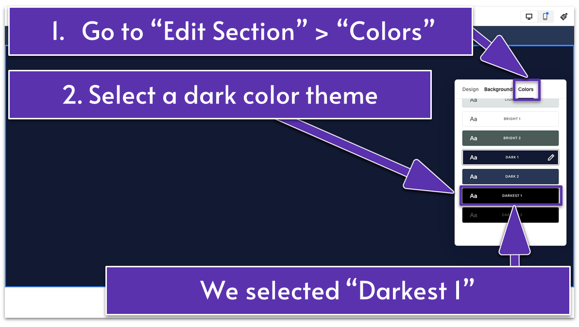
- Select a dark color theme. We chose “Darkest 1.”
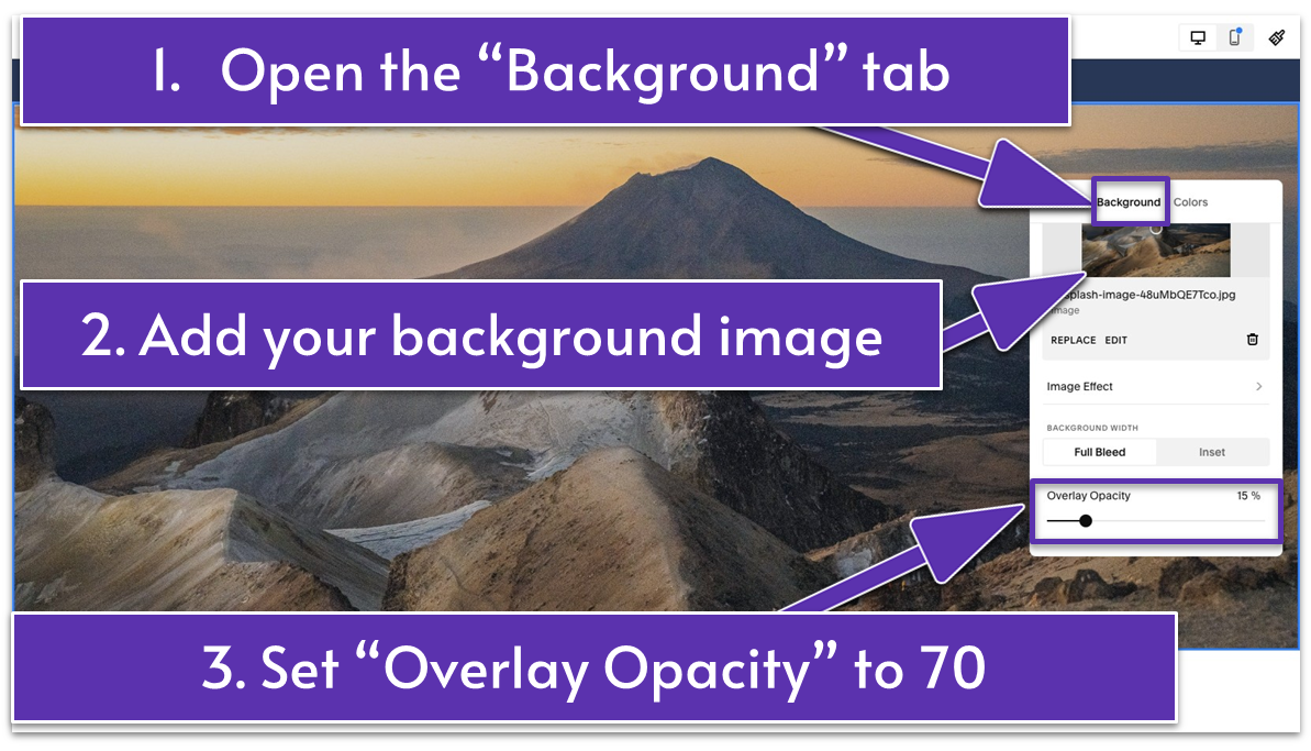
- Open the “Background” tab.
- Add a background image.
- Scroll down to adjust the “Overlay Opacity.” We set it to 70%.
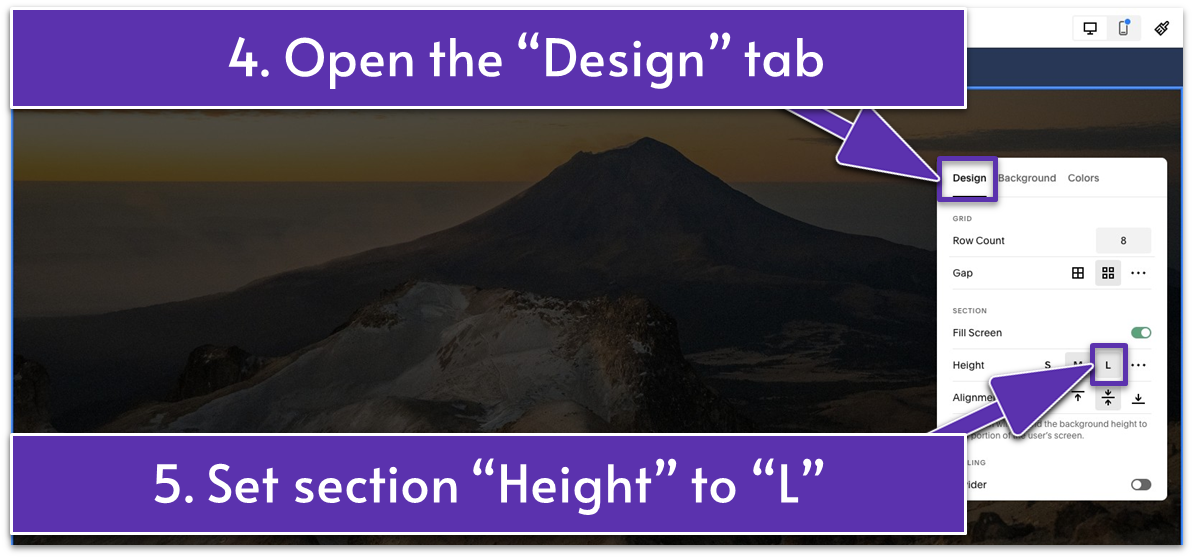
- Go to the “Design” tab.
- Set “Height” to “L” (Large).
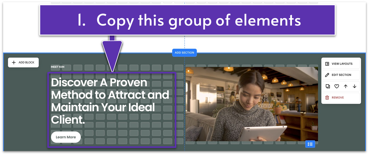
 For example, we spotted a group of elements in the fifth section that we could easily recycle in this section. We copied and pasted it to the last section. Then, we just replaced the content and made a few tweaks, and voila! Our last section was ready in minutes.
If you take the same route, here are the exact edits you need to apply to finalize the section:
For example, we spotted a group of elements in the fifth section that we could easily recycle in this section. We copied and pasted it to the last section. Then, we just replaced the content and made a few tweaks, and voila! Our last section was ready in minutes.
If you take the same route, here are the exact edits you need to apply to finalize the section:
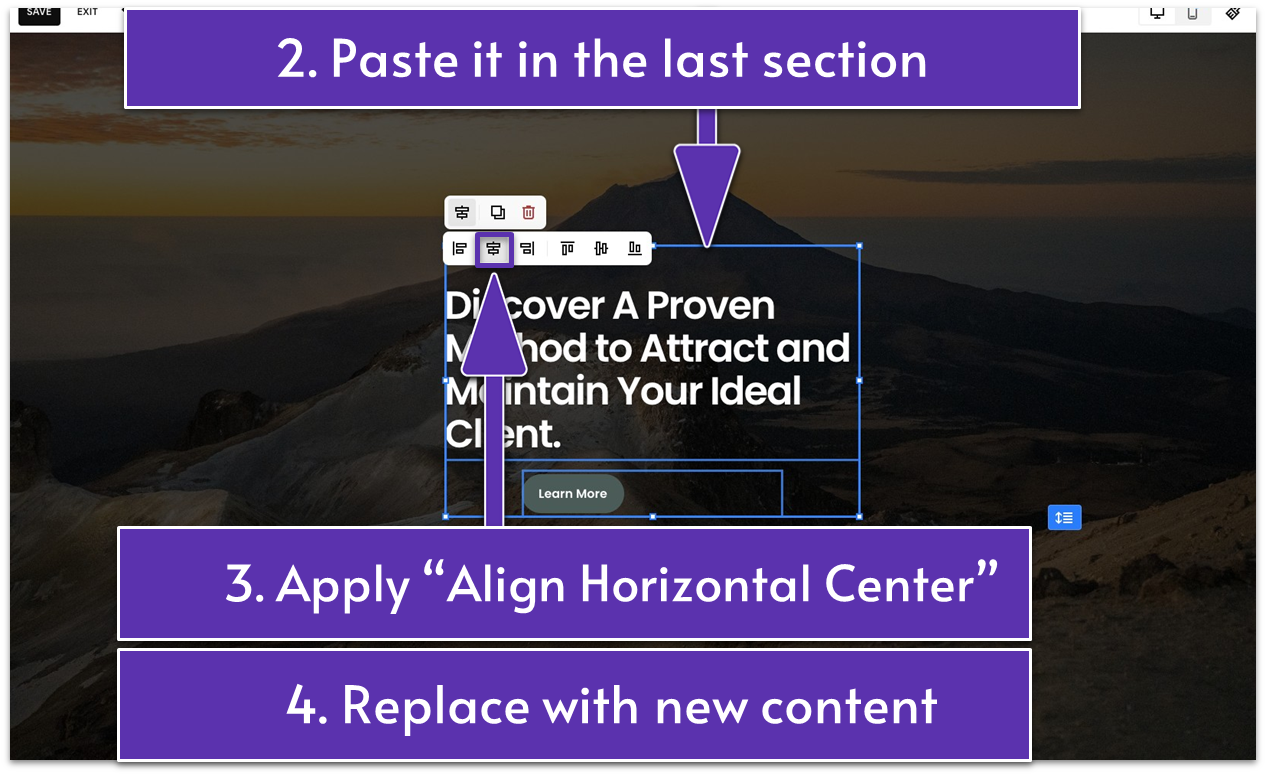
- Drag the group of elements to the middle of the section.
- Highlight the group of elements. Click the “Align Group” icon (
) from the toolbar that appears on top of it. - Apply “Align Horizontal Center” (
). - Align center the section title and headline in the text block using
. - Align center the button using
.
- Drag the text box horizontally across the entire section.
- Lift the button and place it just below the text block. If needed, change the button text and link. We changed the button text to “Contact Us” and linked the button to our Contact page.
- Set the section’s “Height.” Go to “Edit Section” and open the “Design” tab. Navigate to “Height” and click the three-dot icon (
) to apply a custom height. We set the height to 90. - Drag up the grid adjuster (
) to tighten the section’s spacing.
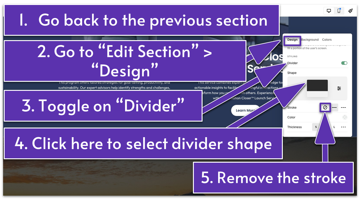
- Go back to the previous section.
- Click “Edit Section.”
- Scroll down and toggle on the “Divider” switch.
- Click the central icon under “Shape” to choose a divider style. We selected “Soft Corners Shape.”
- Reverse the shape using the “Flip” option (
). This will make the divider appear visually like it’s part of the last section. - Set the divider “Height” to “M” (Medium) or as desired.
- Go back to “Design.” Scroll down to “Stroke” and select the “No Stroke” icon (
) if you, like us, want to get rid of the divider line.
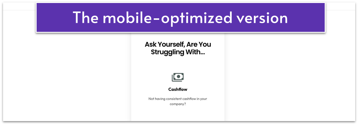
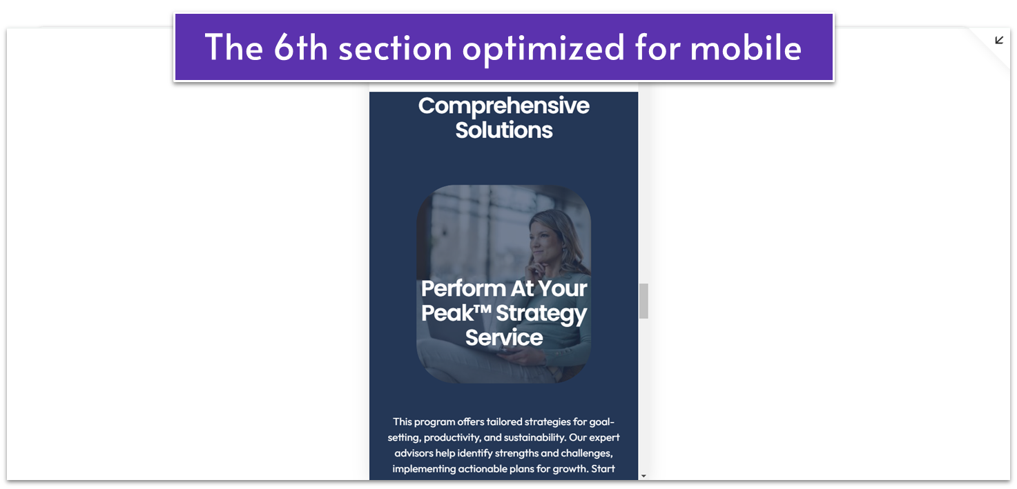
5.9 Optimize Your Homepage for Mobile
A mobile-optimized homepage is crucial in capturing potential clients who visit your site on their phones or tablets. Ensure your homepage’s layout suits smaller screens, text is readable, images are responsive, and buttons are easily noticeable and clickable. If you haven’t followed all the steps we’ve covered, your site’s mobile version may appear differently. You may need to make fewer or additional adjustments to ensure everything looks polished and functions correctly on mobile. Step 1: Go to “Mobile View” (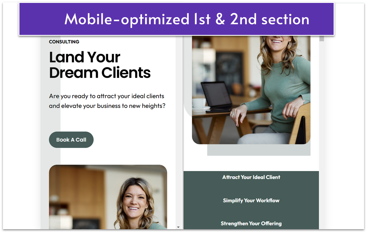
- We brought the text and the button in front of the shape. You can do this by selecting the blocks and clicking the “Move Forward” icon (
). - We also moved the elements closer and used the grid adjuster (
) to eliminate unnecessary blank space.
- The only thing we did here was center the text in each text block using the “Align Center” icon (
) from the main block toolbar.
- We dropped the second button to the bottom of the section. You can move elements up and down with the arrow icons (
). - We also lifted the entire group of elements below the image (text and button) higher.
- We tightened up the section with the grid adjuster (
).
5.10 Save Your Homepage
With just one final step, you’ll have everything set and ready to go live.- Click the “Save” button in the upper-left corner.
- Click “Exit” to leave the page.
 Step back and admire everything you’ve accomplished so far. The toughest part is behind you. You’ve laid a strong foundation. From here on out, it only gets easier.
In the next module, you’ll build your main navigation and footer, optimize for SEO, make final tweaks, and learn about the common website mistakes to avoid.
You’re just a few steps away from launching a website that will truly wow your audience. Let’s do this!
Step back and admire everything you’ve accomplished so far. The toughest part is behind you. You’ve laid a strong foundation. From here on out, it only gets easier.
In the next module, you’ll build your main navigation and footer, optimize for SEO, make final tweaks, and learn about the common website mistakes to avoid.
You’re just a few steps away from launching a website that will truly wow your audience. Let’s do this!
