

Welcome to the second part of building your Portfolio page – the grand entrance to your art and craft. Take it as an opportunity to make a remarkable first impression and invite visitors to explore more.
You’ve already built your Portfolio section, neatly organizing your work into categories. In this module, you’ll complete the journey by adding a compelling call-to-action (CTA) telling your visitors to book and an About section. These elements will transform your Portfolio hub page from a gallery of stunning images into a page that can earn your visitors’ trust and convert them into clients.
We’ll then be able to set this as the homepage of your site so visitors can dive right in.
5.1 Create a Call-to-Action (First Section)
Your Portfolio page needs to start with a powerful opening section that sets the tone for the entire website. This is where you invite your audience to connect with your art and take action.
For this section, you’ll create a catchy headline, encourage visitors to take the next step with a clear and inviting CTA button and display your (business) name front and center to make a strong personal connection. This combination draws attention and guides potential clients into action to explore your portfolio further or book a session.
Let’s design an opening section that makes the first impression unforgettable!
Step 1: Edit the Portfolio page
Unlike before, you don’t need to start with a new page. You’ll continue building on the Portfolio page you created in the previous module.
- Click the Portfolio page labeled with from the “Not Linked” page list.
- Select “Edit” to edit the page.
Step 2: Add a blank section
Click the “Add Section” button above the Portfolio section.
Step 3: Add an image
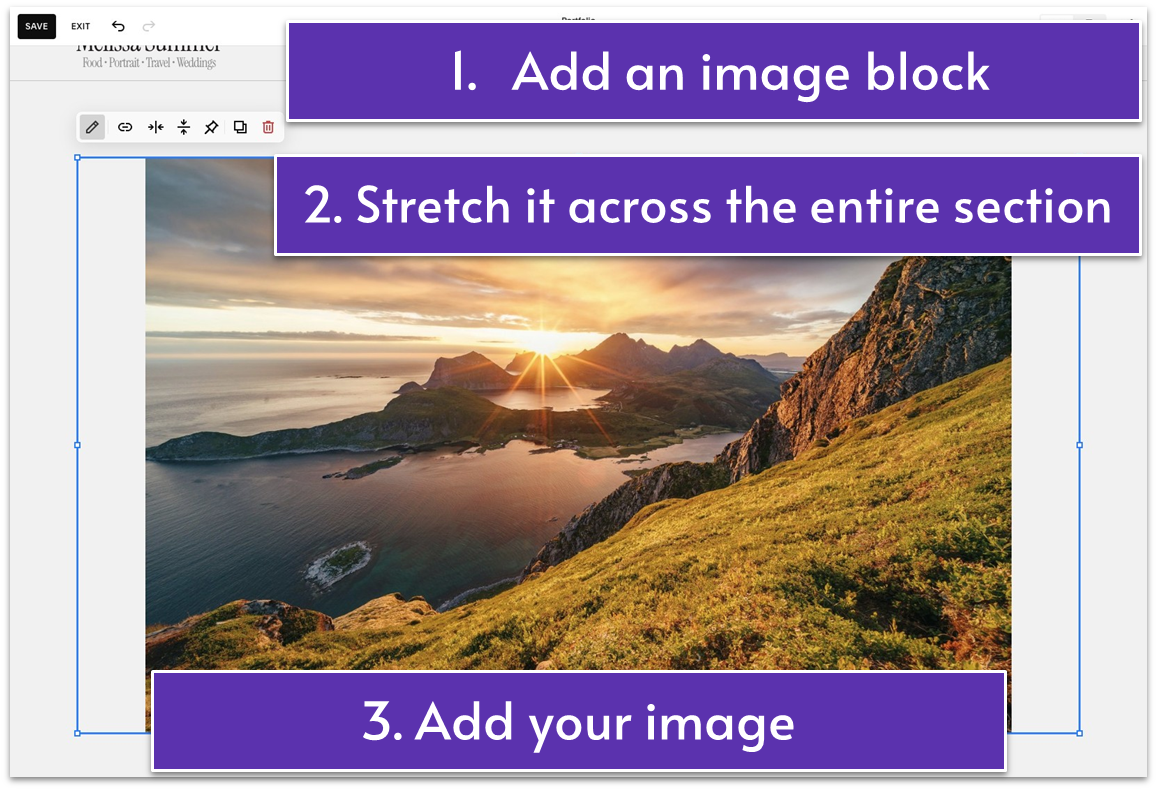
- Add an image block.
- Stretch the image block to fill the entire section.
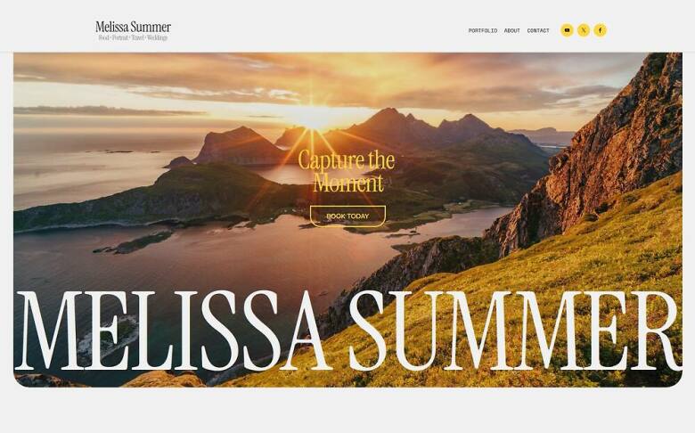
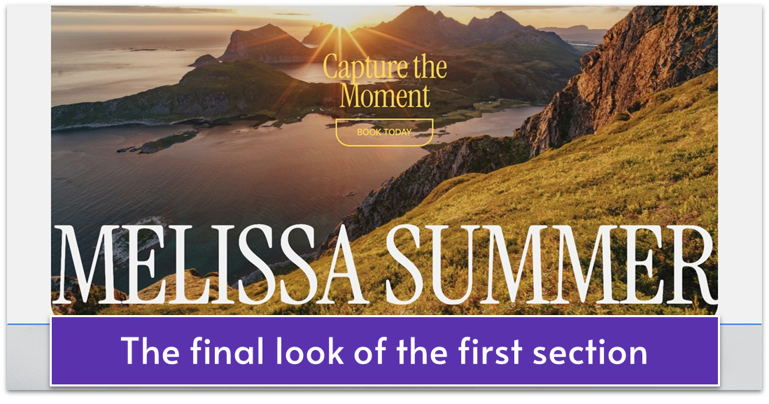
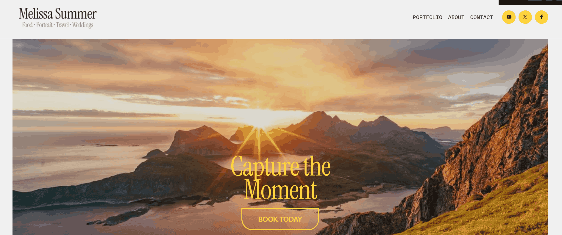
- Add your image. This image will act as a background photo for the section. You need to choose a horizontal image to fill the entire section. We picked a visually pleasing sunset image as the background for our opening section.
Step 4: Edit the image
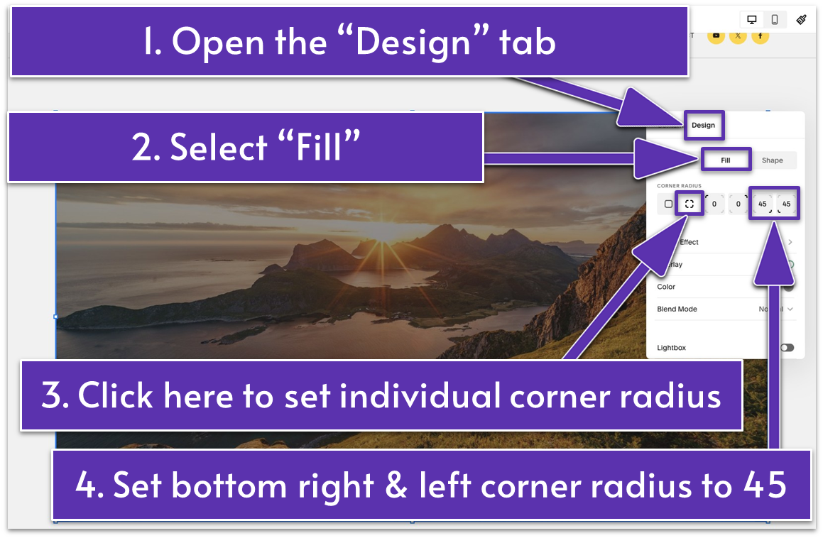
- Click the pencil icon ( ) from the main block toolbar.
- Open the “Design” tab.
- Select “Fill” to stretch the image and cover the entire block size.
- Click under “Corner Radius” to adjust the roundness of each corner of your image. We set the image’s bottom left and right corner radius to 45.
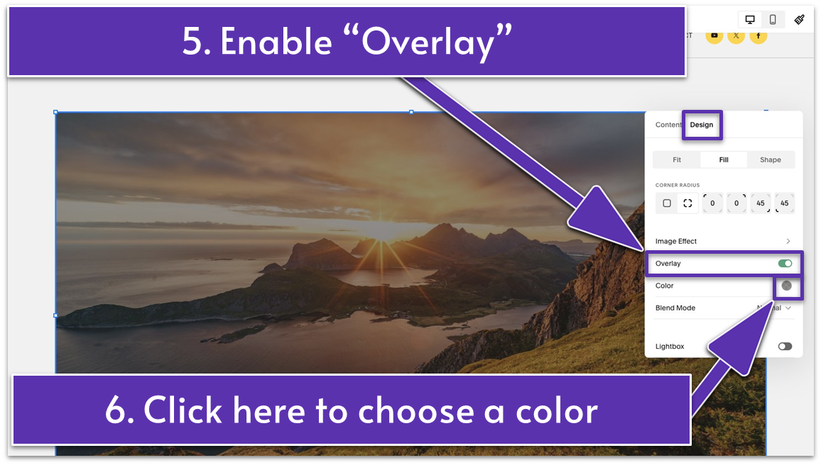
- Enable “Overlay.”
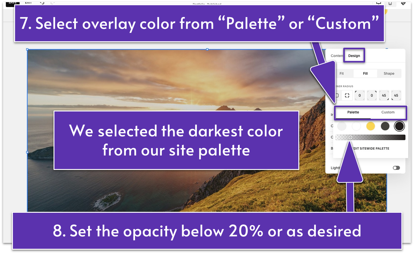
- Click “Color.” Under the “Palette” tab, select a color from your site palette or click “Custom” to pick a custom shade. We selected the darkest color from our site palette (HEX code: #221C1C) and set the opacity to just below 20%.
Step 5: Add text
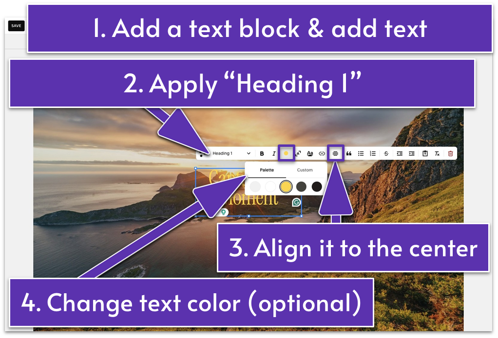
- Add a text block. Move it to the center of the background image.
- Insert your headline in this text block. We wrote, “Capture the Moment.”
- Vertically align the text as desired. We moved it to the bottom of the block using from the main block toolbar.
- Click the pencil icon ( ) and format the text to “Heading 1.”
- Align the text to the center of the text block using .
- Change the text color (if needed). To do so, click the colored dot icon ( ) in the editing toolbar and select the desired color. Since the black text wasn’t visible on our background, we changed it to yellow (HEX code: #FFD52E) from our site palette.
Step 6: Add a button
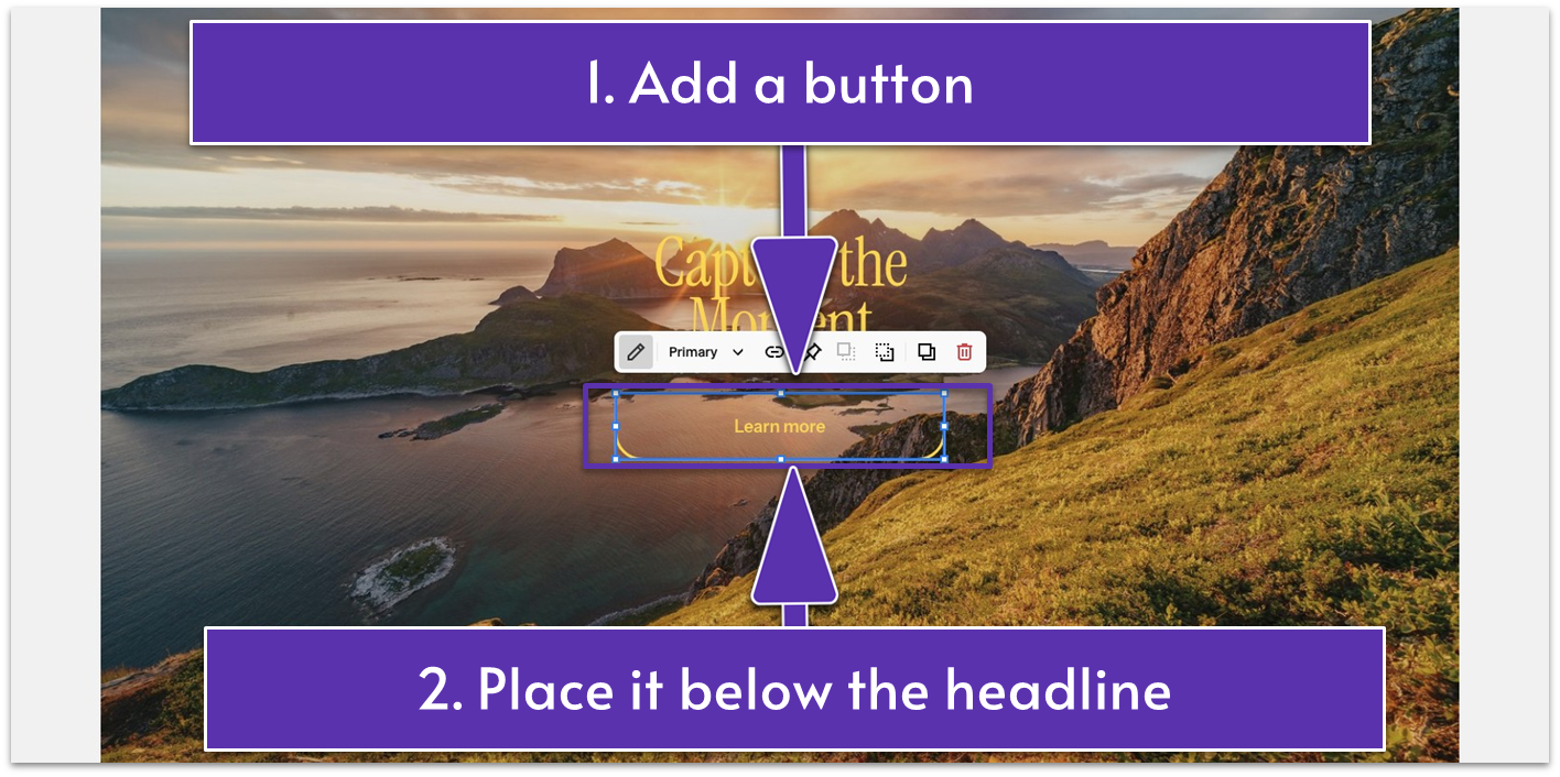
- Add a button block.
- Place the button below the headline.
Step 7: Customize your button
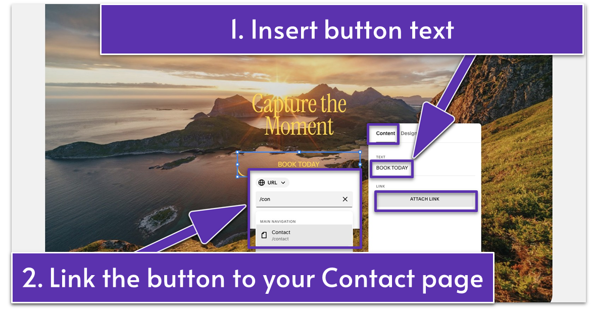
- Click the pencil icon ( ) to edit your button.
- Open the “Content” tab.
- Write your button text. We wrote “BOOK TODAY” in all capital letters to make it more prominent against our background image.
- Link the button to your Contact page. Click the “Attach Link” button and type the name of your Contact page in the search bar. Then, select it from the list.
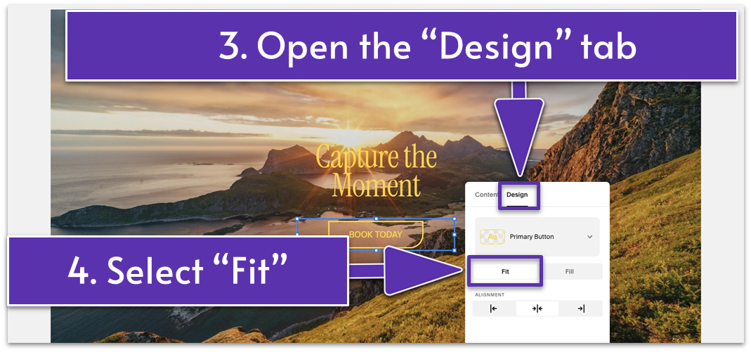
- Open the “Design” tab.
- Select “Fit” to make the button match the text size with spacing around it.
Step 8: Add more text
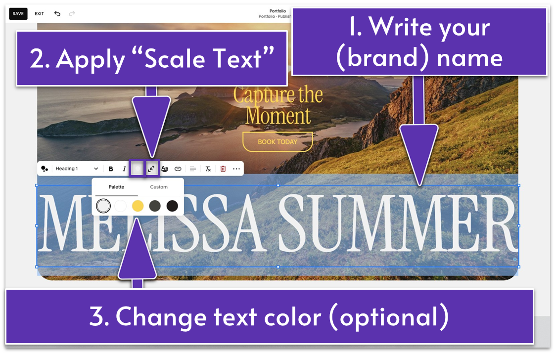
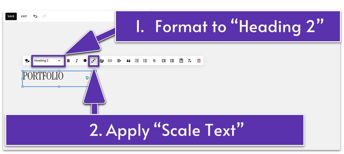
- Add a new text block and type your (brand) name. For example, our fictional photographer’s personal name doubles as their brand name, so we wrote “MELISSA SUMMER” in all capital letters in this text block.
- Format this text to “Heading 1,” and apply “Scale Text” ( ).
- Stretch the text block across the entire width of the section.
- Change the text color if needed. This time, we went with the light gray color (HEX code: #F1F1F1) from our site palette.
- Place the text at the bottom of the section.
Step 9: Make final edits to the section
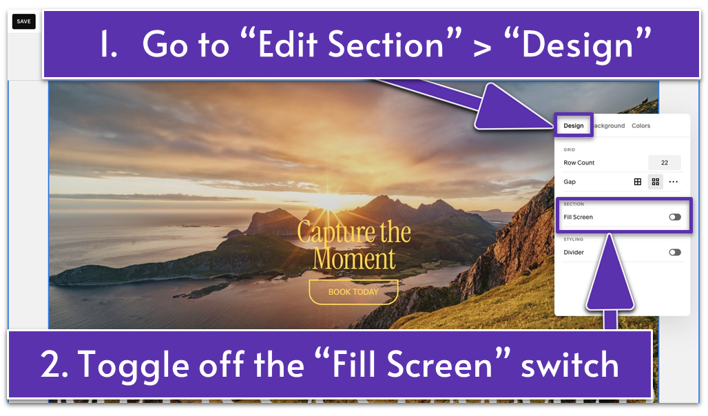
- Go to “Edit Section.”
- Open the “Design” tab.
- Disable “Fill Screen.” This adjusts the section’s height to fit only the content (image and text blocks) inside it.
Step 10: Make final edits to the image
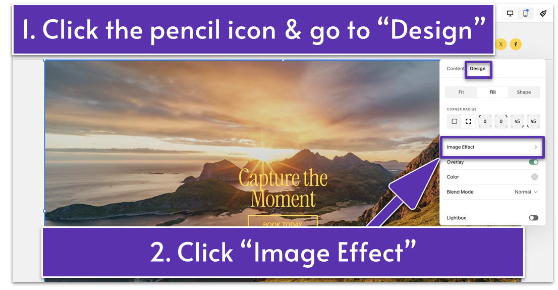
- Select the background image and click the pencil icon ( ).
- Go to the “Design” tab.
- If you, like us, want to add an effect to your background image, click on “Image Effect.”
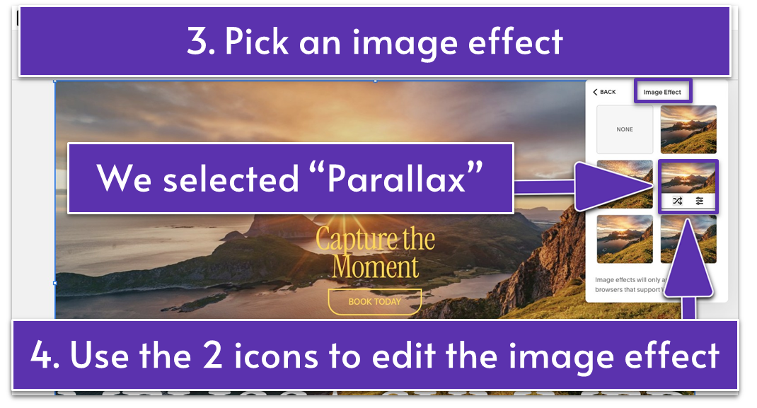
We selected “Parallax,” which adds a subtle parallel movement when you scroll over the section.
You can edit the image effect in two ways:
1. Click the “Shuffle Settings” icon ( ) to randomize the settings automatically.
2. Click the “Edit Settings” icon ( ) to manually apply the desired edits.
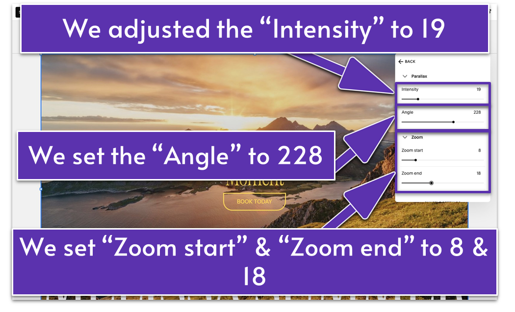
Each image effect has different settings that can be customized. For example, if you choose “Parallax,” you can adjust the “Intensity” and “Angle.” We set the “Intensity” to 19 and the “Angle” to 228. You can also adjust the “Zoom start” and “Zoom end” under the “Zoom” settings, which we set to 8 and 18, respectively.
You’ve nailed this section! Let’s pour the same energy and creativity into your next section!
5.2 Introduce Yourself & Your Craft (Second Section)
The About section is your chance to connect with visitors on a personal level, giving them a glimpse into the artist behind the craft.
This section isn’t just about sharing who you are and the main focus of your work – it’s about creating a connection that sets you apart from the crowd. Potential clients want to know what inspires your work, what drives your creativity, and why they should choose you. Whether it’s your love for storytelling through (insert your craft here), your years of experience, or the unique approach you take, this is the place to let your passion shine.
The good news is you already built an entire About page, so why not recycle a section from there? You can start from scratch if you want to, but I suggest you take the shortcut here.
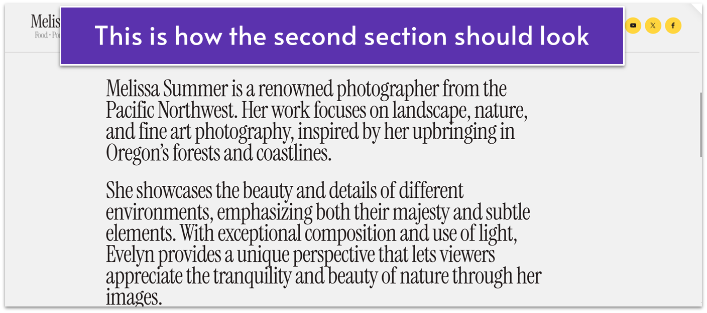
Step 1: Add a saved section
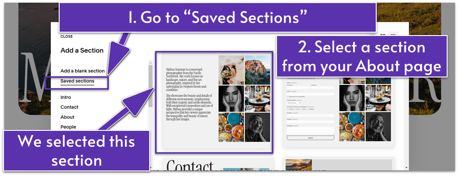
- Click “Add Section” and go to “Saved Sections.”
- Pick a section from your About page. We selected the second section from our About page, which includes personal and work details about our fictional photographer.
Step 2: Edit the saved section
Make edits to your recycled section if needed. In our case, we removed the gallery and made a few more adjustments to make it Portfolio-page-ready. If your About section looks the same or at least similar to ours, here’s what you need to do to transform its look:
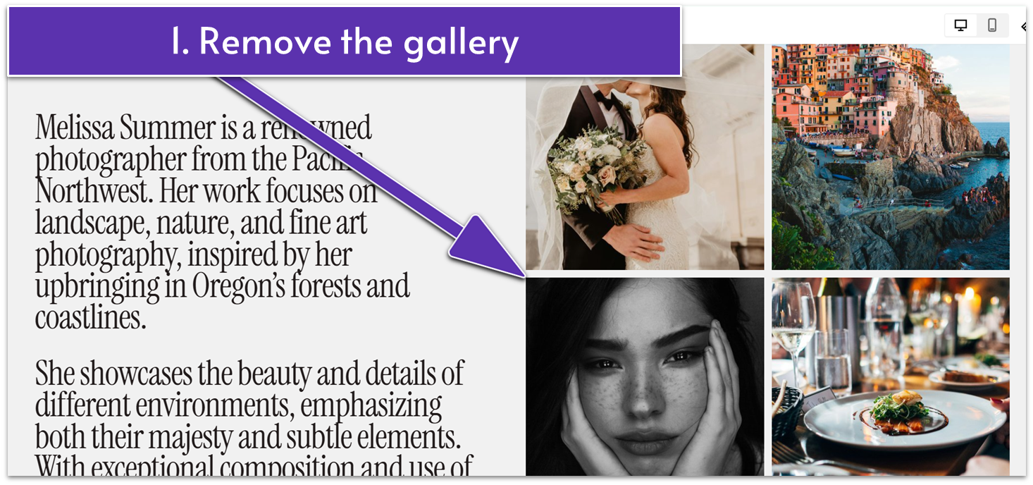
- Select all the images on the right side of the section. Then press Backspace or Delete to remove the gallery.
- Stretch the text block across the entire section.
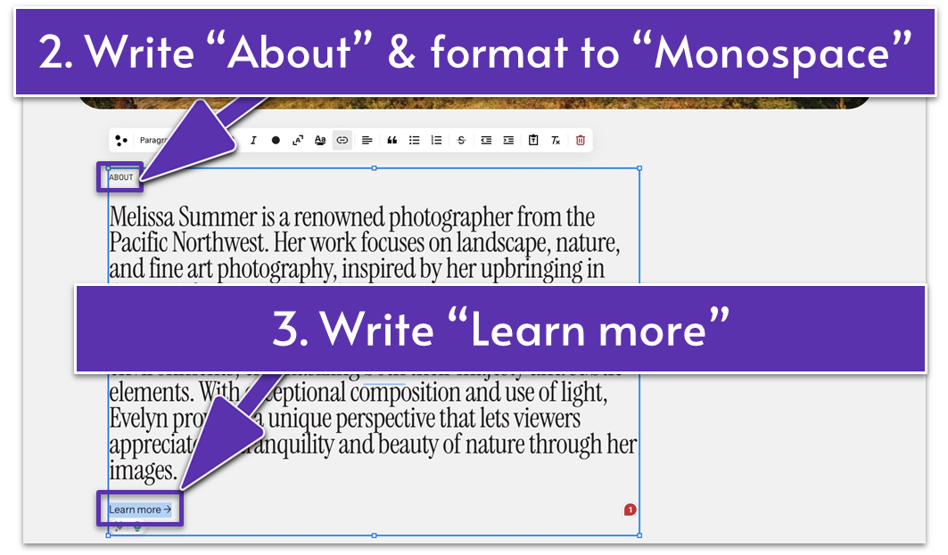
- Write “ABOUT” (in all caps) above the existing text and format it to “Monospace.”
- Scroll down to the bottom of the text and write “Learn more” as this section’s CTA.
Step 3: Add a link to your About page
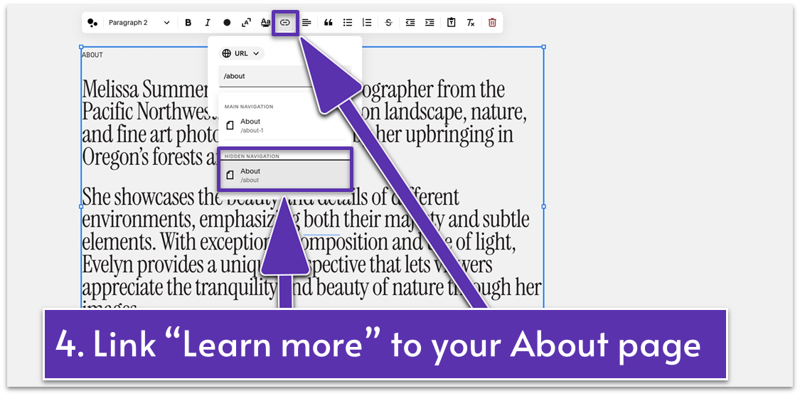
- Highlight the “Learn more” text.
- Click the “Link” icon ( ) from the editing toolbar.
- Add a link to your About page for visitors interested in learning more.
Move and resize the text block if needed. Then, use the grid adjuster ( ) to remove excess blank space.
Step 4: Add a divider
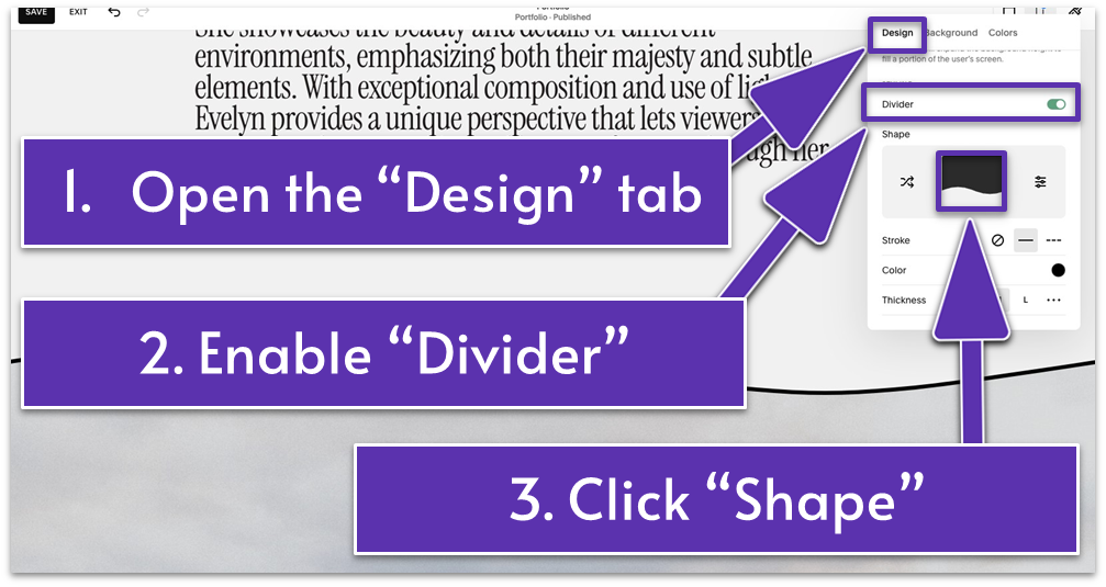
- Go to “Edit Section.”
- In the “Design” tab, toggle on the “Divider” switch.
- Click the shape card to open the “Shape” settings.
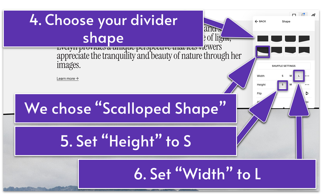
- Please select a shape. We chose “Scalloped Shape” and set the “Width” to L and “Height” to S.
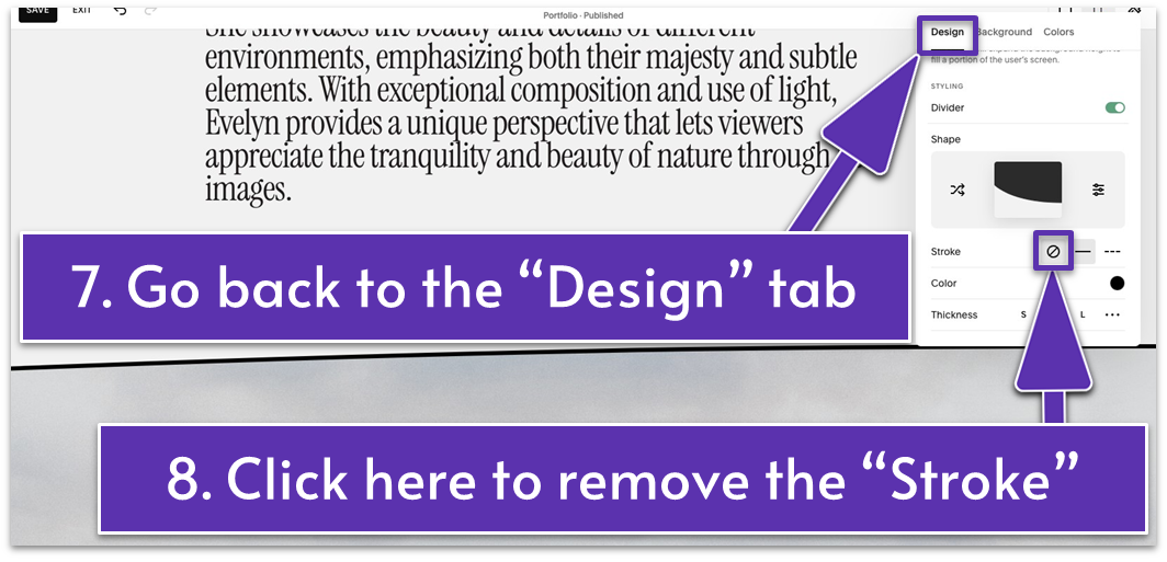
- Go back to the “Design” tab and remove the “Stroke” by clicking .
Congratulations on completing another section! You’re one section away from completing your entire Portfolio page.
Let’s make the rest of your Portfolio page shine!
5.3 Build the Intro for Your Portfolio Section (Third Section)
Use this section to introduce what’s next and clearly separate the Portfolio from the rest of the page. This is one of the simplest sections you’ll build, featuring only a title like “Portfolio” or “My Work.”
Without further ado, let’s tackle this microsection!
Step 1: Add a new blank section
Step 2: Add text
- Add a text block.
- Type “PORTFOLIO” in this text block.
- Apply “Heading 2” and “Scale Text” ( ) formatting to this text.
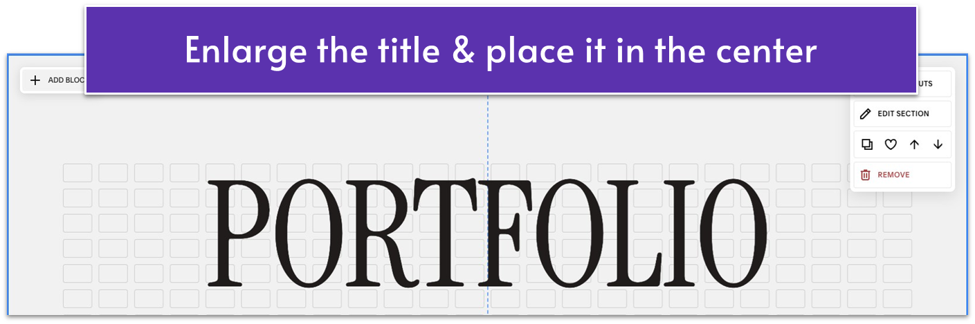
- Drag the text to the upper center of the section. Stretch the corners of the text block to make it bigger.
Step 3: Add an emoji
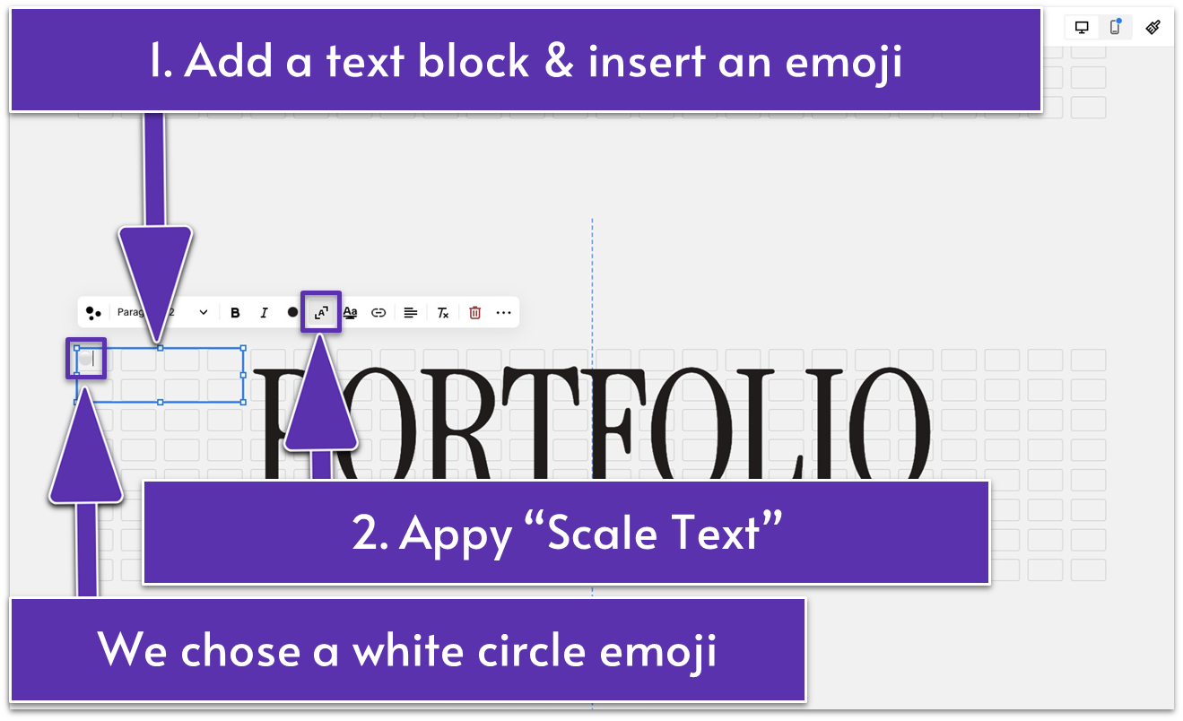
- Add a new text block.
- Insert an emoji in this text block. We picked a white circle.
A reminder on how you can add emojis:
- Windows: Right-click on your device and select “Emoji.” Alternatively, press the Windows key + period.
- Mac: Press Fn + E, + E, or Command + Control + Spacebar.
- Click the “Scale text” icon ( ) to scale your emoji so that it fills the entire block.
Step 4: Add another emoji
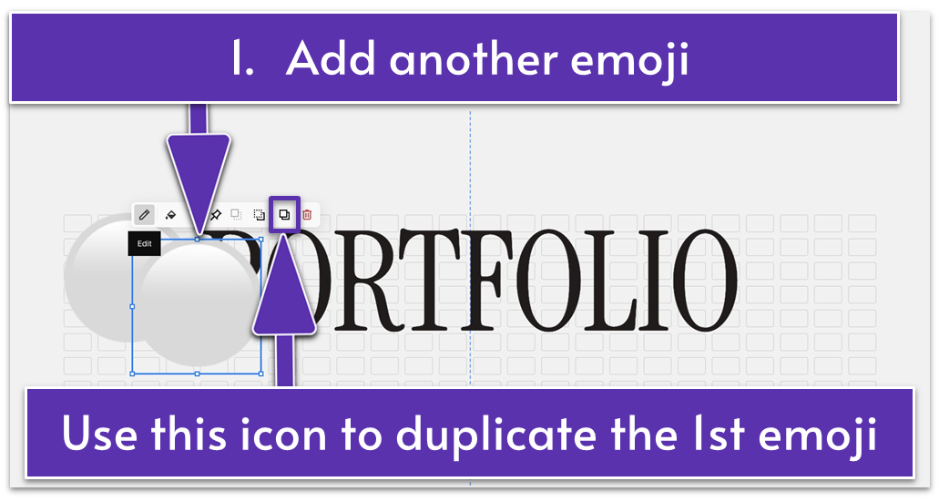
- Duplicate the emoji by clicking in the main block toolbar.
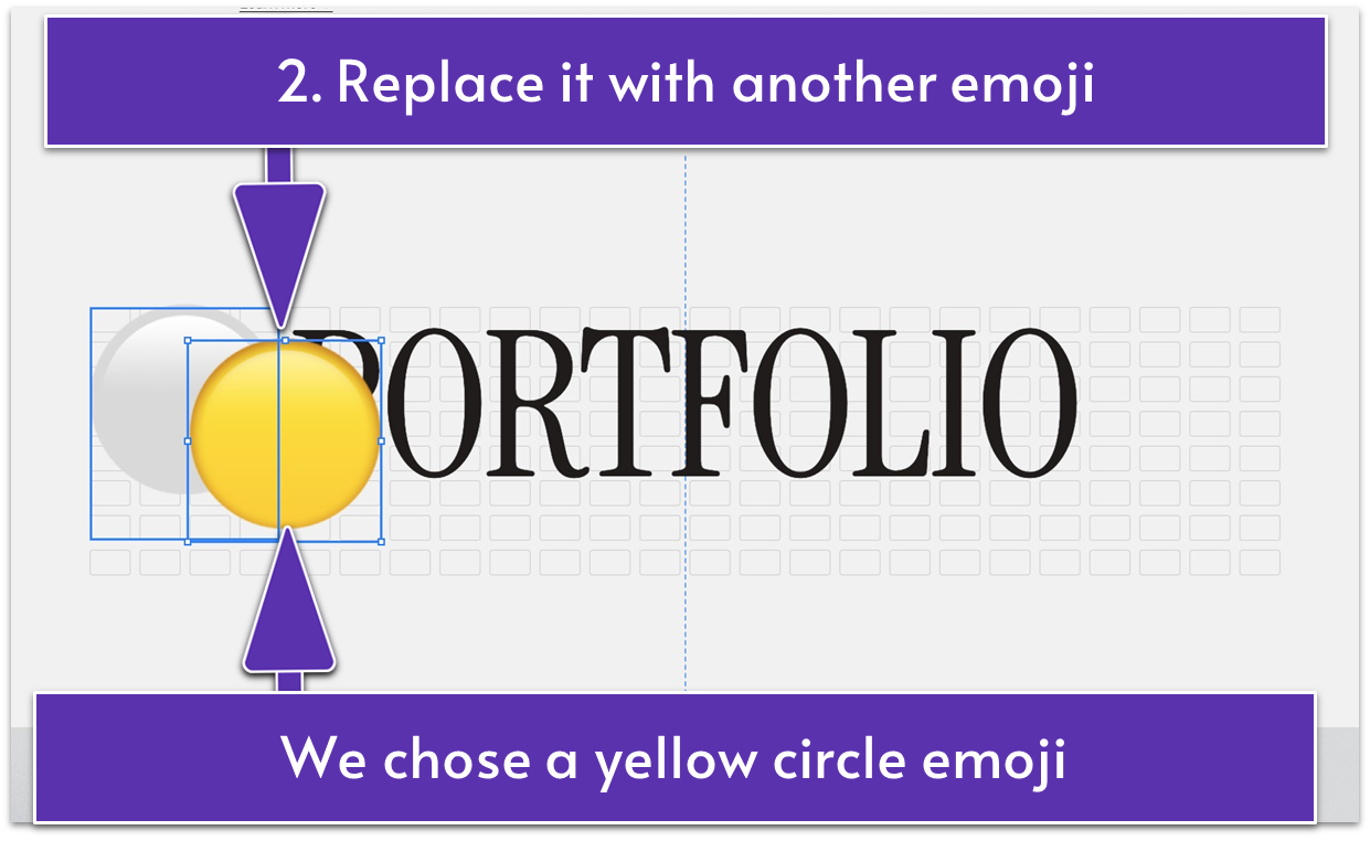
- Replace the emoji with another emoji. For example, we selected the yellow circle emoji to add a splash of color that matches the sunset vibes from the opening section.
Step 5: Customize the emojis
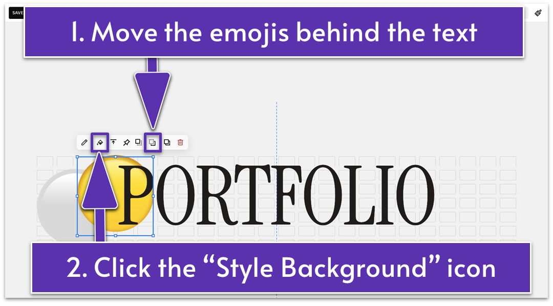
- Place the two emojis behind the text by clicking the “Move Backward” icon ( ).
- Select the first emoji. Click the “Style Background” icon ( ) in the main block toolbar.
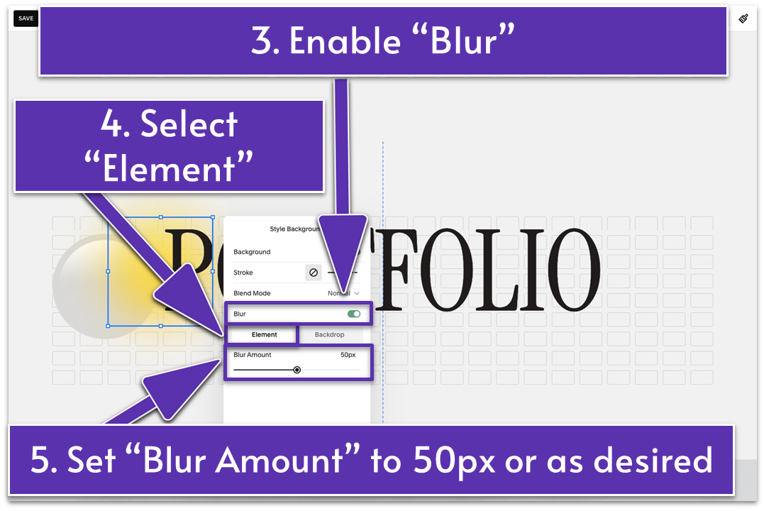
- Enable “Blur” and select “Element.”
- Set “Blur Amount” to 50 px or as desired.
- Apply the same edits to the second emoji.
Step 6: Change the section’s color
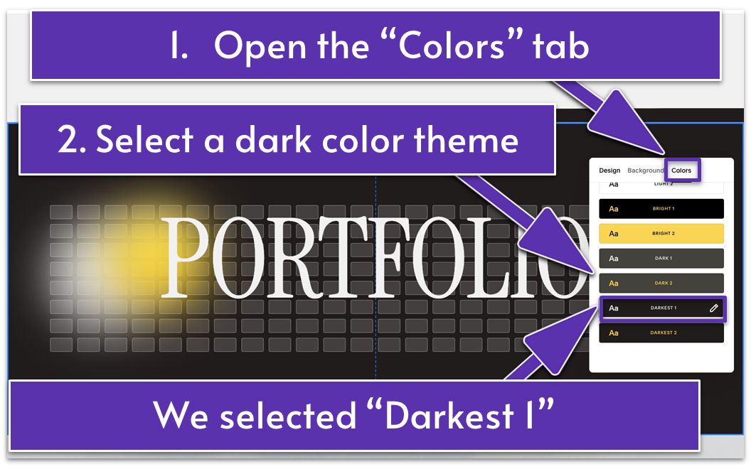
- Go to “Edit Section.”
- Open the “Colors” tab.
- Select a dark color theme. We went with “Darkest 1.”
Step 7: Adjust the section’s height
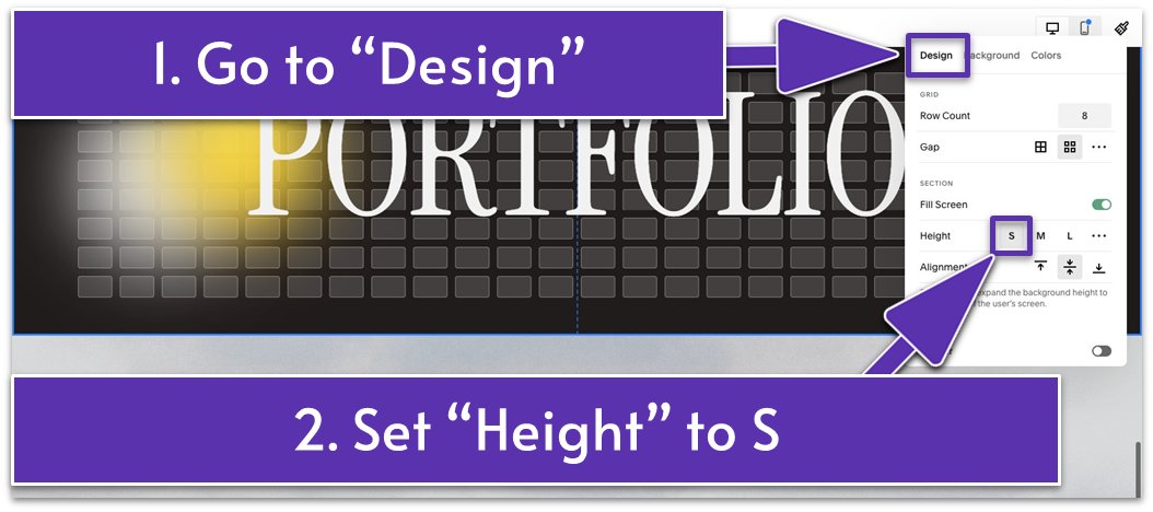
- Open the “Design” tab.
- Set “Height” to S.
- Drag up if you need to reduce the grid rows and shorten the section height further.

Your hard work is paying off! There’s nothing left to create from scratch. All your Portfolio page sections are ready to grace the brightest corners of the internet.
Let’s complete your Portfolio page masterpiece!
5.4 Edit the Portfolio Section
With the structure of your Portfolio page complete, it’s time to add the sparkle and flair and focus on the final touches that will make it truly stand out. This step is all about refining the design, ensuring consistency, and adding any last details to create a polished and professional look.
Let’s transform your Portfolio section into a stunning showcase that wows your audience.
Step 1: Adjust your section’s settings
- Go to “Edit Section.”
We applied a few more edits within the “Format” tab to the portfolio section we built in the previous module. If you want to replicate this on your site, here’s exactly what you need to do:
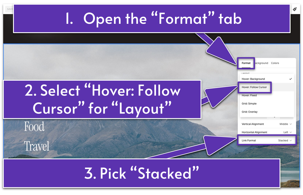
- For “Layout,” select “Hover: Follow Cursor” from the dropdown menu.
- Pick “Stacked” for “Link Format.”
- “Selection in Front” should remain disabled.
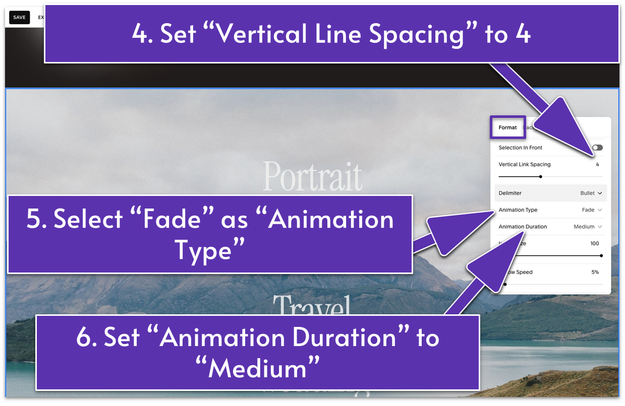
- Set “Vertical Link Spacing” to 4.
- Select “Fade” as your “Animation Type” and “Medium” for “Animation Duration.”
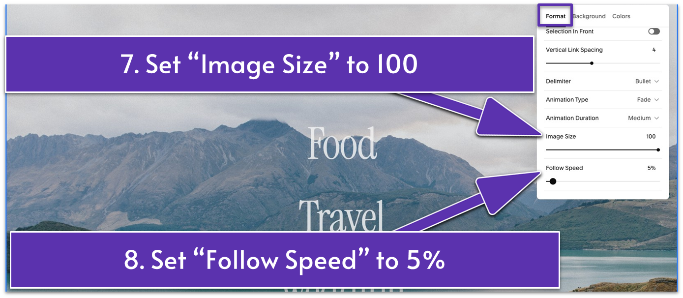
- Adjust “Image Size” to 100.
- Set “Follow Speed” to 5%.
Step 2: Delete the preset portfolio section background image
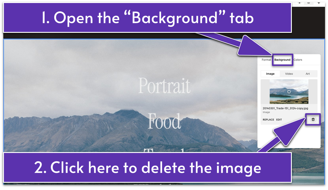
- Open the “Background” tab.
- Click the trash can icon ( ) to delete the preset background image.
Step 3: Change the portfolio section’s background color
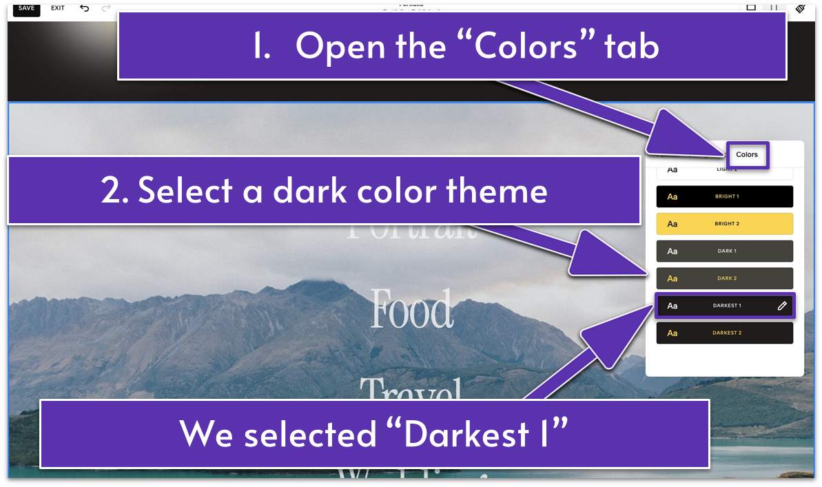
- Go to the “Colors” tab.
- Select a dark color theme. We chose “Darkest 1,” the same color theme we applied to the section above. These two sections need to appear as one visually.
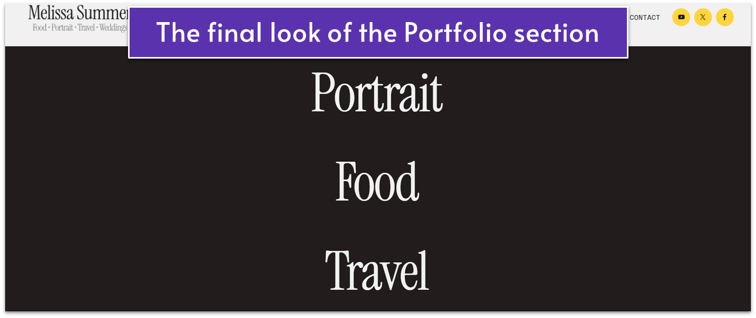
You’ve officially conquered the Portfolio page. Now, let’s give it the final polish so it dazzles on every screen size!
5.5 Optimize for Mobile
Many people will open your Portfolio page on the go from their phone or tablet. That’s why optimizing for mobile is a must. A well-designed mobile experience ensures your work looks just as stunning on a smaller screen as it does on a larger one.
When optimizing your Portfolio page, pay attention to readability, layout, and interactivity. Make sure your text is easy to read, your images load quickly and adjust seamlessly to fit smaller screens, and your CTA buttons are prominent and clickable. The last thing you want is for a potential client to struggle to navigate your site or miss out on key details because of poor mobile formatting.
Let’s make your site shine on every screen and give mobile users the VIP treatment too!
Step 1: Go to “Mobile View” ( )
Step 2: Optimize the first section for mobile
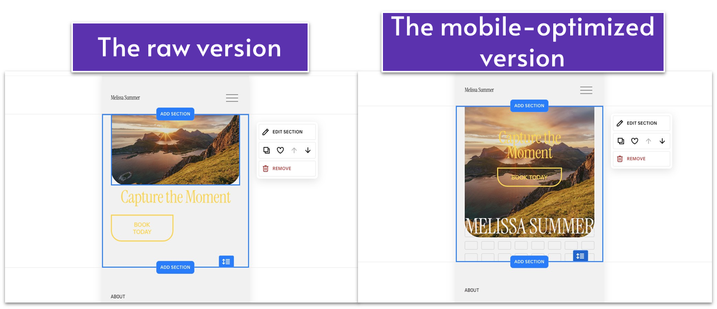
- Drag the image’s corners to make it taller.
- Bring the headline text up and place it in the upper central part of the section. Resize it to fit the mobile view if needed.
- Drag the “Book Today” button’s corners to make it wider. Place it below the headline.
- Bring your (brand) name higher so it sits at the bottom of the image.
- Use the grid adjuster ( ) to eliminate blank space.
Step 3: Optimize the second section for mobile
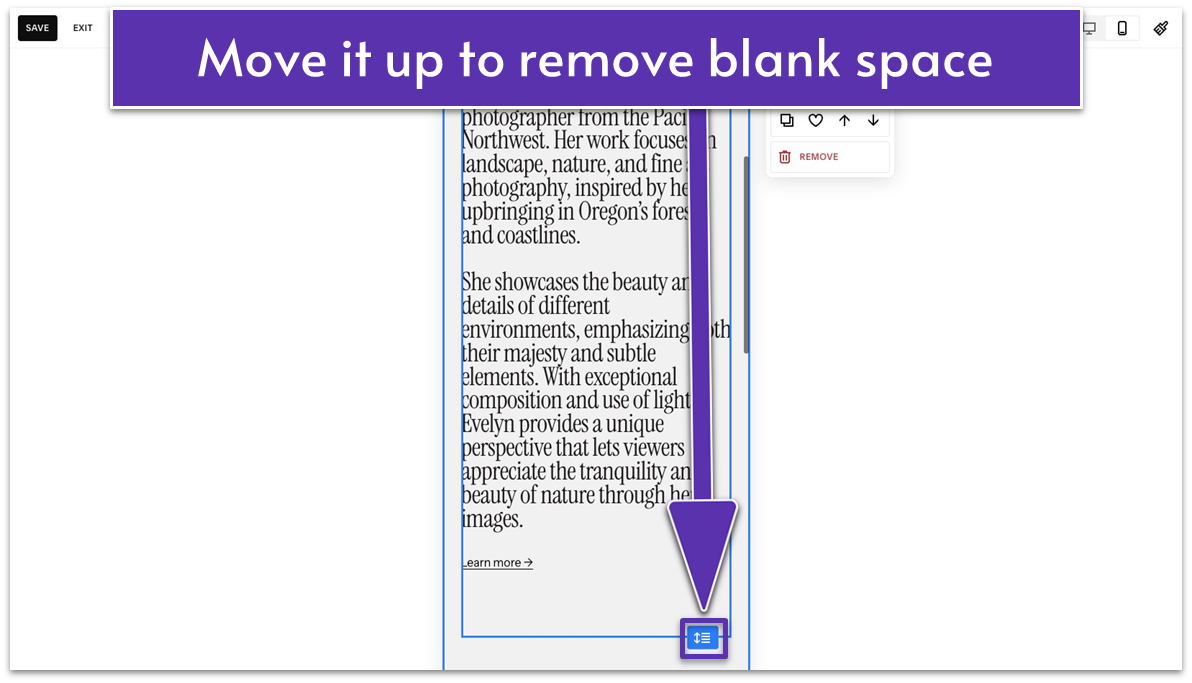
This section looked fine on our end. We just needed to tighten it with the grid adjuster ( ).
Step 4: Optimize the third section for mobile
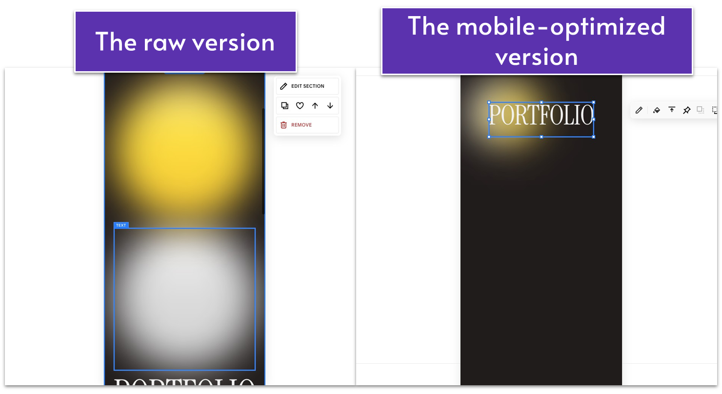
- Make the graphics smaller. On our end, the emojis were too big and covered the entire section.
- Place them on the left side of the section or as you prefer.
- Make sure the text sits in front of the emojis. Use to move the text forward or to move the emojis backward.
- Drag the grid adjuster ( ) up to remove blank space.
The Portfolio section (fourth section) looks great as is. Also, we’ve already optimized the portfolio subpages (Portfolio, Food, etc.) for mobile in the previous module. No further attention is needed for this section.
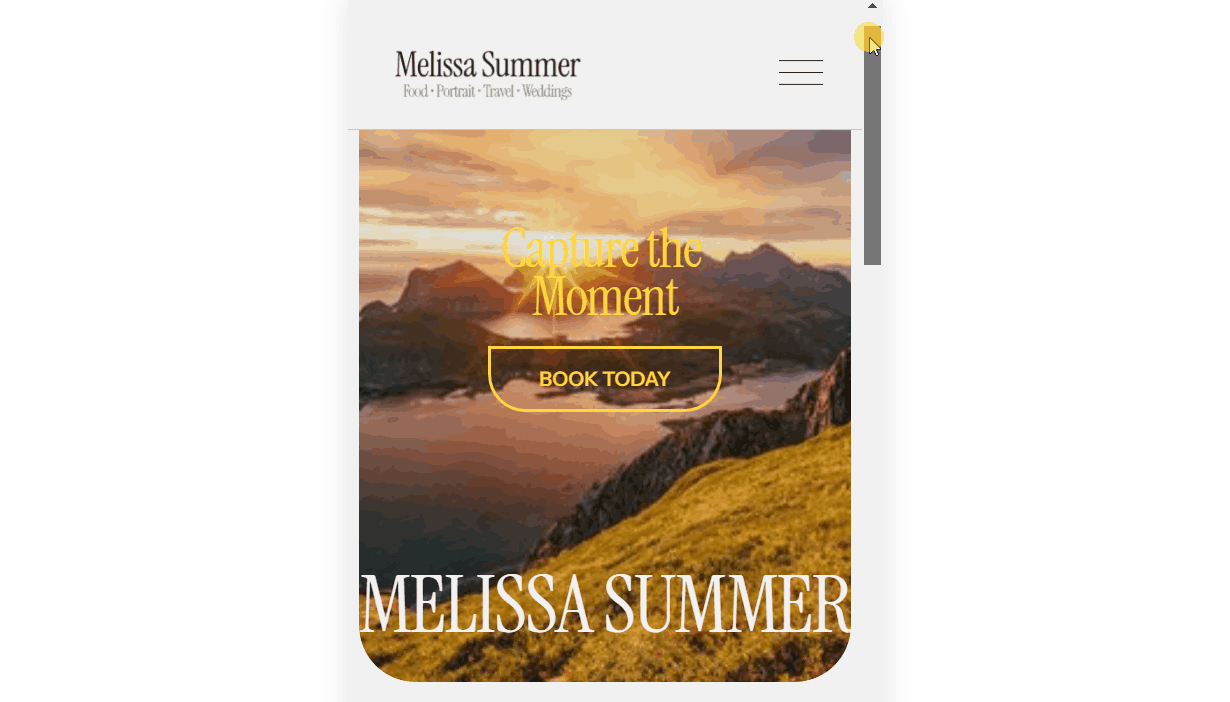
This is how the mobile version should look:
Pop the champagne – your Portfolio page is complete, optimized, and ready to impress! Just make sure to save your progress.
5.6 Save Your Portfolio Page
Let’s save what you’ve built so far.
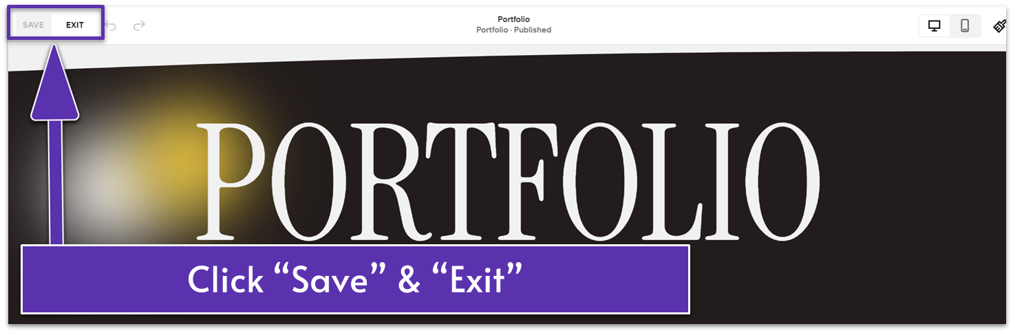
- Click “Save” in the upper left corner.
- Click “Exit” to leave the page.
The internet is officially your showroom!
Take a moment to celebrate – you’ve just completed your (almost) entire website!
But don’t hang up your creative hat just yet! In the next module, we’ll tie up the final loose ends like building the footer, finalizing your main navigation, optimizing SEO settings, and tackling those pesky common website mistakes.
You’re so close to launching your website and sharing your talent with the world! Get ready for the final steps – it’s almost time to hit publish and watch your site dazzle your visitors.
Let’s finish strong!
