

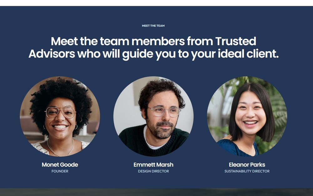
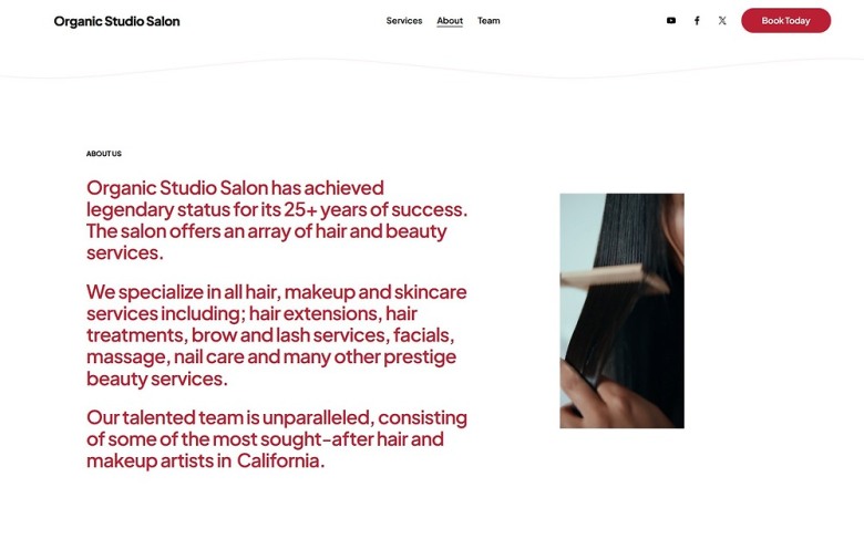
This is your About page, but it’s truly about your clients, their needs, and how you can elevate their salon experience. It should tell your clients the story of the passion and professionalism they will find when they walk through your door.
Use this space to give your clients a glimpse into your expertise. But don’t worry about listing every treatment you offer – we’ll save that for your dedicated Services page in the next module. For now, focus on storytelling and what makes you stand out among the dozens of salons in your area. Highlight the aspects of your work that foster trust and make clients feel welcomed and valued.
Now, let’s create that alluring About page together!
3.1 Add a New Page
You’ll begin by adding a new page. Unlike the Contact page, you’ll place the About page in the main navigation menu (the bar at the top of every page of your website). Whether you’re adding a page to “Main Navigation” or “Not Linked,” the steps are nearly identical.
Step 1: Add a “Main Navigation” blank page
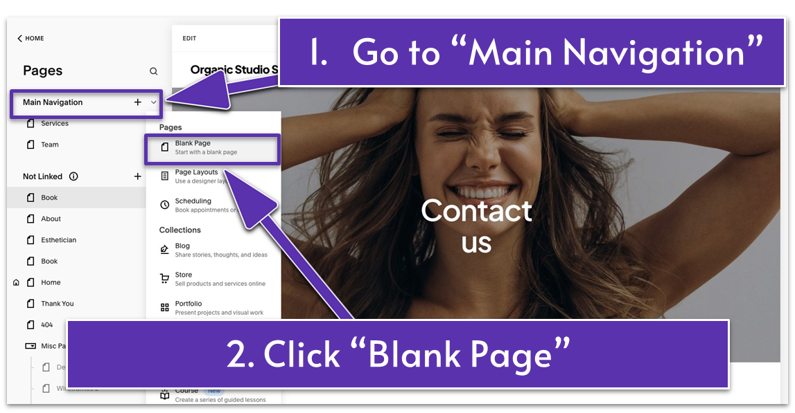
- Choose “Blank Page” from the “Main Navigation” menu. The new page will appear in your website’s main navigation bar.
Step 2: Rename the page to “About”
Now, let’s glam up your About page!
3.2 Catch Your Visitors’ Attention (First Section)
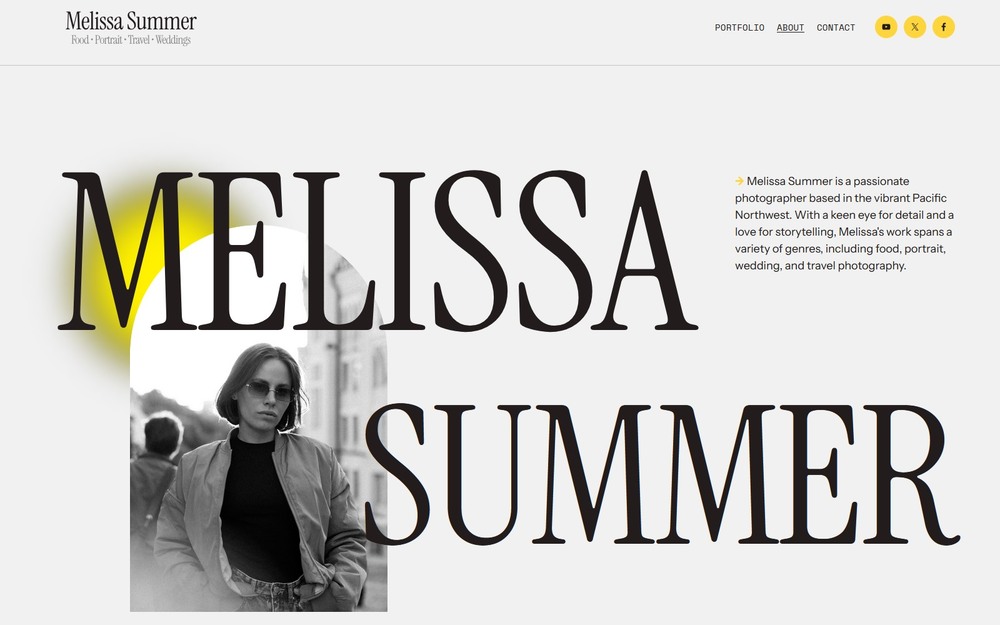
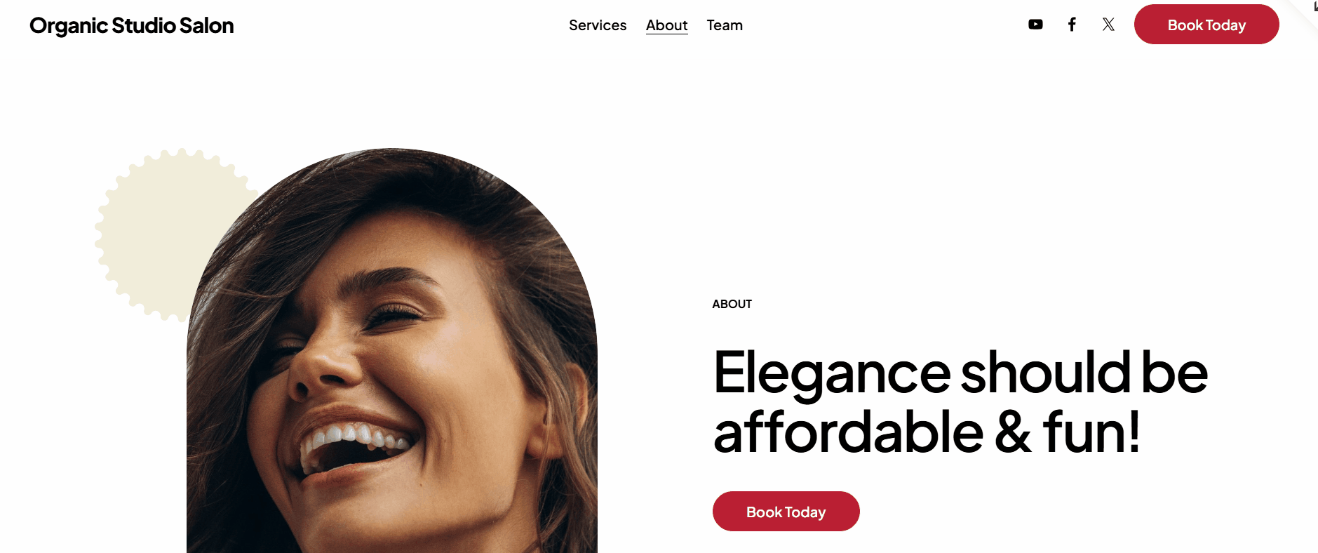
Your website deserves the beauty treatment your clients get! Start your About page with a powerful combination of visuals and words that reflect your talent, values, and style.
Use your own images to showcase your artistry and the details that make it special. This allows potential clients to see the quality of your services firsthand and get a feel for the experience they can expect. Avoid stock photos and generic images – authentic visuals build trust and give a genuine sense of your salon’s personality and expertise.
Step 1: Click “Edit” to open the page editor
Step 2: Add a blank section
Step 3: Add a shape
Let’s spice things up! Squarespace makes it easy to create something extraordinary, so there’s no need to settle for an ordinary website.
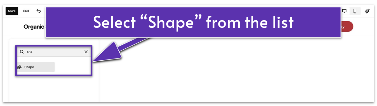
- Click “Add Block.”
- Select “Shape” from the list.
Step 4: Customize the shape
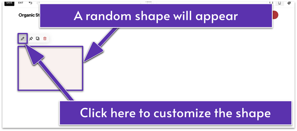
- Click the pencil icon ( ) to customize the shape.
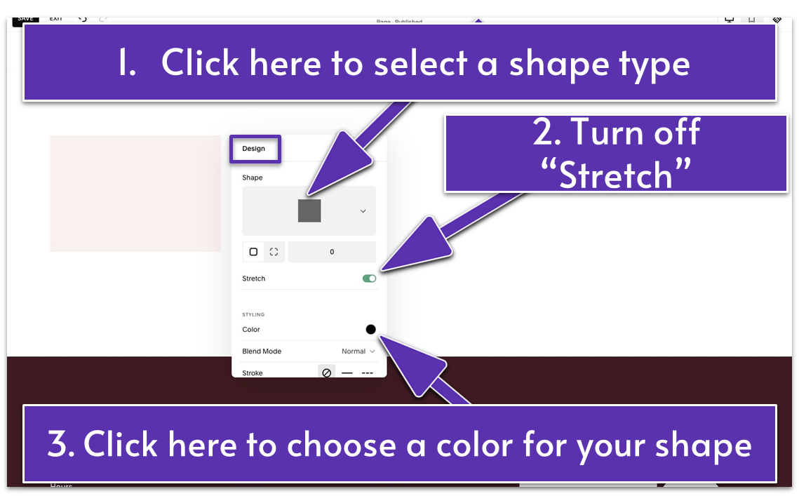
- Click “Shape” under the “Design” tab to choose a shape type. We went for a “Gear” ( ) shape for our website.
- Turn off “Stretch.”
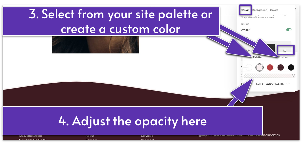
- Select a color for your shape. You have two options here:
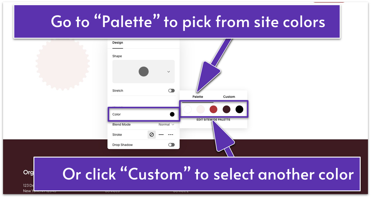
Option 1: Under “Palette,” you can choose a color from your site palette.
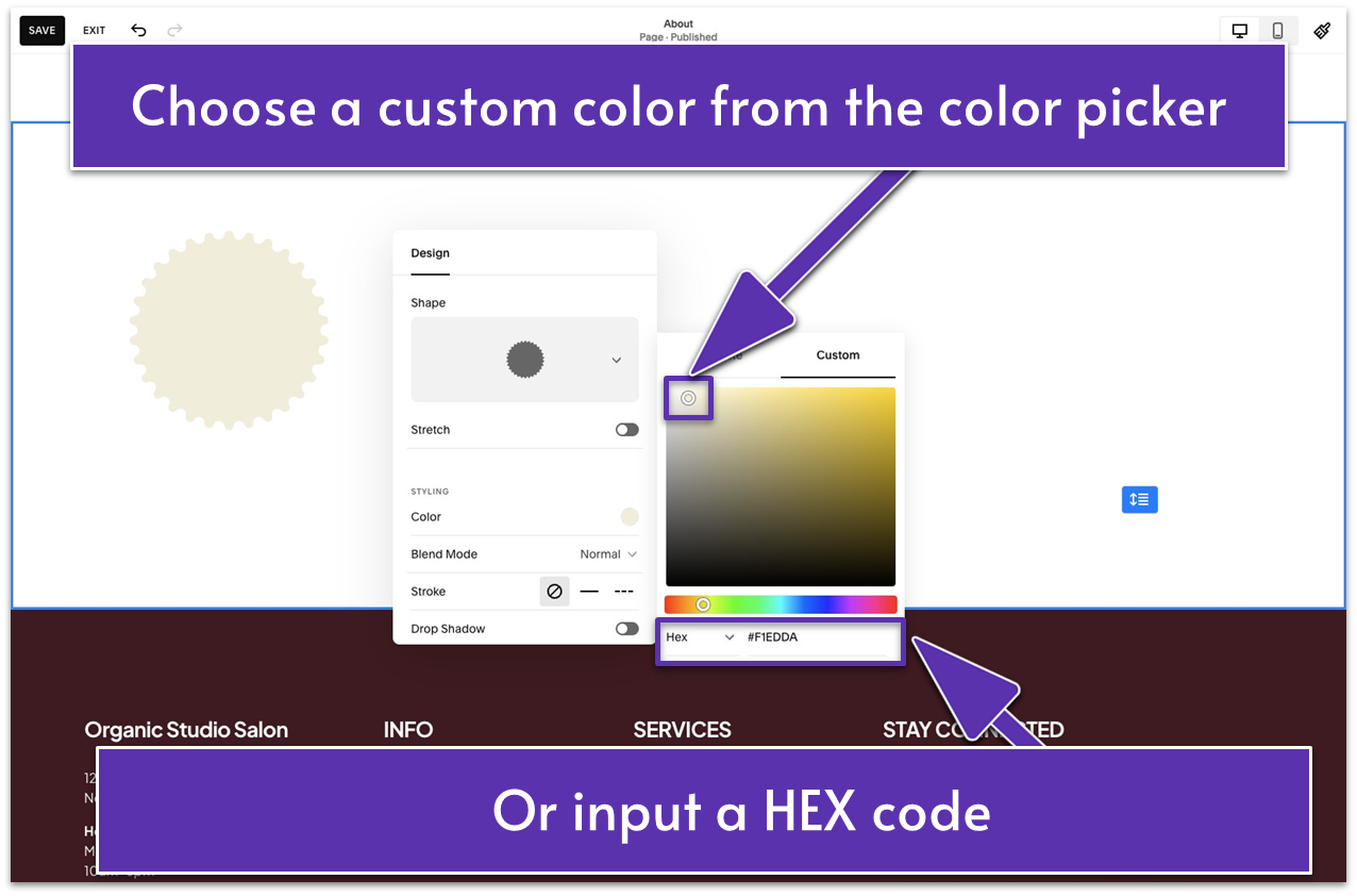
Option 2: Open the “Custom” tab. Select any color from the color picker or input a HEX code. Our shape’s exact HEX color code is #F1EDDA in case you want to copy it.
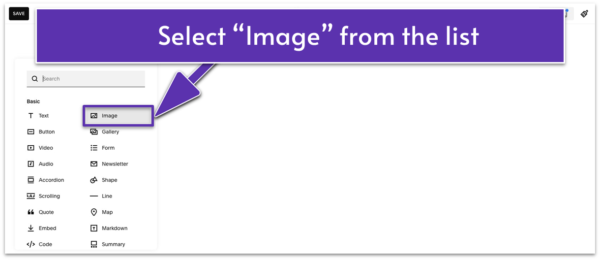
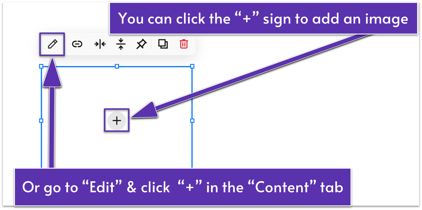
Step 5: Add an image block
- Stretch the corners of the image block to enlarge it.
- Add your image. You can do this in two ways:
Option 1: Click the “+” in the middle of the image block.
Option 2: Click the pencil icon ( ) to open the editing panel. In the “Content” tab, click the “+” sign where it says “Add an image.”
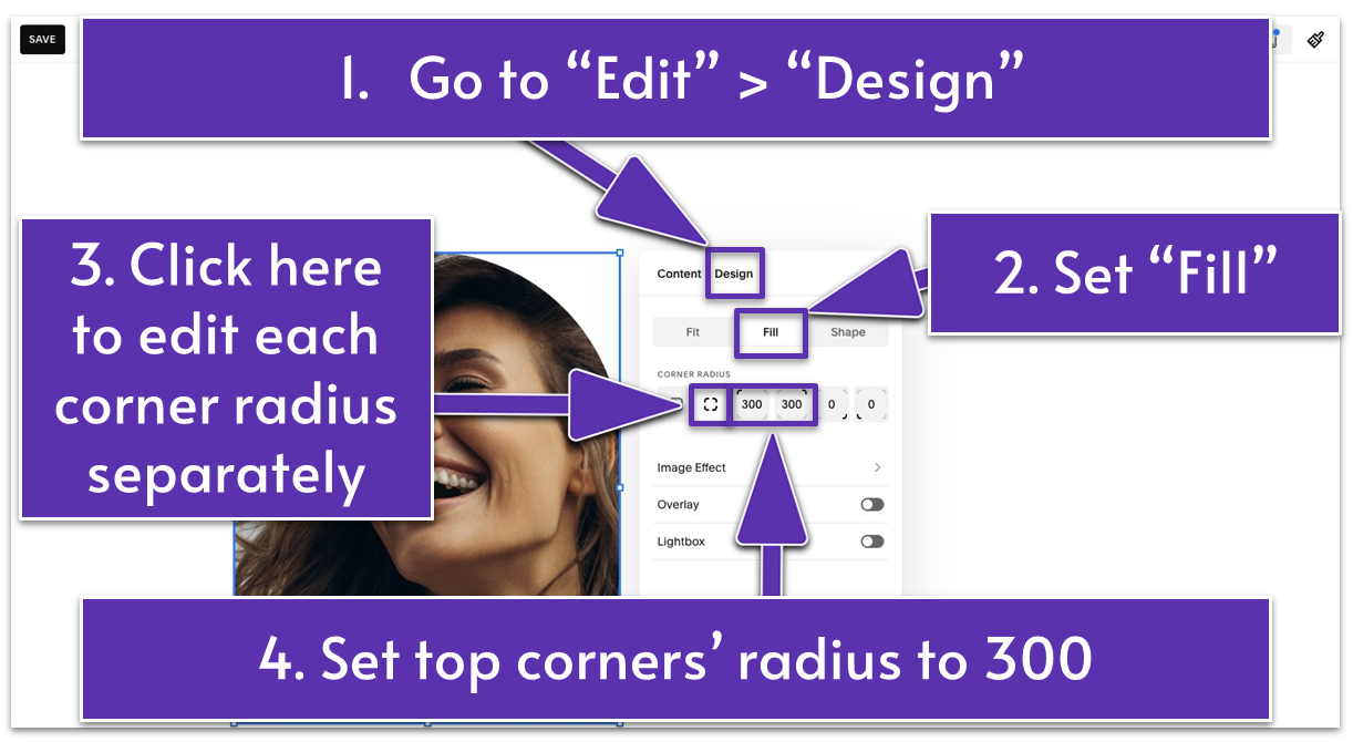
Step 6: Edit the image
- Click the pencil icon ( ) from the block toolbar above the image.
- Open the “Design” tab.
- Apply “Fill.”
- Under “Corner Radius,” click the ( ) icon. This option lets you set the roundness of each corner of your image. We applied a corner radius of 300 to the top left and right corners.
Step 7: Center the image
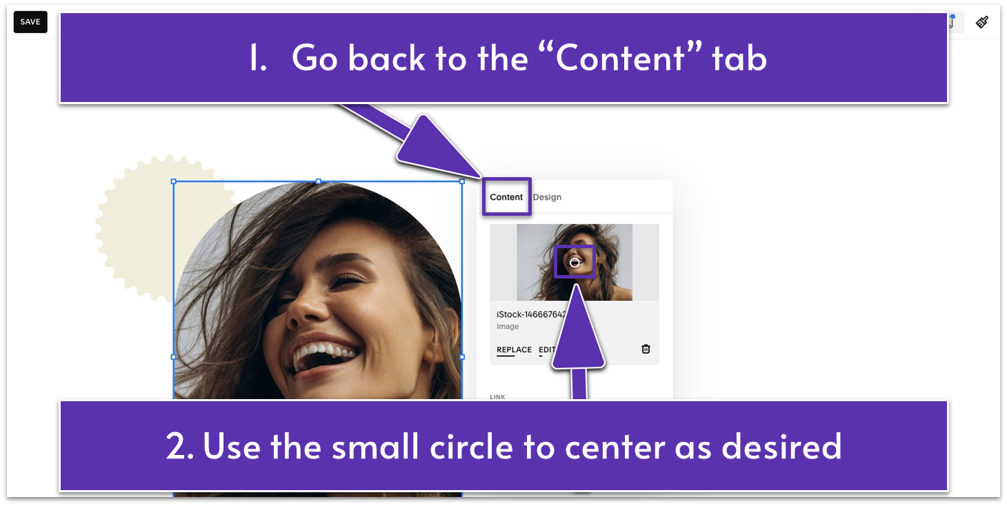
- Go back to the “Content” tab.
- Move the small circle across the image to center it as desired.
Your image might still have unwanted whitespace and elements even after centering it. If that’s the case, you can use Squarespace’s native photo editing tools to crop your image.
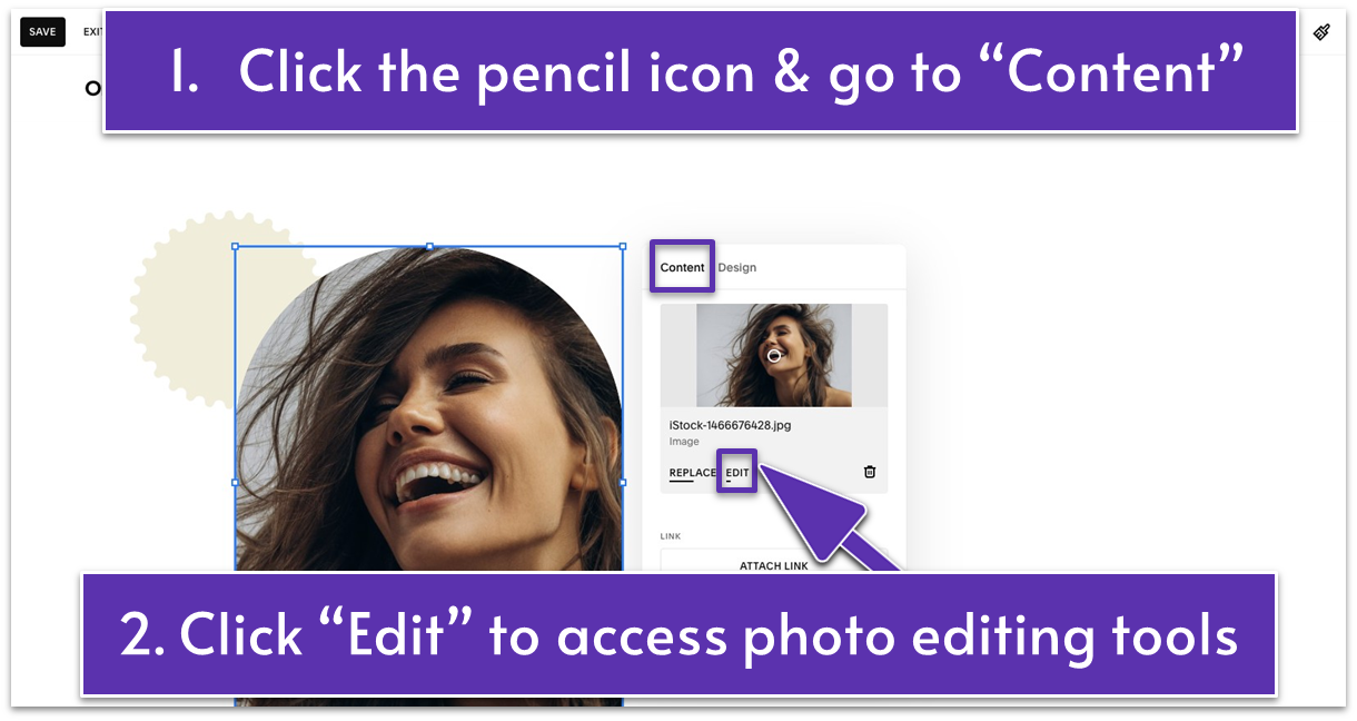
- Click the pencil icon ( ).
- Under the “Content” tab, click “Edit” below the image.
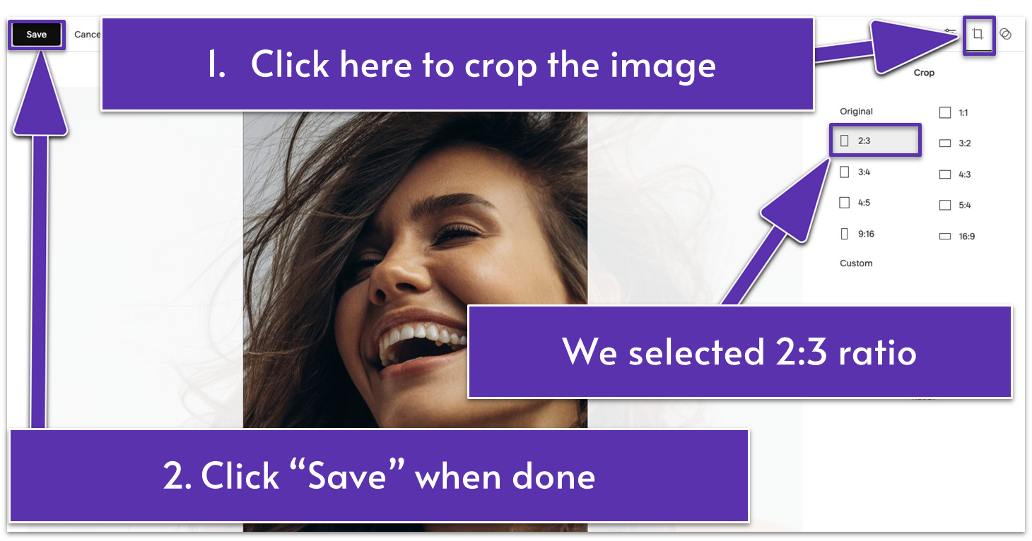
- Click the “Crop” icon ( ) in the upper-right corner. We chose a 2:3 crop ratio to get the best part of the image shown in our introductory section.
- Click the “Save” button in the upper-left corner. Go back to the page editor.
Step 8: Align the shape and the image
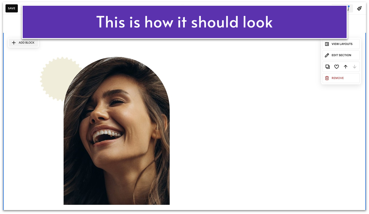
- Drag and resize the elements until you achieve the desired look. In our case, we made the shape smaller and the image bigger. Then we placed them on the left side of the section.
Catch your breath – you’re halfway done with the first section of your About page!
Step 9: Add a text block

- Write “About” in all capital letters. Format it to “Paragraph 2,” and bold the text.
- Below “About,” add a short text reflecting your salon philosophy. For example, we wrote “Elegance should be affordable & fun” as this section’s headline. Format it to “Heading 1.”
- Stretch the text block to cover the left half of the section.
3.3 Add a Button
While your About page needs to highlight your expertise and build trust, a call to action (CTA) encourages your clients to act – in this case, book your services. Without a CTA, interested visitors may leave without taking action. Let’s make sure it’s easy for them to get that appointment – add a clear CTA button like “Book Today” that takes them straight to the booking form on your Contact page.
Step 1: Add a button block
- Go to “Add Block.”
- Select “Button” from the options.
Step 2: Customize the button
- Drag the button below the headline.
- Click the pencil icon ( ).
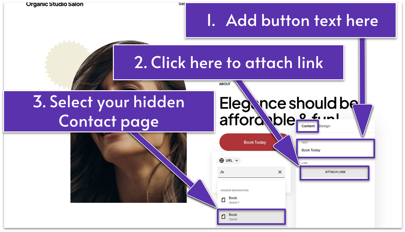
- Under the “Content” tab, add the button text. Ours is “Book Today.”
- Click “Attach Link.”
- Link the button to the “Book” contact page you created in the previous module. Attach a link using one of these methods:
Option 1: Pick a link from the list below the link field.
Option 2: Copy and paste a link in the link field.
Option 3: Type the name of the page you want to link to in the link field. Then select it as soon as it appears in the list below.
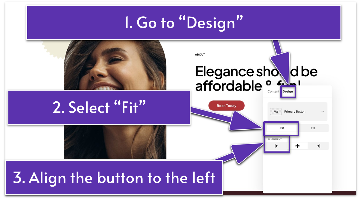
- Go to the “Design” tab and set “Fit” for size. Click ( ) to align the button to the left.
Step 3: Add a section divider
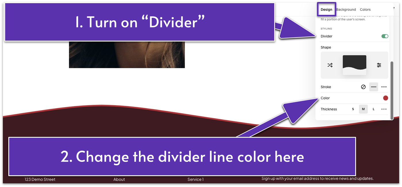
- Go to “Edit Section.”
- Open the “Design” tab. Scroll down to “Styling” and toggle on the “Divider” switch.
- Change the color of the divider line to a light one or as desired. You can move the color slider down to make it more transparent. We set it to the maximum on our website.
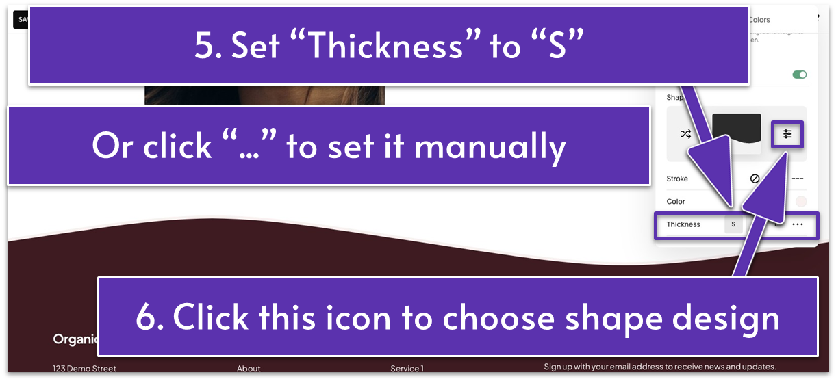
- Set the “Thickness” to “S” (small) or as you prefer. If none of the default options work, click the three dots icon ( ) to adjust it manually.
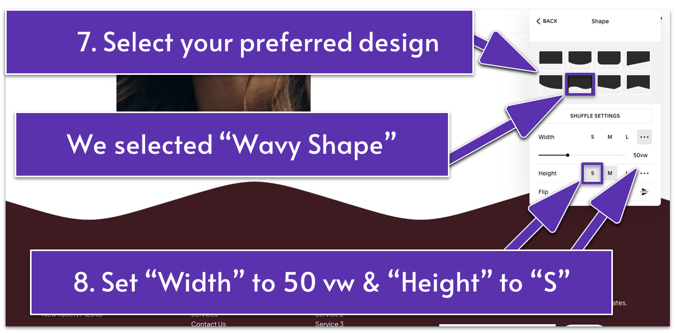
- Click ( ) under “Shape” and select a shape of your choice. We chose “Wavy Shape.”
- Adjust the “Width” of your divider shape. If you want a custom width, click the three dots ( ) menu. We chose a custom width of 50 vw.
Set “Height” to “S” or adjust to your preference.
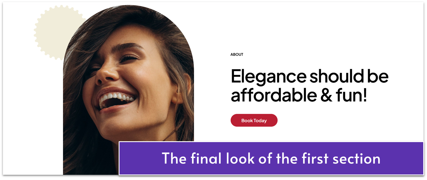
Hooray! The first section of your About page is ready to welcome visitors and clients alike.
Let’s keep the momentum going – moving on to the second section.
3.4 Tell Your Story & Highlight Your Expertise (Second Section)
Focus on building trust in this section. You can include your salon’s story, highlight your expertise, and what sets you apart. Complement your text with compelling visuals to create a warm, welcoming impression.
Step 1: Add a new blank section
Step 2: Add a text block
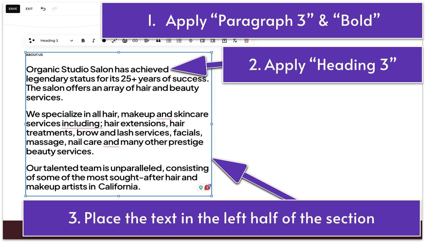
- Stretch the text block to fill the left half of the section.
- Write a section title to indicate what the section is about. We wrote “ABOUT US” in all capital letters. Apply “Paragraph 3” formatting and bold the text.
- Write your bio below the section title. Use Squarespace AI if you need help with this. Make this text a “Heading 3.”
Step 3: Add a video block
- Place the video block on the right half of the section.
- Click the pencil icon ( ).
- Click the “+” sign to add your video.
Step 4: Customize the video
- You can test the video settings under the “Content” tab to see what works best with your video.
We applied the following edits for this example:
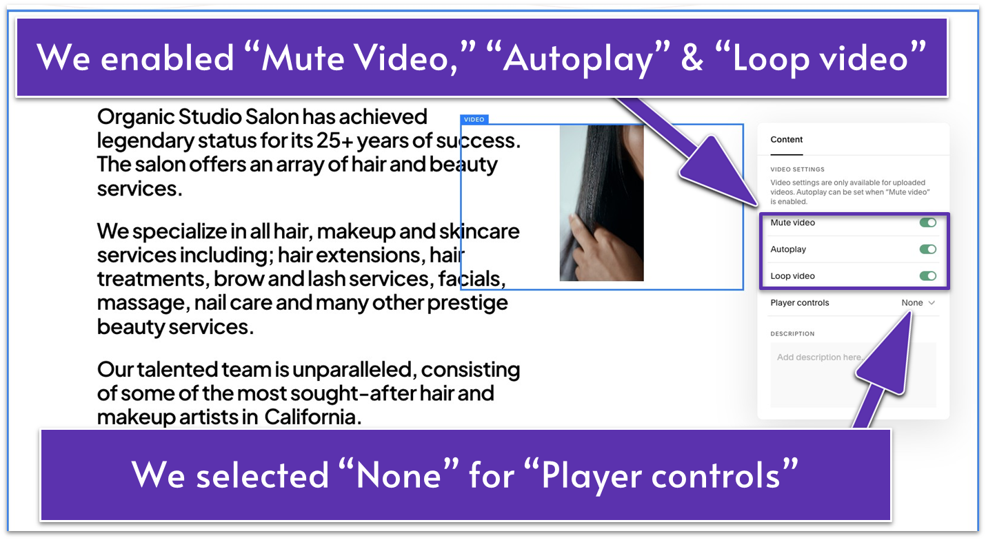
- Enable “Mute Video,” “Autoplay,” and “Loop Video.”
- Select “None” for “Player Controls.”
Step 5: Adjust and align the elements
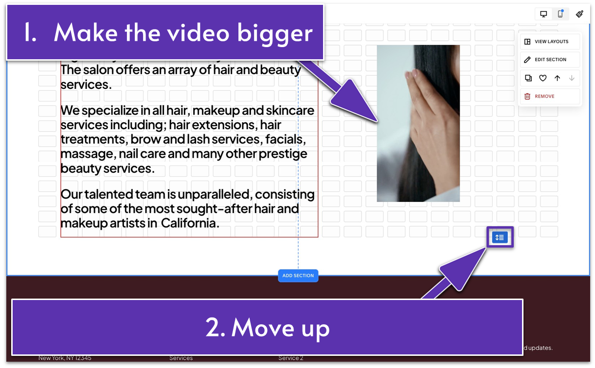
- Make the video block bigger.
- Reduce the height of the text and video blocks to remove the extra white space at the bottom.
- Tighten the section to make it more compact using ( ).
Step 6: Change the section color
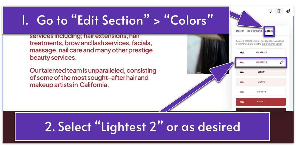
- Go to “Edit Section.”
- Open the “Colors” tab.
- Choose your “Lightest 2” color theme to match our example’s design, or select a theme of your choice. You can skip this step if you don’t want to change your section’s color.
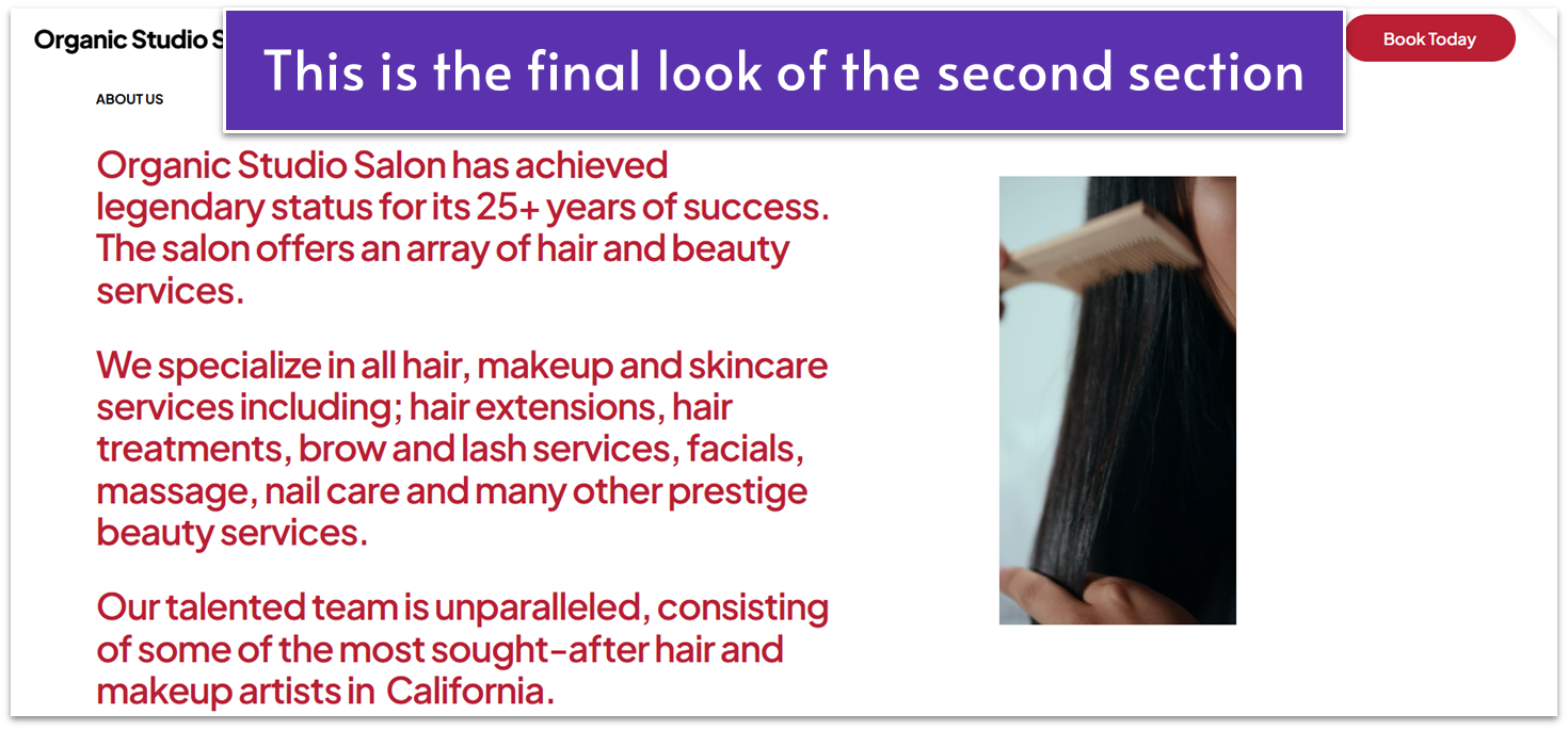
How exciting! You’re one section away from finalizing your About page.
3.5 Emphasize Your Commitment to Quality & Great Service (Third Section)
Highlight the dedication, expertise, and care you bring to every client interaction. You can also emphasize the skill and artistry of your team, the premium products you use, and the personalized approach that sets your salon apart.
Step 1: Add a blank section
Step 2: Add an image block
- Add an image of your choice.
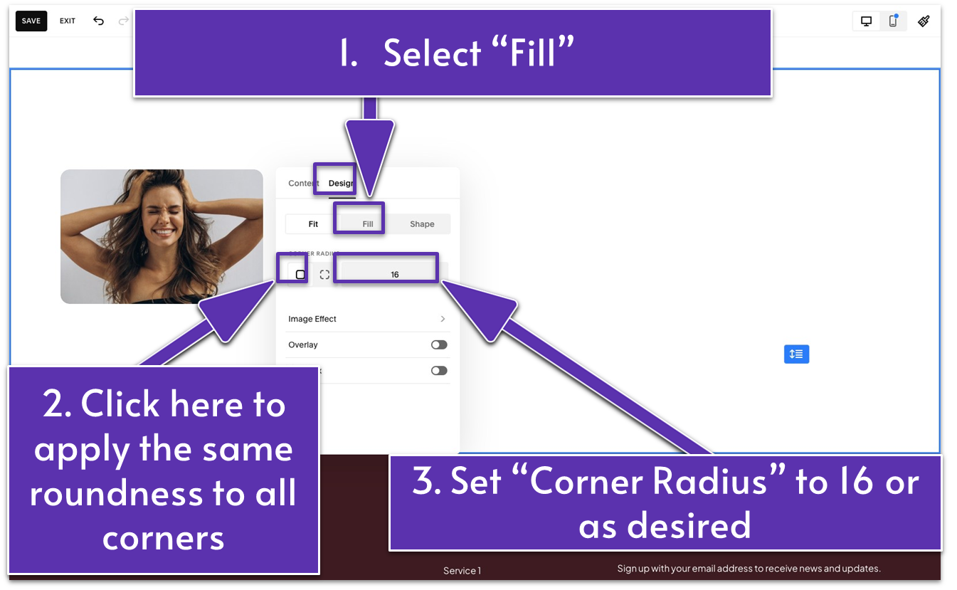
- Click the pencil icon ( ) and go to the “Design” tab.
- Select “Fill.”
- Click on ( ) under “Corner Radius” and set the number to 16 or as you prefer. This will apply the same roundness to all four corners of the image.
Step 3: Duplicate the image block
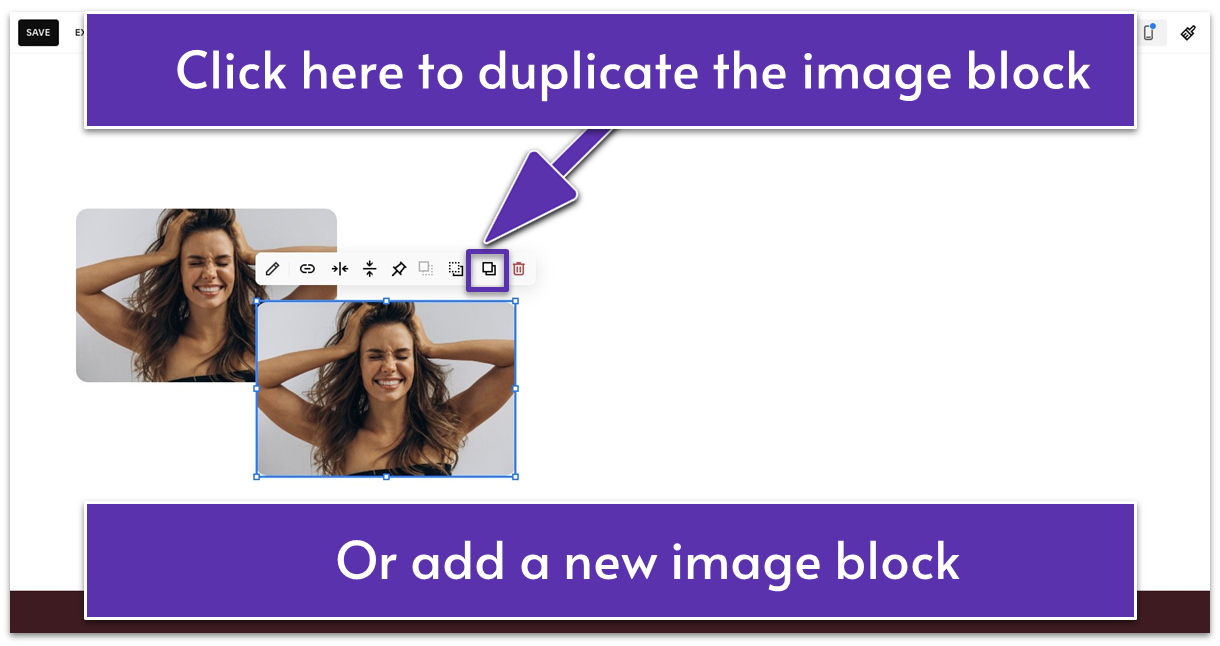
- Click in the block toolbar to duplicate the image block. Alternatively, you can add a new image block.
- Click the pencil icon ( ).
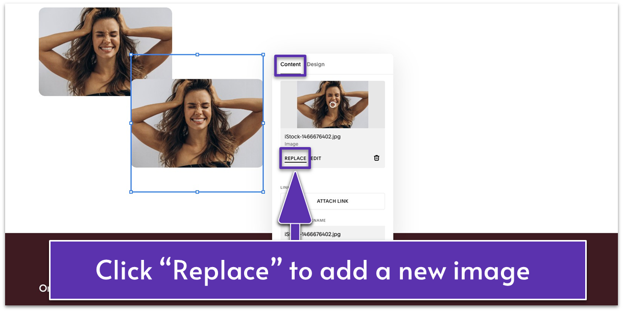
- Under the “Content” tab, just below the image, click “Replace.”
- Upload a new image for this block. It should have the same design settings as the first image.
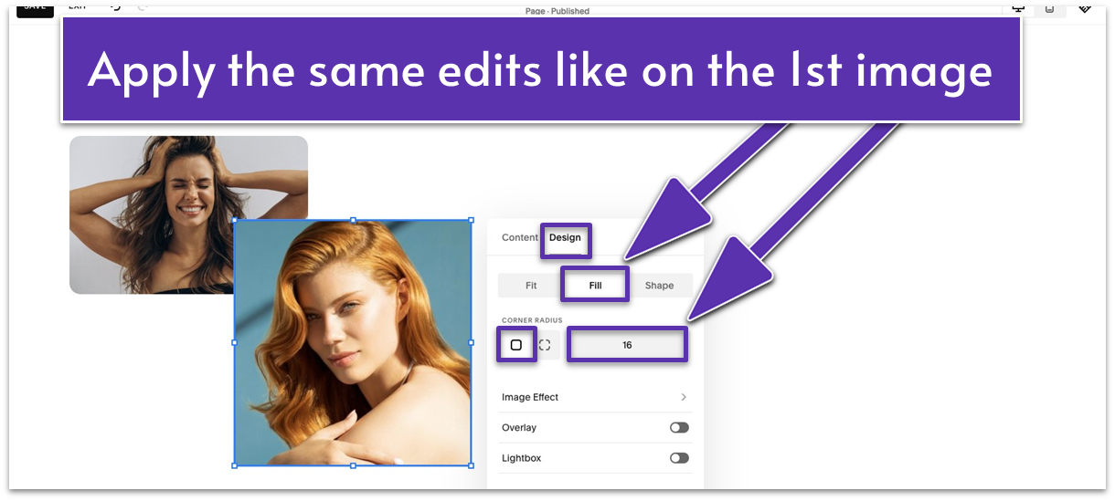
- If you added a new image block, go to the “Design” tab. Apply the same edits as the first image (select “Fill” and set the corner radius).
- Position the image as desired. We moved it to cover the lower right corner of the first image.
Step 4: Add a shape
You’ll use the same shape from the first section. To save yourself from repeating the process:
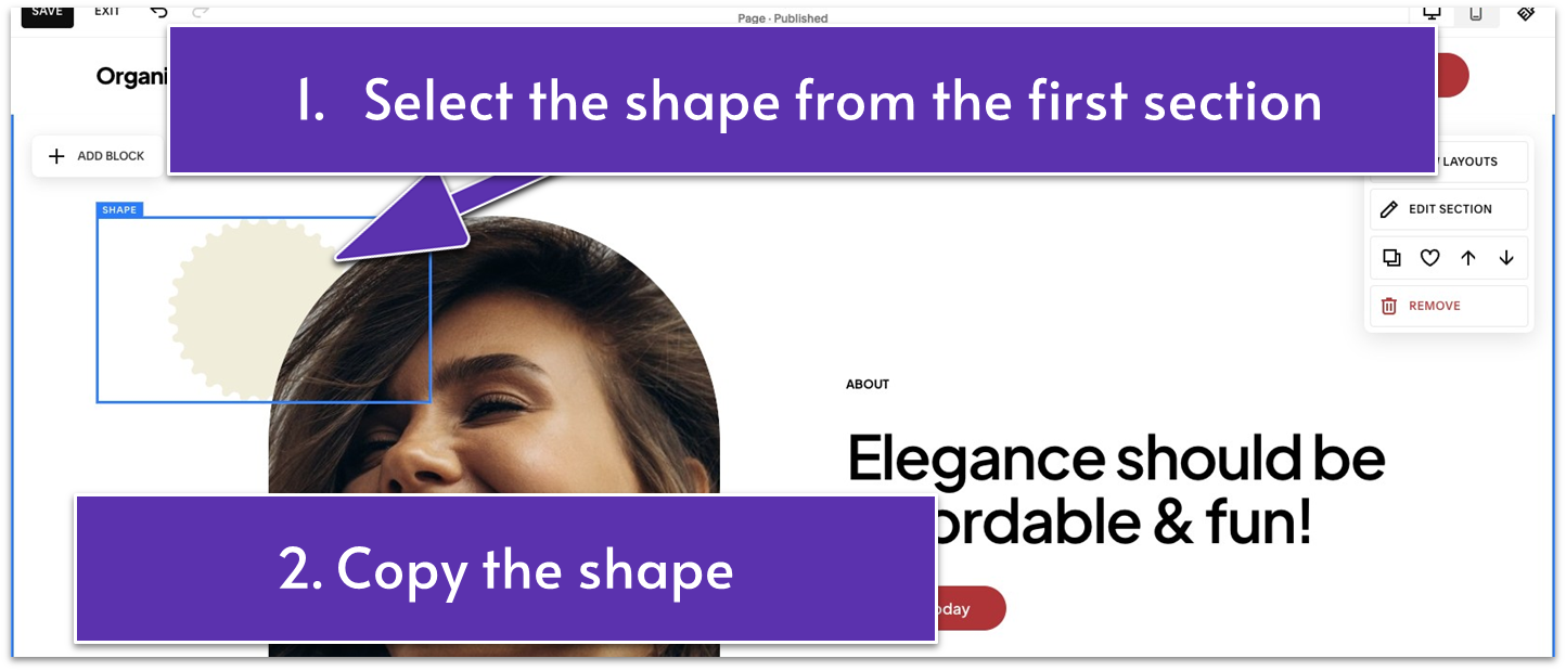
- Go back to the first section.
- Select the shape block. Copy it using Command + C on Mac or Ctrl + C on Windows.
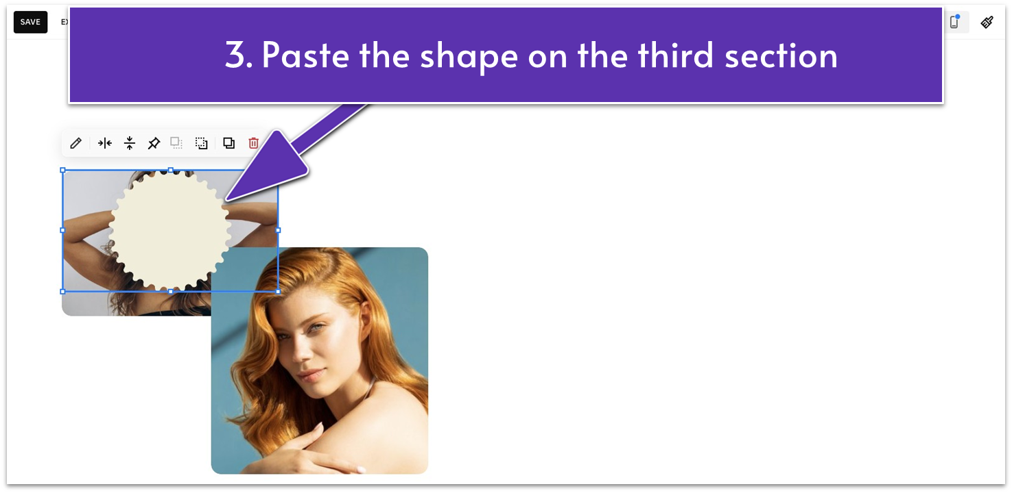
- Go back to the third section. Press Command + V on Mac or Ctrl + V on Windows to paste the shape.
Step 5: Edit the shape
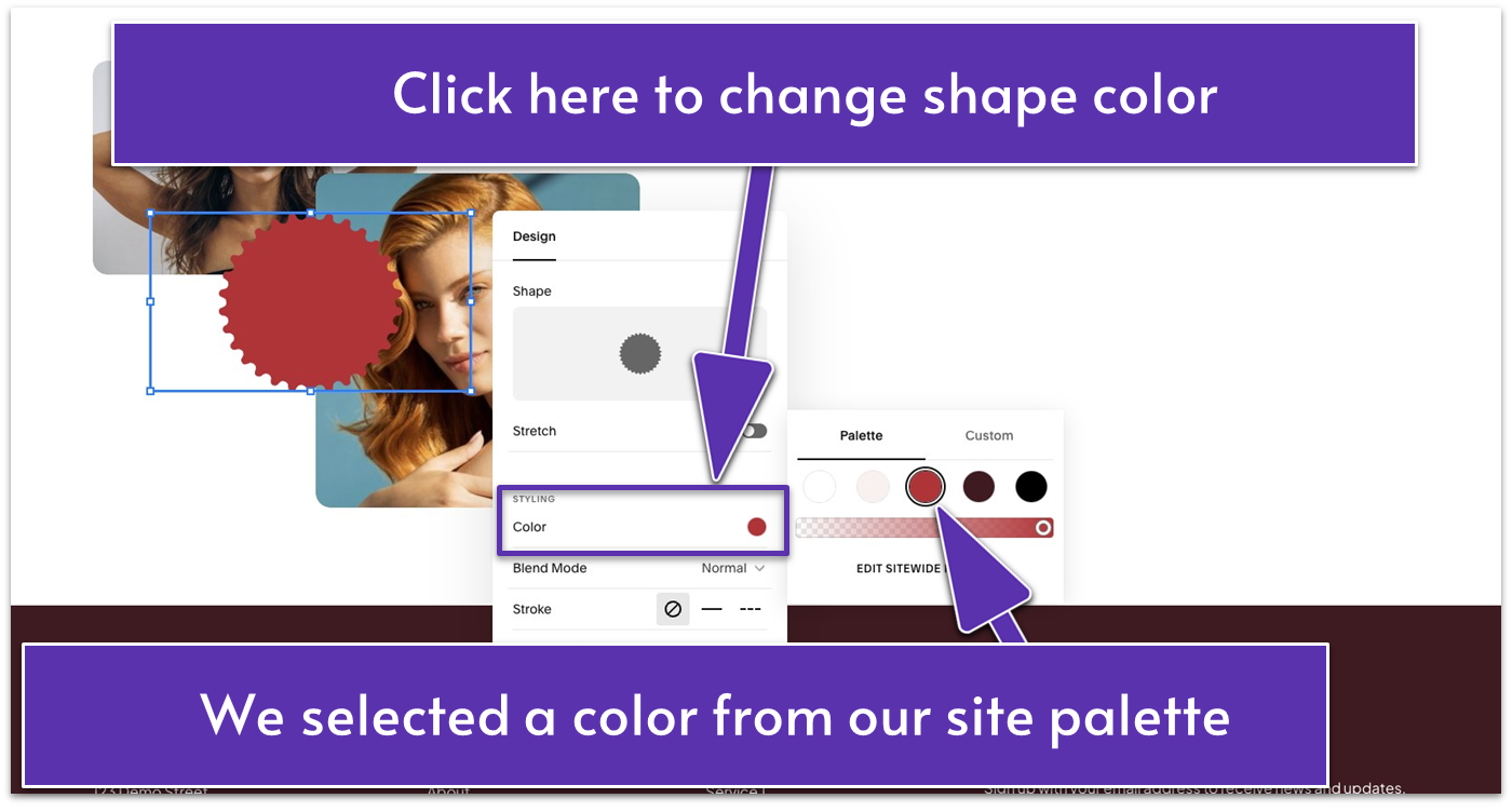
- Click the pencil icon ( ).
- Under the “Design” tab, click “Color” to select the desired color for your shape. We used the red color (#BA1F33) from our site palette.
Step 6: Make adjustments to the section layout
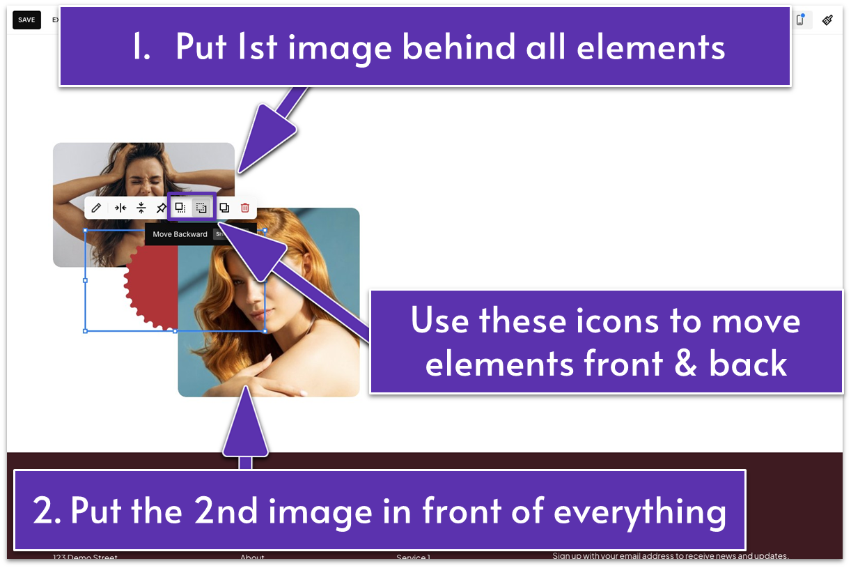
- Place the shape between the two images where they meet.
- Move the first image backward using . It should be behind the shape and the second image.
- Move the second image forward using so it’s in front of the other two elements.
- Select all blocks and make them bigger to fill the left half of the section.
You’re just a few steps away from finalizing the last section of your About page.
Let’s do it!
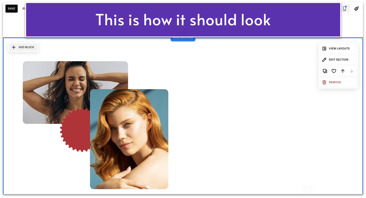
Step 7: Add a text block
- Place the text block to the right half of the section.
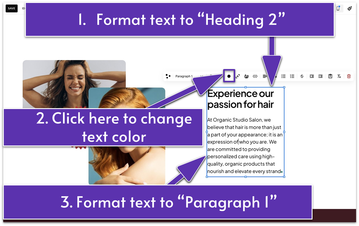
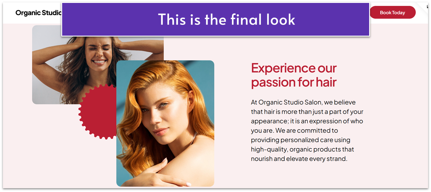
- Type a catchy headline that highlights your expertise and commitment. In our case, we typed “Experience our passion for hair.” Format it to “Heading 2.”
- Add a paragraph below the headline to tell more about the quality of your services. Format it to “Paragraph 1.”
- Click the “Text Color” icon ( ) in the editing toolbar to change the headline’s color. Select a color from your site palette or choose a custom color. We matched the headline’s color to the shape color.
- Stretch the text block to fill the right half of the section.
Step 8: Change your section color
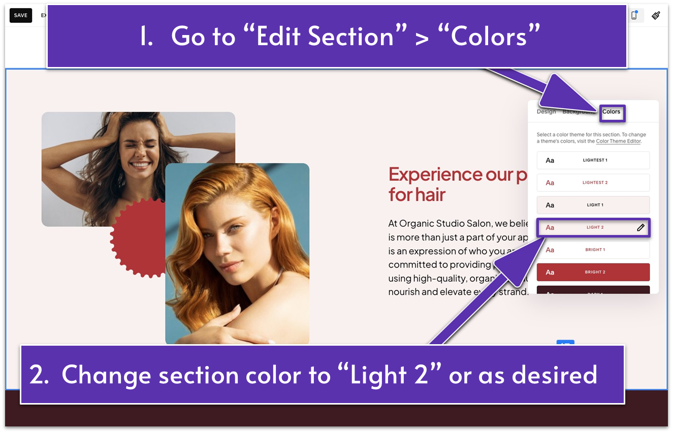
- Go to “Edit Section.”
- Open the “Colors” tab.
- Change the section color to a light color theme or as desired. We chose “Light 2.”
Ta-da! Your About page is all glammed up and ready to charm visitors.
Let’s make sure your mobile visitors have an experience that is as enjoyable as that of your desktop visitors.
3.6 Optimize for Mobile
Some elements might appear slightly off in the mobile preview but don’t worry – optimizing for mobile in Squarespace is easy. We’ll go through the adjustments you need to create a seamless mobile experience.
If your About page has different or fewer elements than what’s shown here, your mobile preview may differ. In this case, you might need to make more or fewer tweaks. However, by the end of this section, you’ll be ready to optimize your page for mobile.
Step 1: Get into “Mobile View”
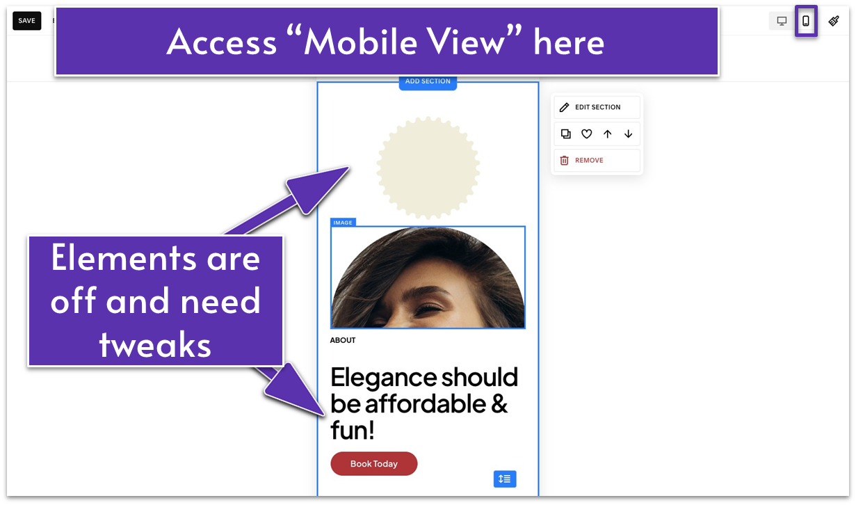
- Click the icon that looks like a mobile device ( ) to open “Mobile View.”
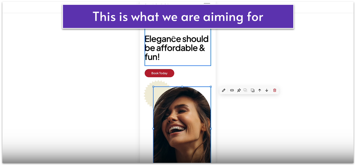
Step 2: Optimize the first section for mobile
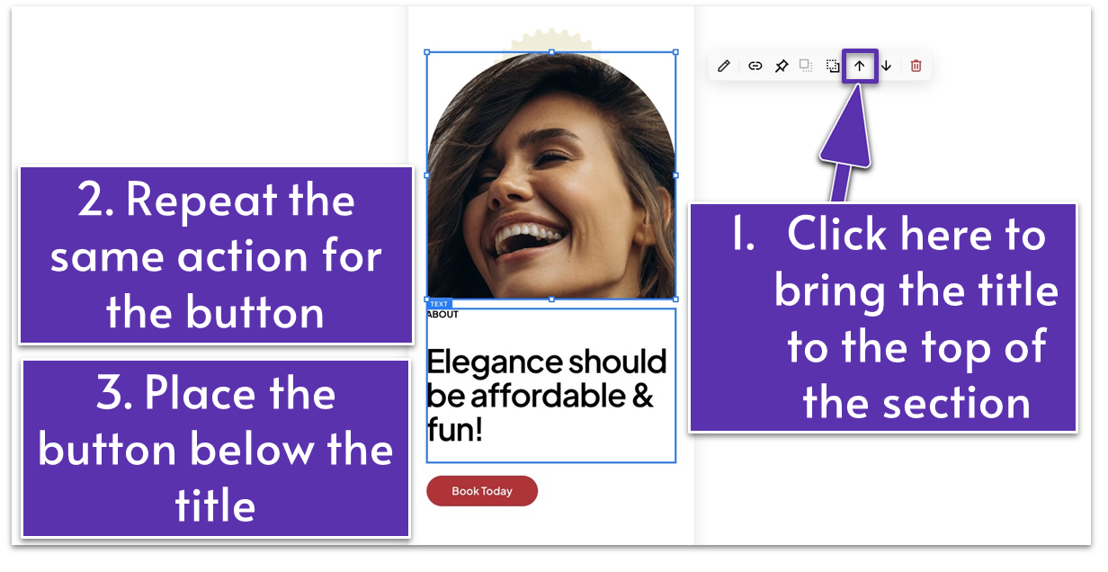
- Move the title and headline up at the beginning of the section by clicking from the block toolbar.
- Move the button up by also clicking . Place the button between the title and the image.
- Make the image taller and thinner. Align it to the right.
- Place the shape below the button. For our website, we tucked the shape’s bottom-right behind the image’s top-left corner.
Step 3: Optimize the second section for mobile
- The only thing we did here was bring the section frame as close to the video as possible by using . Everything else looks good.
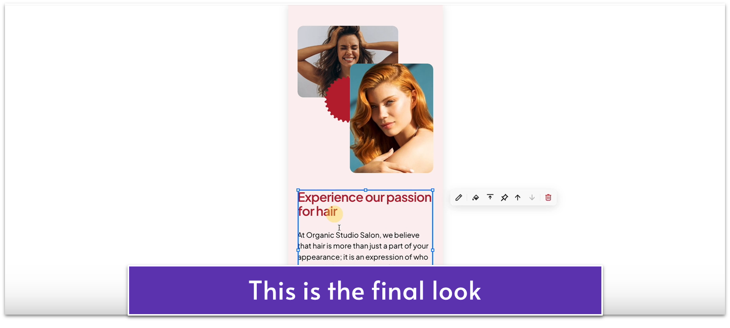
Step 4: Optimize the third section for mobile
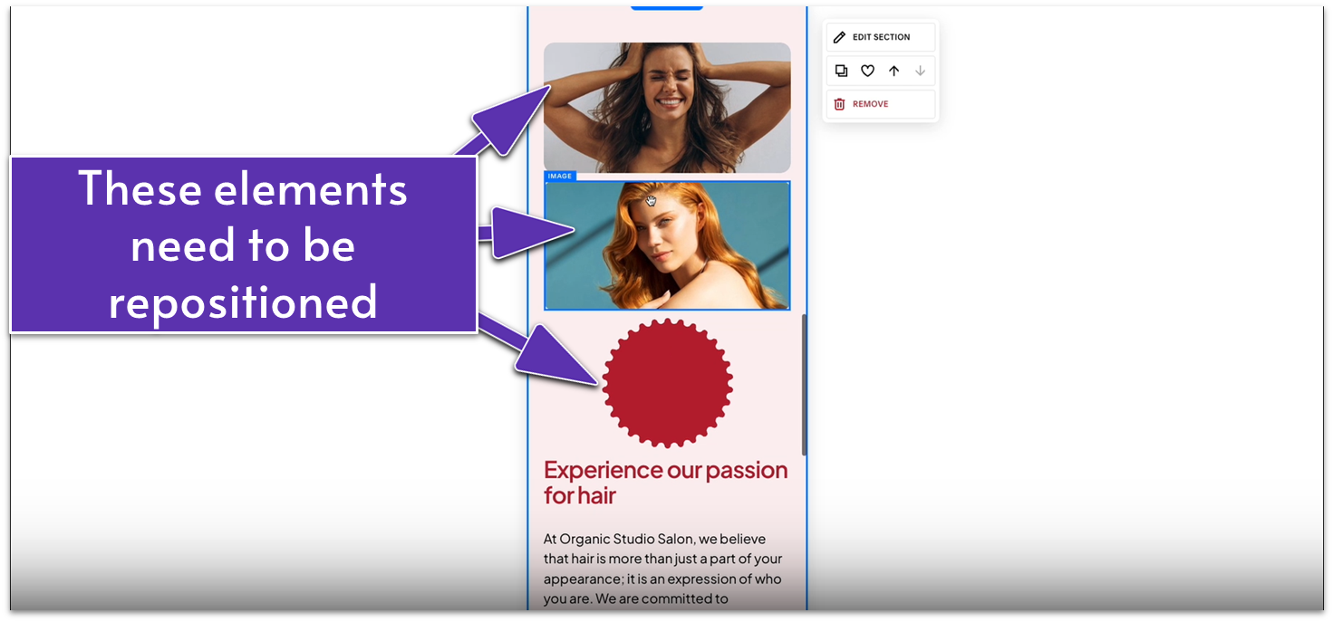
- We resized and repositioned the two images and the shape to match the desktop layout.
- Like in the desktop version, place the first image behind the other two elements using .
- Tuck the shape between the two images, but it should remain visible.
- Put the second image in front of the shape and the first image using .
- Bring the text box higher, just below the second image.
- Drag the grid adjuster ( ) up to tighten the section.
Now that everything has fallen into place, don’t forget to save any sections you anticipate reusing in the future by clicking the icon. Finally, save your work and exit the page.
Your About page is now ready to enchant your visitors!
Take a moment to admire your labor. By this point, you have two fully built pages on your website.
Let’s create your Services page next!
