Inside this Article
The project management software you should use depends on how big your team is. While some software platforms are better suited for smaller teams, there are very few that can work for both.
Having spent a week thoroughly testing both platforms, I found this to be the biggest difference between Wrike and monday.com. While Wrike focuses on larger teams and projects, monday.com is flexible enough to work for almost any kind of team and project.
Though monday.com takes the win for that flexibility – and its advanced project management features – Wrike has some benefits, too. Ultimately, each project management software has a lot to offer, and the one that’s best for your team will come down to your work preferences.
After all, both have powerful automation capabilities, robust mobile apps, and great customer support availability. The biggest difference is that monday.com is a lot easier to use and its pricing is easier to understand.
So, which one is better? It depends, but monday.com has more to offer your team overall. Get started with monday.com for free, or stick around and learn more about how this software’s flexibility can benefit your team.
Features
monday.com Offers Tons of Customization
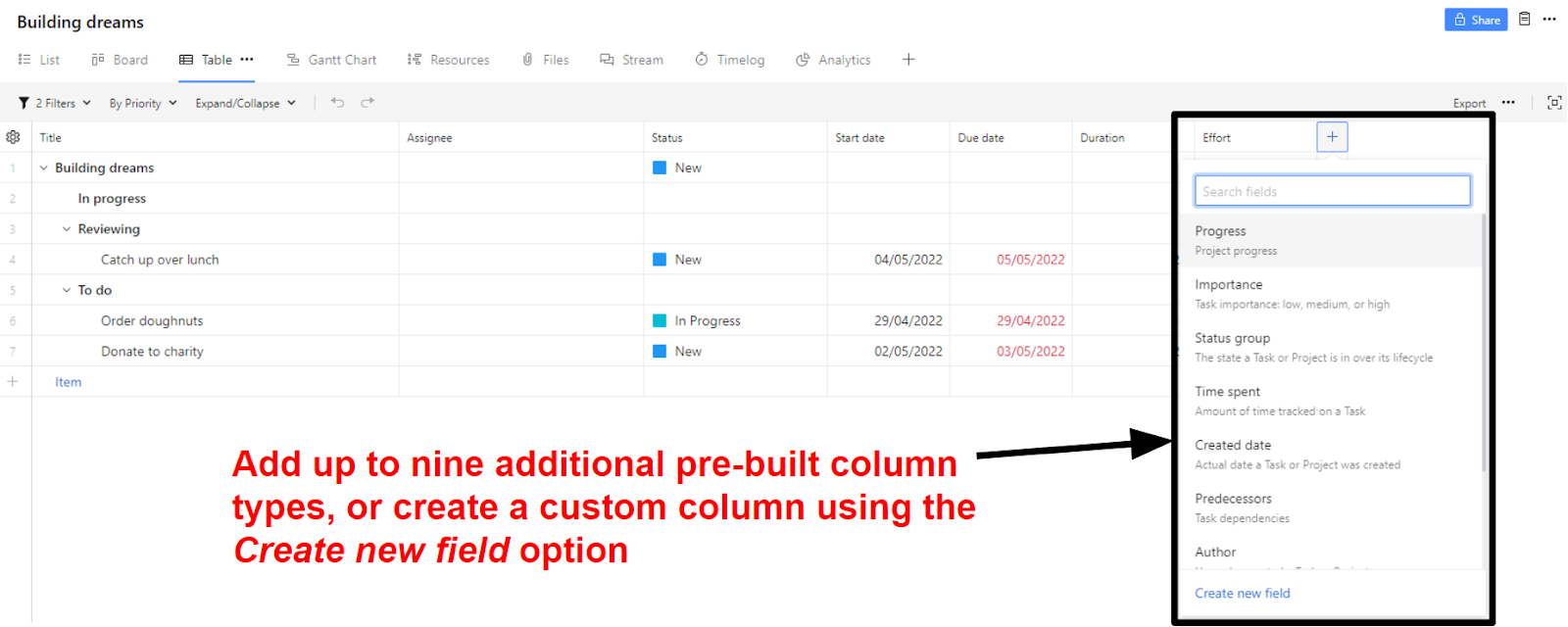
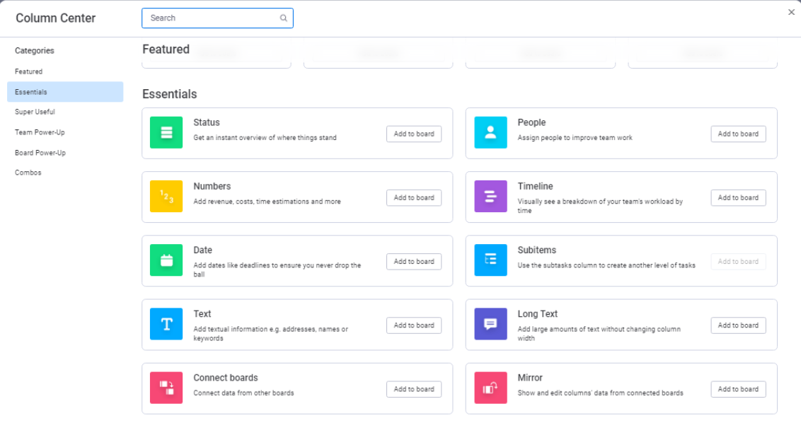
Both Wrike and monday.com offer all the project views you’d expect. You can view your projects as a table, Kanban board, or Gantt chart. Wrike also has a list view and stream view, which is a real-time overview of all project activity. monday.com has a card view (which is similar to Kanban boards, but with more focus on attached files), as well as customizable dashboards.

Ease of Use
See Project Progress at a Glance in monday.com
I know it sounds counterintuitive, but if project management software is built well, you shouldn’t need to spend hours using it every day. For me, this was the biggest difference between Wrike and monday.com – the ability to check my project’s progress immediately. By color-coding everything, monday.com makes it easy to see project status without needing to spend precious time checking every task. By taking away the need for excessive admin time, monday.com allows you to spend more time working on what matters.
Collaboration Tools
monday.com Builds Communities, Not Just Teams
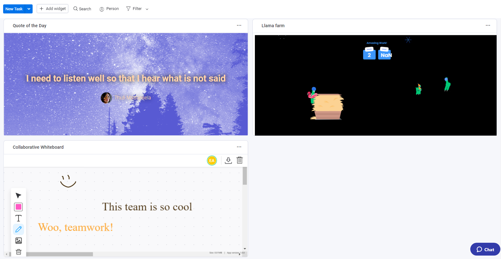
Both platforms have great collaboration features, letting you use @mentions and make real-time comments on tasks to communicate with team members. Both platforms also integrate with popular collaboration tools like Slack and Zoom. That said, monday.com has more collaboration tools available through its customizable dashboards and widgets. When I was testing it out, I set up a dashboard with some fun, motivational widgets in about 5 minutes. The Llama Farm is my favorite, as you get a new animated llama on your screen for every task you complete.
Pricing
Monday.com’s Pricing Is Confusing, but at Least It’s Transparent
Wrike and monday.com both have limited free plans well suited to freelancers and small personal projects. Outside of this, monday.com has three paid plans and a custom Enterprise plan, while Wrike has two paid plans and two Enterprise plans. The two platforms are similarly priced on the surface – but that’s before you take paid add-ons and grouped pricing into account.Here’s What You Get for Free
Wrike’s free plan has 2 GB total storage and five seats, while monday.com’s free plan only gives you two seats and 500 MB of storage per person. Honestly, neither of these plans has a significant lifespan if you’re using them frequently. While the free plans might work well for small personal projects, you’ll struggle to use them to organize larger projects or collaborate with more than one other person.Here’s What You Get If You Pay
On the surface, Wrike and monday.com seem to offer similar features for a similar price. However, when you start comparing what you need to pay for to get the functionality you need, things get a lot more complicated. Both platforms have limited storage, even on their expensive Enterprise plans. It’s not ideal, particularly because monday.com’s storage is limited per account, not per seat. For larger teams, this means that Wrike offers much more storage. With that being said, Wrike isn’t a one-stop project management solution unless you’re willing to pay extra for its many add-ons. You only get 9 integrations included with your Wrike account – even on the most expensive plan – unless you pay the monthly fee for the Wrike Integrate and Wrike Project Syncs add-ons, which together unlock all 160+ integrations. Wrike’s website also doesn’t tell you how much these add-ons cost. You’ll have to get in touch with customer services to find that out, which makes trying to compare costs between different services even trickier. Fortunately, monday.com’s pricing is a lot more transparent. While monday.com only has 40+ integrations and third-party apps, these are all included in the Standard plan and above at no extra cost. Depending on the size of your team, this may be a better deal overall – provided you have the budget for this plan. That said, even if you pay for the Standard plan, you’ll still be limited to 250 integration actions a month. As much as I’ve talked about how monday.com is just as good for small teams as larger ones, its pricing is better suited for businesses with larger budgets. When you pay for a monday.com plan, you can only pay for groups of 5 or 10 seats at a time. (The minimum number of seats you can purchase is 3). This might not be a big deal if you plan to use monday.com across departments – or even the entire business – but it’s not ideal for small teams. If the size of your team falls outside monday.com’s pricing groups, then you’ll have to pay for extra seats, even if they’re never used. With that being said, if you value collaboration and a more laid-back approach to project management, monday.com offers a lot more for your money. The grouped payments are certainly a drawback, but they’re not necessarily a deal-breaker. A lack of transparency means It’s hard to say whether Wrike would work out cheaper. Check out a quick overview of Wrike versus monday.com pricing below.| Wrike | monday.com | |
|---|---|---|
| Starting Price | $9.80 | $9.00 |
| Project templates | 70+ | 200+ |
| Integrations | 9 (or 160+ with paid add-ons) | 0 (40+ on Standard plan and above) |
| Storage | 1 – 2GB per user | 5GB |
| Project views | 3 plus an overall list view and the Stream activity view | 3 plus a dashboard and overall list view |
| Built-in time tracking | No (Business plan and above) | No (Pro plan and above) |
| Customer support | Live chat, email, knowledge base, webinars, courses, community support | 24/7 email support, daily webinars, knowledge base, tutorial videos, training templates |
Support
monday.com’s Support Team Has Your Back
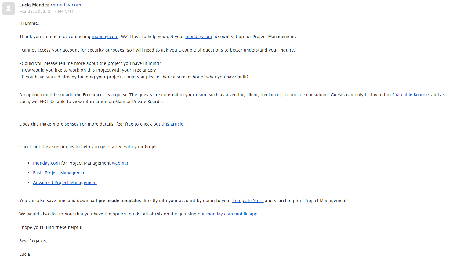
Both monday.com and Wrike have comprehensive knowledge bases, email support, and webinars to help you get acquainted with their software. On top of this, Wrike offers guided courses and a community forum, while monday.com has video tutorials and training templates to demonstrate how to use the platform. Crucially, monday.com offers 24/7 support through its email channel. Wrike has both email and live chat support channels, but neither are available 24/7. Figuring out how to access email support with Wrike is frustrating. Clicking the question mark icon in the top right corner of your dashboard brings up the assistant, which is (unexpectedly) a menu with quick links, and not a chatbot as you might expect. However, there’s no quick link for customer support. It’s also not clear when Wrike’s customer support teams are actually available. You’ll have to click Learning hub > Help and Resources > Help Center just to bring up the knowledge base. To open email support, you’ll then have to go to Submit a request. Despite the frustrating lead-up, I received a response from Wrike in just over 2 hours.

monday.com is a better all-rounder in 2025
If you value flexibility, go with monday.com. Freelancers, small teams, and large departments can all benefit from the wide range of tools and customization that this platform offers. Plus, the ability to see all the information you need at a glance means you can spend more time working on what matters – and not on administrative tasks. With that being said, Wrike is still a great choice for corporate teams. While it isn’t as customizable as monday.com, its onboarding service helps new hires get up to speed quickly. Here are the key things you need to know about Wrike vs monday.com.Wrike
monday.com
Features
Stream view to see project activity in real time, but limited customization
Customizable dashboard views and project fields to suit almost every project type
Ease of Use
Great onboarding process, but has a plain UI that makes scanning project progress difficult
Color-coded and highly visual project management that makes it easy to see information at a glance
Collaboration Tools
Basic collaboration features; requires third-party integration for full communication
Basic collaboration features, but has helpful widgets that make collaboration easy and fun
Pricing
Confusing pricing with certain core features locked behind paid add-ons
Transparent, reasonable pricing, but charges for a minimum number of seats
Support
Live chat, email, knowledge base, webinars, courses, community support
24/7 email support, daily webinars, knowledge base, tutorial videos, training templates


![10 Best Project Management Software for Architects [2025 Update]](https://dt2sdf0db8zob.cloudfront.net/wp-content/uploads/2024/10/Best-Project-Management-Software-for-Architects-1-1.png)
![10 Best Project Management Software for Architects [2025 Update]](https://dt2sdf0db8zob.cloudfront.net/wp-content/uploads/2023/02/IvanaShteriova_photo__1_transparent-150x150.png)


![10 Best Free Management Software for SMEs [2025 Update]](https://dt2sdf0db8zob.cloudfront.net/wp-content/uploads/2024/08/Best-Free-Construction-Project-Management-Software-1724307509.png)
![10 Best Free Management Software for SMEs [2025 Update]](https://dt2sdf0db8zob.cloudfront.net/wp-content/uploads/2020/09/1.jpg)
![10 Best Free Construction Project Management Software [2025]](https://dt2sdf0db8zob.cloudfront.net/wp-content/uploads/2024/03/image1-removebg-preview-150x150.png)


![6 Best Project Management Software for Mac [FREE in 2025]](https://dt2sdf0db8zob.cloudfront.net/wp-content/uploads/2024/06/6-Best-Project-Management-Software-for-Mac-850x445.png)


