Inside this Article
#1. Project Consultant#2. Graffiti Artist#3. Yoga Instructor #4. City Hostel #5. Plant Boutique #6. Family Photographer #7. Vintage Car Garage#8. Graphic Designer#9. Brow Bar #10. Mexican Restaurant #11. Shoe Store Wix Templates that Didn’t Make the CutA Couple of Versatile Squarespace Templates to ConsiderAll-Rounder Website Templates: Looks Can Be DeceivingFAQ
#1. Project Consultant
Modern, clean, and professional, the Project Consultant template helps you highlight what you bring to the table. Pairing a bold forest green background with sharp white text, this template comes with everything you need for an effective personal website. It has clearly delineated sections for highlighting your skills, previous projects, and customer testimonials. Although it’s aimed at (you guessed it) project consultants, it would work well for almost any kind of consulting or coaching website. Simply adding a gallery would turn it into a fantastic portfolio template as well (you can find more of those right here).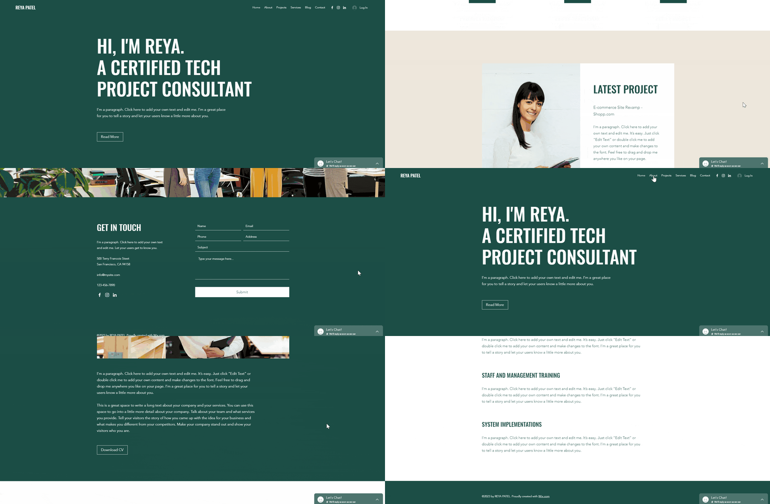
#2. Graffiti Artist
This quirky, image-driven template is sure to grab visitors’ attention with its striking black-and-white color palette and modern design. The background video, portfolio section and parallax scrolling effect make it a great template for photographers, artists and other creatives – or anyone who wants a visually appealing website to highlight examples of their work. (Want to see more Wix templates for photography? Check them out!) And if you want to start selling from your website, you could easily add a Wix Stores page to take your online presence to the next level.
#3. Yoga Instructor
With its eye-catching full-width images, clean white spaces, and parallax scrolling effect, the Yoga Instructor template is the perfect way to attract new clients. Although it’s designed for fitness instructors, it would work well for any kind of website that needs appointment-booking and price-list functionalities, both of which come built in. Just replace the yoga photos with your own images and you’ll be up and running in no time. Pro tip: if you remove the appointment booking sections, Yoga Instructor would be an amazing template for a health and wellness blog! (Find more of those here.)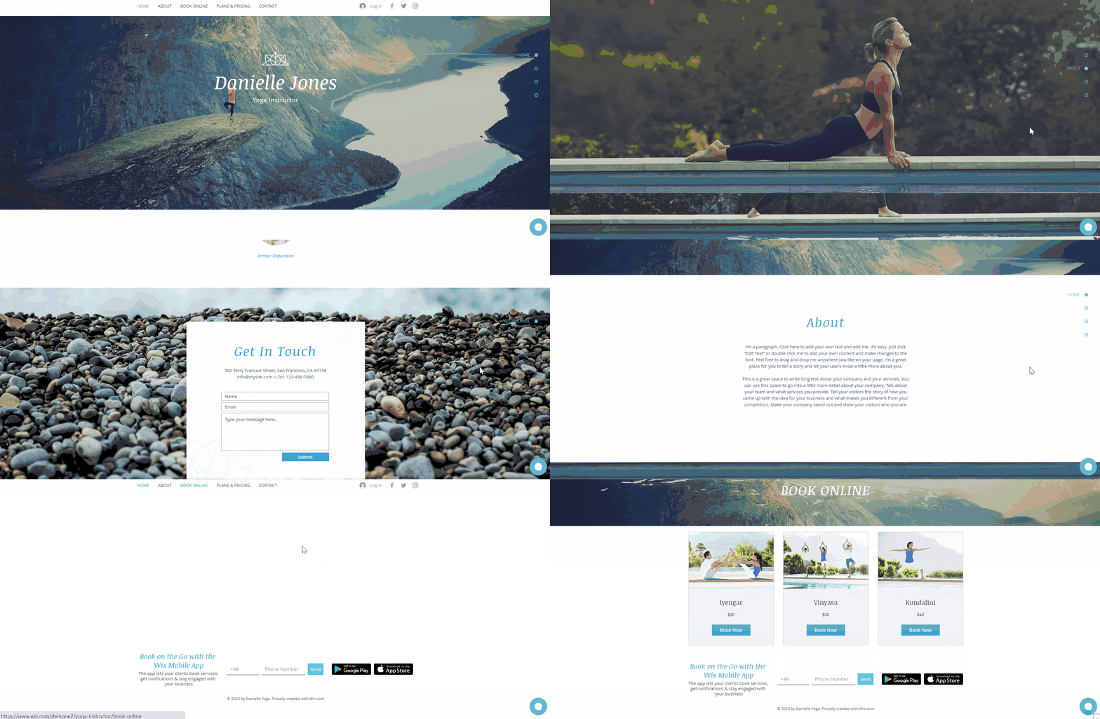

Short on time?
Take this one-minute quiz to learn which website builders are best for your project.
#4. City Hostel
I can’t put my finger on exactly why – it might be the photo carousel, or the quirky red, white, and black color palette – but this template just feels fun and inviting. It’s designed for a city hostel, with built-in sections for booking rooms and highlighting amenities, but it could easily be adapted to other types of service websites as well. If you’re looking for a unique template with a warm feel, City Hostel is for you. Of all of the Wix templates for hotels and travel websites, it’s definitely my favorite – but you can find some more great options over here.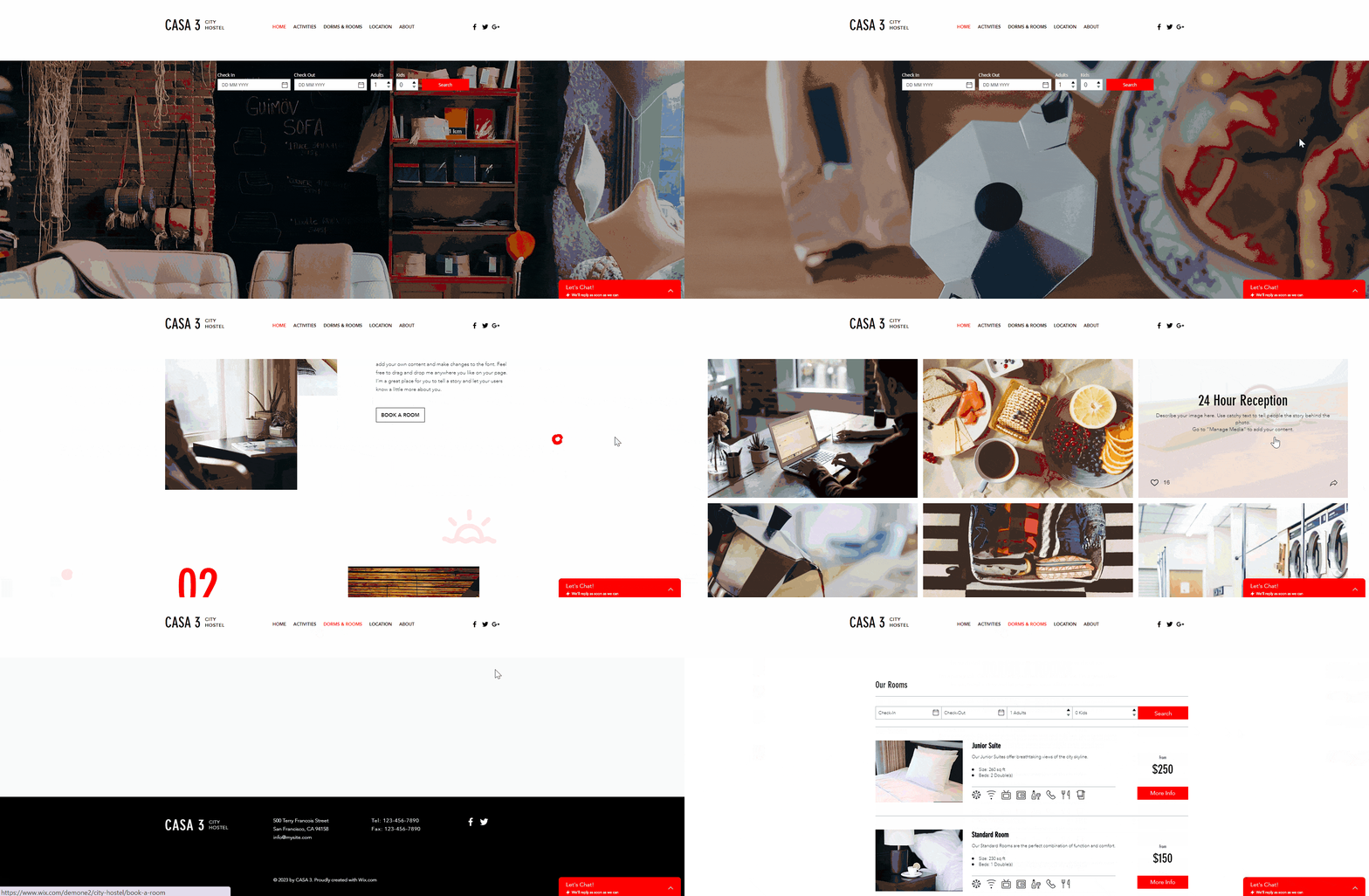
#5. Plant Boutique
Minimalism is so in right now… and Wix’s Plant Boutique template does it exactly right. This fresh, vibrant template pairs a natural color palette with a stripped-down layout that lets the content do the talking. Selling plants is a pretty niche enterprise, but this template can quickly be adapted for any online store if minimalist design is what makes your heart sing. Just update the images, add your own contact details and FAQs, and you’re good to go.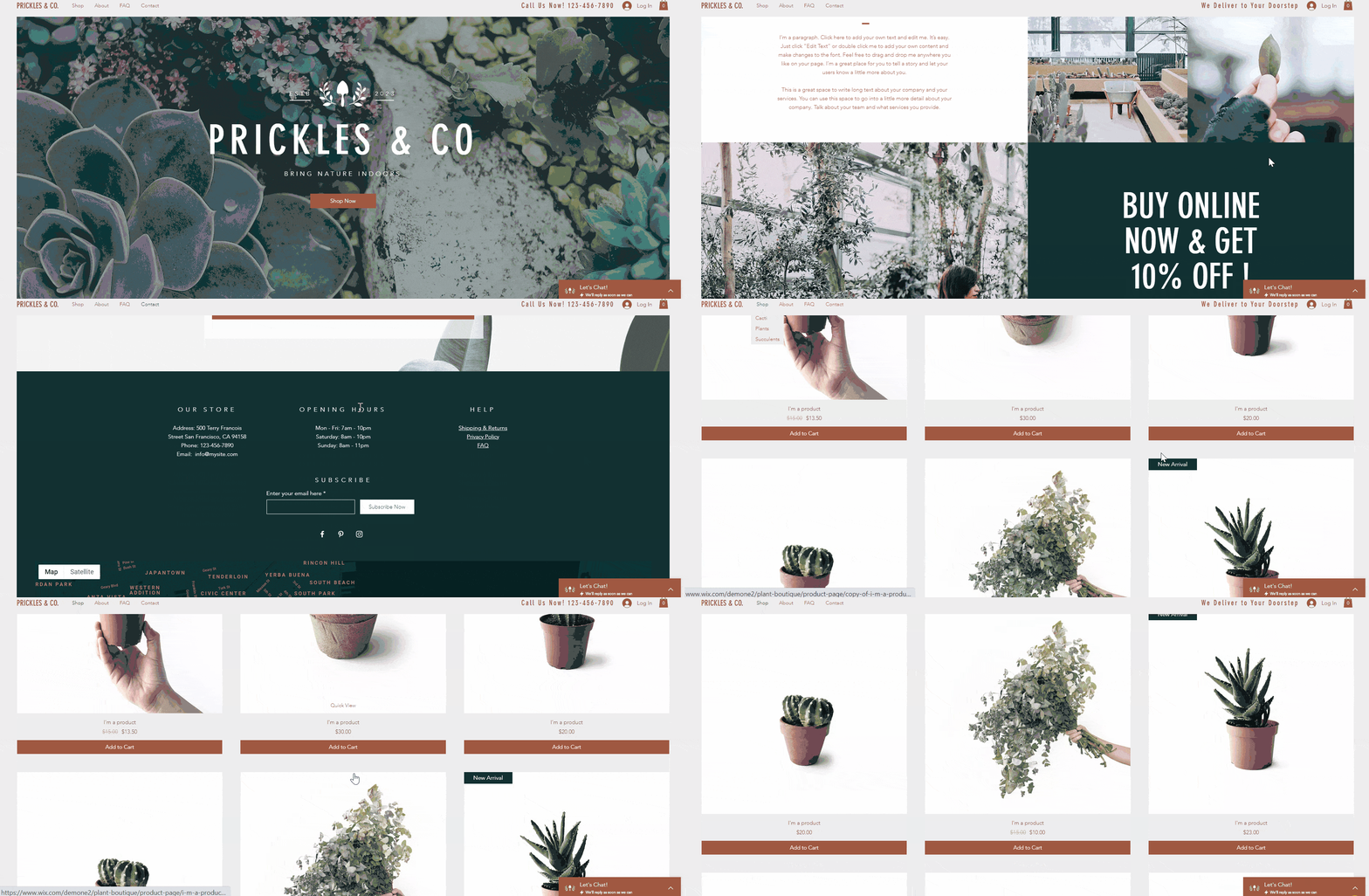
#6. Family Photographer
This is another template that’s heavy on the visuals. Part portfolio, part booking platform, Family Photographer is a minimalist template that’s perfect for impressing potential clients with images of your work – whether you’re a photographer, hairdresser, caterer, or beautician. The simple background and elegant fonts allow your work to take center stage, and with Wix Bookings built into the template, booking your services will be a breeze for customers.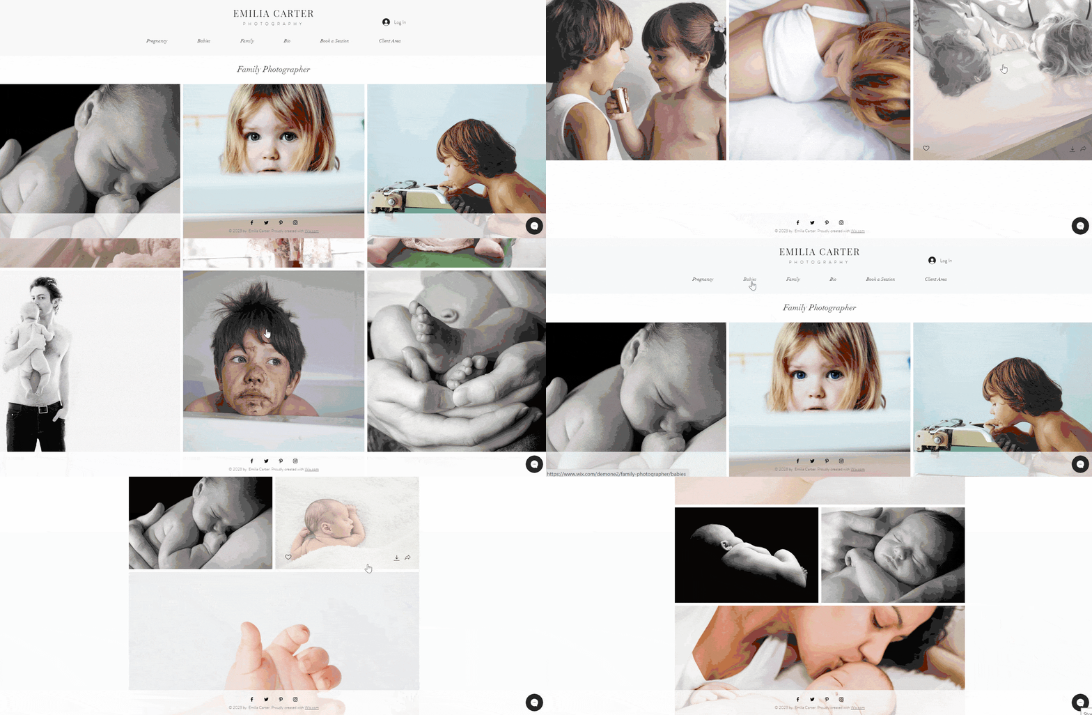
#7. Vintage Car Garage
Although it’s designed for vintage car dealerships, Vintage Car Garage will appeal to anyone looking for a sleek, polished website with classic colors. I personally love the eye-catching black menu bar and bold, contrasting homepage segments. This template also has plenty of space for showcasing your products or services, with a dedicated gallery portfolio section, contact forms, and online booking functionality.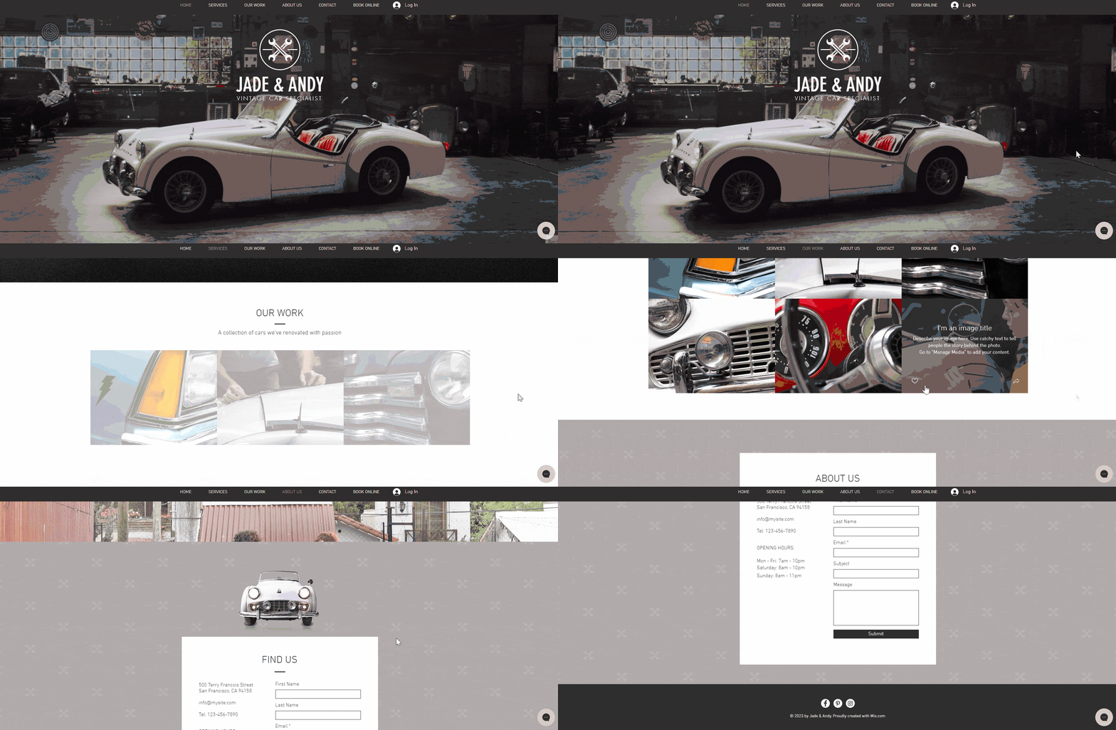
#8. Graphic Designer
Bright, bold and funky, the Graphic Designer template is ideal for cutting-edge designers, artists and photographers – or anyone looking for a personal website template that’s heavy on the visuals and clean lines. This template really stands out with its circular grid gallery and bottom-orientated menu bar. It also features About, Contact, and Booking pages, which will come in handy no matter what kind of website you’re building. It even has a blog section built in to attract visitors to your site.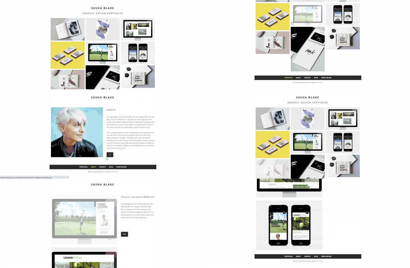
#9. Brow Bar
A website specializing in eyebrow shaping is just about as niche as it gets – but don’t count this template out just yet! Its bright, modern color palette, paired with eye-catching visuals and offbeat layouts, make Brow Bar ideal for creating a stylish website with a unique brand identity. Whether you’re a restaurant owner, travel blogger or graphic designer, Brow Bar can help you tell your story. The Treatments page and booking function can be easily adapted to suit any kind of service website, and social media integrations come built in.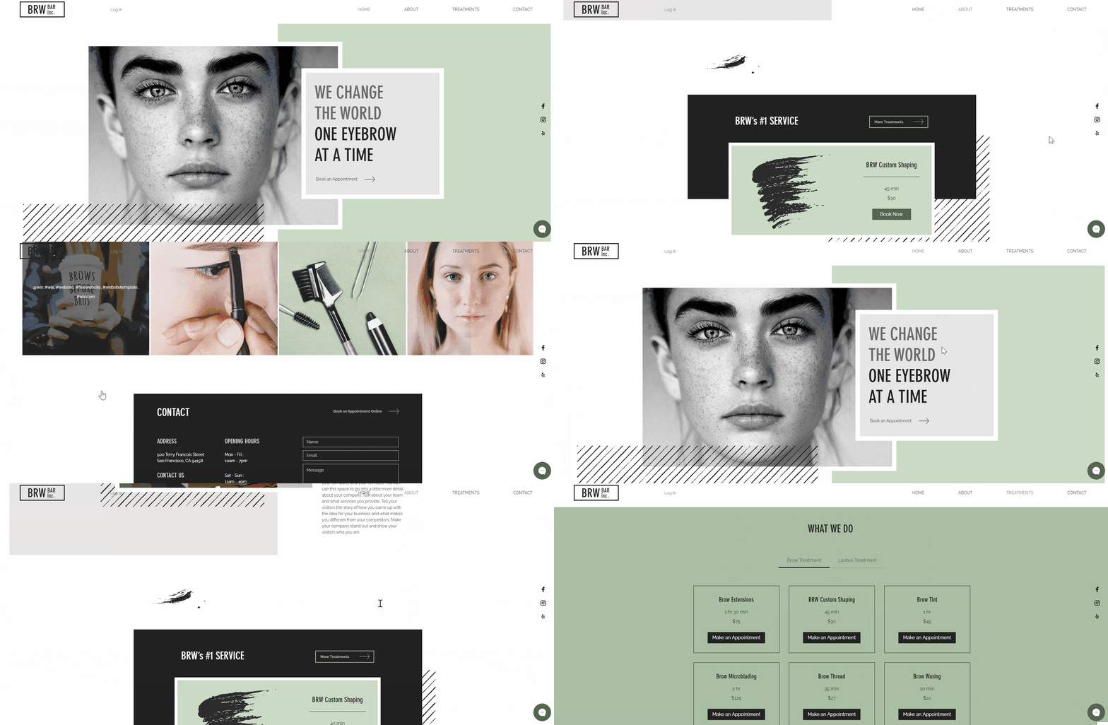
#10. Mexican Restaurant
The most versatile of all the restaurant templates on Wix, Mexican Restaurant pairs a warm color palette with eye-catching photography. This template has a cozy feeling that would suit any family restaurant – or any family business, for that matter. (Check out some of the other great template options Wix has for restaurants!) With menu, photo-gallery, reservation, and online-order features built in, it comes with everything a restaurant owner could ever want from a website – and with a few customizations, it could work just as well for any business that needs a price list and a booking function.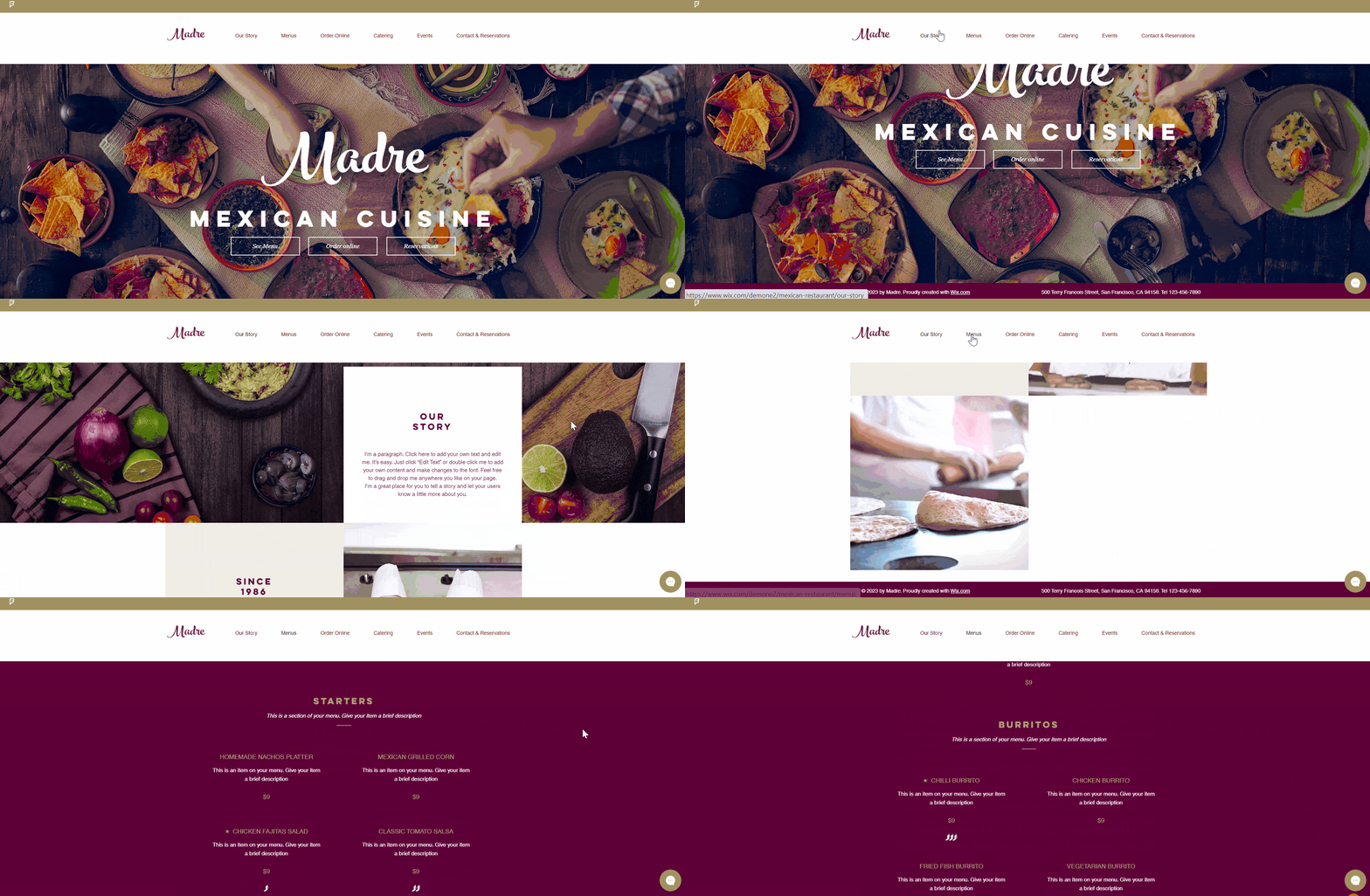
#11. Shoe Store
This crisp, sophisticated, and minimalist template will help you put your products front and center. It emphasizes your visuals while giving you ample space to tell your brand’s story – whether that’s about shoes, jewelry, soap, or anything else that sparks your passion. Shoe Store’s neutral color palette, minimal text and streamlined hamburger menu (the ubiquitous ‘three-lines’ icon) all help keep your visitors focused on your products. With New collection and Sale pages built in, this is the ideal template for online stores with smaller product ranges.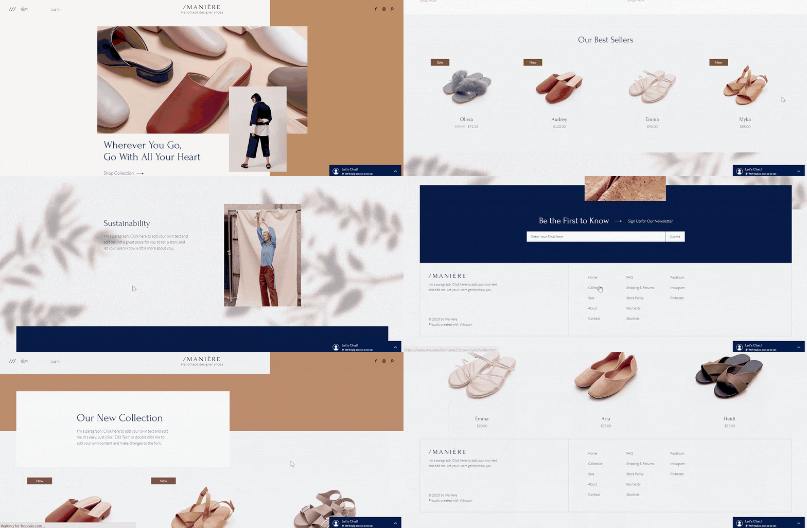
Wix Templates that Didn’t Make the Cut
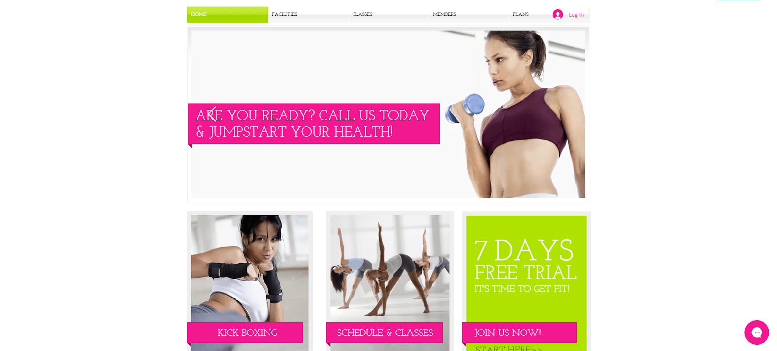
Okay, it’s confession time. Earlier, I said that Wix templates are so customizable that they can be adapted to almost any use. Well, 95% of the time that’s true, but there are a couple of templates you should steer away from unless you’re making exactly that type of website. Here’s three that are just too specific for their own good. First up is Climate Change Conference (niche, I know!). This busy template is packed full of content, but the Speakers, Agenda and Updates pages aren’t going to be much use unless you’re creating a website for a conference or other event with speakers – not much versatility there! Plus, the blue and red color palette is just icky. The same can be said for Live Stream Music Event which, if possible, is even more niche than Climate Change Conference. The simple brick red, orange, and black color palette is attractive enough, but the template is far too simple. With only a calendar reminder and some social buttons built in, it’s not really flexible enough to be adapted to other kinds of websites.
A Couple of Versatile Squarespace Templates to Consider
As the old saying goes, you get what you pay for. While you can use my top 11 templates (and all 900+ Wix templates) for free, I did want to branch out and highlight a couple of Squarespace templates that might be worth paying extra for. Like Wix, Squarespace pairs powerful functionality with great designs. But unlike Wix, their 60+ templates are all automatically mobile-responsive. That means you don’t have to fiddle around with a dedicated mobile editor – and your website will always look good, no matter what kind of device your visitors are browsing on. If that sounds like your cup of tea, read on to discover two of my favorite Squarespace templates.Hester
Hester is a brand-new, shiny template that Squarespace rolled out with its 7.1 update, which gave all templates the same feature and design options. This makes all 7.1 templates super customizable and versatile, and Hester is no exception. You could transform it in almost any way imaginable, with a blog, events, portfolios, a store, bookings, price lists – you name it. With its bold color blocks, call-to-action buttons, and striking fonts, Hester is one of the most eye-catching and aesthetically pleasing templates you’re likely to come across on any website builder.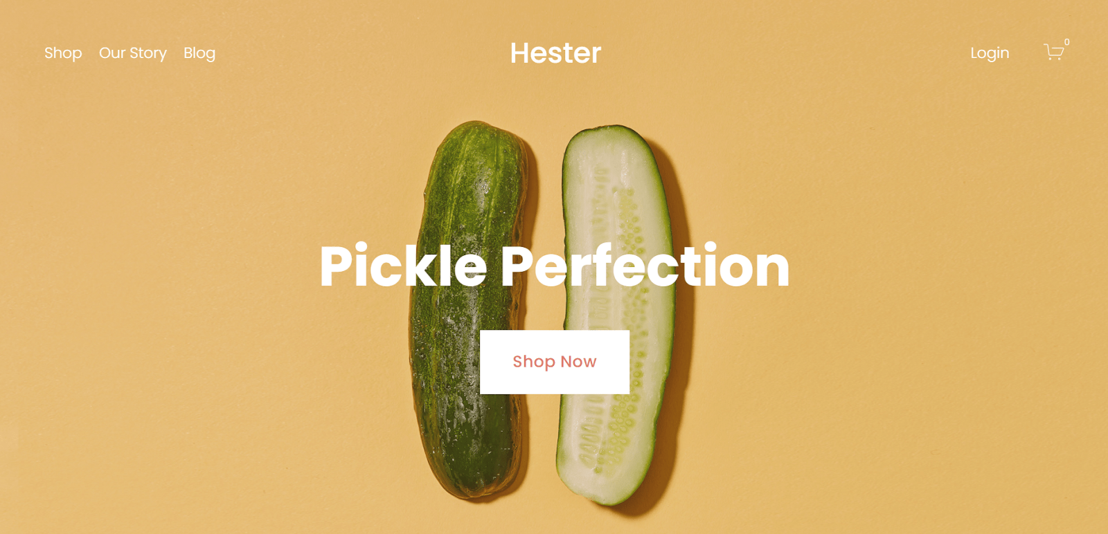
Almar
Almar is also a 7.1 template, meaning it too can be adapted to many different types of websites. It features a simple yet bold design with large image headers and text snippets. And it’s packed full of features, including newsletter signups, a blog, an awards list, appointment booking, and a membership function. Want proof of how versatile it is? Just look at its categorization: Almar is included in the Online Store, Blog, Health & Beauty, Personal & CV, and Professional Services categories. Enough said.


