According to the World Health Organization (WHO), 16% of the world’s population lives with some form of disability – that’s approximately 1 in 6 people. While accessibility has become interwoven with good user experience (UX) design, there are often many issues remaining that most website owners and managers simply don’t know about.
If your site isn’t accessible, it prevents many users from fully engaging with your content, products, or services. And that’s neither fair nor sustainable. It’s not just an inconvenience; it’s a barrier that can significantly impact how people see your brand.
Furthermore, excluding users with disabilities isn’t just unfair; it can also be a liability. In some countries, failure to meet accessibility standards may result in legal action. Depending on where your business operates, you may be legally required to provide equal access to everyone who visits your site.
Despite the seemingly endless streams of acronyms for standards and various legal acts, creating an accessible website is easier than you might think. I’ll give you valuable tips and guide you through the changes necessary to ensure your site is accessible to all. Read on for all the details.
What is Website Accessibility?
In short, websites are accessible when they can be navigated and understood by everyone, regardless of a user’s ability level. For the most part, this means making sure users with disabilities can access the same digital resources and services as everyone else.
The web’s governing body, the Worldwide Web Consortium (W3C), sets the global standard through the Web Content Accessibility Guidelines (WCAG). If followed, these guidelines help ensure that websites and other digital content can be accessed by all users.
These standards are based on four key principles:
- Perceivable. Users must be able to perceive all aspects of the website, either through senses like sight and hearing, or with the help of assistive technology like screen readers. No part of the content should be completely hidden from users.
- Operable. It should be easy to navigate the site and interact with its interface. Every interactive element must offer at least one method of operation, including options that support assistive tools.
- Understandable. Both the content and the interface should be easy to comprehend. Information must be clearly presented, and the site structure should be intuitive enough that it can be navigated without confusion.
- Robust. A website must work across a variety of browsers, devices, and assistive technologies. It should also remain functional as technology evolves, so users can continue accessing its content in the future.
Why Web Accessibility Matters

Have you ever visited a website with tiny, hard-to-read fonts, confusing pages where it’s unclear what to do next, or small buttons that aren’t clearly defined? It probably left you feeling frustrated. For many users with disabilities, this kind of frustration is an everyday experience.
Accessible design ensures every user can access the information, products, and services they need, no matter their abilities.
Some common disabilities that are considered by website accessibility planners include:
- Visual impairment. Blind people may need screen readers for navigation, and people with low vision may struggle to read content if the color contrast is too low. They may also use braille displays or text-to-speech systems.
- Hearing loss. Captions or transcripts are necessary for people with hearing difficulties. Audio-only content without visual cues can be completely inaccessible.
- Physical disabilities. Users with physical impairments may use alternative methods to navigate websites, like using the Tab key instead of a mouse. They may also rely on alternative keyboards and pointing devices.
- Speech disabilities. These users may not be able to use speech input for forms or security purposes.
- Neurological impairments. Flashing colors or animations can overwhelm or harm some users. In addition, physical tremors may make precise navigation difficult, increasing the chance of mistakes.
- Cognitive impairments. Some users may not be able to read or understand long paragraphs of text, while others may struggle to read without specific fonts or a good level of white space between the lines of text. Others may need simplified language that’s easier to read.
Web Accessibility Isn’t Just for Users With Disabilities
Accessible websites are not only for users with disabilities. They help everybody:
- Older internet users. These users can struggle to see small buttons, and may also have trouble clicking them.
- Inexperienced users. Not all of your visitors will know how to navigate the internet. They may not know where to click to open a new tab or where to find certain information on your website.
- Users in noisy environments. Picture a user in a noisy train station who wants to watch a video on your site, but they’ve forgotten their headphones. Without captions, your video will be inaccessible.
- Users in bright environments. If a visitor is using a tablet or smartphone in the bright sunlight, they will need good contrast options to read your site’s content.
- Users with temporary access needs. Users might have difficulty using a mouse if their arm is broken or if they’re holding a baby with one hand while filling out a form with the other.
Not only that, but improving your website’s accessibility helps you, too:
- Improve user experience. Accessibility is closely coupled with good UX design, which often means that you’ll end up with a website that’s clearer and more navigable for everyone.
- Better search engine rankings. Google’s Search Essentials also aligns with WCAG’s guidelines in many areas. By following accessible design principles, like clear headings and navigation, your website will rank higher in search results.
- Enhance brand reputation. Customers are looking for companies that align with their own goals, and brands that champion inclusion and diversity are increasingly popular. Making your website clear and accessible signals your commitment to users from all walks of life.
- Gain a new skill set. If you’ve never managed your own website before, designing for accessibility can teach you a lot. You’ll learn about web design principles, user experience, and you’ll likely pick up some graphic design skills, too.
Web Accessibility as a Legal Requirement

In most countries, including the US, there are laws that require websites to meet certain accessibility standards. The United Nations Convention on the Rights of Persons with Disabilities defines access to information and communications technologies, which includes the internet and its websites, as a basic human right.
US and EU Accessibility Laws
In the US, all websites must comply with the Americans with Disabilities Act (ADA) of 1990 and Section 255 of the Communications Act. There are two key parts of the ADA: Title II and Title III.
Title II ensures that people with disabilities can access government services, programs, and activities without discrimination. Government websites, educational organizations, and nonprofit groups are generally required to have accessible websites due to Section 508 and 504 of the US Rehabilitation Act of 1973.
Title III applies to businesses open to the public and requires that they take steps to make their websites accessible. On top of that, such websites must support relevant assistive technologies.
That said, the Department of Justice (DoJ) doesn’t set out which accessibility standards must be followed. It largely leaves the decision down to local and state governments, as well as businesses, to determine the best way to make their sites accessible.
Websites visited in EU member states must follow the European Accessibility Act (EAA). Like the ADA, this requires that websites that offer a product or service, as well as the products and services themselves, are fully accessible to users with disabilities. The UK’s Equality Act 2010 also covers website accessibility.
The Accessibility for Ontarians with Disabilities Act (AODA) is similar again, and mandates that government bodies and private organizations in Ontario meet accessibility standards.
Legal Case Studies and Penalties
Some organizations have been successfully prosecuted for not having accessible websites. In many cases where the law isn’t clear about accessibility requirements, businesses have chosen to do all they can to meet best practices rather than risk penalties.
Some notable examples include:
- Louisiana Tech. The DoJ prosecuted Louisiana Tech University under Title II of the ADA, as its online learning platform was inaccessible to a blind student. Under the settlement agreement, the university had to provide student and teacher disability training and access to alternative formats for learning materials.
- Robles v. Domino’s. Robles sued Domino’s Pizza under Title III of the ADA as its website and apps couldn’t be used with screen readers. Following an appeal to the Court of Appeals, Domino’s settled for an undisclosed sum, and Robles was awarded a statutory damages payment.
WCAG Compliance Levels
Accessibility laws typically specify that you need to follow WCAG standards. This is followed by a number, which is the version number of the standards to follow, and (usually) “AA”, which is the level of conformity.
Worldwide accessibility regulations vary on whether they mandate compliance with WCAG 2.1 or 2.2. The latter version isn’t substantially different from 2.1, but it includes 9 new standards. At the time of writing, WCAG 2.2 is the most recent version of accessibility standards. However, 2.1 is still in use.
WCAG defines 3 levels of conformity to its accessibility standards. Each standard is placed within one of these levels. The placement depends on whether the standard is critical to accessibility, if it can be applied to a variety of websites and content types, and if it can be reasonably achieved.
- A. This is the absolute minimum that a website should achieve. It includes basic accessibility standards like avoiding flashing content and providing text alternatives for non-textual elements, like images.
- AA. This is considered the standard for websites and includes everything in level A. This outlines additional standards like captions for live and pre-recorded media, and not restricting users to a single display orientation.
- AAA. This is the highest level of compliance and includes everything in the previous levels. You’ll find more complex standards, like ensuring foreground speech content is audible over background sounds, and that users can customize the colors used by the website.

Making Your Website Accessible
Certain accessibility fixes are relatively easy to implement, like changing your background color to white or adding captions to your videos.
Others are a lot more complex and require programming skills, such as the setting of proper heading hierarchies. Below, I’ll outline some of the main solutions for website accessibility and explain how to implement them.
Accessible UI/UX Design
This area covers the overall design of your website’s interface and what users experience while they’re there. The core thing to remember with accessible design is consistency. Your site should follow pre-set design guidelines that outline colors, font sizes, layouts, and more. This helps users navigate your website and understand its content with minimal confusion.
While WCAG Level AA outlines that components and navigational mechanisms remain consistent across pages specifically for the benefit of users with disabilities, this principle also improves usability for everyone.
Color Contrast
WCAG 2.1 AA requires that text should have a contrast ratio of at least 4.5:1, or 3:1 for large-scale text (18pt + ). The only exceptions to this are logos or text that’s entirely decorative.
This means text should stand out clearly from the background, such as black text on a white background or light text on a dark background. Avoid using text colors that are too similar to the background color, as they’ll be too faint to be readable for everyone.
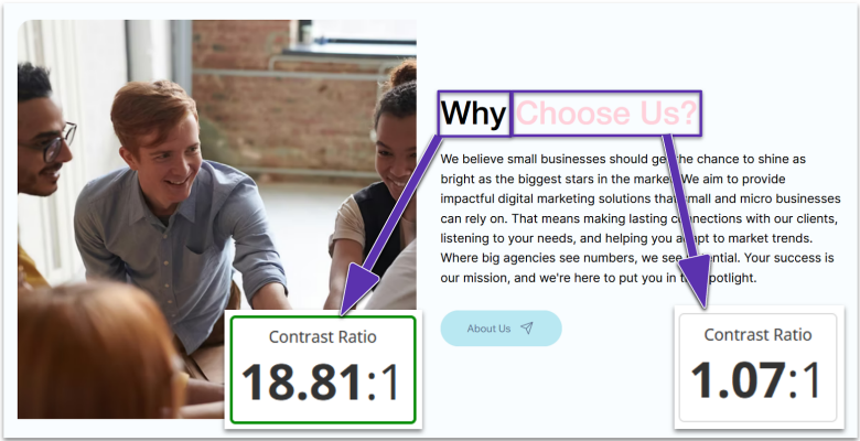
However, the other thing to consider is that some people have trouble reading bright colors, like those with dyslexia.
Furthermore, 8% of men and 0.5% of women have color blindness, so never use color to define content. Other indicators should be used to distinguish elements, like font size for headers. If the user needs to act or respond to an element, you can use additional indicators like underlined text to present hyperlinks.
Fonts
Your text must be in a font that’s easy to read at any size by your visitors. A general rule is to use a minimum font size of 14pt. If you choose to use a smaller font, be sure that the page still renders correctly if your user decides to manually increase the font size by zooming in on their browser.
WCAG Level AA specifies that text should be readable at 200% magnification without the use of assistive technology and loss of content or functionality.
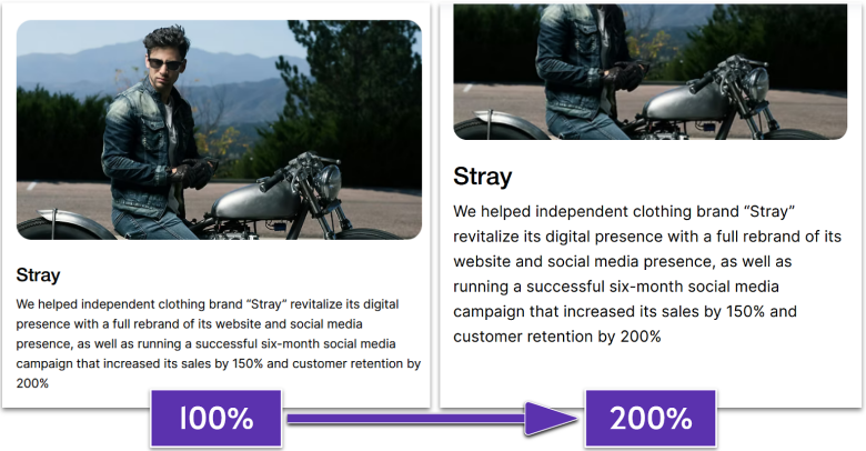
You can design your website for easy enlargement by using relative size values when building content blocks. This ensures that enlarged text doesn’t overlap, break layout spacing, or require horizontal scrolling. Avoid using bitmap images of text, as these can’t be resized or read by screen readers.
Fonts should also be clear and easy to read. Ideally, choose a sans-serif font, as this can make each character easier to understand.
WCAG suggests avoiding fonts with unusual features or thin strokes, as this makes characters less familiar and harder to read at lower contrast ratios.
Errors
You should provide users with easy options for correcting errors and mistakes. People with disabilities, like motor or cognitive impairments, may hit the wrong key, enter the wrong text, or navigate past areas they may want to visit.
WCAG Level A requires that input fields have visible labels or instructions and that any error messages are provided in text. It also suggests including an error alert in the page title, as this can be read by screen readers.
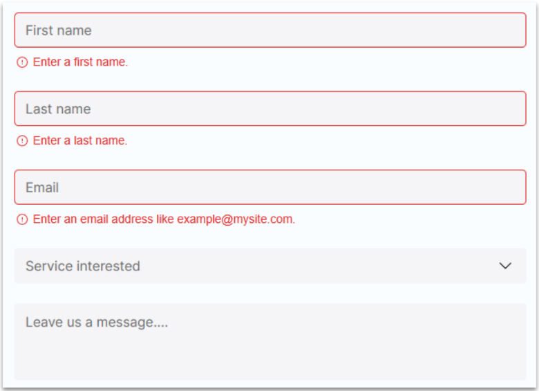
At Level AA, the standard requires that suggestions to fix input errors should be provided to the user. The only exception is if doing so would compromise the purpose of the form or create a security risk.
Error accessibility should extend throughout the rest of your site. For example, while many internet users know what an HTTP 404 error indicates, not everyone will. Your 404 error page should clearly explain that the page couldn’t be found and suggest alternative actions.
Forms and other time-sensitive tasks should allow plenty of time for completion before letting the page “time out.” Users with disabilities may take longer to enter text, type, or click on a button.
WCAG Level AA also states that authentication forms should support copy-and-paste and password managers. This reduces the cognitive load of these forms by reducing the need for memorization, and also helps those with motor disabilities, as there’s no longer a need to manually type out passwords.
Accessible UI/UX Design Checklist
- Colors should have a contrast ratio of at least 4:5:1
- Text blocks should use relative sizes so they can be magnified without content loss
- Fonts should be easily readable at any size
- Input fields should have clear labels and helpful error messages when not completed correctly
Accessibility in Code
WCAG Level A outlines proper HTML structure for accessibility. Semantic HTML elements like nav, main, article, and footer provide built-in accessibility benefits as they communicate the purpose and relationship of content to assistive technologies.
You’ll need to use ARIA tags only when semantic HTML isn’t enough – particularly if you’re using more generic div and span elements. However, you don’t need to do this with more modern elements that are already descriptive. For example, adding role=”navigation” to a nav element is redundant.
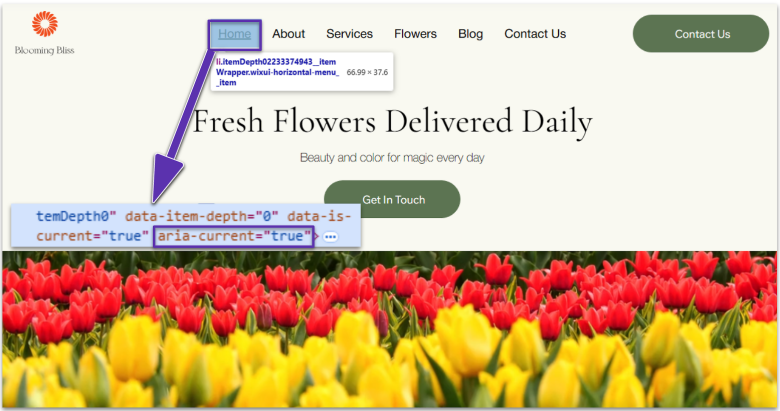
It’s also important to use heading tags in a meaningful and hierarchical order. We’ll cover this in detail later in the guide.
Accessibility in Code Checklist
- Use semantic HTML elements instead of generic divs where possible
- Only add ARIA roles when HTML elements don’t convey the content’s intended purpose
Menus and Navigation
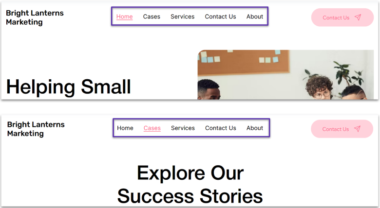
Accessible website navigation begins with clear, descriptive menu titles that meet WCAG Level AA. Each navigation element and page title should clearly indicate its purpose and destination. Use specific, meaningful menu titles that describe where the user is going, such as “Contact Us” and “Our Products”.
WCAG Level AA also defines that menu structure should be logical and consistent. The menu should be in the same location and in the same order on each page.
Dropdown menus should be operable without a mouse and should clearly indicate when they’re expanded or collapsed. Design submenus with adequate timing controls to ensure users can navigate through options before they close automatically.
A search function is crucial for accessibility under WCAG Level AA. Position the search box prominently and ensure its keyboard-accessible. Label it clearly with proper form controls and include a visible submit button. The search box should be available from any page on the site, providing an alternative method to find content.
WCAG Level A specifies that all websites should provide full keyboard controls, too. These shouldn’t require specific timings unless necessary. Keyboard controls should be intuitive and follow standard conventions (like Tab or arrow keys). If alternatives are used, provide clear instructions.
Keyboard navigation should highlight fields in a form and choices in a drop-down menu or list, just as hovering over these elements may cause a focus effect with a mouse. Make sure that all commands can be activated using single keystrokes. Users with physical disabilities may only be able to press one key at a time.
Similarly, your website should respond to touch-free controls, such as voice controls, foot controls, mouth controls, or eye movement trackers. You should provide multiple control options wherever possible.
It’s also a good idea to build mechanisms that allow users to bypass repetitive elements like page headers, navigation bars, and other design blocks without using a mouse.
Menus and Navigation Checklist
- Create clear, descriptive menu titles that explain their destination
- Keep navigation menus consistent and in the same location on all pages
- Make menus fully keyboard-accessible with proper focus indicators
- Include a prominently positioned, keyboard-accessible search function on every page
- Provide multiple ways to interact with your site with a single keystroke
Headers
To meet WCAG Level A, your headers need to follow a logical, hierarchical order. Think of them like an outline: start with your main title as an H1, then use H2s for major sections, H3s for subsections, and so on. Never skip header levels (e.g., H1 to H4) or use heading tags just for styling, as this will confuse screen reader users.
Similarly, never use headers for non-heading content or bold text as a substitute for real headings. This breaks the logical flow of information on the page.
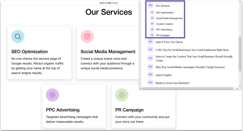
Your page should only have one H1 header. This is your main title and tells visitors what the entire page is about. Multiple H1s can disorient users. For visual appeal, you can style other important text without using header tags.
Make your header text descriptive and meaningful, as required by WCAG Level AA. It should accurately reflect the section that follows.
Headers Checklist
- Use one H1 tag per page as your main title, followed by H2s, H3s, and H4s where appropriate
- Only use heading tags for actual headings
- Don’t use bold text as a substitute for proper headings
- Write descriptive headings that reflect the content below
Content
As with everything else on your page, content should be ordered logically. Under WCAG Level A, the correct reading sequence of the page’s content should be able to be accurately determined by assistive technology like screen readers.
To make your content more accessible, consider offering key information in audio and visual form. For example, you could provide an audio version of blog posts. At the very least, your website should be accessible to text-to-speech devices so blind or visually impaired users can still interact with your content.
Similarly, optimizing your site for voice search allows visually-impaired visitors to find it easily on search engines. This has the bonus of improving your SEO for all users, given the increased popularity of voice assistants like Alexa and Google Home.
The actual content and readability of your page are governed by WCAG Level AAA, which goes beyond normal legal obligations. However, these points are easy to implement. Like with website design, writing accessible and understandable content is largely an industry best practice in the modern age.

Your content should use simple, direct language with minimal use of slang, confusing metaphors, or idioms. Users with autism and cognitive disabilities may struggle to understand non-direct language. Write in the active voice and avoid double negatives or confusing sentence structures.
It’s also helpful to include explanatory illustrations and images alongside the text. This can help users at a lower reading level, who have difficulty comprehending written text, understand your content.
To help your users, avoid using long, dense blocks of text that are unbroken by images or spacing. The majority of text should be left-aligned (or right-aligned for right-to-left languages) to give the reader a consistent starting point for each line of text and minimize eye movement. You should also make sure there’s plenty of white space around paragraphs.
Similarly, avoid excessive text animations, like flashing, blinking, or scrolling. Users may take longer to read and understand the content as they’ll be held back by the visual distractions.
Finally, allow plenty of time for slower readers to keep up. Auto-updating content should allow users to pause or stop any changes.
Content Checklist
- Ensure content follows a logical reading sequence that screen readers can accurately interpret
- Write in clear, simple language without complex idioms or metaphors
- Break up text with relevant images, proper spacing, and consistent alignment
- Avoid dense text blocks and excessive animations
- Make content available in multiple formats
- Give users the ability to pause auto-updating content
Links and Buttons
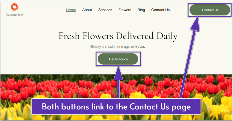
To meet WCAG Level A, the purpose of each link should be determined from the link text alone. Instead of using “click here” or “read more,” create descriptive link text that clearly explains where users will go when they click.
Under WCAG Level AAA, interactive elements like buttons and links should have a target area of at least 44×44 pixels. This larger touch target helps users with motor impairments, tremors, or limited dexterity accurately select elements. For mobile devices, ensure buttons are spaced far enough apart to prevent accidental activation of adjacent controls.
Links and Buttons Checklist
- Ensure link text makes it clear what will happen when a user clicks it
- Provide a large touch target on interactive elements
Images
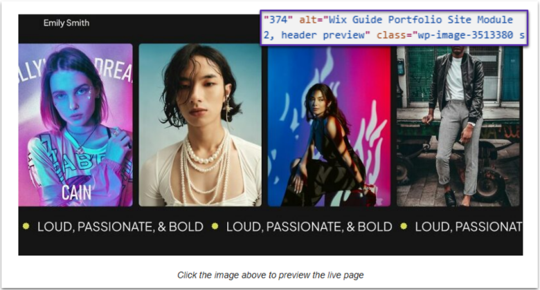
WCAG Level A requires all non-decorative images to have alternative text that serves the same purpose as the visual content. Alt text should describe the function of the image rather than its appearance. For example, use “search” instead of “magnifying glass” for a search button icon. This ensures screen reader users understand the image’s purpose or content.
To meet WCAG Level AA requirements for image scaling, avoid using excessively large images that may not display properly across different screen sizes. Large images can also create accessibility barriers by causing slow load times, affecting both users with disabilities and those with slower internet connections.
As with all content, do not include images that flash more than three times per second, as this can trigger seizures in people with photosensitive epilepsy. Beyond this critical safety requirement, flashing or blinking elements also create barriers for users with vision impairments who may need access to static content to process information effectively.
Images Checklist
- Add meaningful alt text to all non-decorative images
- Optimize image sizes so that they load fast and display correctly on common screen resolutions
- Never use flashing images to protect users with epilepsy and to be more accessible to those with vision impairments
Video and Audio
At the most basic level, you should provide audio-only alternatives or text transcripts for all video content. These transcripts must be accessible to screen readers and provide equivalent information to the audio track. Under WCAG Level AA, audio descriptions should also narrate important visual information not conveyed through the video’s audio track.
All pre-recorded video content with a synchronized audio track should have captions. Captions should be customizable in size, color, and contrast to accommodate different user needs.
While you can use automated tools to generate these, using a human caption writer ensures that these are accurate and fully synchronized to the visuals on screen. You should also check caption placement to ensure they don’t cover important visual elements.
Websites must provide user controls for any audio that plays automatically for more than 3 seconds. Users need an easy way to stop, pause, or adjust the volume of media content independently from their system volume. All audio controls should be keyboard-accessible, too.
The easiest way to deal with this is to simply not use autoplay for videos and audio – it’s not necessary in most cases, and a good portion of your users will find it frustrating.
WCAG Level AAA addresses audio quality, specifying that background sounds should be minimized or eliminated, and that audio content should be clear and free from distortion. It also recommends providing sign language interpretation for all audio content. Finally, any audio alerts or prompts must have visual or text alternatives to ensure this information isn’t conveyed through sound alone.
Video and Audio Checklist
- Provide text transcripts for all video content and add audio descriptions that explain important visual information
- Include customizable captions for all pre-recorded videos with audio
- Use human caption writers rather than automated tools for accuracy
- Avoid autoplay media, but if used, provide easy controls to stop, pause, or adjust volume
- Make all media controls keyboard-accessible
- Provide visual alternatives for any audio alerts
- Maintain high audio quality by eliminating background noise and distortion
Downloadable PDFs
PDFs and other downloadable content must meet the same accessibility standards as web pages. This means providing proper structure, descriptive text alternatives for images, and logical reading order. Just like web content, PDFs should be perceivable, operable, understandable, and robust for users with assistive technologies.
The most crucial step in creating accessible PDFs is proper tagging. Tags provide the structural information that screen readers need to interpret the document correctly. This includes marking headings, lists, tables, and images with appropriate tags that define their role and relationship to other content.
Consider providing an HTML alternative to PDF documents when possible, as HTML is generally more accessible.
Downloadable PDFs Checklist
- Follow web accessibility standards when designing PDFs and other downloadable files
- Tag content in PDFs so it can be interpreted by screen readers
- Consider providing downloadable documents in HTML format instead
Examples of Accessible Web Design
Looking for inspiration? Here are three examples that demonstrate excellent accessibility practices. These sites show how you can still create a modern, slick website while following WCAG guidelines.
CDC
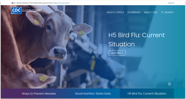
The CDC’s homepage exemplifies clear, intuitive navigation. The link text is descriptive, and buttons are contextually placed under slide titles, so it’s clear where the “Learn More >” button is leading. This helps all users, particularly those using screen readers, understand exactly where they’re going.
While carousel elements often create accessibility barriers, the CDC’s autoplay slides include a prominent pause and play control interface. This gives you control over moving content and meets WCAG requirements for auto-updating content. Each carousel image also includes alternative text, ensuring screen reader users don’t miss important visual information.
Language accessibility is prioritized with a prominent Spanish language toggle at the top of the page. This feature, combined with clearly structured content and consistent navigation, makes the CDC’s site more accessible to a broader US audience.
Visit London
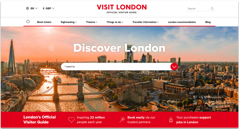
Visit London’s website demonstrates excellent use of color contrast that’s both strong and brand-relevant. The text stands out clearly against both backgrounds and images, meeting WCAG contrast requirements for both regular and large text. This makes content readable for users with various visual impairments while maintaining an attractive visual design.
The site’s menu system is a standout example of keyboard-accessible navigation. All dropdown menus can be operated using keyboard controls, with clear focus indicators showing users exactly where they are within the interface. Each menu interaction includes smooth animations that guide users without being distracting or overwhelming.
On sub-pages, you can see the exact page you’re on and where it lies in the site hierarchy. It’s really easy to backtrack from here, and thanks to this breadcrumb navigation system, you won’t get lost. The overall combination of features creates a seamless experience for all users, regardless of how they navigate the site.
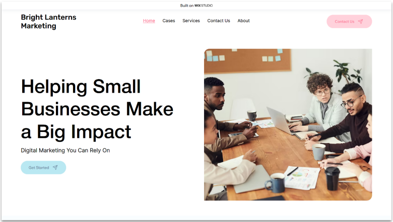
One of the perks of using Wix is that it’s designed with accessibility in mind. Most templates are already set up with WCAG-compliant color contrasts for the primary content, so all you may need to do is adjust the contrast on buttons and focus effects. We’re still using the default focus color on our menu, which needs adjusting to meet accessibility standards.
All the technical elements of website accessibility are largely handled for you, too. Wix sites can be navigated with keyboard controls without having to change any settings. Plus, you don’t have to dive into any code to set alt text for images – just define it in the image settings.
That’s not to say that Wix handles everything for you, unfortunately. You’ll still need to manually check your site to ensure it’s WCAG compliant. There’s also nothing stopping you from veering away from accessibility best practices, which is why it’s so important to learn them in the first place.
You can also take a look at our Wix starter guide, as this will walk you through everything you need to know about building a user-friendly website with Wix. It also includes some accessibility pointers as you go.
In our Wix starter guide, you’ll also find links to our 3 sample sites. Feel free to have a look around and note what you’ll do differently while designing for accessibility.
How to Check Your Website’s Accessibility
If you’re not sure that your website meets general standards and guidelines for accessibility, there are plenty of tools and checkers that can help you to verify compliance and identify where you need to improve.
Some things to look out for when choosing a website accessibility checker include:
- Which languages it supports
- What standards it uses as guidelines
- What file formats or content types it can analyze
- The type of tool it is – browser extension, mobile or desktop app, command-line tool, etc.
- How much it can check automatically
- Whether it provides detailed reports, in-page feedback, content transformations, and other helpful features
Ultimately, no one tool can check your website’s overall accessibility. You’ll need to combine several different tools to evaluate different aspects of your website.
But even the largest toolkit of accessibility checkers can’t replace human insight. Manual testing, like using screen readers, enlarging text, navigating with a keyboard, or simulating different impairments, is essential to identifying real-world barriers that automated tools might miss.
Wix Accessibility Wizard
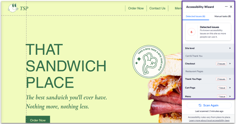
Wix has a built-in Accessibility Wizard that scans your website and diagnoses any issues. I’m testing it out here on a brand new Wix template to show you that while these templates are largely set up for accessibility, there’s still some work you need to do.
When you run an accessibility scan, you’ll see how many issues were detected, along with a dropdown list of each one. Expanding these explains what you need to fix, as well as some helpful learning resources. Even if you’re well-versed in accessible design, it’s a handy tool that can find areas that you’ve missed.
We’ve got a thorough guide on making your Wix site accessible to help you find your way around this tool.
Color Checker
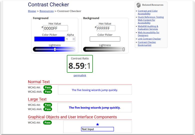
There are tons of color contrast checkers online, but I recommend the Contrast Checker tool from WebAIM. It’s free to use, and it was developed by Utah State University as part of a suite of accessibility tools.
It’s easy to use, too. All you need to do is pick two colors (or input the hex values, if you know them) and it will provide the contrast ratio. You’ll see a green border if it meets all WCAG standards. You’ll also see a preview of how your text will look and individual “pass” or “fail” results for Levels AA and AAA.
For a full tutorial on using this to improve the accessibility of your website, take a look at our accessibility color checker guide.
Tips for Building an Accessible Website
My team and I have collected a range of tips and tricks for accessible design over the years:
- Take a ground-up approach. Build accessibility into your site from the start rather than retrofitting later. This approach is more cost-effective and ensures a more consistent user experience.
- Focus test with a diverse group. Test your site with users who have different disabilities. While automated accessibility scanners are useful, real users can identify practical issues that automated tools might miss.
- Provide content guidelines. Create clear accessibility guidelines for your content team. Include requirements for alt text, heading structure, link descriptions, and plain language to ensure all new content meets accessibility standards. This will minimize how much time you have to spend fixing accessibility issues later.
- Training and development. Train your development team on accessibility standards and best practices. Make sure everyone understands why accessibility matters and how to implement it.
- Site plugins. Choose content management systems, website builder platforms, and other tools that support accessibility features. This makes it easier to maintain accessibility standards over time. Wix and WordPress both offer a ton of accessibility plugins.
- Write documentation. Create an accessibility page that documents your accessibility features and provides clear instructions for users who need them.
- Follow standards. Diverting from the norm can be a source of frustration for users experienced with accessible technologies. For example, keyboard controls use specific buttons, which are largely used across every website – changing the controls unnecessarily on your site is just going to cause annoyance.
- Stay up-to-date. Standards evolve, and new tools become available to help make websites more accessible. Retest your site for accessibility regularly to ensure you don’t fall behind on the implementation of any new standards.
- Manually check compliance. Automated tools are great, but they may not have been updated to use the most current version of WCAG. Similarly, they can’t account for every region’s accessibility laws. Always manually check that your website meets the required standards.
Web Accessibility Makes the Internet Better for Everyone
Creating an accessible website takes a little more time and forethought, but it reaps many rewards. Beyond meeting legal requirements, an accessible website is easier to use for all visitors, boosts your SEO, and provides a smoother experience on your site overall. It also opens your website up to the 16% of the population living with a disability.
You can make your website more accessible quickly with a few simple changes. However, keep in mind that you may find that some accessibility issues run much deeper and may require significant development work, especially if accessibility wasn’t built into the site from the start.
While it may take some extra work, you’ll be rewarded with greater user satisfaction and a minimized risk of legal issues. It’s well worth the effort!


