Inside this Article
#1: Offer Temporary Deals
First things first, one of the most effective tactics for landing page conversion is implementing something called “real urgency.” According to Wish Pond, real urgency is when you put an end date or time on an offer or special deal. Some examples of this include:- “Only 2 hours left to claim your place, so don’t miss out!”
- “This offer expires tonight at midnight, so be quick”
- “Only 30 minutes left to register or you’ll lose your spot”

#2: Use a Countdown Timer
Another effective way of creating a more engaging sense of urgency is through a countdown timer, which can increase conversions by up to nearly 150%. A countdown timer takes temporary deals to the next level. It allows the visitor to view the exact amount of time they have left to retrieve your offer—and that time is running out! It encourages them to act before the clock reaches zero, like the landing page example below. Visitors only have minutes to sign up to this free webinar offered by business coach Marie Lexa, otherwise they’ll inevitably lose their spot. Her countdown timer is a productive tool that forces on-the-spot decision making. It encourages consumers to drop everything and sign up before it’s too late.
#3: Imply Urgency in Your Copy
Another popular way of creating landing page urgency is through “implied urgency.” This is where you use certain buzzwords to push your visitors in the right direction of conversion. Some examples of buzzwords that imply urgency include:
|
|
|
|
|
|
|
|
|
|
|
|
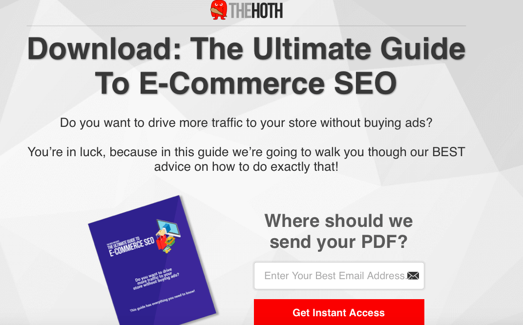 Creating an effective CTA can be a fantastic way to instill a sense of urgency on your landing page, particularly as this is the exact area where you’re looking to score a conversion.
#4: Leverage the Scarcity Tactic
Just like urgency, scarcity is another psychological trigger. Unlike earlier examples, it relies on quantity instead of time to prompt an individual to act. This is a successful tactic because people tend to place a higher value on rare or popular offers. In addition, scarcity plays on the FOMO (Fear of Missing Out) instinct. Essentially, we don’t want to miss out on what others have got. If indicate to visitors when you are running low on stock—or give a sense of how popular the product is amongst others—you’ll automatically create a sense of urgency. Scarcity is often used by the hotel industry via websites such as Booking.com. From an email marketing campaign, a visitor is directed to a landing page that displays different hotels, making prominent note of how many rooms have recently been booked, or how many currently remain. If space is running low, then your anxiety over missing out increases and encourages you to book the room before it’s too late.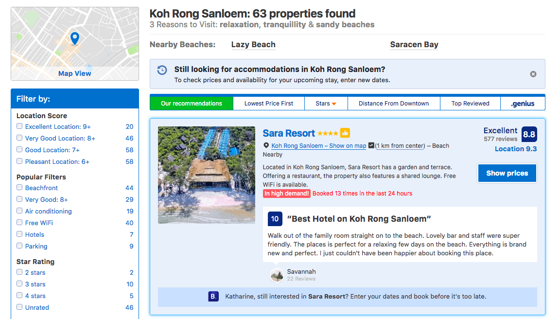
#5: Promise Fast Results
You can also add urgency to your landing page in more subtle ways. A great way of doing this is through promising your visitor quick results. If you reassure them that their life is going to dramatically improve with your service, or that your product will meet their needs in a way that none other can, then you’re quietly persuading them to convert so that can start reaping the benefits. For instance, the landing page of internet voucher company Honey claims that if you download their extension, you will never need to search for another coupon code again. This tells visitors that the sooner they sign up, the sooner they’ll receive hefty shopping discounts.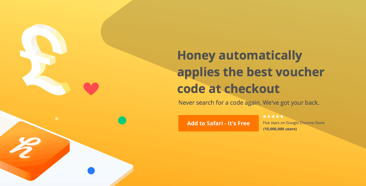 But here’s the thing you need to remember: you must be able to deliver on your landing page promises, otherwise you risk receiving negative feedback that could severely damage the reputation of your brand.
#6: Play on Loss Aversion
Humans are naturally averse to loss, which essentially means that we would rather not lose $5 than we would be to find the same amount. When it comes to marketing, this is called “the takeaway” because, when you threaten to take an offer away, people will act in a hurry to obtain it. So how do you tap into the loss aversion phenomenon? Simply offer your visitors a discounted product or free coupon if (and only if) they retrieve it at that time. For instance, if you click through to the landing page of fashion brand Motel Rocks from Facebook, you can receive 25% off their products—so long as you “Shop Now,” that is. With this technique, visitors believe they will lose the offer or the freebie if they navigate away from the page, even though they never had the offer or freebie to begin with.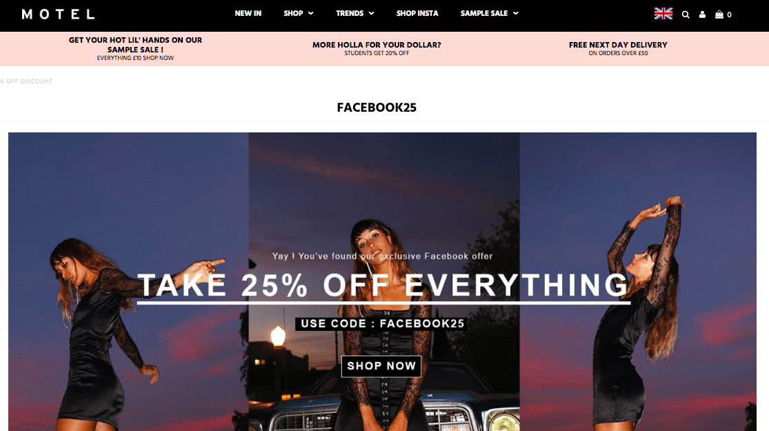
#7: Create Visual Urgency Through Color
When it comes to creating landing page urgency, the design can be just as important as the copy. The best landing page builders can provide templates that help you to create visual urgency by experimenting with layout, imagery, and color. We use different colors to convey distinct feelings or behaviors. Red, for instance, signifies a sense of urgency that commands immediate attention. This is why we often find the most crucial road signs in red and why the word “SALE” is commonly written in this vibrant color. Recently, printing services company Pixart Printing used red on their landing page to showcase the 25% off deal across their product line. The use of the color red, combined with the copy stating the time limit of the offer, instantly created a sense of urgency.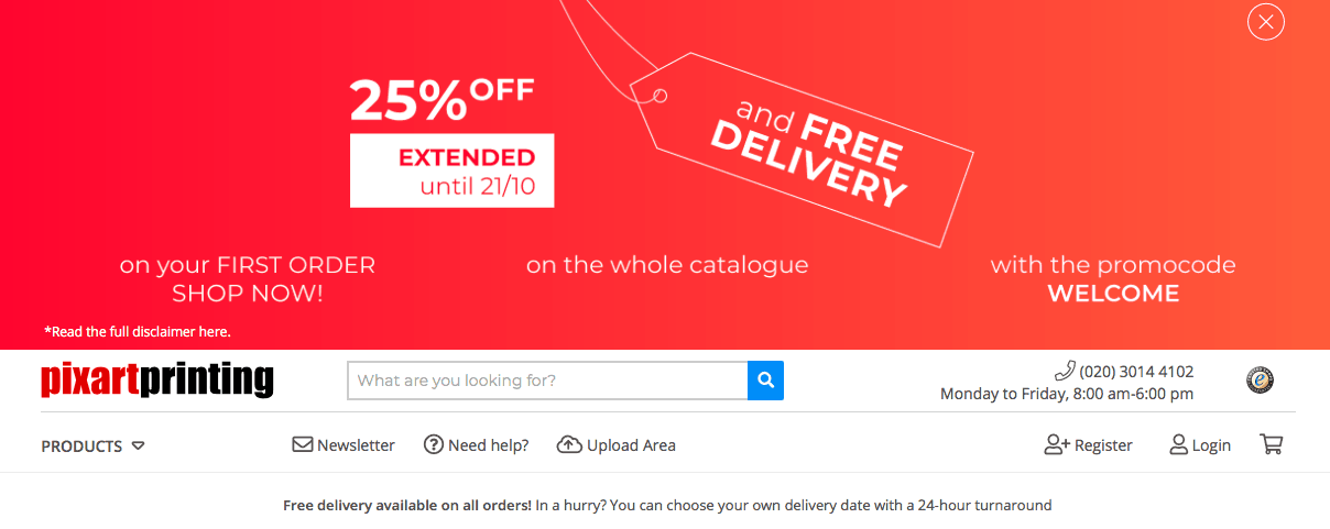 Keep in mind that you’ll still want to align with your brand identity. If red clashes with your existing style guide, you can use another bold color or design to grab your visitors’ attention and encourage them to act quickly.
Hurry Up and Make Them Want to Convert Already
Remember, some tactics are going to work better for certain audiences than others, so you’ll want to A/B test your landing page in order to see which of the above ideas will lead to the most conversions. Try different combinations, keep track of what works, and ditch what doesn’t. Not only will this help you understand your audience better, but you’ll end up with higher conversion rates as a result.Sources 9 Ways To Use Urgency Psychology To Improve Conversions:
https ://marketingland.com/12-ways-use-urgency-psychology-improve-conversions-112603 5 Ways You Can Create Urgency on Your Landing Page:
https ://blog.wishpond.com/post/104158262102/5-ways-you-can-create-urgency-on-your-landing-page 19 Ways to Add Urgency to Your Landing Pages (with Examples):
https ://www.ventureharbour.com/add-urgency-to-your-landing-pages-with-examples/


![How To Build a Landing Page in WordPress [2025 Guide]](https://dt2sdf0db8zob.cloudfront.net/wp-content/uploads/2022/04/WB-general2-850x446.jpg)
![How To Build a Landing Page in WordPress [2025 Guide]](https://dt2sdf0db8zob.cloudfront.net/wp-content/uploads/2021/10/andres_ganem_headshot_optimized-150x150.png)


