9 Best Medical Logos

Logo by creamworkz |

Logo by renderman |
Logo by designcall |

Logo by anna_taylor |

Logo by -Phi- |

Logo by ludibes |

Logo by Andriea Morgado from DesignCrowd |

Logo by bcendet |
Logo by Terry Bogard |
How to Make Your Own Medical Logo
1. Create a Looka Account
Before you dive into the logo creation process, I recommend signing up for a Looka account. It’s free to try, and you’re not obligated to purchase anything until you’re satisfied with your logo. To learn more about Looka, read our in-depth review or watch the video below.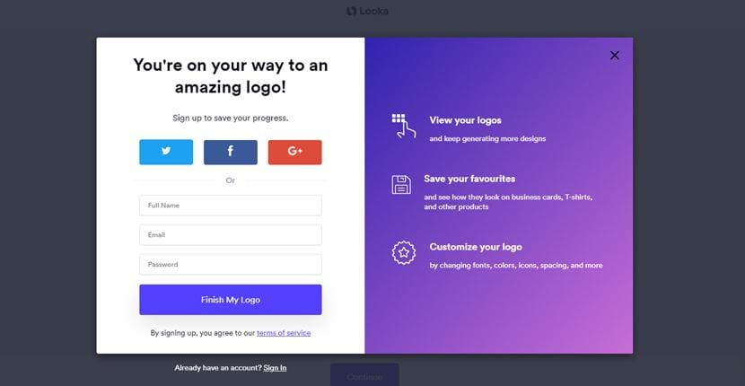
2. Answer Away
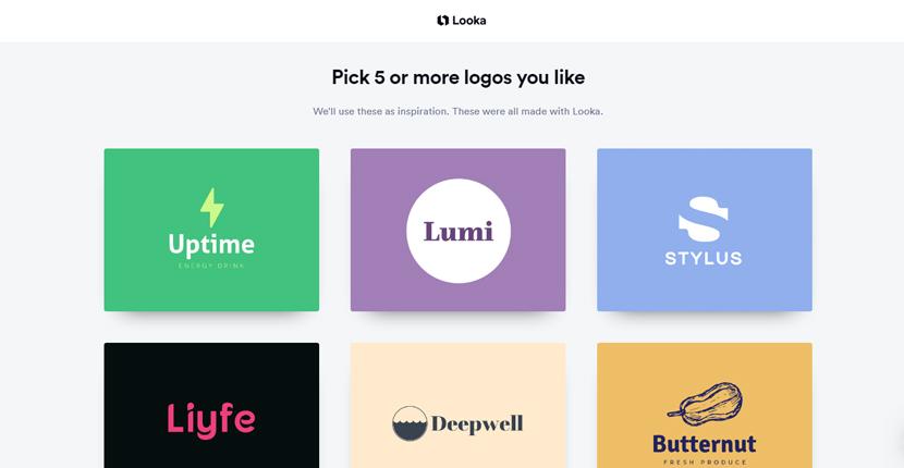
Now, it’s time to answer some questions to help Looka generate some initial designs. If you feel overwhelmed along the way, click the little bubble down in the lower right corner, which takes you to the help section. The first question is pretty straightforward. Just type in your line of work and hit continue.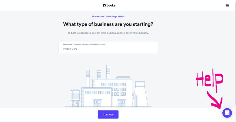 You can choose to skip over some questions, but I recommend answering them all, as it helps Looka hone in on your design preferences. The website gives you a sampling of logos to look at. You don’t have to like them, but if you see colors and fonts you like, it’s worth making a note of them.
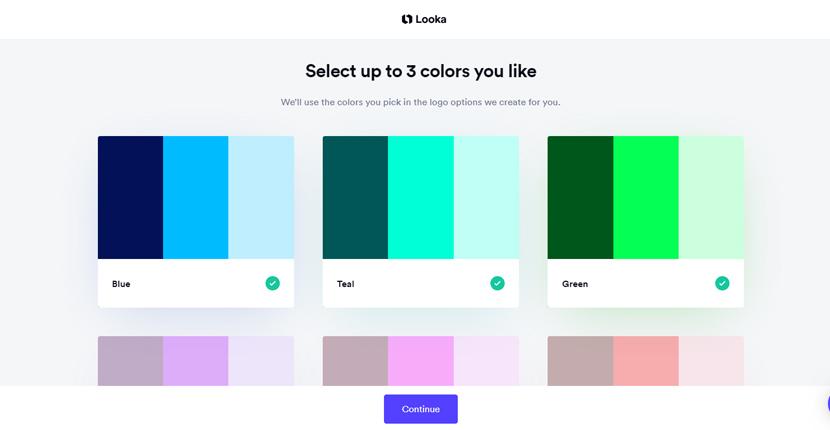
 Next, you’ll see a range of color swatches. I’ve chosen blue, teal, and green, as these color ranges are typically associated with the healthcare industry, evoking feelings of health, wealth, and wisdom.
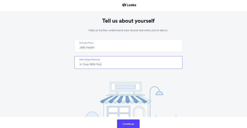
 The next step is to enter your company name and slogan. You’ll want to keep the text as short as possible and to the point as to not overwhelm viewers.
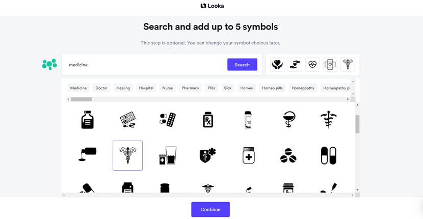 On the final page of the questionnaire process, Looka will display designs featuring your chosen color swatches and the symbols you’ve selected. You can have the tool keep generating more, or if you see a design that catches your eye, you can start editing it right away.
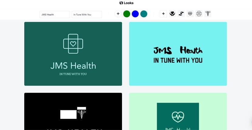
3. The Editing Process
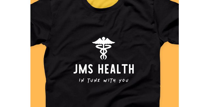
You don’t have to commit to just one potential health clinic logo. You can play around with multiple designs, and Looka will save your progress on each so you can go back and test other designs. You can also revert to a previous version if you decide a design isn’t working after you’ve edited it. You can adjust different logo elements, including background colors, font styles and sizes, and container shapes. Looka also generates previews of layout variations. If you want to run a logo by friends and patients first, you can also hit “share,” and it will post your design to social media or send it via email.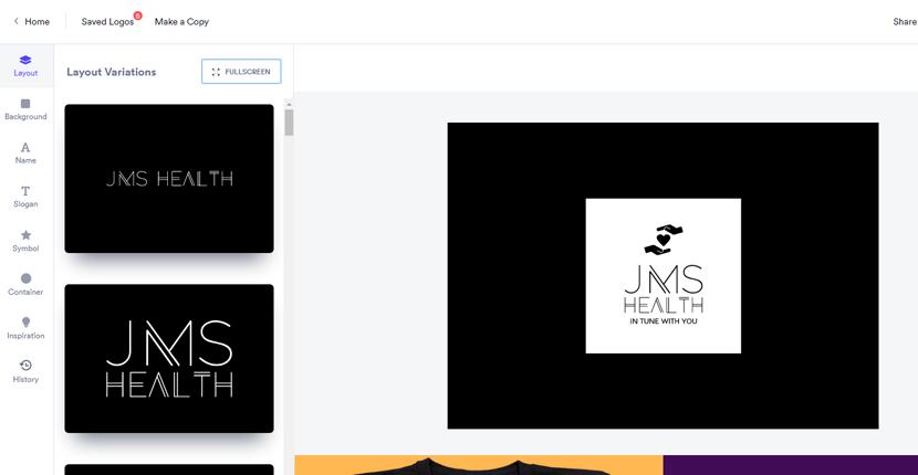 Although Looka doesn’t currently offer printing via the website, it shows you previews of how your logo would look on apparel, stationery, and on social media.
4. Congratulations, It’s a Logo!
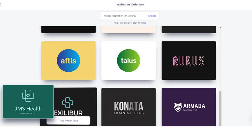
Once you’ve created a health clinic logo that works for you, it’s time to make a purchase. You’ll find the “buy” button in the upper right corner (next to the share button), or you can purchase it directly from the saved logo or dashboard pages. Looka offers a few logo packages. Premium is the most popular choice, as it gives you standard and high-resolution versions of your logo, including full ownership rights. If you’re looking to extend your marketing with print-ready business cards and a social media kit, the Enterprise package provides these in addition to everything in the Premium package. Here are some sample logo designs I created with Looka:
Looka Alternatives
Do you like Looka, but feel it’s missing some of the features you’re looking for? Here are a few other logo makers you might want to check out:- Do you need a logo in a non-Roman alphabet? Take a look at Wix Logo Maker.
- Do you want to print your logo on stationery and a variety of other promotional items? LogoMaker lets you order a range of marketing products directly from its website.
- Are you interested in creating seasonal branding for your medical practice? Tailor Brands can help you create logo variations suited to various holidays.
Prefer to Have Your Logo Created by a Designer?
If you don’t have the time or patience to design your own logo, the best option for you is to hire an experienced hospital logo designer. Thankfully, it’s easy to find skilled designers on Fiverr. While designs start at just $5, you’ll also find a range of services available at different price points. You’ll find logo design services listed at the top of the Graphics and Design menu of the Fiverr website.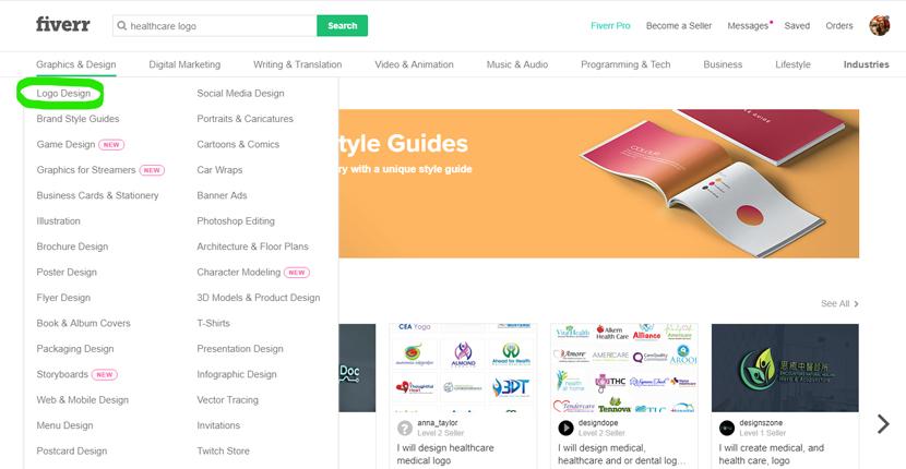 You can also hone in on your ideal designer with Fiverr’s logo design search tool. Find your ideal designer by answering a short series of questions about your brand and design preferences.
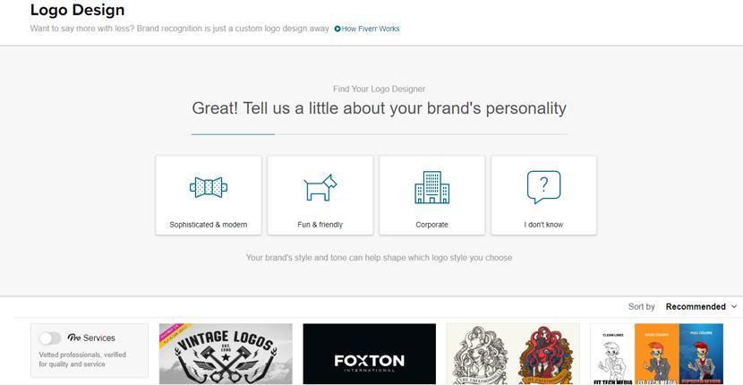 Based on your selection, Fiverr will show you a range of designers who follow that particular style, in this case, sophisticated and modern. You can further refine your search based on your budget, required delivery time, and designer rating. When you see a design you like, click on the designer to learn more about their work, including user ratings that can help you weed out the duds from the gems.
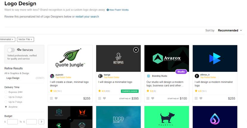
Other Reasons to Like Fiverr:
- Most designers offer basic, standard, and premium package options to suit every need.
- Fiverr’s mobile app makes client-designer communication fast and efficient.
- It has a top-notch Pro services program featuring highly-vetted design professionals.
Get Inspired by Famous Medical Logos
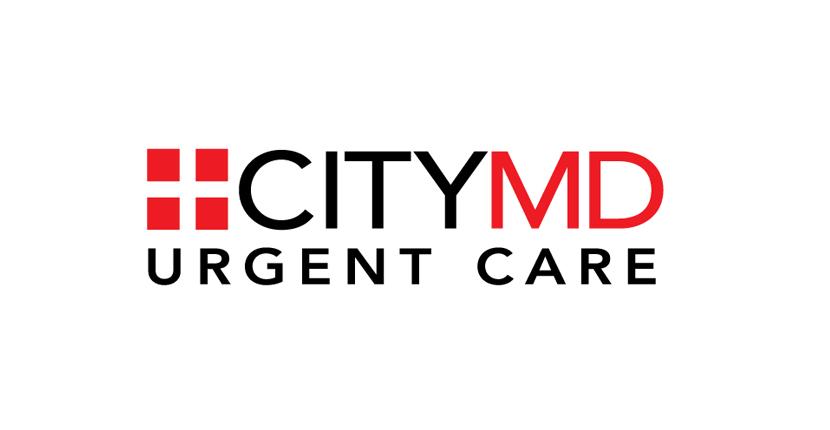 This logo for CityMD is clean, simple, and to the point. Its slogan lets you know it offers urgent care, and the use of red further emphasizes that. This is an important design consideration when patients need to know where they can seek immediate treatment.
 This logo for CHI Franciscan Health contains an abbreviation representing Catholic Health Initiatives, but that doesn’t mean one has to be Catholic to be a patient. The use of the cross symbol subtly ties into a health system that provides faith-based support for those who want it, yet the emphasis is on providing the best care to all.
 The logo for Animalia is cute and colorful, but also clean and modern. When people are entrusting their pets to a veterinary hospital for care, they want to know their pets are in good hands, and this simple design conveys that well.
 While some children’s hospitals use cutesy text, this logo for Children’s of Mississippi keeps things professional with a standard font choice, leaving the colorful illustration to project its child-friendly environment. This balanced design can help both parents and kids feel less apprehensive about hospital visits.
 The primary logo for Doctors Without Borders features both French and English text, making it accessible to users in multiple locations. The logo maintains a consistent look to ensure global recognition with additional translations for speakers of other languages as well.
 Fred Hutch is actually a shortened version of the Fred Hutchinson Cancer Research Center but is commonly known by the shorter “Fred Hutch” or “The Hutch” by people in the medical community. The slogan keys into their primary mission, finding cures for cancer, and the microscope slide icon cleverly incorporates the “H” as part of the design.
 This logo for the Rare Genomics Institute is similar to Fred Hutch in how it uses a symbol of medicine, the DNA helix, as part of the design. It also cleverly incorporates the head and body of a hummingbird in the overlapping elements, giving it an airy and forward-looking feeling.
 This logo for Dragonfly Biosciences tackles a rather delicate concept of medicine: alternative treatments. Some might not pick up on the subtle hint of a seven-leaved plant, which might be the intention. Staying within the law or directly mentioning medicinal products is something a lot of companies still need to be mindful of. This can be achieved with more abstract wording and imagery as Dragonfly Biosciences has by combining the leaves with a caduceus.
 This logo for Seattle Children’s Hospital is another good example of making a logo look modern, yet non-threatening for kids. The combination of the adult and baby whale implies a sense of comfort. They’re very cute, but without looking too babyish for older kids and teens, which the hospital also treats.
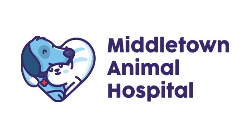 This adorable logo for Middletown Animal Hospital represents a love for its patients. The clever use of the red cross on the dog’s collar lets you know the vets are going to carefully address each animal’s medical issues. While a pet may not be affected by how the logo looks, it can help its owner feel more at ease.
*Website Planet is not affiliated with any of the medical brands above.


![13 Best Logo Makers That Are Free To Try (& Good) [2025]](https://dt2sdf0db8zob.cloudfront.net/wp-content/uploads/2018/08/LD-best-free-cheap-850x446.jpg)
![13 Best Logo Makers That Are Free To Try (& Good) [2025]](https://dt2sdf0db8zob.cloudfront.net/wp-content/uploads/2020/09/1.jpg)
![5 Best Free Text Logo Makers Online with HQ Downloads [2025]](https://dt2sdf0db8zob.cloudfront.net/wp-content/uploads/2019/09/LD-best-free-cheap-850x435.jpg)
![5 Best Free Text Logo Makers Online with HQ Downloads [2025]](https://dt2sdf0db8zob.cloudfront.net/wp-content/uploads/2019/08/ANDREA-EDITED-smaller.jpg)





![9 Best Arabic Logos and How to Get One for Free [2025]](https://dt2sdf0db8zob.cloudfront.net/wp-content/uploads/2020/12/9-Arabic-Logo-Designs-and-How-to-Make-Your-Own-for-Free-850x435.jpg)
![9 Best Japanese Logos and How to Get One for Free [2025]](https://dt2sdf0db8zob.cloudfront.net/wp-content/uploads/2020/12/9-Best-Japanese-Logos-and-How-to-Make-Your-Own-for-Free-850x435.jpg)


