A beautifully designed website is just the beginning.
In this interview series by Website Planet, I talk with top leaders in UX/UI design who uncover the latest trends, pitfalls, and practical tips that will help you craft a website that not only looks great but captivates, converts, and truly stands out. If you’re ready to get a peek behind the curtain of web design, you’re in the right place.
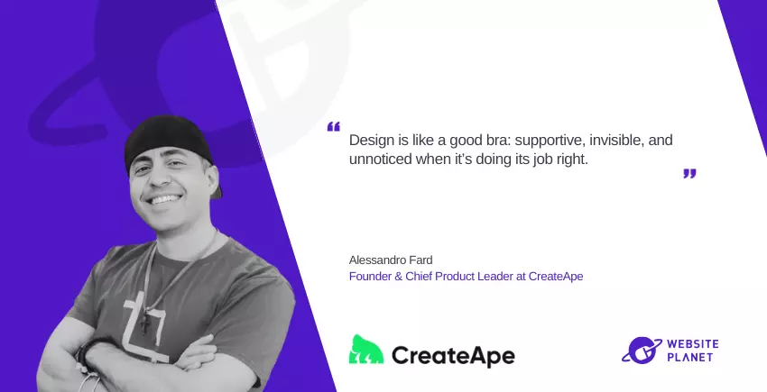
Alessandro Fard is the Founder and Chief Product Leader at CreateApe, and a 20-year veteran in user experience (UX) and user interface (UI) design. His journey began in the early 2000s and has involved collaborations with top firms such as American Express, Facebook, TrueCar, Lynda.com, and Mota Motors. His work has been recognized in major publications like VentureBeat and TechCrunch. With CreateApe he emphasizes a user-centric approach that not only enhances aesthetics but also drives measurable business results.
What are some web design trends that you believe are overrated or even detrimental to user experience and a brand’s reputation? Can you share some examples?
Oh man, where do I start?
The parallax scrolling effect makes the background elements move more slowly than the foreground elements. This difference in speed creates a layered effect that mimics how we perceive depth in the real world. For instance, when you look out of a moving vehicle, distant objects like clouds appear to move slower compared to closer objects like trees.
Sure, it looks cool for like five seconds, but after that? It’s like, “Okay, we get it, you can make stuff move.”
It’s a surefire way to make users motion-sick or just plain irritated unless done tastefully (and please please please test it with real users!). Additionally, the excessive movement and animation can cause discomfort to users with vestibular disorders.
Another one is auto-play videos. Who thought it was a good idea to blast sound at you while you’re casually trying to scroll? It’s like walking into a room and someone just starts yelling—nobody likes that! Stick to functionality and user control, and your brand will thank you.
📊 Several studies have examined user engagement with autoplay videos compared to non-autoplay videos, revealing mixed results in terms of user satisfaction. For example, Wistia confirmed that removing autoplay from their homepage improved overall conversions, whereas Digiday went as far as labeling autoplay “the Most Hated Digital Ad Tactic,” back in 2013.
Sources:
https://digiday.com/media/the-most-hated-digital-ad-tactic/
https://wistia.com/learn/marketing/against-autoplaying-homepage-videos
On the other hand, what are some key UX features that are frequently overlooked? Why do you think they are often missed, and how do they impact UX and other KPIs?
One word: Accessibility. It’s amazing how many sites still ignore basic accessibility features like alt text or proper contrast. It’s not just about inclusivity (though, duh, that’s huge); it’s also about reaching a broader audience. Miss out on that, and you’re basically leaving money on the table.
Another one is microcopy. You know, those tiny bits of text that tell you what to do next. If done right, they can make your user experience feel like you’re getting directions from a friendly local instead of a GPS that’s recalculating for the 10th time. Good microcopy reduces bounce rates and improves conversions.
Do you believe there’s a risk of ‘over-designing’? How do you strike the right balance between creativity vs user experience?
Yes! Over-designing is like putting too much seasoning in your food. Sure, you want to be creative, but not at the expense of usability. You don’t want your user thinking, “This website looks like a modern art exhibit, but how do I check out?”
The trick is keeping the user’s end goal in mind: the user needs to do something—whether it’s buying, signing up, or just finding info. If your design starts to get in the way of that, it’s time to pull back. Think of it like seasoning—enough to enhance the experience but not so much that it overpowers the main dish.
What psychological principles have the most significant impact on engagement and conversions? Are there also triggers that should be used more cautiously, given their potential to manipulate or mislead users?
The classics work wonders:
- Scarcity
- Social proof
- The good ol’ fear of missing out (FOMO)
These tap into our primal instincts and can definitely drive engagement… But here’s the catch: abuse them, and it’s a one-way ticket to the Unsubscribe-ville.
I’m talking about those “Only 1 left!” notices when you know there are 200 in stock. That can seriously hurt trust. People want to feel guided, not tricked.
Use those triggers sparingly, like a nice garnish on a dish. Too much and it just leaves a bad taste.
What metrics or KPIs do you focus on when assessing the success of a UX/UI design?
It’s tempting to just look at conversion rates or bounce rates, but I’m a sucker for digging deeper. I love to see how users are interacting with the site—time on page, click-through rates, and user flow. Are they dropping off at a specific point?
Then there’s NPS (Net Promoter Score), which tells you how likely users are to recommend the site. It’s the digital equivalent of word-of-mouth, and you know how powerful that can be. If users aren’t recommending you, something’s off. It’s probably why I love hotjar so much. Being able to see what users are actually doing anonymously is freaking cool. Not to mention you so many other useful data points like heat maps.
Our main question now: For those building (or rebuilding) their website, what are the 5 most critical UX aspects they should focus on?
- Speed: If your site takes more than 3 seconds to load, congrats—you just lost 40% of your users.
- Mobile responsiveness: It’s 2024. If your site doesn’t work on mobile, you might as well be selling flip phones (I kinda miss my flip phone…sniff).
- Clear CTAs: Don’t make people hunt for what to do next. If your CTA buttons aren’t obvious, it’s game over.
- Accessibility: I said it before, and I’ll say it again—if your site isn’t usable for everyone, it’s not usable. Period.
- Consistency: Keep your design elements uniform. If your site is visually inconsistent, users will get lost faster than you can say “404. This is not the page you’re looking for”
One last word about the ethics of web design. Where do you draw the line between persuasive and manipulative design?
That’s a fine line, and it’s one you don’t want to cross. Persuasion is about guiding the user, and helping them make an informed choice. Manipulation is like the dark side of the Force—it’s powerful, but ultimately, it’ll backfire. Pop-ups that force a “Yes” or “No” with guilt-tripping language, for example, are manipulative.
A little persuasion with a light touch can be magical. At the end of the day, it’s about building trust with your users. Lose that, and no amount of fancy design will save you.
How can our readers connect with you?
LinkedIn: https://www.linkedin.com/in/afard
Website: https://alessandrofard.com
X: https://x.com/alessandrofard
