9 Best Wedding Logos
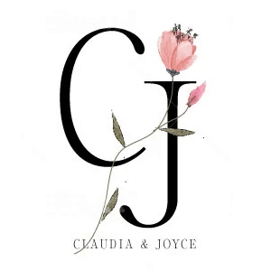
Logo by graphic_point |
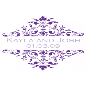
Logo by momal1 |
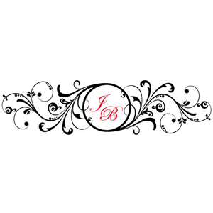
Logo by reitapeil93 |
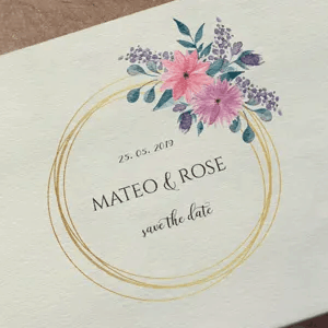
Logo by anacrss09 |
Logo by GoodEnergy |
Logo by anapekic |
Logo by reichperez |
Logo by susannahumber |
Logo by wroldclasslogo |
How to Hire a Professional Wedding Logo Designer for a Great Price
Weddings take a lot of time and energy. If you aren’t up to making your own wedding logo, you can use Fiverr (click here to read the full review) to find a designer to make a logo you love. Not only that, but you can save some money — designers on Fiverr charge as little as $5. The platform lets you specifically search for people offering logo design services based on your preferences — experience with weddings, turnaround time, price range, and Fiverr experience level. You can also look for Best Selling and Fiverr Recommended Designers. Continue filtering until you create a Designer Shortlist.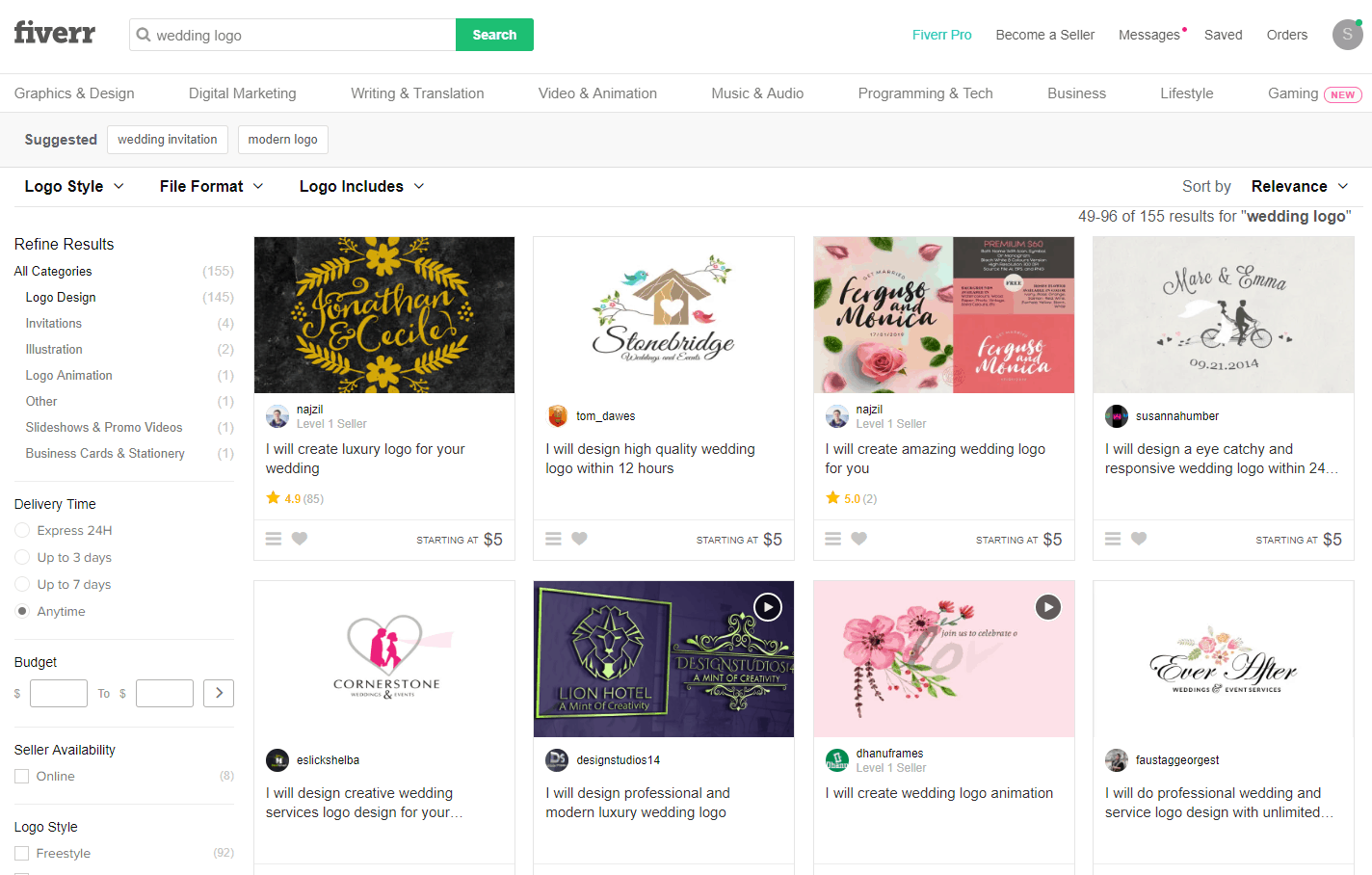 The next step is to review the designers on your Shortlist. Finding a designer with a style that you like is more important than finding one specifically with wedding experience. Once you find the right designer, it’s time to choose a package. For most weddings, the Standard package is the right fit, but you may want to spring for Premium if the logo is exceptionally important to you.
One of the reasons I like Fiverr is the ability to communicate easily with the designers both before hiring and during the design process. And if you don’t like your logo, you can reject the logo or file a dispute. The entire process is risk-free.
How to Make Your Own Wedding Logo for Free
There are several wedding logo design tools, but my current favorite is Wix Logo Maker (click here to read the full review). The biggest reason I like Wix Logo Maker as a top wedding logo creator: It’s easy to use. And since your wedding logo may very well be the one and only logo you have to make, ease of use is likely your top priority. Not to mention, you can design your logo for free. You pay only if you’re happy with it, and the price is low — think less than a casual dinner for date night.- Go to the Wix Logo Maker homepage.
- Enter the text for the logo, such as initials, first name, last name — whatever text you want.
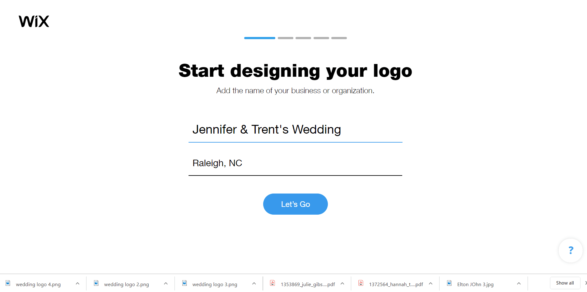
- Enter Wedding for the type of logo.
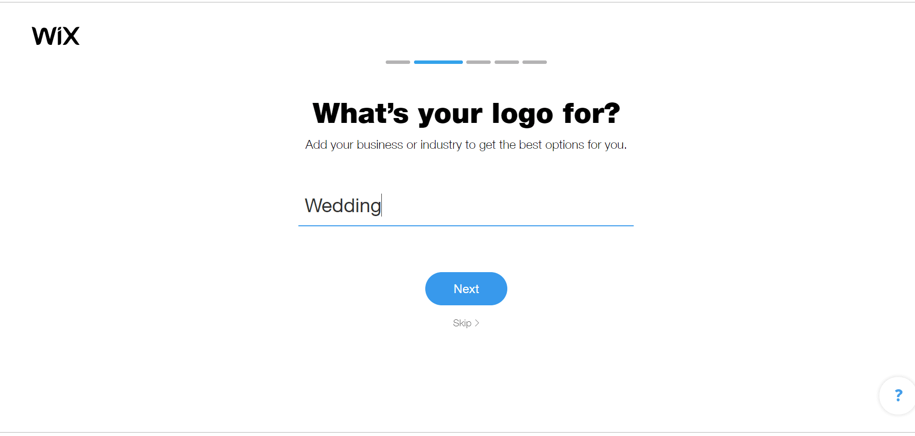
- Select the type of logo you’re looking for
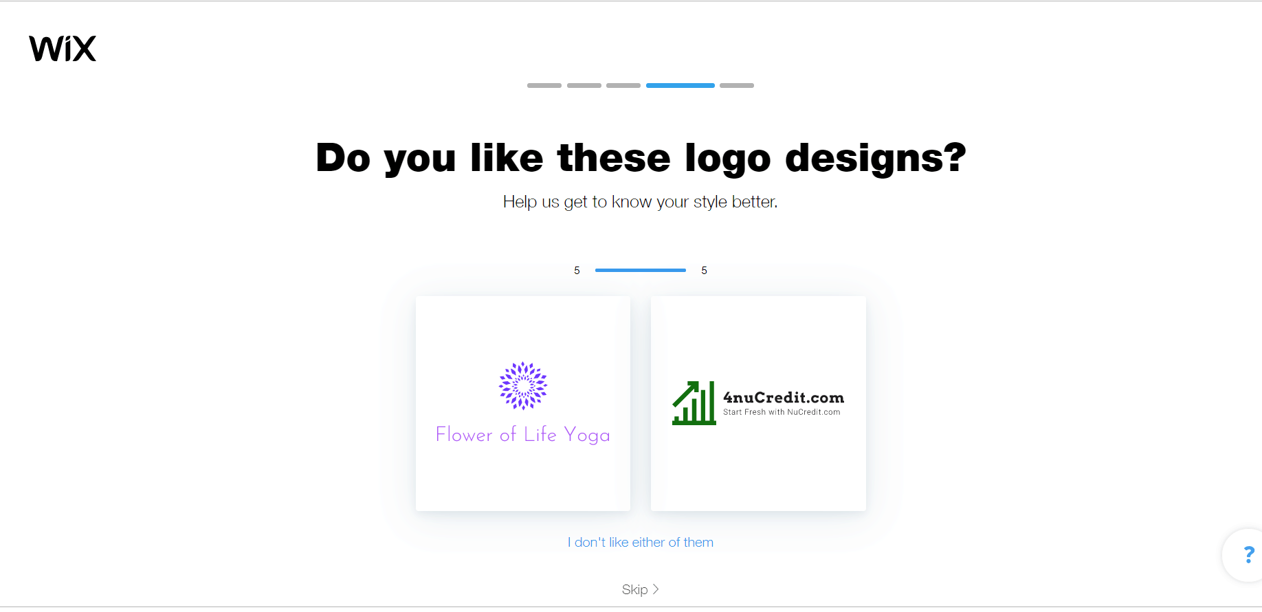
- Now it’s time to make some choices. Wix will show you six different sets of designs. Pick your favorite for each, or click on I don’t like either of them.
- This next step is easy. I promise. Pick where you will use the logo — most likely, your wedding website and on social media. And since there wasn’t a choice for wedding invitations, I picked Other as well.
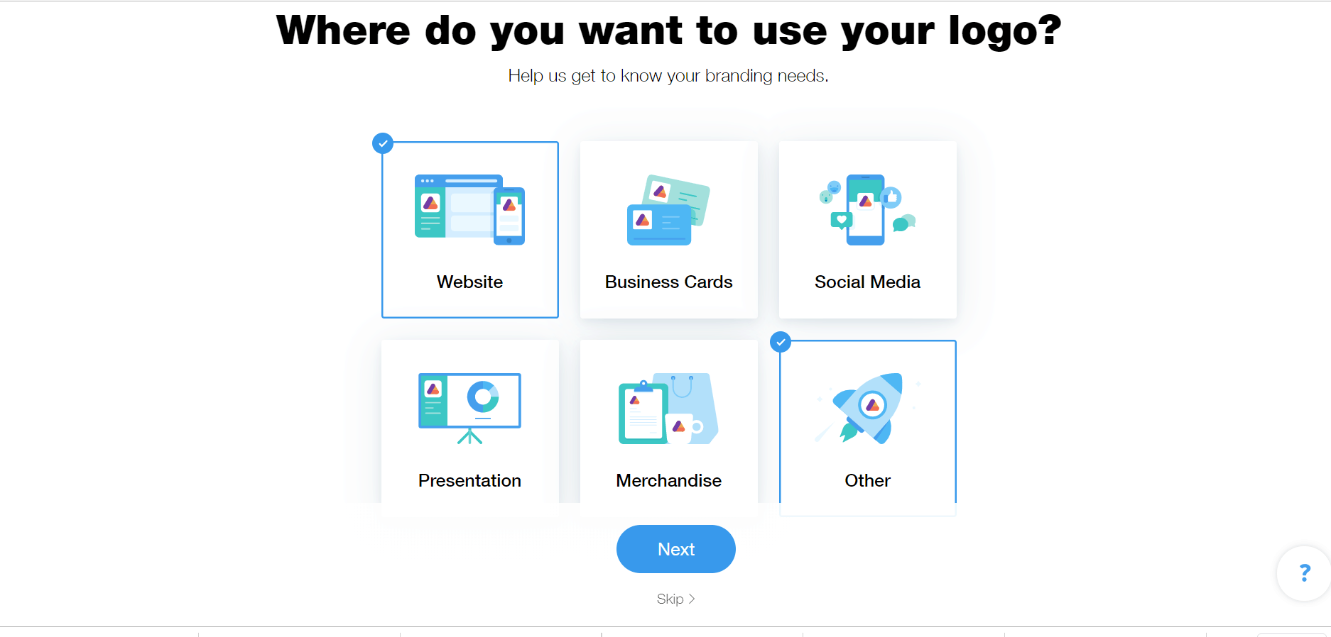
- Once you click Next, Wix Logo Maker creates your logo. It just takes a minute or so. Go get a cup of coffee and you’ll have 12 logo options to choose from when you return.
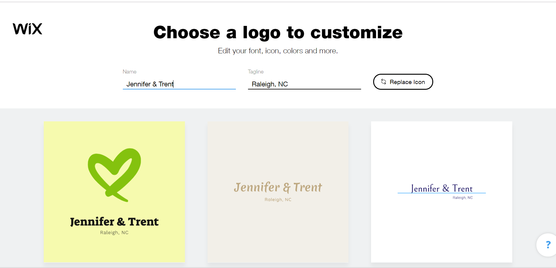
- Spend some time browsing your options. Don’t worry about the colors and fonts at this point — you can change all that later — just focus on the basic design. And if you like the overall logo but not the icon, click Replace Icon and select a new one. You can also change the text in the logo right from this screen. Double click when you’re good to go.
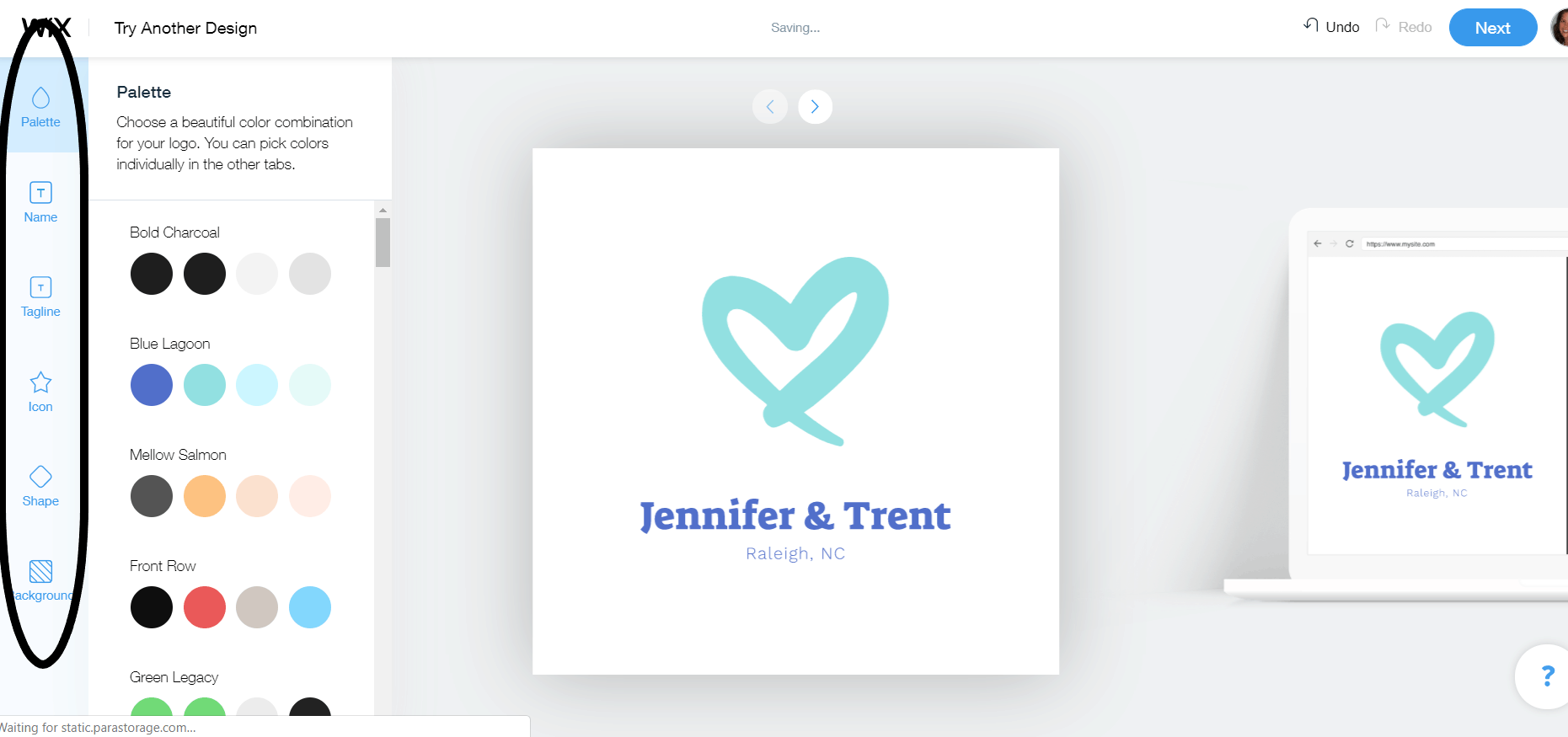
- A basic logo is then displayed. Don’t panic, this is just the beginning. Now you can customize the logo to your heart’s content. Click on the tabs on the left side of the page to change the palette, shape, icon, background, and text. You can even add a tagline. And if you’re not a fan of the options, just click on Try Another Design. When you have a logo you love, click Next.
- Now it’s time to pay and download. Select the plan that works for you and then pay for your logo. The screens direct you through the options — you can save, download, or both save and download.
Wedding Logo Maker Alternatives
Is Wix Logo Maker not right for you? Try one of these alternatives:- If you are planning to create multiple logos, maybe one for the bachelorette party and another for the bridal shower, Tailor Brands is a good fit. For a low monthly price, you can create as many logos as you want and then cancel the subscription. Be sure to download your logos in high resolution.
- If you want more premium fonts, graphics, and icons, Looka should be your logo-making tool of choice.
- If you’re short on time and you want to create your logo as quickly as possible, try out LogoMaker. It’s incredibly easy to use.
The Most Inspiring Wedding Logos
To ignite your creative inspiration, one effective approach is to draw ideas from logos used in other weddings. Recognizing the numerous tasks you have undertaken, and are still working on, I have taken the initiative to curate a selection of the finest wedding logos for you.Margo & Keanu – Hashtag Included
Adding your wedding hashtag to the logo like Margo and Keanu did is a great way to encourage people to use it on social media. The simplicity of this logo caught my eye and I especially love how the openings in the outer circle add a dash of style. While this design is great for a formal affair, you can also make it work for a more casual wedding by using different colors and shading.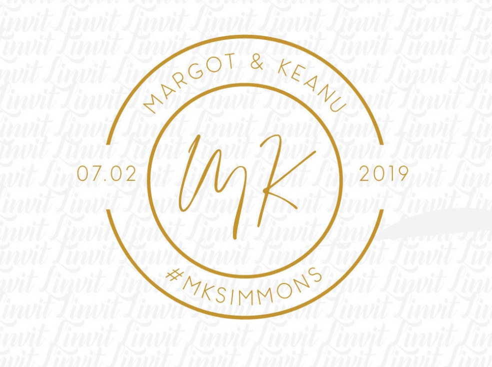
Laura & Frank – Serif Elegance
Most wedding logos use a sans serif font, which gives them a more formal look. But this logo takes the opposite approach with a serif font and vertical line graphic, which creates elegance from simplicity. I especially like the dot on each side of the circle, which adds some fun visual interest.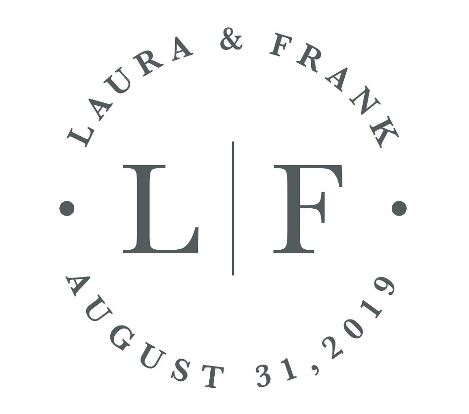
Julianne & Nicholas – Geometric Simplicity
By mixing up the colors and fonts, this seemingly simple logo is exceptionally eye-catching. Most logos use either gold or black and pick either a sans serif or a serif font, but this logo went a step further by not only combining colors and fonts, but also by throwing in a dash of italics. Add in the three squares graphics and you’ve got yourself a fun, eye-catching logo. I also love how this logo includes the location, which is helpful if it’s a destination wedding or most of your guests have to travel.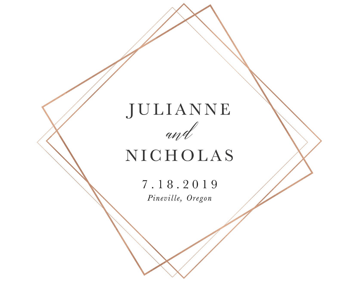
L loves V – Play on Words
Sure, not everyone is blessed with such obvious initials for wordplay, but if your first initials or last name or any combination create a fun word, consider going this route. The subtle visual effects like the line of dots across the circle and the hand-drawn graphics create interest and give it some flair.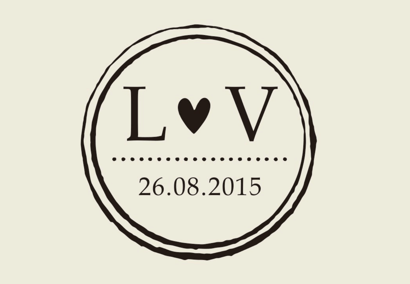
Jackson – Last Name Logo
Many of the wedding logos I saw focused on the couple’s first names or initials, symbolizing the joining of two people, but this logo caught my eye because it focuses on the new family created by the wedding. It’s the simple details that make this one stand out — the lower case “j,” combining the sans serif and cursive italic fonts, and even the creative use of “est.”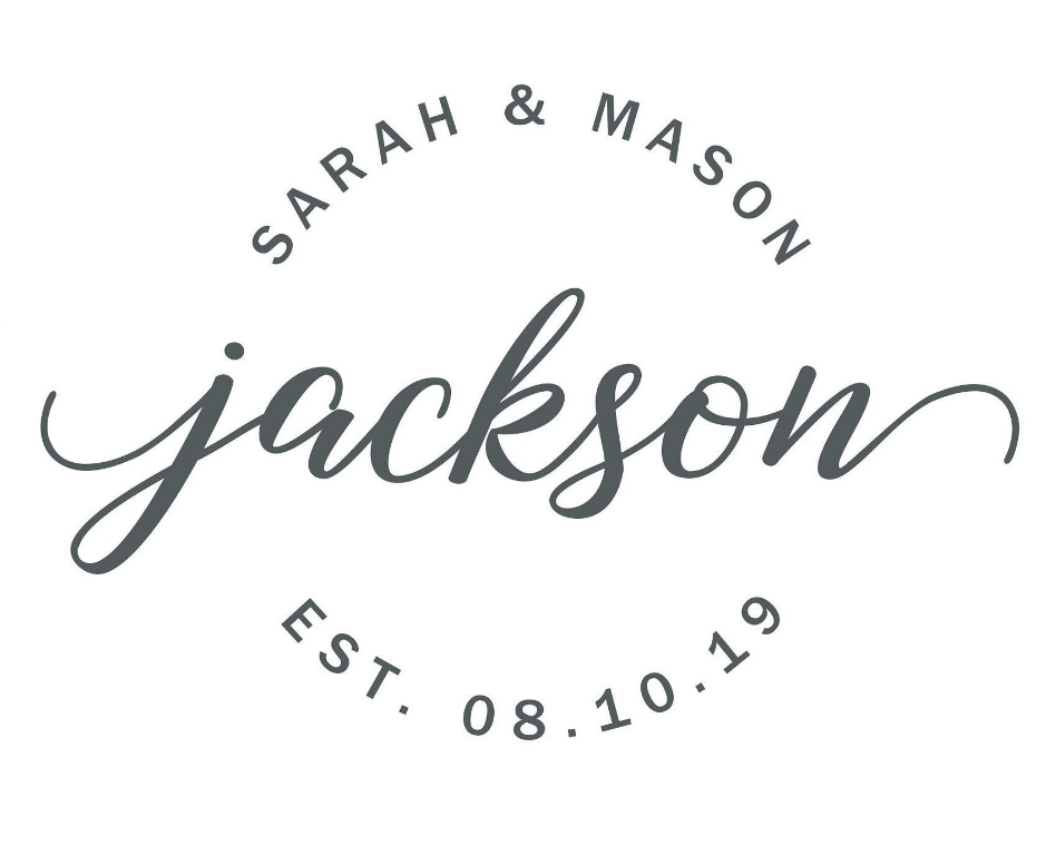
M & R – Color Contrast
This beautiful watercolor wreath immediately jumped out to me and made this wedding logo one of my favorites. You could easily create a similar effect with any watercolor image, such as flowers or even a colorful painted design. While this couple chose an italic font for the wording, I think a regular font (especially a serif style) would create contrast that would add even more appeal to the design.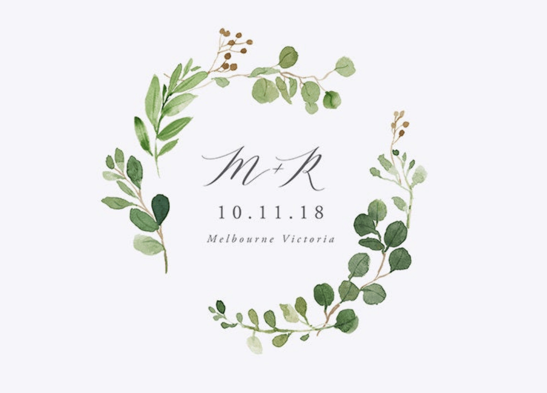
M & K – Simple Circles
If most of these wedding logos seem beyond your design ability, this super-easy-to-recreate ring logo might be a match. The image on top and the circle on the bottom take it up a notch. You can personalize it by using your wedding colors for the circles and even adding some shading for more pizazz. While a heart is a universal symbol for love, any image that’s meaningful to you and your new spouse — a flower, ocean, mountains, an animal — would work as well.
G & K – Elegant Wreath
Drawn to the watercolor wreath but don’t know anyone with painting abilities worthy of a wedding logo? Consider creating an image and then printing it in gold to mimic embossing. While any image could work, I love how the intricate details in the flowers on the wreath add interest. For more contrast, you could use black wording inside the image for the wedding details.
Charlotte & Ben – Diagonal Design
Most logos position the couple’s initials horizontally, but this simple shift to diagonal adds some variation. The contrast of italics and a regular font also creates visual interest. And I especially love the heart graphic in the outer circle. This couple also uses both first names and their new last name, which is a different take than most of the other wedding logos I saw.
Viola & Harry – Stunningly Simple
If I were to choose only one, this might become my favorite. It has the potential to seem a little dull, but by enlarging the initials and rendering them in lowercase, this image springs to life on the page. However, it’s the extended curls of the V and H that elevate this wedding logo to another level. Adding color to the names would also help personalize and make it less formal for a more casual wedding.
Conclusion
Creating a logo yourself or working with a designer can be simple and quick, especially with an online tool like Wix Logo Maker. When designing your logo, keep the following in mind:- Think about the venue and formality of the wedding. A logo for a beach wedding should be different than one for a black-tie affair.
- Make sure both spouses love — not just pretend to like — the logo.
- Be creative. Use the logo to express yourselves and set the tone not only for the wedding but also for your life together.
- Consider married names. If one spouse is keeping their name or you are going to hyphenate, take that into account when designing the logo. Using first initials or names is a great way to go if both spouses will have different last names after the wedding.


![13 Best Logo Makers That Are Free To Try (& Good) [2025]](https://dt2sdf0db8zob.cloudfront.net/wp-content/uploads/2018/08/LD-best-free-cheap-850x446.jpg)
![13 Best Logo Makers That Are Free To Try (& Good) [2025]](https://dt2sdf0db8zob.cloudfront.net/wp-content/uploads/2020/09/1.jpg)




![9 Best Arabic Logos and How to Get One for Free [2025]](https://dt2sdf0db8zob.cloudfront.net/wp-content/uploads/2020/12/9-Arabic-Logo-Designs-and-How-to-Make-Your-Own-for-Free-850x435.jpg)
![9 Best Japanese Logos and How to Get One for Free [2025]](https://dt2sdf0db8zob.cloudfront.net/wp-content/uploads/2020/12/9-Best-Japanese-Logos-and-How-to-Make-Your-Own-for-Free-850x435.jpg)
![21 Best Signature Logos and How To Get Yours for Cheap [2025]](https://dt2sdf0db8zob.cloudfront.net/wp-content/uploads/2020/11/9-Best-Signature-Logos-and-How-to-Make-Your-Own-for-Free-850x435.jpg)


