We rank vendors based on rigorous testing and research, but also take into account your feedback and our commercial agreements with providers. This page contains affiliate links. Advertising Disclosure
  1. Website Planet
  2. >
  3. Blog
  4. >
  5. How To Build a Landing Page in WordPress [2024 Guide]

How To Build a Landing Page in WordPress [2024 Guide]

Andrés Gánem Written by:
21 November 2024
What do your favorite online magazine, fitness app, and cloud-based software have in common? Good landing pages are a key component of their success. A landing page can be an exceptional tool to invite visitors to take action, be it by subscribing to a newsletter, buying a product, or simply driving traffic to your site.

However, quality is crucial when creating a landing page for your business. Just like a well-designed landing page can deliver fantastic results, a poorly designed or broken landing page can make customers dismiss your without a second thought.

That’s why I’m here to show you how to create an outstanding landing page in WordPress. Hopefully, by the end of this guide, you’ll be ready to create your very own high-converting landing page.

But first,

What Even Is a Landing Page?

WordPress landing page
WP can help you create a high-converting landing page.
Just so we’re on the same page. I should clarify that a landing page is not the same as a homepage. A homepage is where visitors arrive when they go to your website – it’s your site’s “home.” Though it is crucial that your homepage accurately conveys the tone and purpose of your website, a “How to create an effective homepage” article would be way different. That’s because the purpose of a landing page is fundamentally different.

A landing page is a single page designed for a very specific purpose: convincing visitors to take some action. This usually translates to getting visitors to share information with you. For example, through contact forms or by subscribing to an email newsletter. However, you could also use a landing page to convince visitors to buy a product or service, or visit your main site.  

What Makes a Landing Page Effective?

Anything that encourages visitors to take your desired action is an effective landing page. Though this can change, most high-converting landing pages have at least three elements:
  • A header. This will draw your visitors’ attention. It should be short and to the point.
  • A subheader. This is a bit of text where you explain to your visitors how you can help them. Though you have a little more space here to elaborate on your header, your subheader should also be short and sweet.
  • A CTA. That’s shorthand for “call to action.” It’s the button you want your visitors to press. Simple as that.
Technically, that’s all you need to create a landing page. But you’d end up with something that looks like this:

Boring Landing Page
This could attract some minimalism fanatics, but I wouldn’t take chances
Most landing pages tend to fail, so you really want to make sure you do everything in your power to make your landing page as effective as possible. If you want to create an effective landing page, there are a few more things to consider:
  • There should be little-to-no navigation. An effective landing page should do everything to draw attention to your CTA. Other navigation elements could distract from your CTA, ultimately losing you leads. Though there are effective landing pages that include navigation elements (DoorDash comes to mind), try to keep these to a minimum. 
  • Include interesting visuals. You don’t want to fill your page with text, but you need to make it attractive somehow. High-quality images are a great way to increase interest in your service. Bonus points if you can include video.
  • Include social proof. Have you received any positive feedback? Don’t be shy about sharing it on your landing page. Human beings are social creatures. If your visitors see that others recommend what you’re offering, they’re more likely to be interested.
  • Make it interactive (if appropriate). Getting visitors to interact with your site can be an effective way to increase their interest. Quizzes, moving bars, and mini-games are all great for encouraging visitors to click. Make sure any interactive elements actually relate to what you’re offering, though. Otherwise, you risk annoying your visitors. 
  • Know your audience. What are you offering? Is it elegant? Energetic? Trendy? A gaming magazine might benefit from an in-browser mini-game. A candle store could have a little questionnaire that helps visitors find the ideal candle. Everything from fonts to background colors should appeal to your target audience. 
If you want to go into further detail, you can read our extensive guide to building a fantastic landing page. Now it’s time to get to work. 

Method 1 – Use a WP Page Builder

Before we begin, we need to be clear on the difference between WordPress.com and WordPress.org.

WordPress.org is an open-source platform for creating and managing websites. You might have heard that about a third of all websites run on WordPress. That’s exactly right.

To use WordPress.org, you need a web hosting provider as well as a domain name. But don’t worry – this sounds more complicated than it is.

WordPress.com is the version of WordPress that comes with its own hosting. Compared to WordPress.org, it’s a lot more like a traditional website builder. This means it’s easier to manage, but it’s also more limited.

Let’s start with creating a landing page with WordPress.org. If you’re only interested in using WordPress.com, you can skip ahead.

Step #1: Get Yourself Some Hosting

Before you start, you’ll need a hosting provider where you can install WordPress and a page builder. If you’re already using one for your main site or online store, stick to it; there’s no reason to complicate things. If you don’t already have a hosting provider, I suggest you read our review of the best hosting providers for 2024.

The process of installing WordPress will vary depending on your provider, but it shouldn’t be too complicated with any. I went with Hostinger for my page. Hostinger has specialized plans for WordPress hosting, so all I had to do was create an account and follow the instructions on its auto-installer. 

1
Hostinger-logo-primary

Save up to 75 % on your Hostinger plan!

Limited-time offer - Don't miss it!

13789 users used this coupon!

Step #2: Install Your Page Builder

Now you have the right hosting provider, it’s time to install your builder. All you have to do is go to your WordPress dashboard, navigate to Plugins, and click “Add New”.
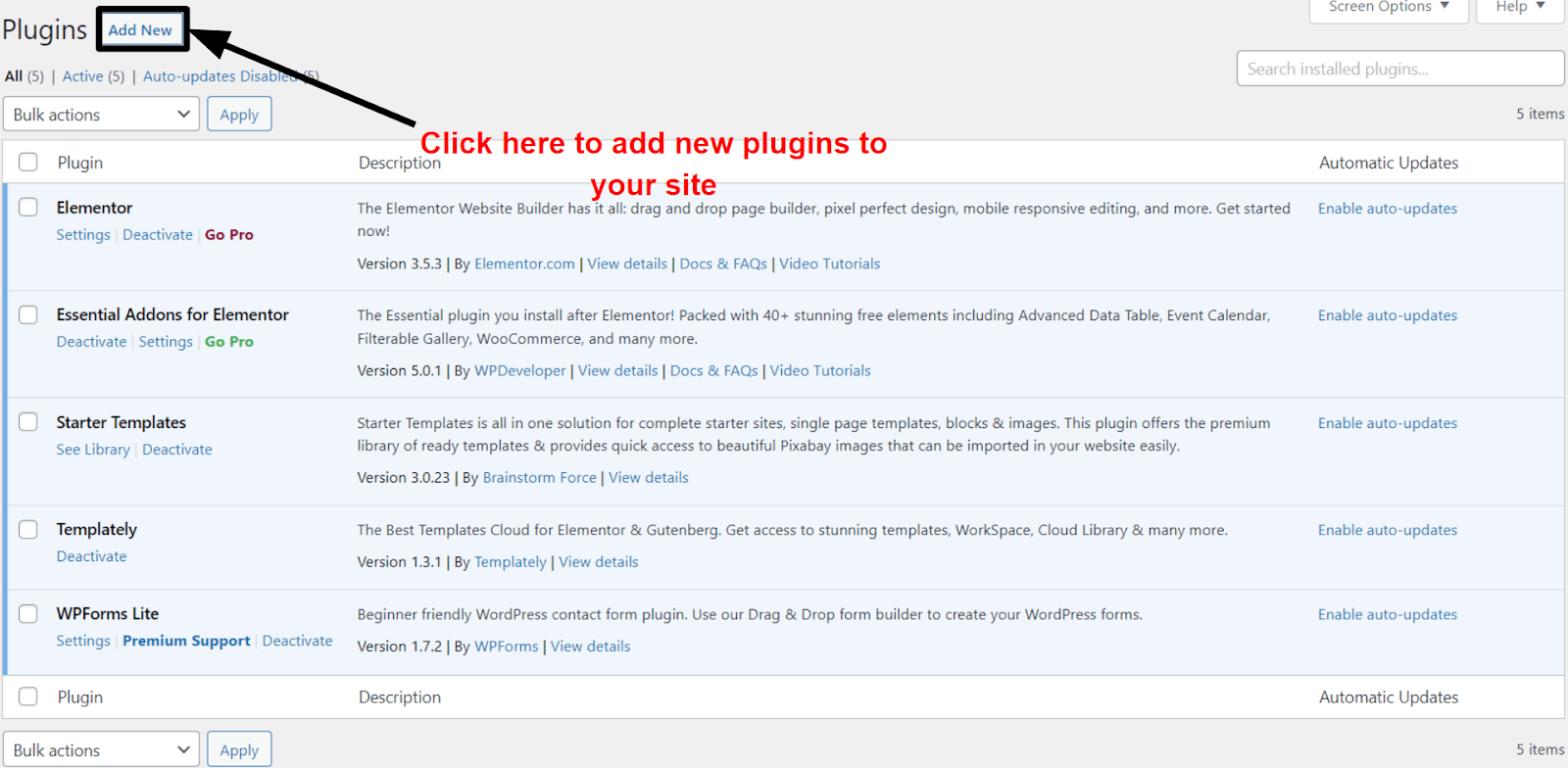
Add Plugin WordPress
Why stop at page builders? Plenty of other great plugins are waiting to be discovered
If you’ve already downloaded a .zip file for your builder, you just have to upload it. Otherwise, you can search for your preferred builder on the “search plugins” bar and click on the “Install Now” button.

I used Elementor for my landing page, but the steps will be very similar regardless of your page builder. If you don’t know which builder to use, you can take a look at some of my favorites below.

Whichever builder you choose, play with it a bit before you start. Watch YouTube tutorials, create mock pages, etc. You want to get comfortable with your builder’s interface and functions before you dive in. 

Step #3: Sketch Out Your Page

If you don’t have a clear picture of what you want, you could easily end up with a messy landing page and no idea how to fix it. That’s why it’s important to have a plan.

Start by making a mock-up of your landing page. There are no rules for this part. You can design it in Photoshop, MS Paint, or draw it on a napkin. The only thing that matters is that it’s clear enough to work with.

If you don’t know where to start, you can always check out examples of great landing pages in your niche. Think of your brand, style, and who you’re targeting.

For this example, I decided to design a landing page for a fitness and wellness app with a post-apocalyptic theme to make it a little more fun. The only real components my landing page needed were a couple of mockups, a CTA, and subscription tiers, but don’t be afraid to think outside the box and add something to draw the user’s attention.

Step #4: Choose the Perfect Template

If you feel comfortable with your builder of choice and have a very clear idea of what you want your page to be, you can comfortably skip this step. However, remember that starting from scratch will involve more work and a ton of minute decisions like fonts, colors, animations, element spacing, and more. Working from a template is much more straightforward. The more the chosen template matches your initial design, the less work you’ll have to do down the line.
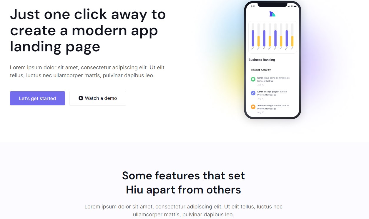
Mobile App Landing Page Template
I decided to start with a third-party template that closely resembled what I needed
Besides WordPress’ own theme gallery with thousands of different options, your builder might come with some built-in options, and there are also tons of high-quality third-party templates out there. If you get overwhelmed, our list of the best landing page templates in 2024 can help.

Though Elementor offered plenty of good-looking templates, I eventually decided to go for a third-party template for an app landing page since it already had almost every element I needed from the start.

Step #5: Customize Your Page

The exact process of customizing a landing page will be different for everyone. Personally, I like to start with the general aspects and work my way into the specifics. 

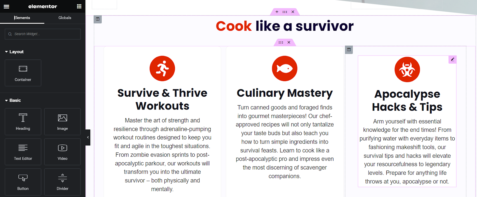
To edit with Elementor, simply go to your WordPress dashboard, create a new page, and choose “edit with Elementor.” Since I used a template from a third-party site, I had to upload it to Elementor before I could begin toying with it. To do this, simply click on the folder icon on the “drag widget here” box, go to “my templates,” and select “upload a template.” Select your template and click “insert.”

Once that’s done, click on the hamburger menu on the top left (that’s the three horizontal lines) and then “Site Settings.” Here, you can customize the more general aspects of your page, like global fonts, background color, and more.  
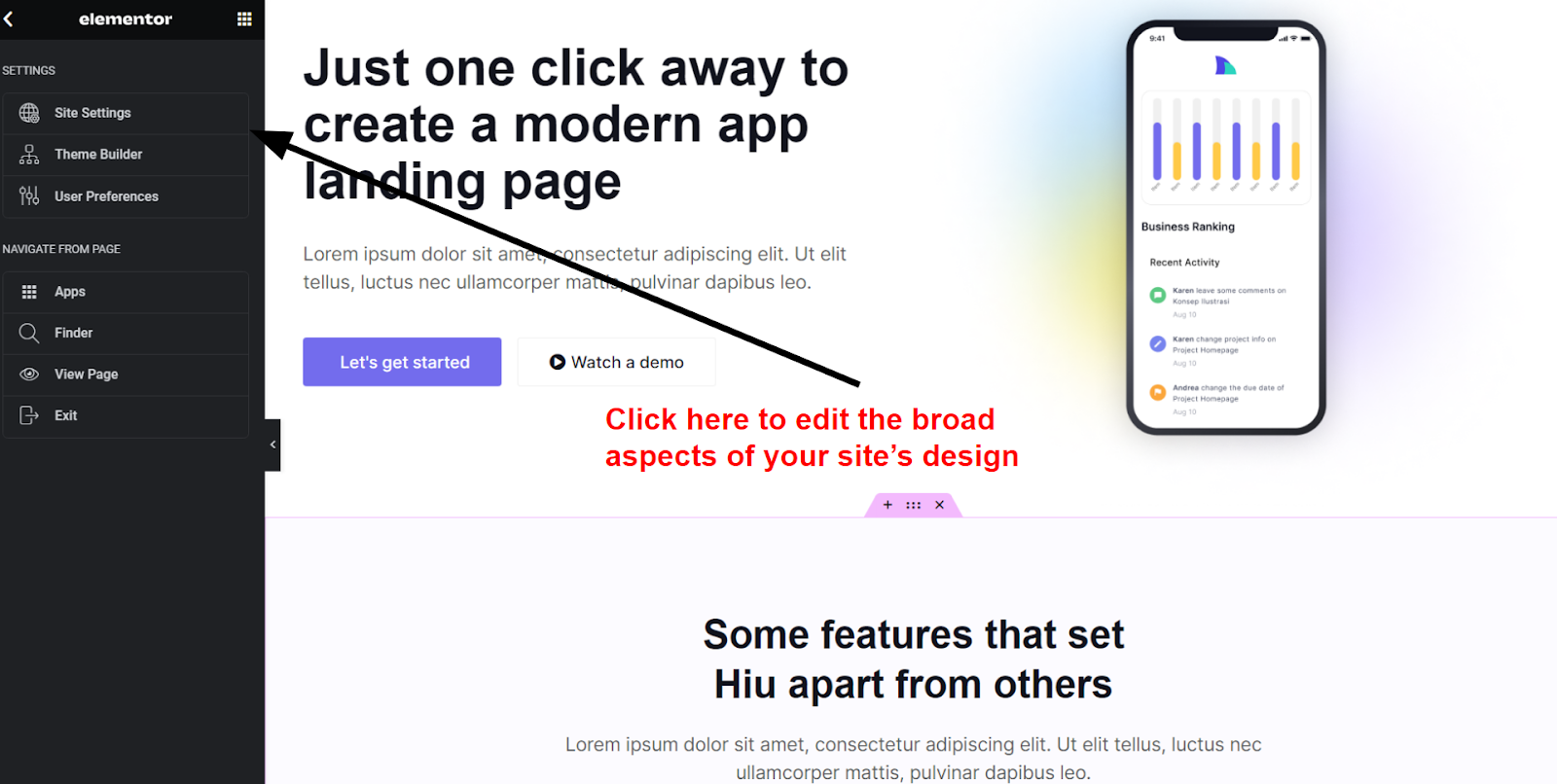
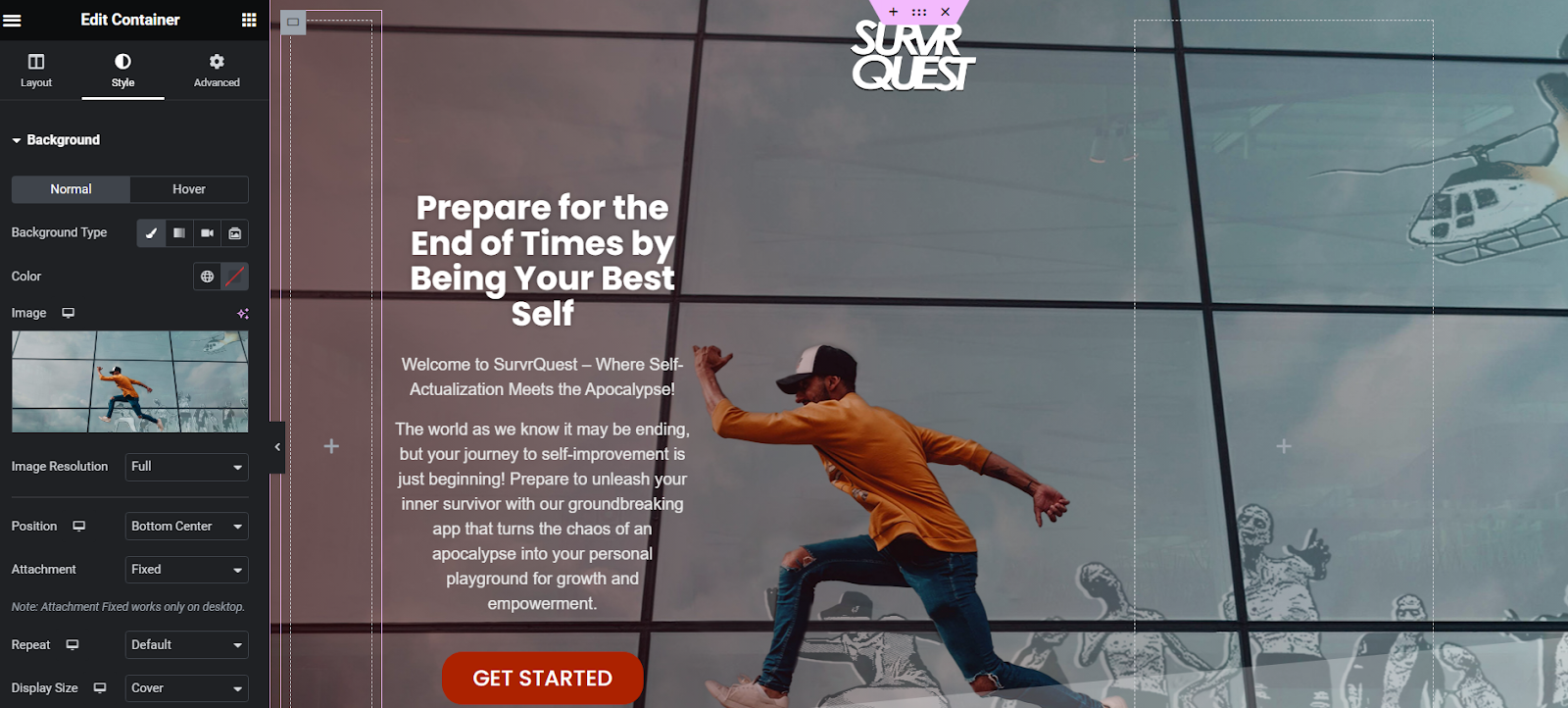
Elementor Site Settings
Use site settings to modify the large strokes of your site
When you’re done, click on the little squares at the top right of the menu. You’ll see a series of widgets you can add to your site. Basic widgets include things like text, images, and videos. I upgraded my plan to Elementor Pro to unlock more interesting widgets like animated headlines and media carousels.

Either way, you can simply drag and drop any widget to where you want it to appear on your page. You can then click on your widget to bring up the widget menu.

Depending on the widget, you can customize things like color, borders, and even animations.  

Since I wanted to capture potential visitors’ attention from the first moment, I started by adding a hero section top that included the basic components from before: a heading, a subheading, and a call to action.

Hero section made with Elementor
Use shadows or overlays to ensure your text is readable
I also re-arranged elements to ensure the page had a nice flow. Remember that the goal of a landing page is to be as straightforward as possible, so you should only add elements if you strongly feel like they add value to your proposition. In my case, I kept a small listing of the app’s characteristics that helped explain the concept further, a mockup, pricing information, and social proof.

Landing page description
Starting with a neatly structured template helped when customizing my design.
Though impressive visuals can do most of the heavy lifting, don’t go overboard and saturate your page too much. Usually, the simpler, the better.

Elementor Landing Page
It might not be a great idea for an app, but the page looks good

The Best Page Builders for Landing Pages

There are a lot (and I mean a lot) of page builders for WordPress. Even a list of the great ones would take up too much space. What I can do is give you a quick look at my absolute favorites.

Elementor1

Elementor Homepage
Elementor gives you a huge variety of templates to choose from
1
Elementor is one of the most popular page builders for WordPress, and for good reason. Elementor offers powerful, drag-and-drop editing for free. There is a bit of a learning curve to mastering its more interesting features, but Elementor is extremely powerful once you get used to it. Some of its best features for landing pages are:
  • Tons of third-party themes. There are thousands of Elementor-compatible themes on the web. This includes plenty of great landing page themes to suit every budget.
  • Scalable functionality. Elementor’s free plan is nothing to scoff at. Still, if you’re looking for even more functionality, the Pro and Expert plans are reasonably priced and offer fantastic features like the theme builder and an advanced popup builder.
  • Custom CSS editing. From the Pro plan forward, you can edit just about every part of your website with custom code. You’ll need a bit of technical know-how, but the possibilities are endless.

Divi1

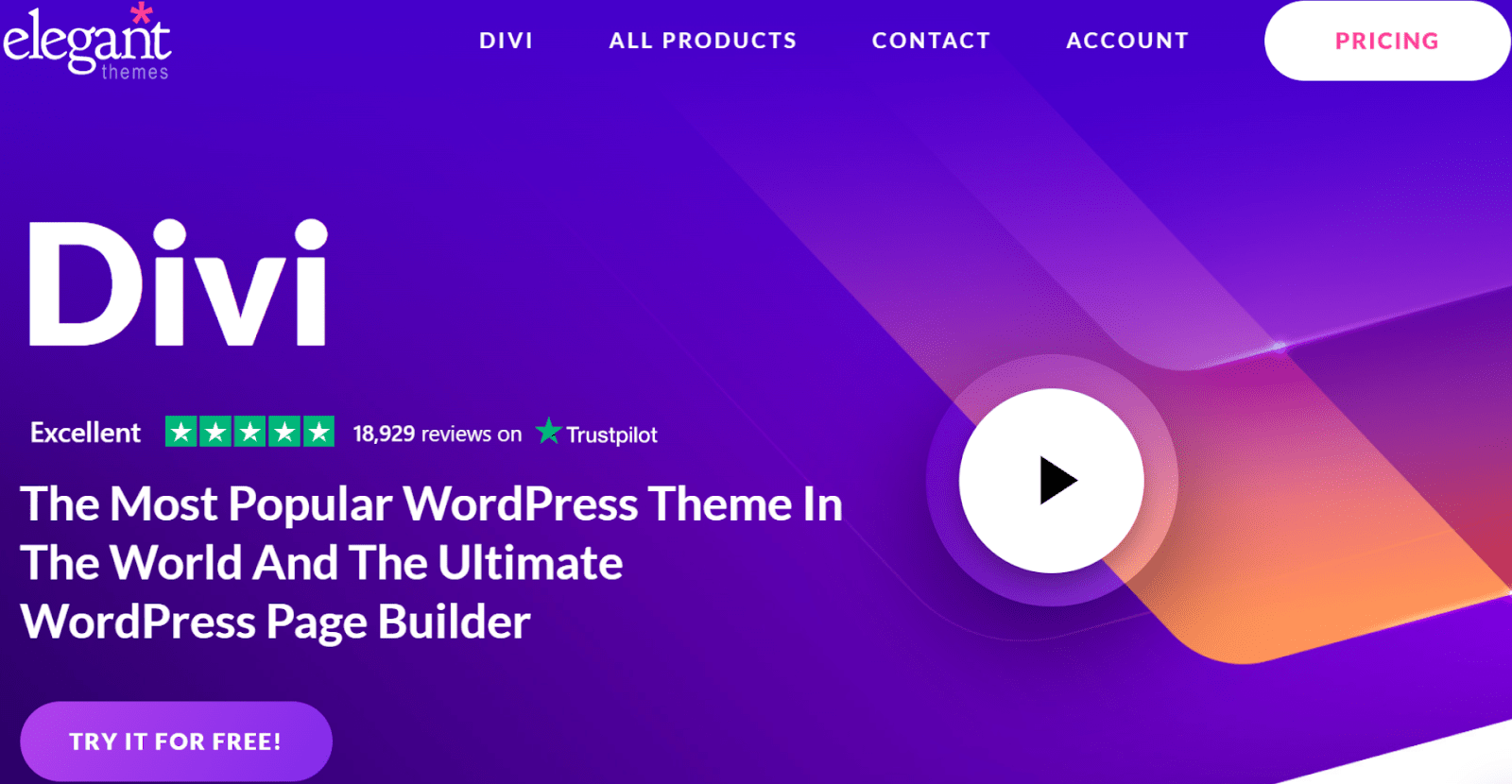
Divi Homepage
Divi’s intuitive editor gives you an impressive degree of creative control
1
Divi by Elegant Themes is a flexible option for building all sorts of sites. The module editor is incredibly easy to use, despite the huge variety of customization options it gives you. And if you prefer backend editing, Divi also supports this.

Some of Divi’s best features are:
  • The module editor. If you want to edit an element, all you have to do is click on it. The various customization options will then appear directly over the element.
  • Fantastic layout packs. Divi offers 340+ template packs (called layout packs) to help you build any kind of page.
  • Incredible ease of use. There are very few page builders out there as easy to use as Divi. 

SeedProd
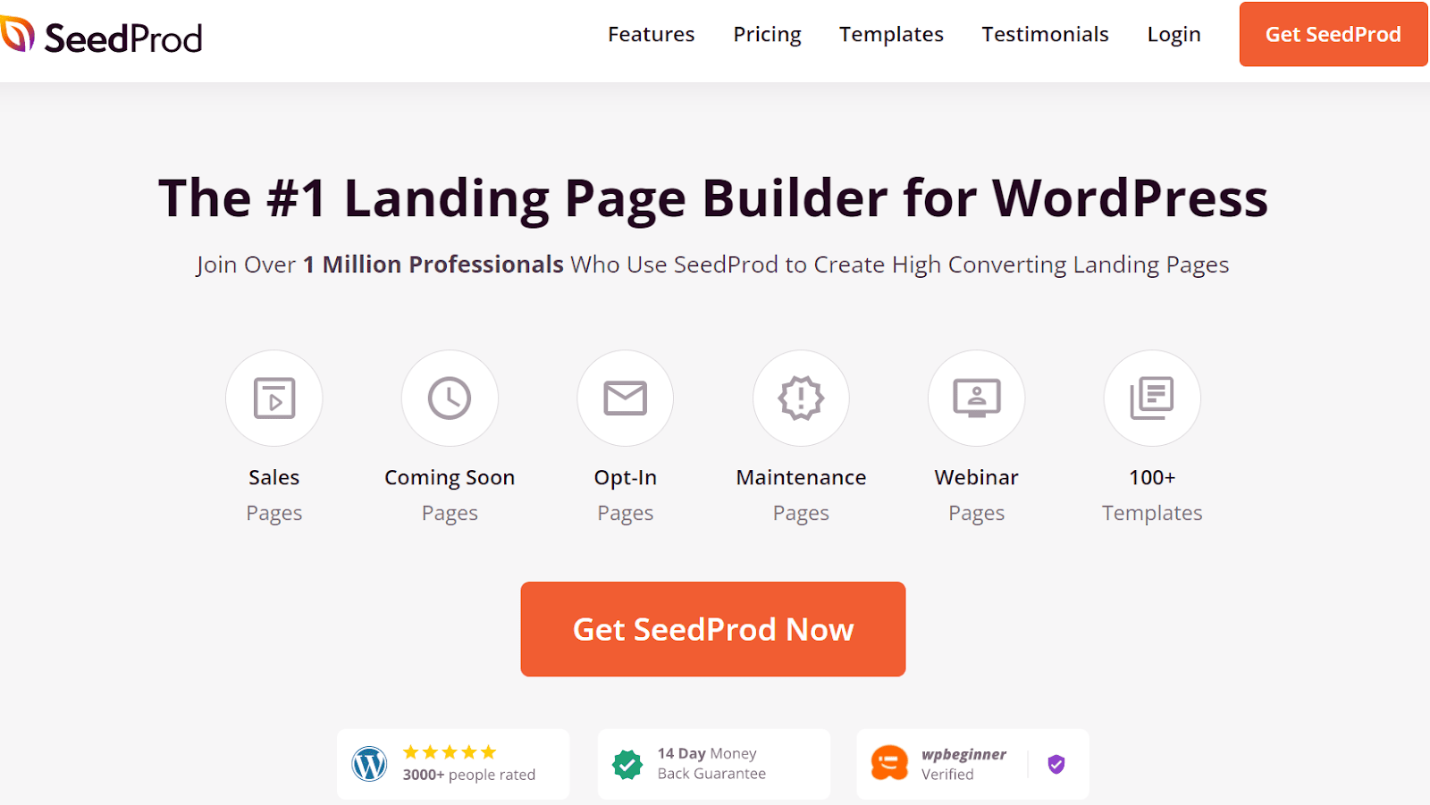
SeedProd Homepage
SeedProd is a page builder specifically designed for landing pages
SeedProd is the only page builder on this list that’s specifically designed for landing pages. It has almost no learning curve, and the results are stunning. It’s particularly great if you’re looking for a more landing-page-focused version of Elementor, as both builders’ interfaces are pretty similar. 

SeedProd offers great features like:
  • Lightning-fast editing. Thanks to the simple layout and responsive widgets, it only takes a couple of minutes to create an awesome landing page with SeedProd.
  • High-quality templates. SeedProd offers up to 180+ high-quality and customizable templates, depending on your plan.
  • Subscriber management. SeedProd’s subscriber management tools lets you track subscriber growth and gives you visual data on your subscription numbers. 

Beaver Builder
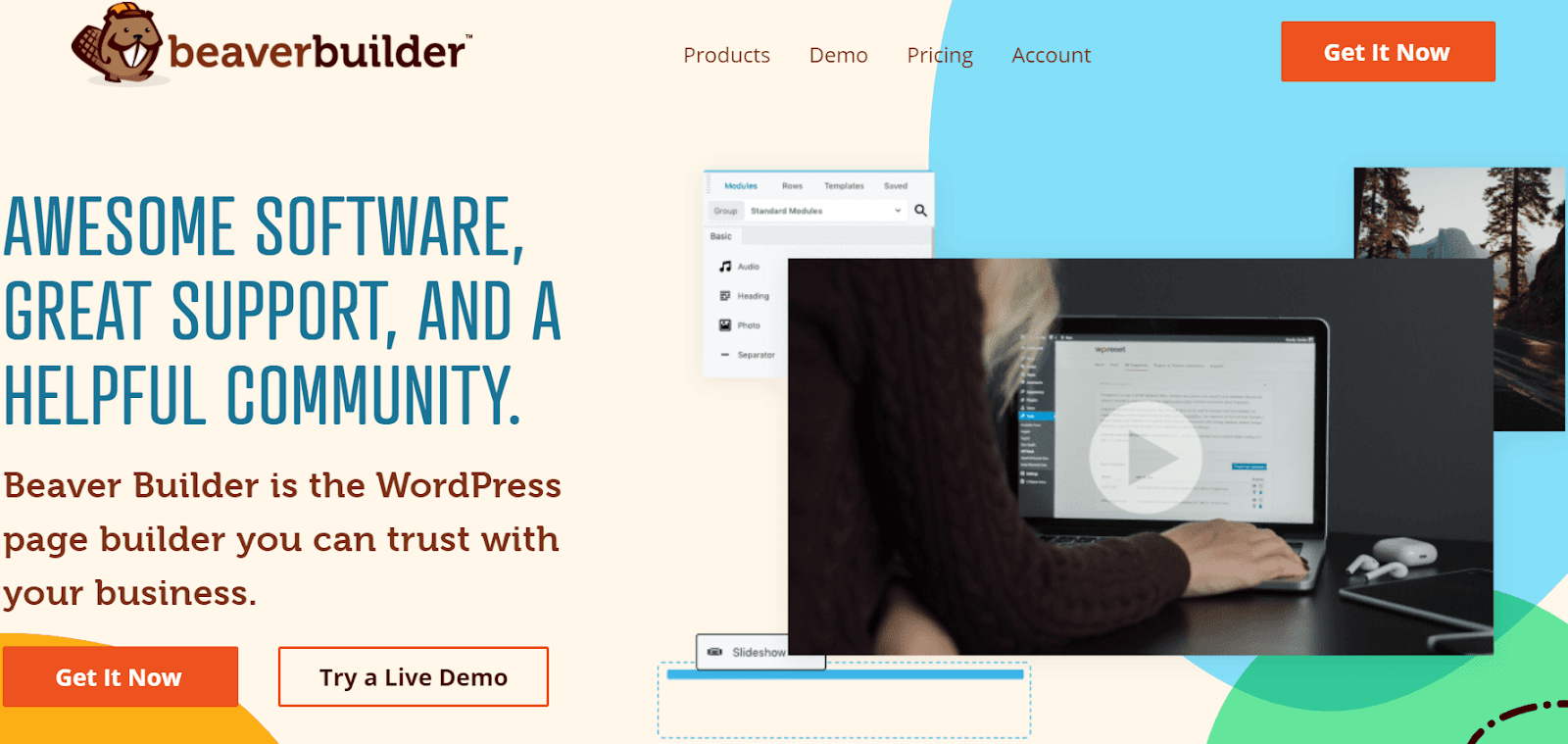
BeaverBuilder Homepage
Beaver Builder is a simple but powerful builder for landing pages.
Beaver Builder is a simple, module-based page builder. Though its focus is on building pages for agency websites, its user-friendly interface and wide template variety make it enjoyable for anyone to use.

Beaver Builder offers:
  • Incredibly responsive editing. When you make changes to your website, there’s virtually no lag in the editor.
  • Easy button editing. Beaver Builder offers every tool you could need to fine-tune a clickable button (an especially important element on most landing pages).
  • Massive support center. If you’re ever lost, Beaver Builder offers hundreds of video tutorials to help you get back on track. 

Method 2 – Use the WordPress Gutenberg Editor

If you’re using WordPress.com, you’ll need to be on the Pro plan to install a page builder (or any plugins for that matter). On top of that, most page builders hide their best features behind a paywall, so costs can quickly rack up.

The good news is that every WordPress plan comes with the Gutenberg editor, a simple block editor for creating websites easily. Though it’s more limited than many other builders, you can still use it to craft an effective landing page, and for little-to-no money. Here’s how: 

Step #1: Create a WordPress.com Account
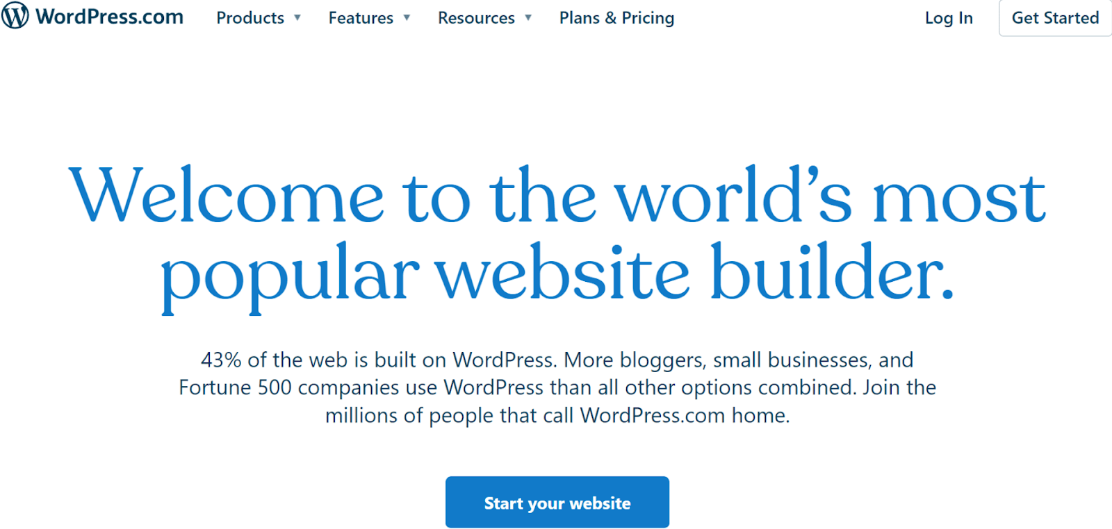
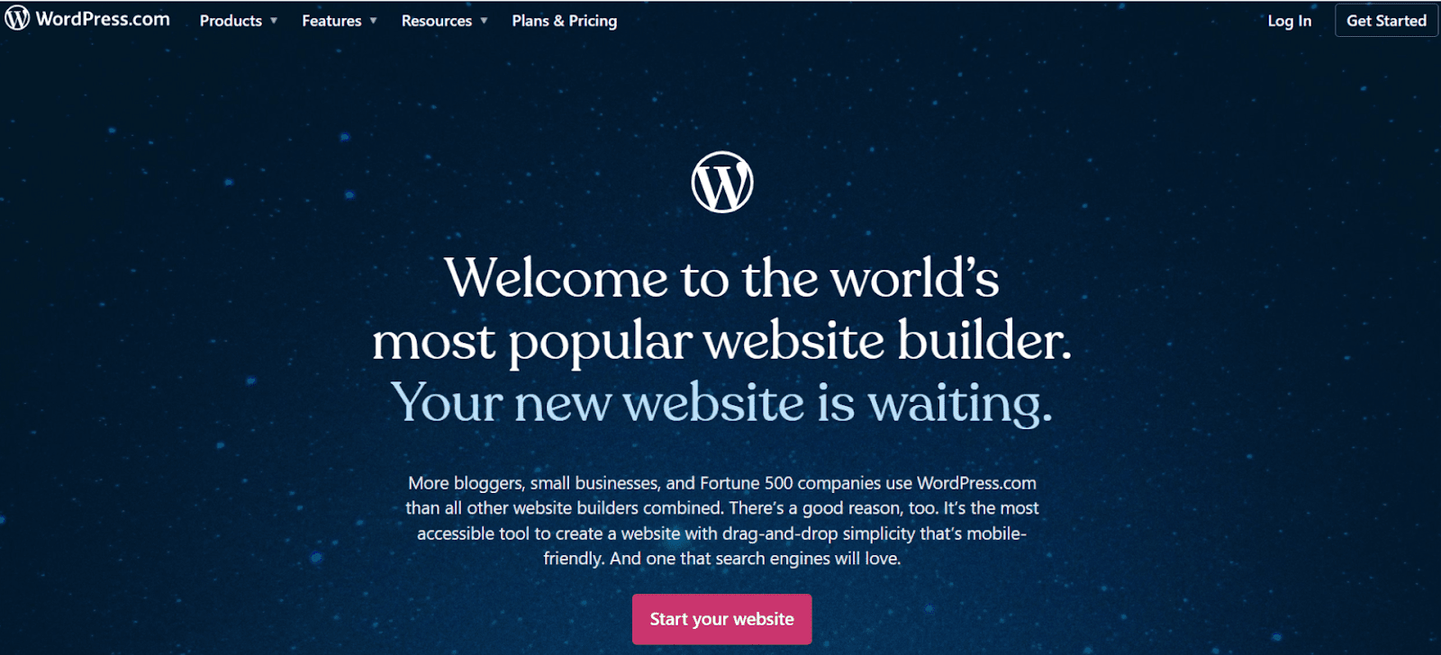
WordPress Homepage
WordPress.com is popular for a reason
To begin, all you need to do is go to WordPress.com and click “get started.” You’ll have to input your name, email, and create a password.

1
wordpress-logo-alt-2

Save up to 55 % on your WordPress plan!

Limited-time offer - Don't miss it!

5072 users used this coupon!
Choose a domain and then a plan. I suggest starting with the free options for both – you can always upgrade later. Finally, you’ll have to choose a theme. Select the blank one for now (we’ll get back to this later). 

Step #2: Plan Out Your Landing Page

This is pretty much the same advice as before, except now you must consider the limitations of the Gutenberg editor when planning your design. Don’t plan a page with complex animations and dynamic backgrounds and… I don’t know, particle effects? With Gutenberg, you’ll have to make do with the basics.

Don’t let this put you off, though. A good landing page doesn’t need a bunch of fancy elements. All you need is a strong CTA and a distinctive identity. 

Step #3: Choose your theme

Now you have a roadmap for your page, it’s time to choose a theme. Go to your WordPress.com dashboard, click Appearance, and then Themes.
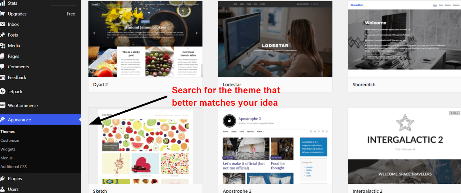
WordPress Free Themes
WordPress.com offers hundreds of simple but well-designed themes
Pick the one that’s best suited to the design you have in mind. Themes in WordPress.com are designed for different purposes. Instead of focusing on colors and text styles (you can always change these later), find a theme that’s optimized for your ideal structure. 

Step #4: Get To Know Gutenberg

When you edit your site for the first time, WordPress.com will offer you a quick tour of the Gutenberg editor. This is a great chance to brush up on the fundamentals. I also heavily recommend playing around for a bit before you start creating your page. Try adding and removing blocks, just to see what they do.
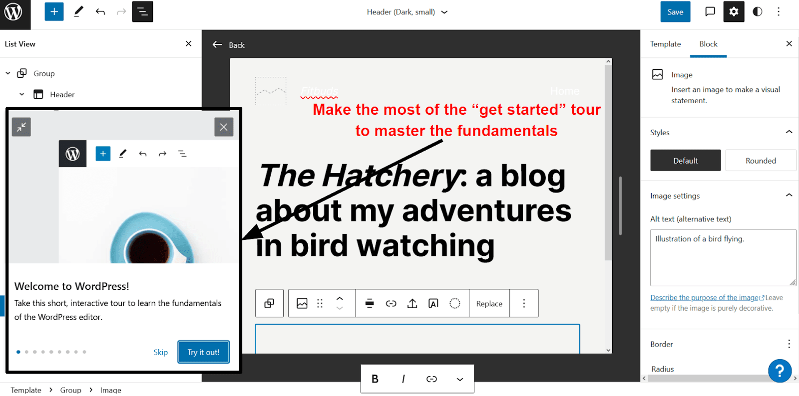
Gutemberg get started tour
Gutenberg comes with a handy guide for learning the fundamentals
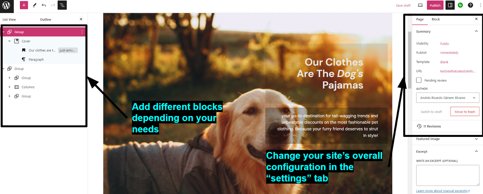
To customize your page, go to your dashboard, Appearance, and then Editor. There, you can start adding and modifying different blocks to suit your needs. To change more general aspects of your site’s appearance such as background color, header design, and fonts, click on the “styles” button in the upper right corner. What you can and can’t customize will depend on your chosen theme.

As a general recommendation, Guttenberg works rather well with squared-based designs and hard lines. Try to make the angular look work to your advantage if you can.

WordPress Guttenberg Editor
The “Twenty Twenty” theme had just the design options I needed

Step #5: Edit Your Page

WordPress.com separates blocks into different categories, like media, text, and design. The design blocks are especially useful as they let you edit your site’s basic layout. Separating your site into columns, groups, and custom spaces can help you create a cohesive design. 

If you need to add an element, simply head to the top left corner and click on the plus sign. WordPress.com offers plenty of basic blocks, but your best tools will be those for adding and customizing headings, images, and paragraphs.

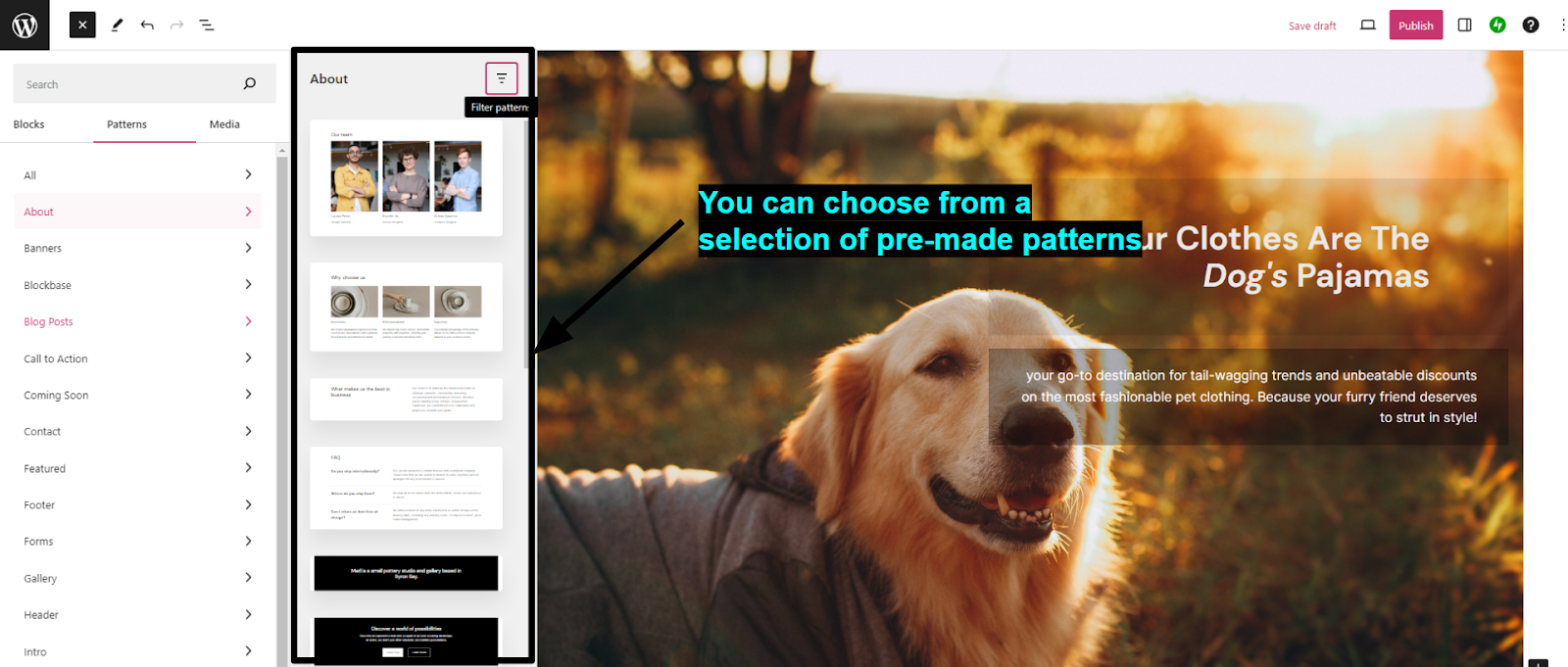
You can also use what WordPress.com calls “Patterns.” Patterns are pre-built collections of blocks you can use to add common features to your page. There are patterns for inserting CTAs, contact blocks, “about us” sections, and more.
Guttenberg Patterns
Patterns can help you make big design changes with ease
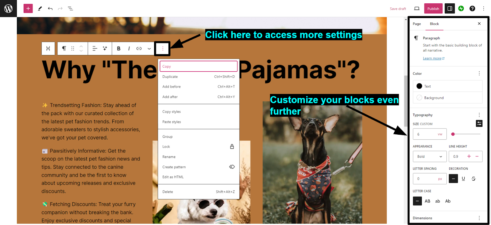
If you need to customize a block, click on the “Options” button (shown as three dots) that appears on its top right and click “Show more settings”. Depending on the block, this will give you different customization options you can use to modify its design. 

WordPress Block Settings
Click on “show more settings” above an element for more design options
Pro Tip. A simple structure can work wonders as long as you have great visuals. A professional designer can create amazing logos, backgrounds, and other elements for you. With Fiverr, you can find experienced designers at an affordable price1.
Guttenberg isn’t the most responsive page builder, so make sure to preview your site every so often. Once you’re happy with your page, click “save.” Then, head over to settings, general, and click on “Launch Site.” That’s it! Your landing page is now live for the world to see.

Guttenberg landing page
Pretty visuals do a lot of the heavy lifting for a landing page

Method 3 (Bonus) – Ditch WordPress for an Easier Solution

Hey, quick question. Why do you want to use WordPress, exactly? Don’t get me wrong, WordPress is a fantastic platform with tons to offer, but it’s not the only way to create a landing page.

There are plenty of website builders out there that will let you make an effective landing page in half the time. And while it’s true that they can’t match WordPress in terms of scalability, for a landing page, they don’t have to.

So, as a bonus, here’s a quick guide to creating a landing page using a website builder.

Step #1: Choose a Website Builder

The best website builder for you will depend on what you need in terms of features, ease of use, and design flexibility.

For landing pages, my top recommendations are:
  • Wix. Wix provides incredible design flexibility thanks to its free drag-and-drop editor1. It’s really user-friendly, so it takes only a couple of minutes to get used to. It also includes plenty of cool-looking animated features and pre-made elements you can use to spice up your page.
  • SITE123. SITE123 is one of the easiest website builders1 out there. With SITE123, anyone can create a landing page in a matter of minutes, regardless of experience. It’s also mobile-responsive, so you can be sure that your page will look as good on mobile as it does on desktop.
  • Squarespace. Squarespace is a fantastic option for pages that emphasize visuals, draw attention to specific elements, and get interactions. I could’ve just said landing pages. I recommend Squarespace1 if you want an elegant yet dynamic design that does most of the explaining for you.
I used Wix to create my own landing page, but the steps are similar with every builder.

Step #2: Plan Your Design and Choose a Template

Yes, this one again. I won’t go into too much detail because the steps are the same as before. Plan the structure of your page beforehand and then choose a template that’s close to it. Wix has a library of over 800 high-quality templatIes (35 are specifically made for landing pages), so it shouldn’t be too difficult to find the perfect foundation for your design. 

Wix Creative Conference
Creative conference by Wix announces the kind of event you want to know more about
Website builders offer a lot more design freedom than the Gutenberg editor. Some even offer dedicated landing page builders. They’re also way more user-friendly. Wix’s drag-and-drop editor, for instance, makes it easy to change the look and functionality of your template as much as you like.

Step #3: Get To Editing

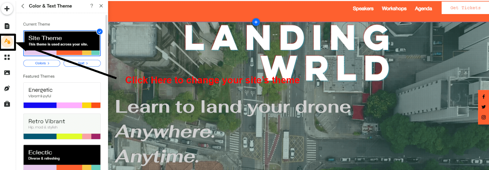
Start by changing your theme’s colors and typography to the style that suits you best. To do this, simply head to the menu on the left and click on “site design.” Here, you can start deleting elements you don’t need and adding new ones.
Wix Theme Colors
Try out different designs to get something that matches your style
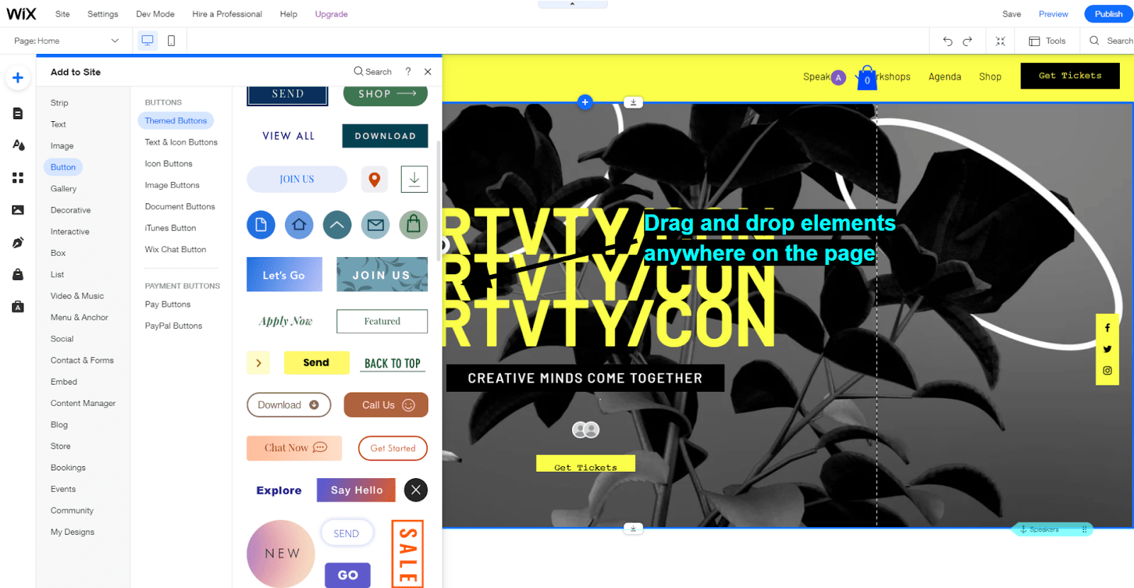
To browse elements, all you have to do is click on the plus sign on the upper left. Wix offers over 20 element categories, ranging from text and decorative elements to store features and a blogging tool. To add an element, simply click on it and drop it wherever you want on the page.

Wix Add to Site Menu
Wix makes it easy to add new and interesting elements to your page
I suggest you take full advantage of the large variety of dynamic effects Wix offers, such as animations and transitions. They are a great way to add visual interest to your page and keep visitors engaged. 

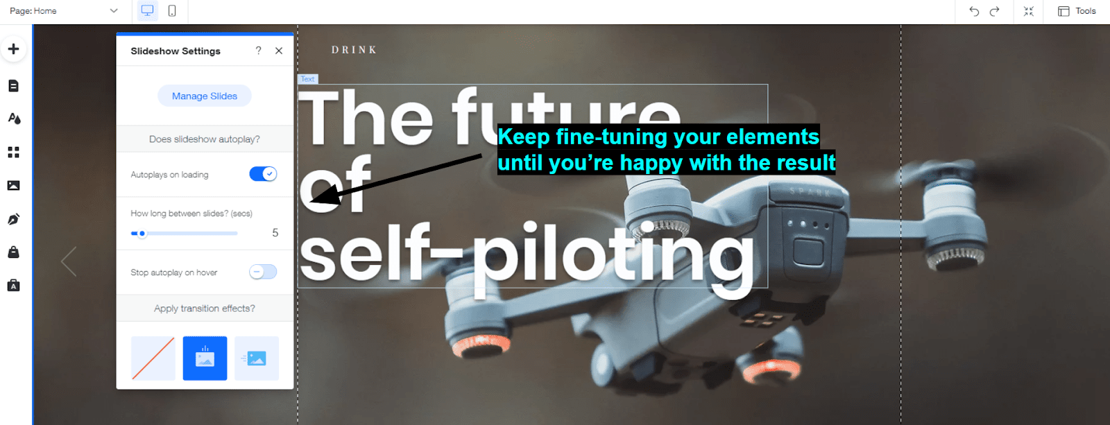
To edit an element’s properties, all you have to do is click on it. Depending on the element, you’ll see buttons for different menus pop up. On these menus, you can do things like edit content, add custom animations, and more.  

Wix Element Settings
Keep changing your page until every element looks exactly like you want it
Remember to preview the different versions of your site to make sure it works well on both mobile and desktop. With a little tweaking, you’ll have an awesome landing page in no time.

Wix Landing Page
It’s a “landing page,” get it?

Step #4: Publish Your Page

To publish your page, you’ll need to register a domain for it, even if it’s just the free version provided by Wix. Don’t worry, though, most site builders come with an integrated domain register that makes it easy to get your site online. 

1
Wix Logo Black

Wix is now only $17.00 per month!

Don't miss out on this great deal!

7467 users used this coupon!

The Magic of a Great Landing Page

Creating a landing page is a great way to help you brand stand out and improve lead generation. It requires less effort than a complete website but can be pretty effective when done right.

A page builder is a great way to create a landing page in WordPress. Page builders give you incredible creative freedom, even if they can come with a bit of a learning curve. Of the builders available, I recommend Elementor1. Its drag-and-drop functions make it a powerful yet easy-to-use option.

If you don’t want to mess with hosting, you can always use WordPress.com1. The Gutenberg editor can help you create cheap and effective landing pages, but keep in mind that it doesn’t have as many customization features as most dedicated page builders.

Alternatively, you could use a website builder. Site builders give you advanced customization options and are easy to use. Of all the options available, Wix is my favorite1. It offers more design freedom than almost any other builder while being very intuitive, even if you have no experience. 

FAQ

What is a landing page?

A landing page is a specialized web page designed to get visitors to take some sort of action. This could be buying a product or service, subscribing to a newsletter, clicking through to another site, or something else. To increase the chance that visitors will take the desired action, a landing page usually has little-to-no navigation, clear and concise copy, and a prominent call to action.

If you want to build a landing page, you should know the fundamentals of website design. For more info, check out our comprehensive guide for creating a site in 2024.

How do you create a landing page in WordPress?

It depends on which version of WordPress you’re using.

If you’re using WordPress.org, the best method is to install a page builder and start modifying a template. You’ll need to arrange your own hosting provider to do this.

If you’re using WordPress.com, then all you have to do is create an account, choose a theme, and edit from there.

What is the best page builder for WordPress? 

This will vary from person to person. Personally, I like Divi and Elementor, as they offer real-time editing and plenty of customization options. For example, Elementor offers intuitive drag-and-drop editing and lots of interesting Widgets you can use to draw your visitors’ attention.

Divi, on the other hand, gives you incredible tools for customizing your page, and it lets you manage all important aspects of your site from a single dashboard. That said, it does come with a steeper learning curve.  

Can you build a landing page for free? 

You can create a landing page for free using WordPress.com. Just keep in mind that the free version of its Gutenberg editor is pretty limited in terms of design freedom.

Another option is to use a website builder. Wix’s free plan will let you create a landing page at no cost, while giving you a lot more features for customizing your page and engaging your visitors. Wix is not the only option, though, many other website builders will let you create a landing page for free (or very cheaply). If you don’t know where to start, check out our review of the best website builders in 2024.

Rate this Article
4.7 Voted by 3 users
You already voted! Undo
This field is required Maximal length of comment is equal 80000 chars Minimal length of comment is equal 10 chars
Any comments?
1 comments
Reply
View %s replies
View %s reply
1 avatar
Sophia Brown
August 22, 2023
Thanking for sharing this article. I appreciate how you explained each element clearly. This article added some more knowledge on creating landing page. If you allow I would like to add one more method. 1. Log in to Your WordPress Dashboard 2. Create a New Page 3. Add Content 4. Keep it Simple 5. Set a Featured Image (Optional) 6. Preview and Adjust 7. Publish 8. Set as Front Page (Optional) 9. Keep Testing and Refining So these was the method I follow. Creating a landing page might be easy but developing a whole website is not an easy task for any non technical person. So they need to hire WordPress website development company, who can develop you website that meets your business needs. Companies like Alakmalak Technologies works on this, they have good team of developers who can build a website at affordable price for you.
1 avatar
Sophia Brown
August 22, 2023
1 avatar
Mihail - WSP Team
August 22, 2023
Thank you for sharing your detailed method on creating a landing page in WordPress and for highlighting the challenges of full website development for those who might not be technically inclined. Your step-by-step addition is a valuable resource for our readers looking to delve deeper into website creation. We also appreciate your recommendation for seeking professional help from development companies like Alakmalak Technologies, especially for non-technical individuals aiming for professional and effective website solutions. Your input enriches our discussion and offers practical paths forward for our audience.
1 avatar
Mihail - WSP Team
August 22, 2023
Read more reviews
Related posts
Show more related posts
We check all user comments within 48 hours to make sure they are from real people like you. We're glad you found this article useful - we would appreciate it if you let more people know about it.
Popup final window
Share this blog post with friends and co-workers right now:

We check all comments within 48 hours to make sure they're from real users like you. In the meantime, you can share your comment with others to let more people know what you think.

Once a month you will receive interesting, insightful tips, tricks, and advice to improve your website performance and reach your digital marketing goals!

So happy you liked it!

Share it with your friends!

1 1 1

Or review us on 1

2621718
50
5000
44106016
Best Landing Page Templates1image

Create an EFFECTIVE Landing Page

Choose a template, customize, and GO!