#1. Focus Solely on Value, Not Conversions
Users subscribe to your list when they believe doing so will give them value. Your opt-in page needs to convince them that it will. If there’s any hint of your “selling” something at the moment they land on your opt-in form, they’ll be much less likely to subscribe. The more value your opt-in page messaging conveys, and the less conversion-oriented it seems, the higher your conversion rate will be. Research from Persuasion Marketing took this idea to its logical conclusion. The A/B test illustrated below showed that opt-in pages that were split into two separate pages — one with just the value, and a second one with the signup forms — increased opt-in conversion rates by 785%.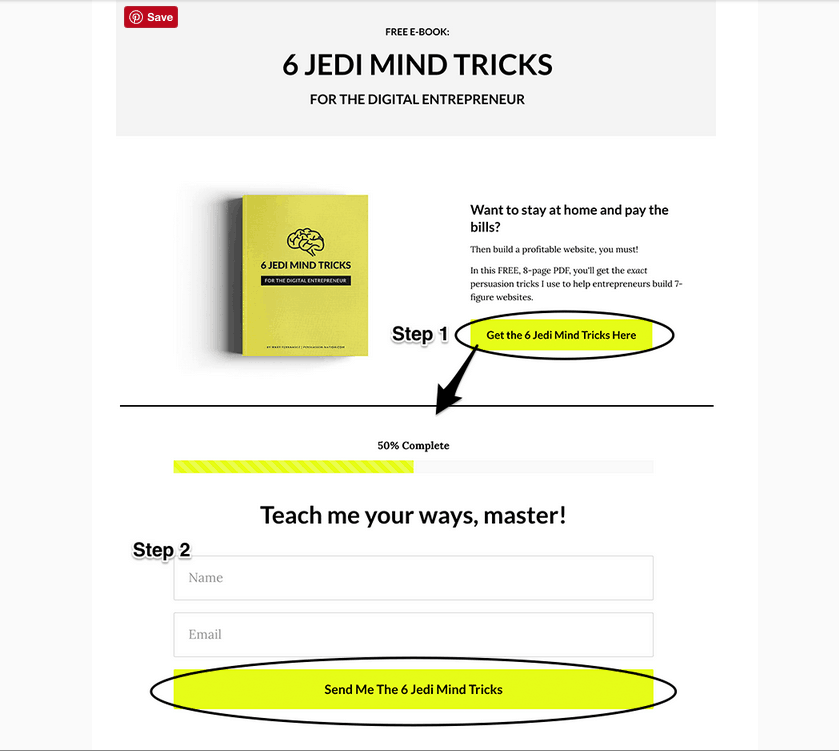 In the “A” version, the the opt-in form incorporated both the messaging and the form fields in the same webpage. In other words, it sent mixed signals. The value being presented for the user was there, but so was the value for the business (the form fields that collect information). By contrast, the “B” version had two entirely separate screens. The first one presented only the value for the user, without any form fields. If the user clicked the CTA button, a second webpage appeared that asked for his or her name and email address.
The results of the test suggest that users are very sensitive to whom they believe is benefiting from their conversion. Any suggestion that they’re being “sold” on something — even if it’s just passively through the UX of the opt-in form — is enough to trigger their “I don’t want to be sold to” defenses and cause them to not convert.
While it’s doubtful that the extreme differences in conversion rates seen in this test are the norm, it still emphasizes the point that users are very sensitive to how they perceive your intentions. If they think you’re trying to get value for yourself by converting them into subscribers, they may turn away. Everything about your messaging must indicate that they’re the only ones benefiting from opting in.
#2. Adding Action Words to CTAs Increases Conversions
The need to present value clearly is omnipresent. It extends beyond the overall presentation and includes the specific language you use. A good best practice when writing copy is to state the value your list provides to subscribers as clearly as possible. Avoid the tendency to use flowery language or use ornate design elements. Remember the ten seconds you have to convince visitors that they want to hear from you again? Just get to the point and let them know what’s in it for them before it’s too late. Call-to-action (CTA) copy is one of the most important areas to use this tactic. A best practice for this is to use clear, value-oriented action verbs like “receive,” “get,” or “download.” Research by HubSpot showed that CTAs using the word “Get” convert 14.79% better than those without it.#3. Keeping Your Opt-in Form Short Increases Engagement
A final example of the need for simplicity in your email opt-in forms involves the question fields you use. Opt-in question fields are an extremely valuable resource. They provide not only contact info, but also an opportunity to directly ask users about pain points and topical interests. Unfortunately, this comes at a price. Research by Marketing Sherpa showed that every question field you add to an email opt-in form decreases subscription conversions by 11%. Because the opportunity to collect valuable consumer information from the source is so great, the best practice is to ask for more than just email addresses alone. However, be sure the ROI gained from asking additional questions is greater than the ROI lost. An email marketing solution like ActiveCampaign provides various opt-in form styles pre-optimized for conversions.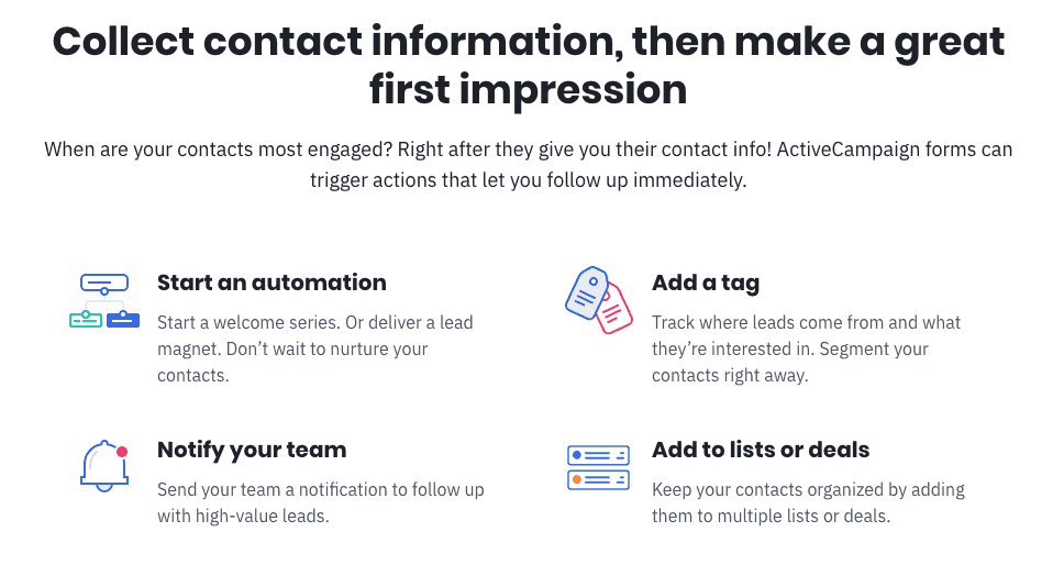 You can use them to take a lot of the heavy lifting out of your testing, and keep the question form fields that you do ask from being intrusive. Check out our ActiveCampaign expert review to learn more about all the form-building features available.
#4. Get More Click Rates With A First-Person Perspective
Part of delivering a message that communicates value is using language that frames the message around the lead’s perspective. Write copy that keeps the users’ internal narrative focused squarely and solely on them. A best practice is to always write email opt-in copy in the first person. Research by Unbounce showed that changing the CTA “get your free template” to “get my free template” increased click-through rates by 90%. This seems like it should be awkward, because when someone speaks to you, he or she uses the second person. But remember, users who read the CTA are speaking to themselves. Using “your” is an unwritten reminder that someone is selling to the user; using “my” keeps the conversation on the user only.#5. Using Negative Words Like “Spam” At All Decreases Subscriptions
People with attention spans as short as ten seconds do not have the luxury to engage with nuances. The words you choose to utilize carry the pivotal responsibility of evoking associations and emotions, presenting you with the sole opportunity to create a positive impact. If your intention is to convey the absence of certain negative qualities through specific words that inherently bear such connotations, your message is destined to be disregarded. Instead, users will cease to pay attention upon encountering the negative association. A good example of this involves research from Unbounce, which showed that the phrase “100% privacy — we will not spam you!” decreased subscription conversions by 18.70%. It goes without saying that users don’t want spam. In fact, they dislike it so much that the mere mention of the word instantly sends a significant number of them away from an opt-in page.#6. Focus on the Design Elements that Actually Matter
A final word about form design. It’s common knowledge that the design of your form impacts conversions. Where most businesses get it wrong is in thinking that this is merely a matter of “what looks good.” Effective marketers focus on empirical truth, not aesthetic style. For small and medium-sized businesses with few resources to devote to design, keep the focus on the elements that data shows impact conversions. CTA-button design is one of these elements. Research from SitePoint showed red CTA buttons increased conversions by 34% over green ones. Other variables known to impact conversion are the placement and shape of your opt-in forms. A best practice is to remember that the effectiveness of design elements is impacted by many external factors, including the brand identity and product offer. To find the best version, a critical best practice is to know how to properly A/B-test every variant you use.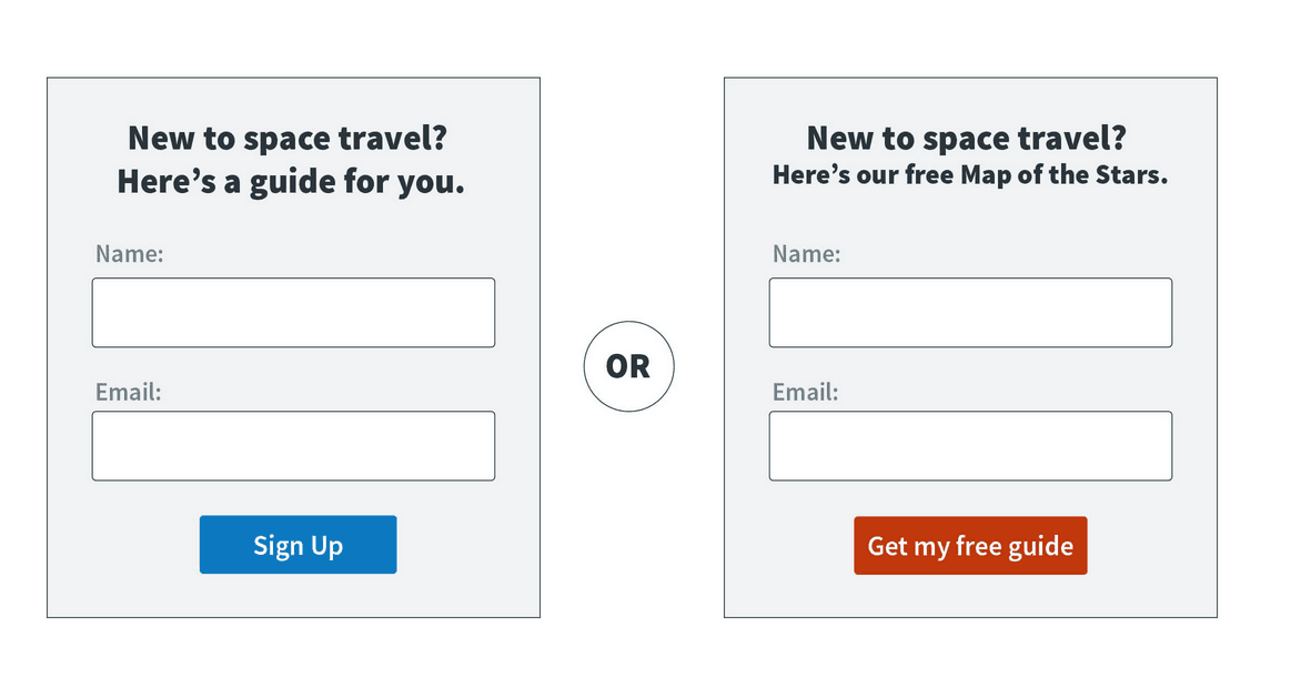 An email marketing solution like AWeber lets you test the important design nuances of every subscriber opt-in page you create, including the type of page (embedded, pop-up, or in-line) and the way it appears on the webpage (by sliding in, or fading in). It can help you get beyond the basics and make improvements without the need to hire an expensive designer. Check out our AWeber expert review to learn more about what’s possible on the platform.
Maximizing Email Opt-in Rates Requires Constant Testing
Finding the email marketing tactics that work for you requires constant testing. Best practices for creating email opt-in pages that convert in specific verticals like e-commerce or online coaching can point you in the right direction. But you should always consider them as basic guidelines to begin your own testing to see what works for you. Every aspect of an email opt-in page will impact your overall conversion rate, and so all of them must be tested. This is possible with today’s model email software providers. For example, a solution like GetResponse offers advanced A/B testing and analytics that allow you to send multiple variants out to portions of your email list, and then shows you the results in real time so you can see which one works best. Check out our GetResponse expert review o learn more about all the analytics tools available. With enough time and patience, you’ll be able to find a strategy that builds your email subscriber list in no time.Sources:
https ://www.nngroup.com/articles/how-long-do-users-stay-on-web-pages/
https ://blog.hubspot.com/marketing/5-landing-page-a/b-tests-and-their-surprising-results
https ://www.sitepoint.com/button-ux-red-green/
https ://www.persuasion-nation.com/blog/how-to-create-a-persuasive-email-opt-in-form-the-definitive-guide
adding more fields to an opt-in form suppresses opt-ins
https ://knowledge.hubspot.com/cta-user-guide-v2/call-to-action-best-practices
https ://www.usertesting.com/blog/11-characteristics-of-persuasive-call-to-action-buttons/


![10 Best Email Marketing Software for Ecommerce [2025 Update]](https://dt2sdf0db8zob.cloudfront.net/wp-content/uploads/2023/08/Best-Email-Marketing-Software-for-Ecommerce-850x446.jpg)
![Keap vs Mailchimp: Which Offers Better Value? [2025 Update]](https://dt2sdf0db8zob.cloudfront.net/wp-content/uploads/2023/06/Keap-vs-Mailchimp-850x446.jpg)
![Drip vs Mailchimp: Read Our Advice Before You Sign Up [2025]](https://dt2sdf0db8zob.cloudfront.net/wp-content/uploads/2022/10/Vs-1-850x446.jpg)
![Drip vs Mailchimp: Read Our Advice Before You Sign Up [2025]](https://dt2sdf0db8zob.cloudfront.net/wp-content/uploads/2022/08/Emily-Robin.jpg)
![MailerLite vs ConvertKit: Read This Before You Sign Up [2025]](https://dt2sdf0db8zob.cloudfront.net/wp-content/uploads/2022/10/Vs-850x446.jpg)

![Drip vs. AWeber: Who Offers the Best Value for Money [2025]](https://dt2sdf0db8zob.cloudfront.net/wp-content/uploads/2022/04/Drip-vs-AWeber-850x446.jpg)
![Drip vs. AWeber: Who Offers the Best Value for Money [2025]](https://dt2sdf0db8zob.cloudfront.net/wp-content/uploads/2021/08/Emma-Ayres-150x150.jpg)
