Inside this Article
Commandment #1: Perfect Your Messaging
Millennials are constantly bombarded with marketing messages. There’s so much noise competing for their attention that they have trained themselves to tune out the vast majority of it. In this environment, messaging that doesn’t create an instant connection will be ignored. That’s why it’s essential to start by crafting your communications using techniques they’ll actually respond to. There are several best practices to keep in mind:Personalize Everything
Millennials hate advertising. Recent studies suggest that as many as 40% of them use ad blockers. So if your email marketing reads like an advertisement they’d normally prefer not to see, it won’t get much engagement. So how can you personalize and not sound like a random ad?Personalize by demographics and consumer preferences
This doesn’t just mean auto-populating first names you captured on your list-building landing page. A good habit to get into is to start collecting as much demographic information about incoming leads, develop a system to segment them, and then create different emails for each segment. For example, although they’re both within the catch-all phrase “millennial,” you should not send the same email to mid-twenty-somethings and mid-thirty-somethings. Even a difference of just a few years in age can create very different cultural markers. Respect that, and take the time to craft entirely different copy for different millennial audiences.Personalize by creating interactive content
Don’t just broadcast your message. Millennials are a social generation who respond well to being brought into a conversation unique to them. A good way to do this is by finding ways to insert your own message into content that solicits their opinions. This type of “interactive content” requires the participation of the reader. Common examples are polls, quizzes, and calculators wherein readers can input their own personal response or information. Creative examples of this type of content include calculating the value of unpaid housework to spread awareness about gender equality, and quizzes that test your knowledge of “must-read” books as a branding tool for websites looking to attract knowledge seekers.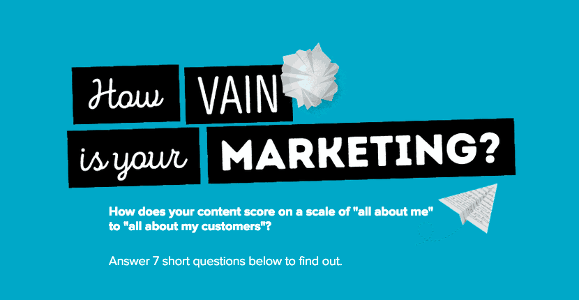 Moreover, this content doesn’t just create personal experiences. Responses give you additional information about leads so emails can be better segmented and personalized in the future.
Provide Value
Millennials know their attention is valuable to you — and they expect to be rewarded for it. Bombarding them with what you want from them will get you tuned out, so don’t focus on what you’re selling. Instead, emphasize what value you’re providing. But don’t focus only on what your product or service does for millennials. If you provide even more value such as free shipping, you’ll stand out in their inbox. For example, while 59% of millennials say they’ll act when they’re sent emails of products relevant to them, an even higher 75% report that they’ll specifically respond to offers of free shipping or two-day delivery. Send out these kinds of offers, and you’ll more than make up for the extra few dollars per order with a large increase in sales volume. But there’s one very important caveat to all this before you go sending out free shipping orders to every millennial on your list: Do. Not. Spam. Spamming is often defined as “sending too many emails.” But this definition is incomplete. Spamming also means sending any email that isn’t relevant to them. Millennials are ruthless and will unsubscribe even if they have some interest in your brand. In fact, 34% say they get annoyed when they receive an offer that doesn’t align with their interests. This is especially important for retailers selling more than one product. If that is you, take the time to segment your list and tailor your messages not just by demographics, but also by item. Don’t send email blasts with nine completely different products thinking you’ll draw attention to all of them. You may see yourself as a single brand, but millennials don’t want information about Product X in their inbox if they only really care about Product Y.Make it Visual
Email is not just text. In fact, in a world of short attention spans, the design of the visual assets you include is just as important. Both the text and the visuals must be easy to understand and informative. And if you don’t include visuals that stand out, it’s going to be very difficult to get your message across quickly enough to be effective. Leaving them out entirely almost guarantees you’ll be ignored. Millennials don’t want to read a wall of text. Here are some best practices to make your design assets effective:Keep it clean
Millennials expect to see minimalist, clean designs with a clear focus. They will quickly pass over overwrought visuals that take time to interpret or understand. You may think the visual looks beautiful and intricate, but millennials will be too preoccupied trying to figure it out to appreciate its beauty. Ultimately, this will leave them with less time to meaningfully engage with your offer. If you can cultivate a relationship between your brand and your millennial customers that is strong enough to be evoked in a single logo, that is ideal. Below is an example of good design by Google promoting their Google app feed as a one-stop shop to keep up with everything important to you. The “G” elegantly tells you the brand, and the different sections showing food, space, and sparkles get the point across that you can use it to keep up to date on a wide variety of topics. It’s minimal, beautiful, and also tells a story.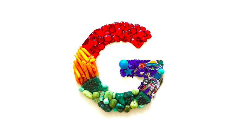
Don’t provide too much information
Even though you have a lot of info to convey, don’t fall into the trap of creating images that are cluttered with information. What you see as comprehensive might rapidly be perceived by millennials as an overwhelming information dump. Visuals are there to present your value proposition quickly so that interested consumers can learn more — not to tell someone everything there is to know about your product. Make it obvious what’s on offer and leave it at that.Commandment #2: Strike the Right Tone
What you say is not the only thing that matters when speaking to millennials. How you say it is just as important. Millennials are a very social generation, and they expect to engage with retailers in the same way that they would their friends. When speaking to them, it’s important not to come off as just another business trying to get their money. Several best practices exist for how to approach the type of language you should use with millennial customers.Be an Honest Member of the Community
Being honest is about more than just telling the truth. Millennials value a sense of community, and your marketing message should go the extra mile to show that you do as well. One of the best ways to do this is by proving the authenticity of your products. How? Try including reviews and testimonials in your emails. A good best practice here is to be creative with how you include this type of content. Don’t just throw a testimonial in at the bottom of an email. Include case studies or individual quotes in your text and/or visuals. Showcase social proof naturally, demonstrating how the community values and respects your company and product. Do not merely present block-quotes that stick out randomly.Be Conversational
Case studies and quotes are just one facet of the need to be conversational. Your emails to millennials should be completely empty of formality. Treat your emails as conversation starters with friends, not as pitches to investors. At all costs, don’t use ad-speak like, “You’ll never believe what this product can do,” or “Everybody loves our product!” A best practice to avoid this is to read your email out loud. Do you sound like you’re making a sales pitch, or like you’re simply trying to have an honest conversation? If the language doesn’t sound natural or seems too one-sided, rewrite it.Be Inspirational
Millennial communities have aspirations. When you speak to them, use the language of inspiration. Give them a sense that your product is going to improve their lives in a way that’s realistic, but also goes beyond functionality and speaks to their hopes and dreams. For example, the alcoholic beverage company Heineken ran a campaign called “Open Your World” which encouraged consumers to use a conversation over beer to “break through the barriers that divide us.” The campaign inspired consumers and turned into a big success for the company.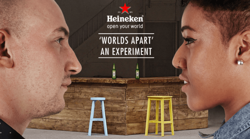 Many companies run these kinds of campaigns in their social media marketing communications, but often ignore them in their emails, possibly because they view the format as more formal and sterile. This is a mistake. A millennial consumer is the same person whether he or she is browsing Instagram or reading an email.
As a best practice, don’t let the email format be reduced to transactional language and messaging. Treat it just as creatively as you would any other channel.
Commandment #3: Have the Right Functionality
What you say to millennials and how you speak to them don’t matter if your audience can’t receive the message quickly and easily. If it’s hard for millennials to understand what you’re trying to say, or to do what you’re trying to get them to do, you won’t see the conversion rates you want. When considering the functional design of your emails, always remember that millennials have short attention spans. Here are a few best practices to keep in mind:Guide the Reader With Verbal and Visual Cues
Don’t assume that readers will know what your email is trying to accomplish. Guide them by using clear, actionable language and design assets throughout the text. State your product’s value proposition clearly, use images to break up text into sections, and make explanations of important features stand out by placing them inside a visual. Here’s an excellent example of how to do this: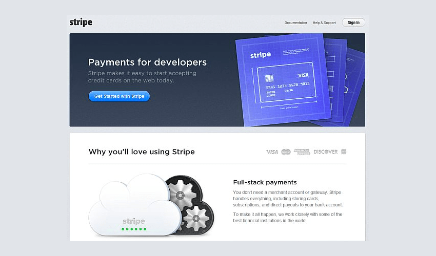 The top-left corner of text clearly states Stripe’s value to the reader: “Payments for developers.” The VISA card visual beside it is a cue on this theme — a brand and item associated with payments. Beneath that, in a separate section placed below the core value proposition, is some more marketing messages for anyone who needs further convincing. This provides additional information if necessary, but without detracting from the real purpose of the email: conversions.
Use Prominent CTAs
You send emails to millennial consumers because you want them to do something. Whether that’s making a purchase, signing up for a new offer, or spreading the word to friends about a product or service, you must state your intention clearly. If you don’t, they will wander away without doing anything. Tell millennial readers exactly what you want them to do by placing clear Call to Action (CTA) buttons throughout your email. There are three aspects to the effective use of CTAs. Message, Design, and Placement:- Clearly state what readers will get by clicking. Don’t just say, “Click here.” Instead, compel them to “Download now to get the FREE ebook!”
- You want to draw attention to the CTA, so make it visually interesting using special fonts, images, or anything else that stands out.
- Include more than one CTA in the email so it’s easy to convert at any time without scrolling to a different place in the email. Place a CTA at the top so people can convert without even reading the email. Place another at the bottom for readers who get through the whole message. If the text is long, place one in the middle, and maybe another in a place where it makes sense for it to be (such as after a value proposition).
Optimize for Mobile
Thirty-nine percent of millennials admitted to interacting more with their smartphones than with the important human beings in their life. Optimizing your emails for this habit is an absolute must. If your message doesn’t get delivered seamlessly on mobile, you’ll miss out on a lot of your audience. It’s untrue that using an email marketing service automatically guarantees your emails are optimized for mobile. There are still best practices you should follow to get the best results.- Text Design. Textually, use as few words as possible. The longer an email is, the more a user has to scroll through it, which risks losing their attention.
- Image File Size. The file sizes of design assets should be small enough that they won’t slow download times.
- Image Display. Images should fit on a single screen if possible, but still be large enough for easy viewing. Visuals lose impact if the user has to scroll to see all of it.
Do Email Marketing to Millennials Right
Millennials constitute a significant market and opportunity for retailers, comprising 43% who cannot start their day without accessing their inbox. Overlooking this demographic means overlooking substantial prospects. Crafting email content that resonates with them is crucial for tapping into these lucrative opportunities. It’s important to note that standard suggestions like “Craft an attention-grabbing headline!” only begin to address the deeper requirements for achieving conversions. Nearly 60% say they will act on offers that are relevant to them. Communicate value to them in a simple, compelling manner, and you’ll be able to target millennials with email campaigns that don’t just get opens, but also get results.Stats: https://theblog.adobe.com/consumers-are-still-email-obsessed-but-theyre-finding-more-balance/ https://www.entrepreneur.com/article/307644 https://www.pewresearch.org/fact-tank/2020/04/28/millennials-overtake-baby-boomers-as-americas-largest-generation/ https://www.mediapost.com/publications/article/282639/mobile-millennials-63-shop-on-smartphones-every.html https://www.sfgate.com/business/article/Millennials-really-hate-advertising-study-finds-7393642.php https://qz.com/work/1083411/this-calculator-makes-the-unpaid-work-women-do-visible/ http://www.pbs.org/the-great-american-read/quiz/


![10 Best Email Marketing Software for Ecommerce [2025 Update]](https://dt2sdf0db8zob.cloudfront.net/wp-content/uploads/2023/08/Best-Email-Marketing-Software-for-Ecommerce-850x446.jpg)
![Keap vs Mailchimp: Which Offers Better Value? [2025 Update]](https://dt2sdf0db8zob.cloudfront.net/wp-content/uploads/2023/06/Keap-vs-Mailchimp-850x446.jpg)
![Drip vs Mailchimp: Read Our Advice Before You Sign Up [2025]](https://dt2sdf0db8zob.cloudfront.net/wp-content/uploads/2022/10/Vs-1-850x446.jpg)
![Drip vs Mailchimp: Read Our Advice Before You Sign Up [2025]](https://dt2sdf0db8zob.cloudfront.net/wp-content/uploads/2022/08/Emily-Robin.jpg)
![MailerLite vs ConvertKit: Read This Before You Sign Up [2025]](https://dt2sdf0db8zob.cloudfront.net/wp-content/uploads/2022/10/Vs-850x446.jpg)

![Drip vs. AWeber: Who Offers the Best Value for Money [2025]](https://dt2sdf0db8zob.cloudfront.net/wp-content/uploads/2022/04/Drip-vs-AWeber-850x446.jpg)
![Drip vs. AWeber: Who Offers the Best Value for Money [2025]](https://dt2sdf0db8zob.cloudfront.net/wp-content/uploads/2021/08/Emma-Ayres-150x150.jpg)
