A beautifully designed website is just the beginning.
In this interview series by Website Planet, I talk with top leaders in UX/UI design who uncover the latest trends, pitfalls, and practical tips that will help you craft a website that not only looks great but captivate, convert, and truly stand out. If you’re ready to get a peek behind the curtain of web design, you’re in the right place.
My guest today is Michelle O’Neal, VP Operations & HR at Comit Developers, a web development and digital marketing company with a portfolio of thousands of website projects across diverse sectors, including oil & gas, healthcare, small businesses, engineering, and eCommerce.
O’Neal shared insights from her 20-years career in the web development and digital marketing industry, including a pivotal role in significant mergers and acquisitions for Comit with Wide Web Marketing, Bizzuka, and Dovetail Digital Marketing.
What are some web design trends that you believe are overrated or even detrimental to user experience and a brand’s reputation? Can you share some examples?
Some web designs don’t take into account user experience and how one interacts and navigates with the site. Research shows that 70% of online businesses fail due to bad UX, which often includes confusing navigation and poorly placed contact information
While the site might look aesthetically pleasing, moving navigation to less typical places or hiding the contact information does not help lead visitors where you want them to go, resulting in a frustrating user experience, something you do not want potential customers to associate with your business.
Overanimating design elements for the sake of being different but not providing any functionality. We’ve had requests for graphics with flyouts but no links to further information, or text that spins to catch attention. We meet our clients halfway to add a little bit of their creativity without going overboard.
A good example is the sidebar navigation utilized on NOAA’s website. The icons are an additional design element to stand in for the left-hand vertical navigation but push the content over every time the menu is opened. In addition, the user has to guess to determine what each icon stands for or open the full menu each time.

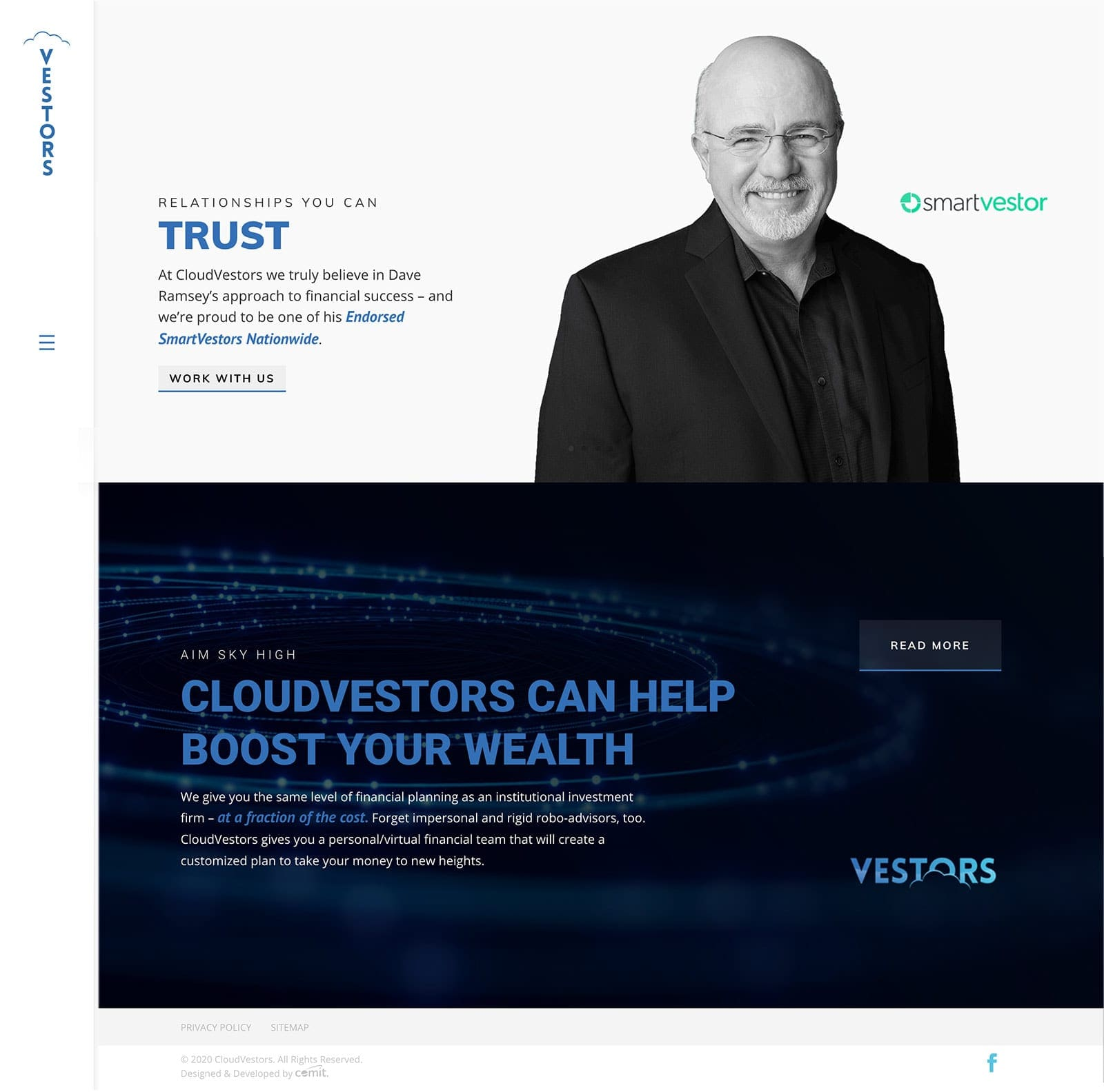
Another example would be the site we designed for an investment company that insisted on a vertical navigation they saw on another site and fell in love with. The team had to tweak the menu to behave correctly especially when the content from page to page varied in length ruining the aesthetic of the design that the clients wanted. Although our team explained the extra time needed to tweak, and the best practices for navigation menus, especially in the finance sector, the client insisted on keeping this look. In the end we all loved the clean, minimalist look of the site we designed that was still able to meet the client’s wishes.
On the other hand, what are some key UX features that are frequently overlooked? Why do you think they are often missed, and how do they impact UX and other KPIs?
Effective CTAs placed in the appropriate places can perform up to 202% better than basic ones, as revealed in a study by Hubspot, with strategic positioning accounting for up to a 70% increase in conversion rates.
The call to action should be relevant to the content on the page so as to lead the user appropriately to the desired action. Do not assume that visitors will know what to do on your site to get more information about a product or service they are interested in.
You must lead them there by telling them what to do: get a quote, download a brochure, call us for an estimate, etc.
Do you believe there’s a risk of ‘over-designing’? How do you strike the right balance between creativity vs user experience?
Comit Developers has a team of developers that are not only developers but all have design experience. We trust them to keep up with best practices and trends to strike that perfect balance between creativity and user experience. We constantly remind clients that a beautiful, creative, site is not worth the time spent if no one knows how to navigate it and ultimately does not convert into new leads for your business.
What psychological principles have the most significant impact on engagement and conversions? Are there also triggers that should be used more cautiously, given their potential to manipulate or mislead users?
Leading a user to believe they will miss out if they don’t take action right away “Fear of Missing Out” (FOMO). If you use this tactic, make sure you can deliver on the promise!

Our main question now: For those building (or rebuilding) their website, what are the 5 most critical UX aspects they should focus on?
- Site load speed
- Clear navigation
- Useful and direct calls to action
- Responsive design
- Accessibility of information
One last word about the ethics of web design. Where do you draw the line between persuasive and manipulative design?
Persuading customers by guiding them through the site to find the information they are seeking, therefore building trust in your company is great, but your content should not make promises that can’t be kept or misrepresent what the company provides.
How can our readers connect with you?
LinkedIn: https://www.linkedin.com/in/michelleloneal/
Website:
- www.comitdevelopers.com
- comitdevelopers.com/team/michelle-oneal/
Data Sources:
https://blog.hubspot.com/marketing/personalized-calls-to-action-convert-better-data


