Building a website with Wix can be exciting, but also quite overwhelming. With so many tools and templates, you can create virtually any kind of site, but figuring out where to start (and how to make it stand out) can be tricky.
That’s why I’ve pulled together 20 real-life Wix websites, each with a design or functionality element that shows you what Wix can do. From photographers with interactive galleries to restaurants with online bookings and payments, these examples show how people across industries are using Wix.
Along the way, you’ll find clever design touches, smart uses of Wix apps, and a few ideas you might not have considered. By the end, you’ll have a clear picture of what’s possible and plenty of inspiration to start shaping your own site.
Did you know that you can build a website in less than a day? Wix has 2500+ unique templates for every style, industry, or goal – with essential features already built in. Pick your favorite template, add images and text, and publish. Or, have Wix’s AI build a website for you, then customize as you please.
1. Lena Steinkuehler
Visit the website at: https://www.lenasteinkuehler.com/
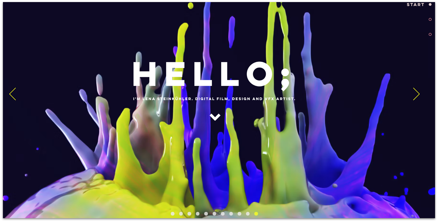
Lena Steinkuehler’s portfolio is one of the best examples I found of how to use visual storytelling to create a rich user experience. She presents each of her digital film, design, and VFX projects with cinematic flair. She uses large-scale 3-D images and Wix’s media management tools to showcase her skills in motion graphics.
If you’re looking for ideas on how to build an engaging portfolio with Wix, this website also demonstrates the power of strong branding – Steinkuehler’s unique style is unmistakable from the first click. And, because Google and other search engines prioritize user engagement metrics, adding interactive elements to your website, as Steinkuehler does, can improve its SEO.
2. 44 Designs
Visit the website at: https://www.44designs.com/
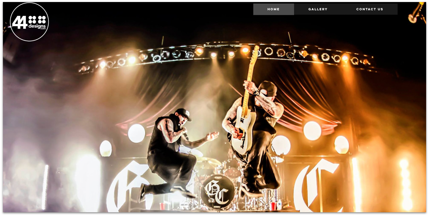
Nashville-based 44 Designs specializes in lighting and stage design for bands, theatre, corporate events, music videos, film, and television productions. I love how the full-screen homepage slider showcases the company’s talents to draw prospective clients in.
The dynamic Gallery page uses Wix Pro Gallery to give visitors an even more interactive experience. As you mouse over, images fade and text overlays pop up. A click on any image brings up a slideshow so you can scroll oversized photos of iconic staged events one by one. For artists or photographers, a design like this that lets your work do the talking can work. All you need is a Contact page so visitors can get in touch.
3. Nikki Porcher
Visit the website at: https://www.nikkiporcher.com/
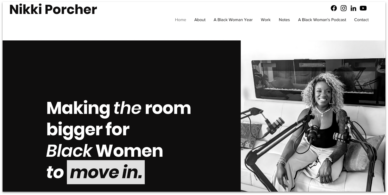
Wix is a great option if you want to build a personal or professional brand, and Nikki Porcher, an advocate for Black women, proves it with her site. Everything about Porcher’s website, from the black and white color theme to the bold text snippets enclosed in Wix container boxes, is designed to connect with her audience and draw eyes to her message.
Blog and Podcast pages allow Porcher to discuss relevant topics for black women, share her story, and explain her nonprofit’s goals. Colorful links to popular podcast feeds – Apple Podcasts, Spotify, iHeart Radio, Amazon Music, and a link to her YouTube channel (for video podcasts), encourage visitors to tune in. The Wix Podcast Player automatically uploads your latest episodes to your website and syncs them to your RSS feed.

4. Sonja Van Dulmen
Visit the website at: https://www.sonjavanduelmen.com/
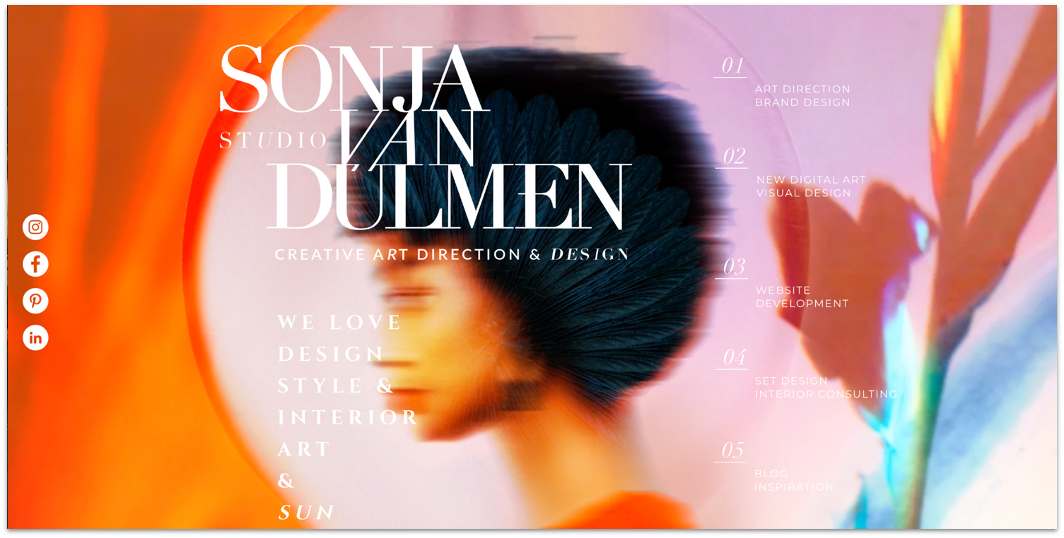
Wix offers many options for personalizing a portfolio, making it hard to pick the best of the best. Sonja van Dulmen made my list of the best Wix sites because I love its edgy and surreal vibe, a perfect fit for her creative vision. I was also impressed by how she uses Wix’s flexible layouts to present her interdisciplinary design services as a cohesive whole.
You can dip into Van Dulman’s multimedia blog for a peek behind the curtain and get insights into what inspires her work in the world of fashion, art, design, animation, and photography. Clients can book her services online using Wix Bookings’ features. And if you fall in love with a digital artwork on her website, you can email to ask about a purchase.
5. Adidas Hardware
Visit the website at: https://www.adidashardware.com/
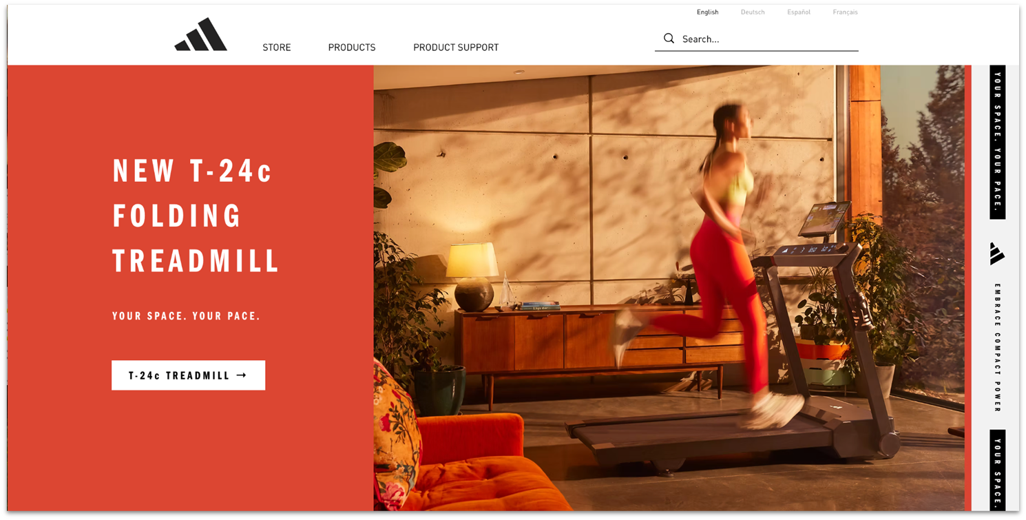
When you land on the Adidas Hardware homepage, you’re prompted to click on a video to get a first-hand feel for one of the company’s newest items. As fitness enthusiasts browse the site, they can view interactive product visuals, detailed user manuals, and professional videos for everything from high-end cardio equipment to wearables, like gloves and scrunchies.
If you lack photography and cinematic skills, don’t worry, Wix has your back. Wix Photo Studio will enhance image quality, remove or change a distracting background, and eliminate unwanted elements. Wix also gives you tools to create promotional product videos, so you can follow Adidas’ example.
Visit the website at: https://www.industrial-jewellery.com/
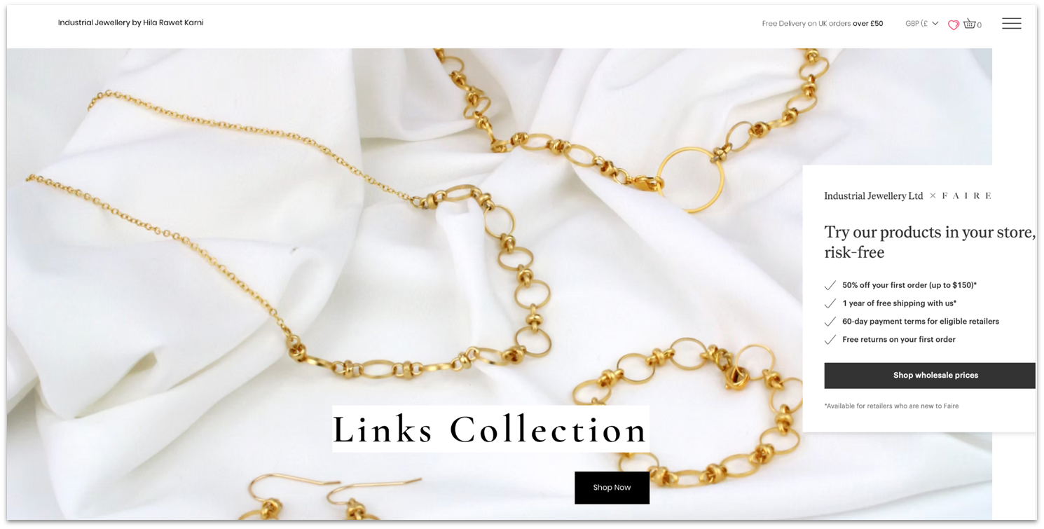
Using a multi-channel sales strategy on your Wix e-commerce site, as jewelry designer Hila Rawet Karn does, can help you reach more customers. Offering direct sales to consumers (B2C sales) while also using her online store to connect with retailers (B2B sales) can broaden distribution. To appeal to an international audience, she also provides on-site currency conversion, a Wix Stores feature.
When visitors land on her page, a pop-up offers shoppers who sign up for email updates a 15% discount. Using the Wix lightbox feature, you can create targeted pop-ups to boost sales. Simply set user-action triggers, such as when a shopper adds items to a shopping cart or leaves before checking out.

Visit the website at: https://www.carouselrestaurant.com/
Carousel ticks all the boxes for a restaurant site. It offers dine-in, takeout for pickup or delivery, and catering for corporate and private events. What’s more, Carousel is optimized for mobile viewing, exactly what any restaurant needs to succeed. Another idea you can use to build your customer base is to offer a rewards program that offers points and discounts.
Integration with OpenTable allows diners to make reservations directly on the website, while the Instagram feed highlights new menu items. If you want to keep everything in one place, you can use Wix Payments for online sales and Wix POS for in-person transactions. The plans, fees, and hardware, including hand-held card readers, are competitively priced.
8. Women in AI

Visit the website at: https://www.womeninai.co/
Women in AI (WAI) shows you how Wix can help you create a nonprofit website, one that makes the case for what you do and why it matters. Case in point, WAI started as a small Facebook group and has grown into a community of over 18,000 members that partners with top tech firms around the globe.
Take a cue from this website. If you have a lot of information to share, focus on a clean structure and user-friendly navigation. Features like the sticky navigation bar and drop-down menus make browsing a content-heavy website a breeze. And the strategically placed call-to-action buttons prompt visitors to learn more, get inspired, and support your mission.
9. The Sofía Log
Visit the website at: https://www.thesofialog.com/
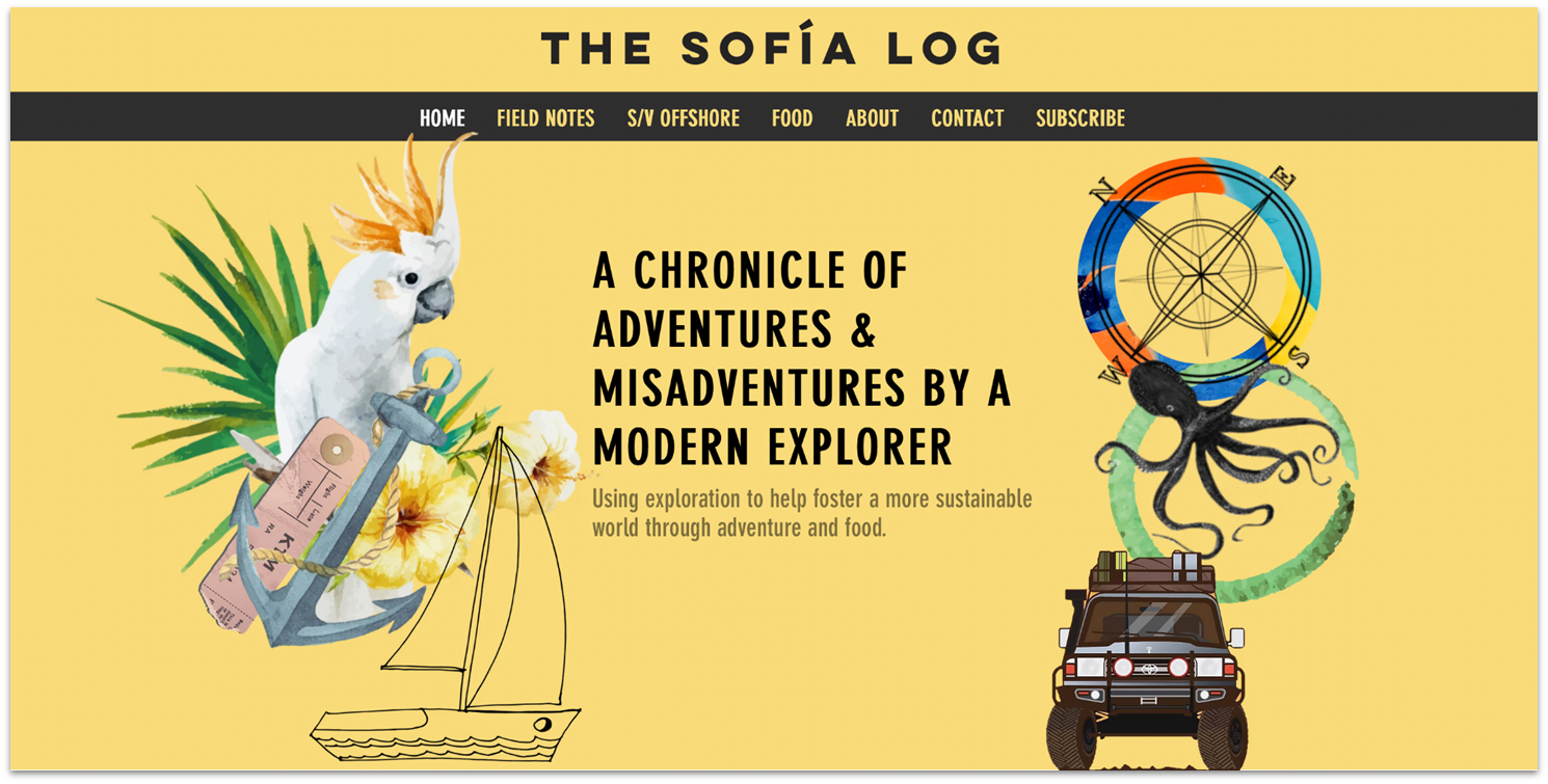
The Sofia Log is a popular Wix travel blog of writer and environmental scientist Sofia Hollingsworth. She makes excellent use of Wix’s multimedia capabilities to fill her blog with visual interest. You can follow her example and use Wix’s design tools – slideshows, video, and hand-drawn elements to draw visitors’ attention.
The heart of the Sofia Log is the Field Notes page, where posts are organized by country and continent. I love how you can pick a location on a map or scroll a list of places she’s visited to zero in on research you’re most interested in. Wix blogging tools let readers comment, like and share posts, and subscribe to her RSS feed. They can even track her travels using the embedded app.
10. Daniel Banuelos
Visit the website at: https://www.dandbc.mx/
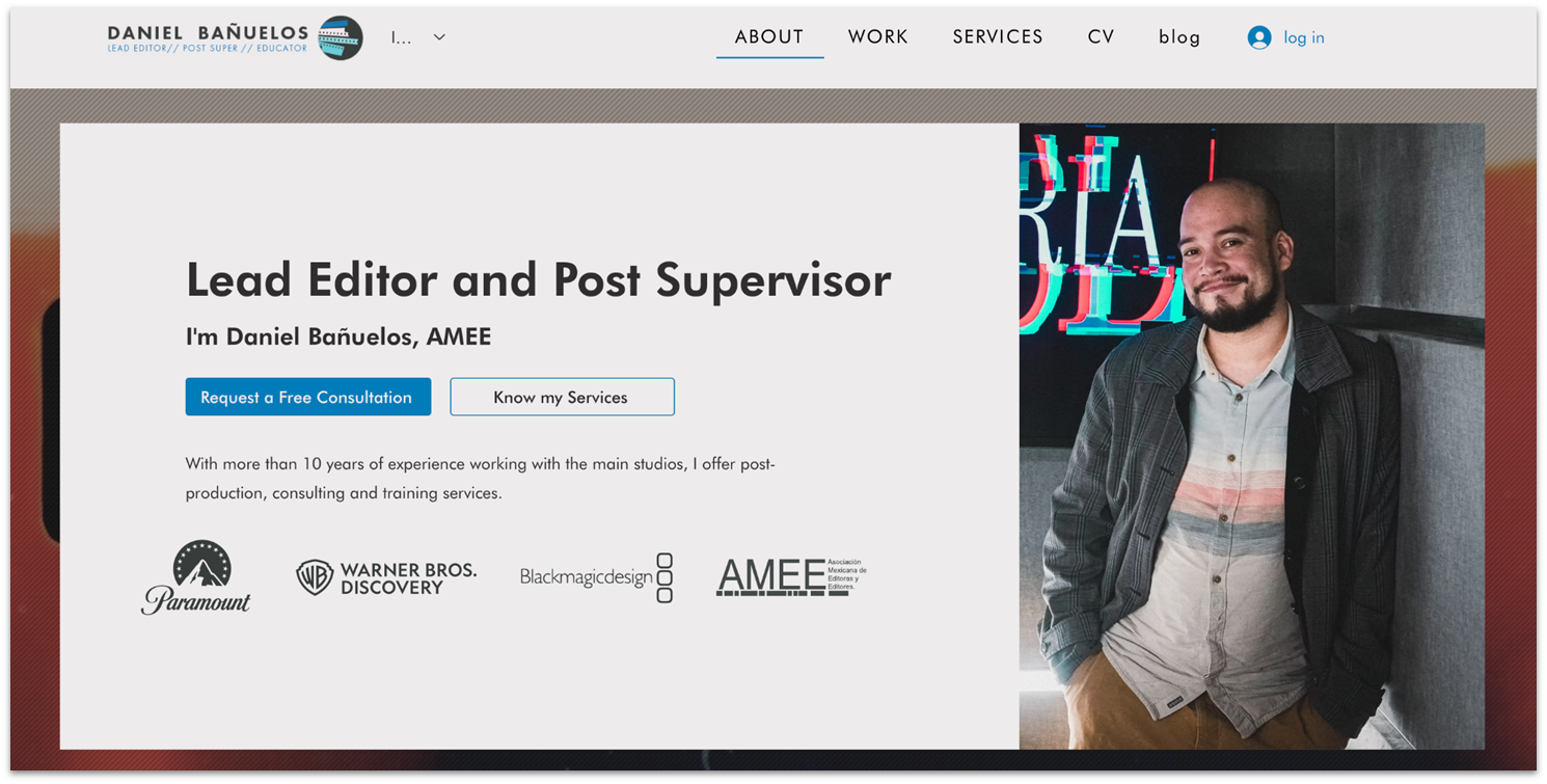
Mexico City film editor and post-production supervisor Daniel Banuelos lets you choose between a Spanish and English version of his website. It’s an example of why Wix is great for building a multilingual site to promote your skills to an international clientele.
The long scrolling homepage covers all the bases: a description of his services, eye-catching video cuts from his recent film projects, client list, testimonials, and a mini project gallery. Rounding out this notable Wix website sample is a CV, a more expansive project gallery, client testimonials, and an informative blog that underscores his expertise.
11. Mariya Designs
Visit the website at: https://www.mariya.design/
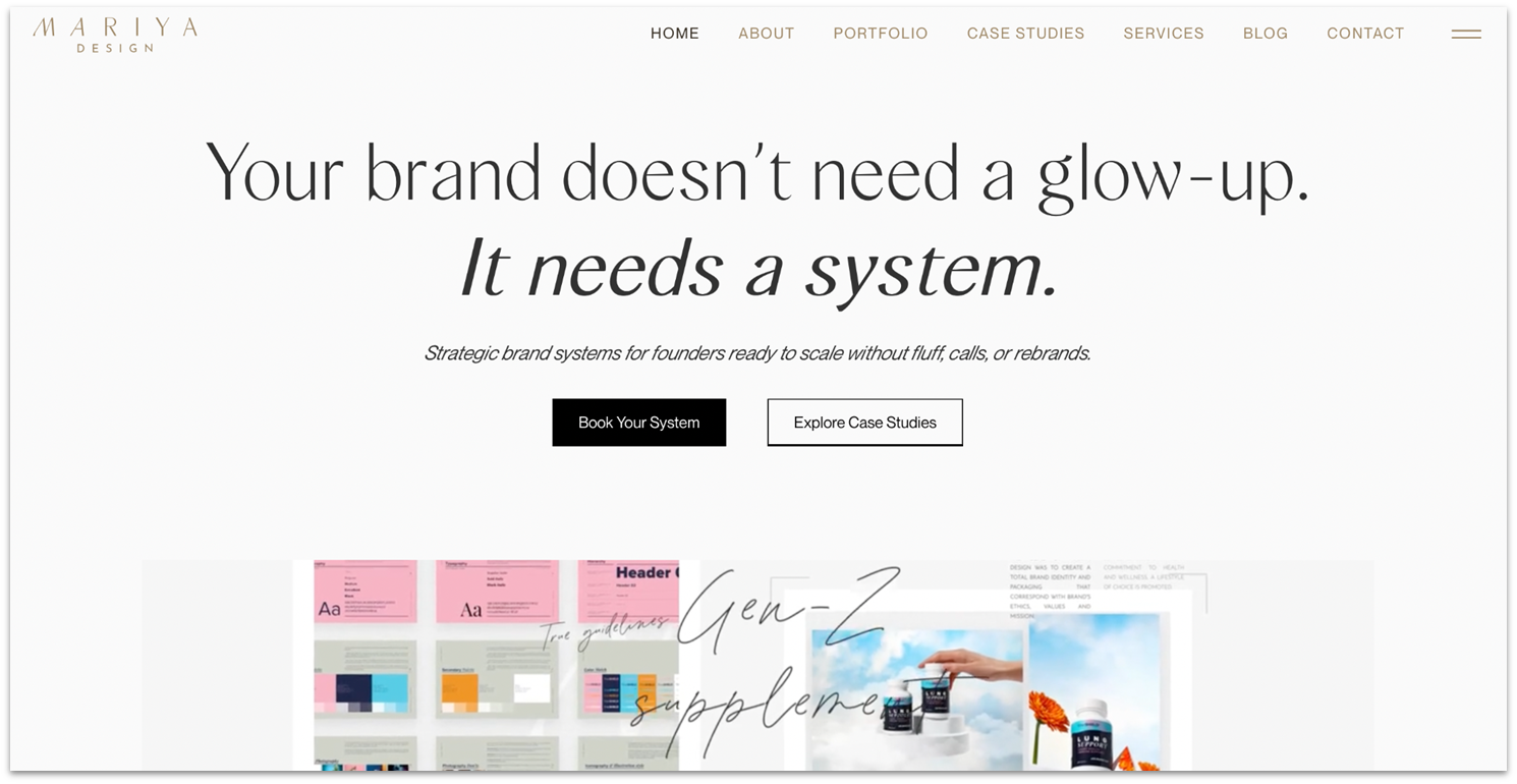
There’s so much I like about Mariya Design – the attractive homepage that showcases this firm’s best work – the sticky header for easy navigation, the dedicated client login area. It’s got everything covered for any service business. In contrast to Steinkuehler’s dramatic portfolio, Mariya Design is all about subtlety, from the unobtrusive Wix animations to the soft color palette.
If you’re intrigued by the homepage, skip over to the Work and Gallery pages to see how the firm shares its best work. What stood out for me is how she uses detailed case studies that show how she solves a client’s problem from start to finish. If brash and bold isn’t your style, this popular Wix website proves you don’t have to shout to draw attention.
12. Nicole Louise
Visit the website at: https://www.nicolelouiseevents.com/
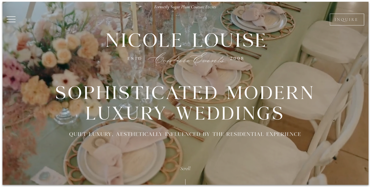
Wedding planner Nicole Louise’s website opens with a full-screen, cinematic video, immediately immersing visitors in her signature aesthetic – sophisticated, modern, and quietly opulent. Wix Studio’s design tools enable seamless layering of text over dynamic background visuals without compromising readability or performance.
The discreet hamburger menu, subtle scroll prompts, and prominent “Inquire” button all contribute to an intuitive user experience that mirrors the bespoke nature of the brand.
If you’re designing a business website, you’ll want to note how a Services Page, testimonials, and blog establish her credibility and put prospective clients at ease.
Other Notable Websites Built With Wix
You can create so many different types of websites with Wix, each with a unique look and feel, that it’s hard to pick a few “best examples.” So, here are eight more great websites to give you more ideas on how to harness the power of Wix to build a compelling website.
13. Ryan Haskins
Visit the website at: https://www.ryanhaskins.com/
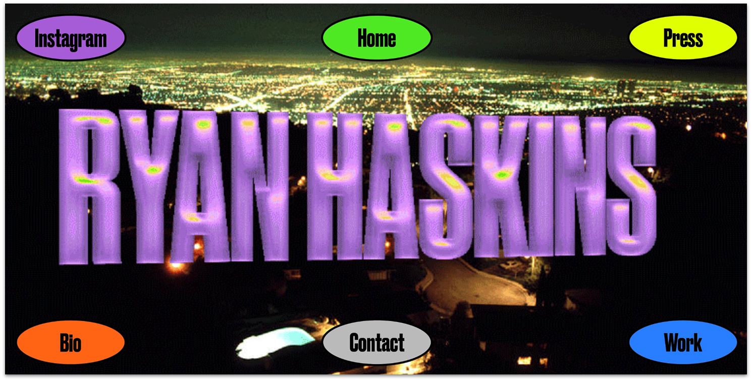
Ryan Haskins is a creative director and brand designer with a taste for neon colors, playful animations, and cheeky graphics. His portfolio reflects his unconventional creative vision – camp, dynamic, and entertaining. While his website may have a bespoke look, adding sophisticated animations to your agency site doesn’t require coding. Spinning headers and buttons, image and text overlays, and scrolling galleries are part of Wix’s intuitive toolkit.
14. Common
Visit the website at: https://www.thinkcommon.com/
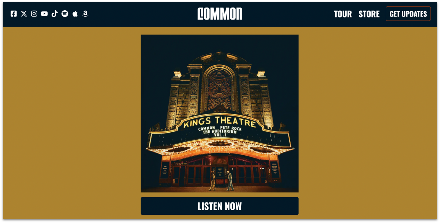
Common’s website has a simple structure that puts all the essentials on the homepage. Fans are greeted by an image of his latest album and a “Listen Now” button that prompts them to start streaming. Scrolling down, they can view a rap video, upcoming tour dates, sign up for his newsletter, and buy Common’s music and merch. YouTube, Spotify, TikTok, Apple Music, and Amazon Music icons are in the top left corner.
15. Fei Luo Photography
Visit the website at: https://www.fishluo.com/
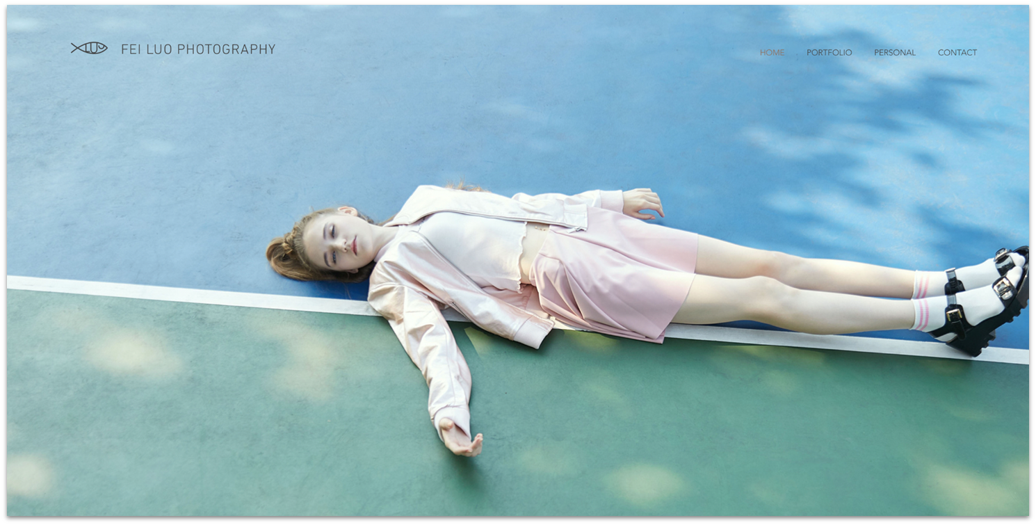
Fei Luo fills her Wix photography portfolio with high-resolution images and video to showcase her commercial and fine art photos at their best. Wix’s flexible gallery options allow her to organize her work in customizable layouts, including a hero image slider, asymmetrical galleries, and a video carousel. Take a tip from her website and use a QR code on your contact page – it’s more convenient for mobile users.
16. Mikaela Reuben

Visit the website at: https://mikaelareuben.com/
Nutritional chef Mikaela Reuben leaves no question about her value proposition – she shares it in a bold header for immediate impact. This is prime real estate on your website, what designers call “above the fold”. It pays to follow Reuben’s example and use this space to make a strong first impression that encourages visitors to explore. Offering free recipes or fitness videos on your health-focused site is a great way to convert visitors to customers.
17. Izzy Wheels
Visit the website at: https://www.izzywheels.com/
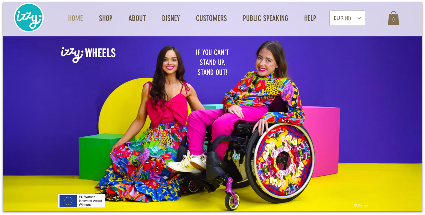
I was immediately taken with Izzy Wheels, the brainchild of Irish sisters Ailbhe and Izzy Keane. It shows how to leverage Wix’s e-commerce, design, and promotional tools to take a niche product from startup to commercial success. Of special note is how the sisters replaced the testimonial slider with a Customers page. These real-life spokespeople make the best case for purchasing their store’s products. It’s no wonder Disney chose to partner with this brand.
18. Peter Ummels
Visit the website at: https://www.dakdekkersbedrijf-ummels.nl/
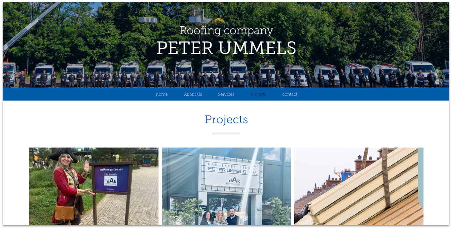
Peter Ummels stands out for its crisp and polished website. The minimalist design is enlivened by high-quality images and text that slide in as visitors scroll. These subtle animations are easily configured in the Wix Editor’s animations panel – all it takes is a few clicks. I’m a fan of how he highlights his commitment to quality service and builds trust by embedding links to his third-party certifications, project warranty, and established history.
19. Ana Leovy
Visit the website at: https://www.analeovy.com/
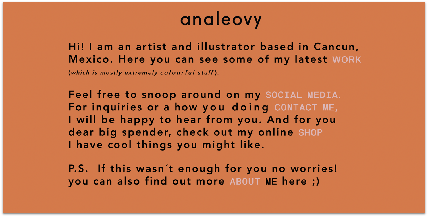
The casual, friendly text makes illustrator Ana Leovy’s website feel less like a traditional portfolio and more like a one-on-one dialogue with potential clients. It’s lively, spirited, and unconventional – an extension of her artistic personality. To connect with your visitors in an authentic way, take inspiration from this website’s warm tone, strong identity, and easy-to-explore format. A personal connection can be a powerful tool for service businesses.
20. The Harvard Crimson Programs

Visit the website at: https://www.gp.thecrimson.com/
Harvard University uses a consistent color palette – crimson and black – for all its brand materials. It’s a smart move you’ll want to replicate on your website, marketing campaigns, and social platforms, essential to establishing a memorable brand identity. Another takeaway from the site is the importance of a clean structure and navigation. When you make it easy for users to find what they’re looking for, they’re more likely to return.
Make the Most of Wix To Build Your Site
Whether you’re a graphic designer, artist, small business owner, restaurateur, or freelancer, Wix has what you need to build a compelling online presence and connect with your audience.
By focusing on clear navigation, high-quality visuals, and strong branding, you can create a site that attracts visitors and performs well on search engines. You’ll want to take advantage of Wix’s design flexibility, its built-in e-commerce, booking, multimedia, analytics, and AI tools. For added functionality, the Wix App Market offers 800+ integrations, many of them free.
FAQ
What kind of website can you build with Wix?
You can build any type of site with Wix, from portfolios and blogs to restaurants, online stores, professional CVs, and business sites. With 2500+ templates, creative capabilities, and built-in tools for SEO, bookings, e-commerce, and media, Wix adapts to virtually any website, goal, or style.
Is Wix good for e-commerce?
Yes, you can design a full-featured online store with Wix that allows you to manage your inventory, payments, and shipping from a central dashboard. Features like multimedia product galleries, secure checkout, and abandoned cart recovery help drive conversion.Wix also supports integrations for multichannel selling, dropshipping, and print-on-demand. Its e-commerce tools can compete with many dedicated e-commerce platforms. Check out our full Wix review to learn more about its e-commerce features.
How long does it take to build a Wix website?
It can take anywhere from 30 minutes to several days to build your Wix website, depending on which of its builders you choose. You can build a site in under an hour with the Wix AI Builder, but using the Wix Editor or Wix Studio will take longer. Overall, the time will depend on how much content you have and the level of design control you want.
Will my Wix website be optimized for mobile?
Yes, every Wix template is mobile-optimized by default. You may still want to take advantage of the mobile editor to tweak layouts, adjust fonts, and add mobile-only elements. For the most mobile-friendly experience, I recommend previewing your site on different devices in the Wix Editor. Carousel is a good example of a mobile-optimized Wix site.
What are Wix’s limitations?
Wix is a powerful and intuitive website builder, and its AI tools are second to none. Still, it’s not for everyone. The creative freedom it offers can be overwhelming, and you can’t easily switch templates or fine-tune the mobile version of your site. That’s why I recommend starting with Wix’s free plan to test its features. Our expert review of the best website builders for 2025 can help you decide if Wix is your best option.


