The right template is key to creating a great first impression online – but the template that catches your eye may lack the features and functionality your website needs.
You could end up deep in the design process before you realize your mistake. When you try to add a new feature to compensate, it might be difficult for you to design it to fit the template.
Even worse, you might learn too late that the builder itself doesn’t offer the right tools for your business. Most builders don’t allow you to export your content to another platform, so that would be a real waste of time and energy.
So with all the website builders and templates to choose from, where do you begin? To get you started I’ve scoured templates from top builders and put together a shortlist of 11 templates that have what it takes.
Read on to see my picks and decide if one’s right for your project.
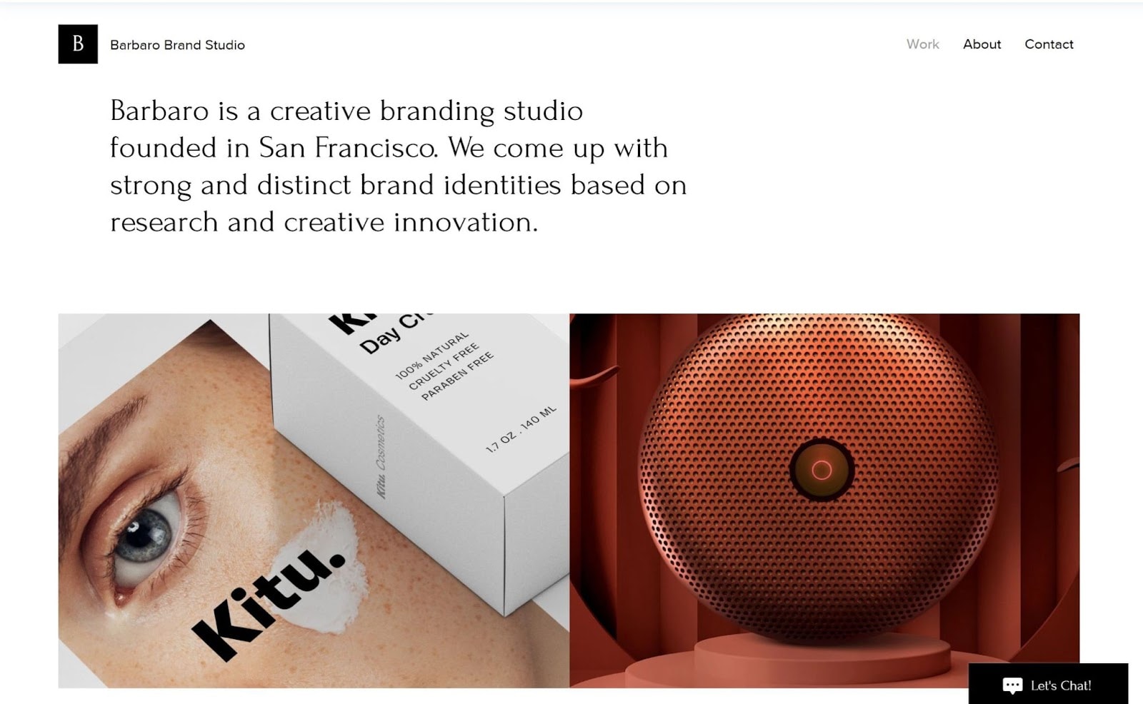
Wix’s Design Studio is a great option if you need a website that speaks to the unique identity of your business. As potential clients scroll down the homepage, images zoom in and darken in an interactive way. Concise text on the homepage clearly lays out your value proposition.
The homepage displays 8 individual case studies to demonstrate your creative range (you can always change the number). Users can easily navigate by clicking on the arrows on the right or left side of the page or on a thumbnail image.
A simple About page shows information about your company, services, team, and important clients. An even simpler Contact page rounds out this striking template. It has a sign-up form for clients and a designated email address for recruitment.
Rounding out this template is a straightforward footer with text links to all your social media channels – Facebook, Instagram, Facebook, Behance, Twitter, and Vimeo.
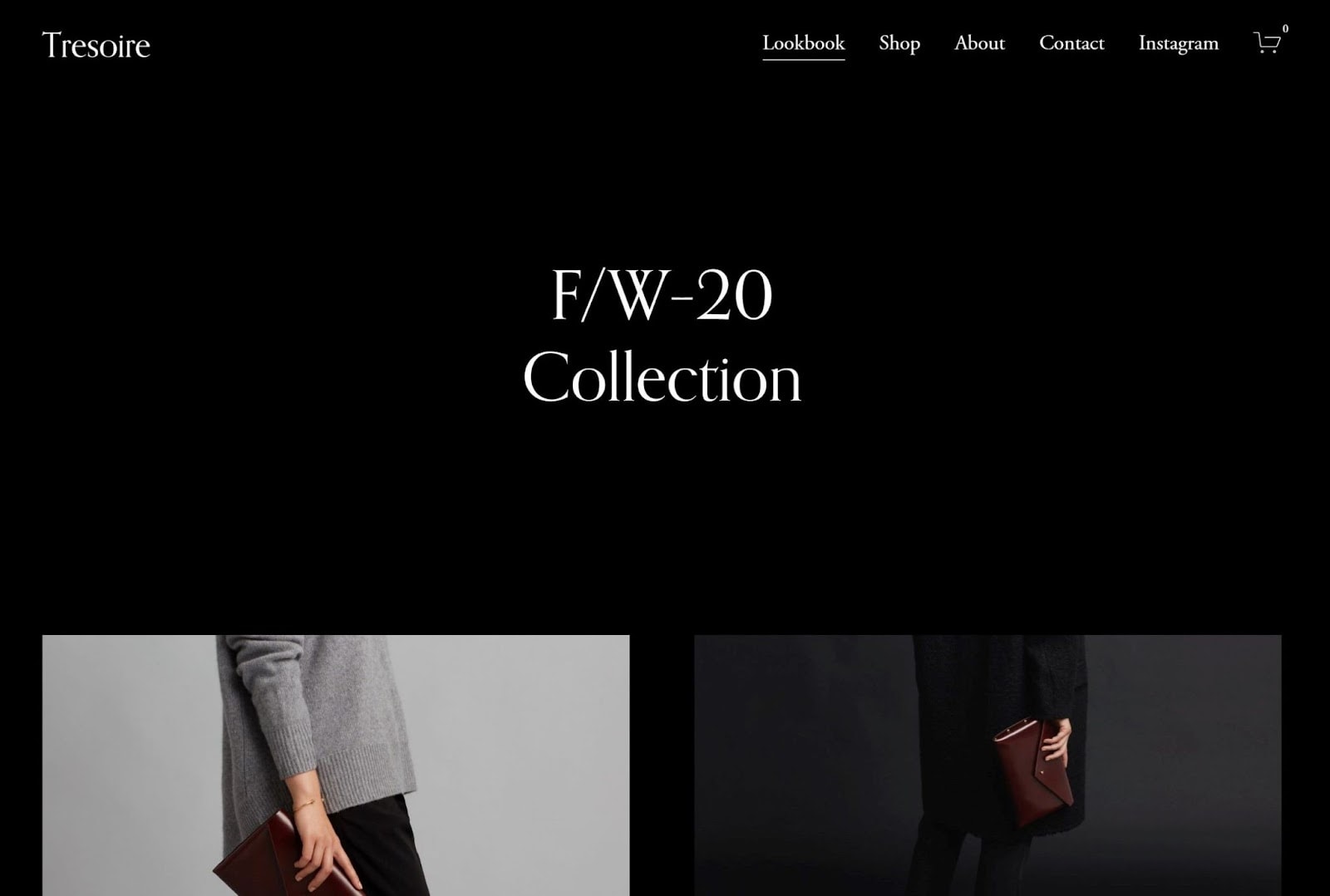
Tresoire’s homepage is simple and clean, but don’t be fooled – this template is big on both style and features. Tresoire’s straightforward design makes it easy for shoppers to browse and purchase from your store, and even set up accounts for faster checkout. A stylish footer nudges visitors to sign up for news about your latest products or sales.
The well-designed product galleries on the Lookbook and Shop pages will keep shoppers’ eyes focused on your creations. When they hover their cursors over an image, a button titled Quick View will appear, and allow visitors to see product details without leaving the page.
To make the most of this template, you’d want Squarespace’s Business or Commerce plans. That said, Squarespace plans have a 14-day free trial, so you can try it risk-free.
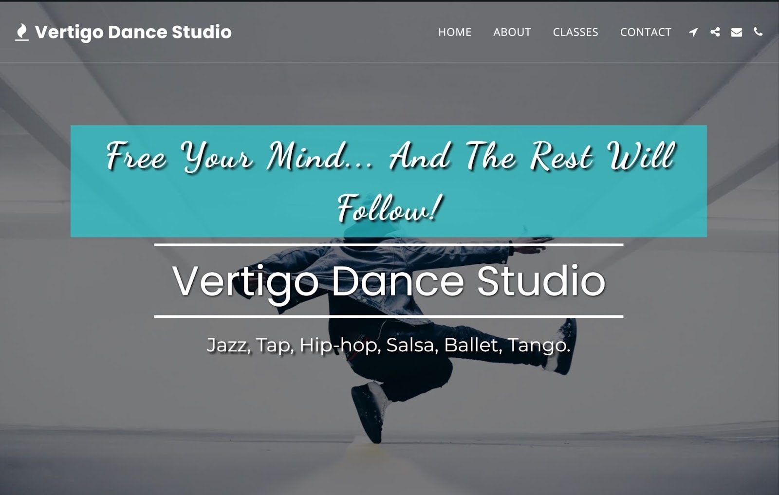
Every design element on SITE123’s Vertigo Dance Studio’s homepage channels movement and excitement, which is great for capturing the interest of your target audience. This template has everything you need to show what sets your fitness business apart: multiple image galleries and About, Classes, and Contact pages.
When potential clients explore the Classes page, they can click on a thumbnail image to bring up a detailed description, class schedule, and fee. The Testimonials page pairs positive client reviews with photos for extra credibility. (You’ll see this page when you’re logged into your SITE123 account.)
You can use the Schedule Booking tool with this template to make it easy for clients to reserve appointments. And with a paid SITE123 plan, you can take payments, integrate live chat, and add tracking plugins like Facebook Pixel or Google Analytics. Every SITE123 template is fully responsive, so your site will look great on any device.

Poké Restaurant – Enticing Design for Restaurants and Caterers
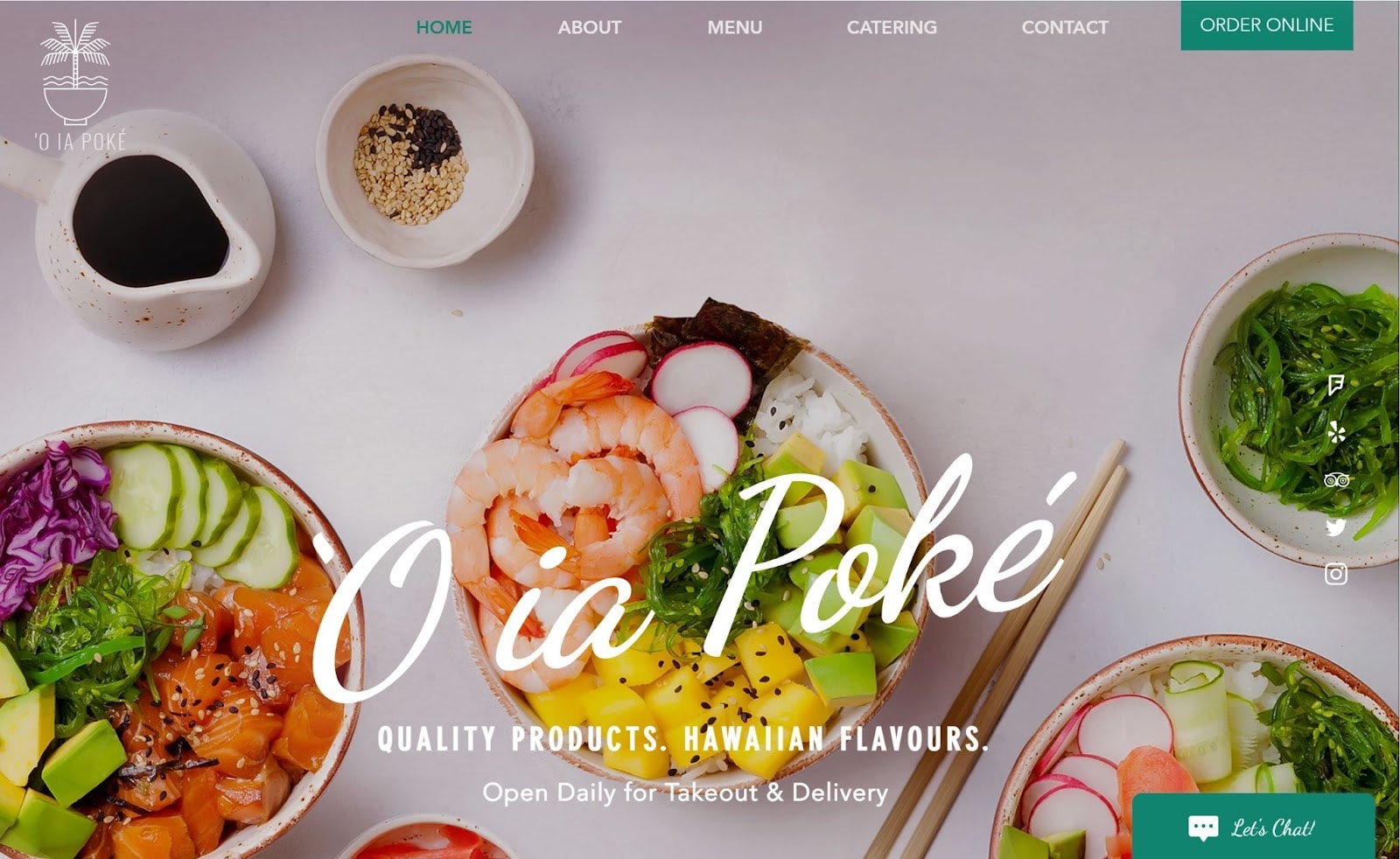
Vibrant colors and quirky animations make Wix’s Poké Restaurant fun and appealing, but its built-in features truly set it apart. The navigation bar at the top of the homepage has links to the About, Menu, Catering, and Contact pages, as well as a colorful CTA that links to a page for online orders.
You can customize text sections and photo galleries to highlight what’s special about your restaurant with free icons, photos, and backgrounds, or use Wix’s user-friendly drag-and-drop editor to upload your own.
The Wix Menu App makes it easy to design your menus for those dining in, ordering online, or ordering catering. And the built-in Wix Reservations and Online Orders apps let customers book a table or order deliveries with just a few clicks.
Poké Restaurant places relevant social media links on the right side of every page, so customers can connect with you, and share positive reviews (the default links are for Facebook, Twitter, Instagram, Yelp, and Trip Advisor).
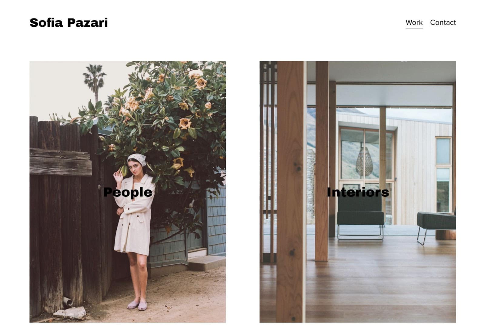
Choose Squarespace’s Sofia Pazari template, and when visitors land on your page, they’ll be treated to four virtual exhibits – each focused on a particular aspect or period of your work. It’s my top pick for photographers and artists because its pared-down design highlights prime examples of your work and doesn’t overwhelm visitors.
The homepage has an image for each category of your work, which demonstrates your creative range. When visitors click on any of the homepage images, they’ll be taken to the full gallery for that category. Text is mostly absent, the better to bring every photo into sharp focus.
The Contact page is short and sweet: it has a brief ‘about’ section, a list of relevant email addresses, and a link to your Instagram account. If you want to share your creative process, all Squarespace plans make it easy to add a blog.
Jazz Blog– One-Stop Destination for a Cultural Blog
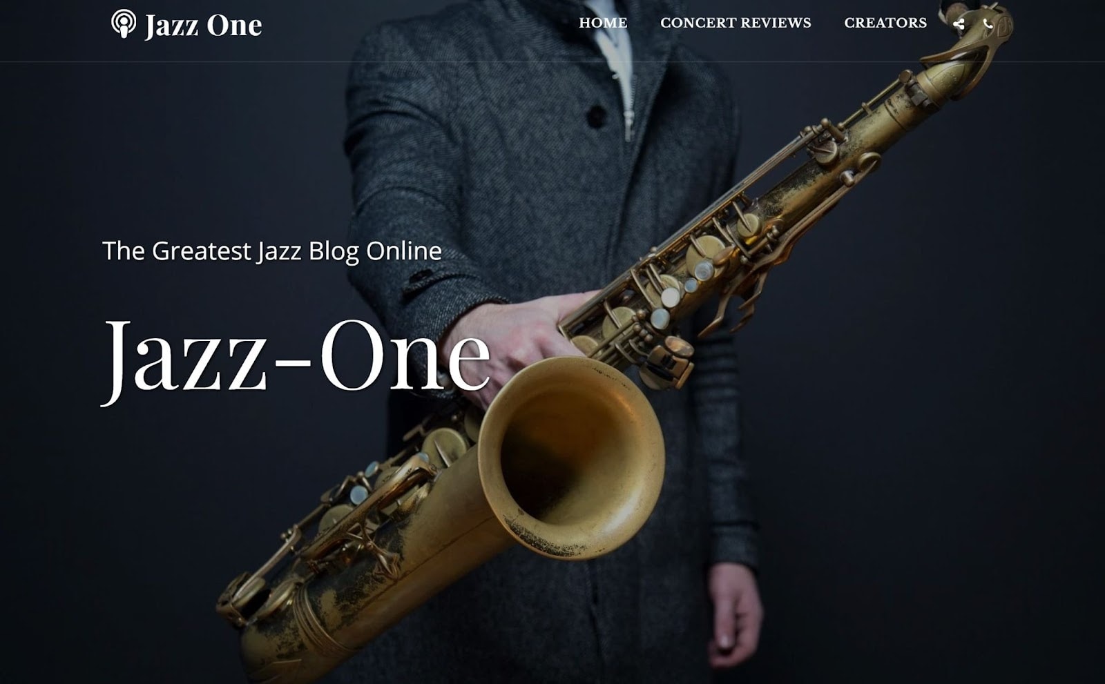
SITE123’s Jazz One has all the features you need to launch a top-performing entertainment blog or magazine, from dedicated pages for reviews and for writer profiles, to a button that lets site visitors add your blog to their RSS news feed.
The Concert Reviews page lists your posts by date. Each post has a title, description, and thumbnail image. When readers click on a title, a full review pops up, along with options for sharing on social media. Posts come with simple comment forms to spark lively conversations. You can manually screen comments or have them automatically approved.
SITE123 blogging tools let you add free audio files to posts, schedule posts, and share them on social media. Facebook, YouTube, and Instagram links built into the top navigation menu and footer can help you build a dedicated following.
If you want to monetize your site, SITE123’s plans let you sell subscriptions and include paid advertising. You can also take advantage of SITE123’s affiliate marketing program.
Resort – Luxurious, Best Resort-Ready Template
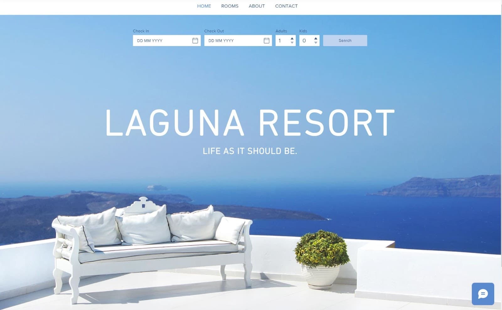
The sleek Wix template Resort has a simple homepage design: an oversized header, hero image, and searchable reservation bar. The navigation menu at the top of every page makes it easy for potential guests to check availability and book reservations. And they can do it in up to 12 languages from mobile, tablet, or desktop.
Each page has a straightforward layout, with a striking banner image at the top and text and visual content below. The Rooms page lets visitors browse room types, amenities, and rates. When their cursor moves over a thumbnail image, a More Info button appears, enticing them to click to see a more detailed description and slideshow.
You can use the Wix Hotels app’s online booking system to set seasonal rates, manage reservations, send automatic confirmations, and accept payments online or in person. It’s commission-free, too!
Educator – Smart and Professional, Best Resume or Personal Site

Whatever your area of expertise, I’d recommend the full-featured Educator for your resume/CV or personal portfolio because it presents your accomplishments in a compelling format.
Warm colors and a clean font set a welcoming, yet polished, tone. Numerous built-in features promote your experience, like the About page, which has a button for downloading your CV. The homepage has a quick overview while dedicated pages for your research, publications, and media appearances give visitors deeper insight.
To bring out this template’s full potential, try a Wix Business plan so you can sell your work. You can also utilize this plan to sell tickets for upcoming events. You can customize this template with any plan, including the free one, but it’s worth noting that many of the built-in features, such as the Publications page, are designed to support monetization.
Garden & Co. – Feature-Rich Design for Outdoor Small Businesses
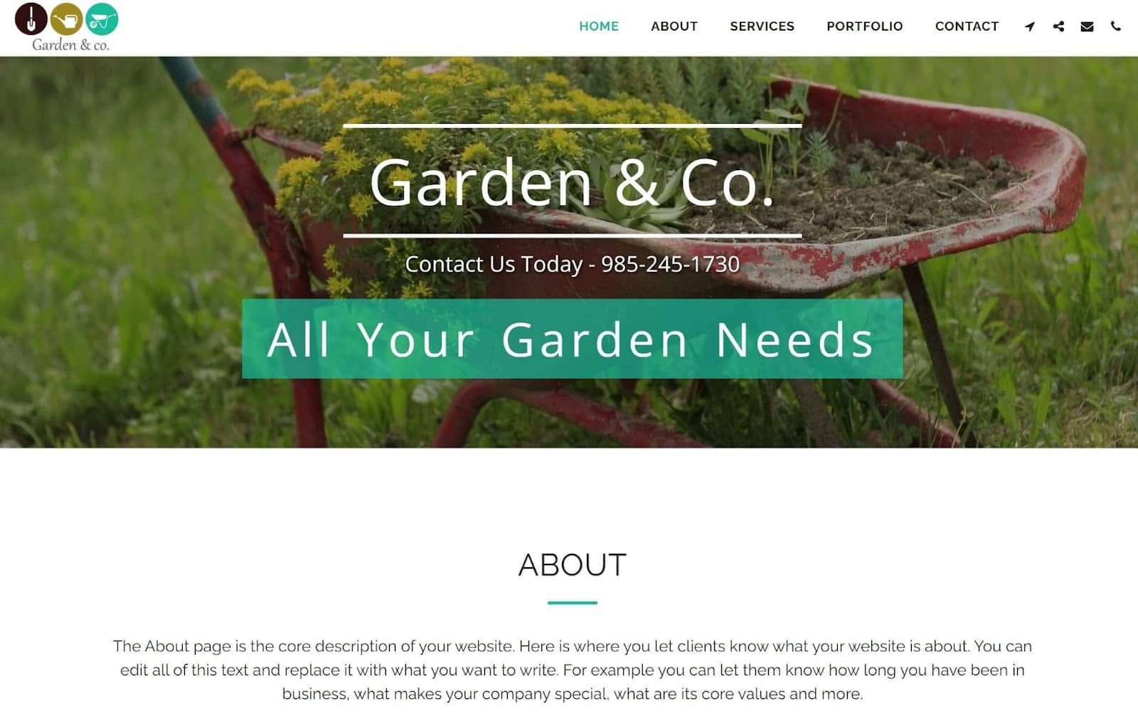
Garden & Co. is a simple one-page site, but like all SITE123 templates, you can convert it into a multi-page site instead. Whichever you choose, you’ll find this template has the important features a small landscaping or gardening company needs to increase brand awareness, connect with clients, and grow.
The About and Services pages (or sections) lay out the core benefits your firm provides and what sets your brand apart. The Services page pairs text snippets and photos with colorful Learn More buttons that encourage potential clients to act. The well-designed portfolio is good for businesses offering design services.
You’ll appreciate how Garden & Co. makes it easy for clients to find you. Visitors can just click on the navigation icon in the menu bar to see directions on Google Maps, Waze, and Moovit. The built-in contact page also has Google Maps embedded.
Clarkson – Best for Nonprofits and Community Organizations

Clarkson from Squarespace gives your nonprofit or community organization tools to tell your story, attract funding, and connect with followers. The homepage is uncluttered and pairs images with short, compelling text. It closes with an email signup form and a footer with your contact information and social media page links.
The About page lets you share your group’s mission, achievements, and goals. Its text sections are arranged in a grid, framed by bands of whitespace, to draw attention to your key points. The Initiatives page has an inspiring gallery of your latest projects, so visitors trust your organization.
All throughout the template, CTAs encourage visitors to learn more, donate, or volunteer. Because Squarespace’s Business plan lets you accept donations, you may want to upgrade to it, to make the most of the template.
Coming Soon – Slick “Under Construction” Template and Lead Magnet
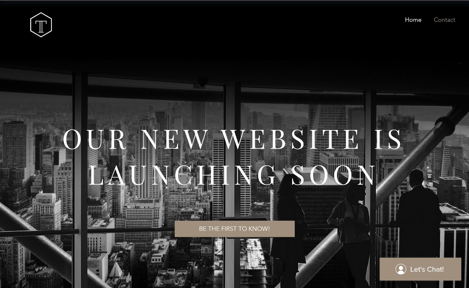
The stylish Coming Soon landing page from Wix is a great way for businesses and professionals to build anticipation about their website launch and generate leads. It’s also good for firms that are revamping their website, and need something useful in place in the meantime.
When visitors click on the Be The First To Know button they’ll be invited to sign up to get notified when your new site goes live. As you collect these leads, you’ll gather contacts you can use to boost your future marketing efforts and grow your client base.
The template’s footer has links for your LinkedIn, Facebook, and Twitter accounts, so you can still share information about your brand on those platforms. It’s also useful if you value your social media presence, and want to keep it boosted while your site is down.
Choose a Template That Will Set You Up for Success
While the overall design and style of your template are essential, it also pays to look deeper to be sure a template has the features you need. It’s true that you can always add features the template lacks (assuming the builder offers it), but customizing new features so they fit the template’s look can be time-consuming and difficult.
So ideally, your template will require minimal changes on your part. But you still need to pick a good builder, so you can improve your template as needed. Luckily for you, the templates in this article all come from beginner-friendly builders with good features!
Generally speaking, use Wix if you want a lot of customization power. You can move, resize, and change every element on your template and use hundreds of apps to add extra features.
Meanwhile, SITE123 is best for getting online quickly. Its point-and-click editor makes editing your template easy and 24/7 live chat support is always there if you have a question.
Squarespace combines power and ease of use. And as all of Squarespace’s new 7.1 templates have the same underlying features, it’s harder to go wrong.
Once you pick the right template and builder, creating your website can be stress-free. And that’s how it should be!


