We rank vendors based on rigorous testing and research, but also take into account your feedback and our commercial agreements with providers. This page contains affiliate links. Advertising Disclosure
Squarespace wasn’t the first name that popped into my head when I decided to build a landing page to capture email leads. But then I looked through tons of Squarespace templates and realized that several of its designs could work really well.
Squarespace’s templates are highly professional without looking salesy, and compared to some alternatives from dedicated landing page builders, they really stand out. Squarespace also provides other essential features like analytics and email marketing tools, as well as social media integrations. All in all, it can be a great option for effective landing pages.
Some of Squarespace’s one-page templates could be a great fit for your landing page, but I found suitable designs in other categories as well. These are my top picks.
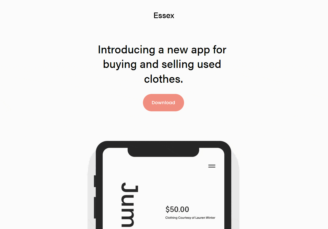
Essex keeps it clear and concise with a single image and CTA button.Essex is simple. Really simple. It’s the most basic on the list, with just a headline, a single call-to-action button, and one image. It’s a great choice if you’re directing users to your page from other online spaces like social media, and they just need a nudge (rather than a grandiose pitch) to take action.
The demo is built for apps but it could be a great choice for other digital products or downloads as well.
I’d also recommend this template as a great starting point for building your own landing page. Since Squarespace lets you add and rearrange pre-designed blocks of content like testimonials, pricing tables, and more, you can craft your own landing page if you’re up for the creative challenge.
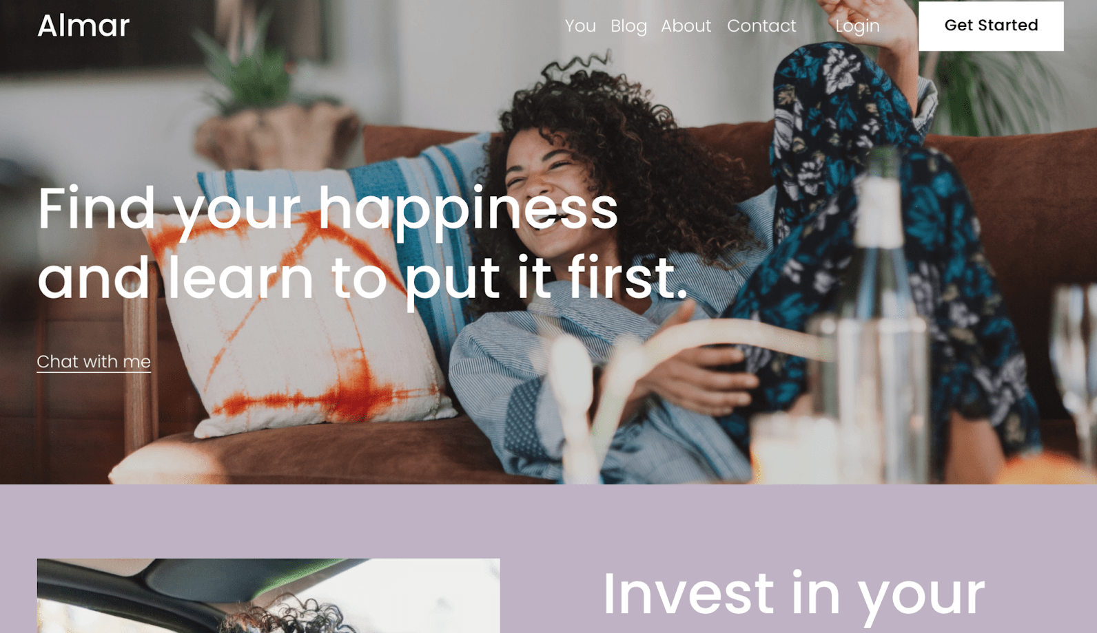
Almar lets you share the logos of your partners front and center: mouse over to see.
I really like Almar. It’s a great all-around template geared towards services like consulting or agencies. It kicks off with a large, attention-grabbing headline and a full-width hero image.
This template also includes Squarepsace’s Logo Wall section, which is a great way to display your social proof. This way, you can easily show off the logos of your partners or the online publications you’ve been featured in.
There’s also room for your testimonials, multiple call-to-action buttons, and a quick sign-up form right on the page.
Lakshi’s services section is clean and simple – hover over to see.
I recommend Lakshi for your landing page if your product or service involves in-depth info and you want to keep your visitors on the page. It’s loaded with different sections that do a good job of breaking up your copy and making your layout visually compelling.
Every section looks great, but I especially like the services section – the background image really makes it stand out on the page. You can use your copy to lay out exactly why your services are amazing and seal the deal with a Sign Up button.
Short on time?
Take this one-minute quiz to learn which website builders are best for your project.
This template takes a unique approach to testimonials. Hover over to see!
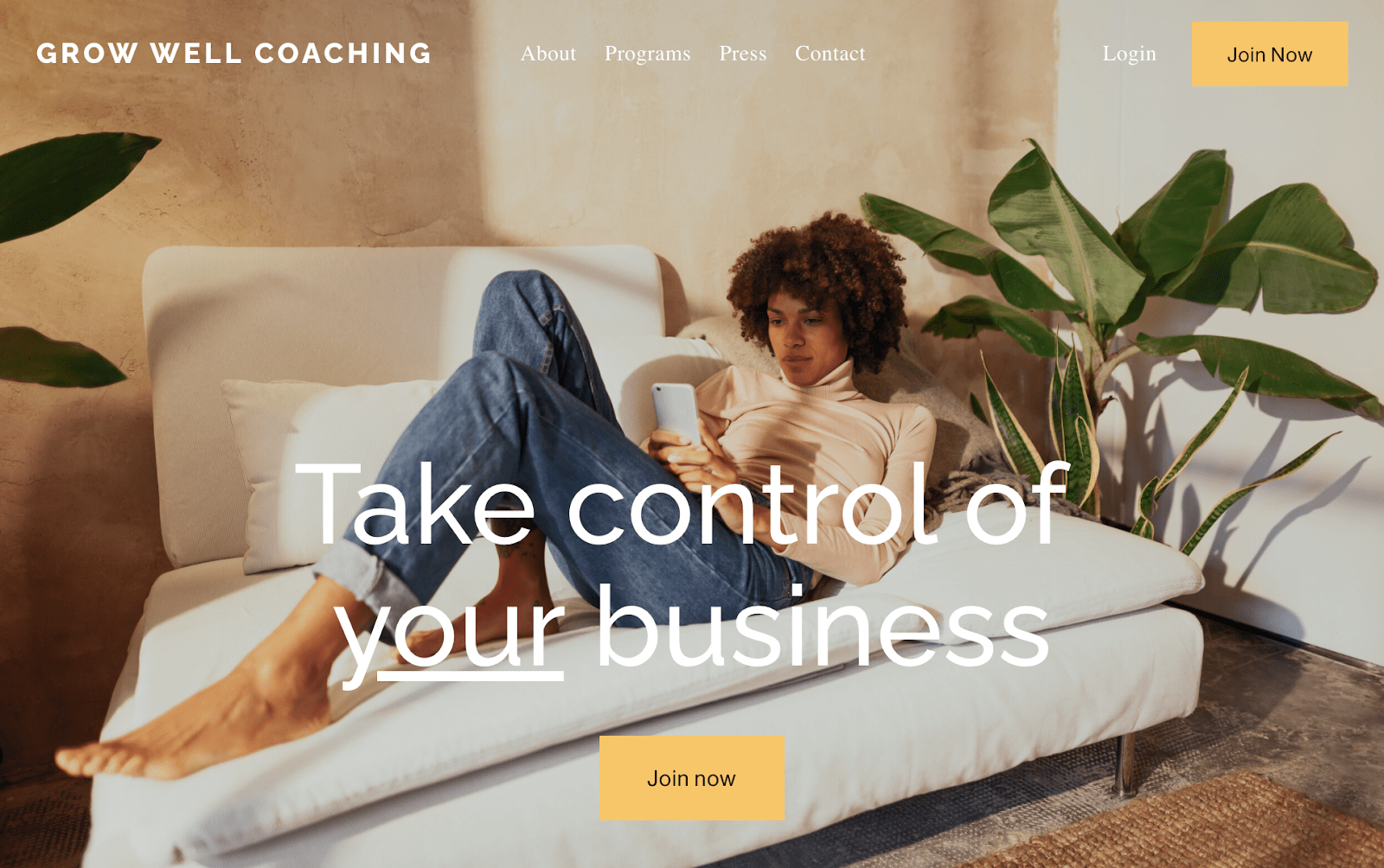
Growwell, another template that shines with big, beautiful headlines and images, offers lots of stylish space to unpack your services, just like Lakshi does. Additionally, it includes a pricing table, allowing you to showcase your plans right up front.
More importantly, I love how this template handles testimonials. You can share your glowing reviews in a way that looks professionally designed and really gives significance to each one. There’s room for your happy users’ names, their titles, photos, and quotes so each review looks distinct and important.
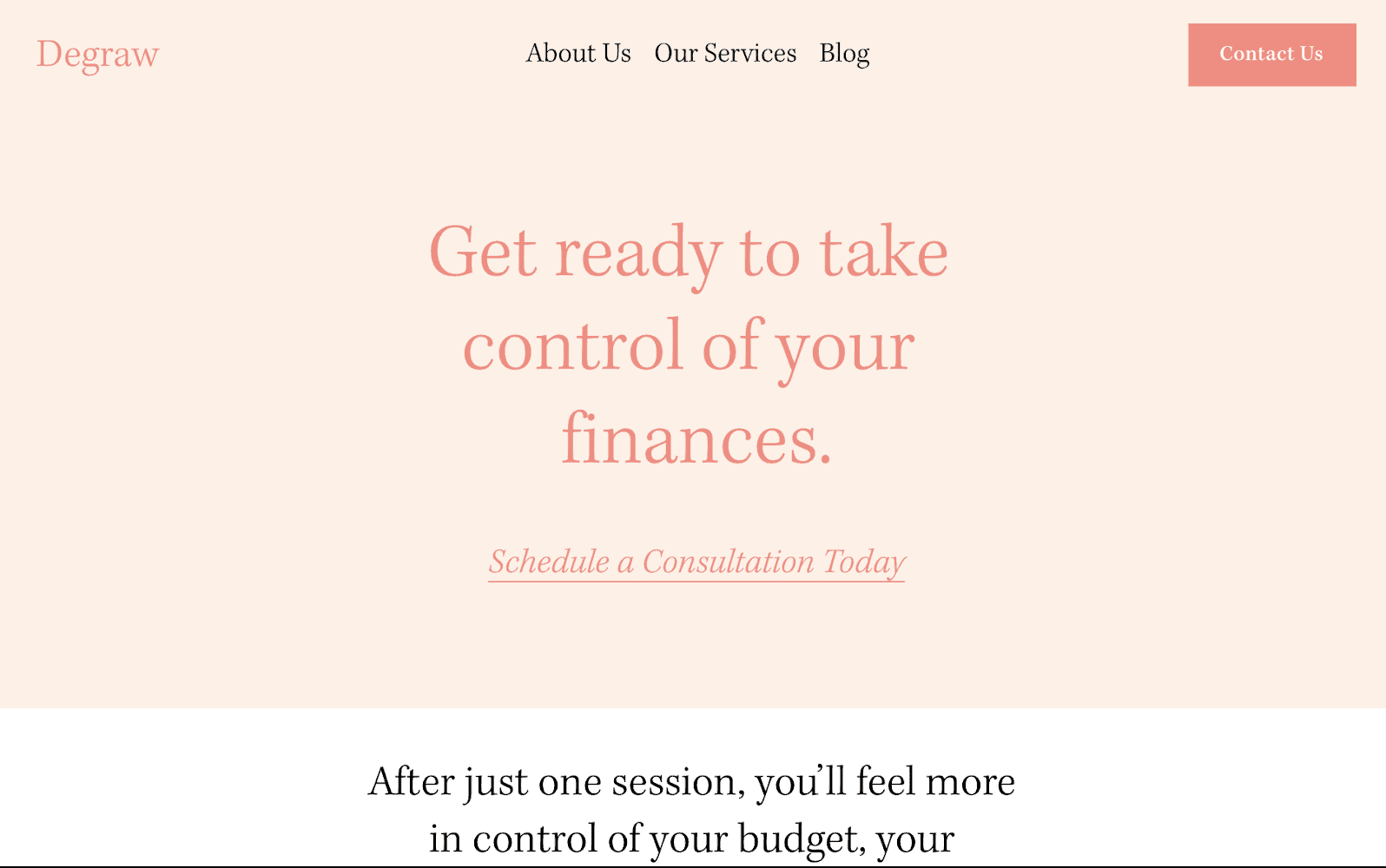
Degraw begins with large text but features images further down the page.
With Degraw, there’s no image anywhere near the top of the page, but that doesn’t have to be a dealbreaker, since you can let your conversion-optimized copy do the talking. The one-two combo of header and subheader is actually an effective way to present your value proposition and explain how your service or product works.
Once your visitors start scrolling, they’ll see your images, services, and a creative testimonials section that pairs quotes with customer photos. If your reviewers are willing to have their picture on your website, this format looks really good and could give your testimonials more credibility than just a quote next to a teeny tiny avatar.
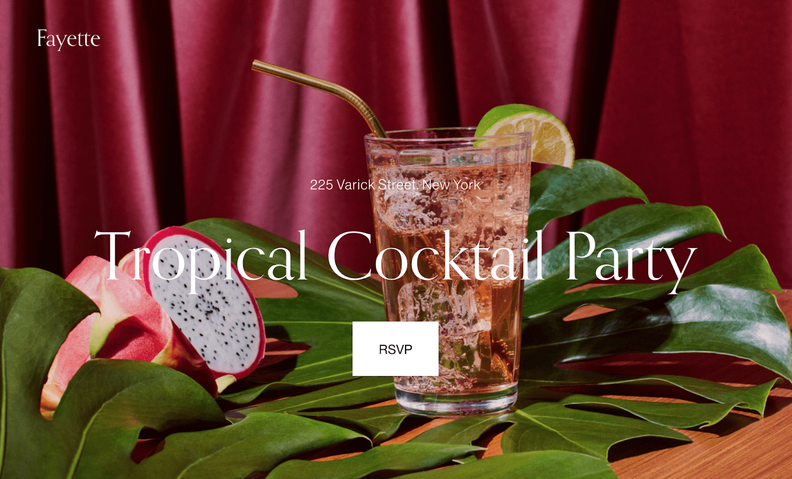
Fayette’s call-to-action section really stands out. Hover over to see.Fayette has a classy, refined look that would work well for luxury items or premium services. It doesn’t include a ton of room for copy, but that means you can keep things clear and concise for your visitors.
You can swap out the RSVP title and buttons with your own call to action to turn this party template into a unique landing page.
Wycoff uses text in a unique way for its call-to-action section.Wycoff is built for celebrations, so it will give your landing page a positive vibe even after you tweak it from a party invitation to a sales tool. The bold fonts are large, but not overpowering.
And just like with Fayette, all you need to do is change the button to Subscribe or Bookan Appointment to convince your visitors to take the next step.
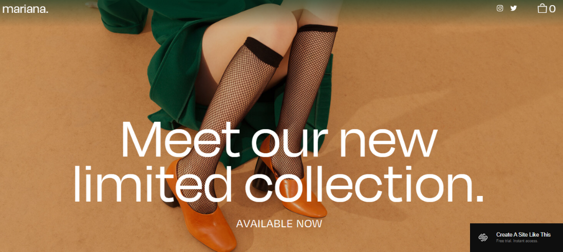
Squarespace’s Mariana template highlights your images
If you have an online store, Mariana could help you create an effective landing page to showcase your latest product collection. In addition to the compelling, full-screen header image, you can use the template’s Featured Products section to present your items in the best light.
As you scroll down the page, there’s a neat section for introducing your brand’s philosophy, followed bya sign-up form for collecting emails. You’ll also appreciate the sticky header with social media icons, making it easy for site visitors to share your story.
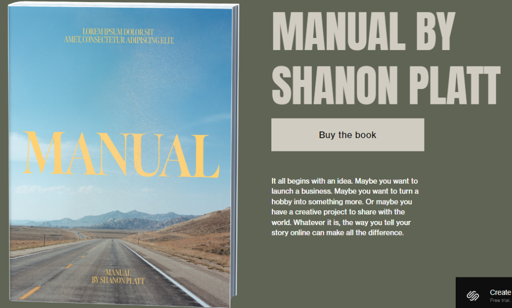
Manual’s journalistic style is bound to appeal to writersManual’s design concept is concise, while allowing you to pack plenty of useful information in. It’s an excellent option for authors or any artists selling digital products. You get ample space to promote your work, include reviews, and make a self-introduction.
The bold font and prominent CTA buttons encourage visitors to take action. There’s also a sign-up form to keep your audience up to date on your latest projects.
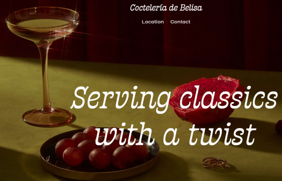
Squarespace offers a robust online scheduling tool to help you manage customer informationBelisa was made for high-end hospitality businesses, but it’s a great fit for any type of service seller. There’sa built-in online booking form to allow customers to make appointments directly on your site. Also, your business’s location and contact information are clearly presented.
If you sell products in addition to services, you’ll loveSquarespace’s attractive gallery types, such as slideshows and carousels. Personally, I prefer the round design, to help you create a distinctive look.
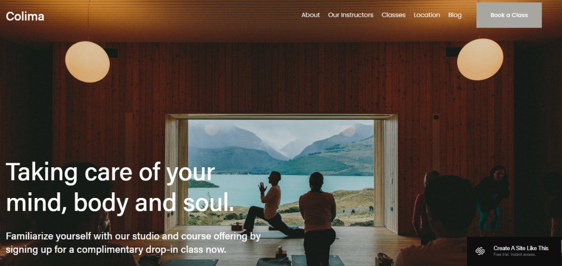
Colima’s strategically placed CTA buttons are hard to missColima hasa clean design that provides plenty of space for text, photos, CTA buttons, and anything else you might need to convey your message and turn visitors into clients. There are dedicated sections for your services, upcoming events, and a newsletter sign-up form to keep everyone in the loop.
This template works particularly well if you hold online or in-person classes. You can present your instructors and courses, upload video lessons, and allow your clients to book appointments online.
Didn’t Find What You Were Looking For? Check Out These Templates from Our Favorite Site Builders
If you’re still undecided about which template to choose for your landing page, here are a few more picks from Wix, SITE123, and IONOS that might have what you need.
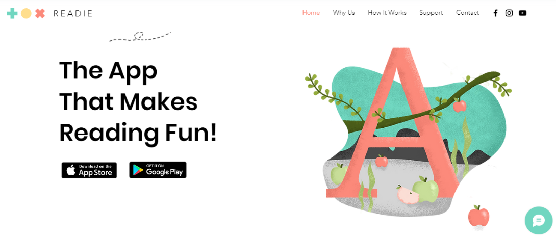
Readie’s professional yet friendly design can help you make a good first impression
Wix’s Readie template works great for education-oriented services, though you can use it for any type of mobile app. You can highlight your app’s features and benefits, upload screenshots of it in action, and encourage visitors to try it out thanks to the built-in Google Play and App Store links.
There’s also a dedicated section for client and media reviews to help you establish authority. And, through Wix App Market, you get access to integrations such as Testimonial Builder and Inffuse Testimonials to help you design professional testimonials that stand out.
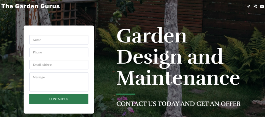
SITE123 allows you to add an up-to-date map to your pages. Mouse over to see.SITE123’s The Garden Gurus template puts your call-to-action up front. The combination of a full-screen image, an effective copy, and a contact form immediately captures the visitor’s attention.
As they scroll down, they can get an overview of your services, as well as full contact information. If your business has a physical location, you’ll benefit froman embedded map that makes it easier for prospective clients to find you.
IONOS’ Coffee Shop template’s concept is simple but effectiveIONOS’ Coffee Shop template has a straightforward, minimalist design with a few images, short but engaging text, and the essential means of contact, such as a form and social media links. If you’ve never built a landing page before, you’ll appreciate the ability to quickly edit sections and personalize the design with minimal hassle.
Depending on the type of business you run, you can add sections for featured products or the list of services you offer. Also, you can make use of the embedded map block to tell prospective customers how to find you.
These Are the Best Squarespace Landing Page Templates
With a wide selection of excellent designs and an array of powerful marketing tools, Squarespace can be a good choice when you want to build a high-converting landing page.
All the templates on this list have different strengths, but each one has what it takes to move visitors through the sales funnel. Once you’ve found a good starting point, it’s easy to add any must-have sections with Squarepace’s editor. The right combination of a good template, well-written copy, compelling visuals, and recommendations can make the difference.
FAQ
Can you create a landing page on Squarespace?
Yes. Just find a template you like (there are lots of good landing page options in the One Page category) and click on the Start WithThis Design button on the template preview page. Once the template is loaded into the editor, you can easily change the photos and text, and add the sections you need.
How do I change my landing page on Squarespace?
You can change the structure of your landing page by switching out its section blocks. Just click Add Section in the editor and choose the type which best suits your needs. To change the look of your landing page, click Design, then Site Styles to see detailed options.
But if you find it complex to use Squarespace’s customization features, there are other user-friendly web builders with premade templates you can try out.
How do I add a splash page in Squarespace?
It’s easy to add a splash page to your existing website by adding a page in the Squarespace editor. You can choose to start with a blank page or one of the prebuilt page layouts. Once you’ve found the right starting point, you can rearrange the page’s sections, as well as customize colors and fonts. Remember to keep it short – an effective splash page, like Mariana, has minimal text and focuses on visuals (a single image or video).
What is the best layout for a landing page?
Your landing page should have one clear goal and be optimized for conversion. A good structure should include:
Ana specializes in writing about web building platforms, project management software, and other digital tools. She has been a freelance writer for 7 years, and has published countless product reviews and comparisons in that time. Ana has a passion for language and all things tech, and she combines the two to provide accessible and insightful resources for anyone interested in building websites or managing projects.
Thank you, - your comment was submitted successfully!
We check all user comments within 48 hours to make sure they are from real people like you. We're glad you found this article useful - we would appreciate it if you let more people know about it.
Share this blog post with friends and co-workers right now:
Thank you, , your comment was submitted successfully!
We check all comments within 48 hours to make sure they're from real users like you. In the meantime, you can share your comment with others to let more people know what you think.
Thank you for signing up!
Once a month you will receive interesting, insightful tips, tricks, and advice to improve your website performance and reach your digital marketing goals!