Many free church website builders lure you in by promising to save you money, but they’re often too basic or hide important features behind a paywall. Building a great website for your church shouldn’t break the bank or limit your access to upgrades if needed. The builder you use should also offer flexibility, as you may eventually need features you can only get on a paid plan.
That’s why I’ve done the work for you and rounded up the top 10 free website builders for churches in 2025. I looked at ease of use, design options, and whether they had all the bells and whistles you need to run your church smoothly.
Wix stood out as the clear winner of all the options due to its super-generous free plan. It won’t limit your access to key features like its search engine optimization (SEO) checklist and AI builder and allows you to upgrade at any time. Keep reading to find out some other great options for churches.
Short on Time? These Are the Top Free Church Website Builders in 2025
What We Look For in the Best Free Website Builders for Churches
To find the best website builders for churches, I focused on features that ensure a welcoming and functional online presence for congregations.
- Full customization. You need the ability to customize your church’s website to reflect your congregation’s unique identity. Customization options should include flexible templates, font choices, and color schemes so your site looks exactly how you want it.
- Built-in features. A great website builder for churches offers built-in tools like contact forms, maps, service schedules, donation buttons, and multilingual support. These features make it easier for your members to connect and engage with your church.
- Social media integrations. Integrating your social media accounts into your website lets you keep your community engaged across platforms. This is important for sharing updates, events, and sermons through one dashboard.
- Third-party tools. You need a builder that supports third-party tools for features like prayer circles, podcasts, and forums. This will help you enhance your website’s functionality and offer more resources to your congregation.
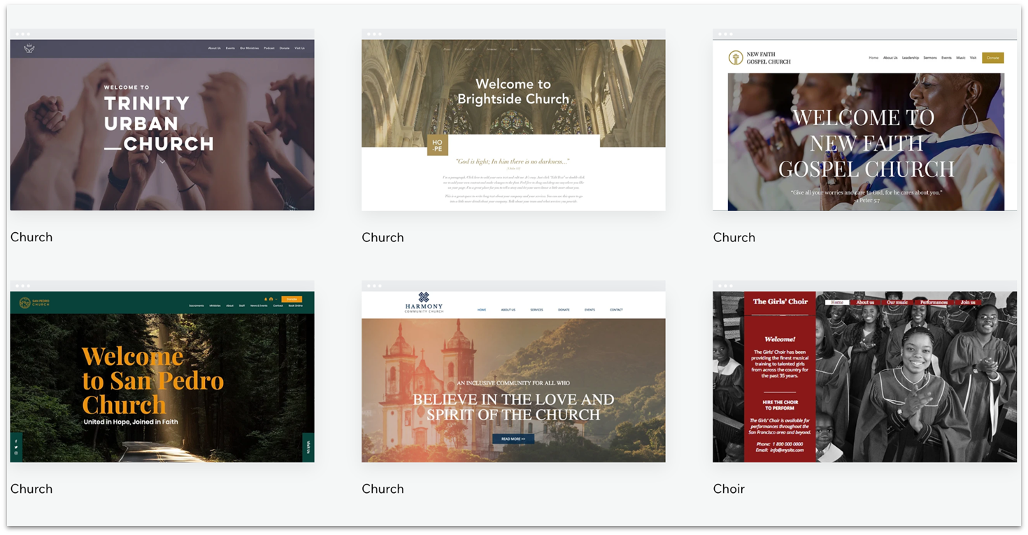
All Wix templates are customizable, but browsing through its 15+ religion-focused templates can make it easier to whip up a visually appealing and functional church website. You can effortlessly tweak colors, fonts, and layouts using its user-friendly drag-and-drop editor to create a website that reflects your church’s unique character – no coding skills needed!
Wix’s free plan is a great deal, letting you create and publish your church website without spending a dime. However, take note that your free site will use a Wix-branded site address and display a Wix banner ad and favicon. Still, Wix’s pricing plans are reasonable if you’re on a tight budget but want an ad-free website with a custom domain for a small monthly fee.
Save up to 50 % on your Wix plan!
Sign up for an annual plan and enjoy the savings.
Plus get a free custom domain for 1 year!
Features
- SEO Setup Checklist. Wix provides a comprehensive SEO checklist built into its dashboard. It helps your church website rank higher on search engines like Google by suggesting what to optimize on your website, such as images, page titles, and keywords used.
- Multiple payment options. Accept donations, tithes, or event fees through Wix’s multiple payment gateways, including PayPal, Stripe, and manual payment methods. This is only available from Wix’s Core to Business Elite plans.
- Built-in analytics. Easily track visitor engagement and donation trends with Wix’s built-in analytics tools, helping you understand your church website’s most visited pages, visitor locations, and more.
- Multilingual site support. With the Wix Multilingual app, your site can support up to 180 languages. This allows you to create a multilingual site that welcomes and serves diverse congregations.
Read our expert Wix review for more details.
| Free plan | ✔ |
| Customizable templates | ✔ (with 15+ church templates) |
| Built-in features for churches | ✔ (donation, gallery, forms, music, video, and event apps) |
| Upgrade price | $17.00 |
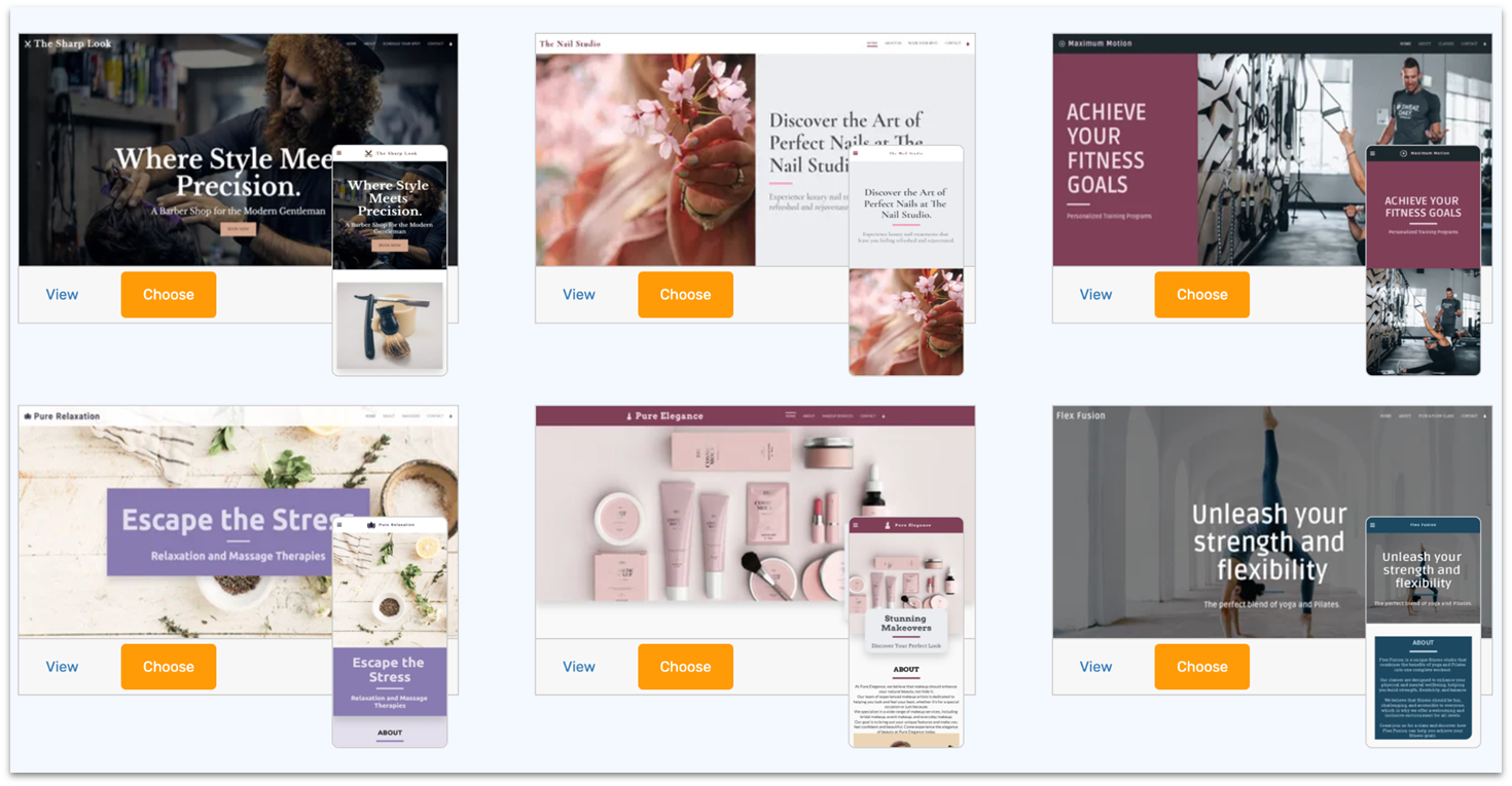
SITE123 offers a truly free plan with basic customization options that require no technical skills. Thanks to its pre-designed templates and easy-to-use point-and-click editor, you can dive right in and start building your website immediately.
Once you’ve created your free church website, SITE123 offers event management tools and schedulers for organizing church activities. You can create and promote events, track RSVPs, and send reminders – all from your SITE123 dashboard. However, just like Wix, your free church website will use a branded site URL (sitename.site123.me) and have a SITE123 floating tag.
SITE123 also offers tools to manage newsletters, helping you stay connected with your congregation. Its free plan is more than enough for basic church communications, but you can upgrade if you’re looking for larger email campaigns and advanced features. SITE123’s pricing for its Premium plans starts at $12.80.


Get a FREE domain + hosting with any SITE123 annual plan!
This exclusive offer is only available for your first purchase.
Features
- Social media integrations. SITE123 makes it easy to connect your church’s website with social media platforms, helping you share updates, events, and sermons directly with your church’s members.
- Comment system. Engage your congregation by enabling comments on your website. Visitors can leave comments and reply, and you can select if you want to review or automatically confirm comments before posting.
- Free SSL Certificate. Every SITE123 website comes with free SSL encryption, ensuring your church’s website is secure and trustworthy for all visitors.
- 24/7 website support. You can get in touch with SITE123’s 24/7 support in English via live chat, a support center, or email to keep your website running smoothly. It also offers support in various languages like Spanish, Russian, and Arabic during business hours.
To find out more, check out our in-depth SITE123 review.
| Free plan | ✔ |
| Customizable templates | ✔ (with 6 church-friendly landing page templates) |
| Built-in features for churches | ✔ (events, booking, music, blog, gallery, and team pages) |
| Upgrade price | $0 |

3. Webador: Quick Church Site Creation With Free Upgrade
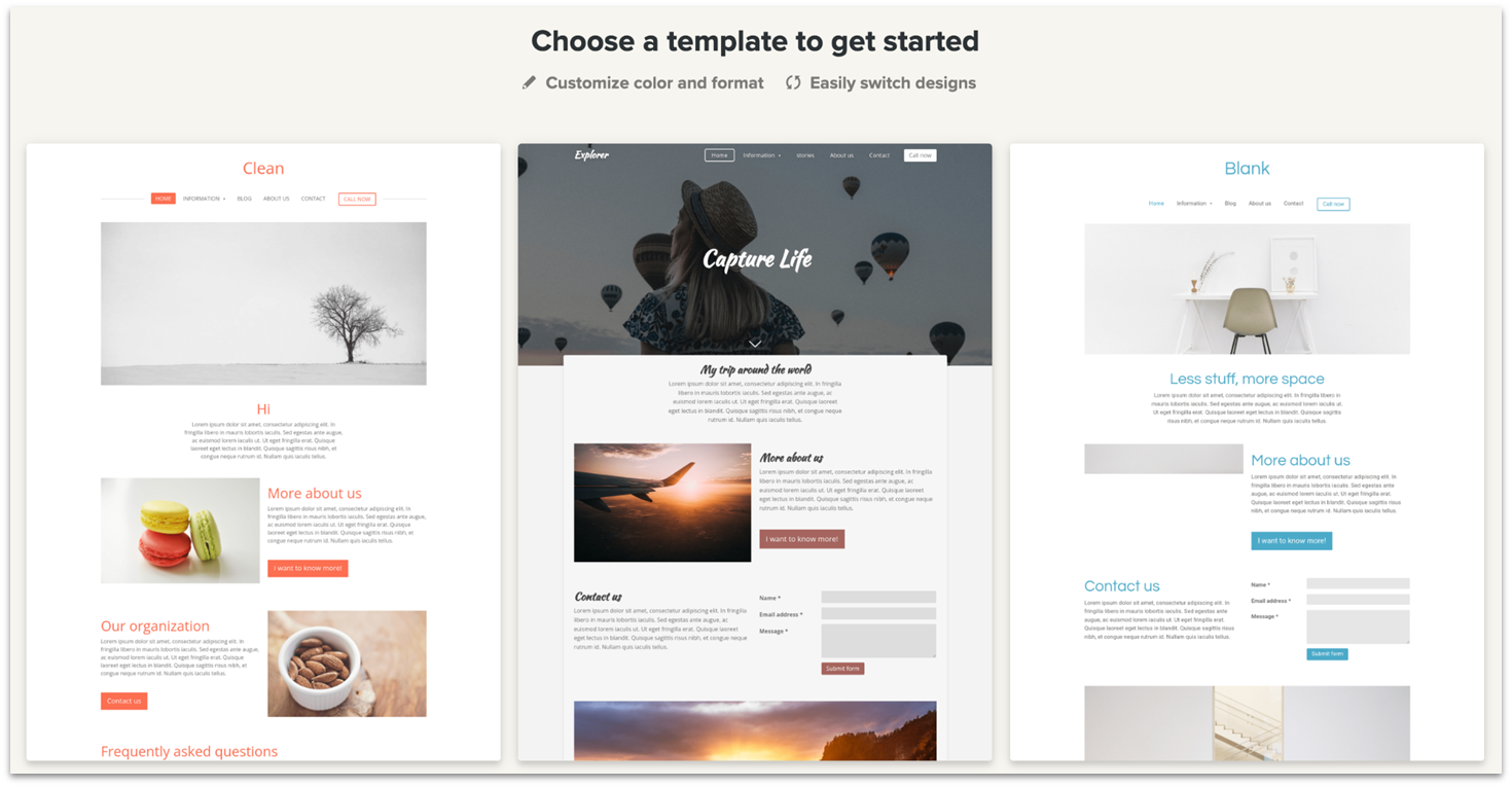
Webador offers a free forever plan that lets you create a fully functional church website without any hidden costs or trials. And if you ever decide to upgrade, Webador has an awesome deal – 6 months free on any of its paid plans – making it a budget-friendly option if you need top-tier features.
Customizing your church website is a breeze with Webador’s user-friendly editor. You can easily tweak the background, colors, header, and footer, and the platform automatically aligns everything for a clean and organized look. It also offers cool editor tools like maps, comments, social buttons, custom forms, and file-sharing widgets that you can drag and drop from the sidebar into your page.
Webador’s free plan, like Wix and SITE123, includes ads and uses a subdomain. It also lacks support for audio, photo albums, and video uploads, but you can still upload images and embed media from third-party sites like YouTube and Spotify.

Get 6 Months FREE with Webador's Pro Plan!
Limited-time offer - Don't miss it!
Features
- Multi-language support. Webador offers an editor in 12 languages, including custom multi-language options for features like custom forms. This makes it easy to create free church websites that cater to a diverse audience.
- Comprehensive help center. Its extensive help center provides you with all the resources you need to master website-building, from the basics to advanced platform features.
- SEO settings. You can easily upgrade your church website’s SEO by modifying page titles, meta descriptions, and more directly within Webador’s editor.
- AI features. Webador’s AI tools help you quickly generate a structured website. It recommends pages to choose from, such as ministries and events, and automatically prefills them with relevant content.
Take a look at our detailed Webador review for more info.
| Free plan | ✔ |
| Customizable templates | ✔ (50+) |
| Built-in features for churches | ✔ (map, comment, button, form, and image tools) |
| Upgrade price | $5.00 |
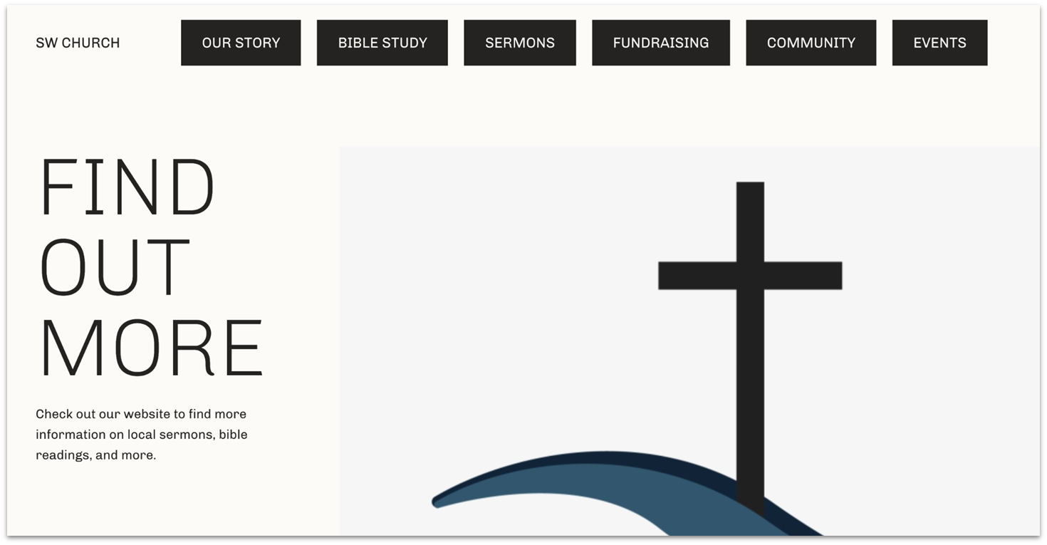
WordPress.com’s free security features help protect donation records and contact details for a church website with online donations and memberships. Its built-in tools block malicious requests and automatically scan for malware, so you can focus on your church without stressing about security.
WordPress.com has over 150 free themes, most of which are perfect for blogs. To narrow down your choices, go to the Community & Non-Profit theme category to see the top 8 free themes for your church website. While these themes allow for some basic customization, you’ll have to upgrade to a premium plan to unlock advanced design features and more professional themes.
Additionally, WordPress.com has a free built-in newsletter feature that automatically sends an email about your new blog post to unlimited subscribers. This lets you update your congregation on your church’s activities from your website – all for free.
Features
- Intuitive organization tools. WordPress.com simplifies content management for churches by allowing you to categorize and schedule large volumes of content effortlessly right from the admin dashboard.
- Various support channels. Even on the free plan, you can access video tutorials, in-depth articles, and an active community forum. If you upgrade, you unlock email support and 24/7 live chat for more personalized assistance.
- Unlimited pages and users. Create unlimited pages for your church’s sermons, events, and ministries. Then, assign access roles to multiple church team members so they can contribute and help manage the website.
- Refunds. WordPress.com offers a 14-day money-back guarantee on its annual, two-year, and three-year paid plans. Monthly plans only get a 7-day money-back guarantee. Domain purchases include a 96-hour refund option with a quick and automated process.
To learn more, read our comprehensive WordPress review.
| Free plan | ✔ |
| Customizable templates | ✔ (with 10+ church-friendly templates) |
| Built-in features for churches | ✔ (donations, payment, security, newsletters, and social media sharing tools) |
| Upgrade price | $4.00 |
5. Elementor: Free Access to Your Website’s Version History
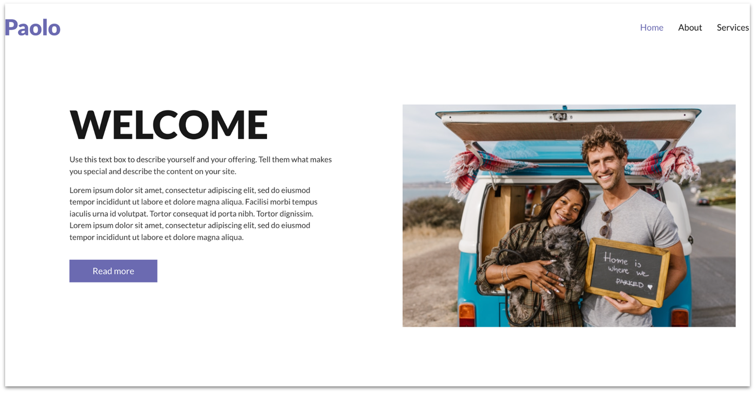
Elementor lets you view your free church website’s version history without needing to upgrade. This feature is handy if you want to go back to a previous version after making some event or campaign content changes. It also shows who made the changes to the page, helping you track contributions and identify any issues that might arise from updates.
As a WordPress plugin, Elementor is all about design customization with its intuitive drag-and-drop editor. While it doesn’t offer e-commerce features or advanced SEO tools, it does come packed with cool AI features that can help you generate content, images, and even custom CSS code.
Elementor’s AI can assist you in improving your church website’s design based on your feedback. However, keep in mind that its AI tools are best for simpler tasks and might need a little tweaking for more complex needs. Also note that before you can use the free site builder plugin, you’ll need to first subscribe to a hosting service that includes a WordPress installation.
Features
- Free full-website kits. Elementor provides two full website kits for free users, and if you upgrade to its pro plan, you can unlock over 100 kits from its website library.
- Add-on market. Elementor’s add-on market offers hundreds of free and paid widgets, like the Scroll Sequence widget, which animates your site as visitors scroll, enhancing user engagement.
- Workflow tools. Improve your efficiency with Elementor’s workflow tools, including custom shortcuts, copy-paste styles, and user-based permissions for streamlined content management.
- Support and online community. Elementor offers comprehensive support through how-to guides, video tutorials, an AI chatbot, live chat, and a ticket system. It also has an active forum on WordPress and communities on Facebook and GitHub.
Read our extensive Elementor review for more details.
| Free plan | ✔ (WordPress plugin) |
| Customizable templates | ✔ (in-house and third-party website kits available) |
| Built-in features for churches | ✔ (gallery, video, Google Maps, SoundCloud, and testimonial widgets) |
| Upgrade price | $4.99 per year |
6. Webnode: Basic Storage and Unlimited Pages
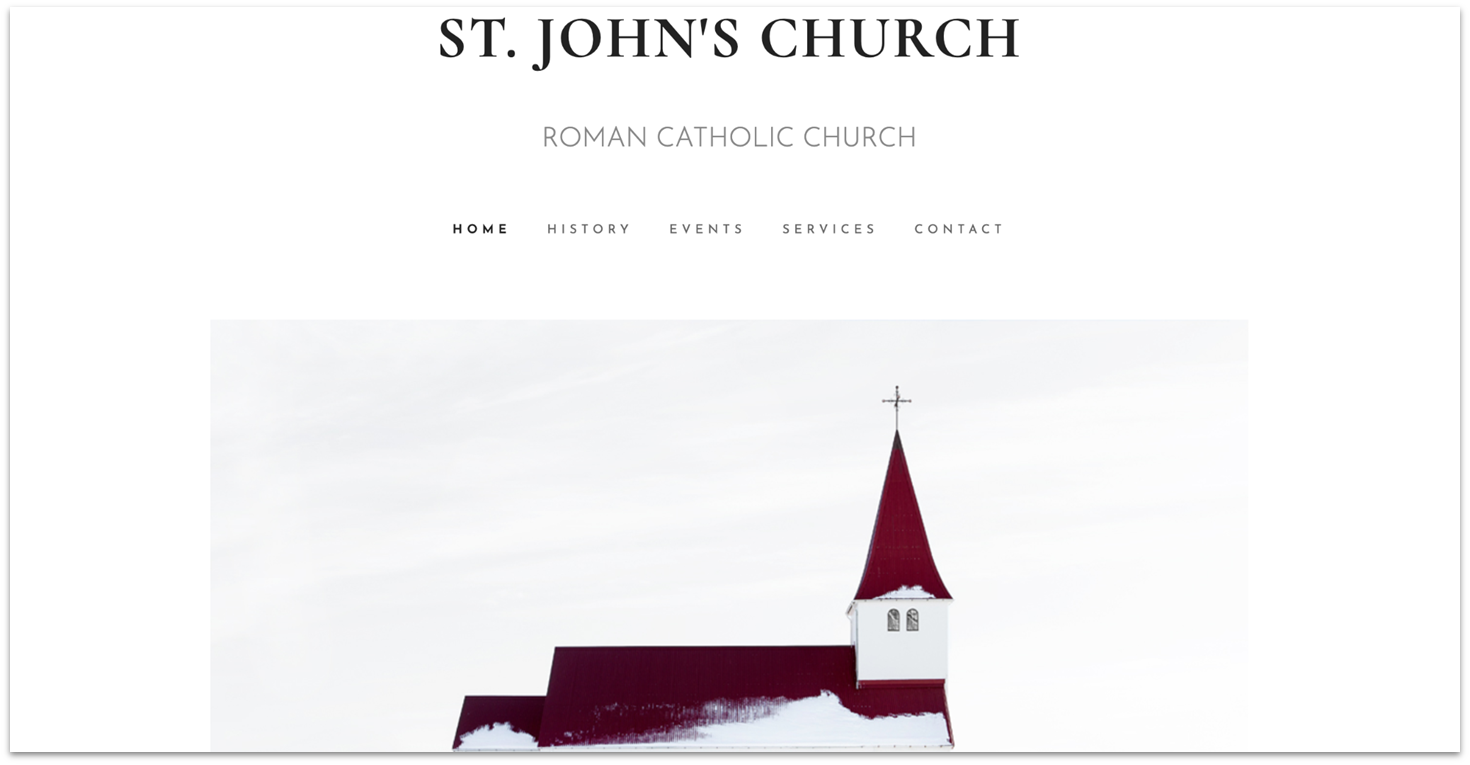
Webnode’s free plan gives you 100 MB of storage and lets you create unlimited pages on a Webnode subdomain. This plan is great if you need a simple site but aren’t planning to use a lot of heavy multimedia.
Plus, Webnode includes some basic but effective SEO tools, allowing you to optimize every page with titles, URLs, meta descriptions, and keywords. You can even add custom HTML header code, a rare find among free website builders, enabling you to integrate tools like Google Search Console to track your church site’s presence in search results.
Its paid plans are reasonably priced if you need more storage, a custom domain, or want to unlock advanced features like e-commerce integrations. However, it doesn’t offer as many features as similarly priced competitors. For example, Webnode’s Limited plan doesn’t include a free domain, unlike Webador’s similarly priced Lite plan.
Features
- Custom form builder. Webnode’s form builder allows you to add fields like drop-down lists, file uploads, and date pickers, making it easy to create tailored forms for your church’s needs.
- Free website templates. Webnode offers over 150 well-designed, fully responsive templates. While some stand out more than others, you’ll find many options to create an aesthetically pleasing church website.
- AI wizard. If you’re unsure about choosing a template, Webnode’s AI wizard can quickly design your site’s structure. Just write a brief description of your church, and it’ll suggest the best templates you can customize in seconds.
- E-commerce capabilities. You can easily add an online store page to your website if you want to sell products, especially digital ones like ebooks.
Take a look at our in-depth Webnode review to find out more.
| Free plan | ✔ |
| Customizable templates | ✔ (with 10+ church-friendly templates) |
| Built-in features for churches | ✔ (SEO and e-commerce tools) |
| Upgrade price | $4.50 |
Other Notable Builders for Free Church Websites
7. IONOS
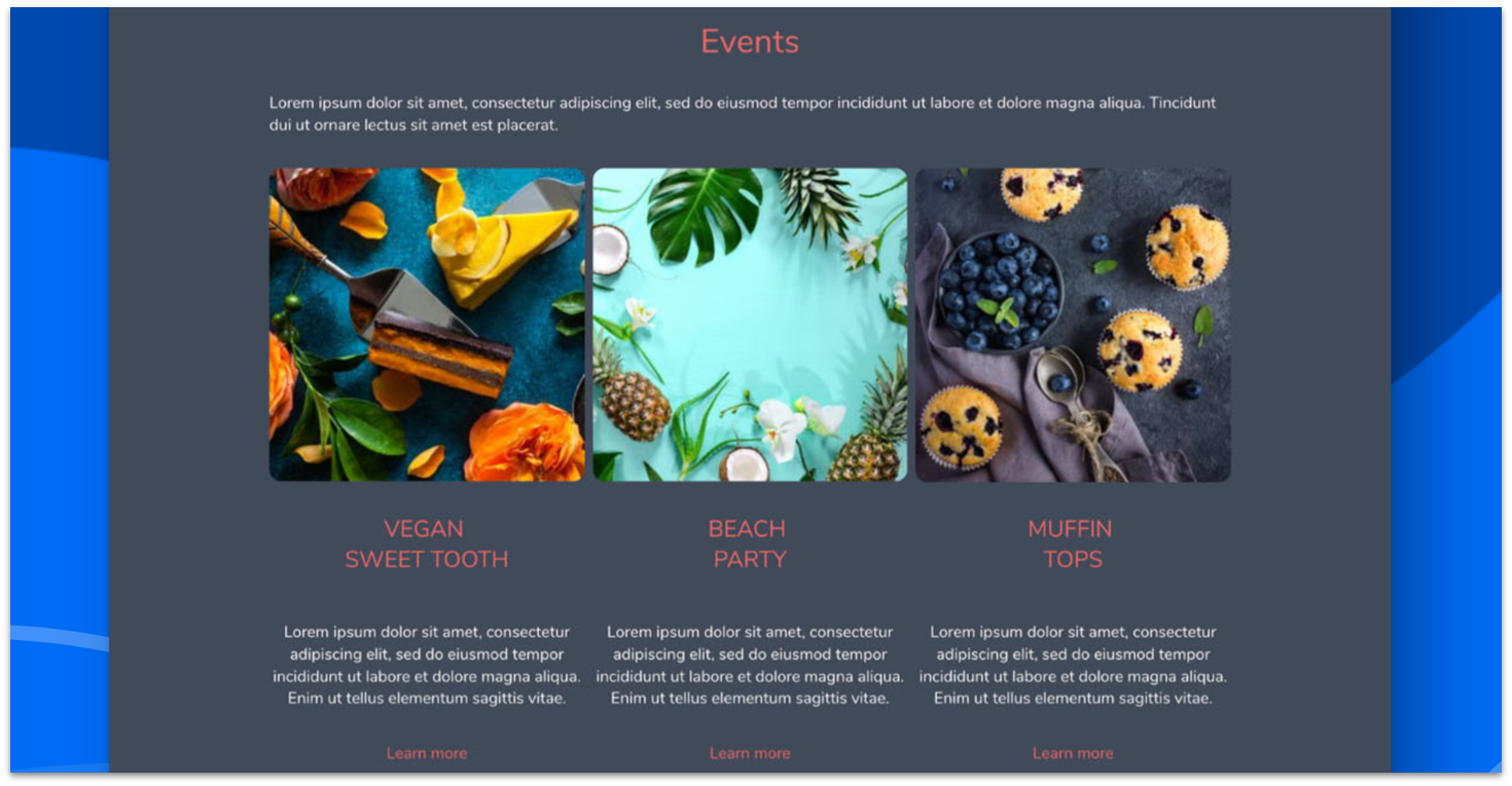
IONOS’ AI website builder helps you create your site quickly and easily. It offers AI tools that let you generate content, optimize images, create SEO titles and descriptions, and even tweak your site’s design with minimal effort. Once your site is live, built-in analytics track visitor behavior to help you optimize your site based on real user experiences.
While IONOS doesn’t have a free plan, it does offer a 30-day money-back guarantee, letting you test its services risk-free. Its heavily discounted Plus plan also costs $1.00 per month for 1 year. All paid plans come with a free domain, a professional email address, SSL encryption for secure connections, and built-in cookie consent banners for GDPR compliance.
8. Jimdo
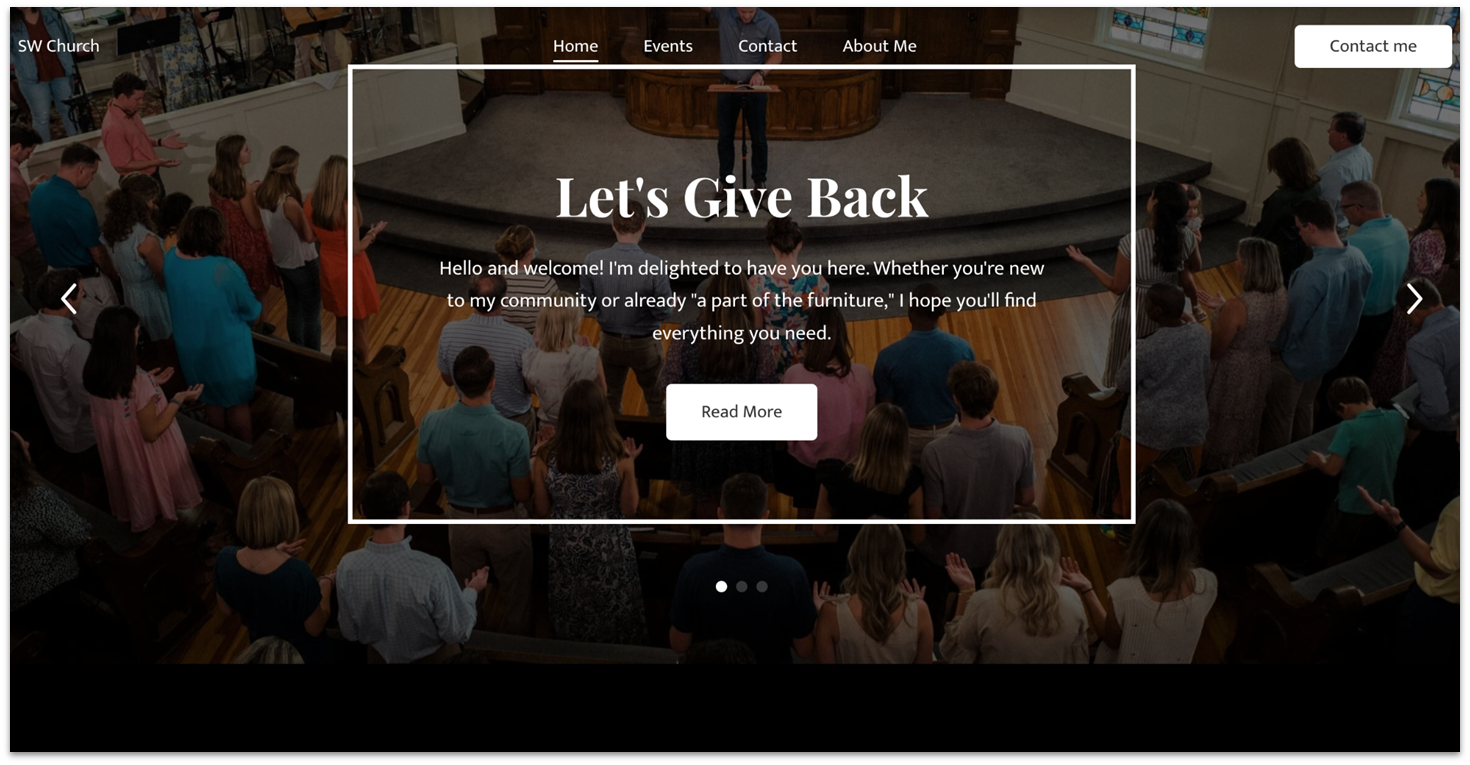
Jimdo’s free plan gives you 500 MB of storage, 2 GB of bandwidth, and up to 5 pages – plenty for a basic church website. It has over 100 good-looking templates to choose from and free tools like logo and legal text generators.
However, the free plan does have some limits when it comes to customization. You’re stuck with predefined layouts, and your ability to modify the design is restricted to basic color schemes and a few layout options. If you’re looking for creative freedom, you might find Jimdo a bit restrictive.
9. Strikingly
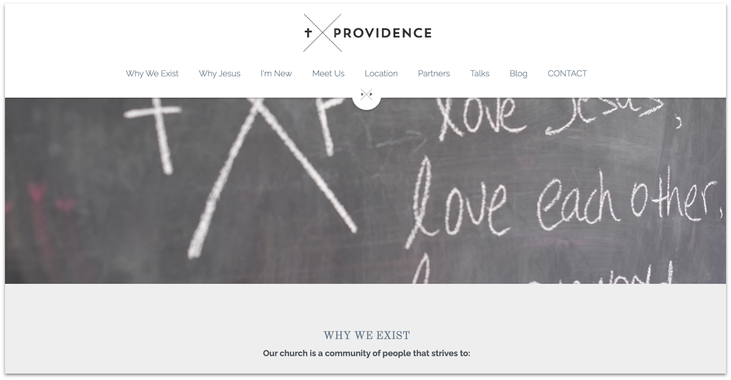
Strikingly’s free plan offers a user-friendly drag-and-drop editor, social media integrations, and even online store functionality. Plus, you can access 200+ visually appealing and mobile-responsive templates requiring minimal editing.
However, if you want to build a more complex site, use advanced e-commerce features, or dive into detailed analytics, you might find Strikingly’s plans a little lackluster. Plus, with only five pages per site on its free plan, it’s not going to cut it for engagement-focused churches.
10. Square Store Builder
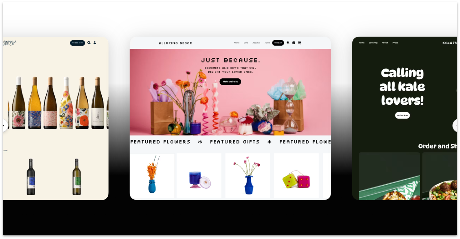
Square Online is a great option if your church wants to add e-commerce features to its website and sell merchandise or organize fundraisers online. It comes with tools to manage products, track inventory, sell digital items, handle logistics, and more.
That said, be aware that Square Online isn’t designed for standard church websites. It has fewer templates and limited customization options. While it includes some built-in marketing tools and analytics, its main focus is selling products and services rather than providing a traditional church website experience.
Launch Your Free Church Websites With the Best Website Builders
Finding the right free website builder for your church can be challenging due to varying needs. To build the best website for your church, check out our highly recommended free options:
For creative freedom and customization, Wix is my top recommendation. It offers over 800 templates, an intuitive drag-and-drop editor, and essential tools like an SEO checklist and donation forms.
If you’re looking for a quick and straightforward setup, SITE123 is an excellent choice for free church websites. Its user-friendly interface allows you to add features like event calendars and blogs in minutes.
Or, if you’re looking for basic customization and the chance to get discounted premium features, go with Webador. It offers SEO and AI tools for a quick and easy building experience.
| Free Plan | Best Feature | Best For | Upgrade Price | ||
| Wix | ✔ | Hundreds of ultra-customizable templates and integrations | Churches with a tight budget looking for creative freedom | $17.00 | |
| SITE123 | ✔ | Easy-to-use point-and-click editor | Churches looking to set up a website with no upfront costs | $12.80 | |
| Webador | ✔ | Free forever plan and big premium plan discounts | Budget-conscious churches that may upgrade in the future | $5.00 | |
| WordPress | ✔ | Free built-in security and performance tools | Churches looking for top-tier security features | $4.00 | |
| Elementor | ✔ | View your website’s version history on its free plan | Churches with minimal website-building experience | $4.99 per year | |
| Webnode | ✔ | Unlimited pages and SEO tools | Churches that need a simple site with little to no multimedia | $4.50 |
FAQ
Does a church need a website?
Yes, a church needs a website. It’s often the first place people look for information about your church. With a church website, you can share your mission, post sermon recordings, and connect with your congregation in seconds. To start, you can use a free website builder with customizable templates and built-in features.
What should a church website include?
Your church website should include key elements like contact and donation forms, service schedulers, digital maps, social media integrations, and a way to download sermon recordings. Free church website builders like Wix allow you to promote Bible study opportunities and feature a welcome video on your homepage.
How much does it cost to build a website for a church?
The cost to build a church website can range from free to around $50 per month. Free builders like SITE123 are excellent for churches as they allow you to dive right in and start building your site from day one. Remember, despite building your site for free, you’ll have to pay a small fee or sign up for a monthly subscription to use your own domain name.
What are the benefits of using a free church website builder?
Using a free church website builder helps you create an online presence without straining your budget. These platforms offer user-friendly tools, templates tailored for churches, and essential features like online giving and event management.


